 https://auburnuniforms.com/wp-content/uploads/2024/03/Nike-Contract-featured-image.png
1014
1819
Clint Richardson
https://auburnuniforms.com/wp-content/uploads/2023/01/Auburn-Uniform-Database-Logo-site-180x180.png
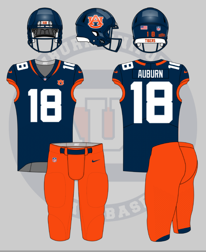
Clint Richardson2024-04-09 08:42:002024-05-26 23:17:17Auburn Inks Apparel Provider Deal With Nike
https://auburnuniforms.com/wp-content/uploads/2024/03/Nike-Contract-featured-image.png
1014
1819
Clint Richardson
https://auburnuniforms.com/wp-content/uploads/2023/01/Auburn-Uniform-Database-Logo-site-180x180.png
Clint Richardson2024-04-09 08:42:002024-05-26 23:17:17Auburn Inks Apparel Provider Deal With NikeThe post Concepts appeared first on Auburn Uniform Database.
]]>The post Crazy Auburn Uniform Concepts – Round 8 appeared first on Auburn Uniform Database.
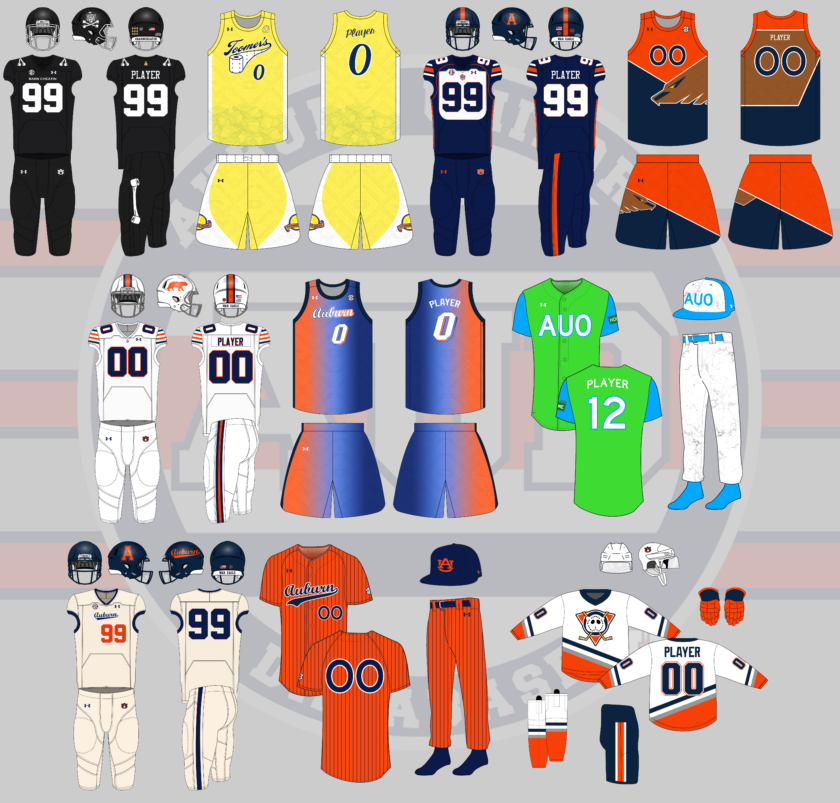
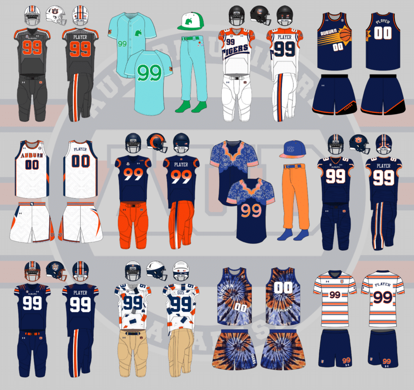
]]>If you’re new here, each summer I put out an all-call on Twitter for the craziest, silliest, sometimes possibly realistic concept ideas that Auburn fans would like to see come to life.
Why? Well, the summer is often riddled with talking heads discussing alternate uniforms. The same horrendous designs have been passed around for years and it’s time to add more fuel to that fire!
This series also works to show that Auburn’s uniforms are pretty good as is. The Tigers don’t need to make any changes or bring unnecessary alternates into the rotation just because they can.
A few things before we get started:
- First off, these designs are intentionally silly, obnoxious, and over-the-top. That’s the point. No one expects to see these hit the field or court. We aren’t saying Auburn should wear these whatsoever. If you are truly upset about any of these designs, that’s solely on you.
- I am not a designer or an artist. This is always a fun project that helps push my very limited creativity. These are not the world’s best Photoshop jobs and they were never expected to be so. Again, they’re goofy on purpose.
Did your suggestion make the cut this year? Let’s dive in and take a look at this year’s crazy Auburn concept uniforms!
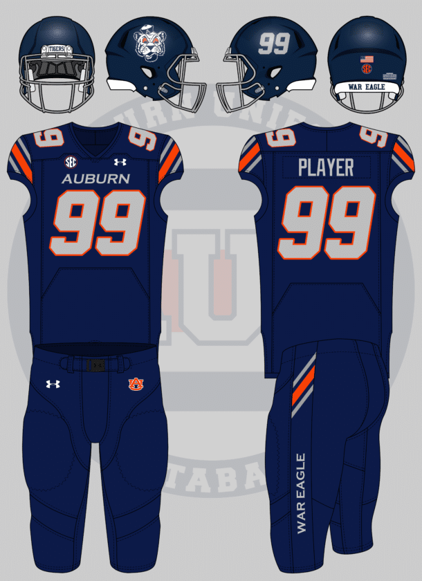
I’d like to see one based on the throwback Bills uniform (Auburn colors, orange tiger on helmet, etc)
— Tom (@ths0002) May 30, 2022
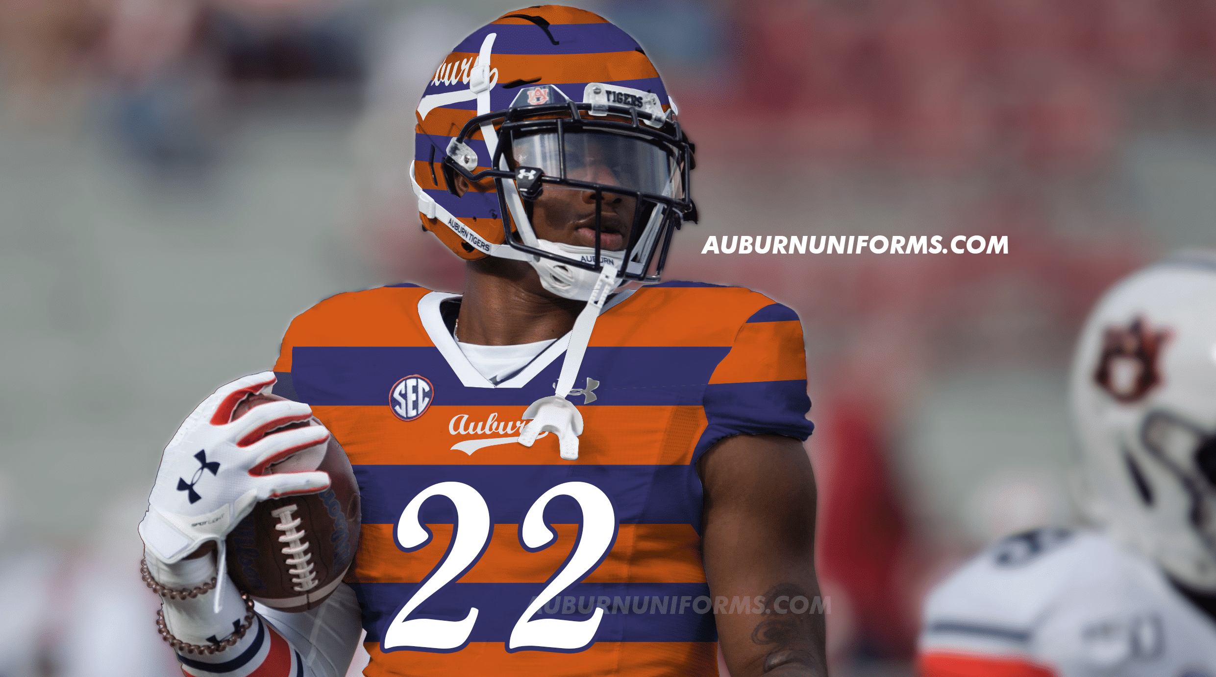
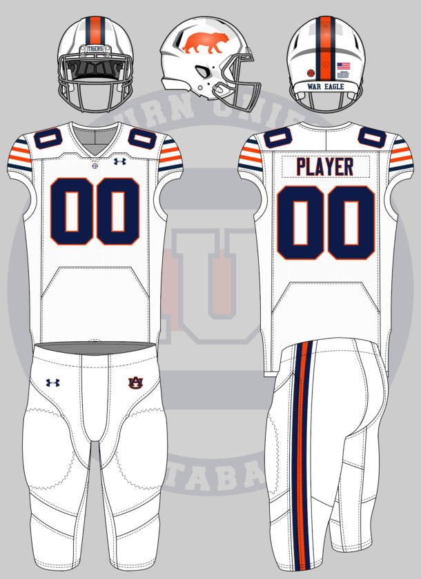
Who doesn’t love the standing buffalo? Let’s see how it works as a standing tiger.
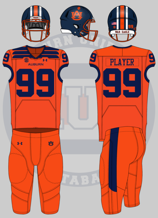
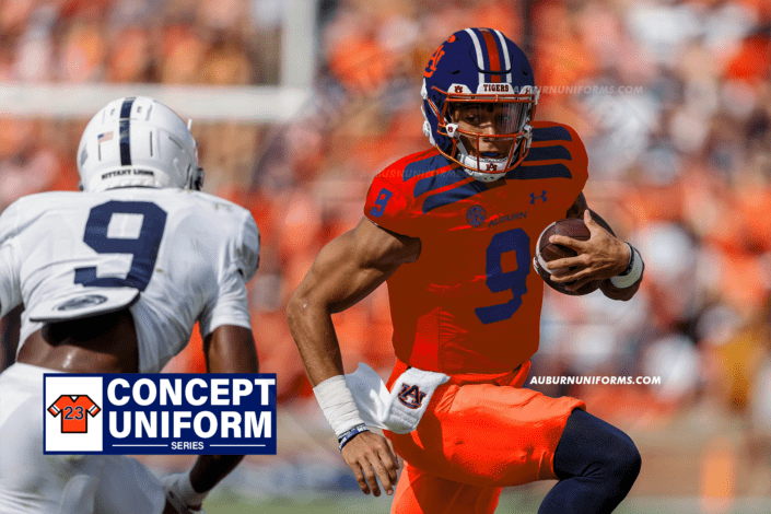
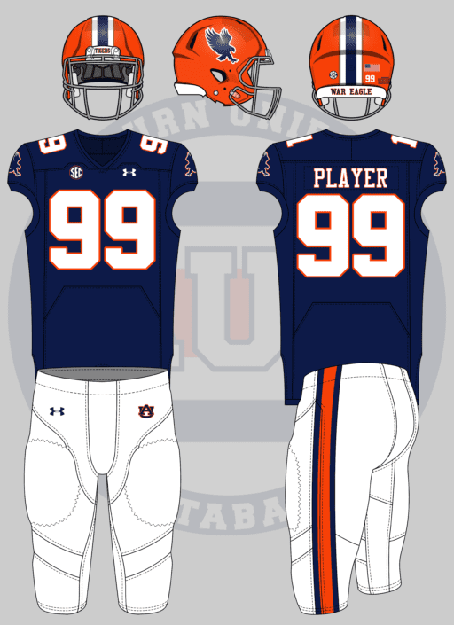
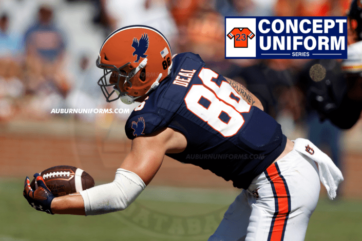
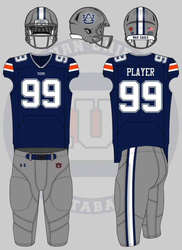
This one was a rather simple tweak. Facemask goes grey, helmet stripes now touch, jersey stripes match the Bills’ design, and the pants stripe is much thinner. To play closer to an NFL uniform, the SEC patch moves from the right chest to the center, much like the NFL shield placement.
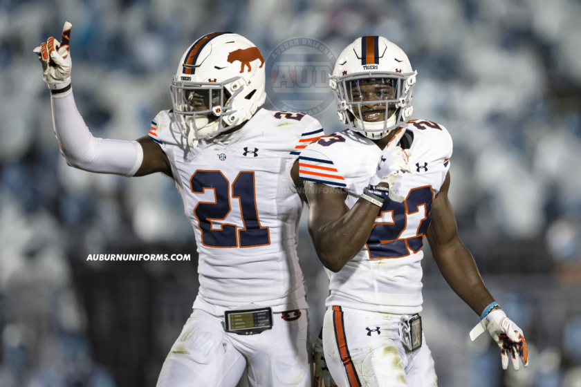
The Bills’ standing buffalo logo is iconic and swapping it with a tiger silhouette works really well here. The different sleeve striping is also a nice fit that doesn’t stray too far from the classic Northwestern Stripes.
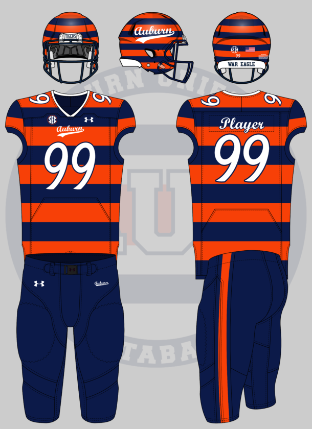
Auburn version of those hideous BYU bib unis from like 15 years ago
— Sonny Dichiara Is My S
irit Animal
(@originalgAUlf) May 25, 2022
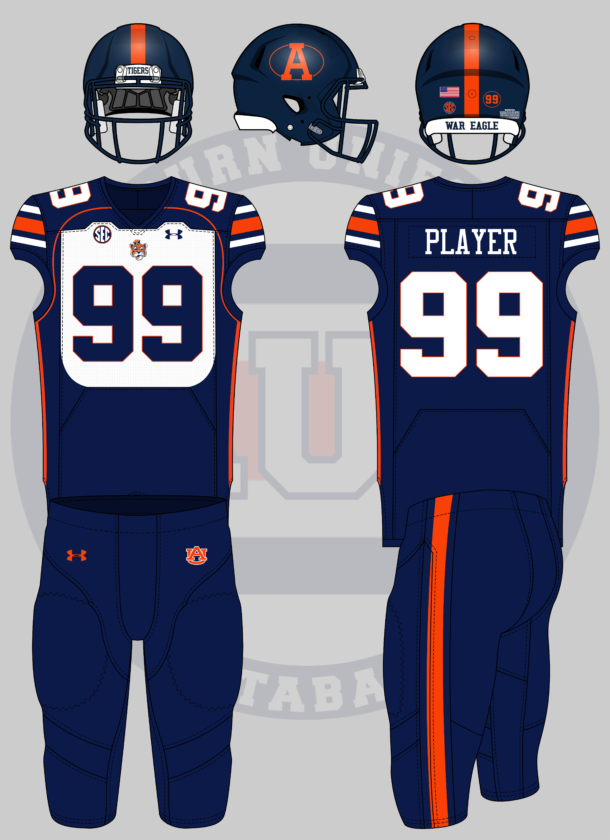
BYU’s 1999 uniforms are often considered the ugliest in the history of college football. And for their ugliness, I love them! The Cougars actually forced the NCAA to change the uniform rules which now require the jersey to be entirely a single color.
For the Auburn-ized version, it starts at the helmet. A navy helmet carries a throwback block A placed within an orange-outlined oval, much like the BYU logo. To add to the logo aesthetic, the player’s number is also encircled on the back of the shell.
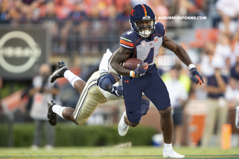
The old templates allowed the “bib” effect on the jerseys much better than Under Armour’s current design. The white are is restricted within the “file tab” textured area here. BYU also had their cougar head logo within the collar, but we’re going to place Sailor Aubie on the chest.
The numbers get an orange outline, the jersey gets terrible orange piping to connect the collar to the side stripes, and the pants get a single orange stripe to match the helmet.
This but auburn pic.twitter.com/bPaYPcPfYa
—
Drew Crowson
(@SonOfCrow2) May 24, 2022
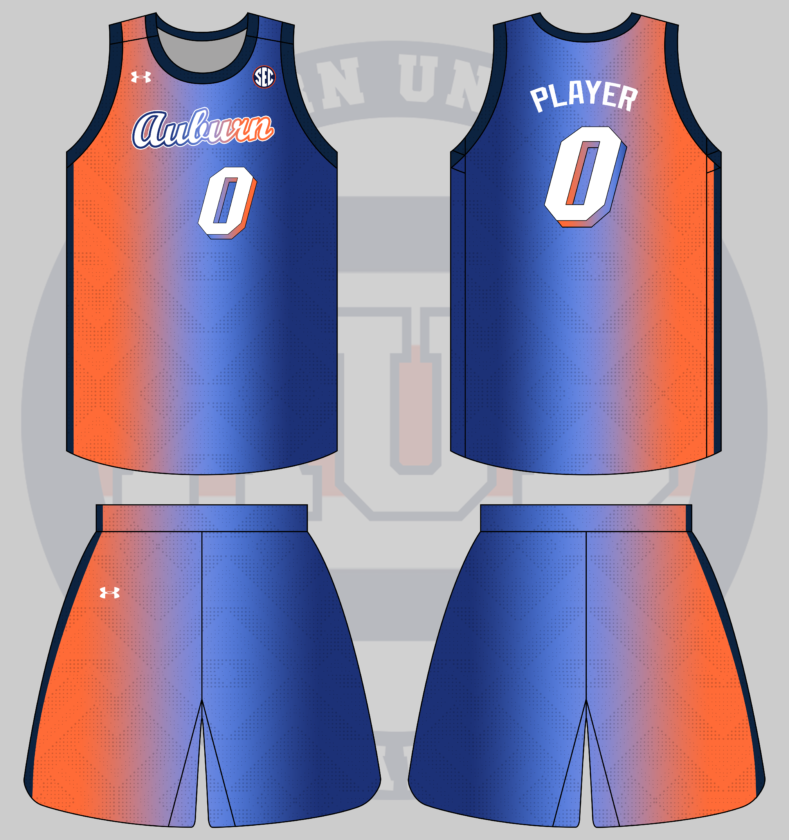
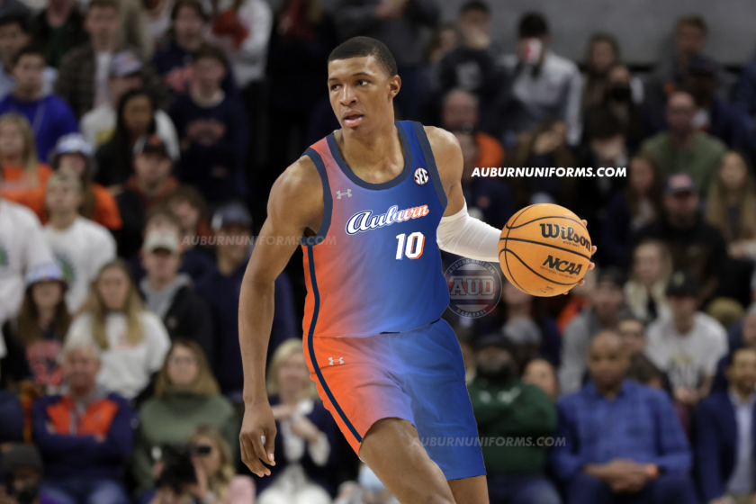
This now makes the third straight year we’ve had an Auburn x NBA crossover design!
The Miami Vice uniforms have been incredibly successful for the Heat. Naturally, we had to make the light blue and pink gradient orange and navy to start off. I stuck with the normal Heat font and added the matching gradient-drop shadow.
Miami uses black wordmarks and numbers, but to stick with Auburn colors and make it pop more, I went with white. And instead of mimicking the Miami Vice font as closely as possible, I went with the beautiful Auburn baseball script.
I debated adding the old 1990s Women’s Basketball flaming AU logo to mimic the Heat logo, but decided against it. Keeping it simple worked well here.
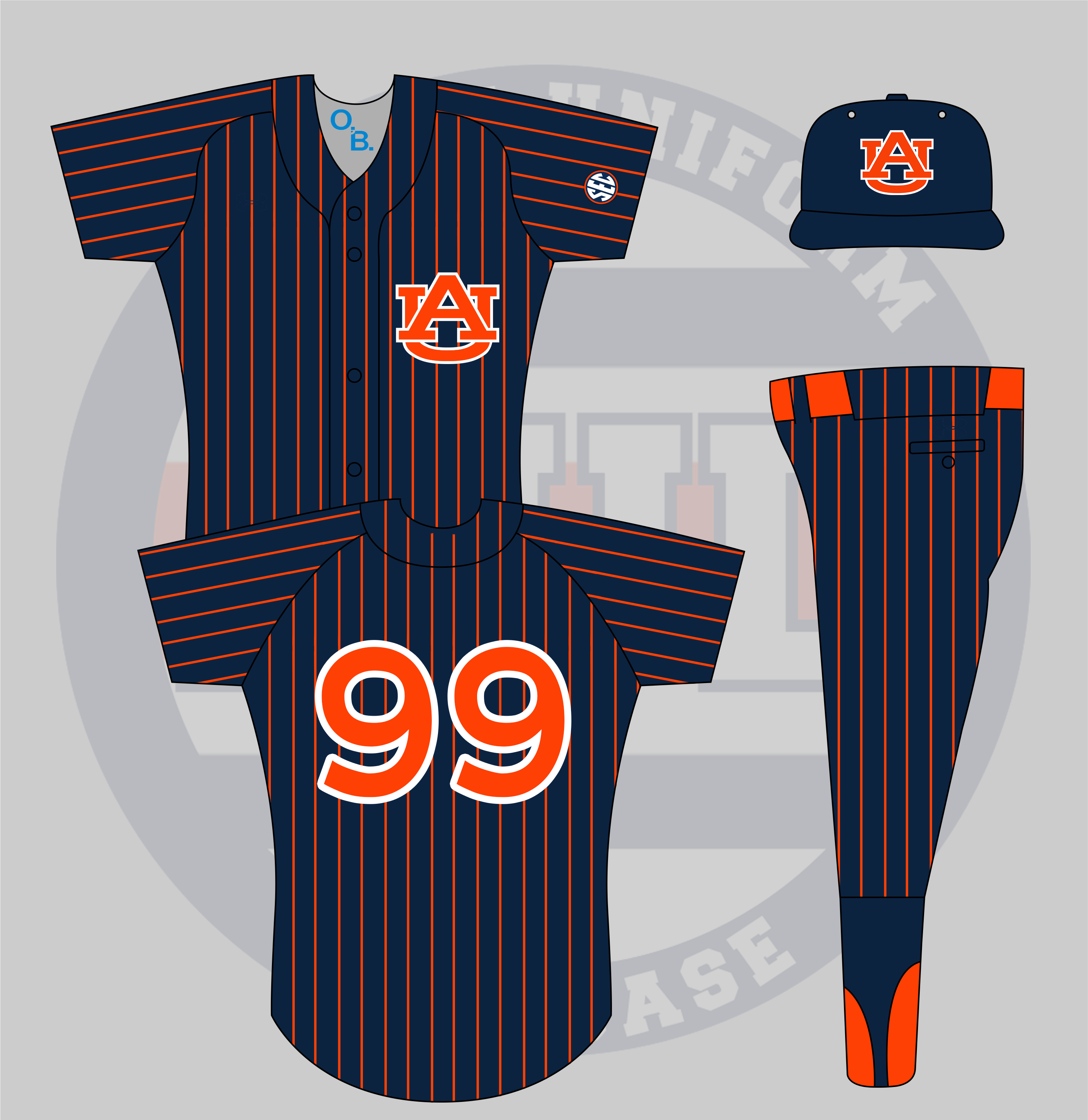
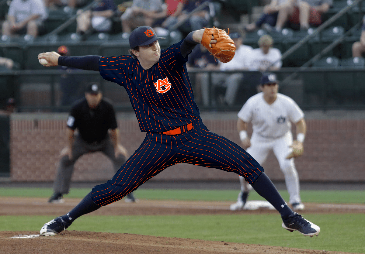
Orange jersey and pants with navy pinstripes and a navy hat or vice versa
— autiger24 (@Aubfather) May 31, 2022
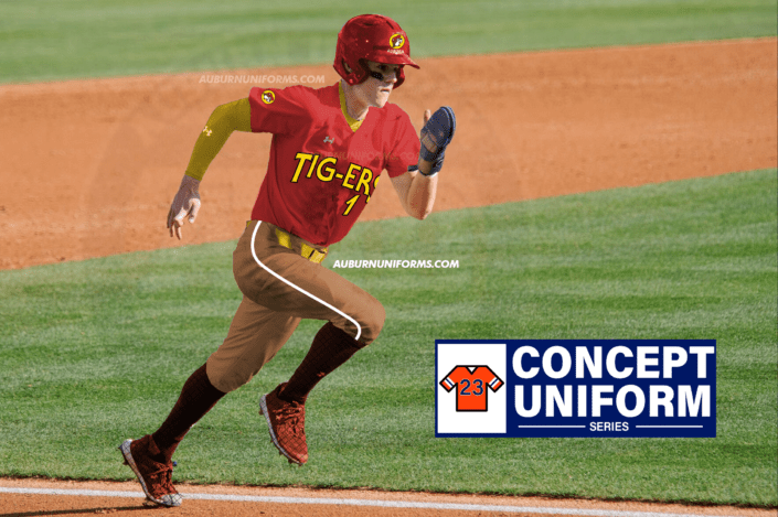
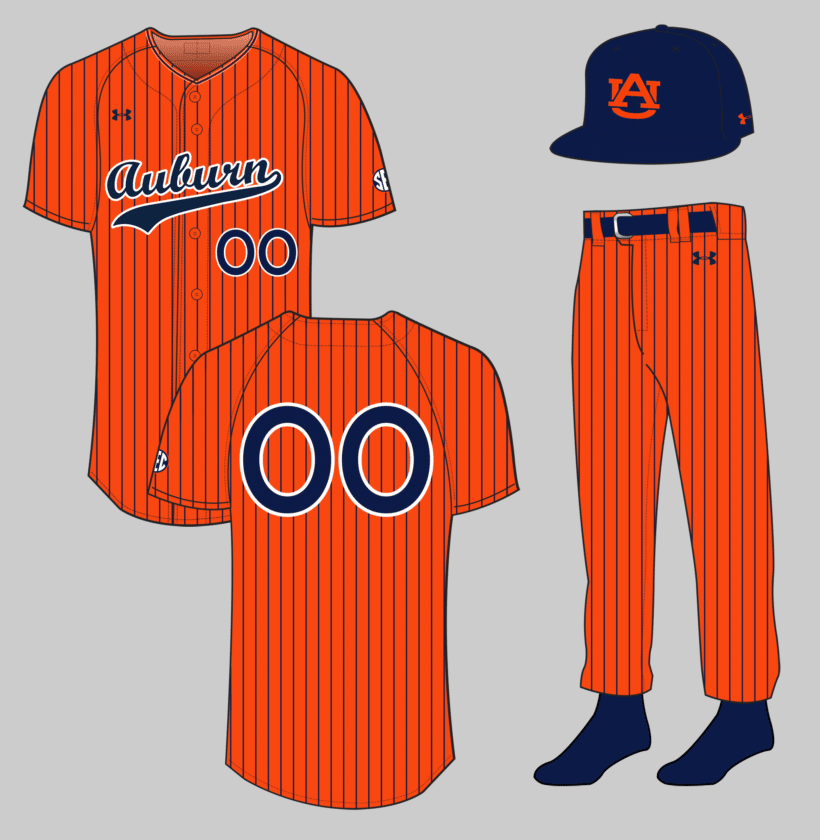
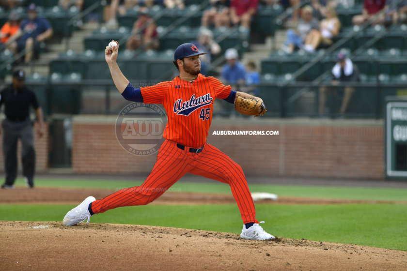
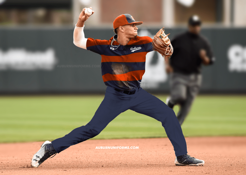
There have been many different pinstripe uniforms over the history of baseball. But I don’t believe I’ve seen an orange uniform with pinstripes. Let’s see how it works!
Uh, yea, that’s a bit much!
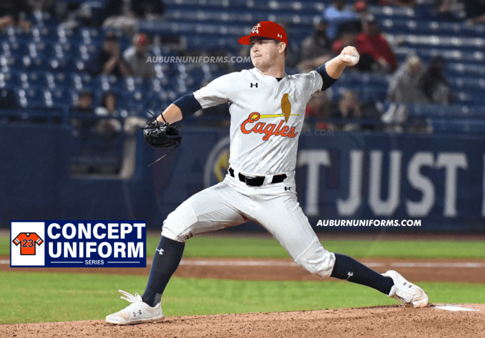
This one could have gone a number of ways. Of course, we start with an orange base, add navy pinstripes, and go from there. The script Auburn has been a staple lately for the Tigers, and it differs from the AU-logo pinstripe sets Auburn has worn over the years. I went back and forth on having a white outline on the script and numbers or not, but trust me, it worked better with the stroke.
For consistency’s sake, the numbers and script are basically the only usages of white on the entire design. The cap also copies this, with the vintage orange-AU logo cap returning for the first time since 2010.
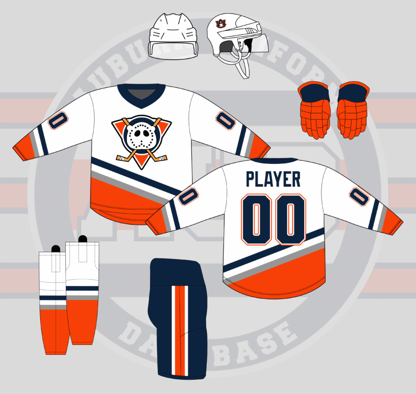
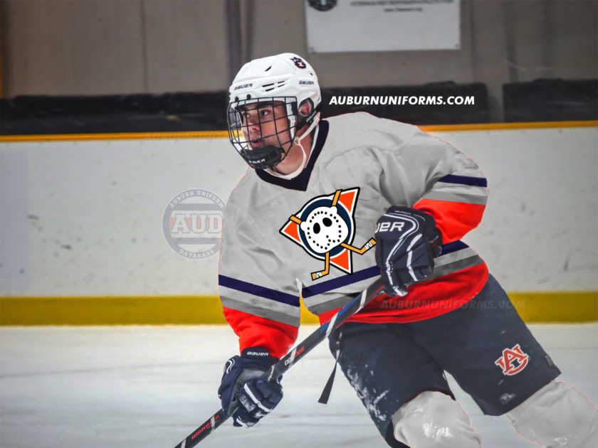
Anaheim Mighty Ducks uniforms with an Aubie shaped goalie mask on the logo. pic.twitter.com/yjUymIRt5s
— Matt (@MRickG_) May 25, 2022
Well, this is a first for this series. It’s about time we add hockey here!
The original Mighty Ducks uniforms had a great look, especially with their colors. To Auburn-ize the design, I simply swapped all purple to navy and all teal to orange. The silver sticks around from the original design.
When I tell you that I’m not a designer, I hope this proves it. The Aubie mask is, well, nightmare fuel, personally! Love the idea, but the execution isn’t amazing haha.
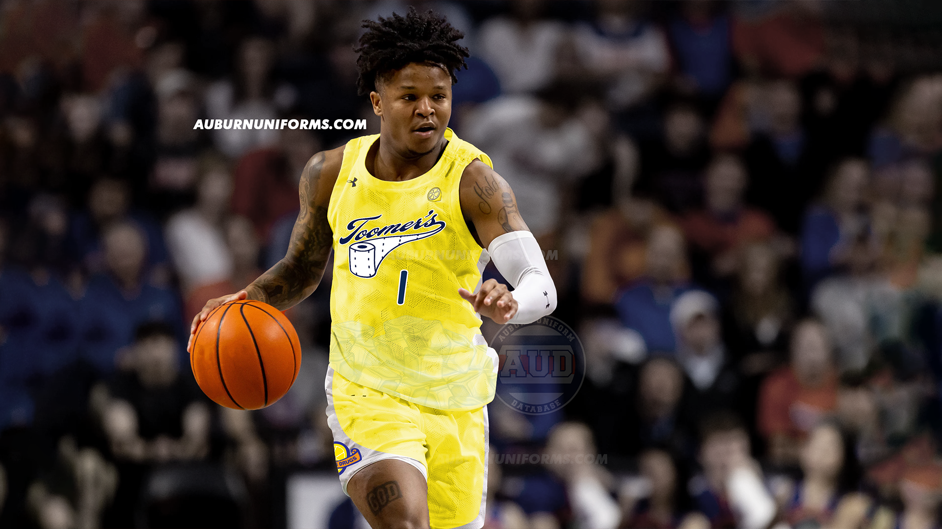
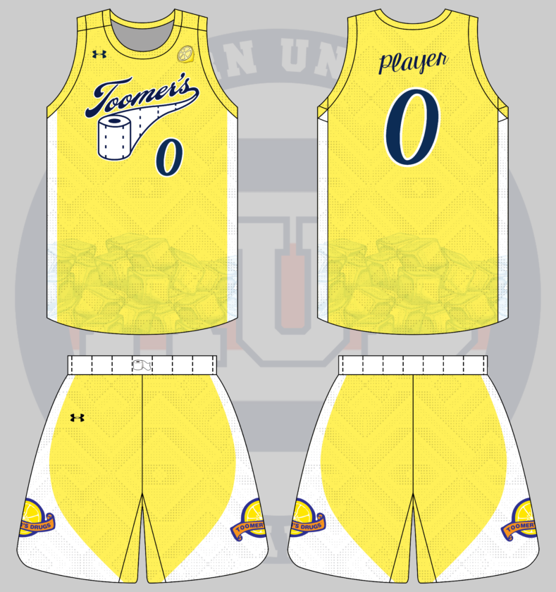
Gimme a Toomer’s Lemonade based basketball uniform
— Avℇry
(@Neji11x) May 30, 2022
Avery has a thing for Auburn food-related concepts  .
.
Avery went above and beyond and used his actual artistic abilities to provide some design direction. He even provided the beautiful Toomer’s script logo for the chestmark!
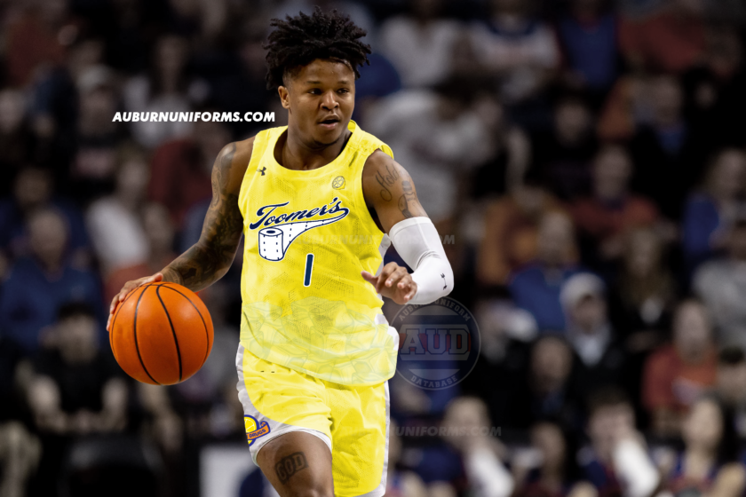
This one feels a lot like an NBA City Connect design. The base design goes all yellow to match the lemonade. At Avery’s request, the SEC patch is replaced with a lemon (I genuinely tried to make an SEC-Lemon patch but it wasn’t working) and ice cubes are added at the bottom of the jerseys. The sillier the better, right?
The waistband on the shorts is white with perforation marks to match the script’s toilet paper tail. The numbers and player names are rendered in a font that matches the script.
The shorts feature the Toomer’s Drugs logo on both sides, housed within a white field that mimics some designs of Auburn Basketball’s past.
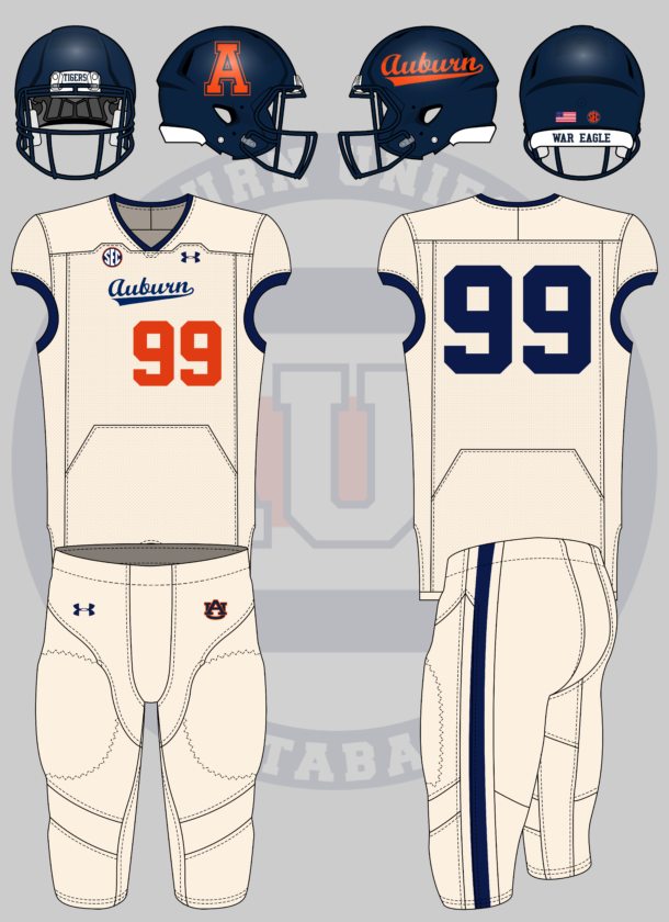
and/or vice versa. A football uniform based off of baseball’s pinstripes or 80s cream/off-white scheme
— Adam Sparks
(@adamsparksphoto) May 24, 2022
Auburn’s fauxback cream uniforms are among the best in college baseball. It’s a shame that we haven’t gotten to see them since 2018.
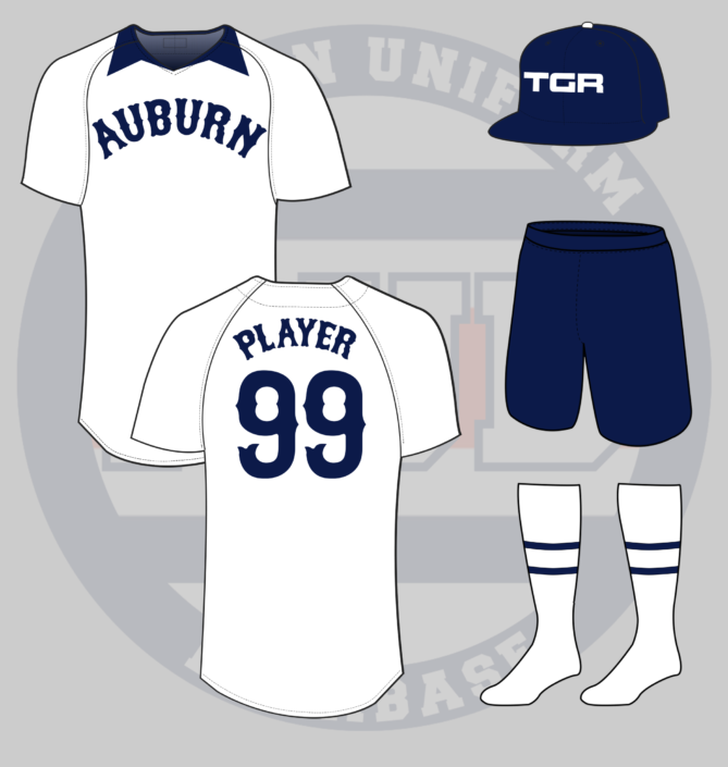
This one’s mostly a simple crossover design. The jersey and pants go cream-colored with navy collars, arm cuffs, and a single stripe on the pants. The script gets placed on the chest but is naturally smaller than the baseball design. The front numerals go orange and get offset.
The best thing here is the helmet. The navy helmet gets to feature both Auburn’s beautiful script currently worn and the throwback block A logo that was previously worn on the hats. Now that’s a helmet I want on my shelves!
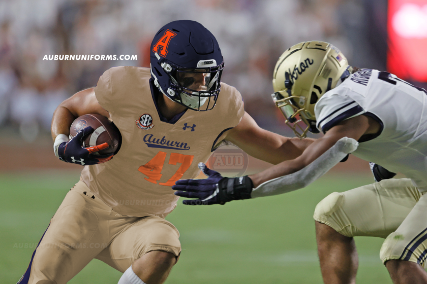
Yes, of course, I had to use a photo of John Samuel Shenker, the latest two-sport athlete at Auburn!
What would a City Connect Auburn baseball uniform look like?
— Plainsman Parking Lot (@AUPPL) May 31, 2022
Now, this is the perfect crazy concept idea! I love this one. If you aren’t aware, MLB and Nike began introducing City Connect uniforms last year, similar to the NBA’s designs. The uniforms were drastically different than the team’s usual threads and often had a direct link to something in the city. Kansas City features fountains, Boston went with the Marathon design, Miami threw back to a Negro League team, and so on.
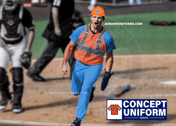
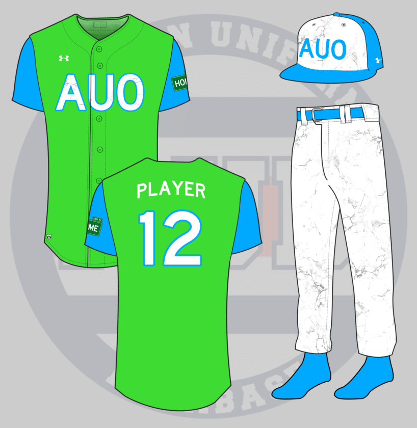
After going back and forth on what local attraction to connect to for Auburn’s design, I finally settled on Chewacla State Park.
Yea, it’s a lot. Let me explain.
Let’s start with the colors. The green is meant to represent the tree canopy and plant life throughout the park. The light blue is for the water, specifically the park’s beautiful waterful. I went with a vest jersey rather than a traditional jersey because one, it’s different than any other City Connect uniform so far, two, it’s traditional for Auburn Baseball, and three, sometimes you need to layer up when on an early morning hike! (Ugh, the Nike speak leaked in again.)
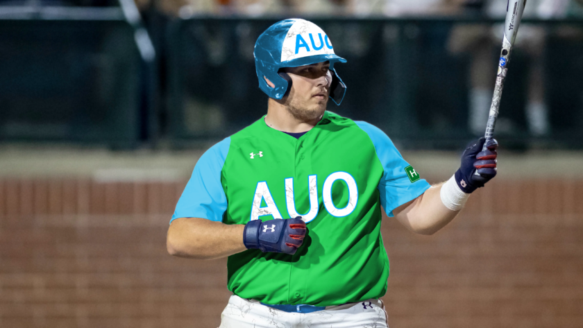
Chewacla has long been mined for a specific type of marble unique to the area. So any white areas on the uniform get treated with a marble texture. The hat and chest get the AUO airport code to further connect to the twin-city area of Auburn and Opelika. And those abbreviation hats have been all the rage in recent years.
The left sleeve receives a special patch that resembles an interstate exit sign. Hoping off Interstate 85 and Exit 51 is the best way to reach Chewacla State Park. But heading north off the exit will take you home to campus.
Last but not least, there’s a hidden raccoon patch on each jersey. For this mockup, it’s placed on the bottom half of the jersey. Why a raccoon? Well, the name Chewacla derives from an indigenous language that translates to Raccoon City. Yes, I did learn that while making this design.
An Auburn football uniform inspired by #TheRefs and #barncheatin with the pirate Aubie logo on the helmet. (special request that the photoshop be of Cam Newton) pic.twitter.com/ksSsLVCD4L
— Carter Michaels (@TheRealCMike) May 24, 2022
Carter never fails to bring a great concept to the table! Let’s see what we can do with this design.
For the crowd that wants black uniforms, here ya go!
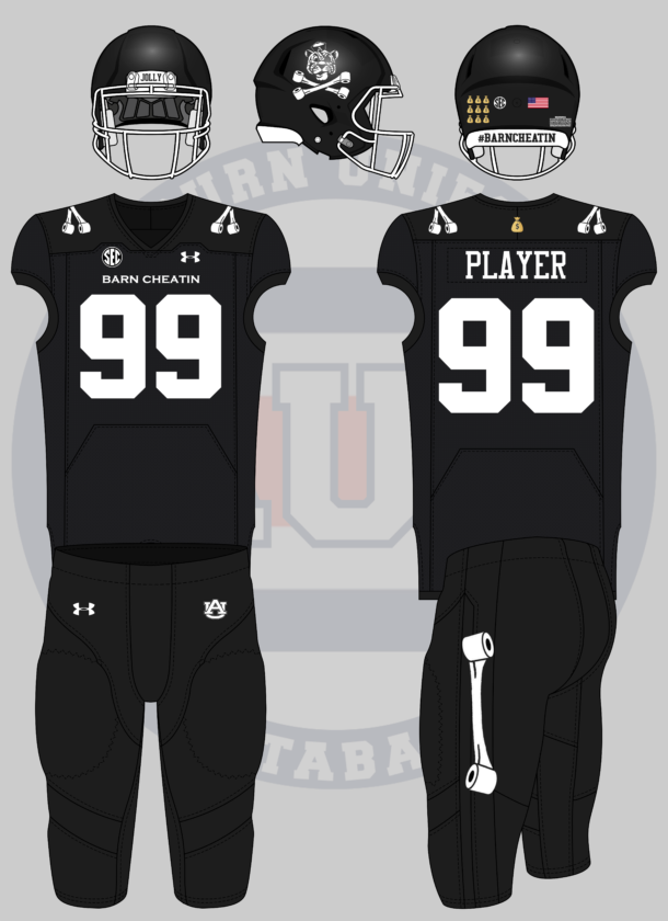
The entire premise of the uniform is based on the Jolly Aubie flag that @AUPPL designed years ago. And I must say, it fits well here on the helmet. The front bumper on the black shell reads “Jolly” referencing the logo and the rear bumper features #BarnCheatin, a popular Auburn Twitter inside joke when anything goes Auburn’s way.
The jersey shoulders feature the crossed toilet paper rolls in lieu of numbers or stripes. “Barn Cheatin” replaces the school name on the chest. A single toilet paper stripe is placed on the pants stripe to tie it all together.
The only splash of color comes from the “money bag” patch on the jersey above the nameplate and the award decals on the helmet. I can just see someone like Cam Newton, surrounded by “improper benefit” controversies, wearing a helmet covered in money bag decals!
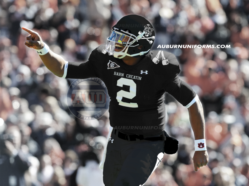
And, to satisfy Carter’s request, here’s an image of the Chosen One wearing the #BarnCheatin uniform!
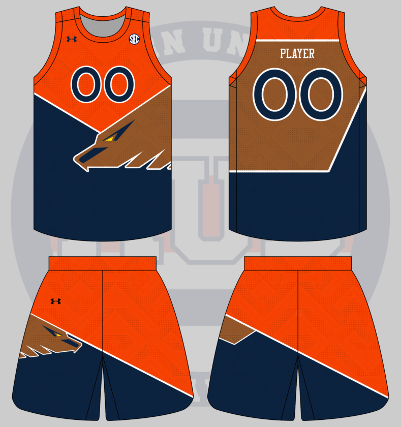
guess who’s back, back again! an auburn version of this AFL Melbourne Demons/Hawthorn Hawks jersey from their proposed 1996 merger. I’m thinking basketball with the eagle and geometric motifs on the jersey and shorts. pic.twitter.com/aIuSdVqGRL
— jillian (@macnchillian) May 26, 2022
As is tradition, we wrap up another year of crazy concept uniforms with my sister-in-law’s designs. Can’t say we’ve ventured into the world of shoulda-coulda-woulda Australian Football League before! 
Wild design input equals wild design output.
I tried to match the AFL jersey as close as possible, but give it more of an Auburn – and eagle – flair. Red, blue, and yellow make for a colorful palette, but we’re going to stick to reality a little more here. The yellow gets swapped out for brown to match a golden eagle’s feathers.
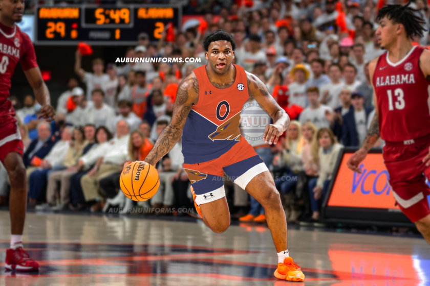
Since the AFL design only featured a jersey and no shorts, I had to make it up in this case. I decided to simply mirror the jersey design and have the eagle head coming from the other side. You can’t have too many eagles!
There was only one choice for the player to model the new uniform – the psychopath himself, KD Johnson:
That will wrap up another year of crazy concept designs! Did your suggestion make the cut? If not, don’t worry. We do this each summer., Keep an eye out for the request each summer and we’ll do it again next year!
Which of these designs was your favorite?
Enjoy learning about Auburn uniforms and history? Want to see more like this? Be sure to follow the Auburn Uniform Database on Facebook, Instagram, and Twitter for even more uniform news. To support this work, you can donate directly via Buy Me A Coffee. You can also purchase your favorite team’s merchandise through Fanatics, with a portion of your sale going to support this website.
The post Crazy Auburn Uniform Concepts – Round 8 appeared first on Auburn Uniform Database.
]]>The post Crazy Auburn Concept Uniforms – Round 7 appeared first on Auburn Uniform Database.
]]>Each year, I put out a request on Twitter for the craziest, silliest, sometimes possibly realistic concept ideas that the fanbase would like to see come to life.
Why? Well, the summer is often riddled with talking heads discussing alternate uniforms. The same horrendous designs have been passed around for years and it’s time to add more fuel to that fire!
This series also works to show that Auburn’s uniforms are pretty good as is. The Tigers don’t need to make any changes or bring unnecessary alternates into the rotation just because.
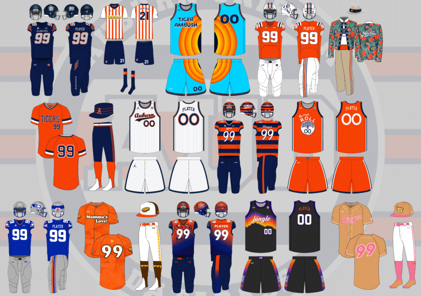
This year saw a record number of concept suggestions – over 50! There’s no way I could have tackled all of them, so below are 14 uniform concepts that are ever more silly than in previous years.
A few things before we get started:
- First off, these designs are intentionally silly, obnoxious, and over-the-top. That’s the point. No one expects to see these hit the field or court. We aren’t saying Auburn should wear these whatsoever.
- I am not a designer nor an artist. This is always a fun project that helps push my very limited creativity. These are not the world’s best Photoshop jobs and they were never expected to be so. Again, they’re goofy on purpose.
Alright, that’s enough of that. Did your suggestion make the cut this year? Let’s dive in and take a look at this year’s crazy Auburn concept uniforms!
(You can click on all of these images to view a larger version. For Chrome users, consider utilizing the HoverZoom+ plugin as well)
Auburn on Boise State designs for Coach Harsin? pic.twitter.com/iCX1nwJzJz
— Dan (@danctweeter) June 9, 2021
The perfect suggestion to start off the 2021 concepts!
In December when Harsin was hired, I joked about making the field orange to celebrate. But what better way to honor Harsin’s alma mater than bringing Boise’s aesthetic with him!
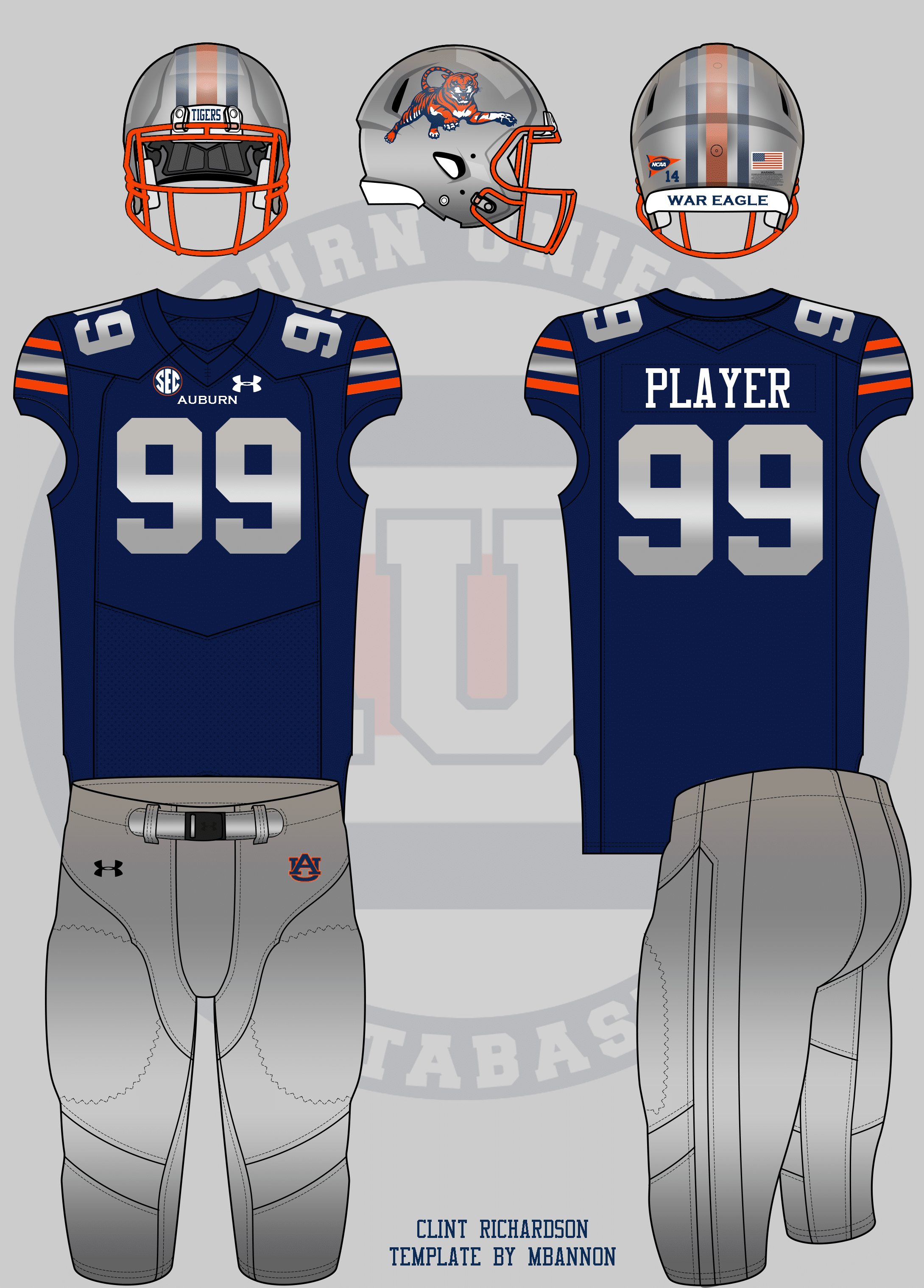
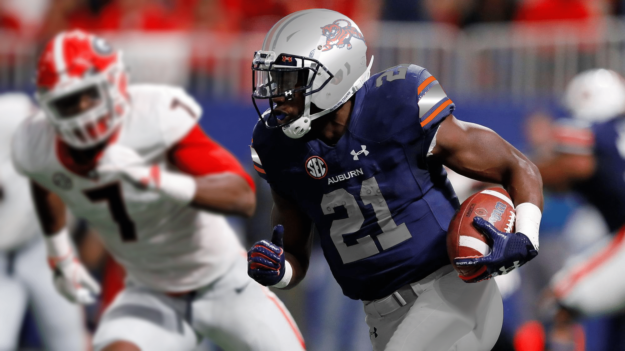
Since 2017, Boise has worn jerseys that showcase a horizontal stripe across the sleeves. Stripes are Auburn’s forte, so it was a simple choice to keep the Northwestern pattern but give it the fast-angled approach. Boise also uses grey as opposed to white, so Auburn’s colorway reflects the same change. The chest mark is larger and italicized, much like the Broncos look. The number is now a light grey and also gets the italicized treatment with a new orange outline.
When Boise State first revealed this set, many wanted to see the diagonal stripes carried over onto the pants. And Nike apparently felt the same, as it’s included in the catalog version of this design. So of course I had to add the stripe to the pants for Auburn’s version. And rather than going with the team nickname on the pants leg, we’re going with the battle cry because, well, it’s better!
The last bit here is the helmet which is now navy with a silver facemask. I tried my hand at recreating the large Bronco logo into a tiger head, but let’s just say my logo-making skills are, uh, trash. So a ghostly Sailor Aubie now populates the right side of the shell with the player number on the left (a terrible trend I for one can’t wait to see end).
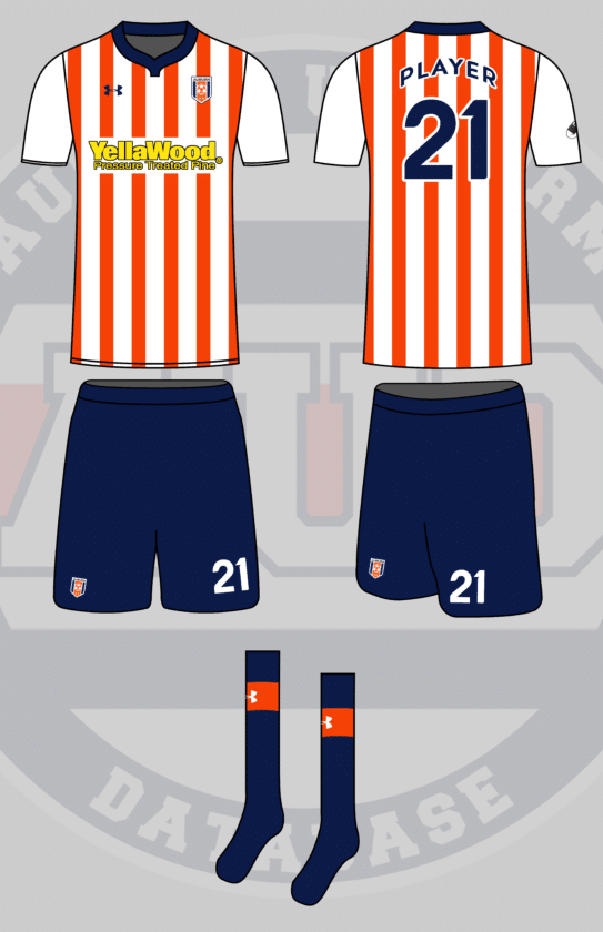
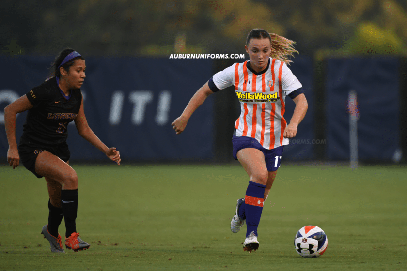
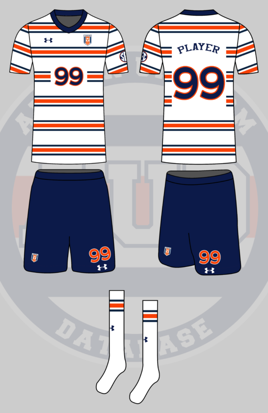
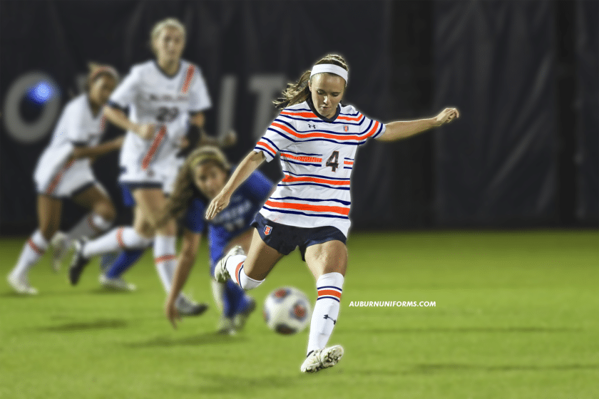
Soccer uniforms modeled after Premier League uniforms – small Auburn logo/crest in the upper left corner and a giant sponsor logo in the center (Under Armour, YellaWood, Verizon, etc).
— M (@MRickG_) June 9, 2021
One thing that this crazy concept series has lacked in recent years is better representation from sports other than football. We’ve done a few soccer uniforms in the past, but it’s always enjoyable to bring new kits to the pitch.
I’ll admit, I know very little of soccer and absolutely nothing of the Premiere League. So after a little research into the designs worn across the pond, I settled on a few common looks, mainly with the vertical stripes. As soccer tends to change designs each season, this look isn’t based on any one team’s design but rather a few different aspects I liked.
The base jersey is white with orange stripes across the torso only for Auburn’s Premier League look. I thought of making the stripes Northwestern Stripes, but that was done last year only horizontally. The solid orange works well here, too. I also kept the sleeves bare to emphasize the torso stripes and avoid being pinstripe-like or looking like a referee.
One of the best features of soccer uniforms I’ve always liked is the large number on the shorts, so of course, that was utilized. The shorts go navy to create some balance with the white tops. The socks also go navy with a larger orange stripe solely to house the Under Armour logo.
Yellawood gets the front chest advertisement location. I debated what colors to use – white, yellow, navy – but settled on yellow and black to really pop and fit better into Yellawood’s (somewhat obnoxious) branding design.
The final details include the Auburn Soccer badge being placed on the left chest and the player name and number being rendered in the Copa America font from a few years ago.
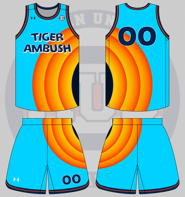
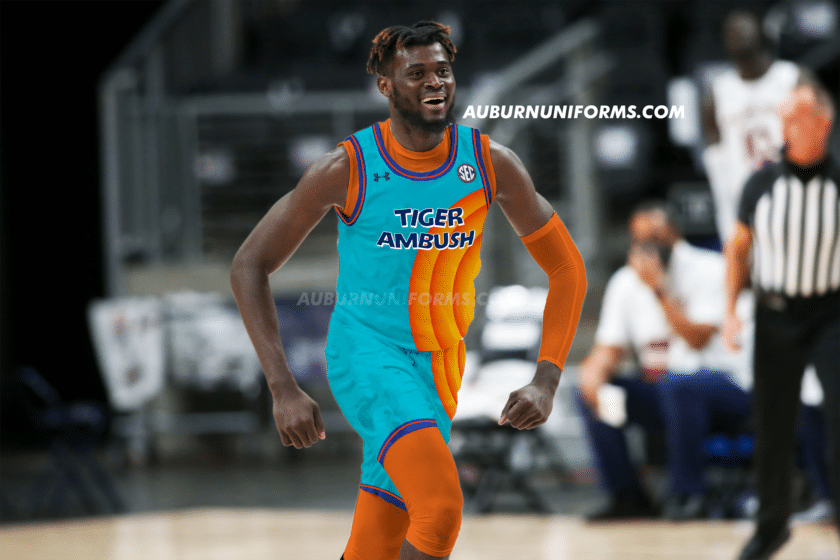
In honor of the new Space Jam, I want an Auburn version of the new Tune Squad uniform, complete with a massive Auburn logo of your choice incorporated on the side. pic.twitter.com/tfLbyhPAkZ
— Carter Michaels (@TheRealCMike) June 9, 2021
Carter is always the master at bringing the best ideas to this series!
I went off suggestion a little bit and stuck with the Looney Tunes gradient circle design on the side. It works well enough. I did think of adding an Aubie logo to the center of the circle to replicate Porky Pig poking out, but it wouldn’t have been very visible with this template.
The Tune Squad name and logo are pretty iconic, so I really wanted to play off of that. I found a compatible font to work with and discovered that the name for a group of tigers is either a “streak” or an “ambush.” Ambush is a much better choice here, so that’s what dons the front of these uniforms.
— Bruce Pearl’s Afro (@AU_barner2) June 9, 2021
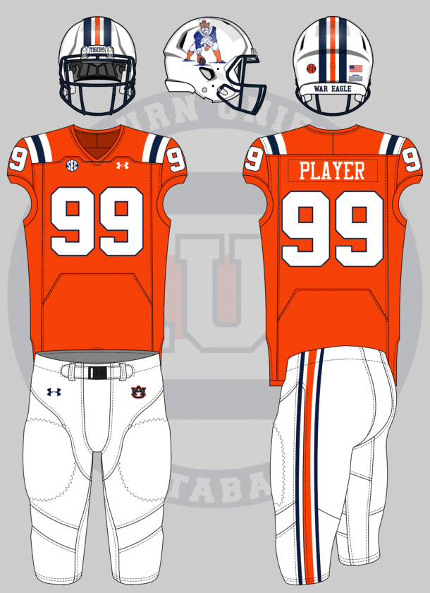
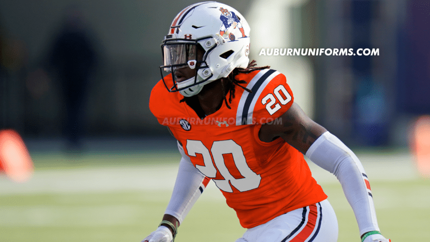
New England’s Pat Patriot throwbacks are among the best in the NFL. It’s a shame the league’s one-helmet rule has mothballed this look – along with Tampa’s creamsicles, among others – for the time being. Now that the rule has finally be repealed, it’s time to bring these beauties back!
This one’s a rather straightforward design. New England’s red now becomes Auburn’s orange while the royal blue is now Tiger navy. The sleeve stripes are replaced with UCLA stripes across the shoulder. The helmet and pants see a slightly modified approach to the traditional stripes.
Pat himself has seen a little makeover, now donning the Sailor Aubie logo on his head! The arms and hands were also made orange with some tiger stripe additions to tie the whole thing together.
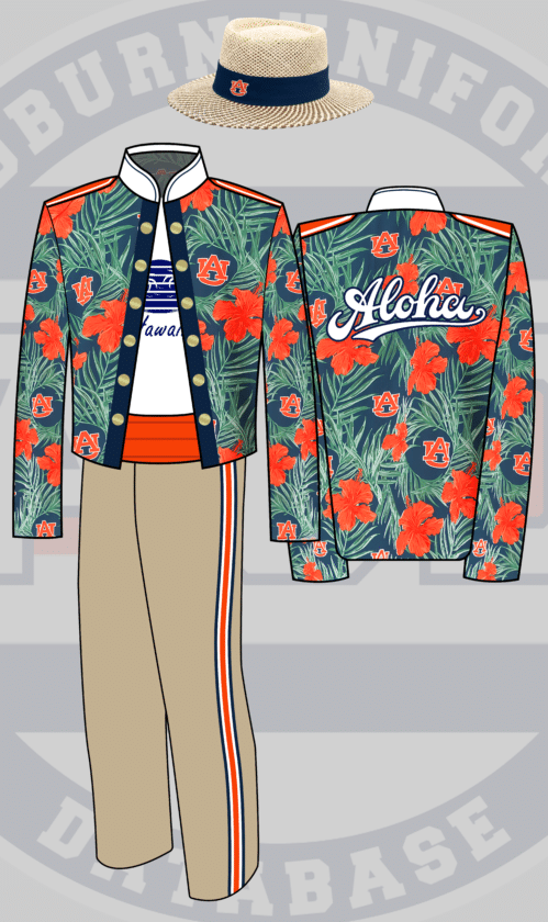
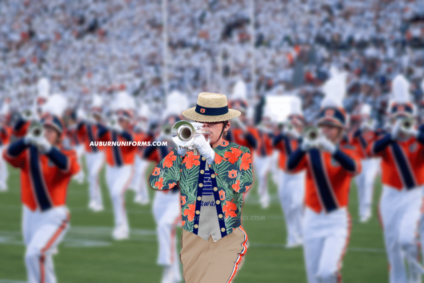
Alright. I’m thinking the band uniform but based on an auburn Hawaiian shirt. Probably blue or white pants. With a beach/straw hat themed shako. Very obnoxiously on vacation vibes
— Laura Church (@lauratysonnoble) June 9, 2021
Yes! The first marching band uniform concept of this series!
This was another suggestion that was a struggle. I wasn’t sure where to start or what template to use, as band uniforms aren’t nearly as consistent across the board as sports uniforms. So, I started with the Auburn University Marching Band uniform design that was worn from 1995 to 2006 for the split jacket look.
The outer portion of the jacket features the floral Auburn pattern as found on a few retail items as a base. The “break,” for lack of a better word, across the center is used to resemble the floral shirt being unbuttoned. Underneath is a white t-shirt with a corny Hawaiian tourism design, just to push the “obnoxiously vacation” vibe that Laura wanted. The back of the jacket is the best, featuring a large, bold Aloha script!
The pants are no longer blue or white but rather khaki-colored. We keep the stripes for good measure here.
Gone are the traditional shako and plumes and in are the straw hats!
The “real-life” images are always the biggest challenge with my Photoshop skills, but this one was magnified without quality, solo band photos!
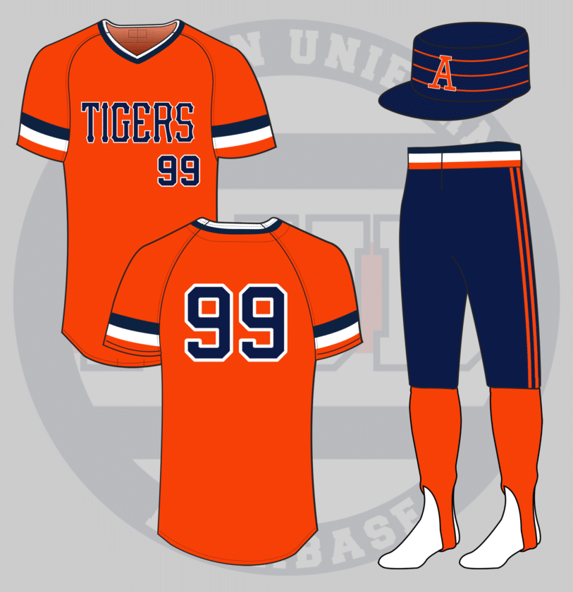
Another one: Auburn Baseball but Pittsburgh Pirates from the late 1970s/early 1980s (the flattop hats)
— Tom (@ths0002) June 9, 2021
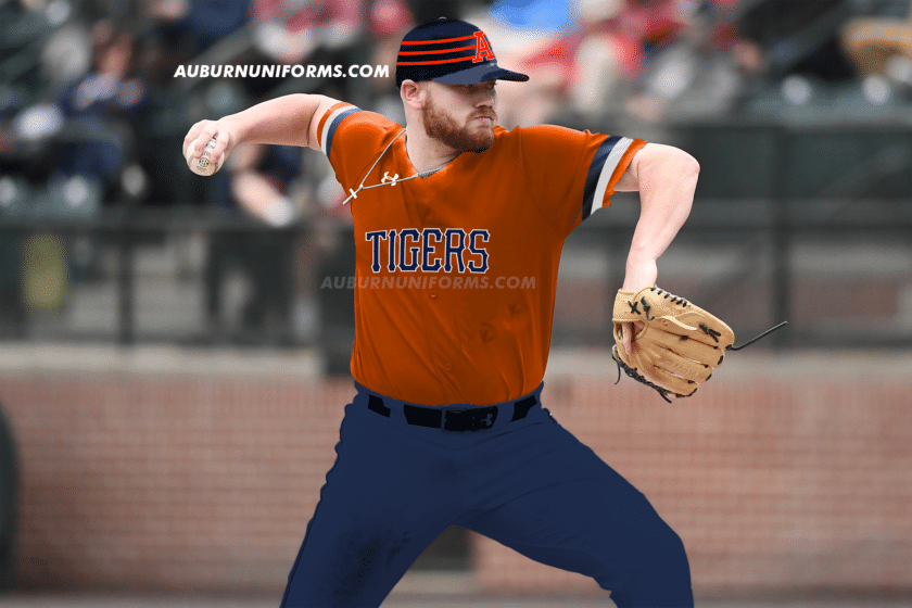
The Pittsburgh Pirates were one of the first teams in professional sports to mix and match their uniforms. From 1978 to 1984, the Pirates were among the best dressed in the league.
Despite the multiple color combinations available, I wanted to base this design on the gold jersey and black pants look. The jerseys are based on Auburn’s early 1980s design with the large sleeve stripes. The chestmark is rendered in the official Pirates font. The pants are now navy with a navy/white/orange striped cummerbund and two orange stripes down the leg. Orange stirrups are worn for the first time, as the Pirates often wore yellow ‘rups.
If the Pirates weren’t known for their over-the-top uniforms, they’re certainly known for the unique pillbox cap design they sported for this time frame. Auburn gets a navy cap with three orange stripes and we’re going to stick with the classic block-A logo on the front.
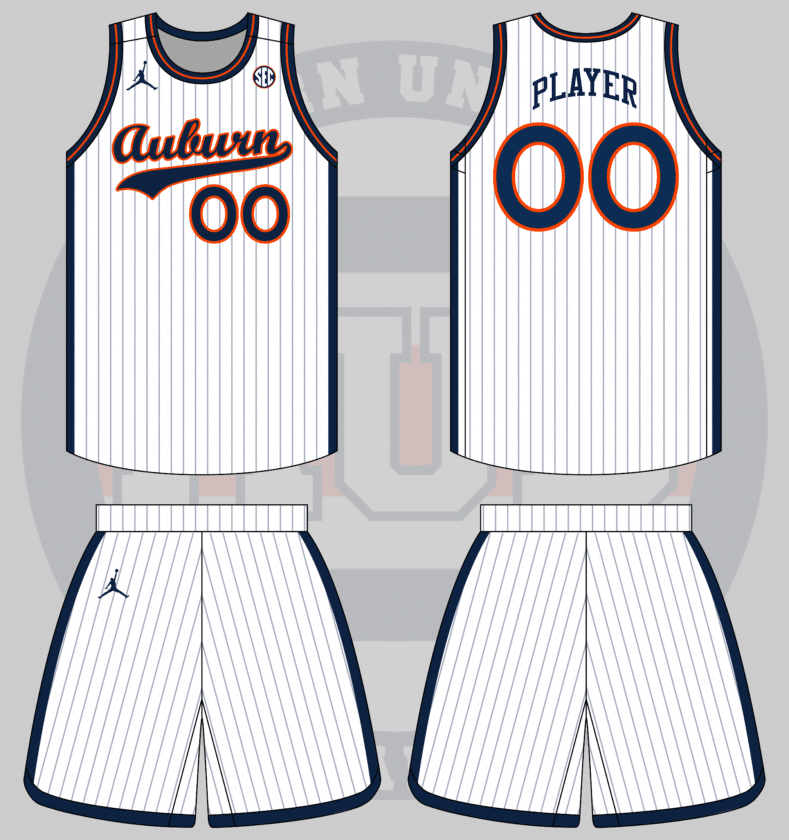
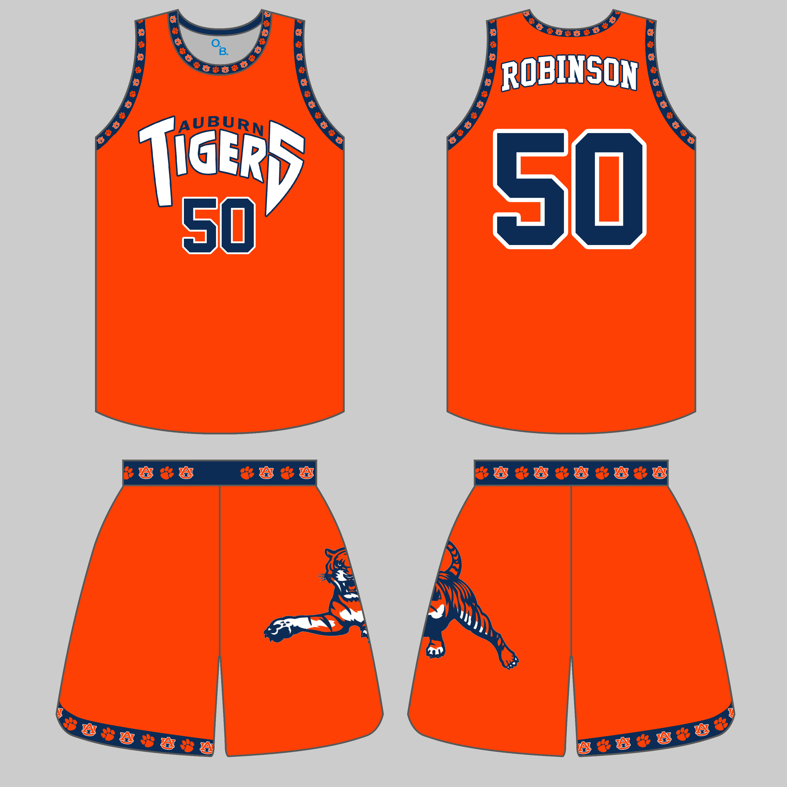
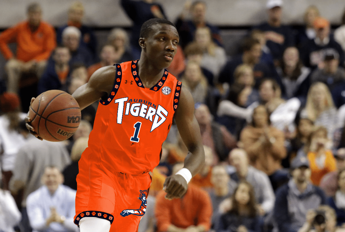
Basketball uniform based on the script Auburn from the baseball uniforms. Made by jumpman
— Drew Crowson (@SonOfCrow2) June 10, 2021
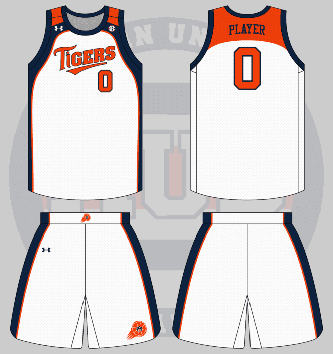
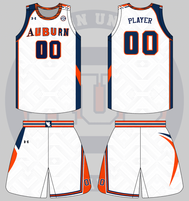
I sat and stared at Photoshop for far too long trying to figure out how to base the uniform off the script alone. I finally moved to base the basketball uniform off a baseball uniform instead, and I really like how it worked out.
Pinstripes aren’t the most common look on the hardwood, though some teams have worn them before. Auburn has never donned such a look – until now. The base uniform is white with light navy pinstripes. The script logo dons the chest with the player number directly under, a la the baseball team. The player’s name also gets a rather baseball treatment, being larger than usual and arching across the back.
To keep from having the uniform simply be all white, the sides of the jersey and shorts have navy stripes. The collar and trim are also navy with a thin orange stripe.
What about rugby style uniforms? Like the ones the cheerleaders wear sometimes but on football uniforms. Also with Sailor Aubie because I love him (you should do these for the Jacksonville Jags too for fun)
— Jordan Williams (@jno_will27) June 9, 2021
The rugby sweaters are always popular! We did a baseball version of this design a few years ago, so a football uniform is the perfect next step.
The first step here was to translate the base design over. The jersey was easy with the horizontal stripes featured on the cheerleaders’ shirts. The collar is white on the football jersey to mimic the popped collars that the male cheerleaders sport. The women’s shirts have a script Auburn on the chest, but it’s slightly different from any official Auburn wordmark. So we skirt that, stick to brand standards, and throw the baseball script on the front of the jersey. To match the script, the number and nameplate are rendered in a similar script font.
The cheerleaders wear plain blue pants or skirts on the field, but that’s a bit boring for a football uniform. I decided to keep the orange stripe down the pants leg to add a little more pop of color. The script Auburn also replaces the AU logo on the hip.
But the real beauty here comes with the helmet. Cheerleaders don’t wear any headwear, so I had to get a little creative with the lids. I debated making the stripes match normal helmet stripes, but thought it would be more fun to simply match the jerseys. Much like the pants, the AU logo on the helmet shell gets replaced with the script Auburn logo.
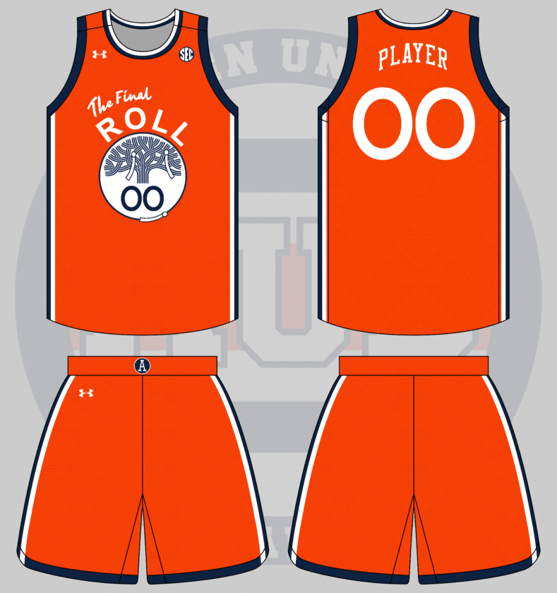
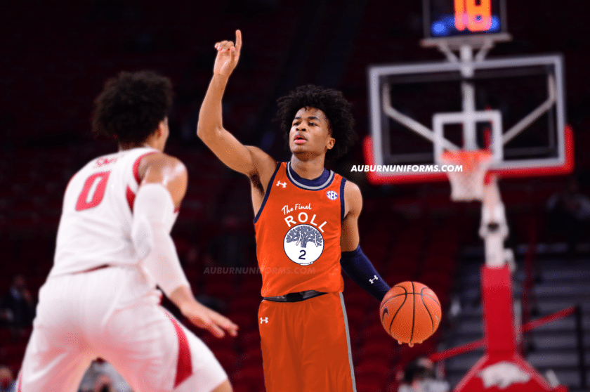
Golden State Warriors mashup with a toilet papered tree from Toomer’s Corner instead of The Town.
— Andrew Lind (@AndrewMLind) June 10, 2021
This is one of those suggestions that’s so good off the bat but became more of a challenge the deeper I went. I’ll explain.
I love the current Golden State Warriors uniform set, particularly the primary yellows. The Town uniforms are such a great way to connect to the city and local fanbase – it just works.
Tweaking the design to Auburn was a bit more difficult than I thought. I figured Auburn’s orange would be a good substitute to Golden State’s yellow, but, as similar as the colors may be, they aren’t identical and don’t work quite as well. The Warriors have also utilized this look on black uniforms. I wanted to avoid that and stick with true Tigers colors instead.
Rather than sticking with “The Town,” I changed it to “The Roll” and then added “Final” to the logo to commemorate the 2013 final rolling of the original oak trees. The lined-tree logo in the center stays rather untouched but gets two rolls of toilet paper hanging off. Adding more rolls felt like the right recipe to make this design as over-complicated as possible, so I kept it to a minimum.
To channel my inner Nike-speak, “the two rolls of toilet paper are limited, but indicated that you, the fan, have plenty of room to add your own flair!” Ok, enough of that. I added one last roll to the bottom of the circle just to differentiate a bit more from the original design.
The shorts are a really basic version of the Warriors’ design, removing the Golden Gate Bridge elements connecting the stripes to the hemline. A throwback Auburn Baseball “A” logo is added to the belt buckle to replace the Warriors’ Circle-W logo.
I’ll admit this isn’t my favorite of the bunch and I’m sure a few different choices could have made for a better look. If you have any suggestions, leave them in the comments!
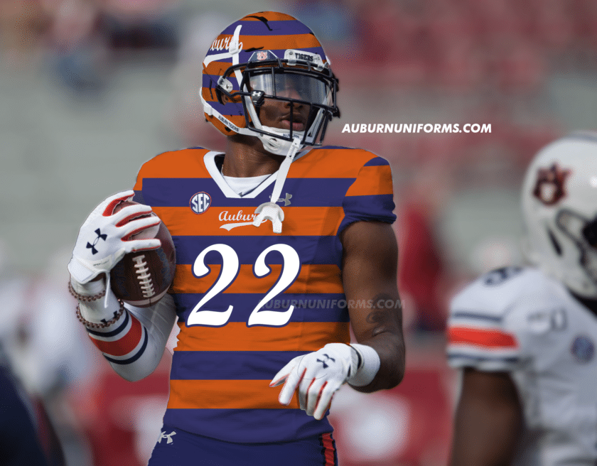
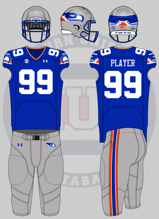
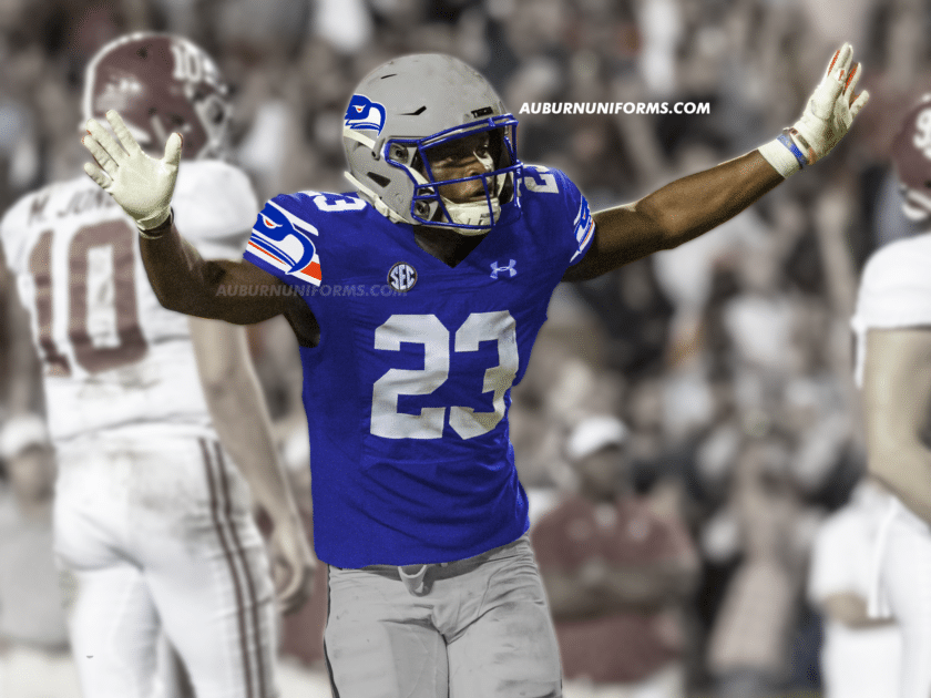
Actually, let’s amend that, Seahawks throwbacks with the wraparound logo on the sleeves
— Colin Turner (@ct95designs) June 10, 2021
Colin has joined in on this series for multiple years now and loves to see what Auburn would look like in NFL looks.
The biggest challenge with this suggestion was tweaking the iconic Seahawks logo. I wanted to keep with the bird look but naturally make it look more like an eagle. I’m in no way a logo designer, so this was a challenge. I took the throwback ‘hawks logo, changed the colors to a lighter blue and orange, tweaked the eye to make it more intimidating, and added some ruffles across the back to give it some more eagle-like character.
The new logo was placed on the helmet, and of course it meets in the back! It also dons the shoulders, placed on top of a new set of stripes to mimic the original design. To top things off, the jersey collar gets a white/orange/white stripe and the pants stripe also mimics the old-school Seattle look.
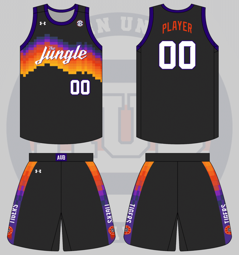
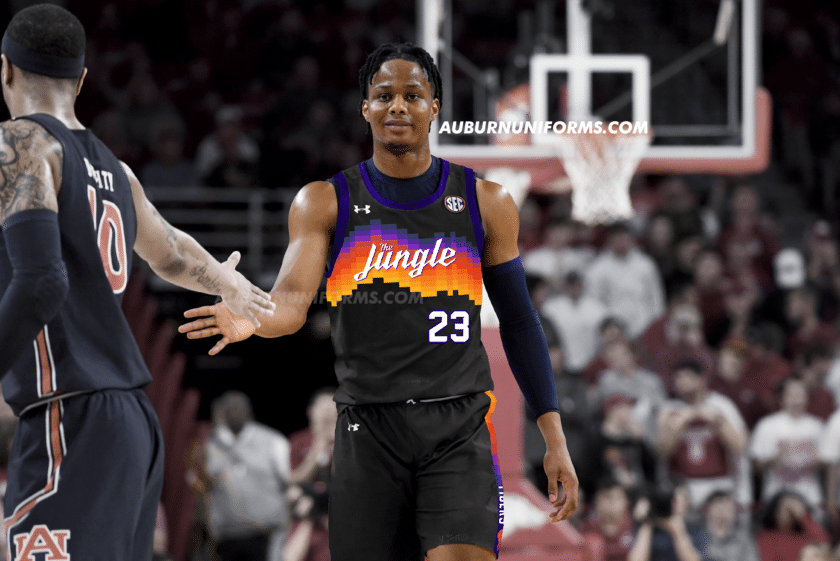
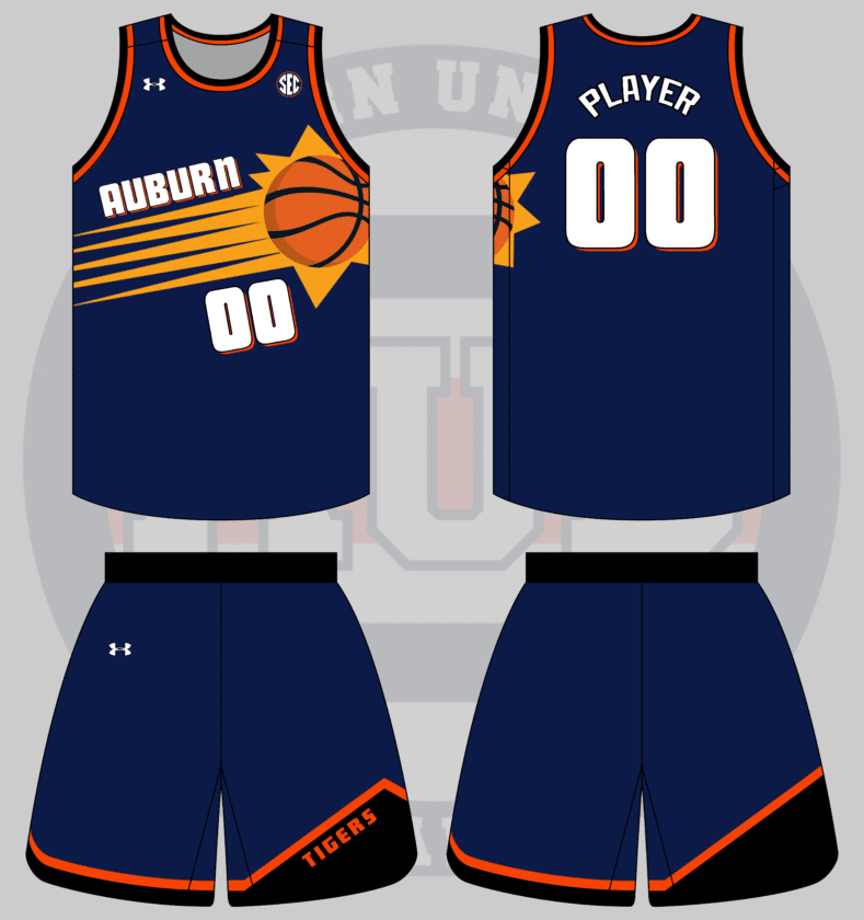
FB/basketball jerseys similar to the suns “valley” jerseys this year except it says “the jungle” and in auburn colors obvi https://t.co/hg2gH3Mq3O
— Paxton Bush (@paxton_bush) June 9, 2021
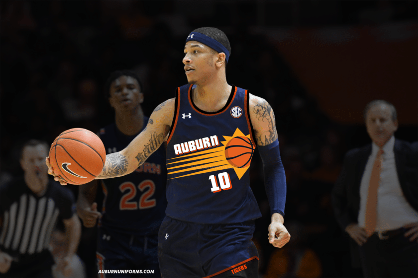
Phoenix’s “The Valley” uniforms have quickly become a fan favorite from the NBA since their debut in December, and it’s understandable why. How will it work Auburn-ized?
Much like last year’s Suns uniform concept, I tried to avoid simply going with black as the base color. The Suns’ purple is also just different enough from Auburn’s navy, so a compromise was made. Rather than black, I went with a lighter shade of charcoal grey – similar to the softball uniforms a few years ago. Navy is also made a bit brighter, closer to purple, just to pop off the dark grey better.
The unique gradient pattern across the chest is such a great aspect of this design. I found a font similar to what Phoenix used for their wordmark to render “The Jungle” across the chest.
The shorts also get the gradient treatment. The Suns’ famous flaming basketball logo is nice, but let’s use Auburn’s own version. During the 1980s and 1990s, Joe Ciampi’s Auburn Tigers women’s teams often sported a flaming AU basketball and it makes its debut on a men’s uniform with this design.
Gotta say, I really love this design. Maybe a t-shirt is in its future. 
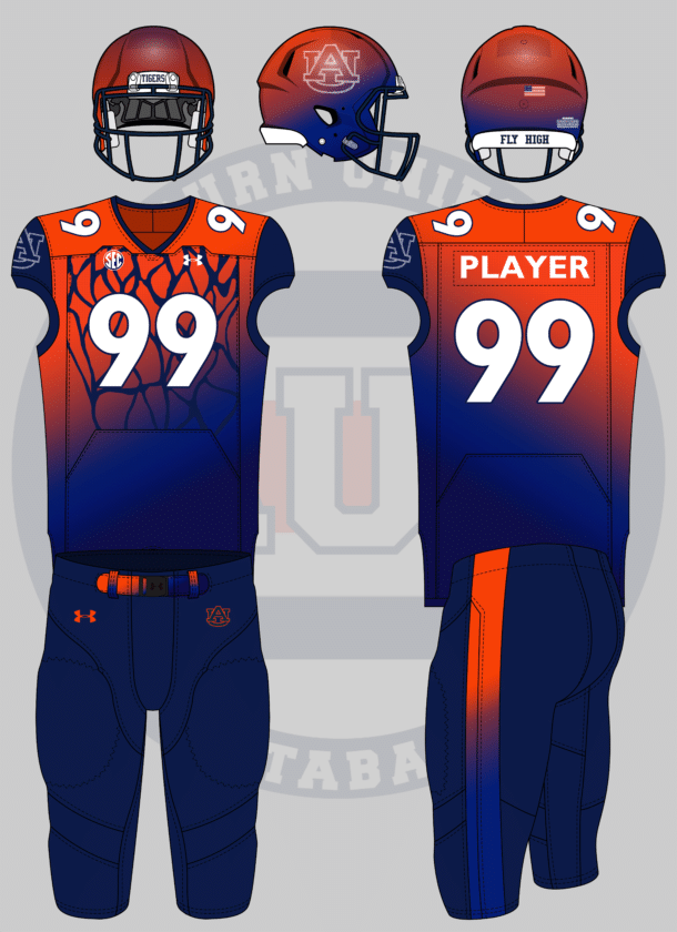
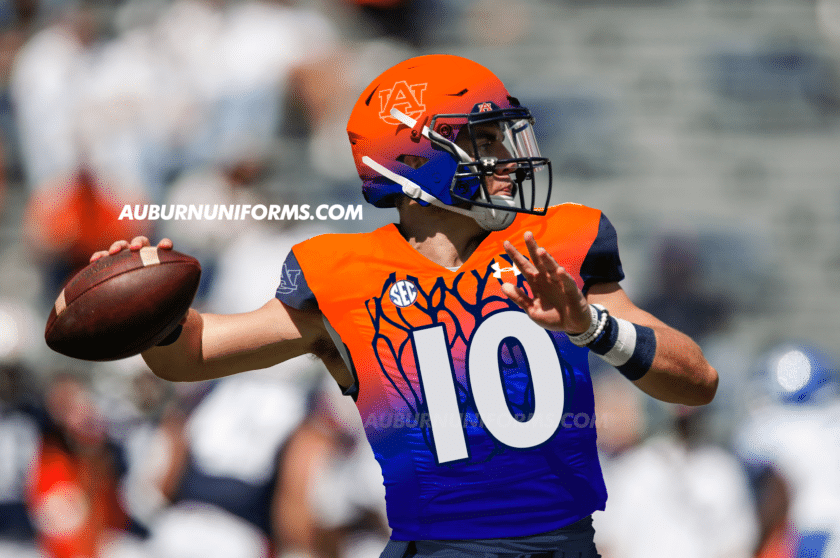
Football uniforms that are fashioned after/inspired by the gymnastic team’s leotards
— Emily Enfinger (@EmilyEnfinger) June 9, 2021
If there’s one Auburn sport whose uniforms give me fits, it’s gymnastics. The leotards are incredibly well-designed and custom-made, so it’s difficult to replicate in an efficient manner.
Emily also indicated that she wanted to see the Tigers’ “snakeskin” leotard utilized for this suggestion. Let’s see how it came out:
Yep, it’s colorful!
The base design starts with an orange/light blue/navy gradient across the jersey. The sleeve cuffs are all navy to mimic the leotard’s navy sleeves. Much like the gymnastics team, this jersey only features the AU logo on the right sleeve, leaving the left side blank. The AU logo is also rendered in rhinestones like was utilized one last year’s baseball/gymnastics crossover uniform. You’ll also notice the SEC patch gets it’s own gradient – a first of its kind for SEC teams! The chest of the jersey sees the “snakeskin” portion of the leotard.
As leotards don’t have player numbers, I had to get a little creative here. After a quick Google search, I decided to base the numerals off of the gymnastics judges’ scoreboards. The rounded numbers with a navy outline sure do give a Denver Broncos feel, but I like it here.
Gymnasts typically don’t wear leggings with their leotards while competing, so the pants here were fully up to the imagination. I thought about mimicking the high-waisted look of a leo but quickly decided against it. Instead, I stuck with all navy, giving the belt a rainbow gradient like the jersey, and adding a large orange stripe down the side.
Finally, the helmet also gets the rainbow gradient treatment complete with the rhinestone AU logo. For an added touch, the rear bumper changes from War Eagle to Fly High. I almost made the facemask gradient as well, but had to show some restraint!
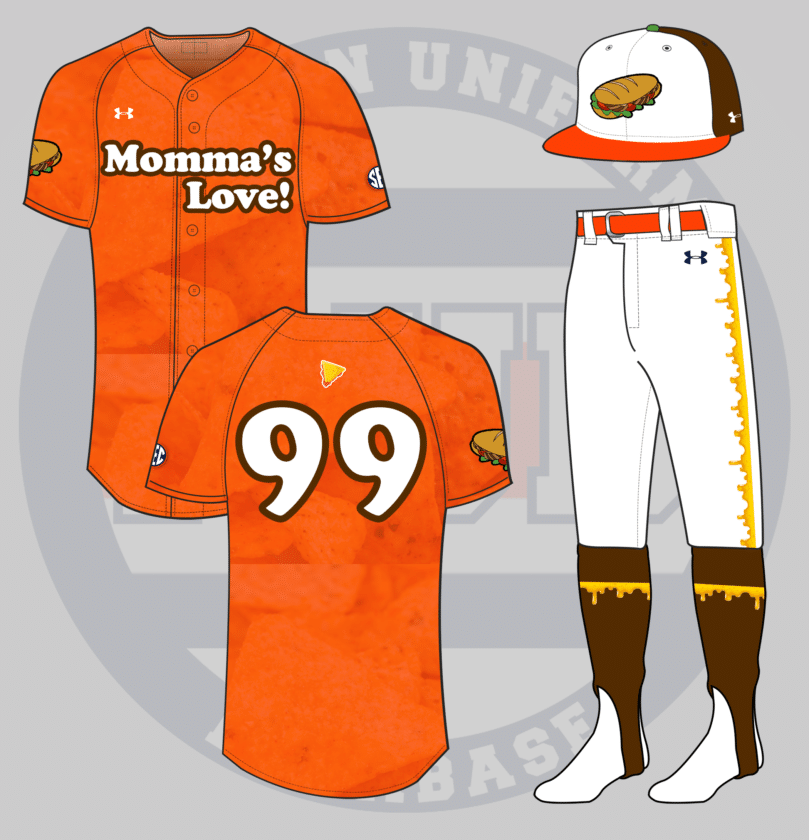
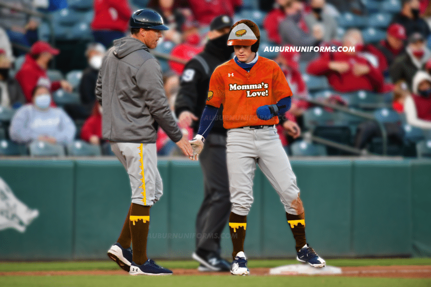
Can we see a Momma Goldberg’s inspired baseball jersey?
— Av3ry
(@Neji11x) June 10, 2021
Gotta have that Momma’s Love! No Auburn restaurant is as beloved and considered overrated as this sub shop.
I immediately thought of Minor League Baseball’s fascination with food-based uniforms and that this would be the perfect tie-in. Let’s start with the hat. Like most MiLB foody hats, this one is a tri-color cap featuring Momma Goldberg’s brown color on the back, an orange bill for the famous Doritos nachos, and a cartoony sub sandwich across the front. The squatchee – the button on top of the hat – gets the lone touch of green to match the lettuce in the sandwich.
The jerseys come in orange and feature a sublimated pattern to resemble the details on a Doritos Nacho Cheese chip – it’s all the finer details! The chest mark features “Momma’s Love!” in the same font as the franchise’s logo. The back number is rendered in the same font. The sandwich from the hat dons the right sleeve and a cheesy nacho chip is placed right above the player number!
My favorite details come below the belt. The pants stripe is super cheesy and is also replicated across the brown stirrups, Of course, Kason Howell is the perfect man to sport these incredible stirrups!
Now I need to stop at Momma’s next time I’m in town!
By tradition, we wrap up the annual Crazy Concept Uniforms piece with my sister-in-law’s always amazing suggestion. Let’s see what she has for us:
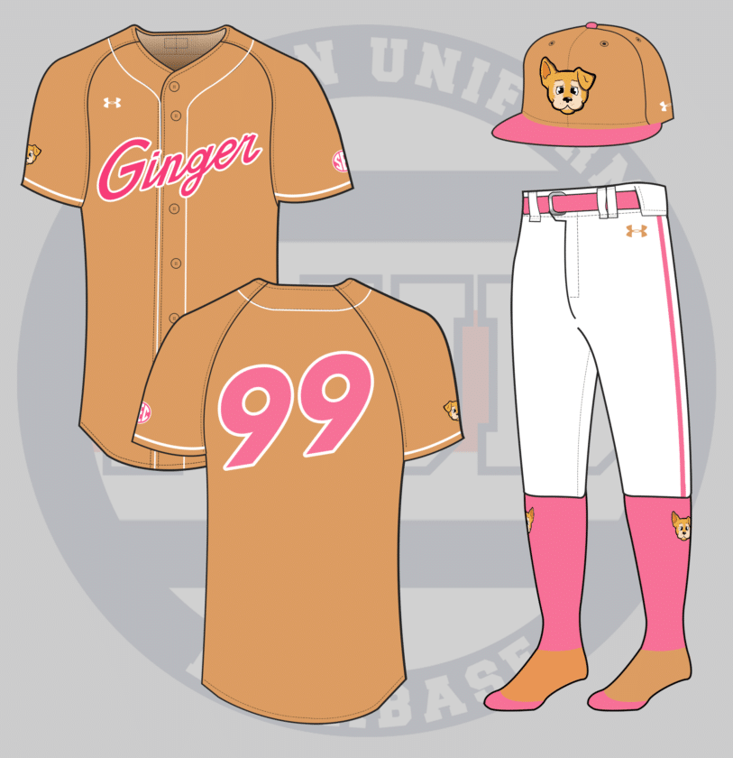
this year I’m keeping it simple: a Ginger themed baseball uniform. Give my aubie-loving queen the space to
SHINE
her face, her iconic pink nail polish, her fur coloring. something that really captures her essence. pic.twitter.com/Law1LoH9fR
— jillian (@wtmjillian) June 11, 2021
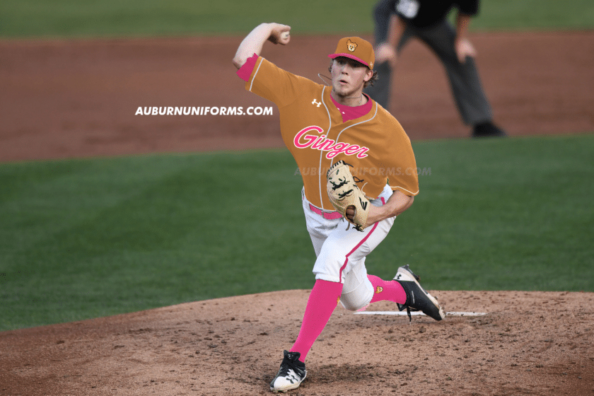
Alright, alright, hold on. Let me explain this one real quick. Ginger is my incredible dog. She’s been with us since 2009 when she was dumped in a neighborhood across the street. She’s the sweetest thing ever. Last year, she was diagnosed with an inoperable grapefruit-sized tumor and we were told she had between two and four weeks left. Well, Ginger laughed in the vet’s face and has been doing fine ever since!
So, the pink. Ginger has always worn a pink collar, but that wasn’t enough for one member of our family. My father – yes, you read that right – gives Ginger a “spa day” each Monday and paints her toenails a bright shade of pink.
No, really.
Alright, on to the uniform. Jillian provided a lot of extra details not included in the tweet above and I tried to incorporate as many as possible. The jersey and ballcap are a light brown-tan color that matches Ginger’s coat. The cap’s bill and squatchee, along with the jersey script, number, and SEC patch are each rendered in pink to match her manicured nails. The pants get a large pink stripe down the side with the belt and socks, naturally, are also pink.
The best part of this concept, for me, is the custom Ginger logo. My good friend and super talented artist Avery Dove created this logo in the same vein as many Minor League Baseball team logos. It fully captures Ginger’s staple “one ear up, one ear down” pose she gives on a daily basis.
So there they are! Another set of the silliest concept uniforms are complete. Which one was your favorite? Which one could I have designed differently?
If your suggestion didn’t make the cut this year, don’t worry! There were over 40 suggestions that had to be left on the cutting room floor. I so wish I had the time and space to create all of them. We do this each summer, so be sure to bring your ideas back next year!
My thanks go out to all of those who made suggestions this year as always! You guys always surprise me with how creative and silly you can get.
Enjoy learning about Auburn uniforms and history? Want to see more like this? Be sure to follow the Auburn Uniform Database on Facebook, Instagram, and Twitter for even more uniform news. To support this work, you can donate directly via Buy Me A Coffee. You can also purchase your favorite team’s merchandise through Fanatics, with a portion of your sale going to support this website.
The post Crazy Auburn Concept Uniforms – Round 7 appeared first on Auburn Uniform Database.
]]>The post Crazy Auburn Concept Uniforms – Round 6 appeared first on Auburn Uniform Database.
]]>Here at the Auburn Uniform Database, we do it a little differently. Rather than simply sharing “sick” designs that have zero context whatsoever like some other outlets, we include the fans to produce some never-before-seen ideas that are (mostly) completely off the wall!
This marks the sixth edition of one of my favorite new traditions. I put out a few requests on the AUD social media accounts to collect the ideas that came in. Like always, some are actually decent designs and others should never be connected to Auburn Athletics whatsoever.
This series is simply meant to showcase designs and to prove just how spectacular the current Auburn uniforms are. In no way are we suggesting that these uniforms should ever be produced and worn or that they are even good looks. And I’m certainly not the best at Photoshop.
With all that out of the way, let’s dive into another 12 uniquely awesome Auburn concept uniforms!
Oh boy. New LA Rams uniforms meets Auburn Tigers?
— Colin Turner (@colin_turner95) May 22, 2020
Colin has been a mainstay in this series, often suggesting some Auburn-NFL crossover look. He stays on brand here with the controversial new Los Angeles Rams uniforms.
This design is mostly just a direct copy of the Rams look. Horns are placed on the helmets and sleeves, gradient numbers and stripes, and the silly nametag patch on the chest.
I often try to match a design to better fit Auburn’s aesthetics, but it’s difficult to find a good comparable design to the classic ram horns.
While the horns make no sense for the Auburn Tigers, can’t say I hate them being rendered in orange and blue!
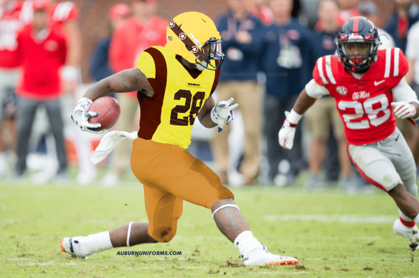
These. But Auburnized. I’m talking adidas shockweb pattern, metallic numbers and all.
pic.twitter.com/pTW0t7rcBQ
— Chad Fields (Vols Uniform Boy) (@CfieldsVFL) May 22, 2020
While Tennessee has a wonderfully classic uniform design, poor Chad has been tortured by bad uniform decisions. I know these horrendous uniforms have haunted his nightmares for years now.
The Tennessee jerseys had a lot of details going on. The adidas patterns showing through were one thing, but there were also the shoulder checkerboard stripe and the number details.
With Auburn having its own set of stripes, I placed the Northwestern Stripes across the shoulder yoke rather than the checkerboards. The stripes also are sublimated over the numbers. I threw on a nice white mask to tie everything together and best match the UT designs. Unlike Chad’s reference photos, these Auburn jerseys feature a white outline around the numbers to better pop against the dark grey.
-basketball uniforms that like the Barkley Era Suns uniforms
-you may have done this before, but a football uniform that combines different throwback elements like Penn State did
-football uniforms based on eagles being the mascot: Philly helmet wings, Oregon jersey wings, etc
— WookieATC78 (@WookieATC78) June 19, 2020
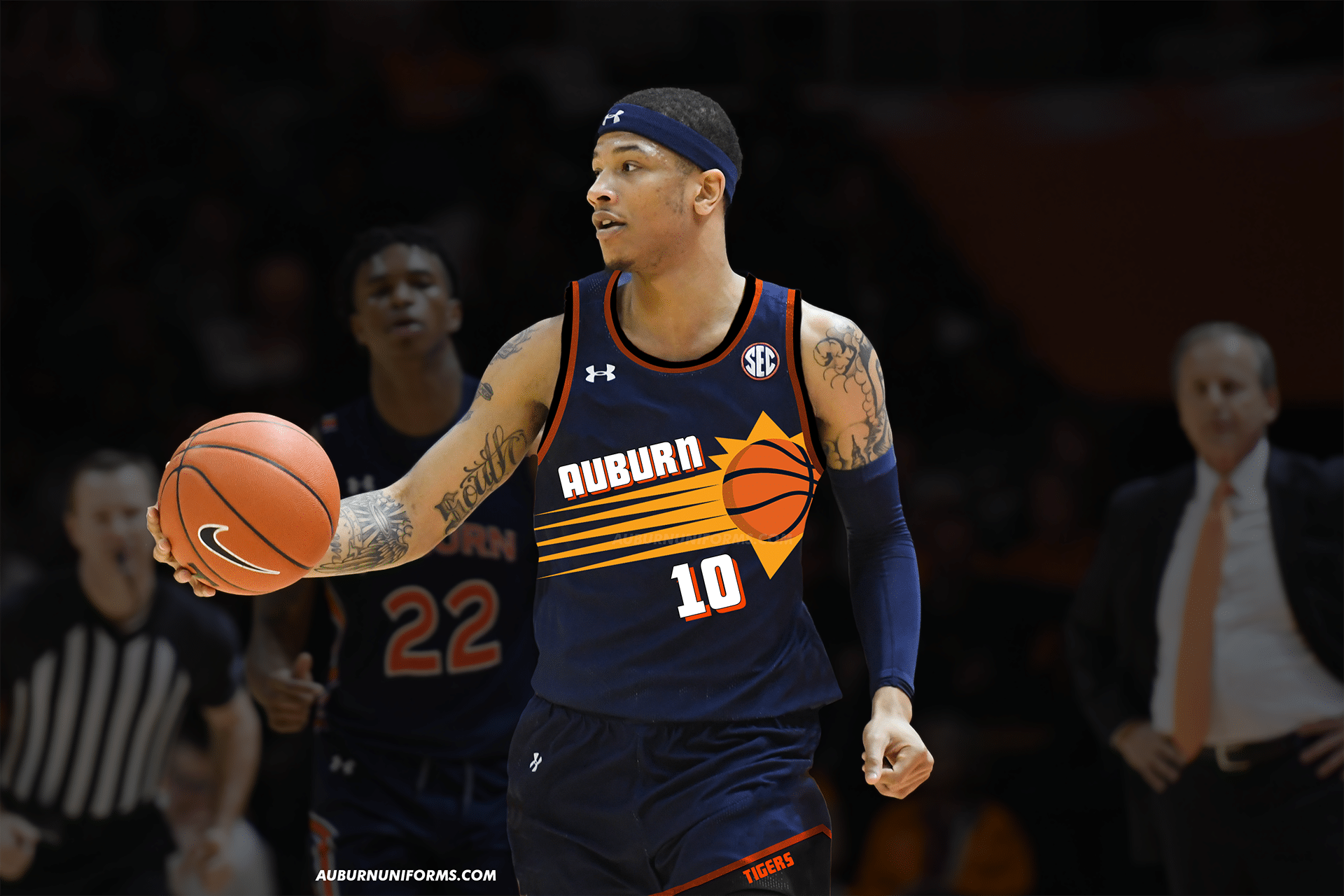
When you give me multiple options, you give me the freedom to pick what I think works best for this series! I thought the Barkley-era uniforms would be a lot of fun to recreate, so that’s what we have here. Enjoy!
Like I said with the Rams uniform, I like to make these designs more Auburn-esque than simply copy/pasting. But it’s difficult with such iconic design elements like the horn helmets and the shooting sun-basketball.
I wanted to avoid adding any black to the uniform and stick to Auburn’s navy, orange, and white, but it just didn’t work. The purple and black Suns uniforms are much more iconic than the whites.
As college programs continue to mimic throwback professional uniforms, this set certainly isn’t out of the realm of possibility and I would not be upset if it were to happen.
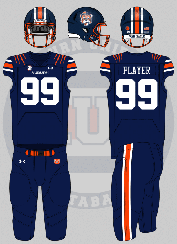
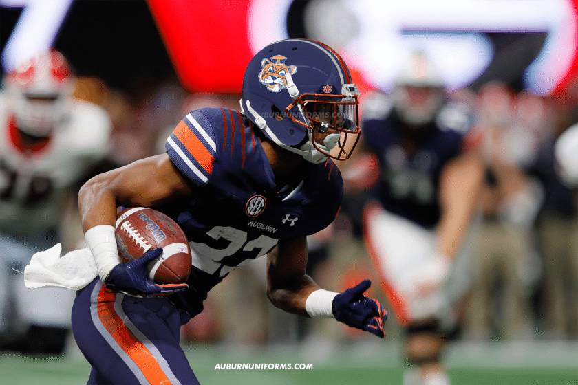
So here is my idea for a football uni since I saw I could send one on Insta, A Navy blue helmet with the old tiger with a hat logo on both sides of it with the same stripes and an orange facemask,Same blue jersey but with orange claw marks on the shoulder, and navy pants+stripes
— josh.iguess (@JoshIGuess11) May 23, 2020
When selecting what suggestions to use, I try very hard to make sure we don’t duplicate any look from previous entries. All-navy has been rather popular (and will continue to be), but I liked the idea of the orange mask on the navy helmet. That was my biggest sell here.
Yea, I adore that helmet. I want one myself now!
Despite Twitter’s character limits, it can be beneficial for me when the suggestions are incredibly direct and detailed. Josh spent much of his time here working on the helmet details, so the rest of the uniform was left to me.
I wanted to stay more true to Josh’s suggestion, so I simply added some navy pants and removed the TV numbers on the shoulders for the tiger claw mark stripes. I’m not too keen on this personally, as it’s rather generic and has been utilized by some adidas teams in recent years.
The real winner here is that helmet  .
.
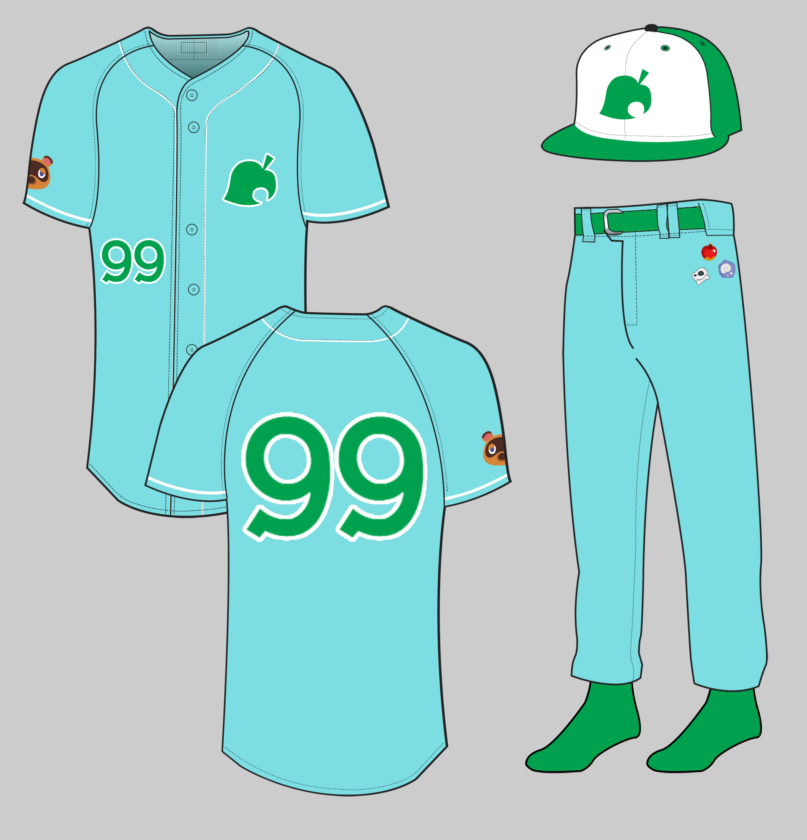
Can I get an animal crossing themed Uni? Doesn’t matter which sport, I’m thinking Isabelle/Tom Nook island attire… pic.twitter.com/nQ62WYRqFu
— Laura Church (@lauratysonnoble) May 22, 2020
Animal Crossing has been the summer hit and I can’t get enough of this game.
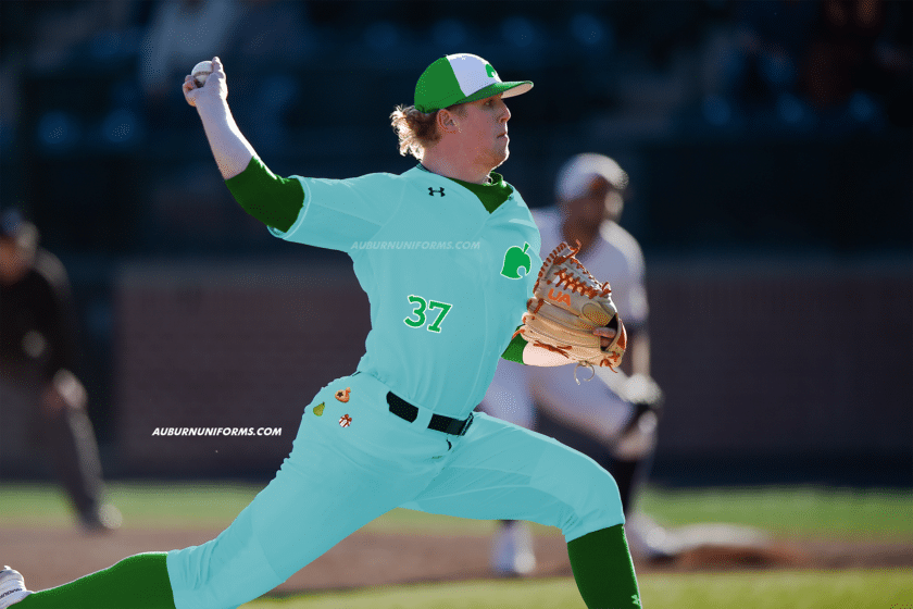
Animal Crossing is such a unique and in-depth game that it was difficult to find an approach for this uniform. I went with the mentality of a Minor League baseball team and their often over-the-top promotional uniforms. Much like Super Hero Night supersede the team’s branding, so does Animal Crossing take precedent over Auburn’s!
The main colors come directly from the special Animal Crossing Nintendo Switch edition. I took the leaf logo and made that the main element for the hat and jerseys. The number font comes directly from the Animal Crossing logo font.
The fun detail of this uniform comes on the pants. In the game, the characters hold many items in the pocket inventory. The pants will feature several different icons from the game placed on the hip, where pockets would go if baseball pants had traditional pockets. Each player would have a different combination of icons, making each pair unique.
Alright, football unis based on:
2014-15 men’s basketball blues
2001 softball whites
Baseball pinstripes and/or off-white
2019 baseball blue digital camo capAlso, updated version on the 1930s greens. pic.twitter.com/YgIjDHxFIg
— Adam Sparks (@adamsparksphoto) June 19, 2020
Adam also handed out a lot of ideas. I had to throw out Adam’s preferred idea because camo is the one thing that I won’t allow in this series! I wanted to do something different and thought the 2015 Men’s Basketball alternate uniforms would make for a very unique look.
The MBB uniforms had a few key elements that were transferred over to this football design – “bracket” stripes, sublimated tiger stripes, and a lighter shade of orange.
Let’s start with the stripes. The brackets were mimicked directly on the pants but set to a V-shape on the shoulders similar to Cincinnati’s uniforms. The helmet stripe also features the brackets, which creates a unique look that bends outwards in the back.
The lighter orange is used throughout. The numbers have an orange outline to match the basketball uniforms along with an orange collar and sleeve cuffs. The basketball uniforms had the tiger stripes on the bottom half of the jersey and all over the shorts, but I went all out and put them on everything head to toe.
The bracket stripes make this such a unique look, especially the helmet. I wouldn’t mind seeing this helmet concept on my shelves.
Auburn soccer in the style of the 2012 USA “Waldo” Jersey but replacing the red stripes with Northwestern stripes, and changing the number font, etc. to Auburn branding
— Brennan Scott (@brennanscott7) May 27, 2020
As you can imagine, football uniforms dominate this concept series. I wanted to include more non-football designs this round, and Brennan hit it out of the park with this suggestion. I’m admittedly no soccer fan, but the Waldo kit was enough to catch my attention.
The Northwestern Stripes are such a staple at Auburn, so much that multiple sports have worn them over the years. Auburn Soccer’s striped sash uniforms were perfection.
Where the USA kit works with the bold stripes, I think the multiple, thinner stripes might be a detriment here. I matched the number of stripes on the USA kit for this design, but maybe removing a set or two would do better.
While it isn’t used on the kits, Auburn does have a soccer crest. I wanted to use it here, but it sure does get lost in the stripes.
This design has some potential but could be tweaked some to make it worthy of being worn on the pitch.
That will conclude the “sane” concepts. Now we get into some of the more wild looks.
Uniforms based off teams from failed football leagues in Alabama. Birmingham Barracudas and Thunderbolts. pic.twitter.com/Mwg1thopqB
— Matthew (@MRickG_) May 27, 2020
This is exactly the concept idea I look for! Something unique that has zero chance of ever making the field is what makes this series fun to make.
I went with the Birmingham Barracudas as they had a more intriguing look. The ‘Cudas had several logo variations built specifically for their usage on the uniform.
I went with the 1990s Tigers wordmark for a bold look on the chest. The jumping tiger gets placed on the shoulder and the tiger head is placed on the black helmet.
The Barracudas had many colors to work with that we didn’t with Auburn. I added a lighter shade of blue to the pants stripe but didn’t use it elsewhere. The shoulder yoke is orange to just make this as bold of a look as can be.
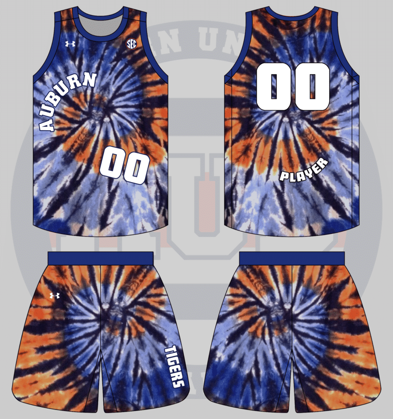
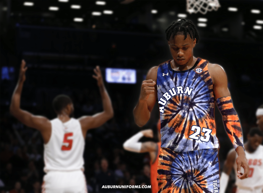
Gimme an orange and blue tie die basketball jersey plz
— Drew Crowson (@SonOfCrow2) June 20, 2020
You got it, Drew!
Creating a tie-dye pattern in Photoshop is more complicated than I imagined, so I found a nice orange and blue pattern on Google that also worked to mimic a tiger tail.
I thought about mimicking the New Jersey Nets’ tie-dye uniforms of the 90s, but it wasn’t bold enough for my liking. A tie-dye base uniform isn’t enough on its own, so I made the team name wrap around the swirl on the front and the player name on the back follows suit.
The number is placed awkwardly on the front and the team nickname is on the shorts just to drive home the craziness that tie-dye naturally embodies.
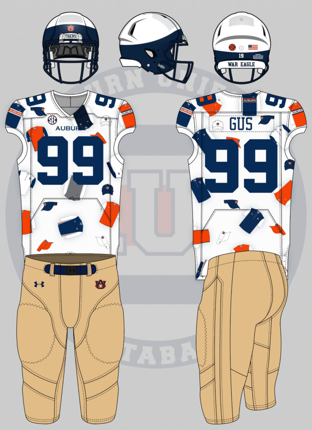
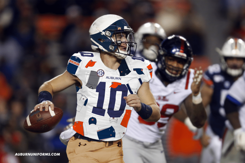
A uniform that is just a collage of the different vests and visors that Gus has worn over the years.
— BH (@6pintsofkramer) June 19, 2020
Good thing I already have a collection of Gus Malzahn’s gameday wear…
I went back and forth for a long time trying to figure out how best to fulfill this request. I thought about making the jersey look like a vest and then scratched it. Finally, I went with the idea to make the vests and caps as polka dots on the jersey.
The jersey has multiple vest mockups with the hat and visors being placed in between. The Ditka-inspired vests are placed on the shoulders to act as the traditional Northwestern Stripes. My favorite detail is with the numbers, as at least one digit on each player’s jersey will “wear” a Gus visor.
The rest of the uniform is meant to mimic Malzahn’s gameday apparel. The pants are khaki-colored and the helmets are meant to look like Gus’ usual visor choice.
I want to see a basketball jersey that uses an individual element from as many different older (and current) Auburn jerseys as possible. Each individual letter and number can use a different font, it can be asymmetric as needed to add more.
— Carter Michaels (@TheRealCMike) May 22, 2020
I can always count on Carter for suggesting the perfect basketball idea.
I did just as Carter requested and included many different design elements from the last 60 years of Auburn basketball uniforms.
Just like the football team, Auburn basketball was rather traditional and unchanged for several years. Even when something changed, it was something simple like the side panels or shorts design. I wanted to throw in as many unique details as possible, and the more crazy uniforms are from the turn of the century.
Here’s a breakdown of each element utilized. You can view the original uniforms here:
- Right shoulder – short striping from the 2019-20 uniforms
- Left shoulder – large striping from the 2012-15 uniforms
- Collar – the beloved tiger stripes from the 1998-2000 uniform
- Right side panel & shoulder yoke – from the 2006-09 uniforms
- Left side panel – from the 2002-03 white uniform
- Shorts Waistband – from the 2019-20 uniforms
- Right shorts leg – from the 2009-12 uniforms
- Left shorts leg – from the 1969-72 uniforms
- Numbers – first digit from 1999-03 uniforms, second digit from 2002-03 white uniform
- Wordmark – each letter is from a different wordmark
- A – used from 1996-2004
- U – used on 2000-01 orange jersey (made letter orange rather than white)
- B – current font used since 2004-05
- U – used from 1969-79
- R – used on 2000-01 white jersey
- N – used on 2002-03 white jersey
All in all, 13 eras were included in this uniform design. As crazy as it is, I kinda like it!
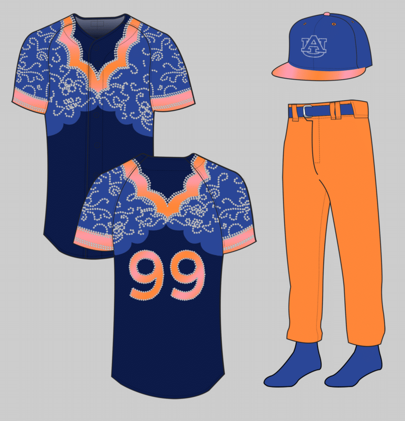
okay so my idea is baseball (with stirrups, not pants) based on the ice skating gymnastics uni. baseball caps have a tiara or ribbon on them around the front to match. the socks are SPARKLY and have the same ombré of the uni
— jillian (@wtmjillian) June 20, 2020
Jillian earned a permanent spot in this series after giving us a beautiful gold sparkle uniform with a cape! She brought another great concept last year, and she didn’t disappoint this round.
I’ll admit it – this one kicked my butt. I’ve wanted to expand the Auburn Uniform Database to cover gymnastics leotards, but one of the many hurdles is accurately replicating each design. This uniform took a lot of learning and experimenting, but I was finally able to replicate a number of the rhinestones.
This was another direct replication from the source material. The jerseys are nearly 1-to-1 and feature a navy base, a lighter blue upper-portion, and a light orange used around the sleeves and collar. The orange also has a subtle orange-to-pink gradient, much like the team’s leos.
As leotards don’t have numbers, pants, or hats, we had to get a little creative. The numbers are rendered in the same pinkish gradient with rhinestone outlines. The pants are orange with some lighter blue details on the belt and socks. The hats also feature the lighter blue for the crown color with the visor being pink and orange once more. The AU logo on the cap is simply outlined in rhinestone to mimic the logo on the back of the leotard.
Another twelve concept uniforms are complete. They’re crazy, they’re garish, but that’s the point! Once again, these designs are completely for fun and meant to be crazy and bad. We are not here to push for these designs to actually be worn.
Big thanks to everyone who submitted ideas again this year! We had over 40 suggestions that had to be cut down to a workable number. Those cuts weren’t easy, as a lot of interesting ideas were left on the cutting room floor. Just because your idea wasn’t selected does not mean it was a bad one.
Hold on to your ideas and let’s do this again next summer!
Did you enjoy this group of Auburn concept uniforms? Want to see more like this and other Auburn uniform news and details? Be sure to follow the Auburn Uniform Database, like the AUD Facebook page, Instagram page, and follow me on Twitter for even more uniform news. You can also purchase your favorite team’s merchandise through Fanatics, with a portion of your sale going to support this website.
The post Crazy Auburn Concept Uniforms – Round 6 appeared first on Auburn Uniform Database.
]]>The post Crazy Auburn Concept Uniforms – Round 5 appeared first on Auburn Uniform Database.
]]>Each summer, I put out the request for Auburn fans to submit their ideas for concept Auburn confirms – the crazier the better. Most of these have been for football only, but we’re slowly branching out to include basketball and baseball. Previous editions have had uniforms based on a car, other football teams, a beloved childhood video game franchise, and even gold sparkles with capes.
This round of suggestions didn’t fall short. In fact, I think this might be the best group of designs thus far!
And because some people are bound to get upset – these are meant to be fun, goofy, and, for the most part, bad. These are in no way supposed to be ideas for anyone to expect Auburn to actually wear.
Without further ado, let’s dive in to the newest concept uniforms.
In honor of playing in Jerry’s world opening weekend, I would want to see an Auburn/Dallas Cowboys mashup, kinda like what Arkansas did.
— Cody Adair (@cadair78) July 3, 2019
In just a few weeks, Auburn will kick off the 2019 season against Oregon in Dallas, playing in Jerry’s World. In 2017, Arkansas and Texas A&M faced off in AT&T Stadium, and the Razorbacks wore Cowboys-inspired uniforms in honor of alumni Jerry Jones.
When Arkansas copied Dallas, they simply swapped blue for red. That’s an easy choice when both teams only have a single primary color. With Auburn have blue and orange, it’s a bit more difficult. I wanted to keep a splash of the orange to differentiate from the original Cowboys uniforms, so the shoulders get an orange stripe. Playing around with more orange, and even an orange jersey, just didn’t work.
Let’s stick with the NFL look-a-like designs.
Football unis, Jacksonville jags level minimalism
pic.twitter.com/Moikduxej5
— Colin Turner (@colin_turner95) July 3, 2019
My Jacksonville Jaguars have struggled on the field for too long now. But at least the uniforms are a bit better. I still miss the original design.
Unlike the Cowboys, the Jaguars have a lot of colors to chose from. I struggled trying to pair the black, gold, and teal with Auburn’s blue, orange and white. I decided to use the navy to replace the black and used the orange for the details.
One more design mimicking other teams.
Matte Navy Helmet with standard AU and striping, but no stripes on pants or jersey. I’m thinking something like the color rush uniforms of the Lions.
— San Andreas (@SanAndreasAU) July 3, 2019
After some discussion with San, he decided to go more Penn State like rather than Lions, as Detroit has stripes all over the uniform.
While Penn State wears white helmets, the navy pairs well here. I actually like this design, one we’ve seen plenty times before. I think the matte look really helps if Auburn were to actually wear a blue helmet shell.
There are always a few people I can rely on for really good concept ideas, and Carter Michaels is no doubt in that group.
Give me a football uniform based on this basketball uniform. pic.twitter.com/Zb84kPPw3S
— Carter Michaels (@TheRealCMike) July 3, 2019
The turn of the century was a really dark time for Auburn basketball uniforms. The uniform Carter showcased was a one-year special worn in 1999. The collar and armholes feature what I’ve called an “Aztec pattern” that feels very out of place.
As the basketball uniform sticks with traditional striping on the side panels and shorts, I wanted to reflect those on the shoulders and pants. This one is pretty much a one-for-one recreation, and it’s equally as… not flattering.
As basketball uniforms are a much smaller canvas for design, it’s sometimes difficult to make up for it with a helmet on a football uniform. I wanted to stick with the orange theme and made for an orange helmet with matching stripes. The shell actually features the same Aztec pattern as the jerseys but lightly sublimated. It creates a nice texture on the lids.
And of course the real-life mockup would use a photo against Clemson, making for a lot of orange in one photo.
I really enjoy seeing new ideas for non-football teams.
What about one inspired by the full-sash soccer kits pic.twitter.com/rR5H29kRZl
—
(@JamesJones_55) July 3, 2019
The soccer uniforms looked amazing with the full stripe sash. Unfortunately the new kits aren’t as great in that sense. But how would basketball look utilizing such a great feature? The program has worn uniforms featuring the Northwestern stripe before, but it wasn’t entirely well done.
Yea, I think I’m in love with this.
Old school A with the eagle for the helmet decal. Grey facemask. White jersey, 2019 template with no AUBURN wordmark on the chest. 2004 collar design with the AU. Navy and white socks, full length.
— gAUlf (@originalgAUlf) July 4, 2019
Nostalgia hits hard in 2019. Let’s go with an old-school logo, a football jersey design feature from the early 2000s, and the classic grey masks.
It’s rather simple, but that’s ok. Auburn’s uniforms have gone rather unchanged for decades because it works.
The grey mask is a nice touch and throws back to the Sullivan era. The simple “button” on the chest could be a cleaner design than the chestmark currently worn. And who doesn’t like the old school logos??
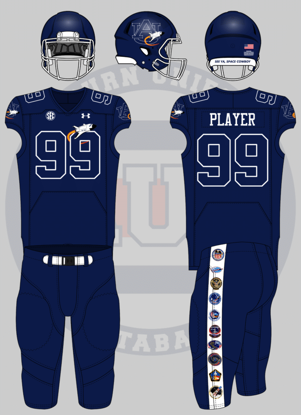
Two words: SPACE THEMED
To honor Auburn’s astronauts
— Tom (@ths0002) July 4, 2019
Auburn has a great space and NASA history, having six alumni being selected as astronauts. In fact, Columbia’s final test flight in 1982 featured two Auburn graduate alums. NASA employed over 800 Auburn people at the time.
UCF has made space uniforms their thing recently, and I wanted to avoid copying any of their designs.
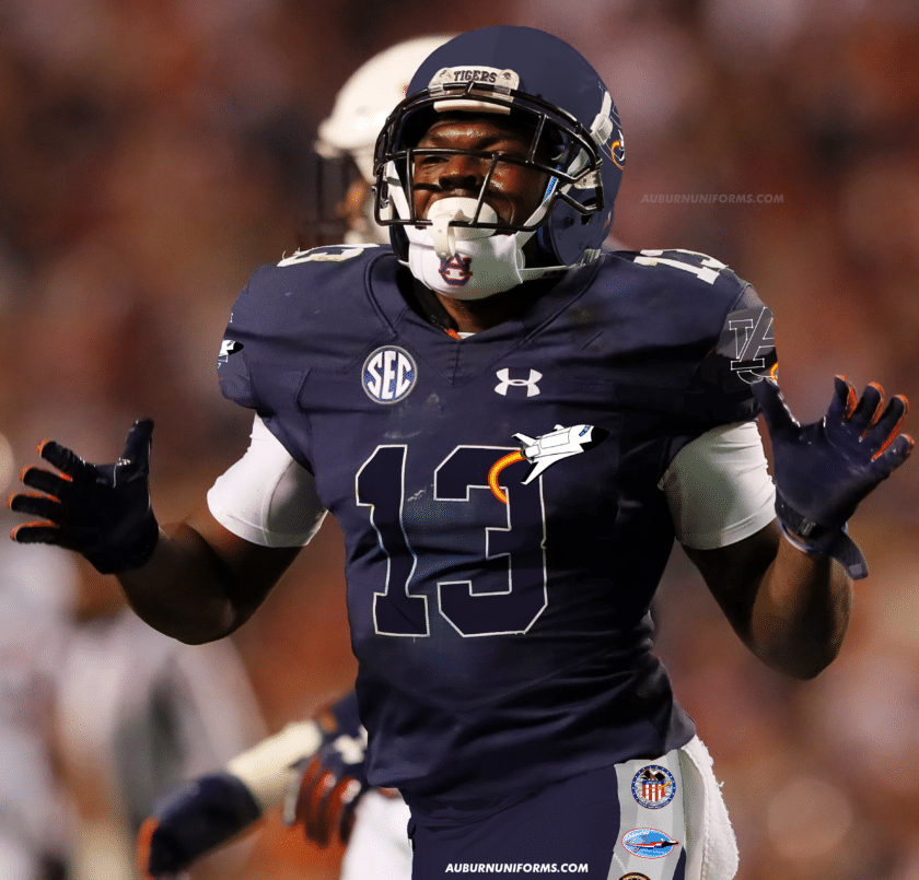
To celebrate Auburn’s history with NASA and space travel, this uniform is meant to honor the past successes. Five of the six Auburn alumni astronauts have been launched into space, and their mission logos don the pant stripes. The AU logo now resembles a constellation and features a space shuttle flying across. The shuttle is also placed on the front chest, circling the player numbers.
Lets go
Matte White Helmet with Tiger Eyes chrome decal
Orange Chrome Facemask
Orange Jersey with White Numbers, blue outline
White pants with 1 single orange strip parallel & touching 1 single navy stripe. (Think Scar pants)
Orange socks and cleats— Auburn Rants (@AuburnRants) July 3, 2019
Some crazy designs aren’t actually all that crazy.
The Tiger Eyes logo is rather divisive among Auburn fans, but that might be the least offensive to many. I would love to see the return of the orange facemasks for real – that’s the one real uniform tweak I advocate for. When Auburn wore orange jerseys during the Doug Barfield era, one of the design issues was the white numbers. A blue outline could easily fix that issue. The pant stripes are a bit different, but can work well here.
I must say, this is my favorite real-life Photoshop image of this entire batch of concepts.
Turn forward the clock, Auburn style. pic.twitter.com/KCZZRAzZ0F
— David (@dsmall75) July 4, 2019
The Turn Ahead the Clock era in MLB history is one of my favorites. The unique designs were all fun and it’s crazy that we’re now at the point were futuristic uniforms are now old enough to be throwbacks.
For this TATC design, I wanted to stick to the theme of the program without blatantly ripping off some designs.
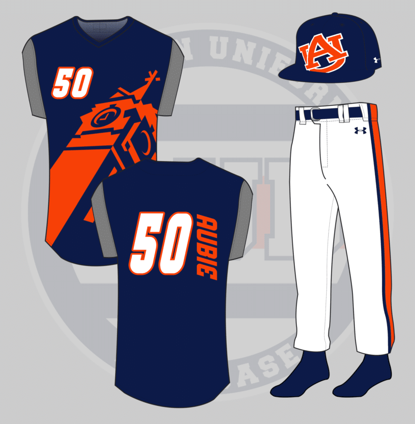
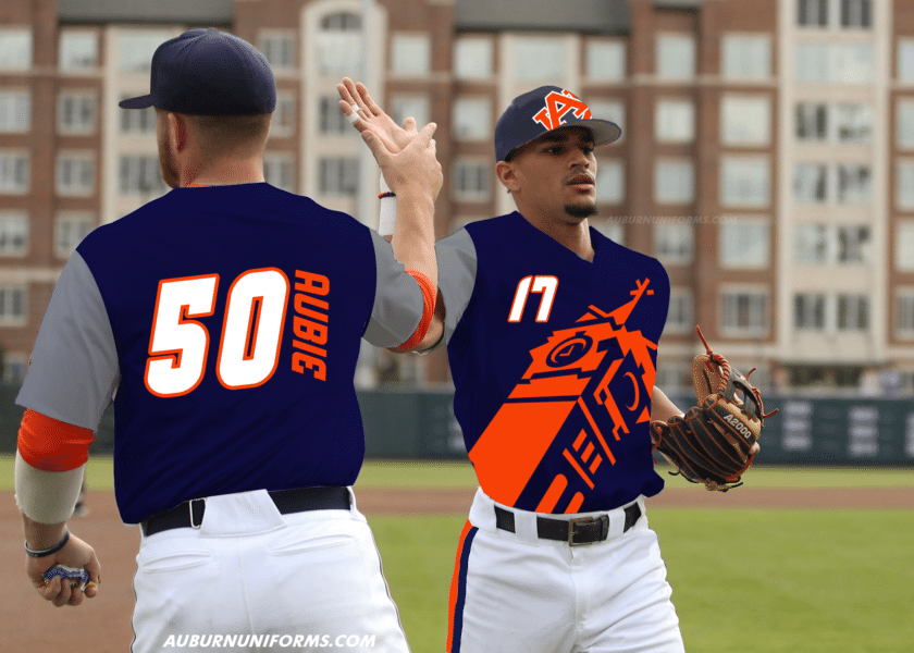
Large logos were a common motif, but a large AU logo wouldn’t have been very dynamic. The now-retired Samford Hall tower logo felt like the right choice here. An illustration of the entire building was considered, but again, this looks dynamic (and obnoxious) enough to fit the mold well.
The vest-like jerseys get a lot of the attention from the TATC era, because the hats and pants didn’t see all that much change. The Mariners wore large striped pant stripes, so Auburn will basically be wearing football pants here. The hat features an oversized AU logo tilted the opposite direction of the jersey logo. While some real hats have shown logos can be continued to the brim of the cap, this one gets cut off. Cause why not.
And you can’t have Turn Ahead the Clock without odd player names and numbers, complete with the horizontal nameplates.
Yellawood themed pic.twitter.com/8hVXSLbTay
— Trace Pridgen (@TracePridgen) July 13, 2019
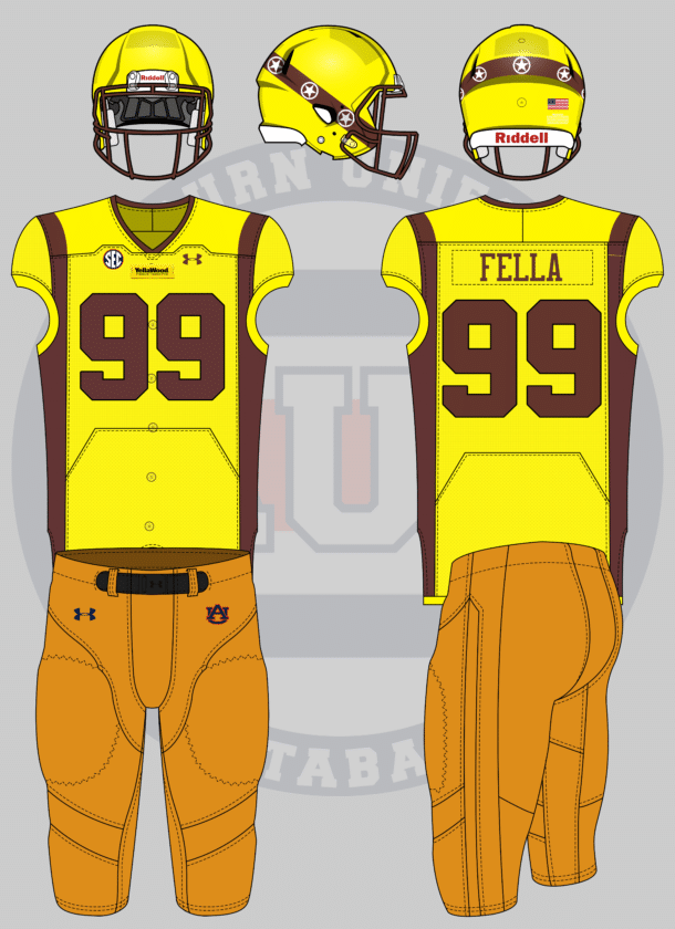
Ah, good ole YellaWood. Jimmy Rane, who acted in the television spots as the Yella Fella, is an Auburn alumni and Board of Trustee member.
The Yella Fella outfit is so distinct that I wanted to stick as close as possible to it. The jerseys have a yellow body with orange side stripes to represent the shirt and vest worn. Sublimated buttons really drive home the look. The helmet is meant to mimic the top hat and looks rather similar to the Iowa Barnstomers lids.
The chest mark has a YellaWood label like the slabs of wood. And of course, to be authentic, it must be stapled on to the real thing.
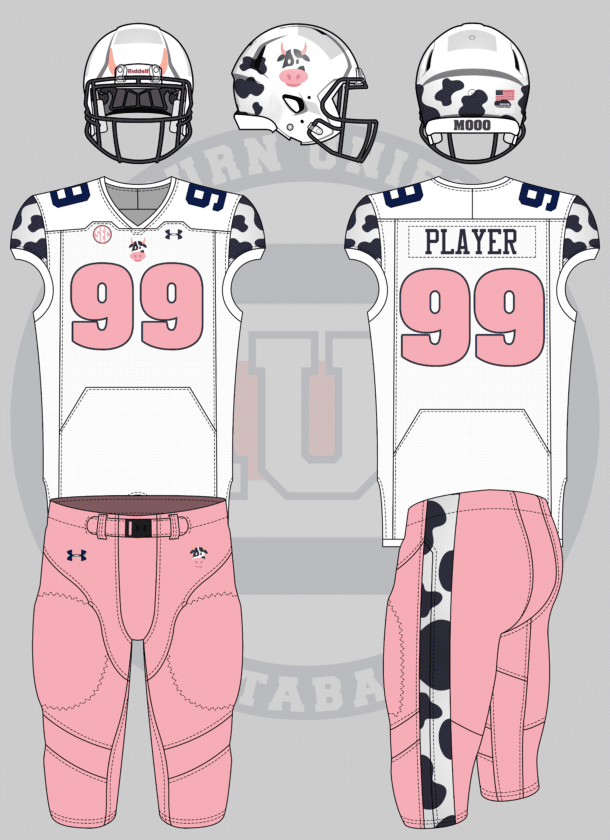
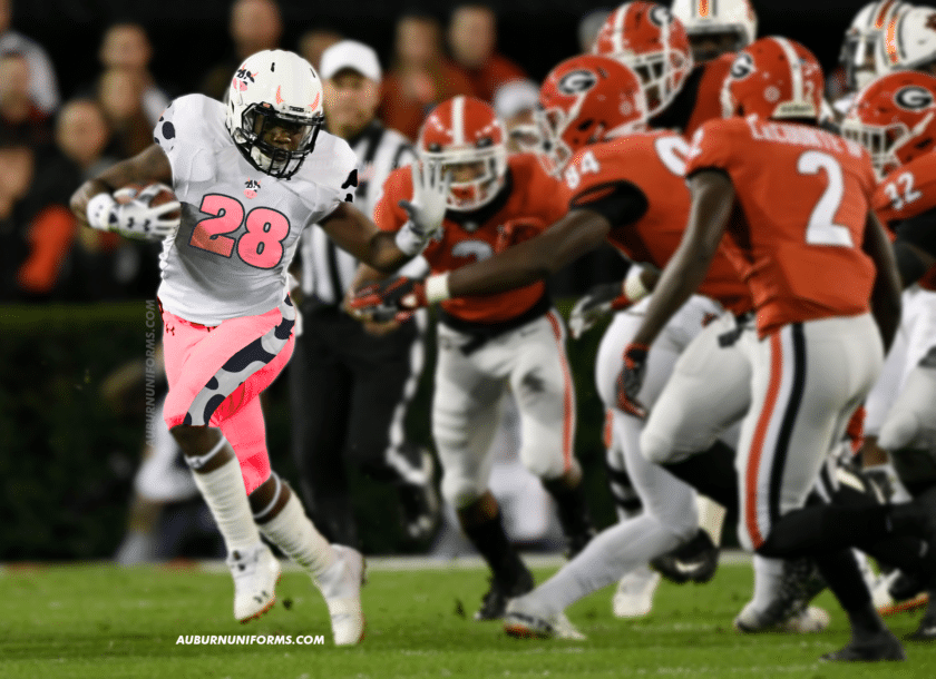
Since auburn is a cow college, I want a cow themed jersey. Do with it as you will.
— Thomas Northcutt (@RealTCutt) July 3, 2019
Cow College. Ight.
Once again, I wanted to avoid being really cliche with this look and not place spots everywhere. I found a nice illustrated cow head on Google and wanted to use it as the new logo. It’s placed on the helmet and the chest of the jersey. The black and white spots get placed on the shoulders, pant stripe, and are used on the back end of the helmet.
The pink from the cow head logo is used to add some color, specifically with the numbers and pants. And just because it felt even more silly, the cow horns are added to the front side of the helmets.
Good luck avoiding the cow college jokes at this point…
Whenever I request concept ideas, I always hope for the truly crazy designs. The ideas that are so out there you know it’s entirely silly. And that’s where the next two fall in line.
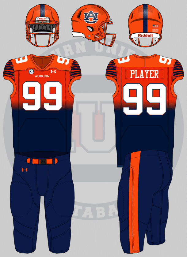
Football: Gradient fade from blue at the top to orange at the bottom. Transition occurs above the waist but below the numbers. White numbers/lettering. 2-3″ wide stripe on sides of bottoms, maybe. Contrasting tiger stripes on the sleeves.
— Emily Enfinger (@EmilyEnfinger) July 3, 2019
Gradients are weird enough. So we have that going for us!
Emily wanted a large single stripe along the pants, so I wanted to mimic that with the helmet. The shell is orange to continue the gradient upward, while the pants continue down. The chest and back numbers feature a gradient outline, reversing the color of the jersey underneath.
The shoulder cap tiger stripes are just the cherry on top for this uniform.
How can we top that crazy?
what if auburn changed their nickname to the watermelons, and changed the colors to red and green like a watermelon. Sure would be something
— joshdub (@joshdub_) July 3, 2019
Oh, that’s how.
I asked for crazy, and I got crazy.
These are the fun ideas where creativity can take over.
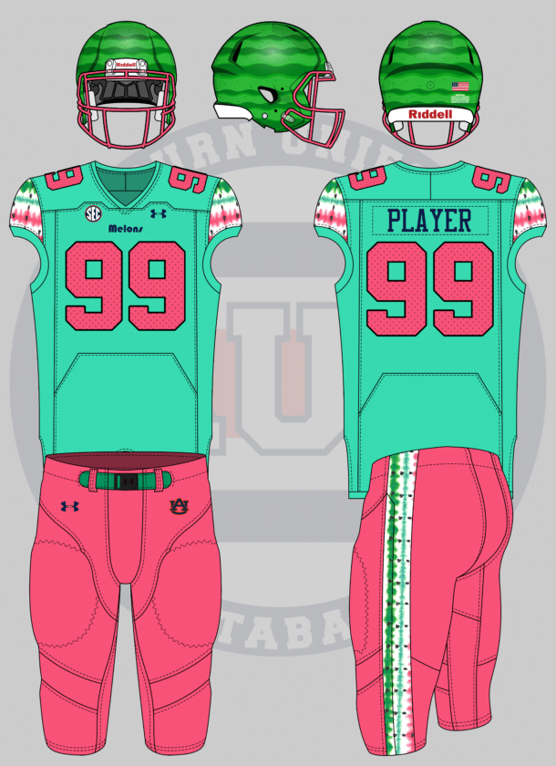
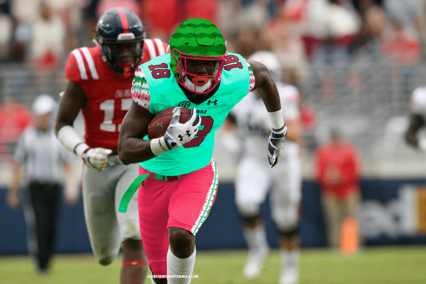
I found a watermelon stripe pattern on Google and wanted to run with it. The stripes are slapped onto the shoulder caps and pants stripe. The numbers and pants go pink, with the numerals featuring “watermelon seeds.”
The helmet features a dark green set of stripes to resemble the rind of the fruit to top everything off.
When you suggest the world’s first football cape (and gold sparkly jerseys), you earn a spot on the next round of concepts (being a sister-in-law also helps).
baseball uniforms based on the rugby cheer uniforms!!
— jillian (@wtmjillian) July 26, 2019
Auburn cheerleaders always wear their rugby sweater uniforms for the Iron Bowl. It’s a fun little tradition that I personally love.
The male and female cheerleader uniforms naturally differ a little bit. This baseball design features details from both versions.
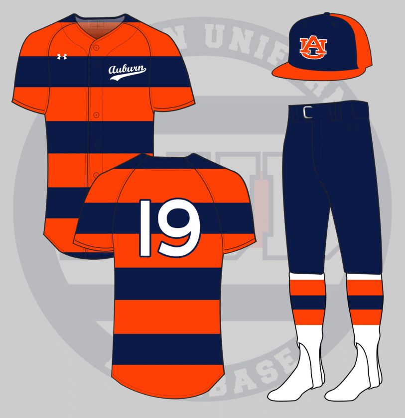
The orange and blue stripes fully encompass the jersey. The women tops have a small script Auburn on the chest, so we kept the baseball script but made it much smaller on the side. The men wear long blue pants, but the ladies wear skirts, so the baseball team should wear their pants bloused to showcase the hosiery. The stirrups are white with the same orange and blue stripes, just to break up all the blue.
The hat is similar to the current tri-color design, but sticking to just the orange and blue, no white.
So there you have it. Eleven new absolutely crazy but beautiful concept uniforms for the Auburn Tigers. Again, these are all just for fun and no, I don’t expect or even wish to see (most of) these come to life.
Thank you to everyone that submitted ideas. We had a ton of great ideas and I deeply regret not being able to tackle all of them. Just because your idea wasn’t selected does not mean it was a bad one. There’s only so much time to create these mockups.
Hold on to your ideas and let’s do this again next summer!
Do you enjoy uniforms and want to see more like this? Be sure to follow the Auburn Uniform Database, like the AUD Facebook page, Instagram page, and follow me on Twitter for even more uniform news. You can also purchase your favorite team’s merchandise through Fanatics, with a portion of your sale going to support this website.
The post Crazy Auburn Concept Uniforms – Round 5 appeared first on Auburn Uniform Database.
]]>The post Auburn’s Amazing New Pads: An Interview with Russell Athletics Vice President of Design and Development Sarah Gholston appeared first on Auburn Uniform Database.
]]>Ever since I began covering uniforms, specifically Auburn uniforms, I have been given many wonderful opportunities, mainly in the meeting of some great people from twitter. I’ve been on two different great Auburn podcasts and another radio show. There’s been a few small perks that have popped up as well. But the biggest opportunity that’s presented itself to me thus far was the chance to review Russell Athletic’s new CarbonTek shoulder pad system. Along with that came the chance to interview Sarah Gholston, the VP of Design and Development at Russell Athletics. I was graced with a good half hour of her time and this is how that interview went.
Tell me about yourself and how you came to work for Russell Athletics and got your position of VP of Design and Development?
It’s a long journey – I don’t know if you have that much time. I am the Vice President of Design, Development and Merchandising for Russell Athletic. I have worked with Russell and the Bike Athletic Brand since I got out of college. So I’ve been doing this for 20 years. I’ve done a lot of things within the company and sports industry.
Tell me about how these pads came to be. What was the whole process behind the drawing board and implementation?
Russell Athletic has been around since 1902, and we have a very, very deep history with football apparel, specifically on the field uniforms. We wanted to expand our football product offering, and expand into protection, specifically shoulder pads. And we had had this conversation for a while, and we knew when we made the transition into the shoulder pad market that we wanted to do it with something that matched all the innovation with the uniform market. We didn’t want to just come out with a shoulder pad with different colored plastic – we wanted to build a shoulder pad that actually helped the athlete perform better.
So what we did was we started with a clean slate – we pretended we had never seen a shoulder pad before. We actually worked with Dana Marquez, equipment manager at Auburn, and we started kicking around ideas and concepts on how to look at the shoulder pad differently. So we talked about a lot of different things, but what we wanted to do was enlist the help of people in different businesses that had never worked with sporting goods before. We wanted to do that for two reasons – we wanted to be extremely open minded and didn’t want to be tainted with what was already there. We also wanted it to be extremely proprietary. We wanted to build something that would really be a difference maker and we didn’t really want to share it with anyone.
So what we decided to do is, we had an initial concept for a foam piece that would be the initial base layer of the CarbonTek shoulder pads. And so what we did was we contacted a tier one automotive supplier – a foam manufacturer specifically – cause we thought “who knows more about impacts that the automotive industry and all the guys up in Detroit”. So we worked with their chemists and engineers to really refine the shape of the foam that goes into the vest portion of the CarbonTek shoulder pads. And really what we came up with was this oblate spheroid shape [think egg-crate bed foaming – CR], or kind of circular shape, about the size of a golf ball. And what that does for us, by making that rounded shape, which gives more surface interest to the pads, so the dispersion of the energy has more space to travel.
We worked with them on the foam production. We do have a dual vented foam that goes into the CarbonTek vest. Also in there is a hole that goes through the middle of the foam shape as well. So, that not only aides in ventilation and heat relief, but what it also does, when the player gets impacted, that impact has energy, that energy has a greater surface interest to travel over the foam shape, and the hole also helps relieve that energy. So it’s multipurpose. We’ve also injected into the foam polygene technology, which is an anti-microbial – with staph infections always a concern in locker rooms, so we wanted to address those issues. That was really the start of the oblate spheroid shape, and then we connected all of these these shapes together into a sheet, and created a compression vest.
What that does is allows the athlete to get 360 degrees of coverage. And it’s tight to the body. So imagine a compression shirt with protective foam in it. And that allows no breaks in the body. There is no space between the actual protection unit and the body itself. So that gives the player a lot more comfort, a lot more range of motion, and it also creates a much lower profile pad for the athlete – much lower to the body.
So we built this great vest (laughs) and all these great characteristics to it, and we don’t want to go ruin this pad by putting plastic on top of it. So we again went back to our tier one automotive supplier and tried to look at different substrates we could use for the exoskeleton of the CarbonTek pads. And what we ended up with is that carbon fiber would be the best material to use. So in working with our carbon fiber manufacturer, we partnered with Boeing and we are actually repurposing the carbon fiber from their Dreamliner.
So it’s kind of two fold – we have a sustainable story of repurposing of this carbon fiber from B, and also it works as an absolutely superior exoskeleton to compliment the vest that goes underneath. So what the carbon fiber does for us is it significantly reduces the weight of the pad itself, and it also gives us a lot more impact resistance as well, as the strength of the carbon fiber aides in the impact dispersion as well. So the other difference in the pad is that it’s actually a system, not a single unit. What we have is the compression vest with OS technology foam and then we have the carbon fiber exoskeleton that goes on top of it so that these two pieces can be detached from each other. So it’s a system itself, not just one unit. So it’s very versatile. But the carbon fiber on top of it gives it an additional impact dispersion. So that’s kind of how we pulled the pieces together.

Russell Athletics was smart with their logo placement, as the R-logo poked out over the v-neck of the jerseys (image via Auburn Athletics)
I read online that these are supposed to be X-ray-able. Was that a goal in mind from the beginning or just a lucky coincidence?
It wasn’t something we initially started out with on the board. Obviously the first thing we wanted to do was we wanted to create a pad with the impact dispersion always at the top of the list. The range of motion, the breathability, those were things that were at the top of mind at the beginning. But as we started selecting materials, we found that the materials were coming together for the pads were going allow it to be X-rayed through. Which, to a trainer, to a doctor, an equipment manager, that’s a really big deal. And we really like that feature to it, because it allows the doctors and trainers to access the athlete and then make the decisions afterward and really don’t have to move the player around.
What was Dana Marquez’s (Auburn Equipment Manager) role in the development? Did he come to you guys are did you go to him?
Dana had approached us with an initial concept for a foam shape, and we collaborated with him from there. So that’s when we brought in our tier one automotive supplier, the engineers, and those things. He had the initial concept of a version of the oblate spheroid that we’ve refined through the development process. Dana was a big part of this development from the very beginning. And the other part that is really invaluable that Dana brings to the table is his years of knowledge, not just in the equipment room but with athletes and shoulder pads and protective systems in general. So we were really able to incorporate him into the development process along with engineers, along with materials from our suppliers and our design team to kind of have all eyes looking on it from different angles. Dana was very important to this whole process.
How did you guys test these new pads? What did those initial tests show in regards to the strengths and weaknesses of this whole brand new system?
We took this in two ways – we did the actual field testing, which we did a lot of this at Auburn University, and we actually had them on players through practice and game situations. And then we knew we wanted to get some more lab testing and more data around these pads.
The struggle at the beginning of this development was that there is no standardized testing, unlike there is for helmets. There isn’t a NOCSAE Standard for shoulder pads. We reached out to Dr. Richard Brandt, who is with Sports Science and Dr. Brandt has a very long resume in testing – he was a big part in the bat testing that has been going on for years. He developed that testing method. We reached out to him and threw a challenge him basically, that there isn’t a testing method out there, so he could help us come up with something. We wanted it to be independent, so we commissioned it with him and he went out and created a whole testing method that would allow us to determine the impact dispersion or wave of the energy moving across the pad.
He built a whole system with sensors and we tested 500 mph impact and we compared the CarbonTek shoulder pads with the other leading pads on the market. And so what we really found through that testing is really significant impact dispersion of our pads. The player that is coming at you is still going to be coming with speed – unfortunately you don’t get to slow them down. The whole goal of developing this pad was for when you do get hit, the surface area of the OS foam and of course the carbon fiber exoskeleton spreads that energy and disperses itself over the entire pad itself so the player feels less of it on their body.
We found significant results with our testing with Dr. Brandt and what was really fantastic, whenever you’re doing lab testing and field testing simultaneously, the field testing was almost mimicking what we were seeing in the lab. So the athletes were saying “I know I’m getting hit. I’m not really feeling it in the exact location of where I’m getting hit.” And that’s the spreading of the energy over the pad. And they are recovering from the hit much faster.
Now the things that you can’t tell on the lab testing that we got from the field testing was the information from the athletes that they had increased range of motion. Guys were telling us “Hey, when I’m tackling another player, I feel like I can wrap them up better because I have more extension in my arms and more range of motion.” The fact that the carbon fiber shell itself is molded, whereas other modern pads when laid on a table lays flat, and you have to use a robust buckling system to create the arch in the pad that gives you protection, but the CarbonTek system is already molded into that shape. That also gives a lower profile to the body, the combination of the carbon fiber exoskeleton and the compression vest which fits very tight to the body. It’s a lot harder for the opponent to grab. It’s a lot harder for them to get a hold of your pads. The anti-microbial and the moisture management properties and ventilation properties that we incorporated into the pads give you a little bit more breathability as well.
Will these pads be specifically molded for certain players?
Nothing is off the table, and we are already working on the second and third generations of this pads, and we find all these great things we can add to it. One of the things that we do is that we have the option today to modify the vest. We do that a lot with Dana and the Auburn players. You may want to add a little more to the vest. You might want to extend it down to replace rib guards or a kick plate, some of those items. We can incorporate all those accessories into the vest itself. It does become a very customizable piece for the player. The beauty of the CarbonTek system is also the fact that it is in two pieces makes it very versatile. You can use this pad for every player position, and I think Auburn is a perfect example of that. We have it on pretty much every position on the field at Auburn today. Everything from quarterbacks to running backs to wide receivers to lineman. Every position has been covered.
Are there differences in the specific position pads or is it more of a “one-size fits all” piece at the moment?
Right now, what we are finding is that the way we have constructed the CarbonTek system is that you don’t need as many options for different player positions, which adds a lot to the versatility of the pads. We have different options for different positions, but we have not seen players need that or request that as much. And we also have the tailoring that allows the different positions to do what they want for any other protection that they may need.
How many Auburn players wore these last year and how were they specifically chosen to test it out?
Last year we had about 11 or 12 all the way through the season that were being used in game situations and more so in practice. The selection of the athletes that had the opportunity to wear them was left up to Dana. Our conversations with him, it was a combination of the need and guys that wanted to step up and try something a little different. But that was really Dana and the coaching staff’s call.
How many teams and players now wear the new pads?
We have really branched out into a lot of different schools. We also have our brand ambassadors – Mark Ingram, Pierre Garcon, and Colt McCoy (who’s playing a lot right now) [They’re big fans of Colt at Russell – CR]. So we’ve really expanded into a lot of ACC and SEC schools. We are only at Division 1 and NFL today.
The pads have grown really quickly in terms of production and number in play. What does that say about Russell Athletics and the quality of the new CarbonTek system?
I think it really tells us that there’s a lot of room in the market for products that really enhance the player’s performance. And I think that’s what we’ve always been about at Russell Athletic – we want to help that athlete perform better. And I think there is always going to be a need out there for products and technology that helps these players recover faster. Give them advantages in game situations, and I think you see that in every sport. There’s this opportunity and I think players are looking for that.
What is it like being a producer for only a handful of teams, whereas the other big three companies have a long list of teams that they provide for.
Russell Athletic is still the market share leader for football uniforms. Obviously there has been some changes at the Division 1 level with contracts and all of that. We do still have several schools that we work with. For us, it’s a great opportunity to work with schools at every level and help them come up with their own image, their own design, but incorporate the very best materials and fit. I think that’s been something, with over 100 years of experience, that we’ve been able to deliver a lot better than our competitors on the uniform side of the business. We are a manufacturer – we design and make and actually manufacturer our uniforms, and that truly is different from all the competitors. We have a lot of control from the design side, from the production side, that really allows us to give all these athletes and schools uniforms that I would say is much better than what they could find anywhere else.
Does Russell Athletics plan to expand more in Division 1 or do you plan to just concentrate on Georgia Tech and Southern Miss?
I think as we go forward we are evaluating every opportunity as it comes along. And if an opportunity comes along for us to be a partner with another school, we definitely always look at those opportunities. We evaluate them and if they work, we definitely want to continue.
How do you balance a team’s traditional design with the modern technology and trends?
That challenge is for whoever the manufacturer is. You have a rich history in a lot of these programs that you don’t want to walk away from some of the traditions that have been established at these universities. I think what we try to do with our partner schools, like a Georgia Tech, is really sit with the program at the beginning of the development cycle and try to understand what they want their identity and how they want to express that through their uniforms during the season. We try to do that at the very beginning. We want to stay true to their traditions but at the same time we want to give them the benefit of the technology and the fabric and the construction. We want to allow them to have the best uniform on the field. We try to balance those things with working with the teams, working with the coaches, working with the institutions with what they are trying to convey for the season. That helps us as a design and development team come up with something that pleases everybody’s expectations.
Who gets the final yes or no say over a design?
It’s probably different [for each program]. From our experience, we obviously have a lot to say from a design stand point, so we’d like to share that as well. But at the same time, we want to be a partner with our school. That’s something we are very proud of. It’s usually never one person, it’s usually more of a collaboration. We’ve never found that to ever be a big issue.
Did Russell Athletics ever push Auburn to try a different alternate uniform like we’ve heard Under Armour has tried to do?
We were with Auburn for a very long time. I don’t ever remember any kind of conversation in terms of pushing, again it was always more of a collaborative process. We would sit with the program at the beginning of the season and say “What would you like to accomplish this season with your uniforms?” and we usually work with them that way.
I will say, though, the trend is to have a lot of different uniforms. You can thank some other teams for that. It does help to get the fans excited, and I understand that. It’s a very tough balance. Alternate uniforms are kind of the big thing. When Russell Athletic had Major League Baseball, we had a lot of teams that had up to six different uniforms. I understand that everyone wants to keep it fresh and exciting.
Any other projects going on over at Russell Athletics?
We are going to continue to expand our CarbonTek franchise. We are currently working on development in different categories of the same OS technology. We really are in an innovation mode right now. We are continually trying to come up with more products that are actually very differentiated to help the athletes perform better. We really pride ourselves on trying to stay very connected to the athletes, to the equipment managers, the people that are in there day-to-day, and try to help them solve their problems. We create products that can help the athlete, the equipment managers, the trainers and help them perform better. Those are the things we have been concentrating on here in the past two years.
I’d like to thank Walt for the opportunity, Matt Fox for setting everything up and helping with everything, and especially Sarah for being gracious enough to spend some time on the phone with me. I’m truly honored to be able to do something like this.
If you enjoyed this piece, and would like to see more like it, please take some time and visit my uniform blog – the Auburn Uniform Database. I do my best to cover each and every detail on the uniforms Auburn athletes wear. No detail is too small. Spend some time over there. You just might learn a thing or two.
Enjoy uniforms and want to see more content like this? Be sure to follow the Auburn Uniform Database, like the AUD Facebook page, Instagram page, and follow me on Twitter for even more uniform news. Also, you can support this site by purchasing AUD t-shirts and other merchandise. You can also purchase your favorite team’s merchandise through Fanatics, with a portion of your sale going to support this website.
The post Auburn’s Amazing New Pads: An Interview with Russell Athletics Vice President of Design and Development Sarah Gholston appeared first on Auburn Uniform Database.
]]>The post Auburn Concept Uniforms – Round 4 appeared first on Auburn Uniform Database.
]]>This year, we have another eight concept ideas. Like the previous editions, the suggestions will be mocked up on a standard template. As an addition, I have edited game photos of Auburn players to hopefully represent the concept on the field. I’m not very experienced with the real life edits, so they will differ in certain areas from the mock ups.
Because I know some will get upset (and already have), I have to say that these aren’t in any sense supposed to be taken seriously. I never have any intentions on Auburn even considering these crazy designs. Don’t get worried or upset when there’s nothing to get worried or upset about. Now on with the show.
We’ll start with one suggestion actually from the last round of concepts. David wanted to see an Auburn football uniform based off an orange, blue, and grey painted 1929 Lincoln. He also added to his suggestion this year.
Inspired by this car. Silver helmet with standard decals & stripes, orange face mask. Orange jersey w/blue & white NW stripes. Silver pants. pic.twitter.com/oSVQIaOReG
— David (@dsmall75) July 27, 2017
I wanted to best replicate the car on the uniform, which meant sticking with the blue jerseys. Orange is rather limited in the car’s scheme and I wanted to stay true to that. The helmet, numbers, and pants each feature a metallic grey gradient to give it a nice shine.
I didn’t even realize until I finished, but the Photoshopped image of Kerryon Johnson looks a lot like his new Detroit Lions uniforms.
Last year, I made a Nike-based Auburn uniform and included the current Cleveland Browns’ pants style. This year, Colin wanted to go a step further.
Cleveland Browns style jersey stripes ?
— Colin Turner (@ct95designs) July 14, 2018
I left the pants as normal this time around. Auburn gets an orange helmet and orange numbers with a white reverse dropshadow.
I must say, I do like the larger stripes.
Auburn has one of the most traditional uniforms in college football. But what about using even more traditional elements? That’s what Carter wanted to see.
Michigan Auburn Jersey. Air Jordan
— Carter Byrd (@CarterByrd13) July 11, 2018
I tried to mimic Michigan’s uniforms with an Auburn twist. While Michigan uses a dark helmet shell color with bright stripes, Auburn’s are reversed. Michigan doesn’t wear stripes otherwise; Auburn does.
I wanted to expand this series of concepts beyond football, and invited people to suggest concepts for other sports.
The first one received was for baseball:
Also, what about an all-Navy pinstripe for Auburn Baseball. Very similar to the Vanderbilt ones?
— Auburn Rants (@AuburnRants) July 14, 2018
Vanderbilt’s all black pinstripe set is a very divisive design (I, for one, enjoy the look). Vandy’s design features their light color (gold) over their dark color (black) as the base. This Auburn design includes a navy blue base with the pinstripes being navy. It’s a re-coloring of Auburn’s current white pinstripe uniform with a few tweaks, including the outline on the number and logo. I wanted to pair the new orange-logo cap with this design rather than the white-logo hat to better match.
A basketball uniform concept was also suggested. I really enjoyed creating this one.
Auburn hoops uniforms in the style of Vancouver Grizzlies pic.twitter.com/xpfSjVUpr6
— Son ‘o’ Crow (@SonOfCrow2) July 15, 2018
While the Grizzlies had a more ornate pattern used on the trims, I wanted to stick to current Auburn icons. The Auburn trim features the AU logo and a paw print. The wordmark was recreated to mimic the original Grizzlies font. Vancouver had a large bear with a basketball on one side of the shorts. Auburn has no such sports-specific logos, so the throwback leaping tiger fit perfectly.
Previous editions of Auburn concepts centered around some more plausible designs that could be trotted out on the field. Not this time. And never when Carter Michaels has suggestions. I know I can always count on him for great ideas.
Auburn football decides to have a minor-league baseball style theme night complete with themed uniforms. The theme? Pokemon.
— Carter Michaels (@TheRealCMike) July 15, 2018
I make it no secret that I love Pokemon, and this one fit perfectly. I wanted to keep to the “minor league” mentality with this one. Some baseball teams will abandon their branding for the theme night uniforms. They also typically use one design element and over use it. For this concept, Auburn does the same.
Pokemon has many great design elements to use, but none are as iconic as the PokeBall. I wanted to use the PokeBall to the fullest extent, so the general striping pattern is used on the helmet, facemask, shoulder caps, and thigh stripes on the pants. The fonts across the jersey all changed to the Pokemon font. The helmet logo was also created with the same font. It’s cheesy because it was meant to be.
Tom is also a go-to for suggestions and he didn’t fail me this year.
How about as annoyingly Nike Pro-Combat as you can.
— Tom (@ths0002) July 11, 2018
This might be my favorite concept of this round. I tried to incorporate as many Nike Pro Combat tropes from the early 2010s as possible. For this design I used: the helmet from Georgia’s alternates – grey with stripes over the facemask; floating FlyWire collar and shoulders from multiple; stencil number font from Army; curved butt stripes from Florida. I made the shoulder caps contrast in color, the stripes float and don’t connect to the end of the shoulder caps, and the stripes and numbers have tiger stripes sublimated.
To round out this round, here’s the craziest concept I’ve ever received. I asked for crazy designs this time and this one was the best.
imagine: a gold sparkly football uniform with added navy and orange sparkles for ~aesthetic~ and capes, gold sparkly socks, and a dabbing aubie on the helmet
— jillian (@wtmjillian) July 15, 2018
I never thought I would see a gold uniform. Or even a cape!! I love using Dabbing Aubie on the helmet.
Like I said, it’s rather crazy. Now feast your eyes on Jarrett Stidham wearing a sparkly gold uniform and … a cape:
Someone get Under Armour on the phone. These must be worn!
So there’s the eight newest concept uniforms added to the collection.
Which of these designs are your favorites? Have an idea for a future concept? Save it and let’s do this again next year!
The Auburn Uniform Database is celebrating five years in 2018! Take time to check out the brand new website and consider purchasing an anniversary t-shirt. Do you enjoy uniforms and want to see more like this? Be sure to follow the Auburn Uniform Database, like the AUD Facebook page, Instagram page, and follow me on Twitter for even more uniform news. You can also purchase your favorite team’s merchandise through Fanatics, with a portion of your sale going to support this website.
The post Auburn Concept Uniforms – Round 4 appeared first on Auburn Uniform Database.
]]>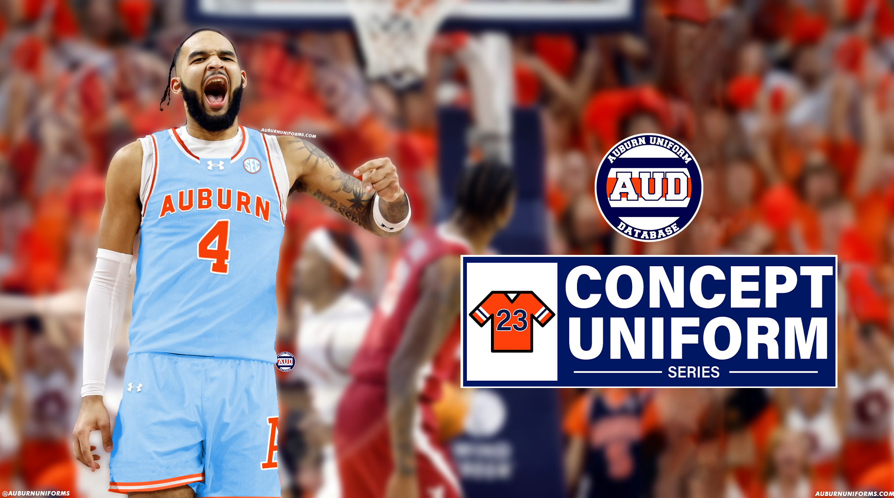
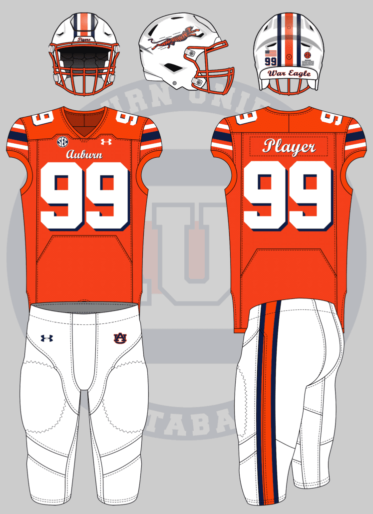
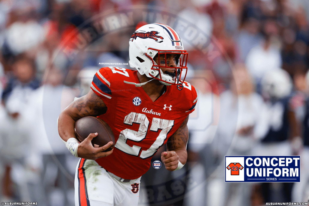

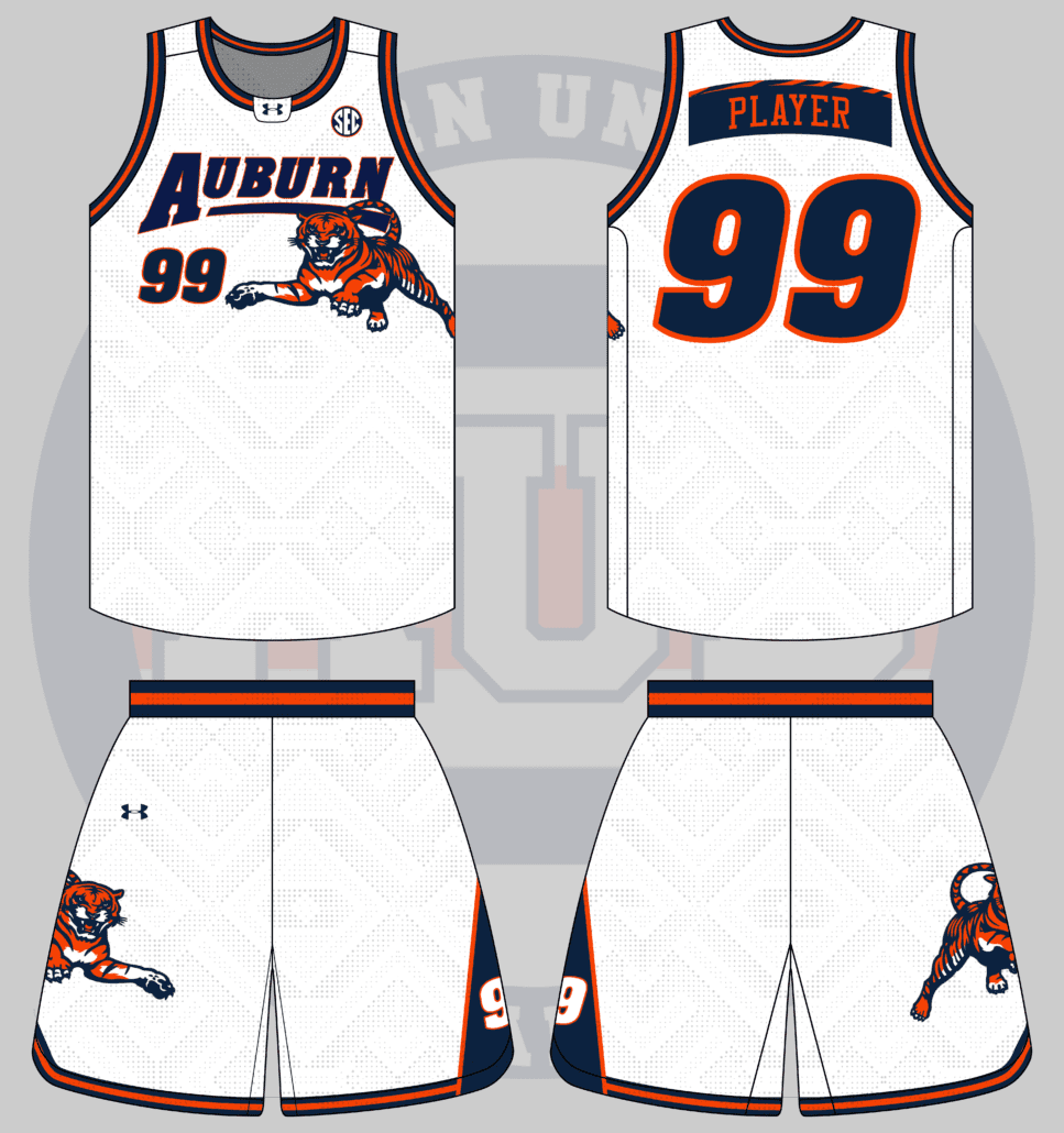
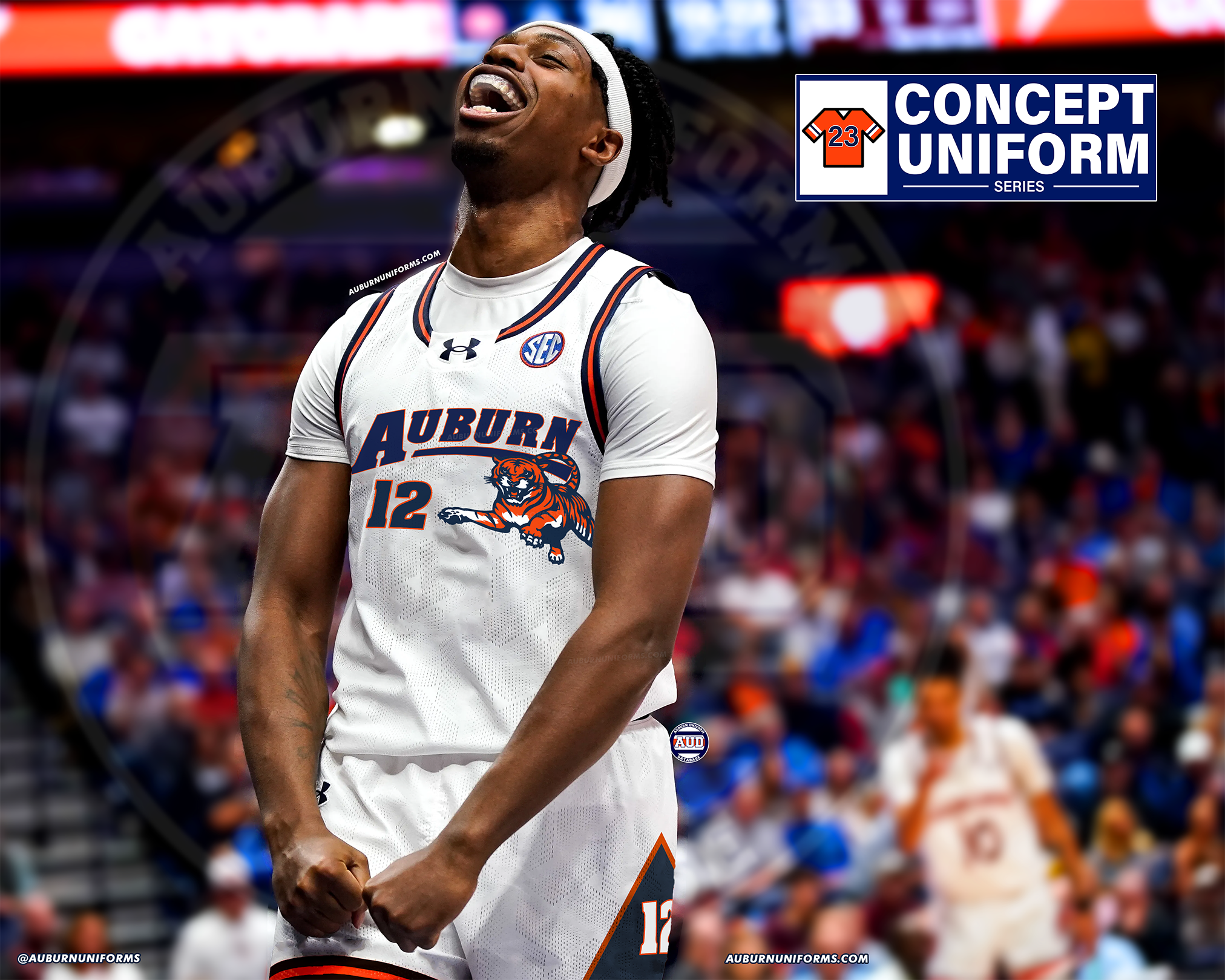

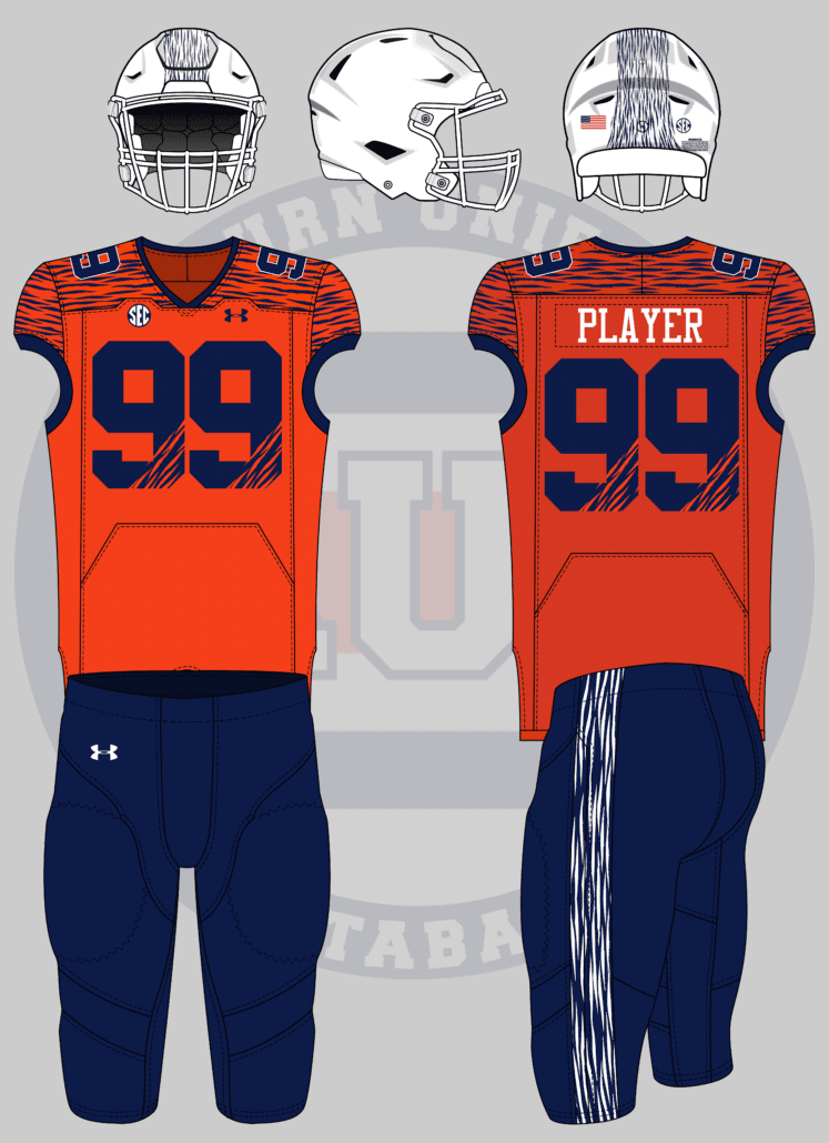
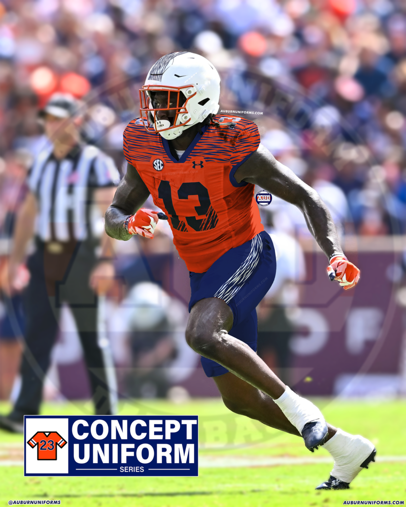

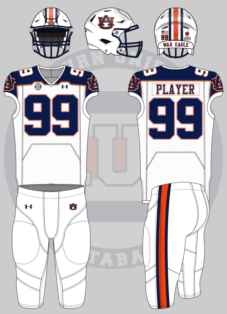
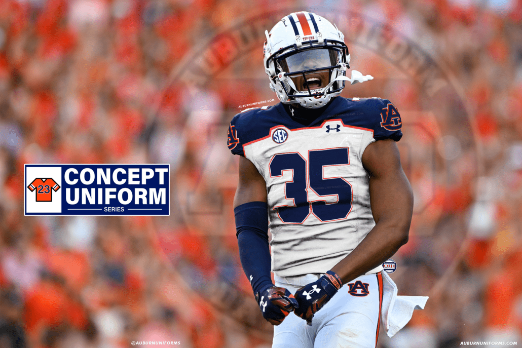

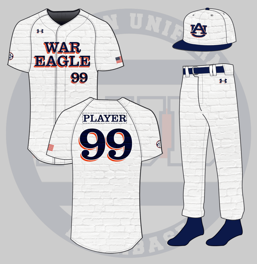
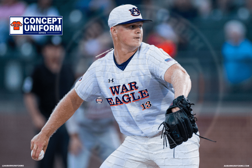

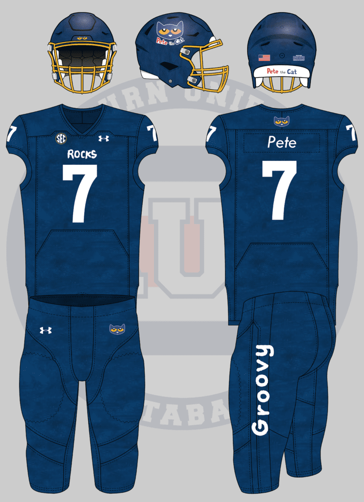
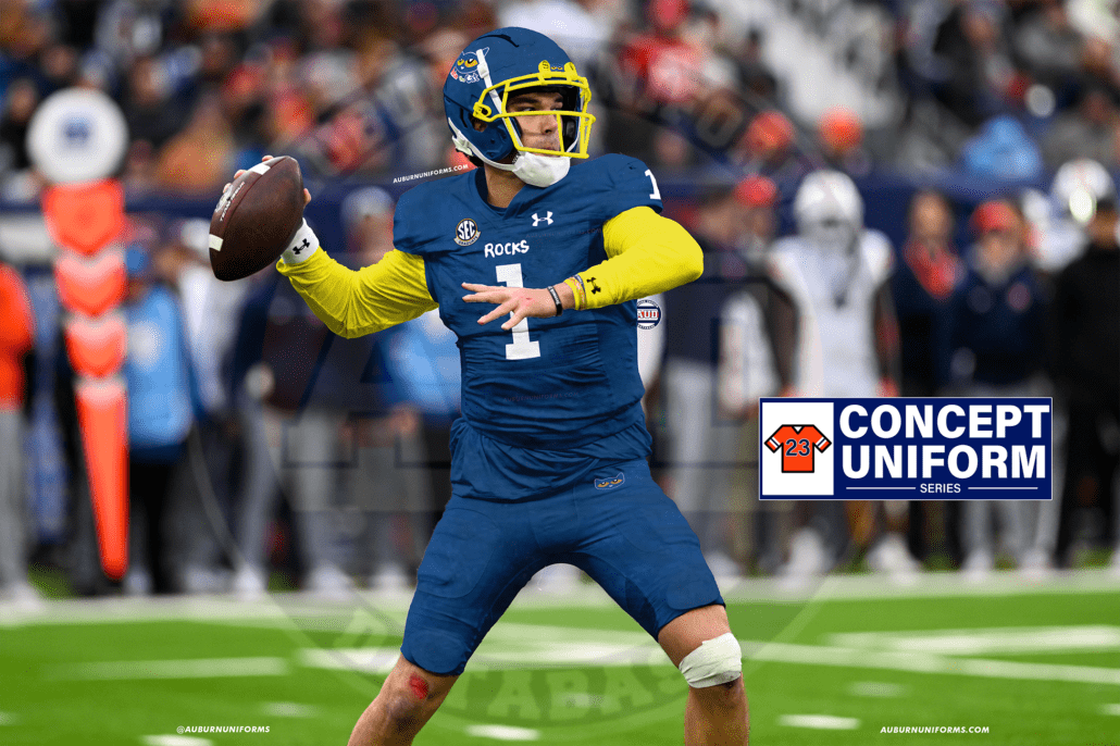

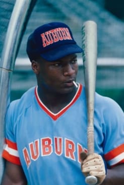
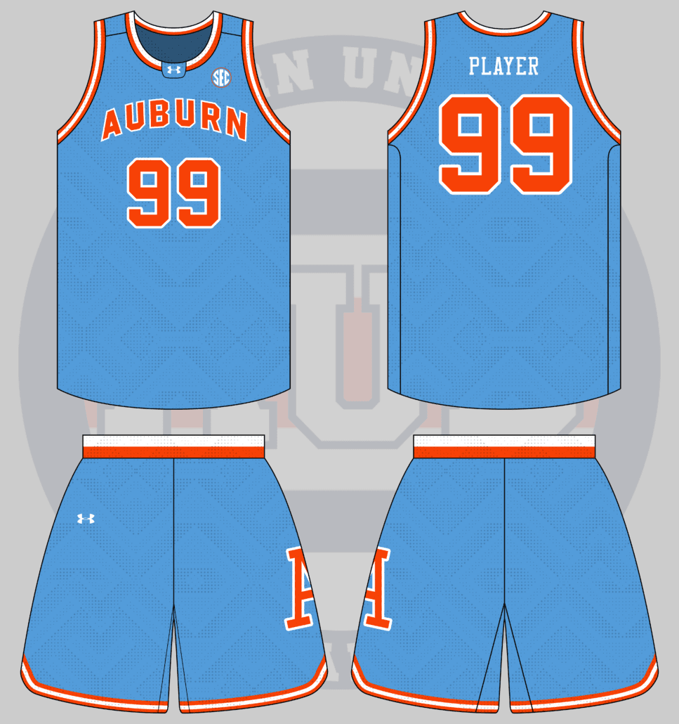
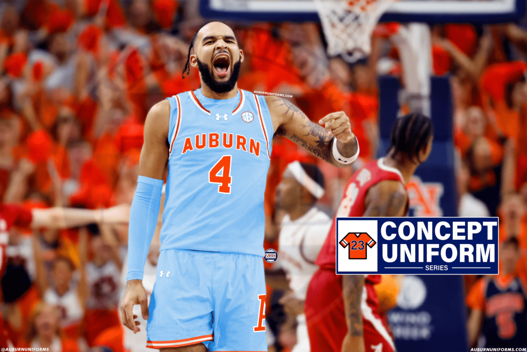

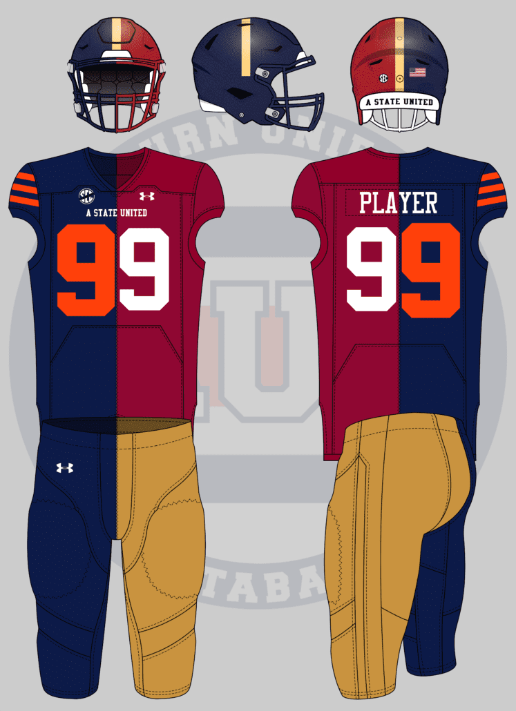
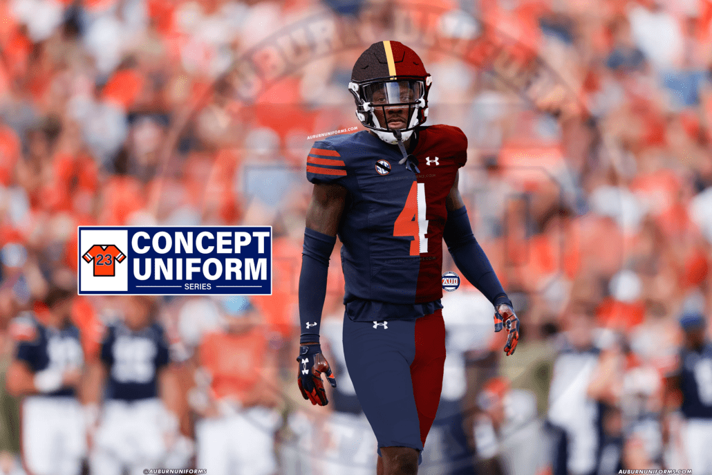

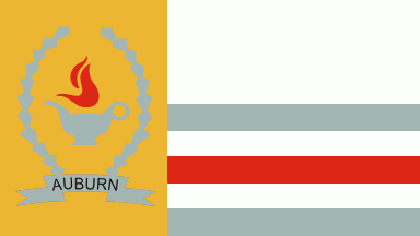
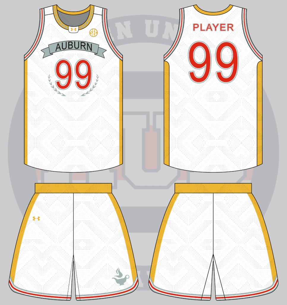
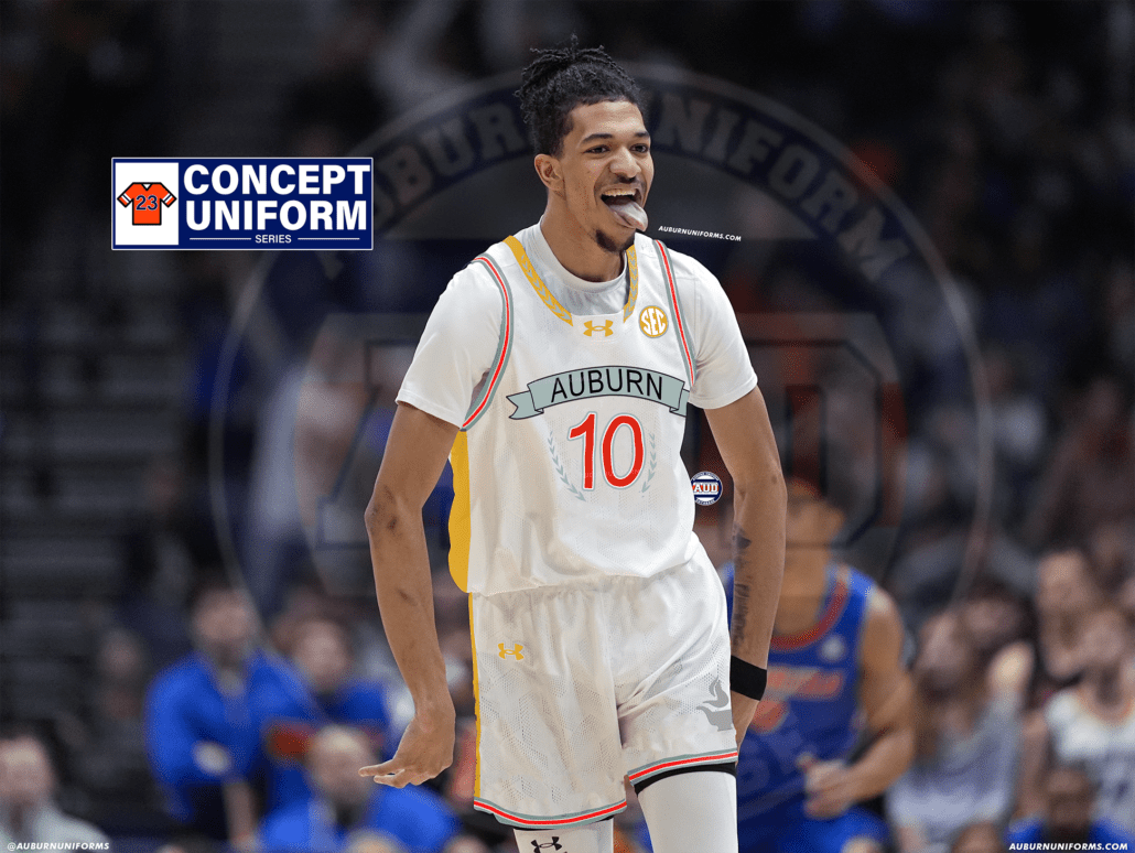

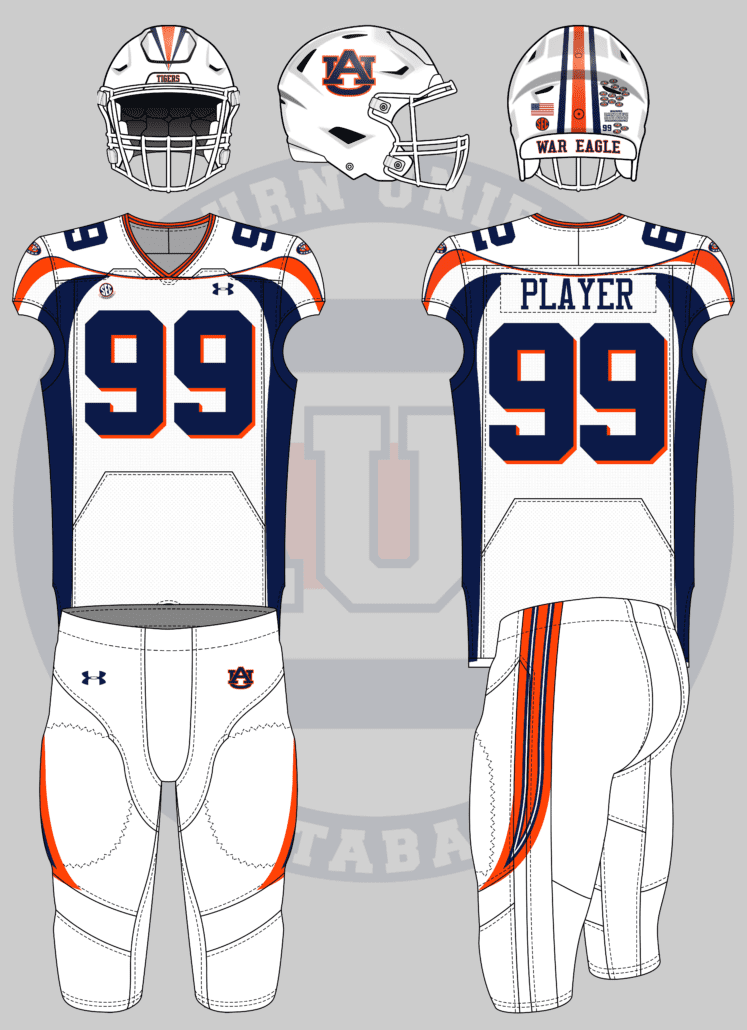
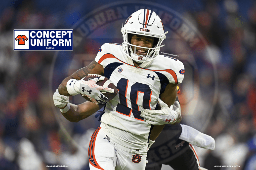

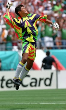
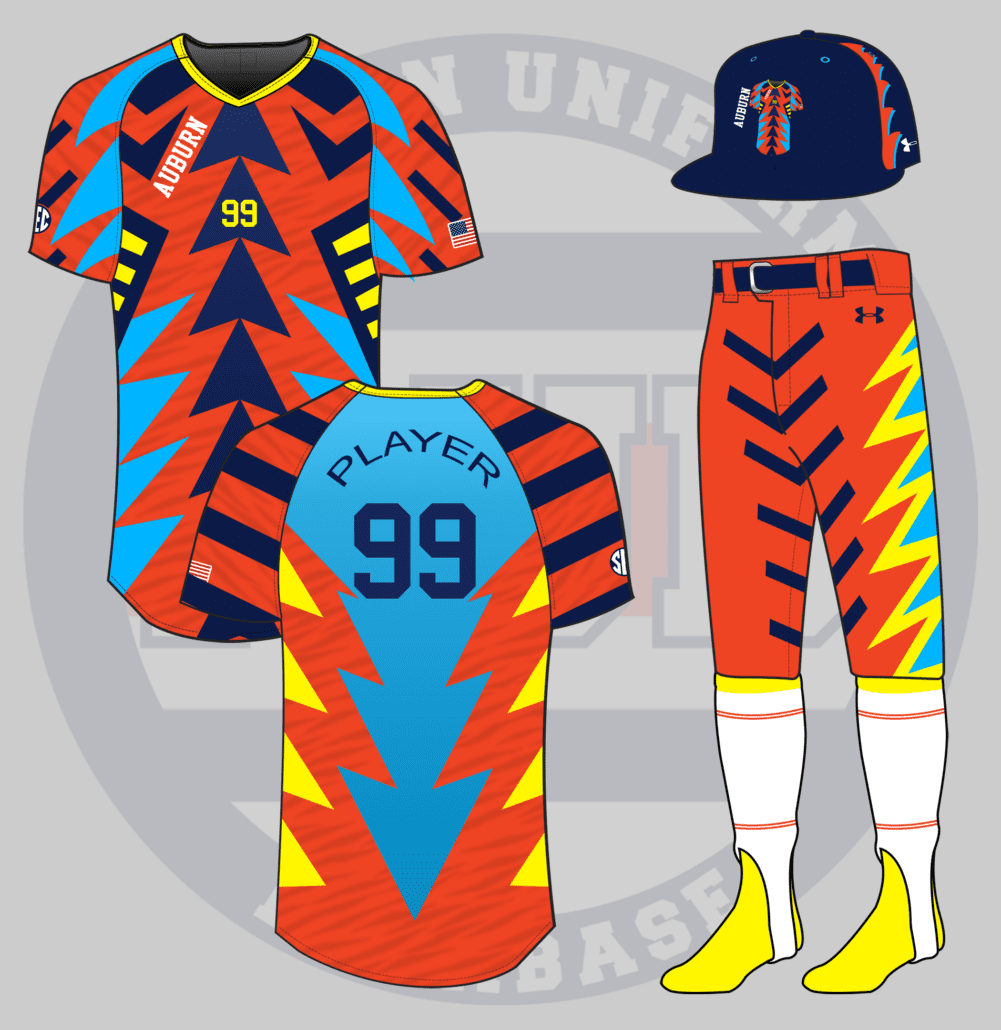
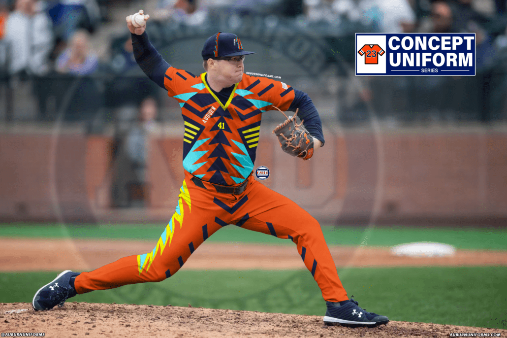
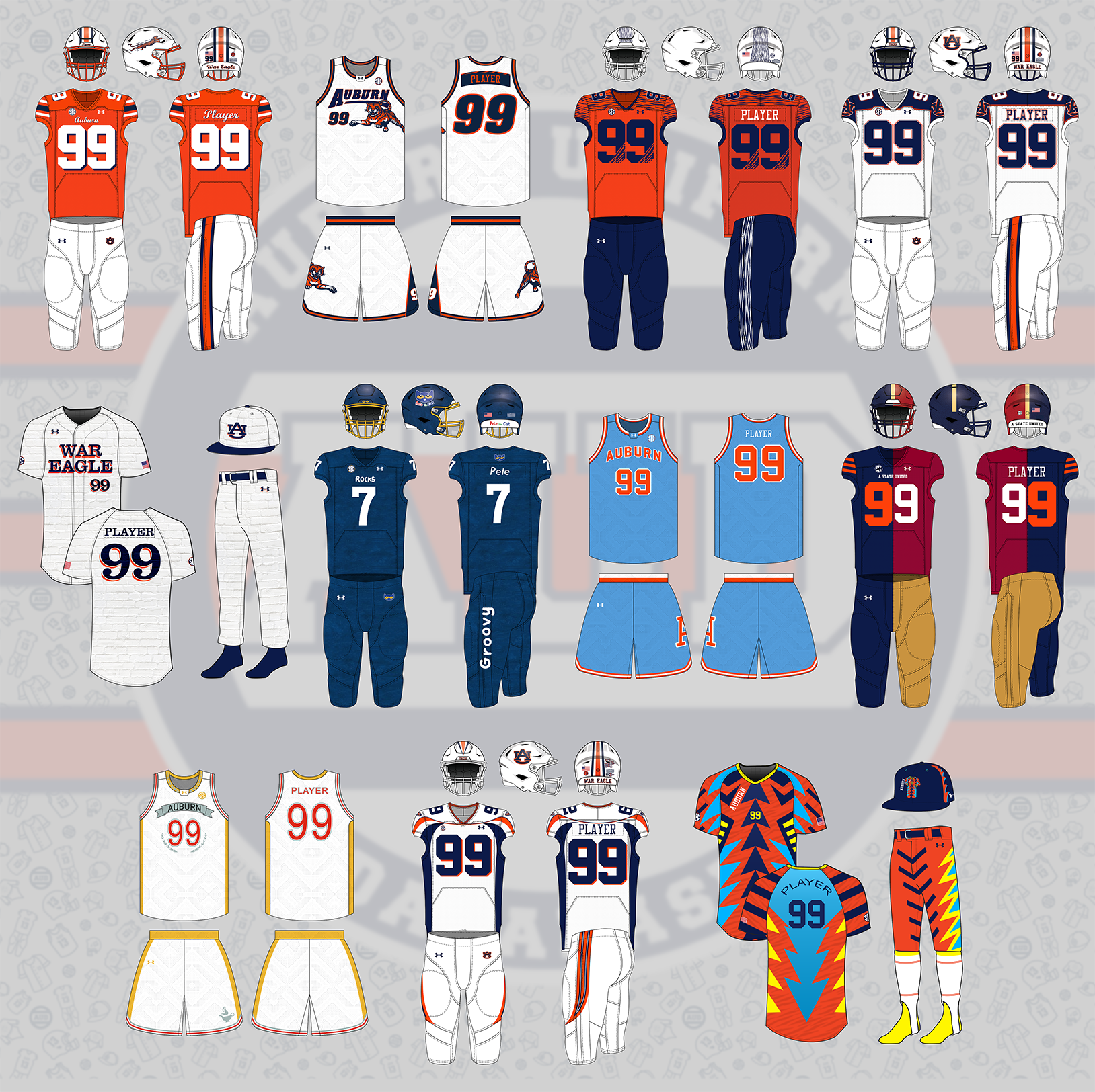
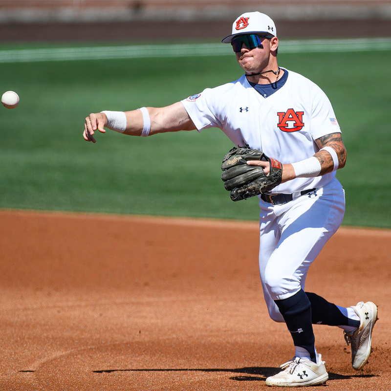
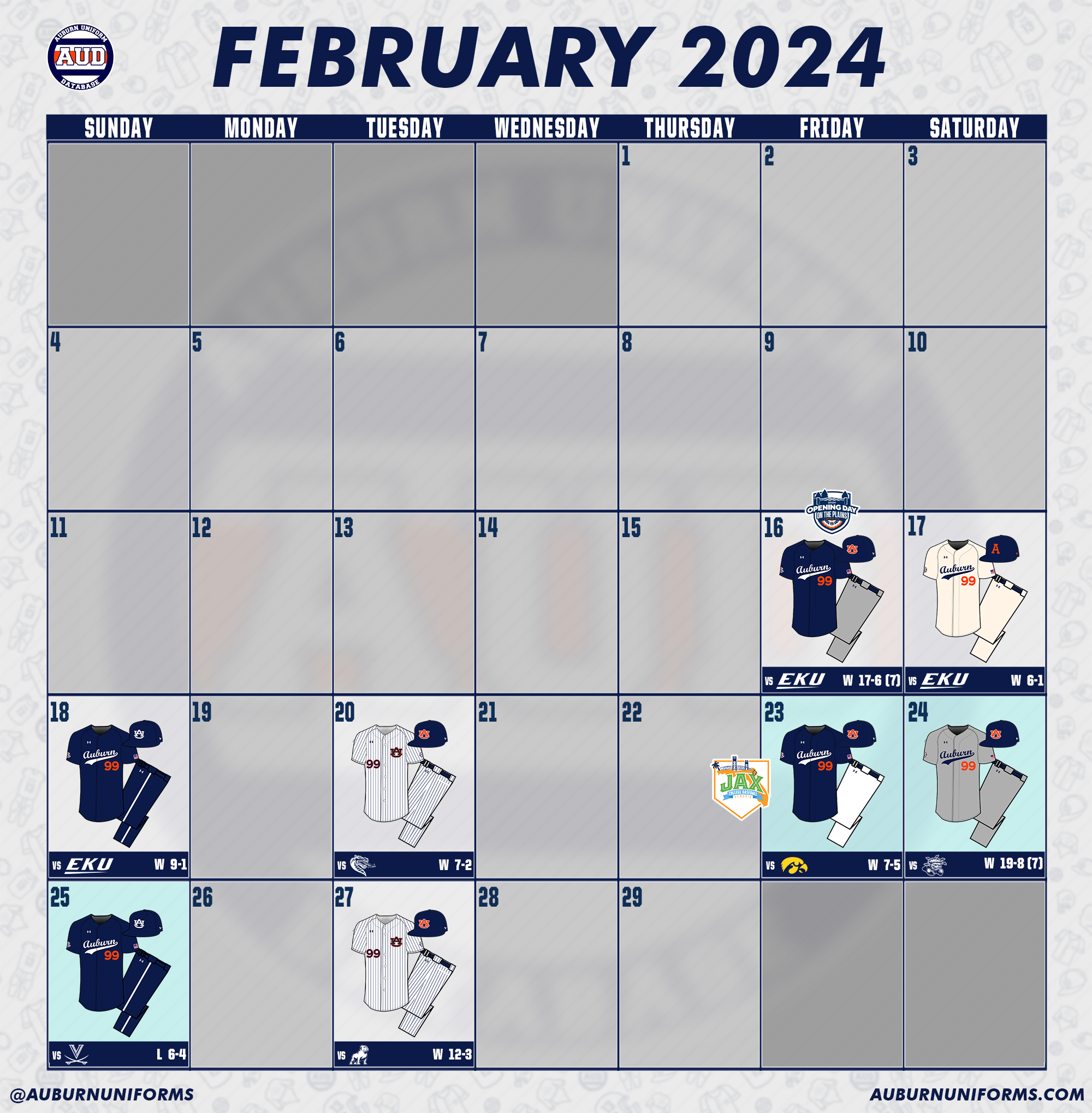
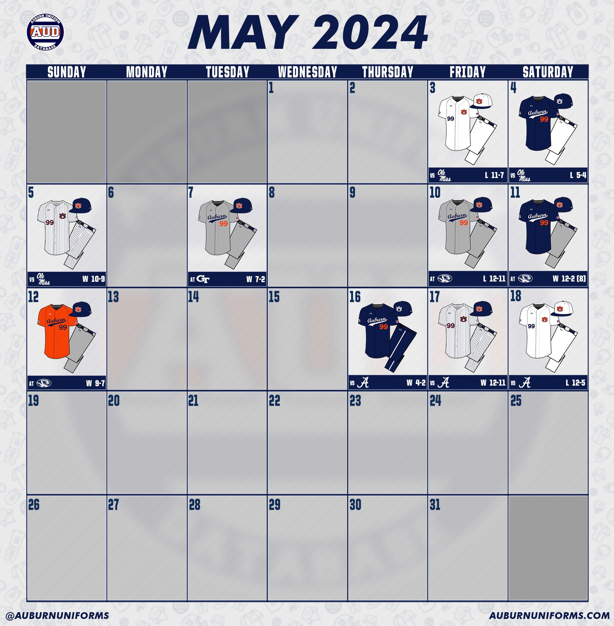
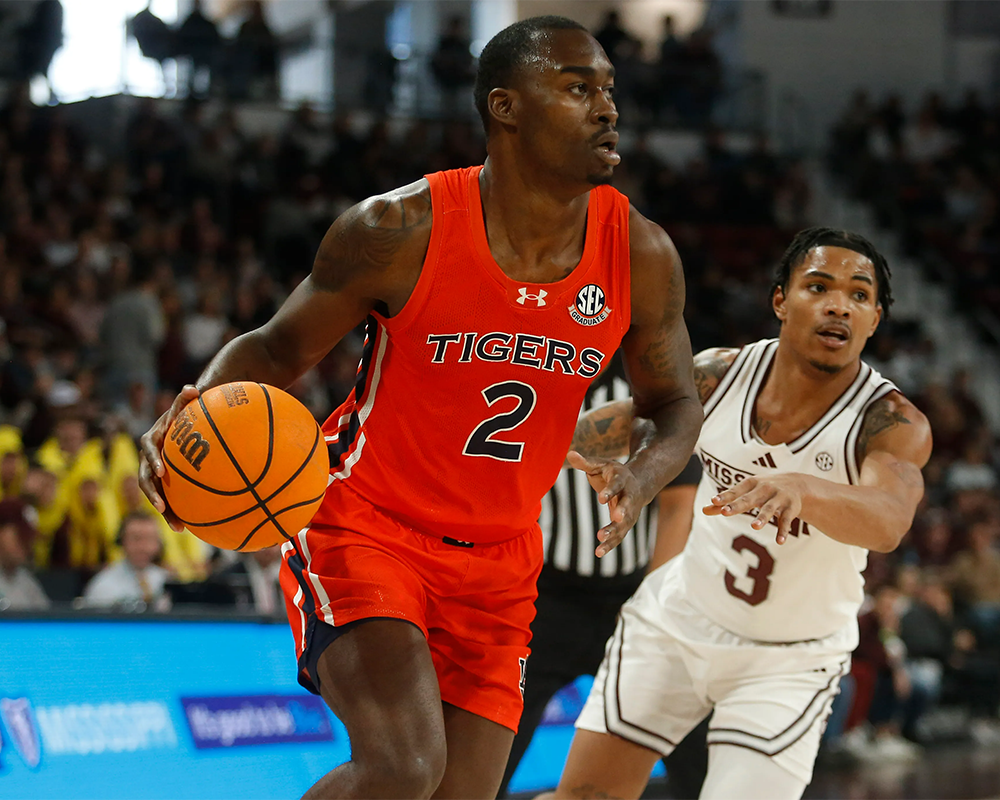

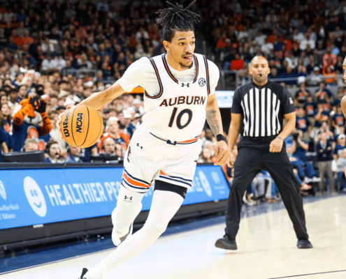
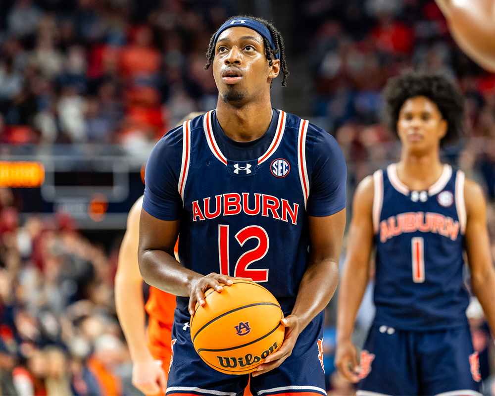
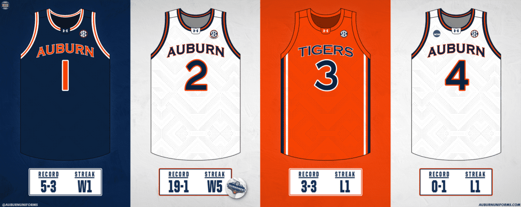



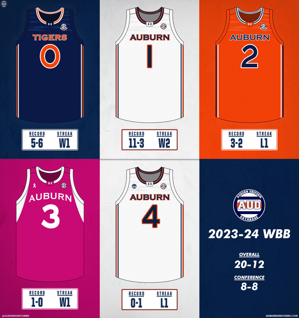
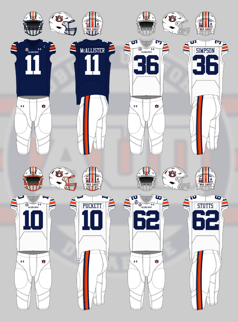
![2024-1-12 vs Kentucky [Legends leo] (Adam Sparks, OANews)](https://auburnuniforms.com/wp-content/uploads/2024/01/2024-1-12-vs-Kentucky-Legends-leo-Adam-Sparks-OANews.png)
![2024-1-19 vs Florida [Warrior leo] (Grayson Belanger, Auburn Athletics) (2)](https://auburnuniforms.com/wp-content/uploads/2024/01/2024-1-19-vs-Florida-Warrior-leo-Grayson-Belanger-Auburn-Athletics-2.png)
![2024-1-26 vs Arkansas [Illuminate leo] (Auburn Athletics) 1](https://auburnuniforms.com/wp-content/uploads/2024/01/2024-1-26-vs-Arkansas-Auburn-Athletics-1.png)
![2024-2-2 vs Temple, Talladega, Fisk [Toomers Corner leo] (Adam Sparks, OANews)](https://auburnuniforms.com/wp-content/uploads/2024/02/2024-2-2-vs-Temple-Talladega-Fisk-Toomers-Corner-leo-Adam-Sparks-OANews.png)
![2024-2-9 vs Alabama [Orange Crush leo] (Adam Sparks, OANews) (3)](https://auburnuniforms.com/wp-content/uploads/2024/02/2024-2-9-vs-Alabama-Orange-Crush-leo-Adam-Sparks-OANews-3.png)
![2024-2-16 vs LSU [Invincible leo] (Auburn Athletics) (2)](https://auburnuniforms.com/wp-content/uploads/2024/02/2024-2-16-vs-LSU-Invincible-leo-Auburn-Athletics-2.png)
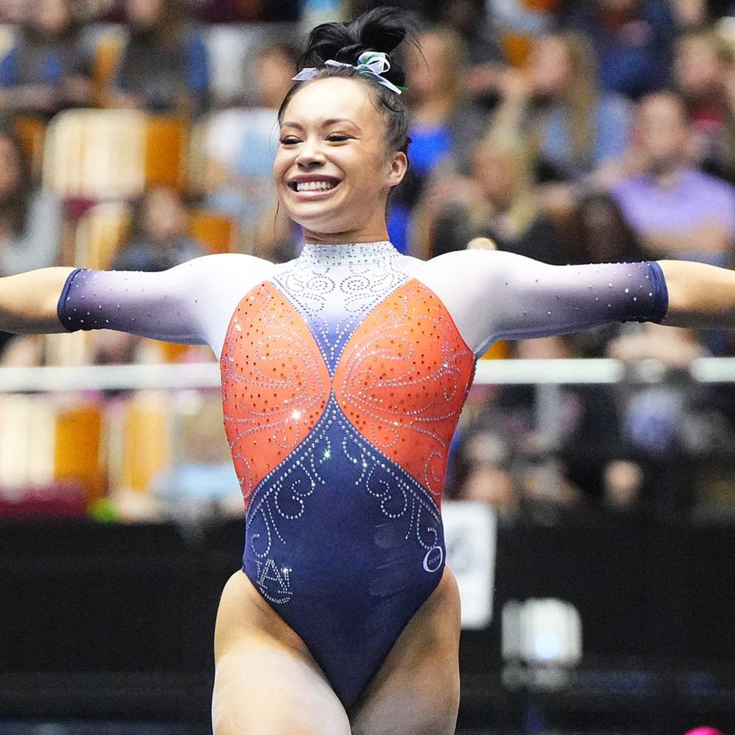
![2024-3-23 SEC Championship [Galaxy leo] (SEC)](https://auburnuniforms.com/wp-content/uploads/2024/03/2024-3-23-SEC-Championship-Galaxy-leo-SEC.png)
![2024-4-5 [Creed leo] (Melissa J. Perenson, Cal Sport Media)](https://auburnuniforms.com/wp-content/uploads/2024/04/2024-4-5-Creed-leo-Melissa-J.-Perenson-Cal-Sport-Media.png)
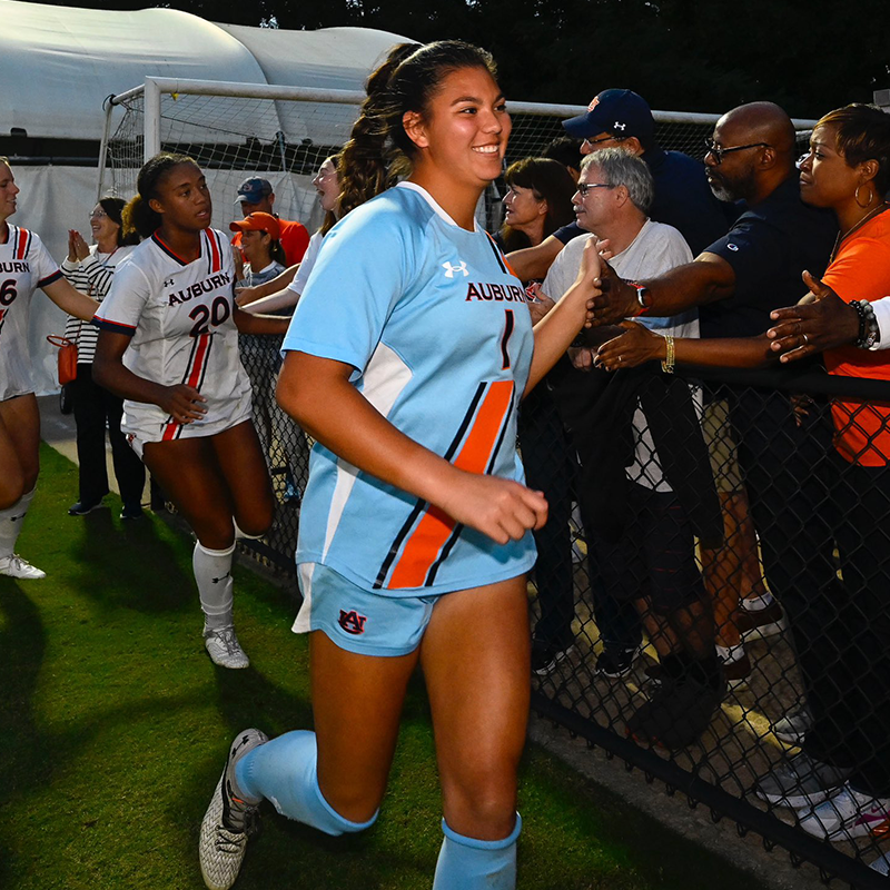
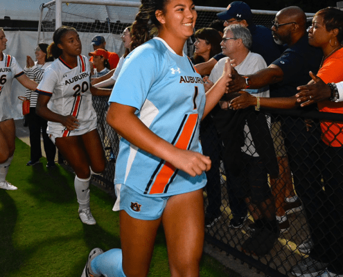
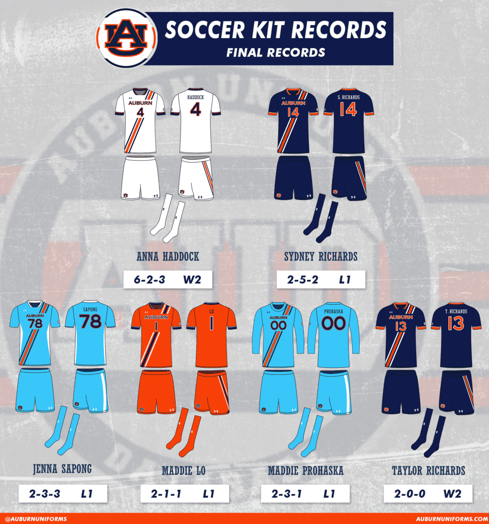
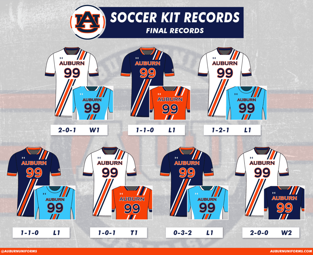
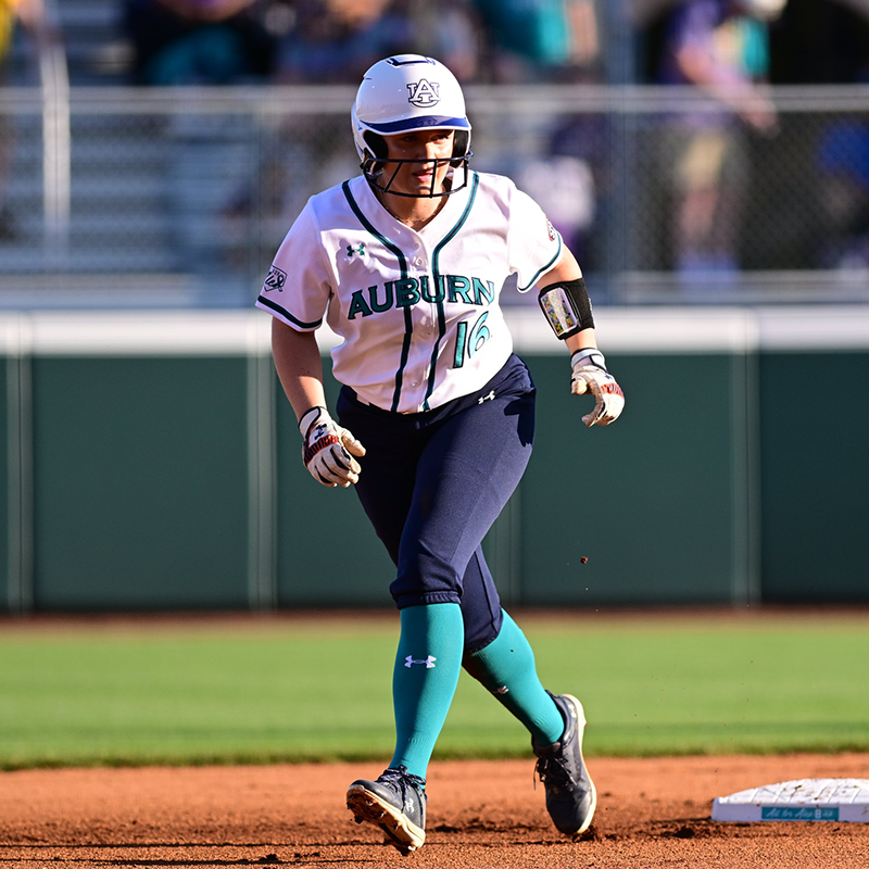
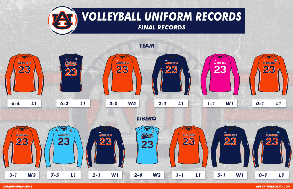
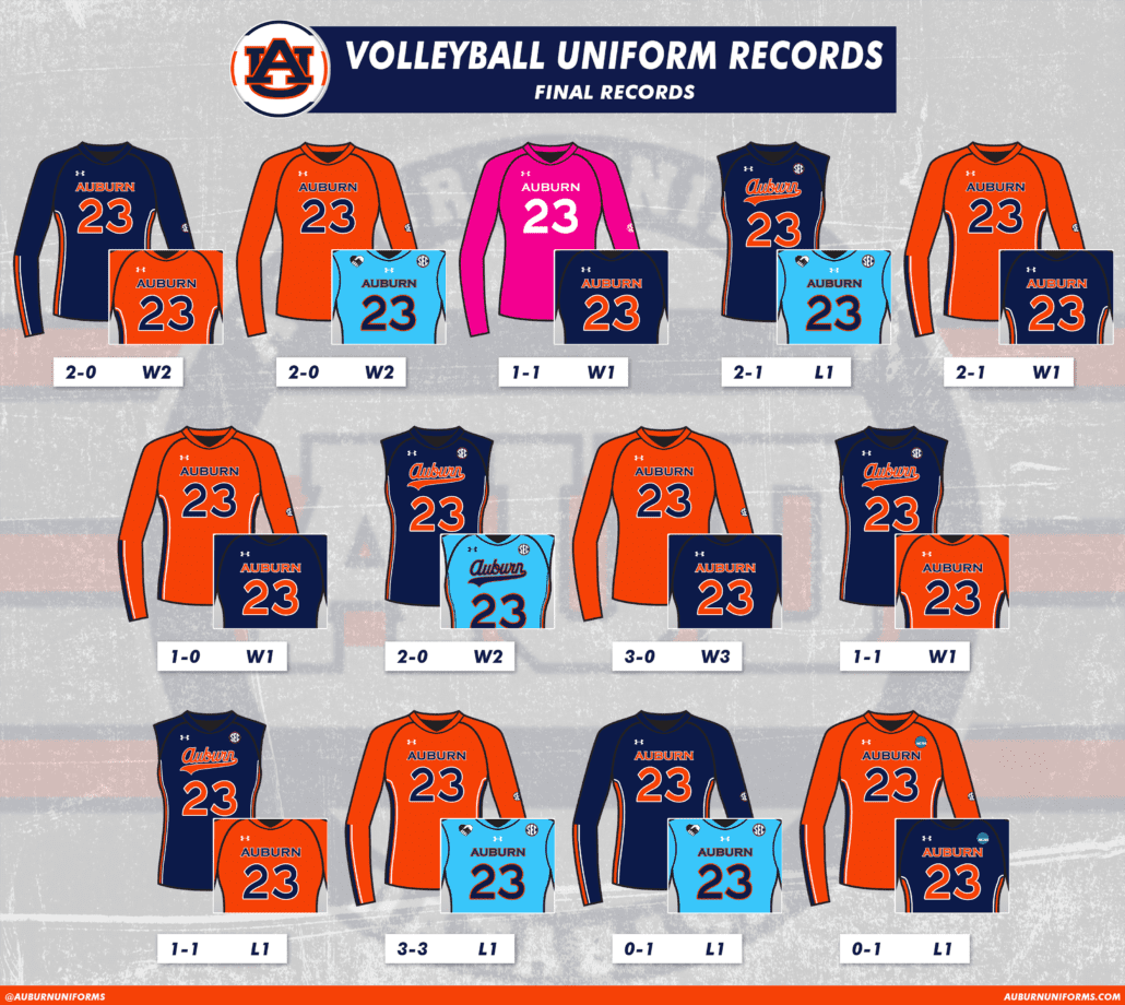
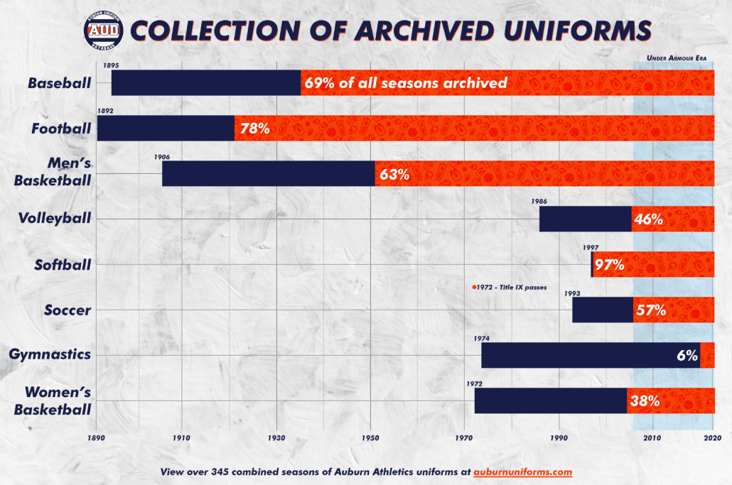
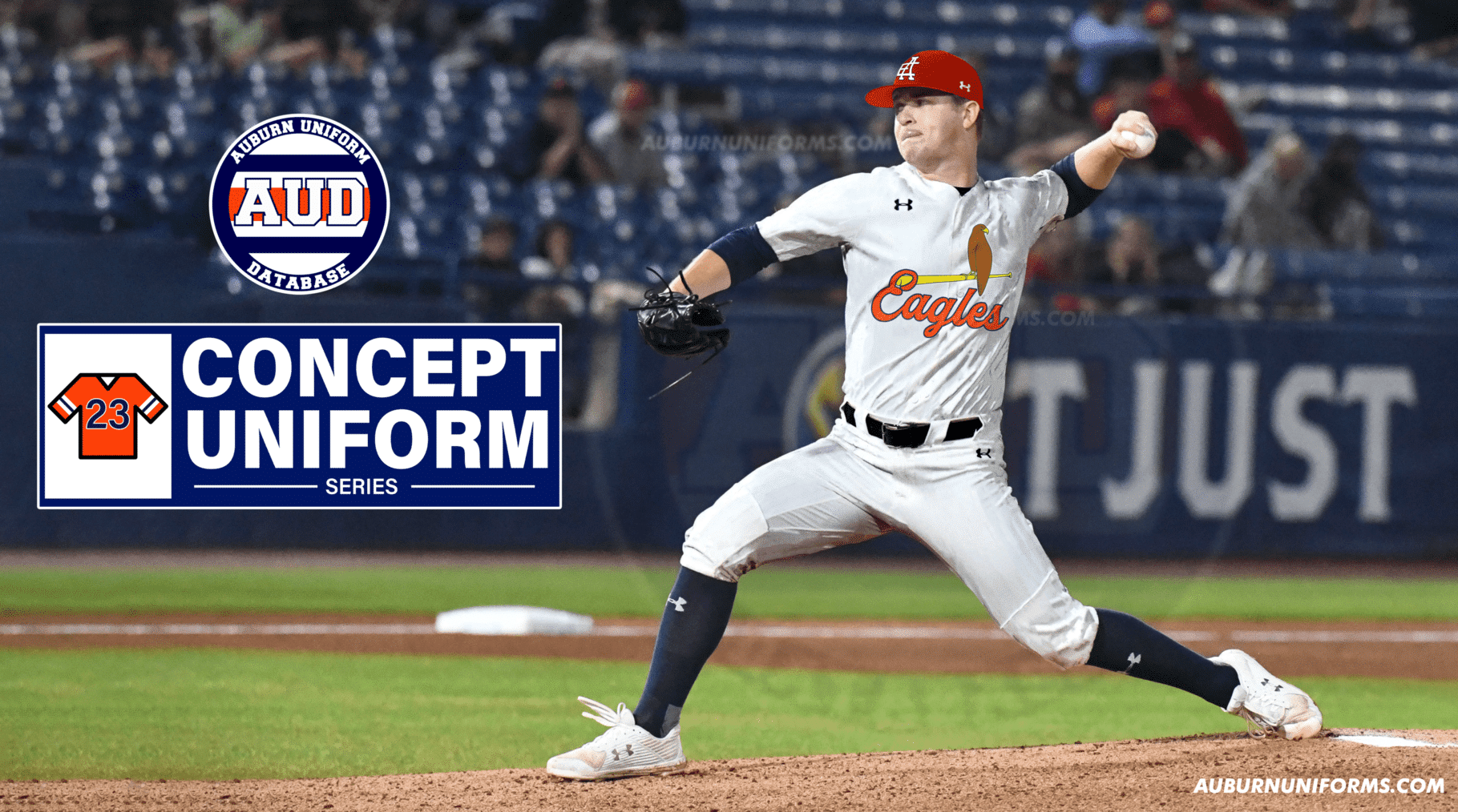
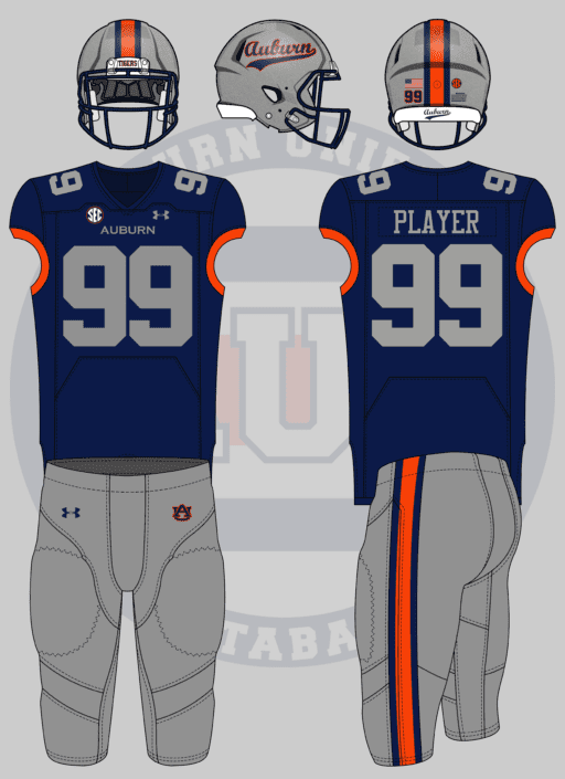
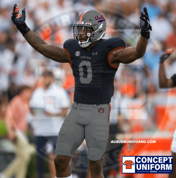
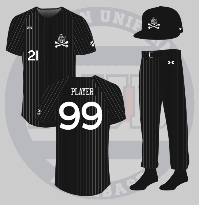
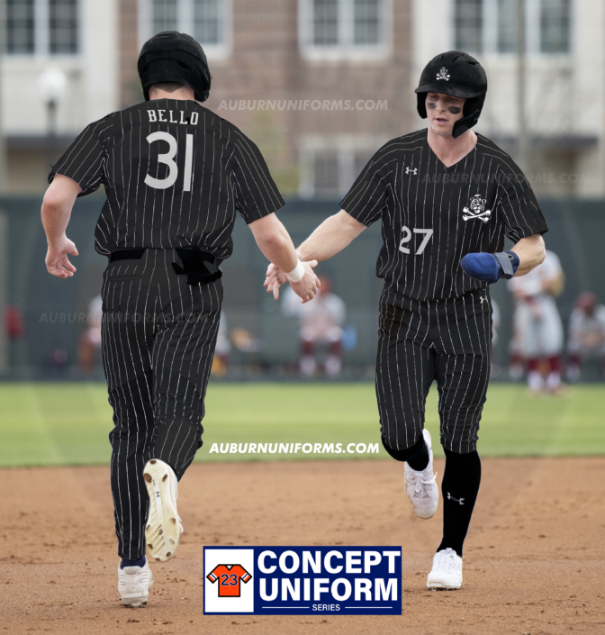
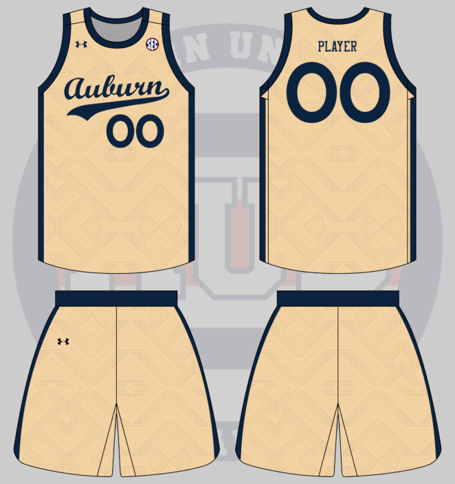
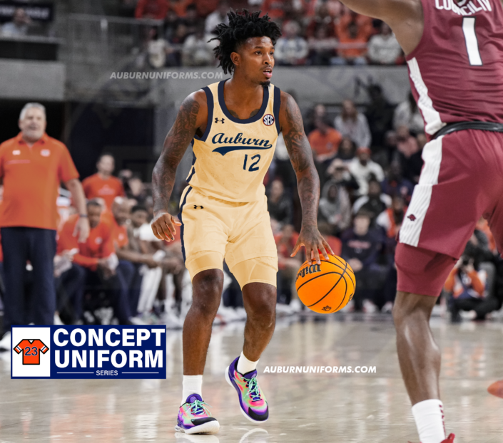
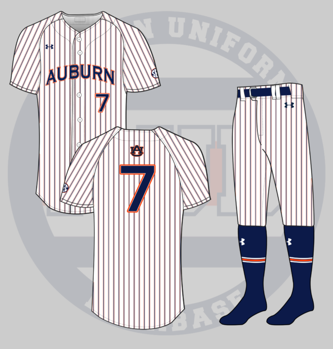
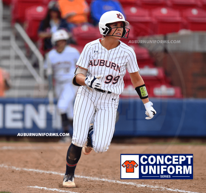
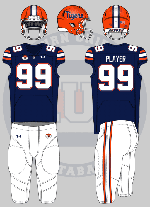
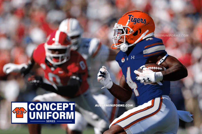
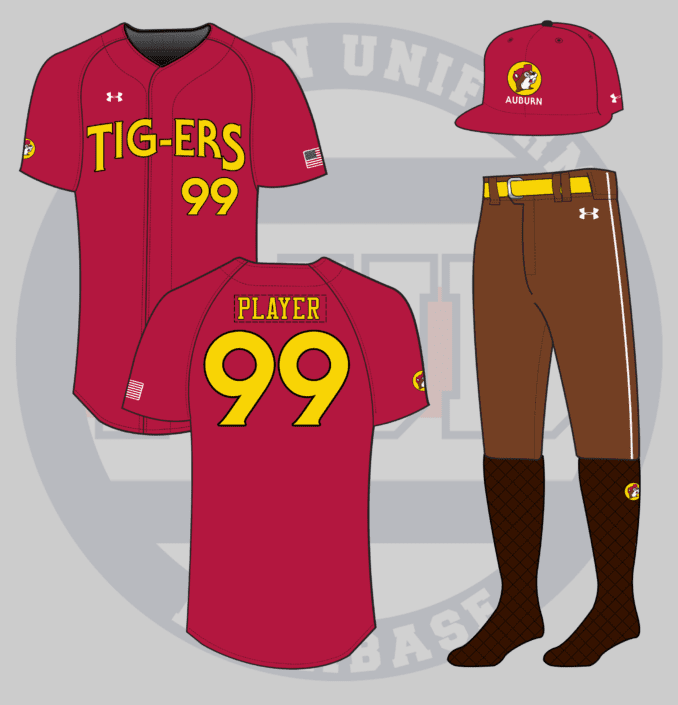
 .
.