A week ago was the report that Auburn University was officially changing the academic logo. A few days later, Jeremy Henderson of The War Eagle Reader (one of my favorite sites; could spend hours jumping down Auburn-related rabbit holes) posted a piece regarding the Auburn logo. In fact, the time that Auburn tried to change the logo entirely.
In case you skipped reading Jeremy’s piece, here’s the story. Back in 1995, Auburn University was looking to unify the school across the board under a single identity, a single logo. To accompany the changes, the University put out a call to the public to help redesign the school’s logo – the AU logo that had been prevalent for 40 or so years at this point. It’s no secret that this didn’t set well with fans and students and more.
 Then Auburn University president William Muse actually announced a unifying of the logos – a single, completely new logo – in February of 1995 on a Birmingham sports radio show, which was hosted by Doug Layton, the color commentator for Alabama football broadcasts. That, surprisingly, wasn’t the worst idea of this entire thing. The radio show and the Auburn University Relations department got “floods” of phone calls, according to the Auburn Plainsman. “A whirlwind of unhappy phone calls sent the University Relations seeking shelter,” the student newspaper wrote.
But it turns out that in the January 9, 1995 issue of the University’s newsletter requested input on potential new designs. According to The War Eagle Reader, Ninety-three people entered the contest. Most of them were students, faculty members, or former alums. Not a single one of them won the contest. The three judges chosen to determine the winner couldn’t make up their minds. You’ll see why in a bit.
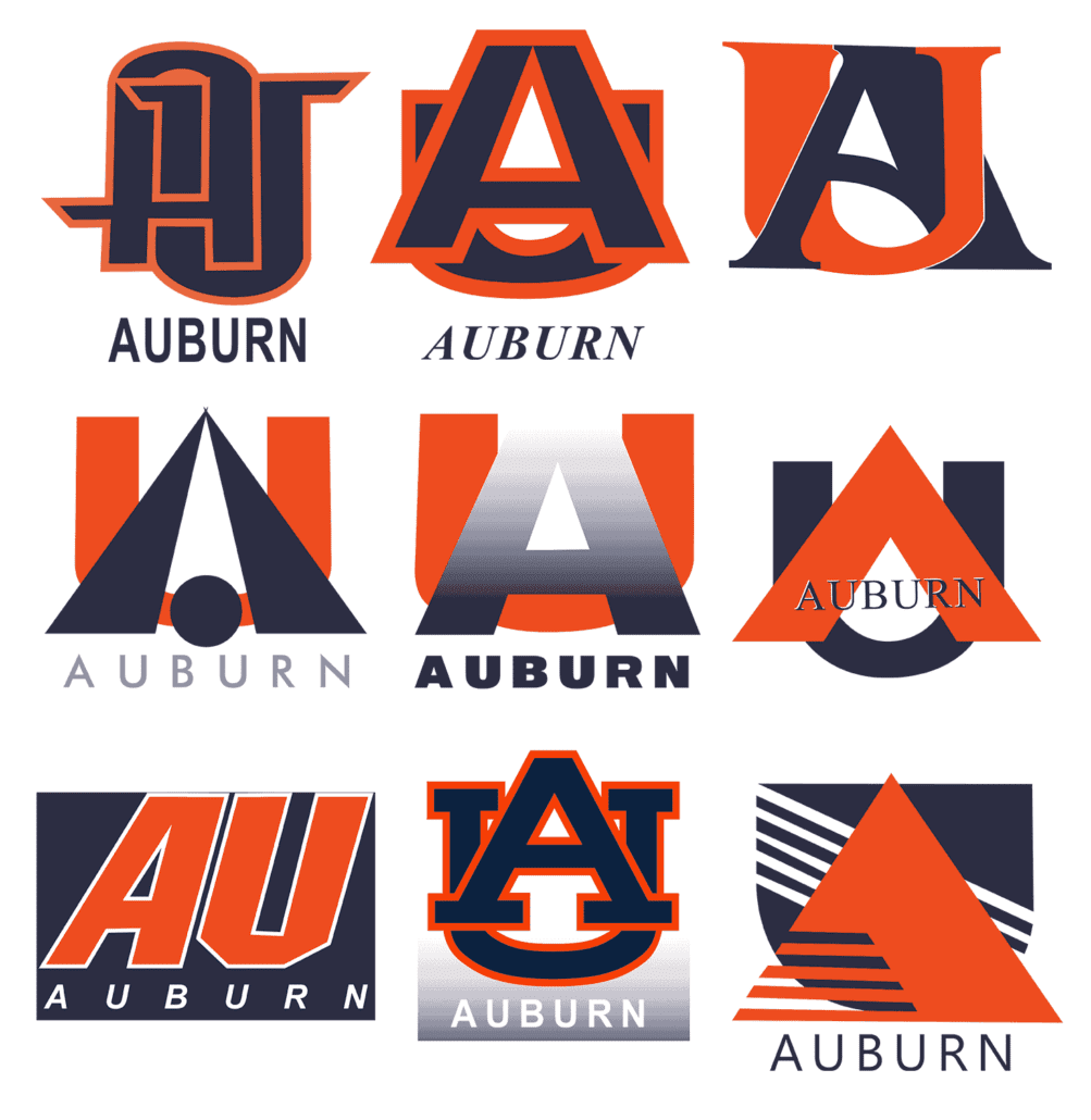
The following year, the University sent out pamphlets with designs for the general public to chose from. Two University faculty members, one a graphic design coordinator, the other an industrial design assistant professor, created forty-two logo variants for the voting. There’s actually only like 12 different designs, with each having numerous color variants and such.
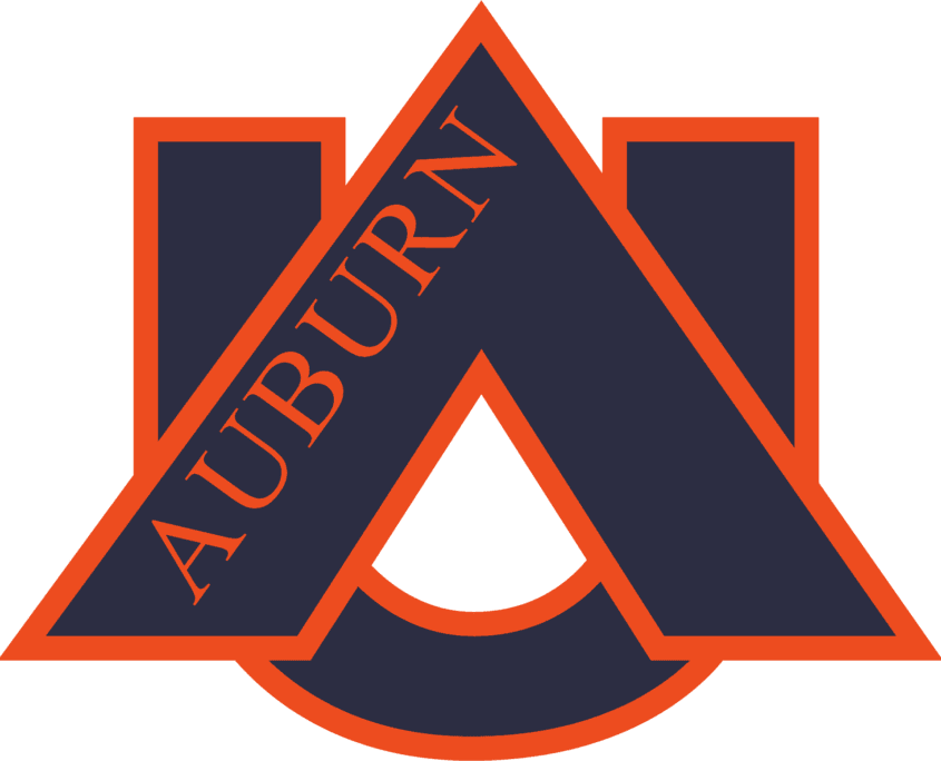
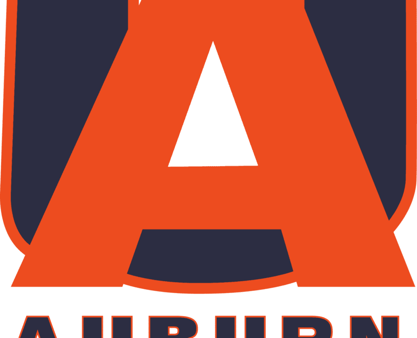
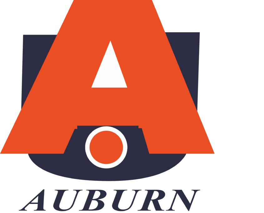
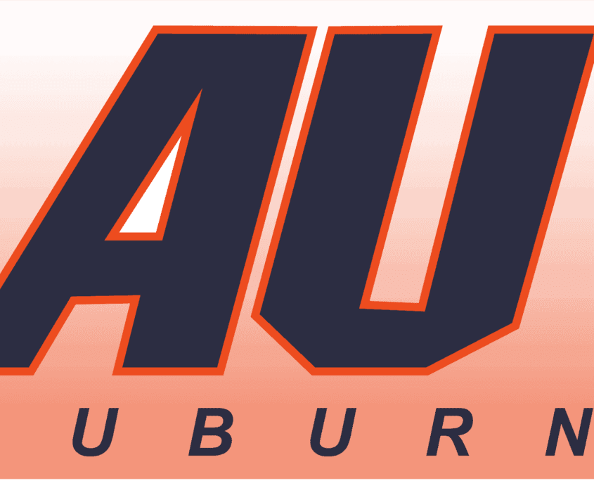
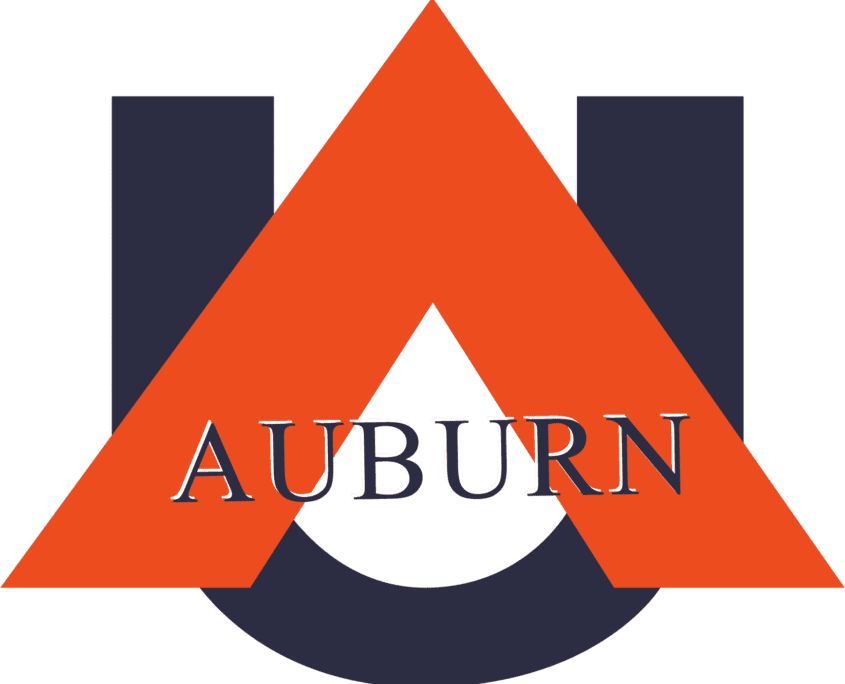
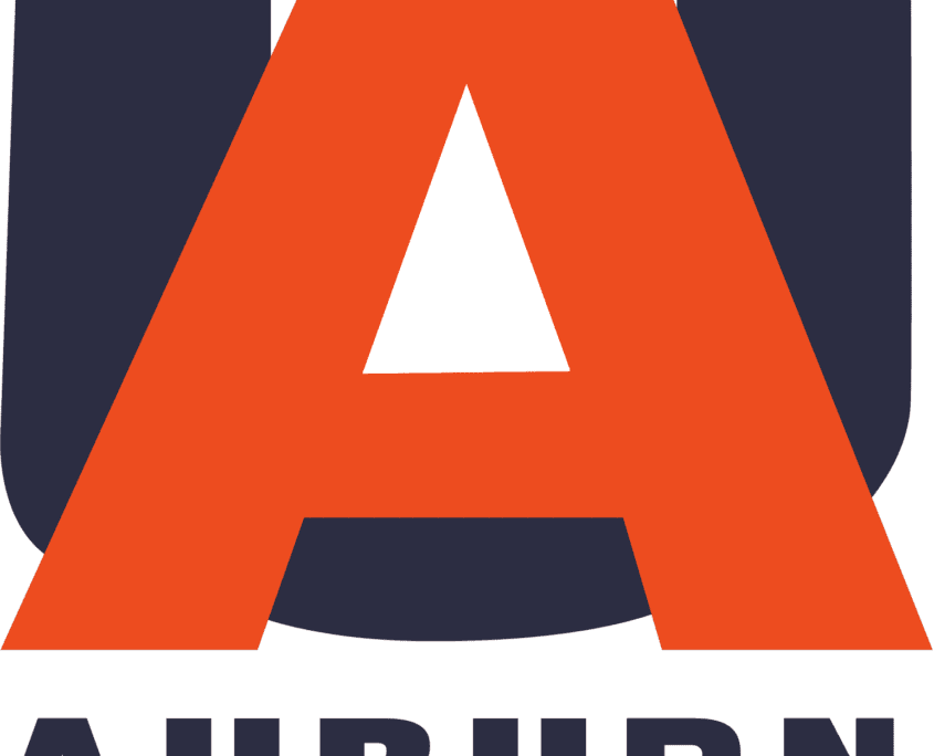
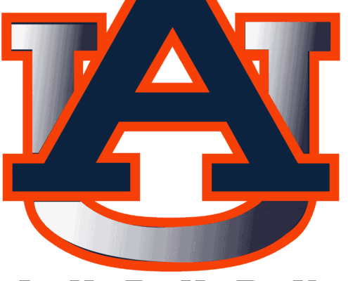
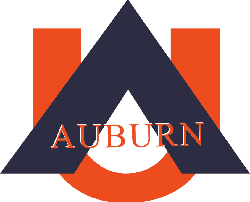
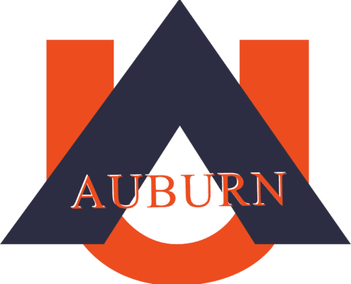
Jeremy found that original pamphlet and uploaded it for our viewing. I went ahead and traced each logo, and recreated the 42 different designs, so we could all get a better look at them. Most of the designs were rather bad. They looked like they had been put together on Microsoft Office 95. You could tell it was the 1990s with all the gradient uses and font choices. Here’s a look at each of the different logos:
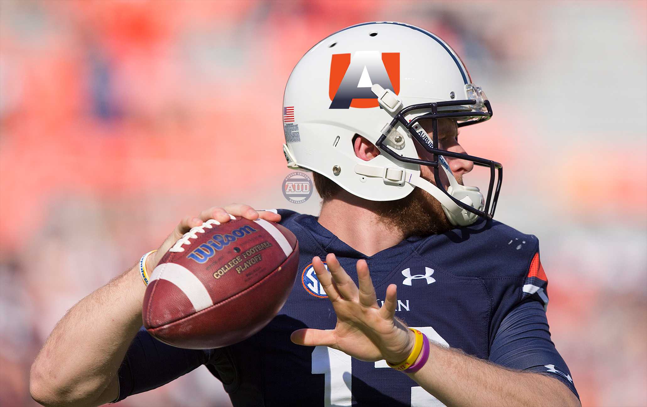
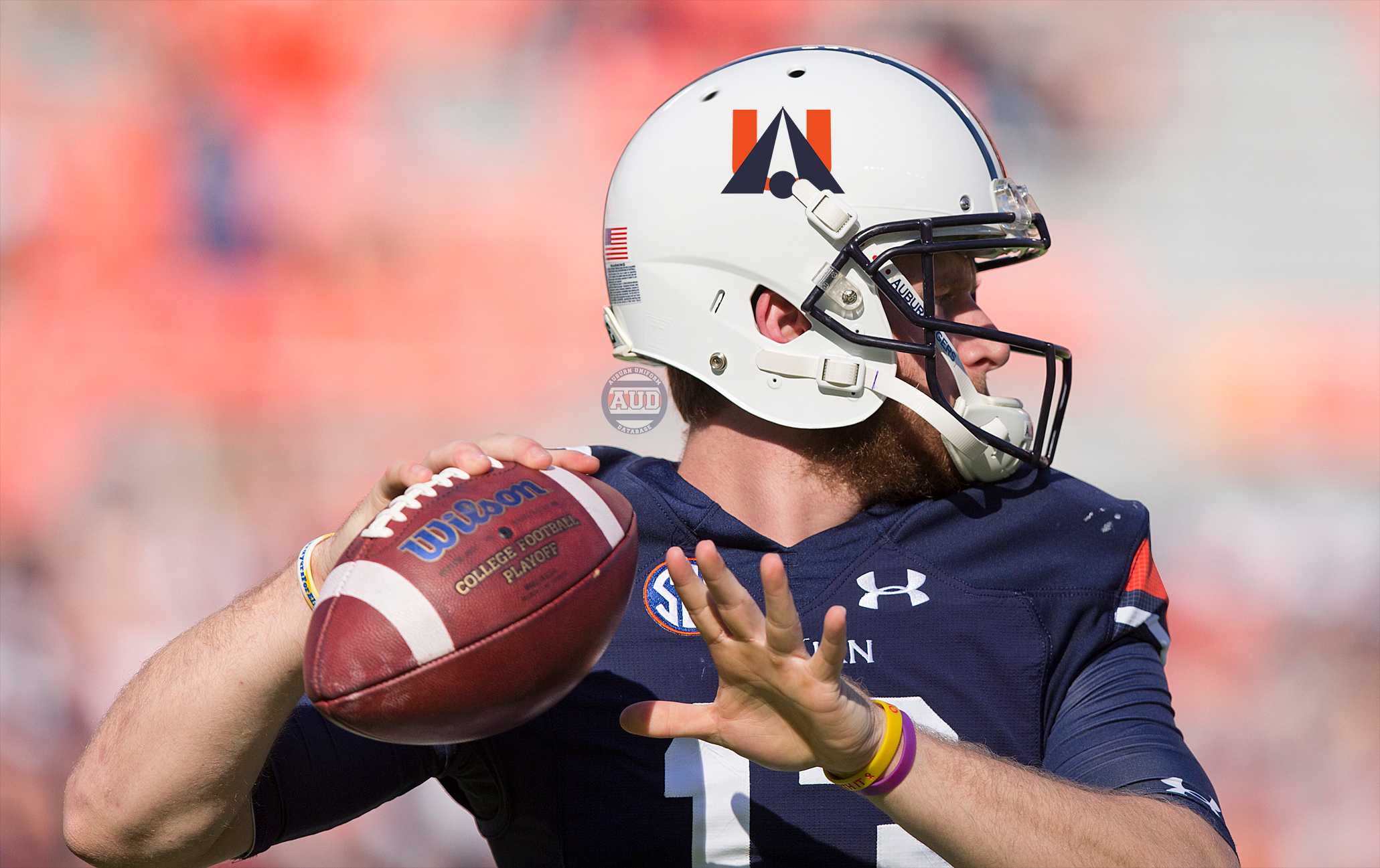
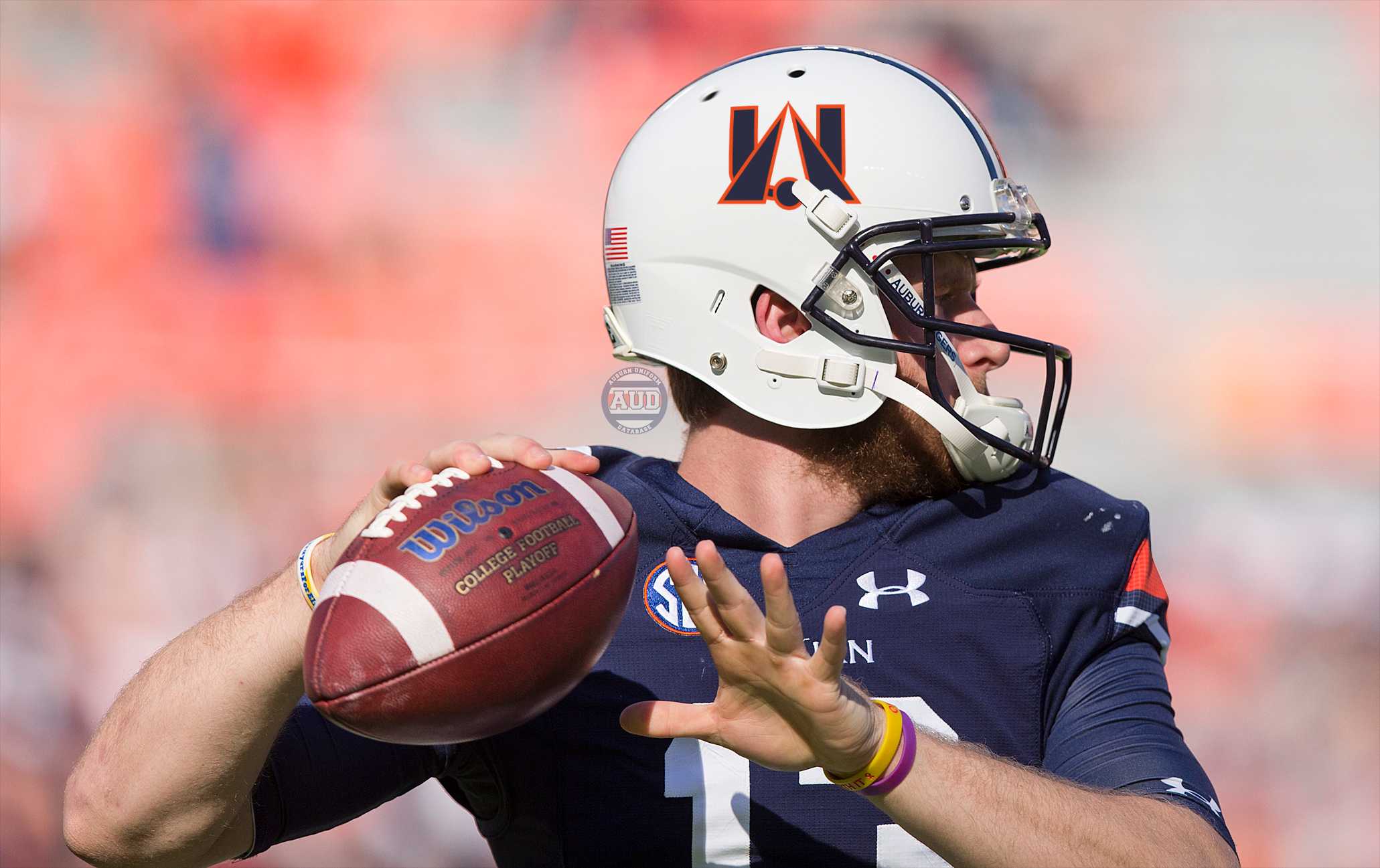
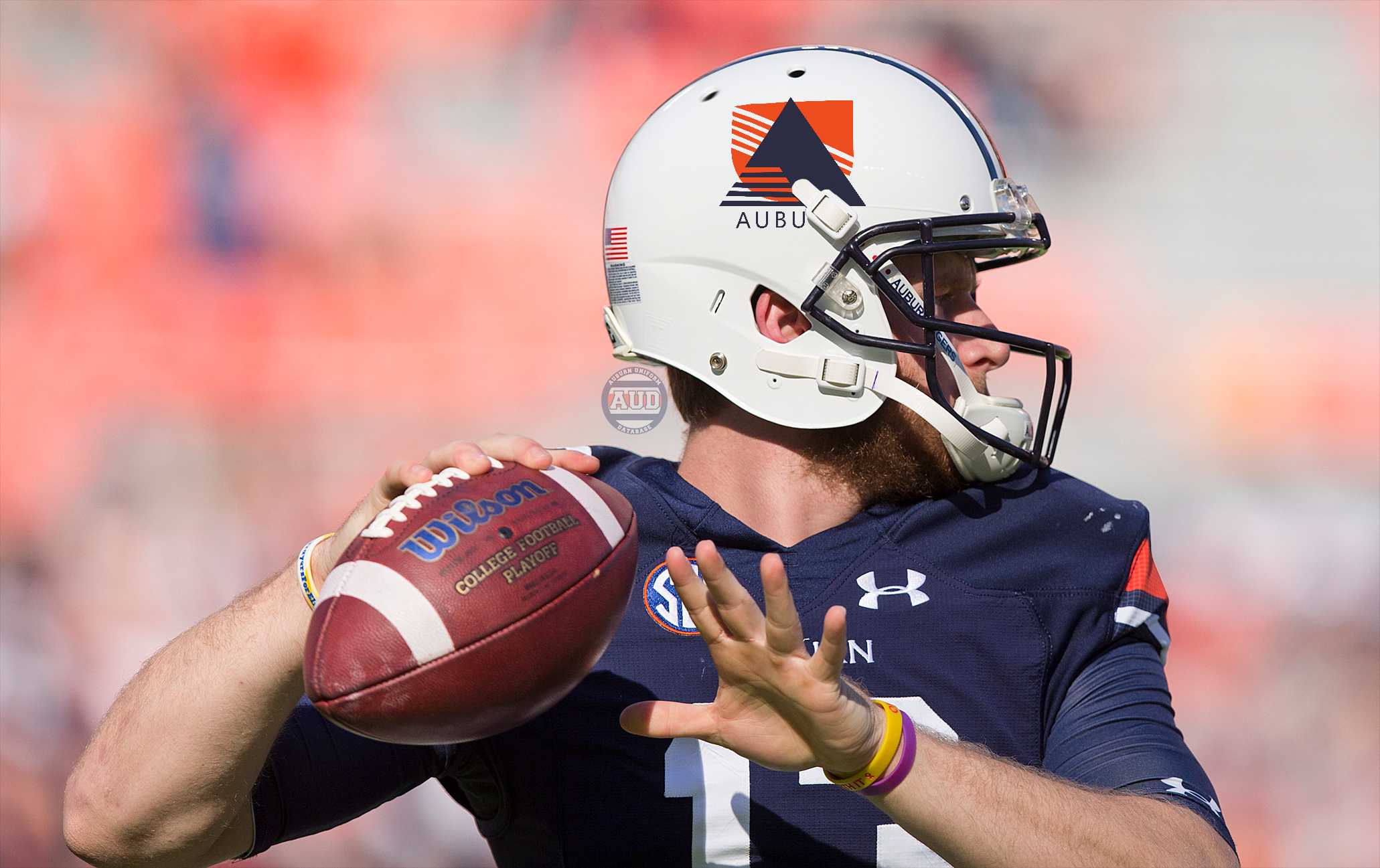
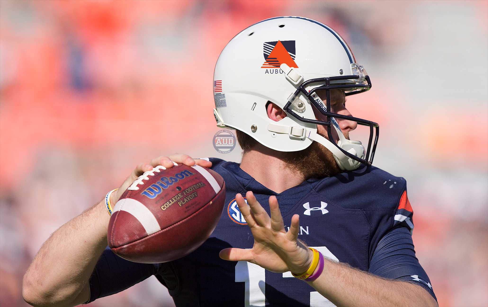
Not great, right? The best of them were simply minor adjustments to the pre-existing logo. Others were completely different. The design to the right looks more like an architectural rendering than a university logo.
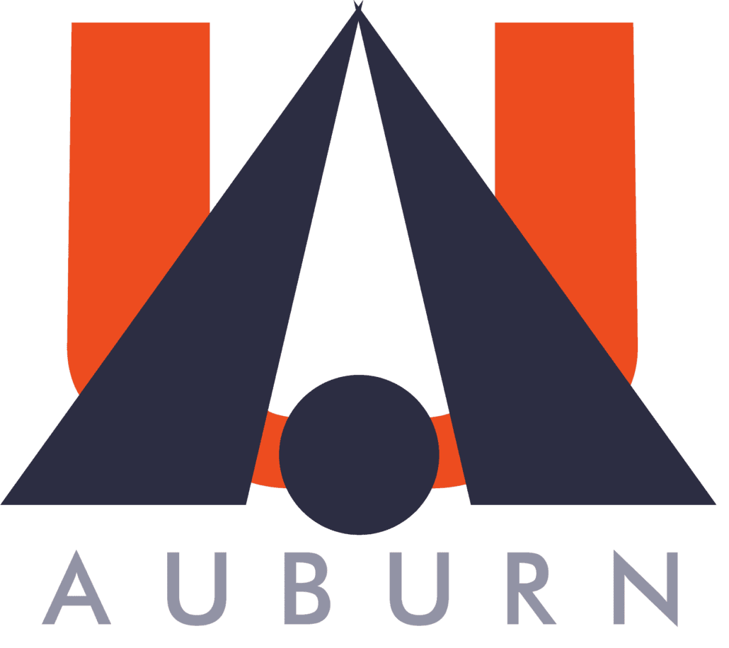 The entire gallery is fantastic to look at, just on the pure design elements and how dated they look now, and how dated they probably looked over 20 years ago. It’s also terrifying to think about what could have happened, had one of these actually been chosen. Had one of these potential designs been placed on the football helmets, the basketball court, or elsewhere in town or on campus. These designs aren’t the type of image you would expect to see the general student population wearing around campus (unless one was actually the true, official logo, that is).
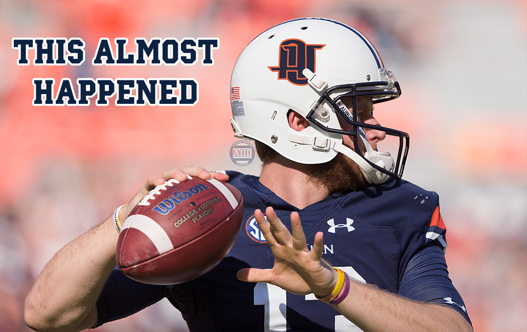
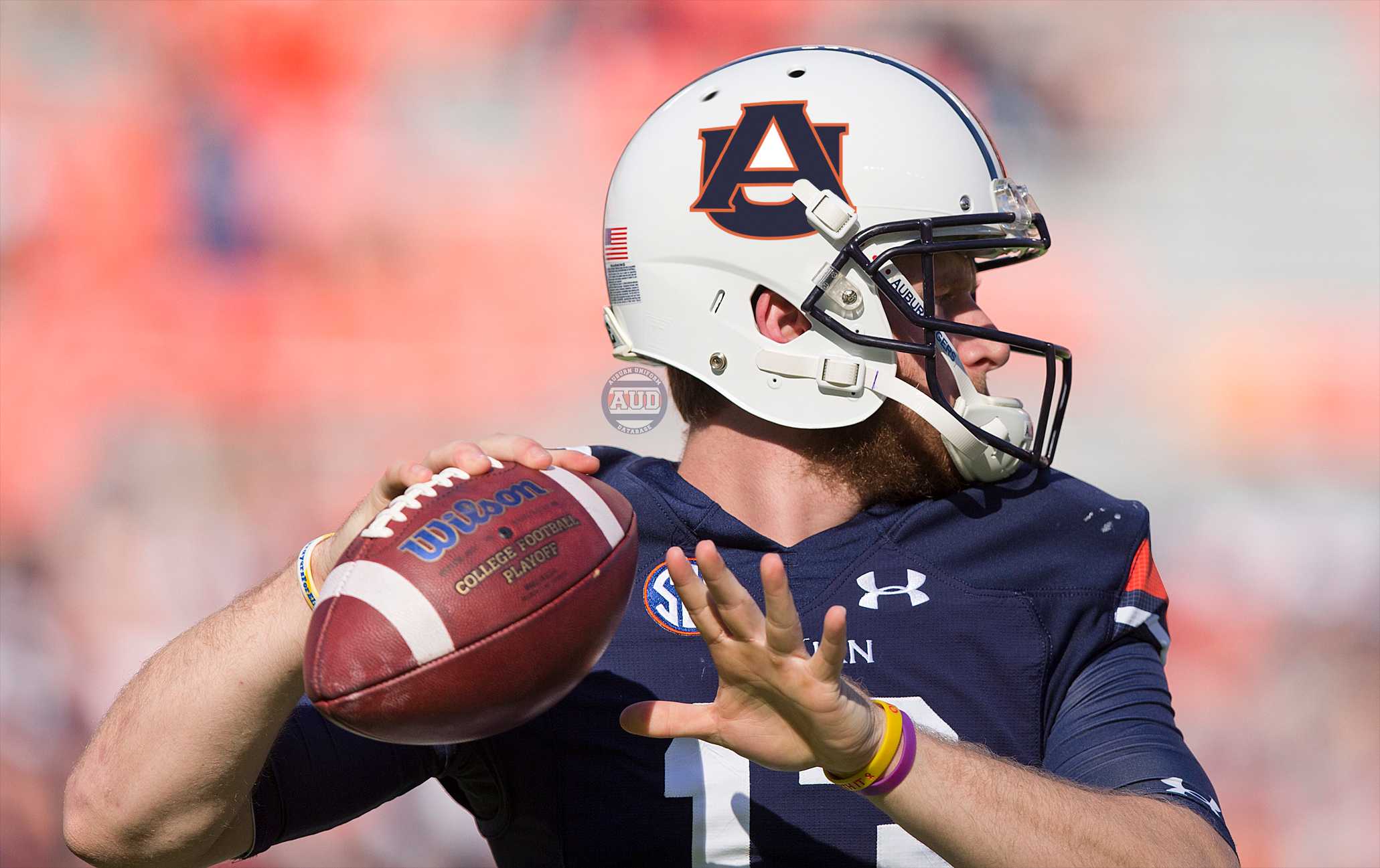
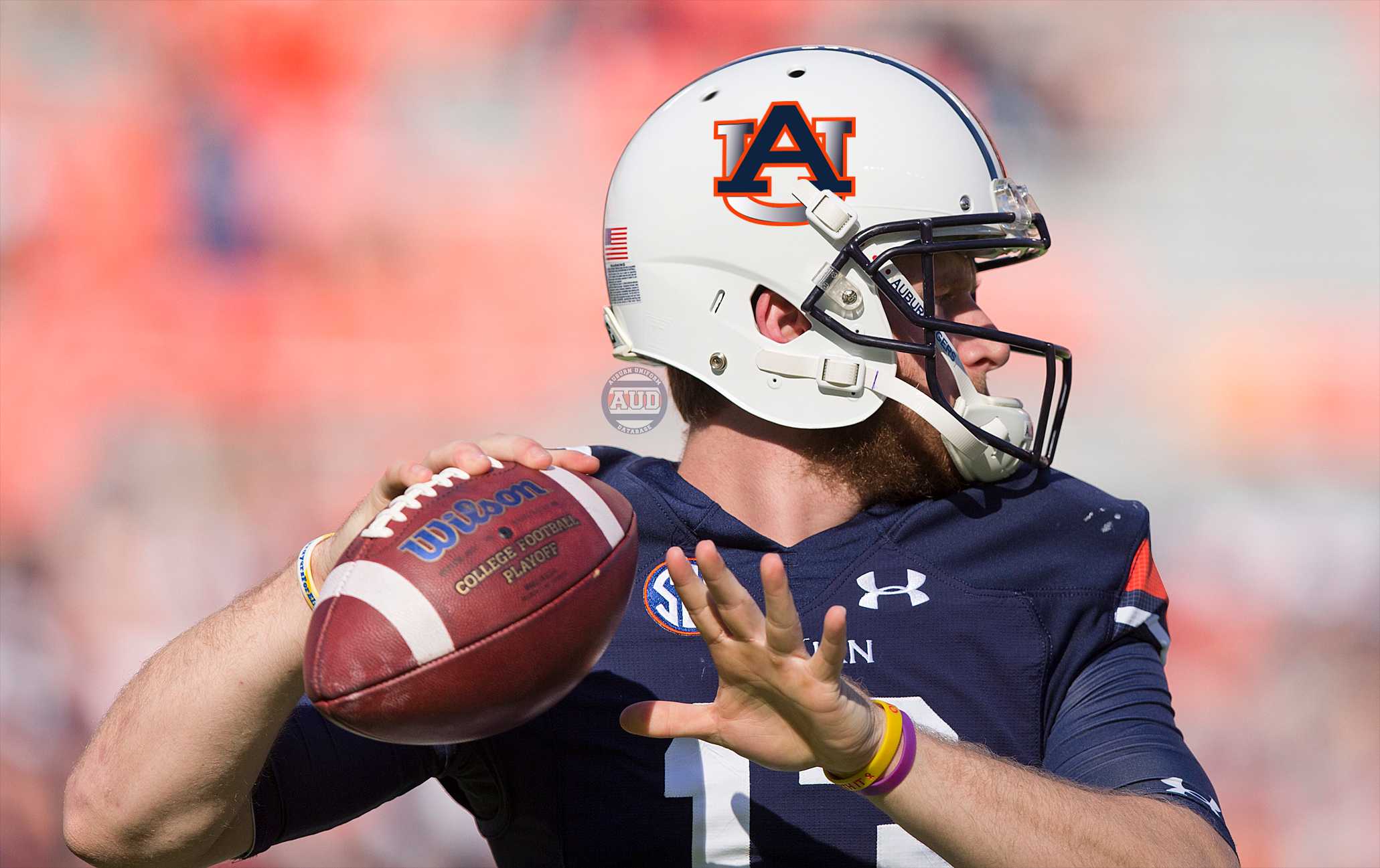
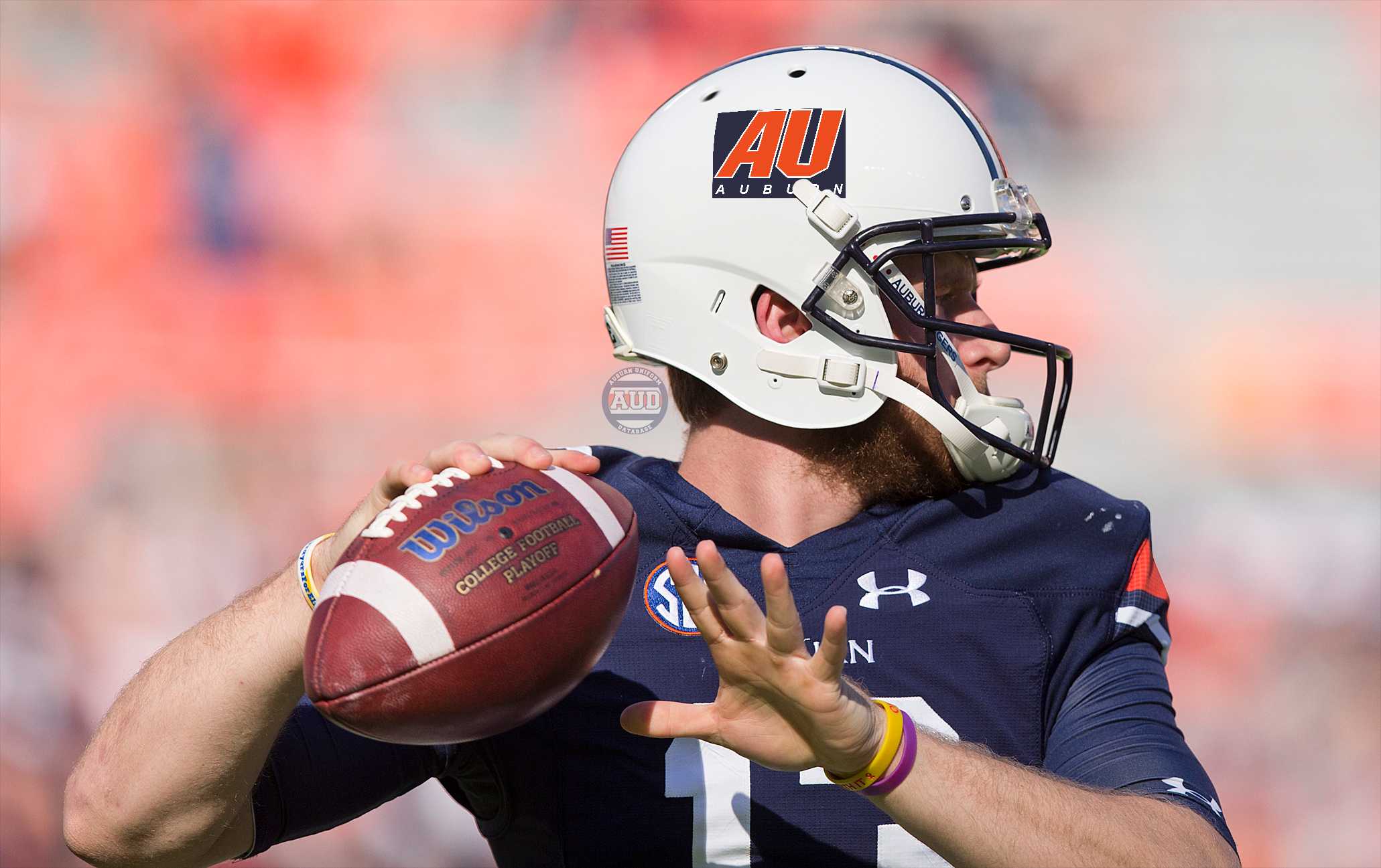
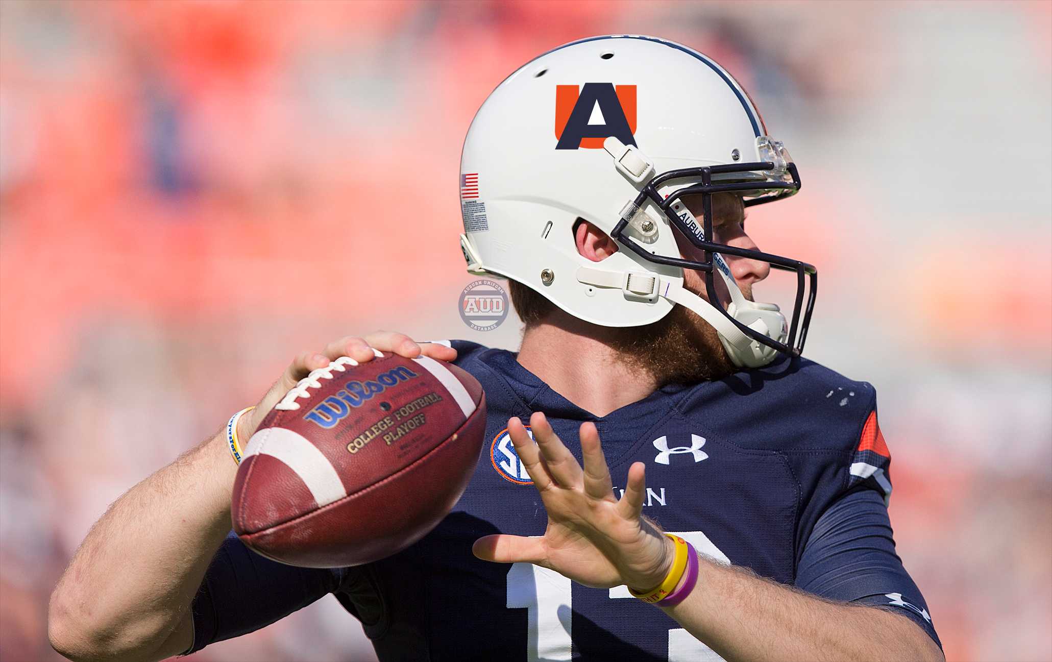
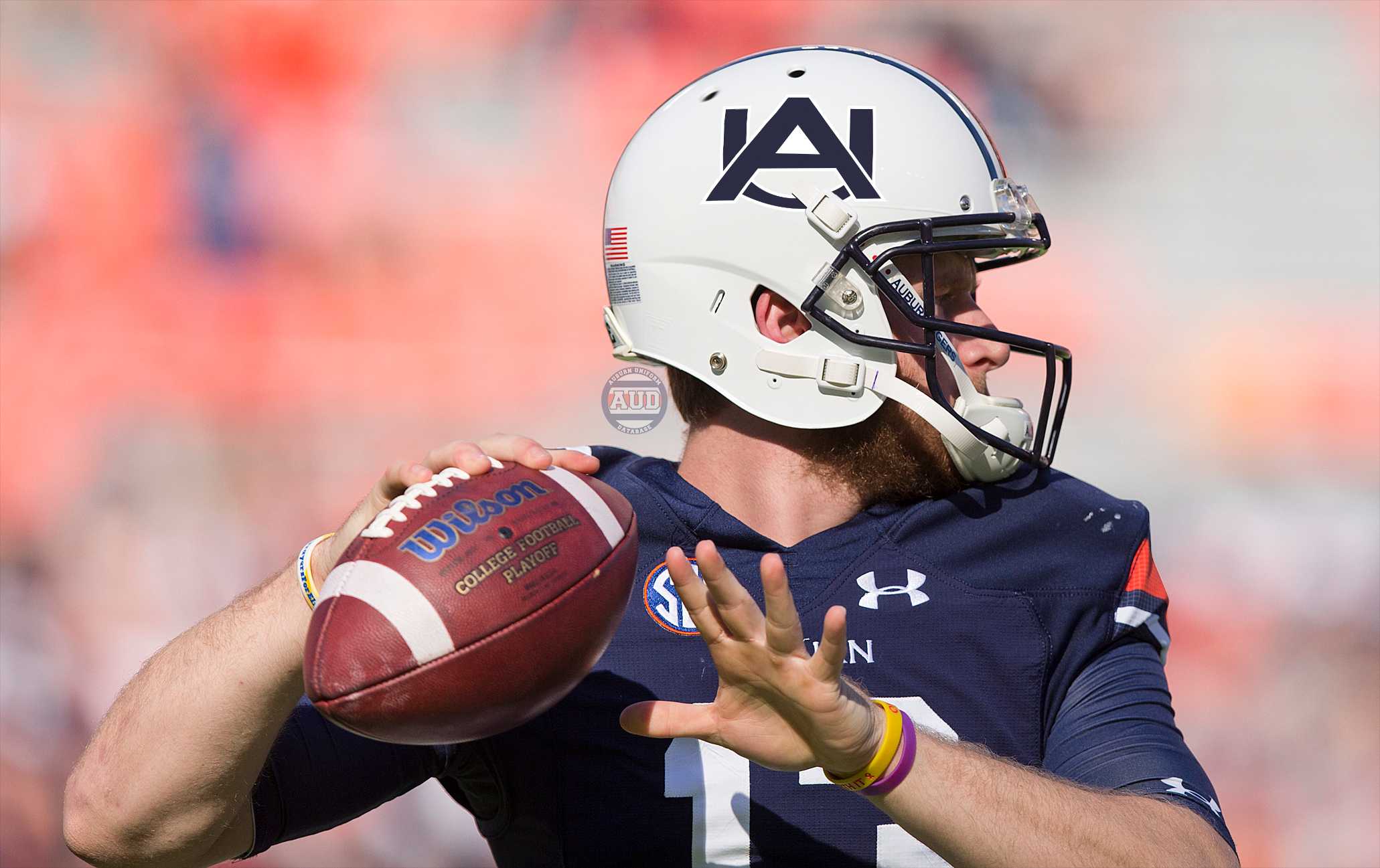
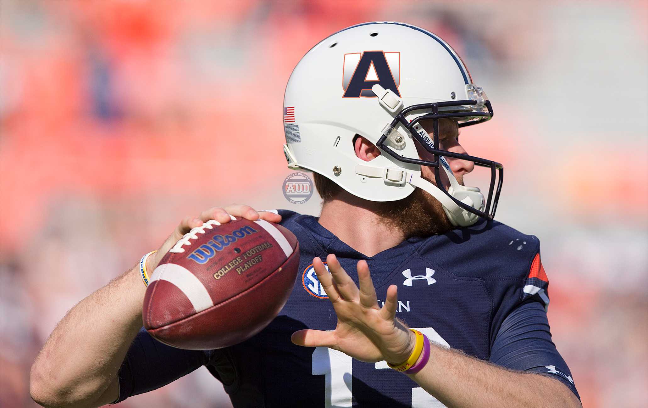
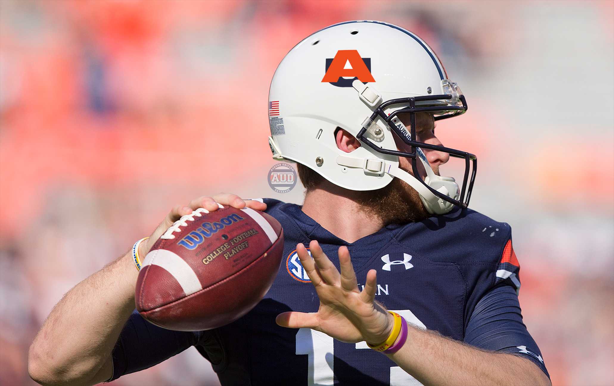
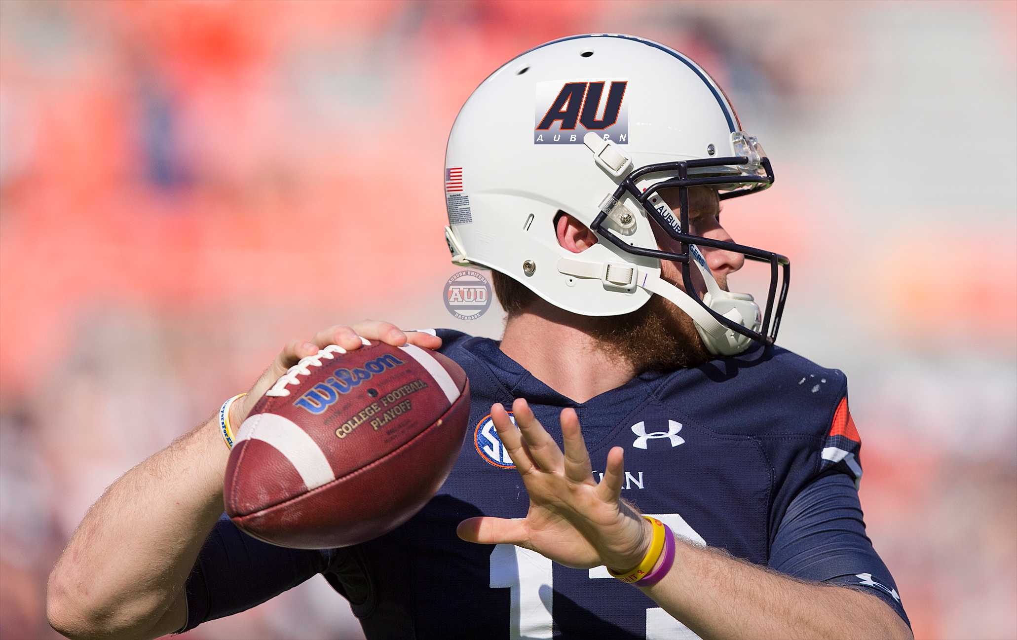
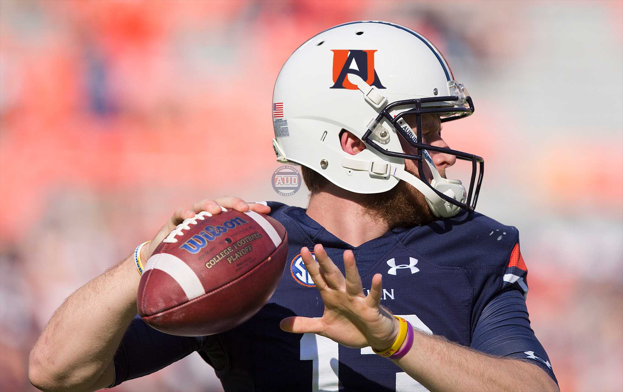
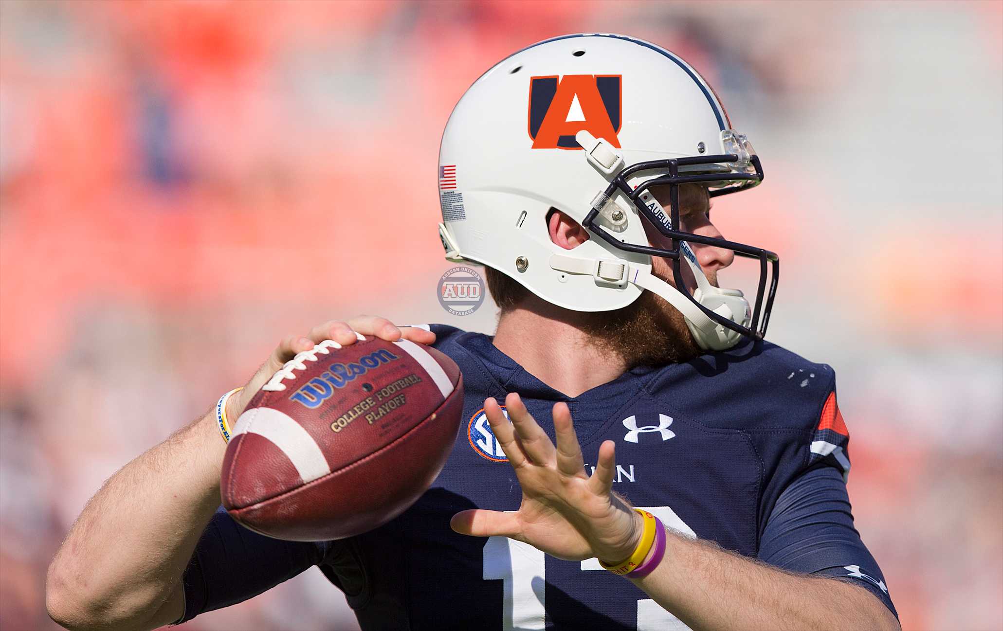
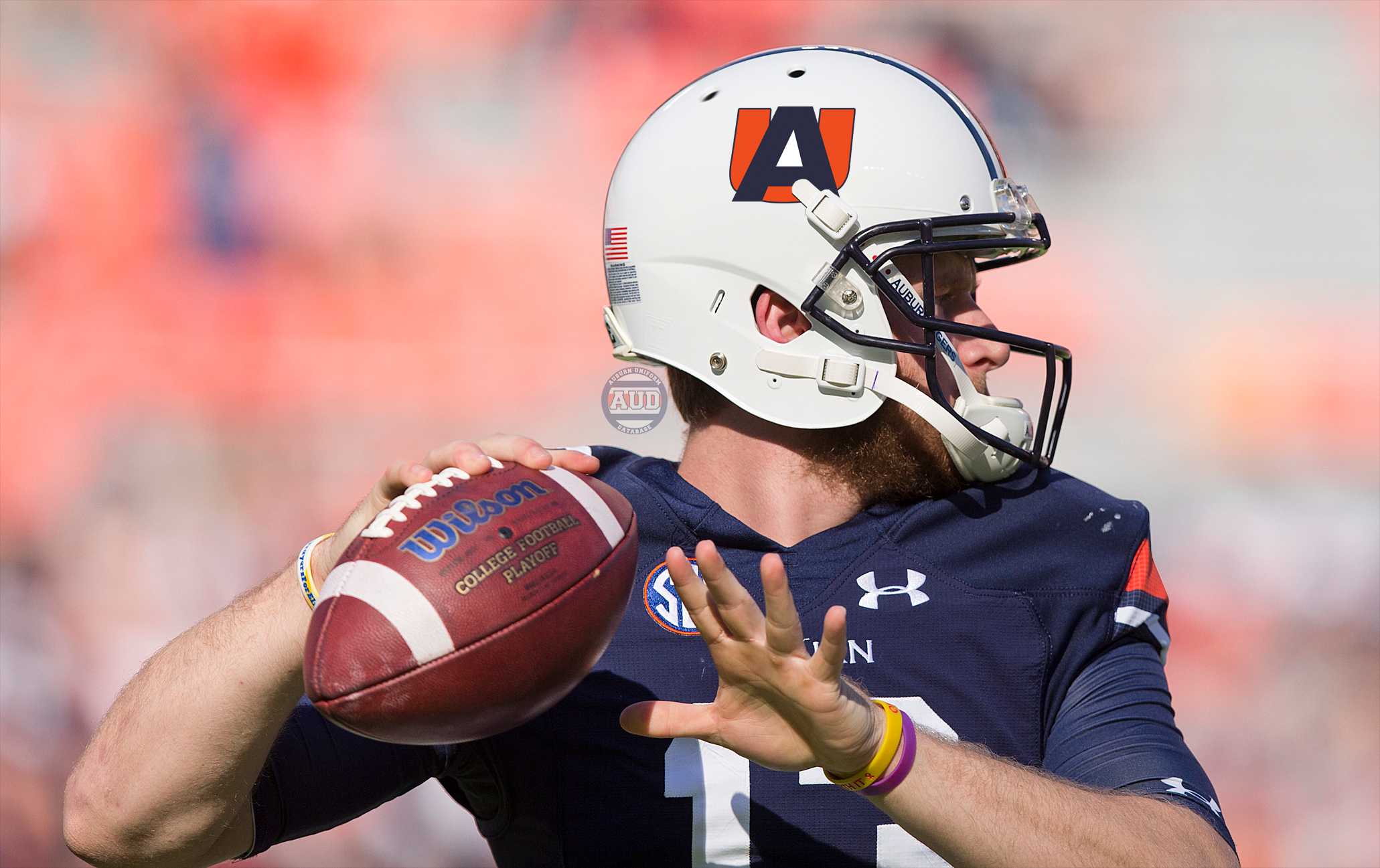
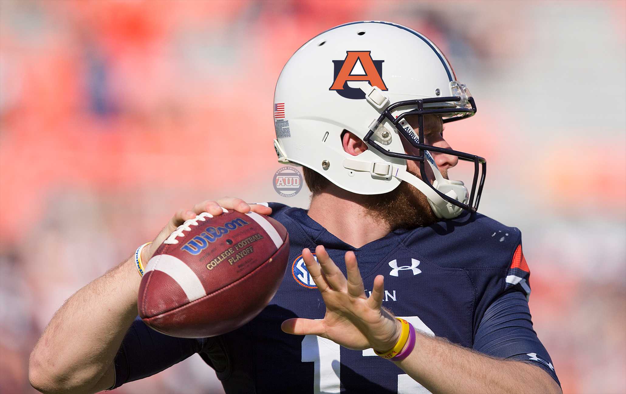
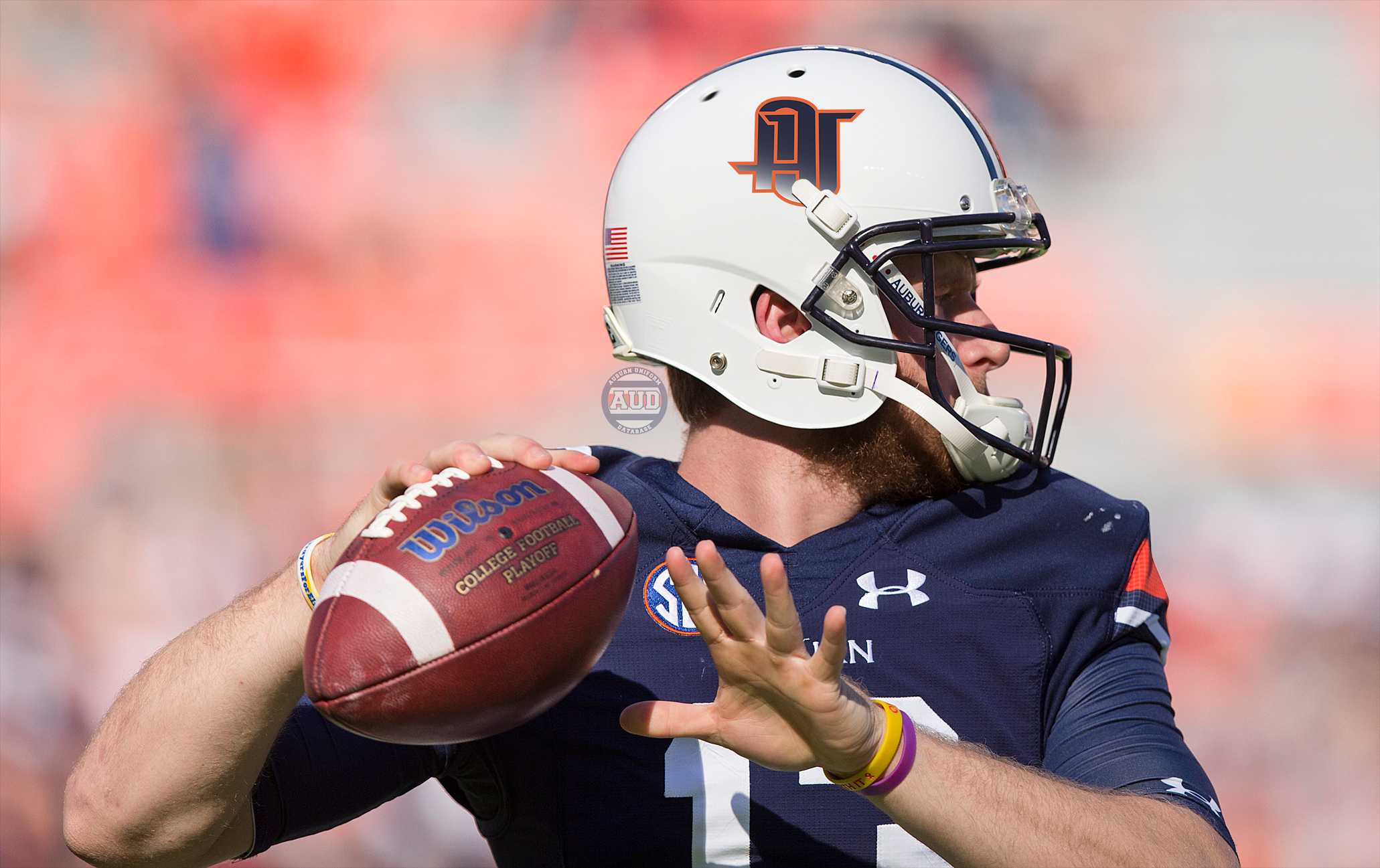
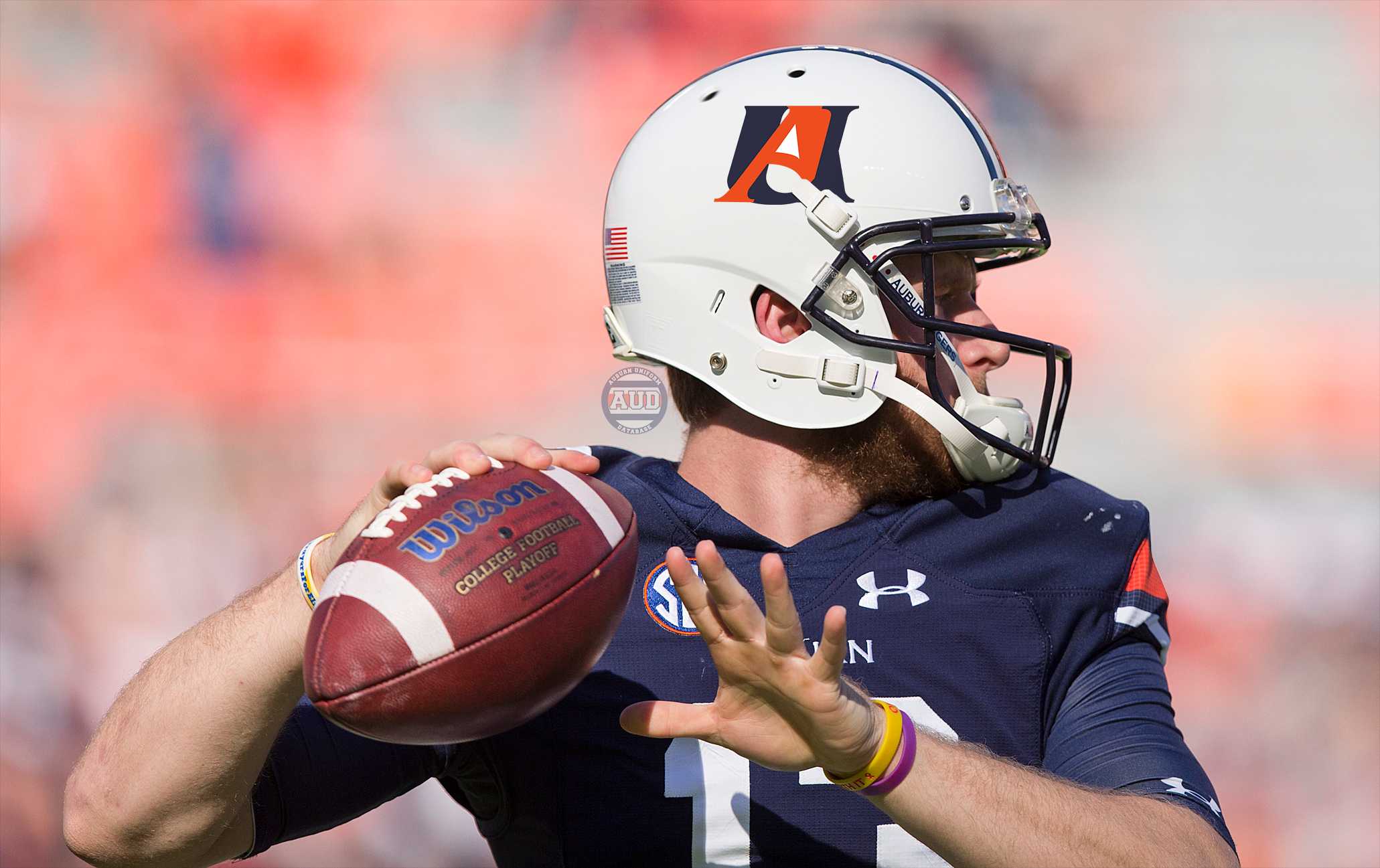
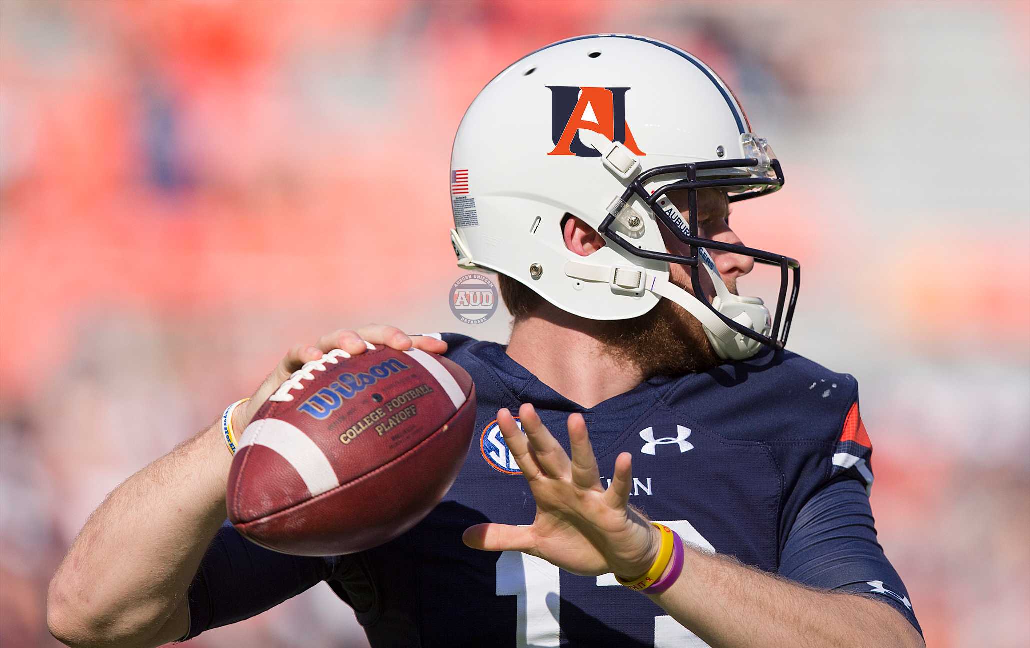
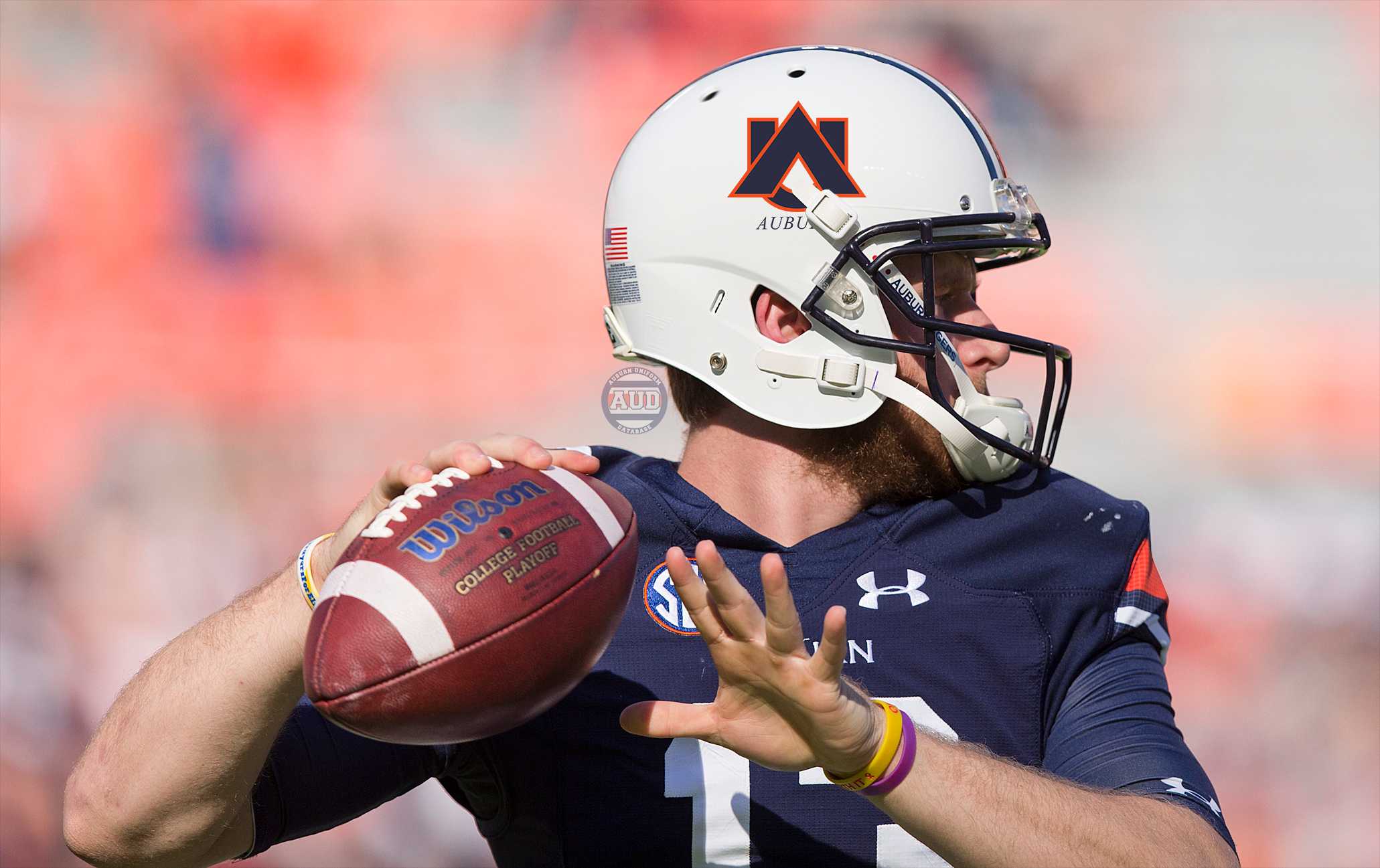
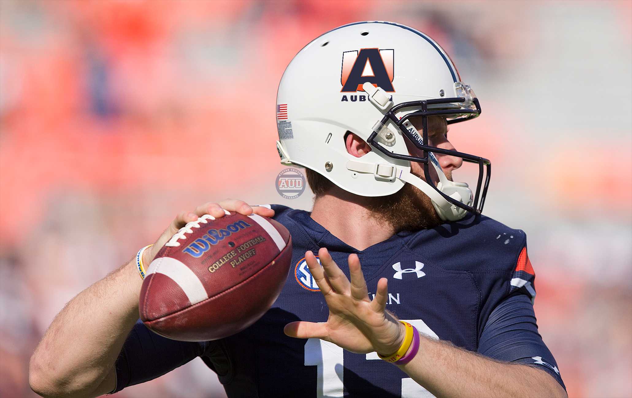
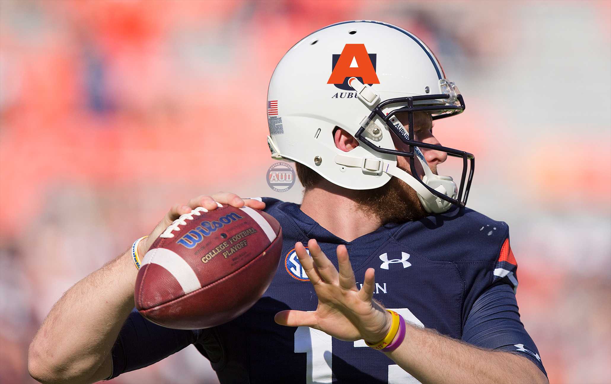
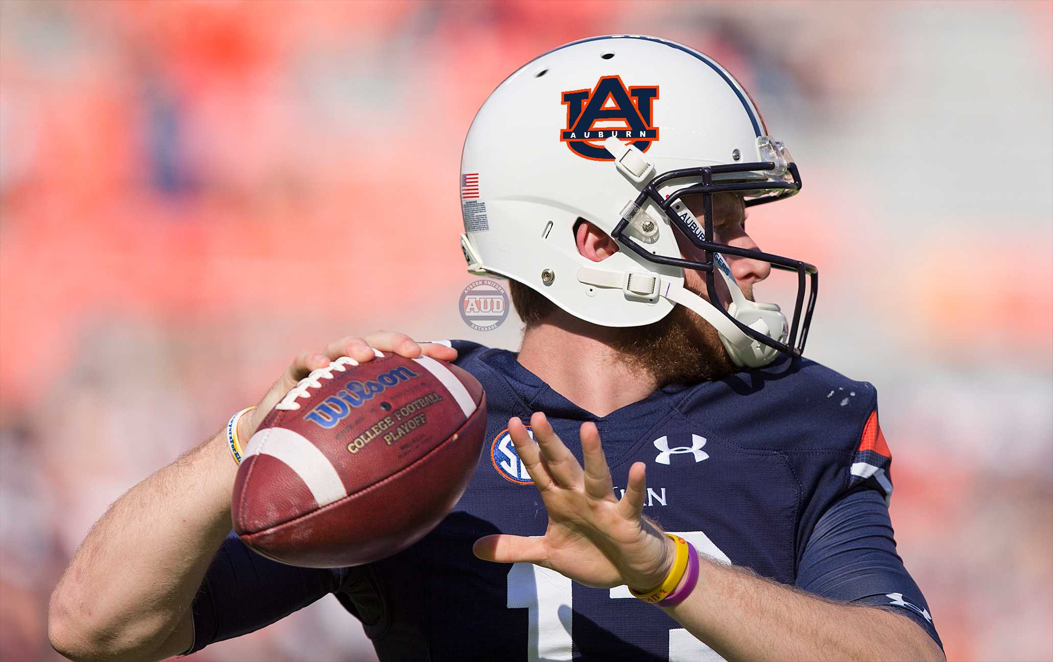
To better illustrate that fear, I placed each of the designs on a current day Auburn football helmet. I’m ashamed to admit that a few of the designs surprised me at how they looked on the helmet. Most of them, though, just cemented the idea that the AU logo should never be touched.
I know last week’s announcement of the death of the Samford Hall clock tower logo left many upset. But I think we can all agree that it’s a good thing these forty-two designs were left on the drawing board. It’s a shame that anyone ever wanted to change to AU logo, and I hope that no one ever does it again.
Enjoy uniforms and want to learn more? Be sure to follow the Auburn Uniform Database, like the AUD Facebook page, and follow me on Twitter for even more uniform news. Also, you can support this site by purchasing AUD t-shirts and other merchandise.
Featured image via Brynn Anderson, AP Images
Want to see more like this? Be sure to follow the Auburn Uniform Database on Facebook, Instagram, and Twitter for even more uniform news. For ways to support the AUD, including affiliate links to Fanatics and Dick’s Sporting Goods, visit the Support page.










































Wow, Clint, Auburn fans- and design fans- really dodged a bullet there. Those were some horrible ideas.
Thanks for sharing your research and presenting the info well.
Leave the design alone!!!!!!!!!!!!!!!
Auburn’s logo efforts suffers from logo identity strategy. In the modern scheme of things, two letters or a word mark does not necessarily make a powerful logo or an iconic brand.
Let’s face it, an Auburn Tigers logo literally needs stripes, teeth and tails! Again literally — certainly not figuratively. But it needs a professional design and branding strategy you often can not get from an in-house art department. Just ask Apple.
What I’m alluding to is a great university must seriously consider hiring a professional designer.
There’s a lot of good invested in Auburn’s word mark.
The solution should not just be how to arrange and stylize the ”AU” monogram. It should re-envision the team’s “AUBURN Tigers” brand. Auburn needs to change its stripes, grow some fangs, and leave room for considerable swagger with a tail.,
No Eugene, no.
#32, 21, and 14 look pretty cool on the helmet though