With three more weeks until the National Championship Game, I think it’s a bit early to post a uniform preview for that game yet. I’ll post that with about a week or so until the game. This week I want to showcase many of the concepts out there that people want Auburn to adopt. As you can assume, there are a lot of people that want to do something different with Auburn’s uniforms, whether it be for a single game or to completely overhaul the uniforms. Some of these that will shown aren’t the worst thing that could happen. Others, well, you’ll see.
*NOTE* I am not here saying I want Auburn to change. I am not endorsing any of these ideas. This is just to showcase people’s ideas. Their opinions and ideas are theirs alone, not mine.
This post will consist of many pictures in-line and then a few will be hyperlinked. I will credit those designers that I have info about and will do my best to link to their sites.
The first set of concepts will be from a
Chris Creamer’s SportsLogos.Net (a very interesting site if you want to waste a few hours) commenter that goes by the name
“bigmike”. Mike, what I’m going to call him since I think it’s safe to assume that is his real name, is apparently an Alabama fan. But that’s ok, since he has created concepts for his own team. And his artwork and ideas are amazing. Go check him out and look at his work. It’s exceptional.
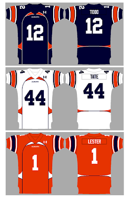
Mike actually has two sets here. He created the first one in 2010, and posted them on the site not long before the National Championship Game. This first set is a lot more radical than his second. With this set, Mike decided to add piping, a number outline that contrast the uniform color, a contrasting collar with more piping coming off the collar creating some odd mini-triangle effect, and adding the classic “eye of the tiger” logo on the collar. Mike also made the pants striping match up with the rest of the uniform (more on that
here).
As far as these go, they aren’t bad. But just not for Auburn (which you’ll hear that a lot from me). When it comes to someone trying to mock up new uniforms, I appreciate good art work with good reasoning. On the
forum where Mike posted these, he does explain his reasoning, and I respect that. He also created a mock up of the All-Blue look that was rumored about in 2010.
For Mike’s
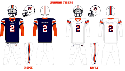
second set, he went a little more classic and just “updating”. These don’t consist of anything more than shoulder piping, which I think highlights that second stitching line (read about that
here) and would help the casual fan understand why the shoulder stripes are truncated.
Again, Mike makes the striping pattern consistent throughout the uniforms. I do like that he is using the “eye of the tiger” logo (which I think was retired by Auburn?). IF Auburn were do something different, out of all the concepts I’ve gathered in preparation for this post, this is the one I would like to see. But just check out Mike’s orange “Tiger Theme” uniform based off of that logo. Very Cincinnati Bengals like…
Umm…Wow…No thanks…
This next set was posted on the
same site by a user named “fnz”, and these are…well…busy. That’s all I say about these…
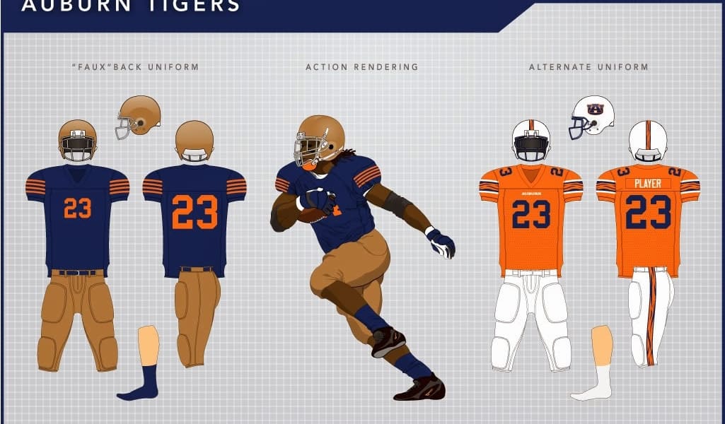
The next set comes from Bowen Hobbs, and he has apparently been spending time completely renovating a lot of teams. I really enjoy the attention to detail Bowen used, in that he not only has uniform mock ups, but has “in action” views of them, and has a cover sheet per-say with the logo(s) and typography/wordmarks on them. Makes it more of a complete project. For his Auburn set, he adjusted the AU logo slightly, which looks a little like the early AU logos, and also created a secondary “tiger stripe” logo. Both of these are unique, but don’t touch the AU. Just sayin…
As you can see, Bowen added the “tiger stripe” motif into the stripes, which I think is a unique concept. One of my favorite things about his set is that he added in a “fauxback” (fake throwback) uniform complete with the leathery colored helmet and pants.
I don’t think these are as faux as he thinks. Auburn wore a very similar
uniform in 1913.
One of the most famous conceptors is
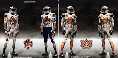
Charles Sollars. He was even featured in two posts done by WarBlogle. He has created so many different sets, nearly concepting every single team from the NFL, NBA, MLB, and a ton of college teams. He has so many Auburn concepts that I won’t be able to show but a few here. Just remember, Charles creates very few uniforms that would be considered to really hit the field. He creates more of what I call “the hell with it” concepts that are very out there. You’ll see if you check out his site. My favorite of his are similar to this one. He has a good dozen based of this look, and I like the ones with the socks consisting of the same striping as the shoulders and base layer
Just look at how crazy some of his uniforms can be.
And some of his helmet designs.
In 2009, a website called AuburnTron designed some very high school-ish uniforms using EA Sports’ Team Builder website. Talk about busy. More of these are on the site, but I’ll only post one.

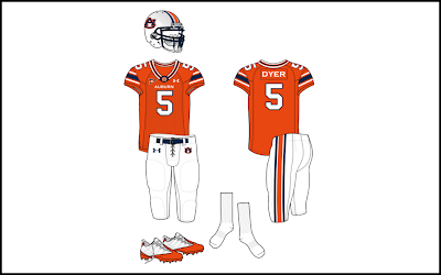
These next pictures are what I see as the most plausible for Auburn to change to if they were ever to change. These come from SportsLogo.com user “Brave-Bird 08”. He seems to be into concepting uniforms that would be likely to hit the field. I’m not a fan of the collar design, but everything else isn’t too terrible. Other than the collar, the only thing different is the pant stripe matching, which is common as you can see. Also, the orange uniforms are pretty much what we would see if the old ones were made for a current uniform.
We all know that in 2010, when Auburn hosted Clemson, the game was the first “True Blue” game. Now, a TON of people were claiming that Auburn would come out in a full blue uniforms. The talks got extremely hot after this picture surfaced (I’m not aloud to say anything about that). Ever since then, people have been Photoshopping and designing “true blue” uniforms. One of the most popular Photoshop jobs is this picture.

And that about does it. I know this was a longer post than usual for me, but there were a lot of people I wanted to showcase and these pictures take up a lot of room. I hope you guys enjoyed this post. As much as I hate the idea of Auburn changing their uniforms, I do enjoy seeing what people mock up. Some are obviously much better than others. Like I said earlier, I appreciate the guys that actually explain their reasoning for designing the new sets. Good art work goes a long way as well.
What would you like to see Auburn do IF they were to do something different? Drop a comment below and let me know your opinions.
I’m going to leave you all with this final picture. I have no idea who made it, but it is based off of one of my favorite helmet designs of all time. I love this picture, and would absolutely love to have a prototype set up on my shelf.
Stay tuned for more posts coming up, especially the BCS National Championship Uniform Preview coming in two weeks!
War Eagle!









Many of these jerseys are pretty farfetched however I like many of the classic ones and even the current jerseys that they wear now. I would hope they don't choose to wear the Orange unis for the game but that would only follow along with the trend of current flamboyant kits. The bottom helmet design posted looks to me like a rip off of the helmets that Navy wore just this past weekend. I have not seen these worn by other teams however I do love the design. The issue with this though is that Nike had produced these and there would be no way that an Under Armor school in Auburn, would be able to use these.
The bottom helmet is based off Navy's helmet they wore the past two years in the Army/Navy Game. I forgot to hyperlink to a picture of Navy wearing them, but it's been fixed now.
You wont have to worry about Auburn breaking out anything new for the BCS Championship Game this year. We have already seen pictures of the white uniforms with the patch on it.
Thanks for reading and also for commenting!