Auburn Logos: Then and Now
Not too long ago I was on a mission to find the Auburn style guide. Style guides are used to determine what can and can’t be done to an entity’s logos or wordmarks and such. It’s very interesting to me, at least the Auburn one. We usually see these things surface when a team or school goes through a complete rebranding, so they aren’t mentioned every day. Among finding the Auburn guide, I found a complete series of official Auburn logos, current and retired. This post will be centered around those logos.
If you follow me on twitter, you may remember seeing me tweet some pictures out about these logos. I tweeted out this picture of the logos in the vault, and eventually AUFamily found it and sent it out as well. My phone was blowing up the entire weekend. AUFamily asked people which one was their favorite, and the majority of people said numbers 5, 6, and 11 were the ones they wanted back.
For this post I just want to run through the Auburn logos with a little trivial information and just break it all down basically. I am going to refer to them as the number that is shown above the logo for simplicity’s sake.
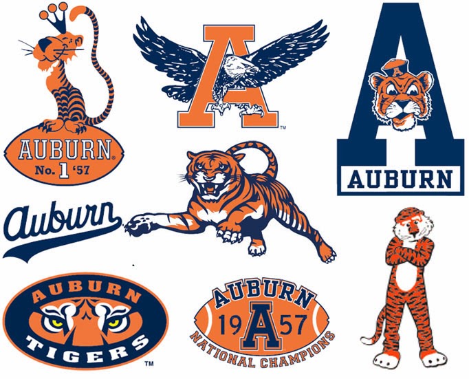
-Numbers 1, 2, and 3 are basically the same, just a block “A,” with the latter having the “sailor capped” Aubie head and “AUBURN” below. I honestly don’t ever remember seeing #3 in anything Auburn related. But it’s obviously there. Numbers 1 and 2 were both used a lot, with I think #1 being used much more. Number 1 was used on many hats back in the 1970s and 80s, with the baseball team wearing that logo on all of their hats.
-Number 4 is nothing but an old school pennant. Not much more to say about that. I do wonder where they would have used this logo…
-Number 5 is probably one of the most famous Auburn logos of all time. I refer to it as the “Sailor Capped Aubie,” because the hat is so similar to old sailor hats (or at least the cartoonish stereotype of sailors). WarBlogle has done an extensive research project regarding this logo. Yes, this logo is used by many different teams, but no, this logo was not originally Auburn’s. Long story short, the logo was created by a cartoonist on the West Coast, and named him Oswald. Oswald was to be used for the local Occidental College in LA. Many schools then went and copied the logo and adopted him as their own. I’ll let WarBlogle explain it all for you. It’s actually very interesting.
-Then comes #6, which is the full body tiger. This is one of the three most popular logos in all of Auburn (#5 and 11, which we’ll get to). According to SportsLogos.Net, this logo was retired in 1997, which is about the time I was thinking. Obviously this logo is still used in today’s merchandise, but it just isn’t used with official Auburn University/Athletics items. More on that later. I love this logo. Many of my old memorabilia has this one on it. And there is of course the combination of the tiger and the AU, which is possibly my favorite logo of all time.
-Next is #7, which is just a stylized Aubie. I want to say this was used mostly for children’s merchandise, but I’m not sure. That’s where you’ll find this logo nowadays, or at least a modernized version. SportsLogos.Net lists this logo has being used from 1981-2003.
-Numbers 8, 9, and 10 are a little different. Number 8 is a championship logo in which I don’t ever remember seeing myself. Numbers 9 and 10 seem to be more of t-shirt designs, which confuses me as to why they would be listed here. I do love number 9 because it is a cheerleader specific design. How often do you see that nowadays?!
-Number 11 (and 12, same design just different colors) is another of the most popular logos. SportsLogos.Net doesn’t list this logo, but I would assume it was retired around 1997 as well, as the school went through a little bit of rebranding during that time. This logo and #6 were used on basically anything during their time. It would have been pretty difficult to find anything that didn’t consist of either of these two.
-Number 13 is just the old API seal, which hasn’t change very much with the current Auburn one. Still pretty cool though.
-Numbers 14 and 15 really intrigue me. I never even knew 15 existed until the JHS JumboTrons were updated prior to the 2010 National Championship. I never knew teams had championship logos back then. And I love 15! It’s so simple, yet gets the point across very effectively. Number 14 is just cool. I didn’t know about that one til I found this page. I love the prim and proper tiger sitting atop the football logo. Auburn was on top of the world in 1957 with the championship, so it makes plenty of sense. These two are just classic logos, and it’s a shame they were basically hidden for so long. What else are you hiding from me Auburn?!
-Numbers 16 and 17 are basically the same, but so much is different with them. Number 17 with just the TV number decals was the helmet design used in the early 1960s. It wasn’t until 1966 that the football team started using the AU logo. Auburn wasn’t even the official school name until 1961, so it’s understandable why it took six years to put the logo on the helmets. Number 16 must have been from the mid to late 60s, going by the facemask design and coloring. Auburn football wore the grey facemasks until 1978, right before the orange masks came into existence.
That is all of the old logos that have been “retired” to the vault. Now, about being “retired.” Just because a logo or design or whatever has been retired, doesn’t mean it isn’t allowed to be used. Plenty of hats and shirts and other merchandise consist of the old logos from above. Being retired pretty much just means that the school, athletic departments, and other areas of the university will no longer use the logos.
Now how about some current logos? Along side the logo vault, Auburn’s website had a link to all the current logos. I don’t feel the need to go through each and every one of these because they are current. But I do have some things I’d like to go over.
-
Numbers 1 through 4 dictate the only allowed versions of the AU logo.
-
Numbers 5 through 12 are the “eye of the tiger” logo, which I had personally thought was retired, but apparently not so. As you can see, it shows two different styles, one logo with the “AUBURN” and “TIGERS” on top and bottom of the eyes, respectively. But one design is missing; the “tiger stripes” logo. SportsLogos.Net lists this logo has still being used to this day, even though it is on neither this list of logos or in the vault. I wonder what this logo’s exact status is? Did Auburn just forget about it and let it die out? Or what?!
-
Numbers 24 and 25 are new Aubie logos. Number 25 seems to be an updated version of the old 1980s Aubie logo. I really like the Aubie head design. Number 25 is “not permitted at mass retailers.” So I would guess that means only Auburn and certain stores (the bookstores) are allowed to sell merchandise with this logo on it? I know I see a lot of children and baby clothing and merchandise with it in the Auburn University Bookstore.
-
I find it funny that Auburn has to list a design that can be mirrored. The helmet designs, numbers 26 and 27, are the exact same, just mirrored. I guess it needs to be listed to show that it can indeed be shown in a certain position.
-
Take a look at numbers 30 and 31. These both are the new Auburn Arena logos. What’s odd is that Auburn still lists the logo with “2010” above the Arena design. This was obviously used during the inaugural season of the Arena, but why would it still be listed with the currently used logos? Do they still use it somewhere? Anniversary and inaugural and similar logos are usually one and done and never seen again. So this confuses me…
Let’s look at the wordmarks real quick. In the late 1990s, Russell Athletics and Auburn designed new vector wordmarks, and it was used so very much. Here’s the odd thing. Auburn and Under Armour signed their new contract at the end of 2005, but in 2004 Auburn introduced a new set of wordmarks. I used to think these were designed through Under Armour, but now I’m not so sure. So I really don’t know if these came with Under Armour, if Russell designed them and UA kept them, or what. But the new wordmarks are the current ones that you see everywhere.
One more little odd trivia piece- Auburn officially has TWO shades of orange. In the Auburn style guide, they list PMS (Pantone color ID) 158 and PMS 172 as official colors. PMS 158 has a higher consistency of yellow, which in turn is better for printing purposes. They also list two shades of orange to allow some leeway with matching when it comes to apparel needs. Also, yellow is an official color. But it’s only allowed to be used within the eyes of the tiger logos. The more you know…
If you really love a few of the older pictures above, well, the full body tiger and eagle in the AU specifically, this is for you. A member of SportsLogos.Net’s online forum created a thread to modernize old classic logos. He did these two for another member, and boy do they look great.
I really enjoyed going through the logos and style guide, probably more than I should have. I hope you guys enjoyed this post and hopefully there will be more logo posts to come!
War Eagle!


This is good stuff Clint! I found a site that converts those PMS into RGB for use on any Excel sheets I make.
Also PMS = 289, RGB = 0 38 73, HTML = 002649