The 2014-15 Auburn basketball season was going to be a season of change, a new era. That was fully expected with the hiring of Bruce Pearl last March. We knew the culture surrounding Auburn basketball would change, that the play on the court would be drastically different than years past, and much more. But one aspect that wasn’t thought of much during all this was the uniforms, and rightly so. Auburn is a place built on tradition and that obviously trickles down to the uniforms, specifically those of the football team. Prior to the 2012 season, Auburn revealed the current Northwestern striped, asymmetric uniforms that garnered a lot of praise. The edgy, different look and feel to them was something Auburn wasn’t necessarily used to, with the most prominent uniforms sporting the Auburn orange and blue and the AU being the same since the early 1960s. Yesterday, Auburn revealed a brand new uniform, to everyone’s surprise.
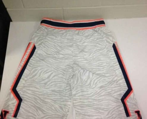
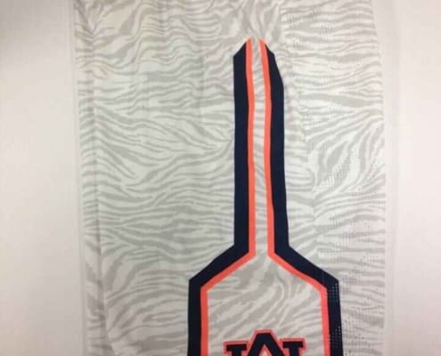
Early Saturday afternoon, the Auburn Men’s Basketball twitter page teased a new surprise for the Missouri game, with a picture what was obviously of a uniform (also, they tagged UniWatch, which easily gave it away). Of course it took Auburn twitter and myself by surprise, and I immediately began to do what digging I could. Through a source close to the program, I was able to confirm a few things. Once arriving at the Arena to stand out in the cold, a picture of the shorts was posted by OA News’ own Alex Byington, which showed the new pattern and stripe. After seeing that, I immediately knew what the tops were going to look like (more on that in a bit). Thanks to sitting front row in the student section, I was able to get an up-and-close view of the new shorts. The sublimated tiger striping was pretty evident, even from more than a few feet away. You can see them easily up close:
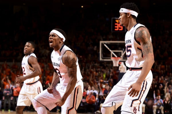
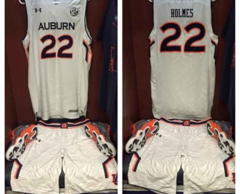
It wasn’t until player introductions and tip-off I was able to see the jerseys and the entire uniform. And by that point I had already determined what the entire set was more than likely going to look like. Not two weeks ago, Under Armour revealed a new uniform set for Maryland. Not long after, South Carolina revealed a new black uniform, with camo print pants. This time it was easy to see that the short pattern was used as a fade at the bottom of the jerseys. South Carolina has since worn a white version as well. Seton Hall has also now worn this design. The Auburn uniforms were along the same lines of these, having the sublimated tiger stripes, the fade on the jerseys, and the striping on the shorts and abdomen of the tops.
Honestly, that’s what I didn’t like about these uniforms. I loved that Auburn was in the position to tease and hype new uniforms. A growing gripe with uniforms is manufacturers process of “templating” teams and uniforms, meaning that a uniform maker designs a one-size-fits-all uniform design, and changes bits and pieces of it to match the individual team. That’s why we see so many teams looking more similar than different. When Auburn revealed the most recent set back in 2012, it wasn’t gridlocked by Under Armour’s template. No other team wore asymmetric Northwestern striped uniforms, and it was unique to Auburn, just as the football uniforms are as well. Whereas these uniforms are similar to the other Under Armour teams. This doesn’t mean that I didn’t like them, because I did like seeing something a bit different on the court, I just don’t like the idea of Auburn looking the same as other teams, in this aspect. Under Armour’s template isn’t the greatest, and they are pushing it on so many of their teams at the same time. Time will show how many UA teams end up wearing this template.
One issue with the uniforms was that the orange was the wrong color. Auburn’s burnt orange is such a rich, deep shade of orange that is easily spotted from far away. These new uniforms showcased a brighter, almost neon, shade of orange. I referred to it as “volt” orange at the game, as it resembled Oregon and Nike’s volt yellow color. The difference in the orange was fairly obvious at the game. I think that if it had been the true burnt orange the uniforms would’ve looked better overall. I’m not certain if this was an Under Armour mistake in color matching or if they were designed and ordered with this in mind.
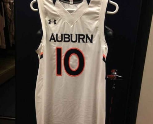
If my uniform research holds true, this is the first time Auburn has had a true alternate uniform in the arsenal. I emphasize true for the reason being that this was not an announced alternate like the SEC-wide throwbacks back in 2005-06, or a one-off throwback the football team wore in 2007, which was nothing more than a change in facemask and removal of AU decals. These are true alternates in the sense that Auburn basketball can now chose to wear the original white uniforms or the new tiger striped unis in home games. Of course baseball and softball have multiple uniforms to chose from for any given game, but that’s typical in the sport, so that’s also not what I was referring to. For the rest of the year, at least, it’ll be interesting to see which white uniform Auburn decides to wear. One issue with the uniforms was that the orange was the wrong color. Auburn’s burnt orange is such a rich, deep shade of orange that is easily spotted from far away. These new uniforms showcased a brighter, almost neon, shade of orange. I referred to it as “volt” orange at the game, as it resembled Oregon and Nike’s volt yellow color. The difference in the orange was fairly obvious at the game. I think that if it had been the true burnt orange the uniforms would’ve looked better overall. I’m not certain if this was an Under Armour mistake in color matching or if they were designed and ordered with this in mind.
Here are a few more close up shots of the new uniforms:
Auburn had been riding a five-game win streak with the original white uniforms, and with tonight’s debut of the tiger stripe unis, that streak stays strong. Here are the records for each uniform up to this point:
Auburn now takes their six home game win streak on the road to Florida Thursday night. If you have been to any games this year, you know how important the home crowd is to this team. Be sure to check out my recent College & Magnolia piece about just how much the crowd can help and how we are working to grow the student section and become one of the better student sections in the country. Also, be sure to listen to the Ever to Conquer Podcast side show, “Inside the Jungle” after every game as Kyle Loomis and I break down each Auburn basketball game. It’s a quick 15-20 minute podcast, so you can knock it out pretty quickly.
War Eagle!
Featured image via Zach Bland, Auburn Athletics
Want to see more like this? Be sure to follow the Auburn Uniform Database on Facebook, Instagram, and Twitter for even more uniform news. For ways to support the AUD, including affiliate links to Fanatics and Dick’s Sporting Goods, visit the Support page.




The football team needs to somehow suggest to UA that the numbers need to go back to bigger font size. They looked tough. Something to bring back with the more physical defense we should have in 2015. Everybody's going to the smaller font numbers. Auburn would stand out even more.
Thanks