Back to the Drawing Board – More Auburn Football Concepts
There’s been a lot of chatter about alternate uniforms for Auburn football lately, thanks to the release of a wonderful al.com video documenting the first time the Tigers broke out the orange jerseys in the modern era (I’m also credited in the video, so go watch it!). It’s a typical topic – what would happen if Auburn ever deviated from tradition? – that pops up during the football lull of the summer months.
Last year, I put together a plan to slowly build an alternate uniform over the course of a few seasons, ultimately getting as far back as 1913.
I took to Twitter to ask if Auburn fans would truly be interested in seeing an alternate uniform, even for just a single game, and if so, what would they like to see? Granted Twitter isn’t the most scientific and accurate way to accomplish a survey by any means, I wasn’t all that surprised to see that fans wanted to see something different. But I was shocked at the number that did. Nearly 75% voted in favor of mixing the uniform up! That’s pretty crazy when you think that Auburn fans have historically been against this kind of thing.
Would you be in favor of Auburn adopting a single alternate uniform, used for at least a single game?
— Clint Richardson – Auburn Uniform Database (@Clintau24) June 16, 2016
As a follow-up, I asked for fans to vote on what type of alternate uniform they’d prefer. Once again, I was pretty shocked to see the favor for orange jerseys. I’ve heard a lot of wanting to see blue helmets on-field, but that was considerably behind the orange tops. I was happy to see that the historic throwbacks were pretty popular, as that would’ve been my vote.
If you are, what would you like to see?
— Clint Richardson – Auburn Uniform Database (@Clintau24) June 16, 2016
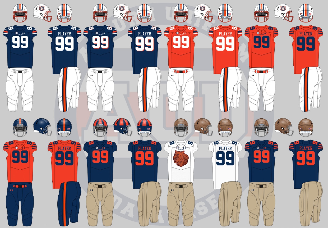
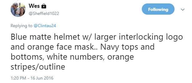
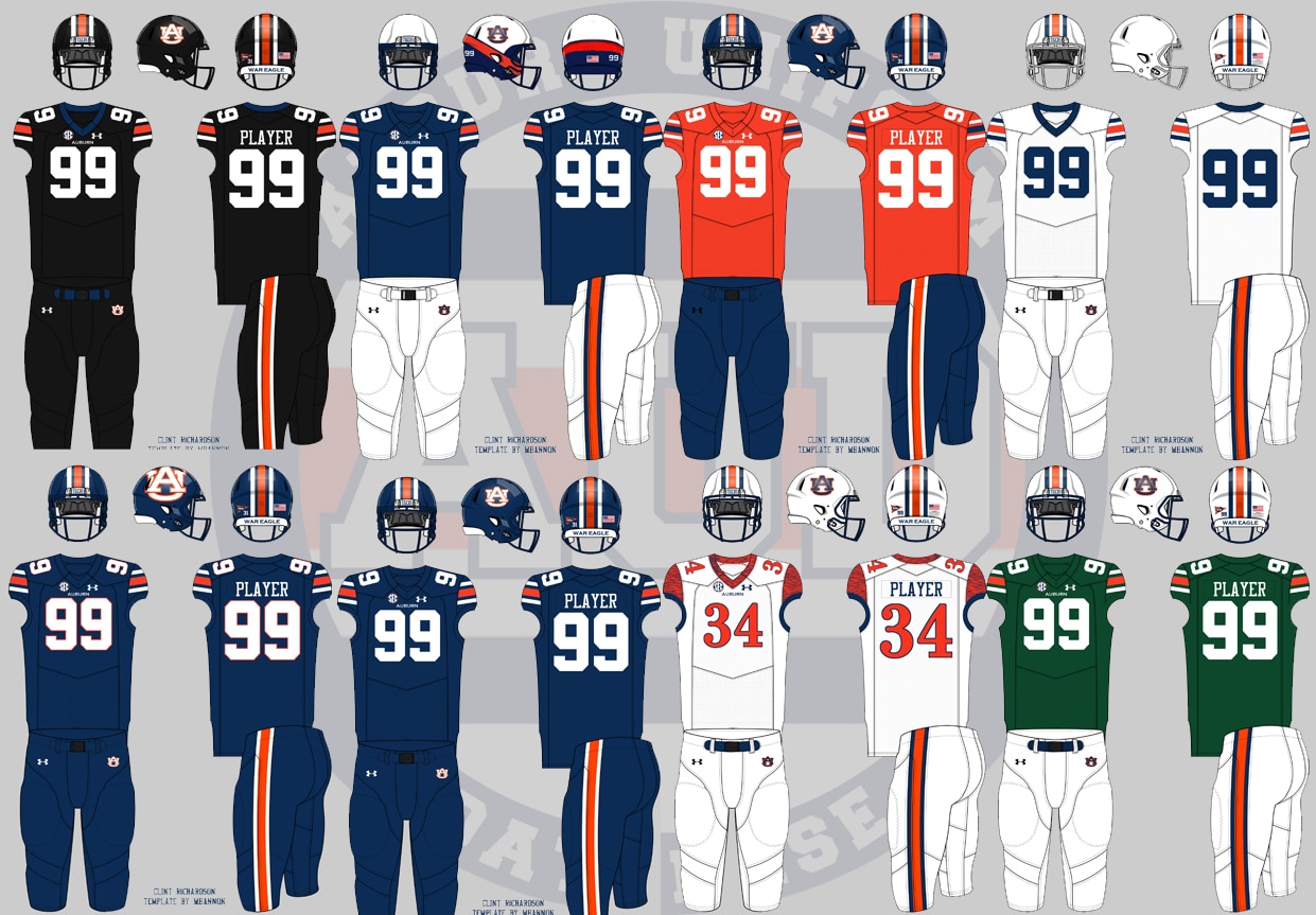
The fun part came when a couple people started suggested ideas for uniforms, many of which were pretty unique. Here’s a fun collection of their tweets and ideas, and the accompanying mock-up I made afterwards.
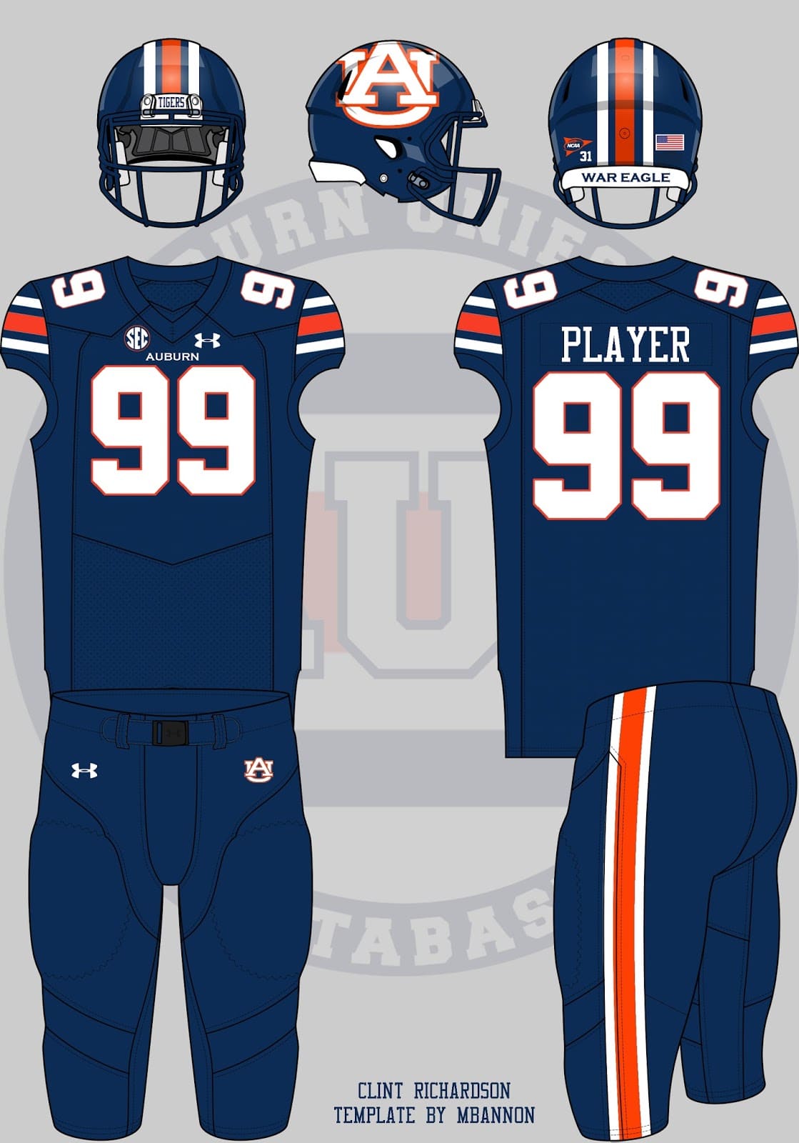
An all-blue uniform is pretty much guaranteed to be asked for. So, for sake of putting it on the new template. I wanted to keep the helmet logo similar to the prototype helmet leaked back in 2010, even if it doesn’t look all too great.
Then a slight progression from that…
@Clintau24 give me the storm troopers at home with no helmet logo
— Jordan Dowdy (@JDowdy250) June 16, 2016
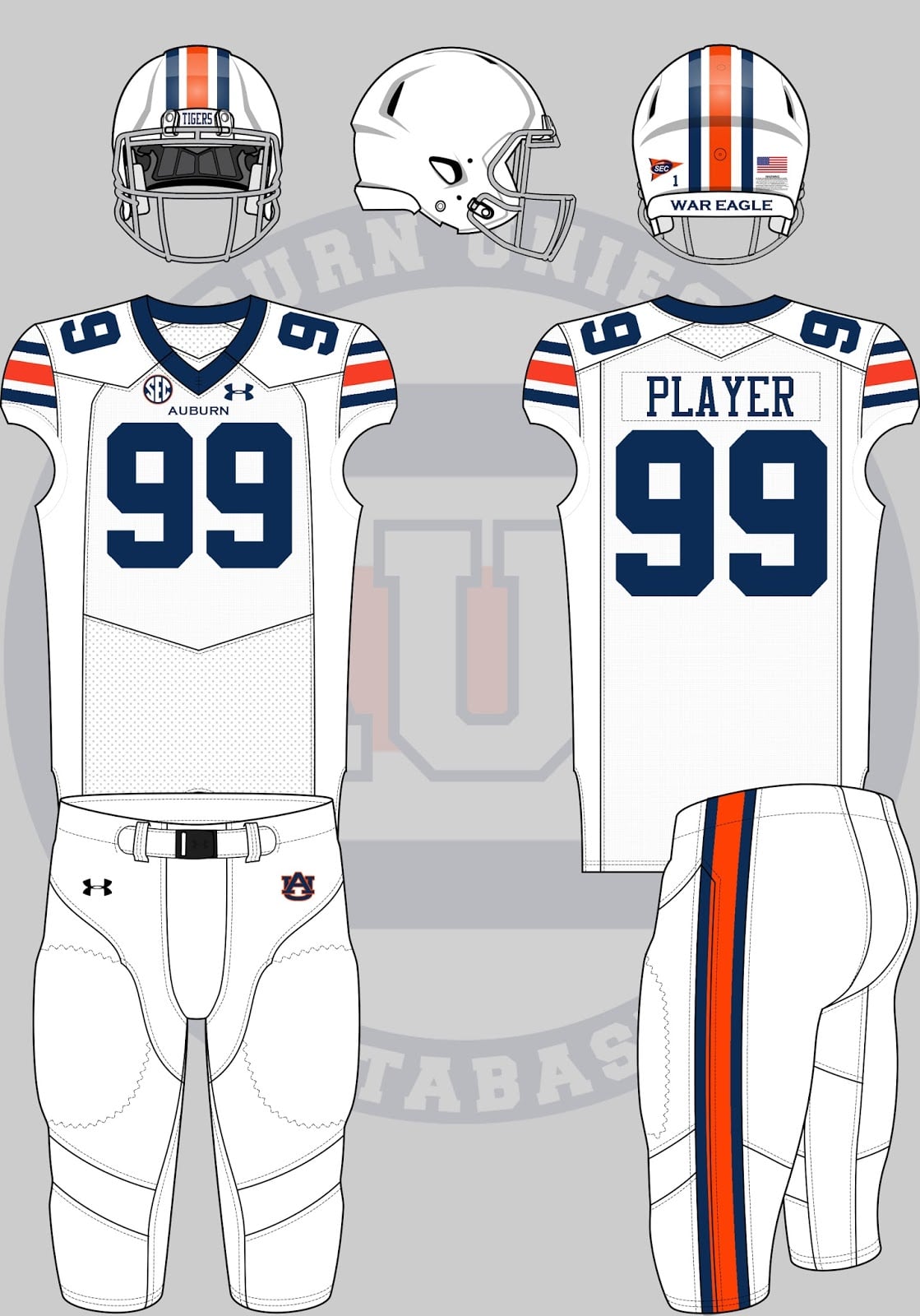
We’ve already seen this once once, back in 2007, but let’s see it on the new template.
After some conversation on Twitter, it was concluded that all extra stuff on the chest – wordmark, Under Armour logo, SEC patch – cluttered up the throwback design. So here’s a more basic design, a bit truer to the originals.
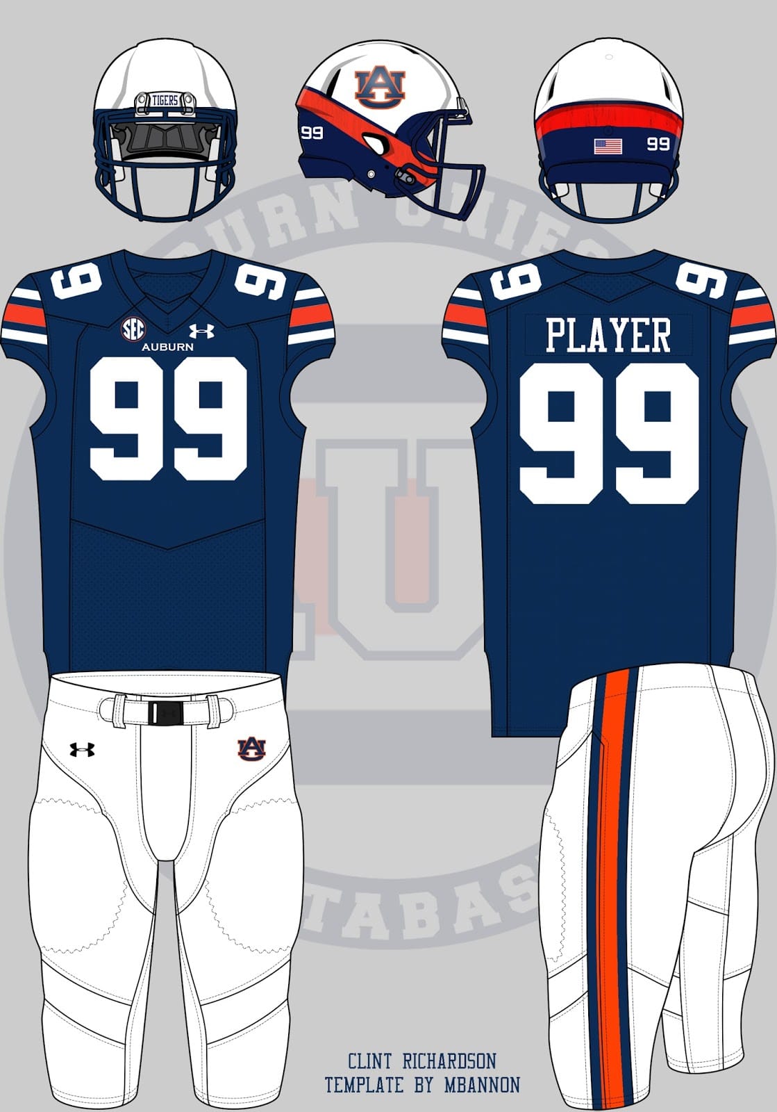
Rich Perkins sent in an Auburn version of one of my all-time favorite helmets ever – the 2012 Navy ProCombat helmet.
@Clintau24 pic.twitter.com/HJNiLl9FKt
— Rich Perkins (@richwdeperkins) June 16, 2016
So here’s that helmet with the home uniforms.
I personally love the original Navy helmet. I’ve said it many times before, but it’s one of my all-time favorites. The Auburn version doesn’t look awful either. It just sadly doesn’t work well here. It looked even worse with the white jerseys.
Then there were some crazy requests…
@Clintau24 last one, I promise.
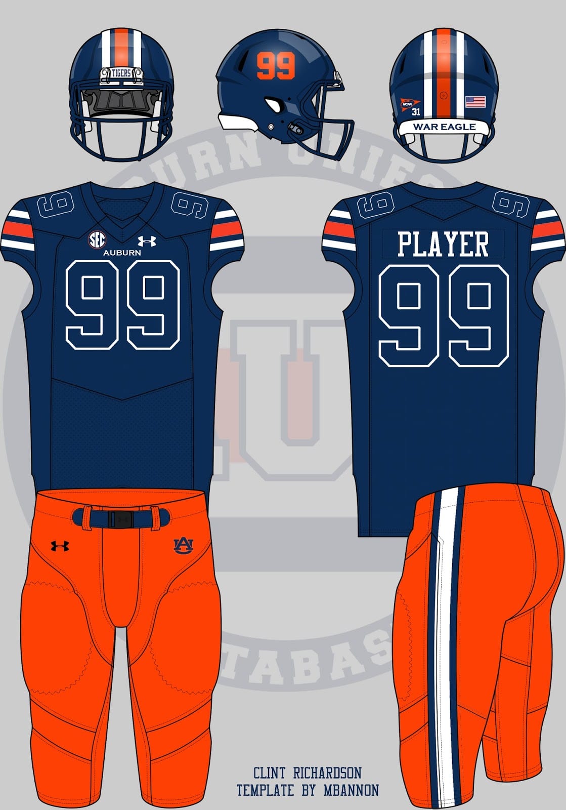
Completely monochromatic jersey, blue. Only orange numbers on a blue helmet. Orange pants.
— Nick H (@cinco2seis) June 16, 2016
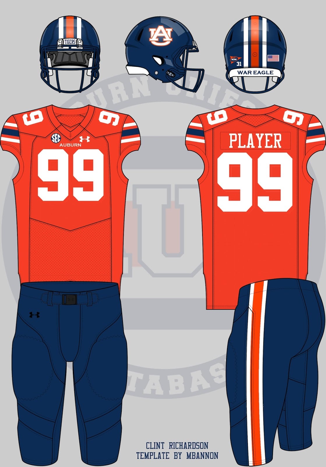
It’s not monochrome as Nick requested, as I tried to stick with the typical design elements that have donned Auburn’s uniforms for decades. Blue numbers on a blue jersey wouldn’t work whatsoever, so I put a white outline on the numbers. Granted, these still aren’t legal according to today’s NCAA rules, but it proves the point. (I honestly don’t hate the pants. The striping looks pretty good, even though I don’t like a middle white stripe on the orange jerseys)
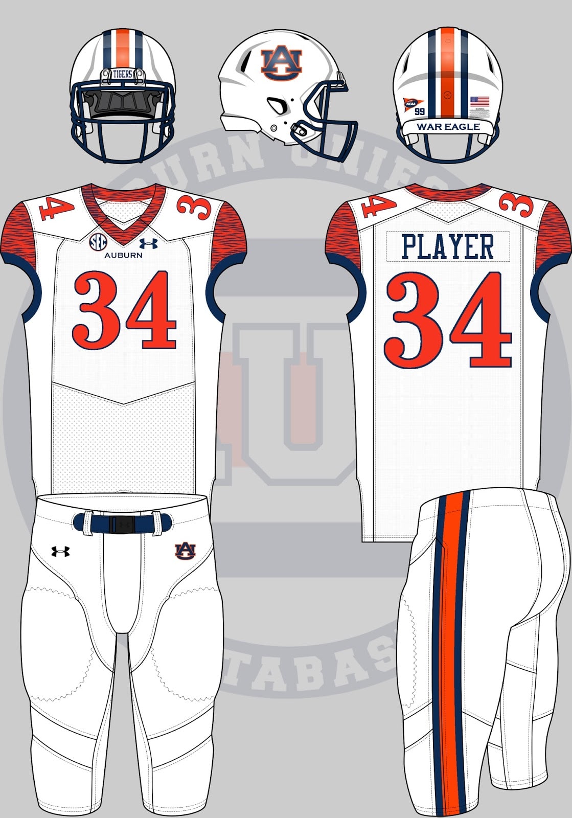
Auburn basketball enthusiast Carter Michaels wants to see a basketball-inspired football uniform, specifically based on the Chris Porter-era tiger striped uniforms. We’ve already seen the basketball team wear football-inspired uniforms, so here’s the reverse.
Football uniforms based on the ’99 Auburn basketball unis, tiger stripes and all.
— Carter Michaels (@TheRealCMike) June 16, 2016
The tiger striping stayed true to the original uniforms by staying contained to the collar, but extended beyond the arm-holes to cover the entire shoulder cap. The original orange-blue-orange side paneling was difficult to translate over, so the normal pants striping and blue sleeve cuffs will compensate for that. Number 34 was chosen over 99 like the other concepts due to the unique font and previously completed Mamadou N’Diaye basketball uniform mock up.
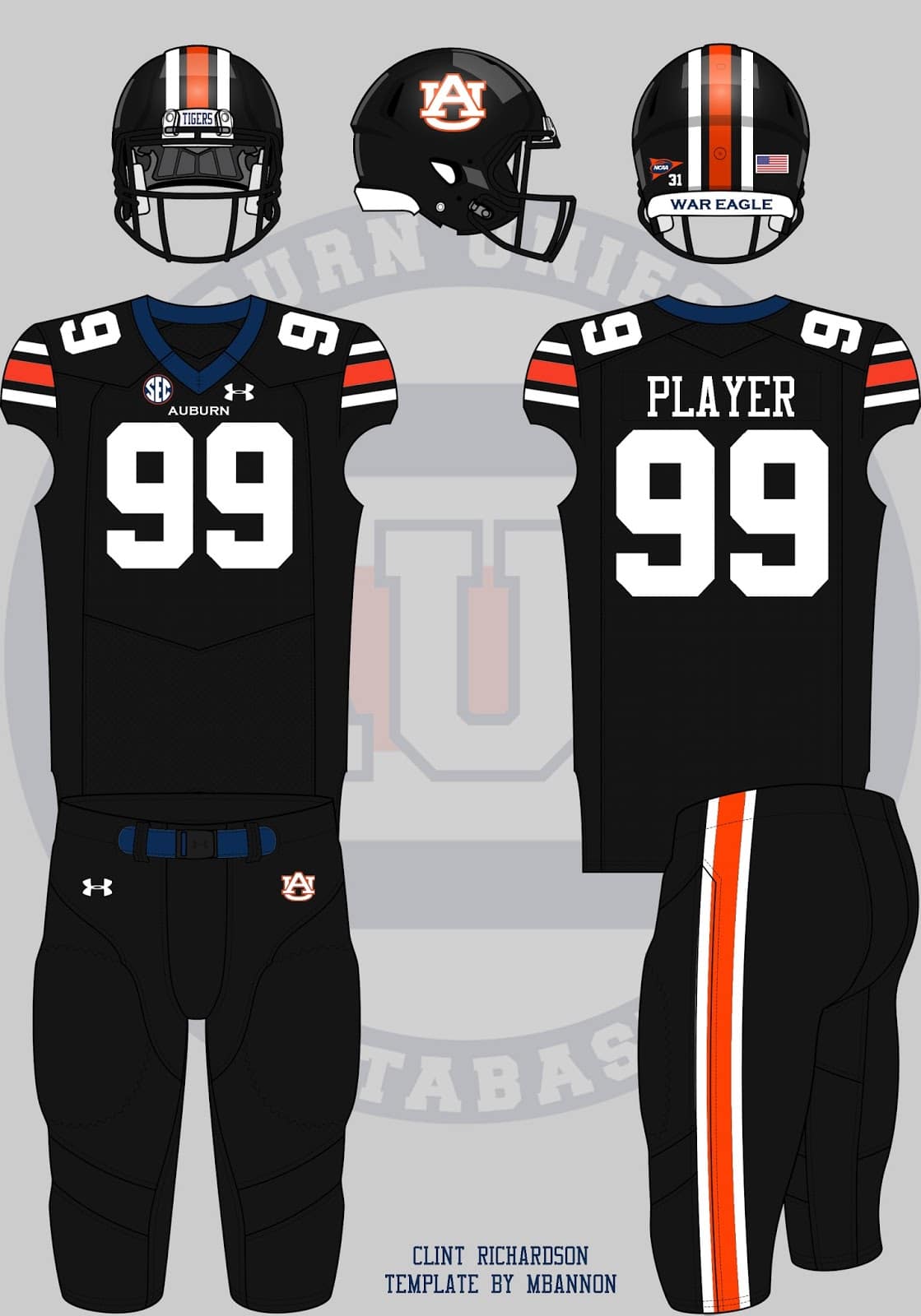
And of course, Black For Black’s Sake (BFBS).
is blackout too overdone?
— Taylor Brewton (@TBrew93) June 16, 2016
This all black uniform is just a recolored version of the all blue. I left the collar and belt blue just to keep some blue in the uniform, and it contrasts much better than the other colors used.
Last year’s post of building a historic alternate featured a blue/orange/blue uniform combination. But this one will feature the current design.
I love the orange jerseys with navy pants blue helmets would like the AU emblem on the helmets
— Debra Fuller (@BcchampDebra) June 17, 2016
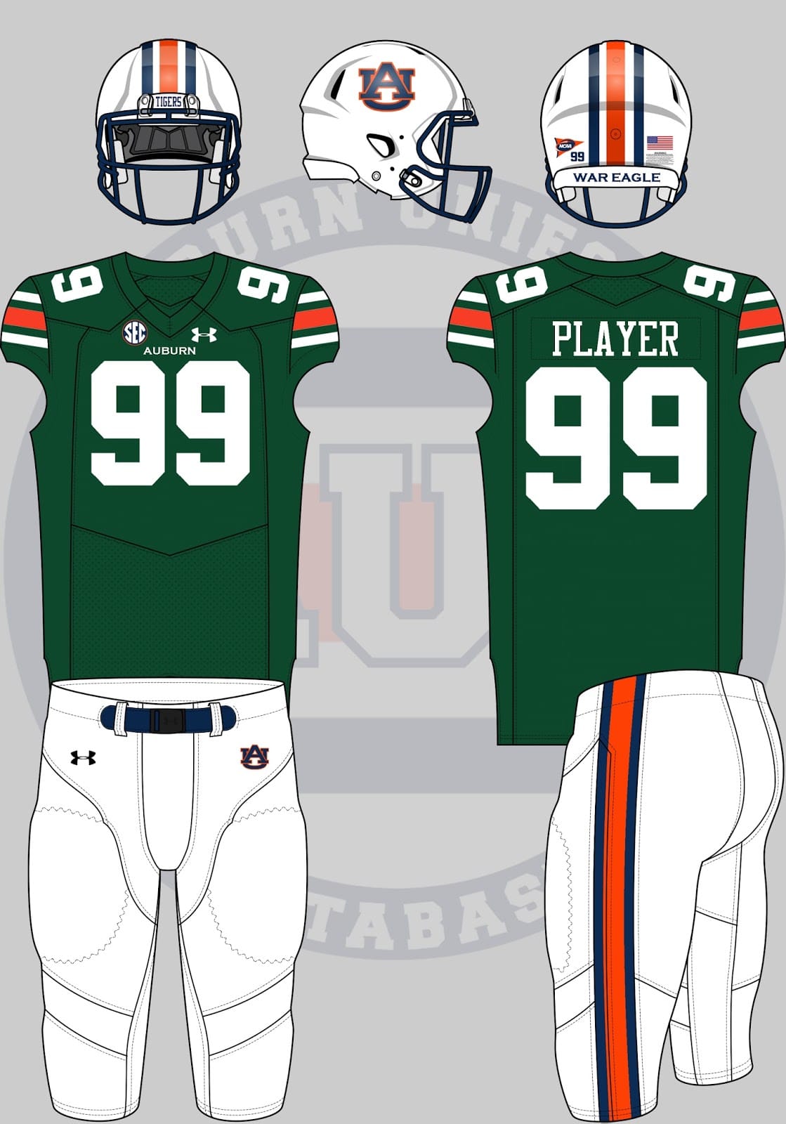
A couple people brought up that Auburn wore green uniforms a handful of times in the 1930s and 40s. Great coverage of that topic over at The War Eagle Reader. Definitely worth the time.
It’s honestly not that bad of a design. The lack of blue on the jersey doesn’t do a lot for me. But hey, it’s historic.
Summer always draws some pretty interesting discussions with everyone waiting on the season to start. With the attention on uniforms nowadays, it’s no wonder teams like Auburn and Alabama, teams that never deviate from their classic designs, are dragged into the discussion.
It’s always fun to discuss these topics, and it’s even more fun to mock them up and see what they can look like. Which of these designs do you like the best? The least? Comment below!



I like most of the alternates. The black and green ones are too strange though. How about blue pants, white top, blue helmet with normal logo, orange belt, orange numbers, and orange face mask.
That two tone helmet (like the USNA one) is absolutely the best way to intro a splash while keeping the uni the same. WOW!