Last Thursday, it was announced that Auburn University would be adopting a “new” logo to represent the University as a whole. Beginning this fall, Auburn University will be unified under a single logo.
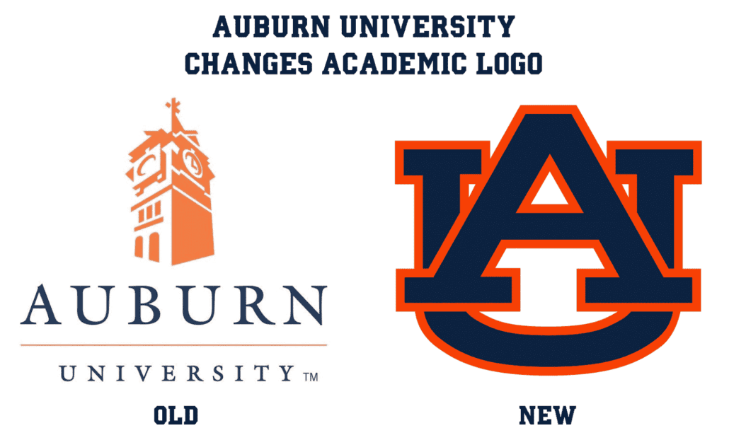
First reported by The Auburn Plainsman, the school’s student newspaper, Auburn has decided to discontinue the silhouette of Samford Hall’s clock tower. Samford Hall has been the main building on campus since 1888. The University has used the clock tower image to distinguish academics from athletics for years now.
Auburn University will now use the traditional interlocking AU logo that has donned the side of the football helmets since 1966. The move marks “an effort to reinforce Auburn’s brand identity and to avoid confusion among national and international audiences,” according to Mike Clardy, the assistant vice president for communications and marketing.
 I have to believe the Samford Hall logo lacked the recognition to anyone outside the south. Naturally, anyone that has visited Auburn’s campus will recognize the building referenced in the logo. But for the many people and, more importantly, the many potential students, that had little to no knowledge of Auburn University will struggle to associate with the imagery. Auburn’s AU logo is easily recognized, recalled, and identifiable for so many. With the ever growing exposure of collegiate athletics, and the more SEC football is shown across the country and world, the majority of people will be able to identify Auburn University with the AU logo worn on every athletic uniform. Trying to transition from the AU logo to the Samford Hall logo could be incredibly difficult to retain the recognition that the school had already built.
But why the change? According to information I’ve gathered, previous University president Dr. Jay Gogue pushed for the change to the academic-only logo when he took over office in 2006. Dr. Gogue retired from the presidency position at the conclusion of the spring 2017 semester. Mid-June saw the beginning of Dr. Steve Leath’s term as school president. I’m wondering if the University had planned this change, or if this might be one of Dr. Leath’s first projects to undertake as president. Regardless, it didn’t take long for Auburn to make a change once Dr. Gogue had left the office he had held for a decade.
 The original Auburn Plainsman piece stated that existing materials on campus that feature the Samford Hall logo will not be replaced to reflect the change. Any new items used in the future will feature the AU logo, though.
Auburn University uses rectangular signs (placed vertically and horizontally) to identify buildings on campus. These are some of the more prominent items to feature the Samford Hall logo. I’m curious as to how much the design of these will be changed in the future, as the current design is a great look, in my opinion. If they do plan to change the design at all, it’s a shame that this news wasn’t released a few weeks prior, as a few new signs have popped up in various areas, maintaining the now-old logo.
It didn’t take too long for the school’s website to change. Just a few hours after the Plainsman story went live, the home page of Auburn’s official website had changed over to the AU logo. Funny enough, Auburn had actually broken their own branding standards by using the blue-over-orange colorway on the blue background. According the standards, the orange-over-white version should be used on dark backgrounds.
Auburn isn’t the first school to make this move either. Back in 2015, Texas A&M made a change to their school seal, replacing the T-Star logo that had been featured in the seal image for 52 years with the “aTm” logo that is well recognized when seen on the football helmets and other spots. The school’s chancellors stated a unified brand was the reasoning behind the change.

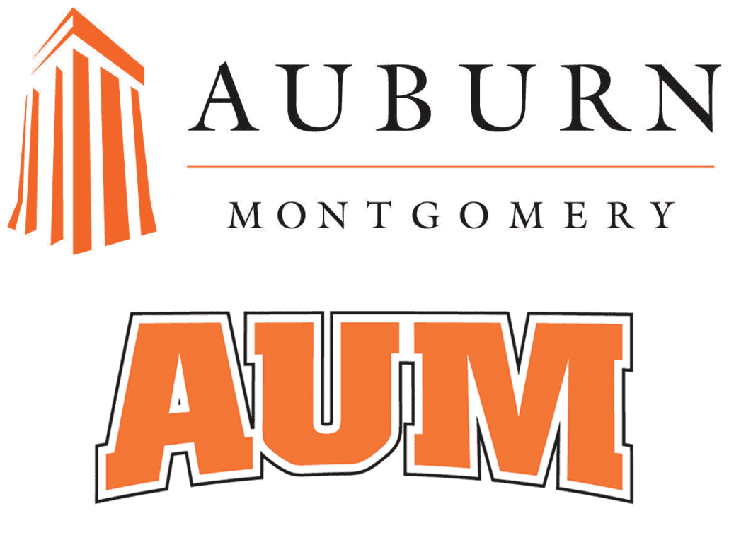
Much like the main campus, Auburn University Montgomery has a separate logo for academics and athletics.
Like many other schools, Auburn has a sister campus. Auburn University at Montgomery (AUM) is located in the state’s capital city, only about a 45-minute drive from the city of Auburn. AUM has used two different logos to differentiate the academic and athletic aspects of the school. The academic logo is designed in the same vein as the Auburn University Samford Hall logo, featuring a silhouette of the Ida Belle Young Tower, the 10-story building that is home to the AUM library. AUM adopted their new logo in January of 2007. Will this silhouette logo eventually have the same fate as the Samford Hall logo?
Many people voiced their opinions on Twitter after the news was released. The general consensus was that it was a good idea to separate academics and athletics. Most of the opinions I read said they loved the Samford Hall logo and will miss it. I too appreciated the separation of academics and athletics in this way. But I understand the branding piece to the decision. A single brand will naturally be stronger than a divided one.
What do you think of the change? Do you think AUM will follow suit? Leave a comment below with your thoughts on this matter.
Enjoy uniforms and want to learn more? Be sure to follow the Auburn Uniform Database, like the AUD Facebook page, and follow me on Twitter for even more uniform news. Also, you can support this site by purchasing AUD t-shirts and other merchandise.


