More Auburn Football Concepts
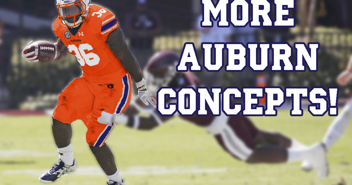
Last year I randomly asked people to send me their craziest Auburn football uniform concept ideas and I would make them come to life. I enjoyed it last year, so thought we should do it again this year. Once again, I was not let down by the ideas some come up with. Some were crazy. Some were more tame. Others were literally impossible. Here’s a new collection of crazy Auburn concept uniforms!
Let’s just go down the list, pretty much in the order they were received.
roads with blue pants (I’ll still love the all-white look more, but still). Maybe a steel gray?
— 🏴Pickford fan account🏴 (@JamesJones_55) July 26, 2017
For the all grey look, I changed the blue stripes to white, but kept the blue numerals. That way, the stripes pop, and the numbers are borderline illegal for being illegible.
As for the second suggestion, the blue pants on the road, I don’t think it’s a bad look. I wouldn’t want to see it on field, but always fun to play around with these ideas.
Auburn uniforms but with the lyrics to “All-Star” by Smashmouth all over them
— Nathan Deal (@NattyD13) July 26, 2017
Oh Nate. You meme-monster. Rather than trying to replicate this idea for the entire uniform, I just did the helmets. The lyrics are sublimated over the shell, with custom back bumpers and front bumpers to match the song.
A uniform designed after Aubie, like what Oregon did with their mascot. pic.twitter.com/BffWxa9WzL
— Carter Michaels (@TheRealCMike) July 26, 2017
This was a fun one. I contemplated exactly how to do this for a little while before coming up with a decent idea. Oregon has an easier job with this, as the Duck has defined locations of each color, which correlate well to the football uniform. Aubie, unfortunately, does not. Aubie doesn’t usually wear pants, so the football pants were easy – tiger stripes the entire way down. Now, the jersey was more difficult, as Aubie is always wearing something different. He’s best known sporting his own football jerseys, so the tops weren’t touched much. The SEC patch was replaced with an Aubie head just to drive home the point.
The helmet is by far the most unique part here. Aubie has those nice, fluffy white cheeks, so I tried to replicate those on the helmets. His snout also consists of three areas – tiger stripes, white fluffy cheeks, and the black nose. The front of the facemask is designed like the original Oregon State rebrand helmets, with stripes down the middle.
How about:
all orange (a la Clemson)
Tiger stripes
Something Oregon-y— Tom (@ths0002) July 26, 2017
All orange is pretty loud, huh?
I enjoy the multi-uniform gimmicks that Oregon puts out each year, but my favorites are by far the Webfoots throwbacks. I even bought the shirsey version and the hat. I love the design so much, so thought it wouldn’t be a bad idea to try to mimic it here. I decided to go with a “Be The Creed” motif throughout the uniform. The Auburn Creed is sublimated over the stripes on the jersey and pants, as well as the helmet shells and stripes. I contemplated matching the Oregon design more so – with the thinner stripes and all – but thought to stick closer to the Auburn aesthetic. For this design, all players would wear “PETRIE” nameplates, to honor the man that wrote the Auburn Creed.
Suggestion #2: A uniform designed entirely around this logo. Windows 98 it up. pic.twitter.com/kom0el2l37
— Carter Michaels (@TheRealCMike) July 26, 2017
This suggestion comes off of last week’s article regarding the multiple designs that Auburn almost chose from to replace the AU logo in 1995. In honor of Windows 98, it would have made more sense to make this all in MS Paint (RIP). But I just tried to base the design completely off the logo itself. The stripes are inspired by the negative space “cutouts” in the logo. Just to go all in, I added the pattern to the numbers.
Oo Oo last one but along the same line:
Go full Adidas on Auburn.— Tom (@ths0002) July 26, 2017
Ugh, “full adidas” is my nightmare. Without completely screwing up Auburn’s look (which, we know, adidas might do), I added a silly stencil font – like adidas has done – with the awful chrome/tinfoil looking numbers – like adidas has done. The pants stripes have an eagle wing cut out, cause ¯\_(ツ)_/¯.
Auburn these up for us pic.twitter.com/PXR4s3r3t5
— Chad Gibbs (@Chad_Gibbs) July 26, 2017
I’m in the minority as I absolutely loved the Steelers’ throwback uniforms. The horizontal stripes came out a little thinner than the original design. I kept the stripes on the pants just to add some more “Auburn” to the design.
Our current uniform color scheme and logo placement but on a Nike template with Nike fonts
— J.D. (@jdh1605) July 26, 2017
The new Nike Vapor Untouchable template is the best one on the market right now. It creates such a clean look and I’m glad so many teams are moving to it. I tried to “Nikefy” these uniforms much like the adidas concept. The numbers are in the Michigan State font, as a lot of teams seem to be using it. I also added the team name on to the stripes, a la Cleveland Browns.
Matte, Medium-Grey helmet and grey jersey with white pants. Navy blue AU helmet logo with white outline. No orange, just navy/grey/white
— Zach Baker (@ZachBaker21) July 26, 2017
Similar to the steel grey concept at the top of the page, this one keeps all the blue aspects on the jerseys. With the pants being white, too much white on the jerseys would be overkill (as if going to grey wasn’t already).
Naval Academy helmet treatment is great. Any chance of a UCLA/LSU type mock up? Please no more #BFBS!
— 76ers Supporter (@KentHagan) July 27, 2017
I’ve always liked the UCLA stripes design, but as I was working on this one, something felt odd. Something felt familiar. Then I realized that this was awfully similar to the Steve Spurrier playing-era uniforms that Florida wore. They even wore them as throwbacks a few years ago. In order to differentiate from the Gators, I flipped the orange and white shoulder sleeves.
And that’s all for this round of fan-submitted ideas. We also had some concept helmets posted in this piece, in conjunction with the 1964 Tiger Head mystery helmet.
Which of these concepts were your favorites? Leave a comment below!
Enjoy uniforms and want to see more like this? Be sure to follow the Auburn Uniform Database, like the AUD Facebook page, and follow me on Twitter for even more uniform news. Also, you can support this site by purchasing AUD t-shirts and other merchandise.


My favorite: definitely the UCLA stripes.
I would actually take that Steelers knock-off in a heartbeat. But, then, I'm a big fan of the Iron Bowl Rugby Shirt look the cheerleaders do and those would fit in perfectly with that.