Auburn Baseball Unveils New Uniforms
Back in November, we published a post regarding new uniforms possibly coming for Auburn Baseball, and what the entire set would look like. Not much information came out on this front since then, with Auburn being pretty tight-lipped on anything uniform-wise. Today, though, the program has revealed the entire uniform set, which means it is time to dive in.
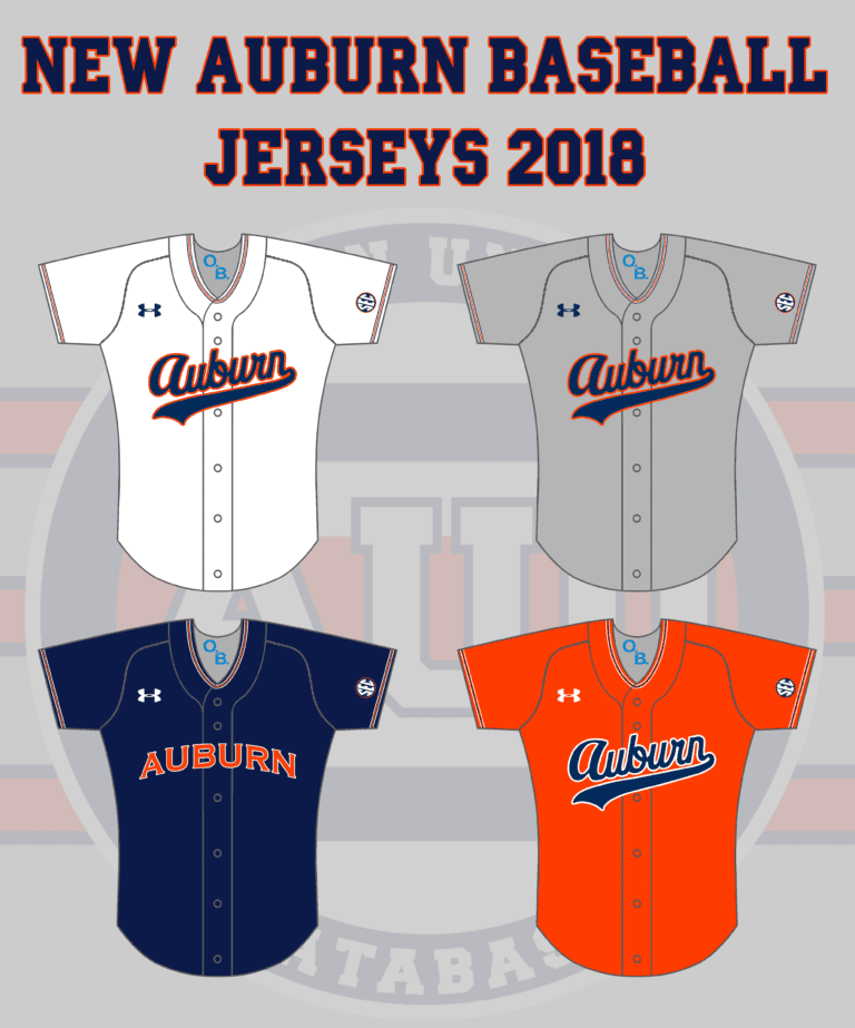
The new design originally leaked when the players participated in head shot photo day. We were given visuals through the Auburn Baseball Twitter account in a behind-the-scenes kind of way. Surprisingly, even with a photo or two of just the jersey, we were able to pick a lot out and apply it to the rest of the design. If one jersey was going to feature a new striping pattern on the collar and sleeves, it was pretty likely at least one other top would do the same. I put together some concept images of possible new jerseys, and wasn’t too far off.
New year, new unis. 🔥🔥🔥
Thanks, @UnderArmour.#WarEagle pic.twitter.com/KTHulY9ww4
— Auburn Baseball (@AuburnBaseball) January 12, 2018
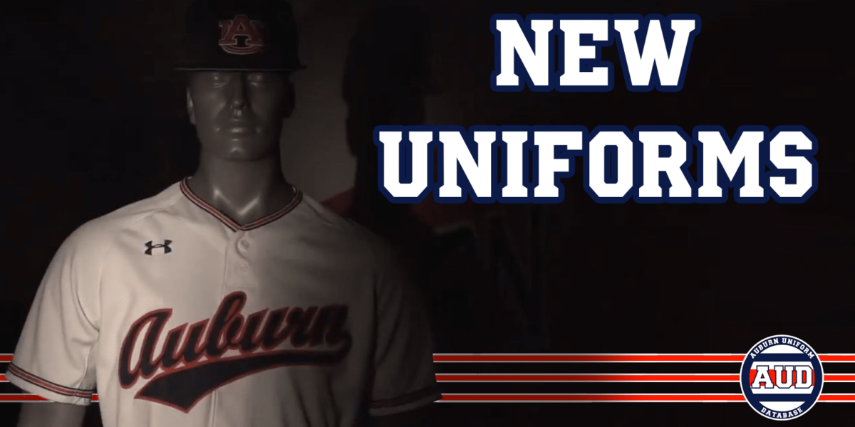
Auburn Baseball posted a video unveiling their entire uniform rotation for the upcoming season. In that video, we see four brand new jerseys, two new pairs of pants, one returning uniform set, a new hat, and a returning hat.
The video starts with the white uniforms, which features the script Auburn wordmark. This stylized wordmark is based on the old uniforms worn by Bo Jackson and Frank Thomas, with a few tweaks. It has been on the throwback uniforms for years now, and more recently the previous orange jerseys. Also, you’ll see a brand new aspect to the uniforms that hasn’t been worn (in this style) before – striping. A set of stripes similar to the Northwestern Stripes (what they’re called) the football team and sported for decades now dons the baseball jerseys around the collar and sleeves, as well as the pants down the leg. This striping is featured across all the new uniforms.
Next is the brand new orange top, which isn’t all that different from the last one. The chestmark stays the same with the script Auburn. The biggest difference, of course, is the striping. Even with that small change, it creates a completely new look.
The next new jersey shown is the blue version. The previous blue tops were the oldest of the set, having been in rotation since 2009. The old style was very simple, with the AU logo on the left chest and the player number on the right side. This new jersey features the Copperplate Auburn wordmark on the chest.
Finally, we see the grey uniforms. They’re exactly what we saw back in November when they leaked. Stripes on the jersey and pants like the other sets, script Auburn across the chest. The base grey color looks a bit lighter than the previous set as well.
Also shown in the video is the pinstripe uniform worn since 2013. It looks to have remained unchanged since the last time we saw them on the diamond last season. Oddly enough, the cream throwback uniforms were not shown. They made their glorious return last season after being absent the year before. I can’t imagine Auburn would just dump these, so we might see them at some point this season.
The baseball team rotated through two different hats last season – one featuring an orange AU logo and brim, the other with a white AU logo on a completely blue cap. The latter design was originally worn with just the pinstripe uniforms, but was worn with just about every other design last year. It quickly became a team favorite, and was easily the most worn. This year, per the video, it looks as though it will be sticking around. The orange-brim cap, though, looks to be gone. It looks to be replaced by an all blue cap with the orange AU logo. This design was pretty popular with the previous Auburn Softball coaching staff.
That seems to be all of the uniform news from that one video. There are a few things interesting, to me at least. First, the lack of player numbers on the front of the jersey. With the previous set, the white, blue, and grey jerseys all featured front numbers. As it was shown in the video, none of these do. But that doesn’t seem right. In one of the promotional images Auburn Baseball recently tweeted, the model player was shown with hist number on the front, just below the script. The original images of the grey jerseys did not show player numbers. So I would imagine the white tops have the number, the grey jerseys do not. Then we still have the blue and orange tops. The old orange jerseys did not have the front number, but the blue ones did. Since the blue jerseys previously featured the numbers, and the old grey tops that had the Copperplate Auburn chestmark did, I think the new blue tops will show the numbers on the front.

The blue jerseys are the odd ones out with this set. Yea, they keep the striping consistent with the other designs, but the wordmark is bothersome. In the old set, Auburn did a nice job of changing the front of the jerseys, by way of wordmarks, scripts, and the AU logo. The AU logo is looking to be exclusive to the pinstripes now. Since the grey, white, and orange tops all feature the same chestmark, I feel like the blue jerseys should at least match. The arching Copperplate wordmark looks like a sore-thumb in this set. It would match better, in my eyes, if at least one of the other jerseys had a different front design.
It’s no secret that Auburn doesn’t like to emphasize “Tigers” in their visual identity. Back in 2014, I was told that the baseball players wanted their orange tops to read Tigers rather than Auburn, but were shut down. I contacted Jay Jacobs a few weeks later, and was told that Auburn does emphasize the school name over the nickname, mainly in part to the amount of Tiger teams across the country and the SEC. Jacobs also said that it is ultimately up to the teams if they chose to sport the team nickname, which has been evident by the softball program, mainly, and more recently the basketball team. My original concepts for these baseball uniforms featured a Tigers script, similar to what was worn in the late 1990s.
One small detail that will probably get overlooked is the SEC patch. Previously, many teams wore a single colored patch, with the blue sometimes appearing a brighter shade than what is used on the rest of the uniform. Now, all teams have transitioned over to the true navy and orange patch, and that will now don every baseball jersey.
Enjoy uniforms and want to see more like this? Be sure to follow the Auburn Uniform Database, like the AUD Facebook page, Instagram page, and follow me on Twitter for even more uniform news. Also, you can support this site by purchasing AUD t-shirts and other merchandise. You can also purchase your favorite team’s merchandise through Fanatics, with a portion of your sale going to support this website.


Leave a Reply
Want to join the discussion?Feel free to contribute!