New Auburn Marching Band Uniforms
The more things change, the more they stay the same. At least on first glance, that is.
The Auburn University Marching Band has new uniforms for 2018. Most might not even notice any changes when they see the uniforms on gameday. For a quick refresher on the previous style, check out the overly detailed (as is the case on this site) overlook from December.
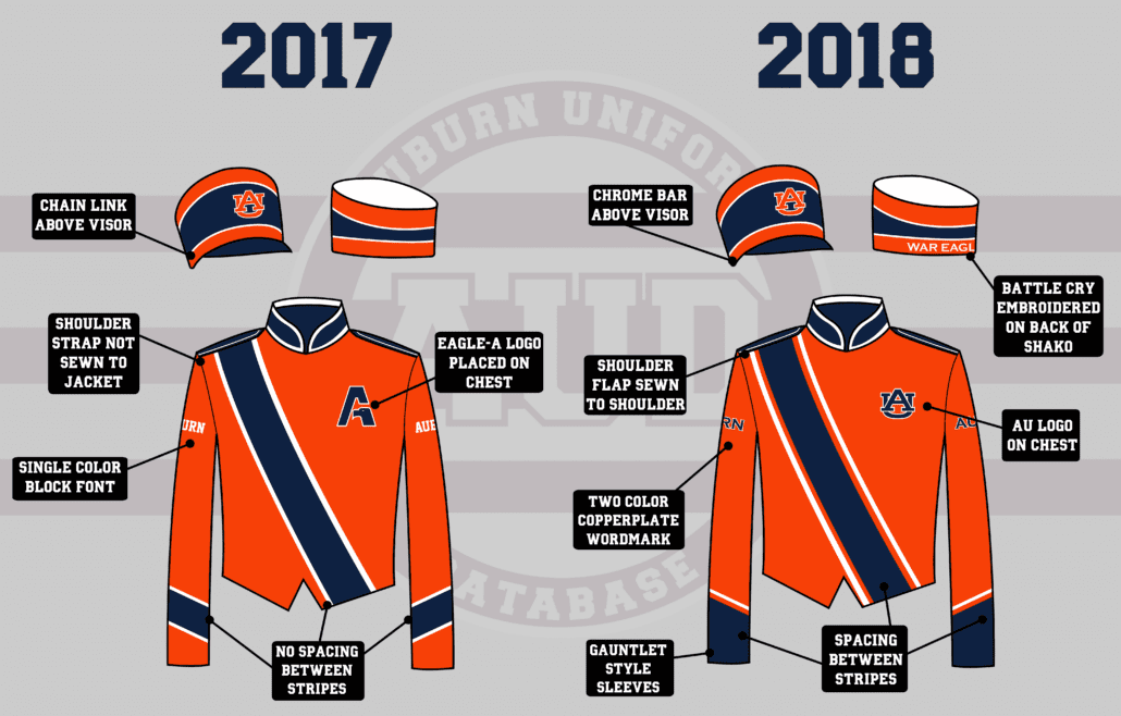
Starting from the top, the shako (hats) saw changes in the front and back. The front edge of the cap, just above the visor, used to feature a chain link. The chain was also connected to the shako by an engraved button. The chain is now replaced with a metal bar that looks to feature a chrome inlay. The ornate button has also been replaced with a chrome button. On the back side, “War Eagle” has been added in large embroidered letters.

The drum majors’ uniforms also saw a few updates, with the chest logo change and the sash stripes being adjusted. (image via Emily Enfinger, OANews)
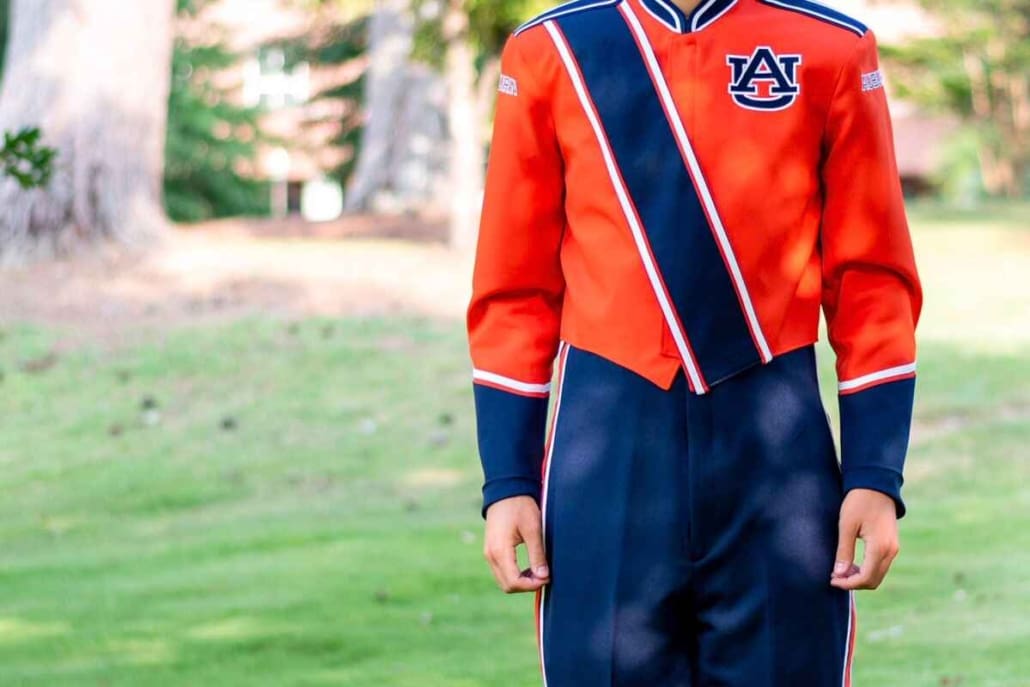
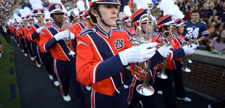
The jackets saw the majority of changes. The biggest change is the front logo. The beloved AU logo dons the left side of the jackets. If you didn’t know any better, you would think it had been there all along. But the band specific logo that featured an eagle head inside an “A” had been in that position, this time around, since 2007. Let’s come back to this in a little bit.
Striping is always important in Auburn, and the AUMB uniforms saw a slight change in this category. Previously, the stripes on the orange jackets sat directly beside each other. Now, they resemble the infamous Northwestern stripe pattern a little better having added a stripe in between. The blue jackets look to have had that spacing previously as well. The sleeves, however, received more than just a striping pattern change. In fact, they aren’t even wrist stripes anymore! They now have more of a “gauntlet” look to them, with the stripes going to the end of the sleeve. The drum majors’ white uniforms have had the same feature for a while, so now all three designs will match better across the board.
Probably the smallest change of all is the lettering on the shoulders. “Auburn” used to be placed in a standard block font in a single color. It now is the Copperplate wordmark and comes with an outline color. Also on the shoulders, the strap on the top is now completely sewn to the jacket. You won’t see them bowing upwards anymore.
The pants don’t seem to have had any design changes.
Here’s a side-by-side look at all the changes:
The Tiger Eyes – flagline, dance line, and majorettes – also have new uniforms. The visual ensemble portion of the AUMB has new, handmade uniforms available each season. The most notable piece is the addition of the AU logo. I’ve been told this is the first time the logo has appeared on their uniforms in a long time, but don’t have the photos to confirm.
Let’s go back to the chest logo now. The “eagle-A” logo has been part of the AUMB’s identity since the 1970s, if not earlier. Unlike the AU logo, which is now used to represent every aspect of Auburn University, the band logo was the rare instance of a design representing one specific entity. The logo has been nothing shy of a favorite of band members, current and alumni. In fact, the Alumni Band still uses the logo.
It had been rumored for a while that the “eagle-A” logo was going to be dropped. The University retired the academic-only Samford Hall silhouette logo in favor for a unified single brand under the AU logo. I don’t believe it is a stretch to consider this change in the same category.
The AU logo replacing the beloved eagle-A is a point of contention for some. (image via Auburn University Marching Band)
The Auburn University Trademark & Licensing Department did not respond to a request for comment.
The change in logos may seem rather minor to some fans. But any band member, current or former, will say otherwise. When the first photo of the uniforms surfaced showing the change, I posted it in the Auburn Alumni Band group on Facebook. At the time of this being published, that post has 55 “reactions,” with 26 being sad face “dislikes.” There are also 25 comments from members voicing their disdain and confusion for the change. The original post on the Auburn Uniform Database page has similar numbers as well.
The reaction all across the board was rather negative. There is no reason to make the change, according to most that voiced their opinion. I can’t say for certain, but I truly believe this was nothing more than a branding decision. To unify the entirety of Auburn University – athletics, academics, and more – under one logo, one brand. No, I don’t believe this move was made solely for the “almighty dollar” and obsessive control, like some have suggested. Take a look at the current landscape of branding, especially athletic branding, and you will see that simple is best.
So many want to insert their belief of what makes a better, stronger brand. Yet they have no insight into the reasons why those in charge think a different way. If you think it does no harm to have a Samford Hall logo for academics, the AU for athletics, and the eagle-A for band, that’s fine! But that’s obviously not what Auburn University and those that do this for a living believe to be best for Auburn.
We all love Auburn and want the best for Auburn, even if it’s something you disagree with.
Many of the images used in this post come via Keith Stephenson, photographer for the Auburn University Marching Band.
Featured image via Emily Enfinger, OA News
The Auburn Uniform Database is celebrating five years in 2018! Take time to check out the brand new website and consider purchasing an anniversary t-shirt. Do you enjoy uniforms and want to see more like this? Be sure to follow the Auburn Uniform Database, like the AUD Facebook page, Instagram page, and follow me on Twitter for even more uniform news. You can also purchase your favorite team’s merchandise through Fanatics, with a portion of your sale going to support this website.

Leave a Reply
Want to join the discussion?Feel free to contribute!