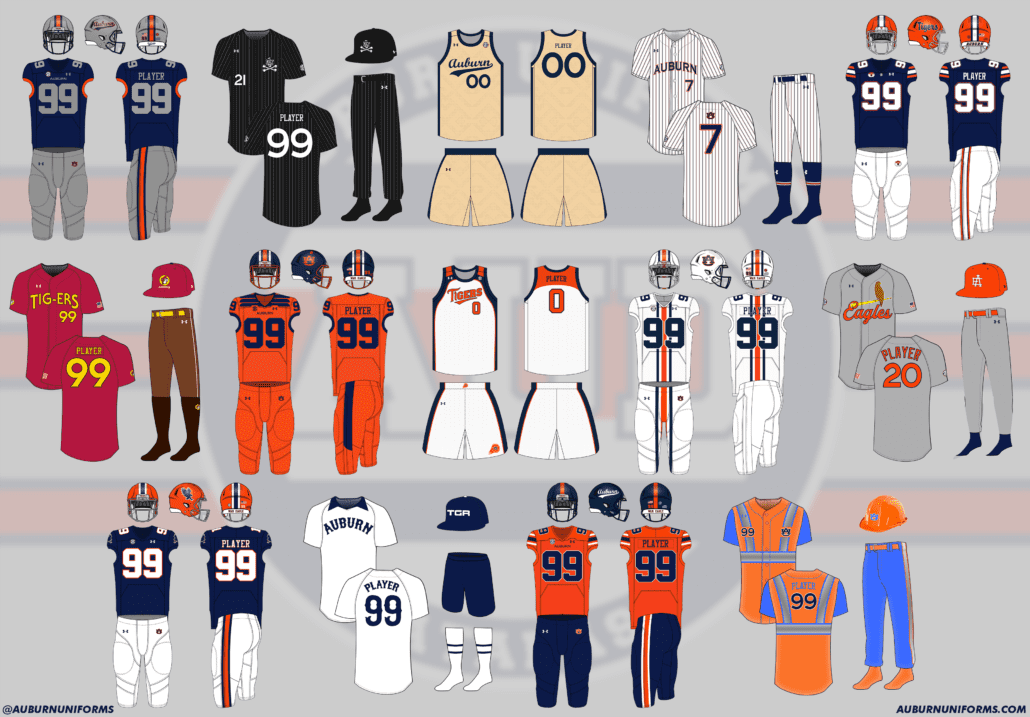
Ah, it’s here, the best time of the year. Time for another round of crazy concept uniform designs!
If you’re new here, I put out an all-call on Twitter each summer for the craziest, silliest, and sometimes possibly realistic concept ideas that Auburn fans would like to see come to life.
Why?
Well, the summer is often riddled with talking heads discussing alternate uniforms. The same horrendous designs have been passed around for years. It’s time to change that (and add more fuel to that fire!).
This series also works to show that Auburn’s uniforms are pretty good as is. The Tigers don’t need to make any changes or bring unnecessary alternates into the rotation just because they can.
A few things before we get started:
- First off, these designs are intentionally silly, obnoxious, and over-the-top. That’s the point. No one expects to see these hit the field or court. We aren’t saying Auburn should wear these whatsoever. If you are truly upset about these designs, that’s solely on you.
- I am not a designer or an artist. This is always a fun project that helps push my very limited creativity. These are not the world’s best Photoshop jobs and they were never expected to be so. Again, they’re goofy on purpose.
We have another 14 incredible designs ready for you this year. Did your idea make the cut?
Let’s dive in and take a look at this year’s crazy Auburn concept uniforms!
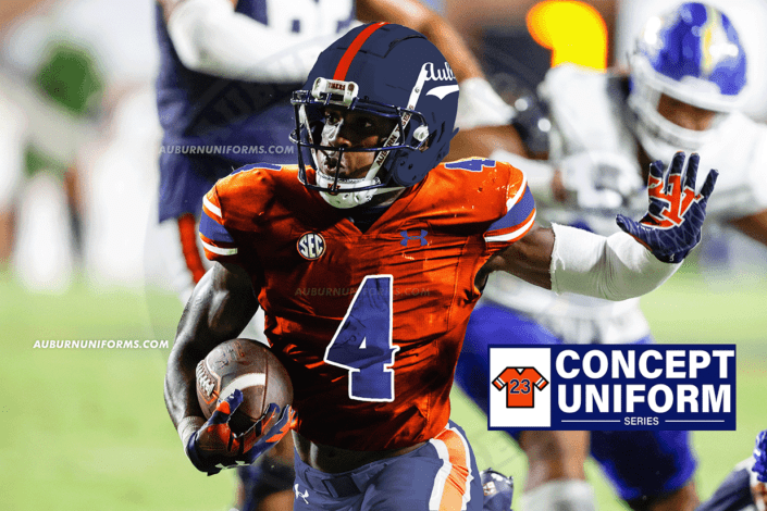
Silver helmet with navy Auburn script on sides. Navy/orange/navy center stripe with no gaps, navy mask. Navy jerseys with silver numbers, no stripes but orange sleeve cuff. Silver pants with same stripes as helmet
— John Talley (@JP_Talley) May 31, 2023
Let’s start with a simpler design. And thank you, John, for detailing the concept so well – it makes this so much easier!
This design is pretty straightforward. We swap all the white for silver – a sparkly, textured silver on the helmet shell for an added touch.
The script Auburn wordmark looks amazing anywhere, especially on a football helmet. As a bonus, let’s add it to the rear bumper as well. While I’d prefer to keep the traditional helmet striping, this style doesn’t ruin this look.
The biggest drawback to me is the orange sleeve cuffs rather than normal striping. Yea, it looks alright on the mockup above, but check out how large and almost out of place they feel on Owen below:
After the general reaction about Auburn hosting a regional I’m thinking Jolly Aubie baseball uniforms like what you did with football a couple years ago. All black everything with white pinstripes like the White Sox City connect uniforms, so nice little salute to Frank and Bo too
— Some Guy Named Cody 🦚 (@cadair78) May 30, 2023
If you missed last year’s installment of this series, we did a great Jolly Aubie “Barn Cheatin” uniform modeled by the one and only Cam Newton. Let’s try turning it into a baseball uniform.
We’ll start with a simple black canvas across the board and add white pinstripes on the jersey and pants. This set of pinstripes is slightly thinner than the original white set. We’ll keep it simple and place the fantastic Jolly Aubie logo on the front chest and on the all-black ballcap.
Just like the football edition, this uniform is solely black and white. Unlike the gridiron design, the baseball uniform will not feature any “Barn Cheatin” easter eggs – that’s exclusive for football.
Let’s see how it looks in action:
Crème script basketball uniforms
— bg (@bigbaggetta2) May 30, 2023
The cream baseball uniforms have long been a fan favorite. The script wordmark continues to get used more (as it should) and is becoming more beloved by the day. Combining the two with the excitement that Bruce Pearl’s program has brought to the Plains is a perfect combo.
Another simple translation here. I decided to lean into the previous throwback uniform design rather than the new threads and incorporate some navy trim around the uniform. The blue collars, sleeve cuffs, side stripes, and waistband really help tie everything together.
To top it all off, the player number isn’t centered like normal but offset and tucked underneath the script’s tail like the baseball tops.
AU baseball/softball pinstripes but they are just tiny northwestern stripes
— Tom (@ths0002) May 30, 2023
Our first softball concept of this series! Let’s get to it:
As Auburn continues to embrace the Northwestern Stripes across all sports, this feels like a natural concept.
Starting with the usual pinstripe uniforms, we’ll simply add a few extra outlines to get the desired look. To have the wordmark and number pop a little better, I added a white outline in between the blue and orange areas, much like what softball wore during their first Women’s College World Series appearance.
On one hand, it looks perfect. On the other, it feels a little overwhelming. And if you happened to have a weird third hand, it may not be noticeable at all.
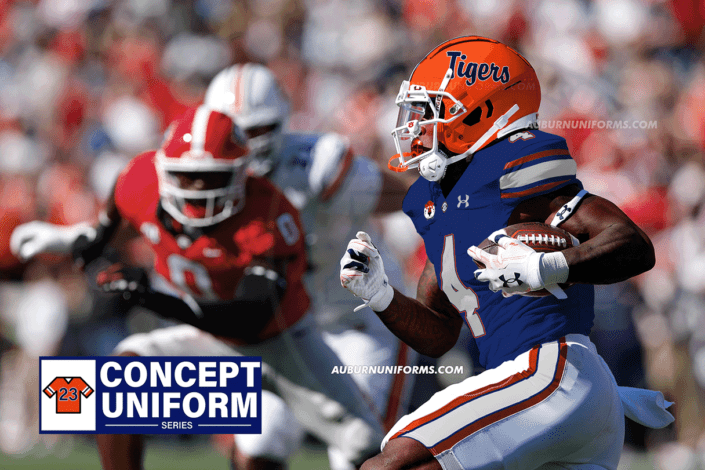
Florida type uniform where basically the royal blue is replaced by Navy and the gators is replaced by script tigers pic.twitter.com/nC6Yr0b8Yk
— RJ (@rjf__18) May 30, 2023
It’s not the first SEC foe concept, but it’s always odd trying this out. Let’s see how it works.
You know, not bad.
Florida has a unique look with the hand-drawn script logo on the helmet and the mascot logo used everywhere else. But if we play into their design, it really isn’t the worst thing ever for Auburn.
“Tigers” on the helmet is rendered in the same font that Florida uses. Let’s swap out the gator head with an Aubie head and place it on the front bumper, right chest of the jersey, and left hip on the pants. We’ll match the small SEC logo on the front point of the collar (though Under Armour’s current template clearly isn’t built for that). Then we’ll utilize Florida’s stripes on the shoulder and pants with their master stripe pattern to tie it all together. And top it off with the back bumper rendered in the Gators’ primary logo font.
I didn’t think this one would work well when I first started. It’s still not something I’d ever like to see Auburn adopt, but it’s not as egregious as I imagined!
Aight, hear me out: Bucc-ee's x Auburn Baseball uniforms •Red batting helmet and/or cap (Bucc-ee's logo maybe?) •Red uniform w/ yellow numbers & Tig-ers in the Bucc-ee's font. •Brown pants w/ a white stripe down the leg •Socks w/ a beaver tail pattern •Tan cleats pic.twitter.com/Gcfpig7NbE — Avℇry 🎨 (@Neji11x) May 30, 2023
If you’ve been here for a few years, you’ll know this name. Avery has had a thing with food-related concepts recently. This time, we honor the newest addition to the Plains.
It’s always great when a suggestion comes with all the details already planned out!
We’ll keep this one pretty much in line with Avery’s ideas. Red hat, red jersey, brown pants.
The hat will carry the Buc-ees logo with the city name below, much like the road signs do. We’ll also add the Buc-ees logo to the sleeve in place of the SEC patch. The wordmark matches the logo as well but reads “Tigers” instead. (Insert “lions, tigers, beavers, oh my” joke here.)
Take a close look at the socks and you’ll see a hatching pattern to represent the beaver’s tail. And honestly, I love this little detail! Let’s add another Buc-ees logo to the side of the socks cause we love the corporate partnership here 😁.
And if there wasn’t already enough color on this uniform, let’s have Caden Green model it! That helmet came out looking a little chrome too!
What about these with Auburn and northwestern stripes? 😅🤣 pic.twitter.com/uaPxrJfwz3
— Colin Turner (@ct95designs) May 31, 2023
Colin is another recurring character in this series, back again with his first college football crossover!
The Iowa uniforms were loud and bold, much like the originals worn in the 1990s. Auburn’s should do the same.
We’ll do a direct swap of yellow for orange and black for navy blue. That leaves a very colorful design. The jerseys retain the shoulder stripes, but represent eagle wings rather than hawkeye wings now.
The helmet shell goes blue with an orange facemask. We’ll keep the striping in place for some brand recognition but go with a one-color all-orange AU logo on the sides.
Iowa has long worn a special ANF decal on their helmets for “America Needs Farmers.” Zoom in and you’ll see the special Auburn version: COW. Happy Cow College, everyone!
An @AuburnWBB uniform in the style of the old-school Indiana Fever uniforms from the Chantel Tremitiere era. Bonus points if you can incorporate the throwback logo pic.twitter.com/sEperLP1kG
— Carter Michaels (@TheRealCMike) May 30, 2023
First softball concept earlier, first women’s basketball concept now! And I LOVE this one!
One big Northwestern stripe uniform. Why stop with the helmet like in the picture? Have the Northwestern stripes go from the helmet all the way down to the cleats. pic.twitter.com/CubUbh9fUm
— The Barnalorian 🦚 (@Barnalorian) June 2, 2023
When Oregon State revealed their new identity way back in 2012, the new striped facemasks were one of my favorites. The white helmet with the white mask and the new beaver head logo was beautiful in my eyes.
This one’s not too hard. We take the all-white uniform with the white facemask and simply add the stripes down the front. Even the pants will enjoy the new stripe location!
In order to make sure nothing blends into the stripes, let’s add a white outline to the numbers and nameplate.
When you combine Oregon State’s facemask stripe, Northwestern’s unconventional stripe placement, and Auburn’s striping pattern, it combines to create, well, this:
A baseball concept: jersey would have two war eagles on a bat a la St Louis Cardinals.
— Ethan Dimitroff (@ethan_dimitroff) May 30, 2023
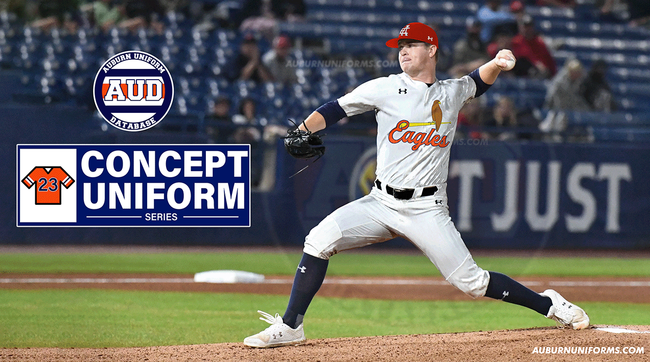
Back in April, I asked Twitter for some Auburn Baseball hat concepts for a little mini-series. A Cardinals bird-on-a-bat hat was among those creations. Now, we expand that look!
We’ll take a different approach from the solo hat concept. This uniform is based on St. Louis’s road grey uniform. To keep it simple, we swapped all instances of red for orange and any Cards blue is now Auburn navy.
This isn’t a concept for the Auburn Tigers baseball team, but rather for the Auburn Eagles program. Gotta keep the bird theme going!
The eagle-on-a-bat design gets added to the chest of the jersey. The Cardinals’ insignia wraps around the bat, so the new Eagle script – rendered in the same font – does the same!
The biggest departure from the source material comes with the ballcap. The now orange hat features a new interlocking A and E logo, leaning into the Auburn Eagles name. The St.L logo that the Cardinals wear is iconic and Auburn’s initials, whichever way you cut it, don’t make it easy to match.
Let's see if this makes the cut: A few years ago Arkansas used a Cowboys themed jersey when they played in Dallas. Mississippi St did something similar when they played UMass in Foxboro. How about a Falcons inspired jersey for the next time we go to Atlanta? — gAUlf (@gAUlf_WDE) June 4, 2023
Over the years, we have matched the Jaguars, Rams, Cowboys, Browns, and Patriots, Bills, and Seahawks throwbacks, in this series. Let’s go ahead and add one more!
Rather than going with the modern Atlanta uniforms (we already did a gradient uniform once anyways), let’s go back to the best Falcons look. The throwback uniform with the red helmet and black tops is the epitome of Atlanta football in my eyes.
Once again, we’ll do a simple color swap to start: red becomes orange, and black becomes navy. The primary bird-shaped logo will be represented by the modern eagle logo that has recently donned the basketball shorts.
The helmet gets a navy center stripe flanked by two white stripes. The original Atlanta helmets had a gold stripe to make sure the Falcons represented both Georgia and Georgia Tech with their uniforms. To Auburn-ize the look, we add a small set of brown stripes to represent the eagles.
The jersey numbers get an orange outline to match the Deion-era threads while the flying eagle logo gets added to the shoulders. The pants, simply enough, go untouched.
Baseball uniforms modeled after the 1976 White Sox shorts uniform. pic.twitter.com/zFqULxCG3c
— Matt (@MRickG_) June 1, 2023
Ah, one of the all-time uniforms in MLB! Let’s take a stab at it.
Starting from the top: The SOX hats are iconic (and one of my favorite wordmarks), but it’s kinda difficult to turn that into an Auburn design. Especially without making it look like the popular airport code hats. So, we’ll keep it simple and go TGR for Tigers. As Chicago has the city name on the shirt and the team nickname on the hat, I really wanted to stick to that theming.
The jerseys get some navy blue collars to match the original Sox design. The chestmark, nameplate, and numbers are all rendered in the same font as what Chicago originally used.
The shorts are plain navy blue and the socks will match Chicago’s identically.
Since we don’t have any photos of Auburn baseball athletes playing a game in shorts, we’ll have to make do with practice garb. Clearly, Cole enjoys it!
Love the use of the script in baseball. Blue helmet with script to pair with orange jerseys and blue pants.
— 🎩 𝘾𝙝𝙤𝙥 𝘾𝙝𝙤𝙥 𝙍𝙪𝙥𝙚𝙧𝙩 🎩 (@ChopChopRupert) May 30, 2023
Blue/Orange/Blue? Sure, why not!
As requested, we’ll start with a navy blue helmet shell and facemask. The script Auburn gets placed on the sides in a single-color all-white fashion. We’ll leave just the center orange stripe down the middle, solely to do something different this time around.
The jersey goes orange with navy details. The sleeves get a white/blue/white striping pattern, as that’s a much better look than the Barfield-era orange tops with the large centered white stripe. And, to make things pop, the numbers get a white outline – we saw how muddy navy on orange can look with baseball this year.
The pants will move to a blue base with the traditional stripes swapping to white/orange/white.
The inconsistent striping patterns throughout the entire uniform may be a drawback, collectively. But I think the pieces work well individually here.
But let’s see what Tank has to say about these:
I’m baaaack! let’s do a “Welcome to Construction, Don’t Mind the Auburn” theme in honor of the old Hill/new COE. Turn the 90s baseball vest uniform into a construction vest, hats into hard hats, all auburn colors, incorporating construction signs, reflective Northwestern stripes.
— jillian (@macnchillian) June 1, 2023
As is tradition, we wrap up another year of crazy concept uniforms with my sister-in-law’s designs. It doesn’t matter the time of year, there is always construction going on in Auburn!
We’ll begin this design with a basic hi-vis orange safety vest. The usual reflective stripes remain on the vest in a silvery color outlined in a day-glow light blue color. The AU logo and player number get placed into a small cut-out box of the upper stripes and are the rare appearance of navy on this design. Both the logo and number are outlined in the reflective silver.
To top off the jersey, the placket and headspoon piping is light blue as well as the undershirt.
The pants get a bit of a reverse colorway, going with a light blue base color trimmed in the hi-vis orange and silver. The belts and socks will also carry the orange color.
And, because we can, we top it all off with a traditional orange hard hat, complete with the light blue AU logo.
It’s a unique look! A look only this series could put together.
So that’ll do it for this year of crazy concept designs! Thank you to everyone that submitted ideas and allow this series to continue each year.
Did your suggestion not make the cut? Don’t worry – there are always great ideas that unfortunately get left on the cutting room floor. I’d love to create every single one of them if it were possible.
We do this every summer. So go ahead and get working on next year’s concept ideas!
Which of these 14 crazy concept uniforms is your favorite?
Enjoy learning about Auburn uniforms and history? Want to see more like this? Be sure to follow the Auburn Uniform Database on Facebook, Instagram, and Twitter for even more uniform news. You can also purchase your favorite team’s merchandise through Fanatics or Dick’s Sporting Goods, with a portion of your sale going to support this website.
