It’s my favorite time of the year – time for another round of crazy concept uniform designs!
If you’re new here, I put out an all-call on social media each summer for the craziest, silliest, and sometimes possibly realistic concept ideas that Auburn fans would like to see come to life.
Why?
Well, the summer is often riddled with talking heads discussing alternate uniforms. The same horrendous designs have been passed around for years. It’s time to change that (and add more fuel to that fire!).
This series also works to show that Auburn’s uniforms are pretty good as is. The Tigers don’t need to make any changes or bring unnecessary alternates into the rotation just because they can.
A few things before we get started:
- First off, these designs are intentionally silly, obnoxious, and over-the-top. That’s the point. No one expects to see these hit the field or court. We aren’t saying Auburn should wear these whatsoever. If you are truly upset about these designs, that’s solely on you.
- I am not a designer or an artist. This is always a fun project that helps push my very limited creativity. These are not the world’s best Photoshop jobs and they were never expected to be so. Again, they’re goofy on purpose.
This was the first year that suggestions have been opened up to Facebook and Instagram, stepping out of just the Twitter/X audience.
This year’s crop includes eleven new designs! Did your idea make the cut?
Let’s dive in and take a look at this year’s crazy Auburn concept uniforms!
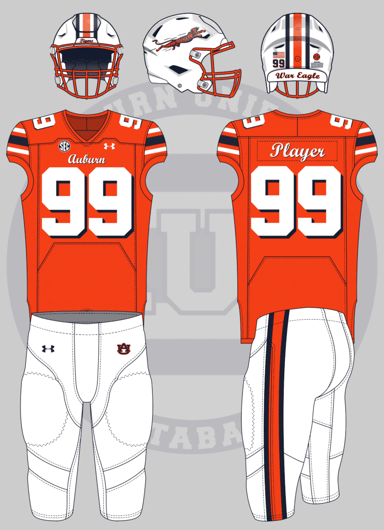
White pants, orange jerseys with white numbers and blue drop shadow (like ’97 jerseys), front “Auburn” and back names in cursive script, white helmet with orange mask. Your choice of side logo.
We start off this batch of designs with a (relatively) simple concept. I love it when the suggestion is as detailed as this one is, but also allows some creative liberties!
Orange jerseys are always requested in this series. While we don’t repeat concepts, it’s always fun to add a unique twist to a uniform design like this.
The orange jersey includes white numbers with a navy blue drop-shadow. The sleeve stripes go white/navy/white, which I will always believe is a better look than what the Barfield uniforms sported. The script logo on the chest gets a matching drop-shadow and looks fantastic.
The script motif carries to the player name on the back and the helmet’s front and rear bumpers. The helmet also gets an orange facemask to tie it all together (and it’s the best facemask look).
That leaves the helmet logo. With dealer’s choice on what to place here, I went through my logo collection. Nothing really spoke to me until I found what I call “Super Tiger.” Our little leaping friend was a design I discovered years ago and I, sadly, can’t remember where. But I love him and felt that he fit perfectly with this design.
I might need to get Super Tiger decals made for my own helmet collection…
Basketball jersey with the leaping tiger logo jumping over block “Auburn” on the front. Similar retro look to the old Raptors jersey. Leaping tiger logo on the side of the shorts with piping at the bottom.
A few years ago we mimicked the old Vancouver Grizzlies uniforms. It only makes sense to replicate probably the most popular uniform in all of NBA design.
Thankfully the Raptors’ uniform features striped collars and armholes, so we get to leave those untouched here. Most of the design work comes on the body of the jersey.
I almost ditched this idea because I did not want to rework the original Raptors wordmark. I then decided to stick with an Auburn 1990s aesthetic and went with the old wordmark design. The leaping tiger logo gets added to the chest with the tiger tail looping around the wordmark tail. The player number flanks the Tiger in a font that matches the wordmark.
The player name is encased in a navy box on the back of the jersey. The Raptors had dinosaur spikes on their nameplates, but we’ll simply include some tiger stripes here.
For the shorts, the jersey stripes are added to the waistband and hemlines. The tiger logo is added to the right side of the shorts. The left side gets a triangular field to house the player number, a callback to the John Mengelt era of Auburn uniforms.
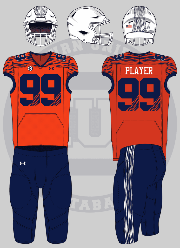
Football uniform, no Auburn logos. The whole uniform is alternating variations of orange/navy/white tiger stripes. For instance: white helmet, navy stripes; orange jersey, navy stripes; navy pants, white stripes.
The gaudier, the better.
When you ask for gaudy, you get gaudy!
Yep, it’s gaudy and obnoxious. But that’s the point!
The white helmet has a matching white facemask and no logo as Adam requested. The center stripe is just navy tiger stripes. The stripe tapers outward at the back end, similar to the Buffalo Bills, just for an added flare.
An orange jersey features navy numbers and tiger stripes across the shoulder yoke and sleeve caps. The TV numbers get a white stroke to stand out slightly. The body numbers get their own stripes, cutting out the bottom right corner of each digit. Navy collars and sleeve cuffs top this look off.
The pants are navy and the traditional stripes are replaced with, you guessed it, tiger stripes.
Gaudy might not be a strong enough word…
Year three of suggesting a football jersey inspired by one of these 90’s Apex unis. Feel free to straight-up rip one of these off or design one of your own.
Carter has been suggesting this idea for years. And each time, I’ve tried and failed to figure out how to do it justice. This year, I was determined to tackle it.
If you look through the few designs that Apex created and inspired, there were multiple routes to take. I debated Minnesota’s front chest logos and Arkansas’s giant hog logos. I ultimately decided to go with a Dallas Cowboys-inspired look. Yes, Apex created the Cowboys’ famous Thanksgiving look. No, I wasn’t aware of that either!
Starting with a white jersey, the shoulder yokes go navy. To incorporate the Minnesota wrap-around stripes a little, the yoke is outlined in orange. The TV numbers are now white while all sets of numbers get a double-outline to match the Apex aesthetic.
Giant AU logos are placed on the shoulder caps, too big to view the entire logo. I went with the navy/orange/white colorway for the logo here to fit the period a little better rather than using the now-correct orange/white version.
While Apex uniforms included very unique jerseys, the rest of the team uniforms were left untouched. So we leave the traditional Auburn helmet and pants unchanged here.
Yes, the jersey isn’t as white as the rest of the uniform. It wasn’t easy turning the navy uniform white and keeping all the details. I warned you I wasn’t the best at Photoshop here!
War Eagle Wall baseball uniforms: white jerseys with the war eagle wall text across the chest. Navy lettering with orange shadowing.
After doing this series for now ten years, I wonder if the best ideas have been exhausted. And then an idea like this comes through and I can’t believe we haven’t done this before!
(The wall design we all know today was originally painted by Randy Brown, who has been a pivotal part of Auburn’s design history.)
This one is really straightforward. The base uniform is slightly off-white and includes a brick motif throughout the hat, jersey, and pants. The chestmark and player numbers are rendered in the traditional Clarendon font with the same orange drop-shadow as the real wall. Even the Under Armour logos get in on the drop-shadow fun!
We tie it all together with the hat’s AU logo getting a similar drop-shadow treatment as the rest of the design.
I LOVE this look and really happy with how it came out. There’s often one uniform each year that looks like it could truly come to life one day. And I think this one fits that bill this season!
I have an idea but hear me out! A way to bring awareness to a famous, yet underappreciated alum, James Dean!
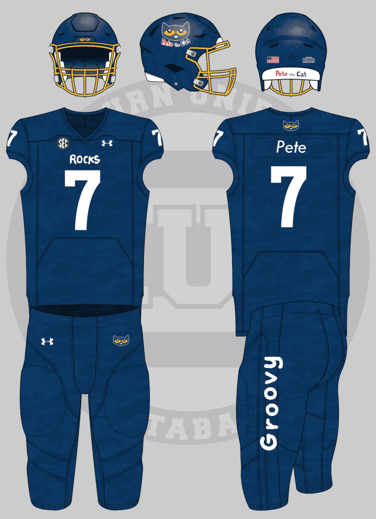
Pete the Cat football uniforms:
Navy lids, tops, and bottoms for Pete’s fur
Maybe a Pete decal
Yellow facemask for Pete’s eyes
Red cleats for Pete’s famous red shoes
Avery has a lengthy list of creative suggestions, from Momma Goldberg’s to celebrating the city’s new Buc-ee’s location! This one fits the bill and celebrates an Auburn alum!
Avery knows all too well my annoyance with alums not being celebrated until they hit the biggest stages of their careers. Think Tim Cook, Octavia Spencer, and many more. I even launched Today in Auburn History earlier this year that, in addition to celebrating the everyday moments that have occurred in Auburn’s history, will celebrate more former Auburn students.
Note to self: add a page for James Dean now!
Avery is good at giving specific design briefs. It must be the artist in him. So we’ll start this one and take Avery’s ideas rather literally.
A navy blue base for the entire uniform is then covered in a pattern to resemble Pete’s fur. In fact, this pattern was taken directly from the Pete the Cat covers. The helmet gets a yellow facemask and the Pete the Cat logo on the sides, along with Pete’s eyes on the front bumper. The logo text is also utilized on the back of the helmet to tie it all together.
The jersey features “Rocks” on the chest. This was from the book “Pete the Cat: Play Ball!” where the titular character plays baseball. Pete joins The Rocks team, which sports red jerseys. Our favorite cat character also wears #7, which carries over here.
The Pete cat head logo is placed on the back of the jersey above the player name and on the pants hip. The pants also get “Groovy” on the leg, which is a recurring theme in Pete the Cat books.
I went back and forth trying to figure out what to add to tie this to Pete even more. While Pete’s “Four Groovy Buttons” and other features nearly made the cut, the decision was made to leave this one rather simple and straight to the point.
Even though the flat mockup looks ever-so-slightly plain, I think it looks better modeled here by Payton Thorne!
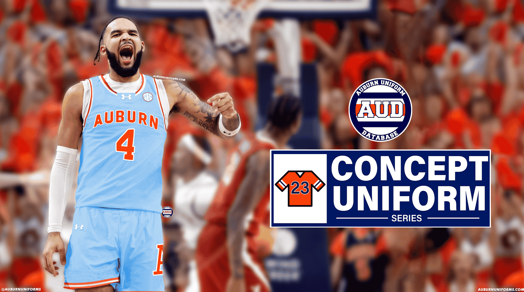
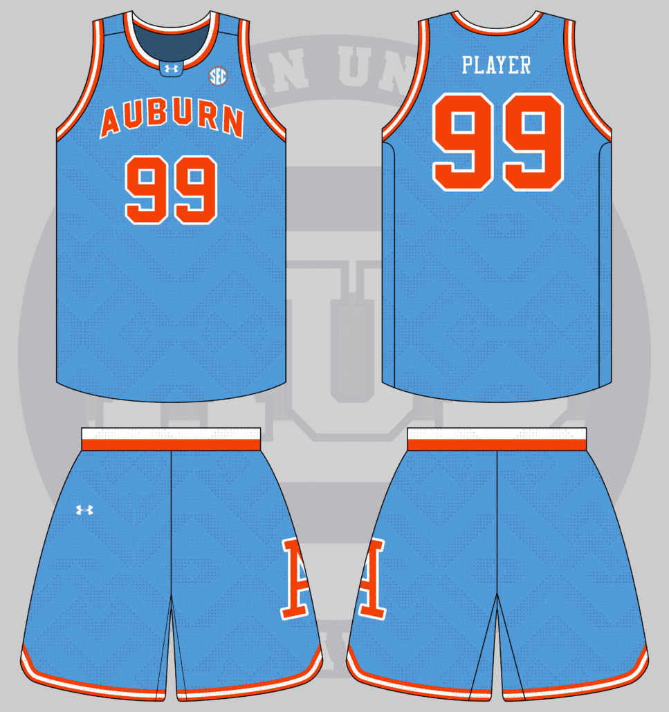
I’d love to see Basketball uniforms based on the Bo era baseball powder blue uni. White and orange stripe down the shorts.
Auburn Baseball debuted the powder blue uniforms in 1976 and wore them through the 1980 season (as far as I’ve been able to confirm). Powder blue apparel has been so hot in recent years that stores have trouble keeping it in stock.
I love this concept. A beautiful uniform mixed with the hottest program on campus. Let’s see how it turns out!
We’ll start this design with a powder blue base. Throw on the same wordmark the baseball team wore in the 1970s and 80s and a matching number. The collar and waistband will feature two stripes while the armholes and short hemlines will feature three to match the source design.
To add to the baseball-inspired look, let’s throw on the block A the Tigers wore on their caps. For the sake of being unique and harkening back to previous basketball uniforms, the logo will only be placed on one side of the shorts rather than both.
Throw it all together and I think we have a really solid look!
I must say, this might be my favorite result of this year’s uniforms!
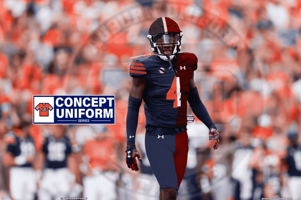
The year is 1943 and most of Auburn and Alabama’s players are fighting in WWII. In an effort to boost morale, they combine to create one college football team, the Auburn-Alabama Crimson Tigers, a la the NFL’s Philadelphia-Pittsburgh Steagles.
This may have been my favorite suggestion of the entire year. It’s always fun to get such a thought-provoking idea and one with such historic ties as well!
I battled with how to make this work in my head. And the only way to figure it out was to write a backstory for it all.
The lore goes as such:
With both schools unable to fill complete teams to compete in collegiate football, the rival schools who hadn’t faced each other in 36 years combined forces to boost the morale of the students, fans, and state of Alabama as a whole. Football was/is king in the South, after all.
Advocates had fought for the two schools to compete on the gridiron for years to no avail. The two parties were so far apart that it wasn’t going to happen. Now getting them to agree on the details of a merger? That was going to be impossible.
Frustrated by the stagnation of discussion, a support staff member from both schools stepped up to tackle it as only they could. In a sign of togetherness, the two men both took a sweater jersey and ripped it down the middle. They then paired the right side of the Auburn jerseys with the left side of the Alabama jerseys and sewed them back together.
The Auburn side was navy, complete with the orange numeral and sleeve stripes. The Alabama half was crimson red with a white numeral and no other decorations. Because they knew the debate would continue, they did the same thing to the pants. Auburn’s navy blue pants and Alabama’s khaki-colored britches were ripped, paired, and sewn back together.
The Frankenstein uniform was then modeled to the suits in a big board room trying to come to some conclusion. It wasn’t at first well received, but every member of the decision-making team finally accepted it as the only option. Only then did the remaining items of the to-do list get split evenly between the two schools.
Ultimately, this very moment would be what would bring the Auburn-Alabama annual rivalry game back to the gridiron in 1948. It would take another few years due to scheduling issues and having to rebuild the squads following the war’s conclusion.
Once the initial meetings concluded, one of the Auburn decision makers asked the staffer about the uniforms.”How did you two decide which school would be on which side of the uniform?”
“Auburn is on the right side, because, well, Auburn is the right side,” the staffer said with a coy smile.
With the 100th meeting in the Iron Bowl fast approaching, the two schools wanted to work together to honor the special combination team that helped rekindle the rivalry and spark the state’s assistance in America’s victory in World War II.
The new throwback uniforms will harken back to the split uniforms with the crimson and navy halves. A few stitching patterns overlay the two colors to represent the hand-sewing work the two staffers accomplished all those years ago. The numerals will never match, regardless of the player’s number, just like the 1944 team had.
The chest mark reads “A State United” while the SEC patch is rendered in white on the Auburn navy side. The patch includes a black memorial band across the letters, meant to honor all the players who gave up their careers to go fight for their country overseas. Some, unfortunately, never returned home.
Teams in the 1940s wore leather helmets, so a bit of artistic licensing was needed for the helmets. We’ll stick with the modern shells, but mimic the leather aesthetic as much as possible. Once again, the shell and facemask get split right down the middle navy and crimson. A special leather stripe decal runs down the middle and across the top to form a “t” shape, similar to some leather helmet panels of the era. The rear bumper repeats the “A State United” theme of the uniform design while the USA flag and a black SEC decal are placed on the back side.
Yes, it’s a monstrosity, but I think the story here at least helps the cause haha!
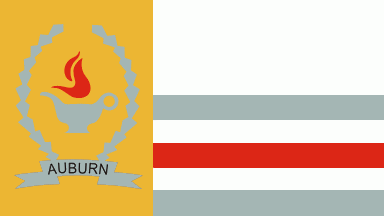
I’d like to see a Nike “City Edition” style men’s basketball uniform that uses the city of Auburn’s flag as inspiration.
Carter always brings the most interesting and unique ideas to this series. This may be his best one yet!
While we’re tackling this, can we please get Auburn a new city flag? This thing is rough!
Despite the rough nature of the Auburn flag (which I don’t know if anyone knew existed), this was a fun one to convert. Trying to balance all the colors and design elements was a unique challenge.
We start with a white base for the uniform. Gold gets the nod for a more prominent color and is used on the collar, side panels, and waistband. The wreath design found under the lamp is going to be placed on the collar for added detail.
The triple grey/red/grey stripes from the right side of the flag are going to be used as armhole stripes and around the bottom of the shorts. These make for a nice, more subtle pop of color to balance out the gold. The player numbers and name on the back are designed to mimic this colorway as well. The front number also gets to be flanked by the wreath design, because why not.
The chestmark is taken directly from the flag – a banner shape with the city name across the center portion. And yes, that is basic Arial font. The lamp from the flag can’t be left out and is placed on the left side of the shorts.
All in all, I don’t hate this look! It’s certainly not an Auburn University uniform, but for the source material, I think it works well enough.
Give me your worst (best) early-mid 2000s style football uniform. Piping, tapered stripes, weird fonts, etc.
Every era of uniform design has its fair share of hits and misses. The 2000s is no exception. Well, Matt, you asked for it, so here you go.
This look combines multiple team uniforms into one. The most prominent is from the Miami Hurricanes. The Canes won their 2001 title sporting uniforms with a unique stripe that went from shoulder to shoulder across the front chest and rear body of the jersey. It was only natural to include this feature.
Hunting for inspiration, I came across the Indiana Hoosiers who inexplicably included black in their look during this period. The Hoosiers sported red jerseys that included black side panels that tapered into a Denver Broncos-esque chest stripe. So of course we combine that with The U shoulder/chest stripes!
The jersey also includes a striped collar, another feature common during this era. I almost added contrasting sleeve cuffs to round it out, but the two different striping patterns intersecting the cuffs simply worked that much better. The drop-shadow number craze hadn’t fully concluded, so let’s bring it back here, why don’t we?
We top off the jersey with the Tiger Eyes logo placed on the shoulders above the Miami stripes. Why? Because it’s the 2000s, Auburn just revealed this logo a few years prior, and, well, it’s something that the Tigers would’ve done if it weren’t for the traditional stripes.
Since we’re already using the Broncos – kind of – for inspiration, let’s continue that to the pants. Instead of Miami’s more unique stripe shape, let’s match the Indiana jersey stripe. But a solid color horn-shaped stripe isn’t enough. Let’s go back to Miami and mimic their pants-striping design here!
One last Denver element to round it all out – the helmet stripe. Forget the traditional helmet striping, let’s taper it at the front. It only makes sense at this point!
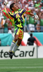
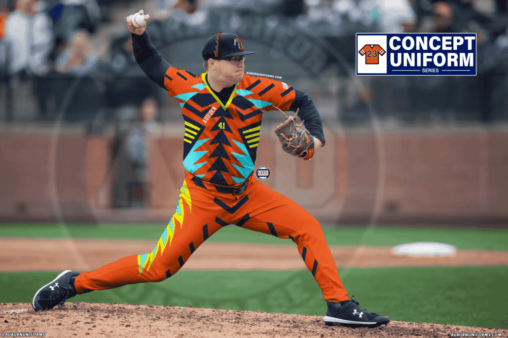
My idea is to do baseball uniforms based on the Mexican soccer goalie Jorge Campos’s jersey in the 1994 World Cup. It’s camp, it’s slay, and it’s chaotic! Make it orange, navy, and whatever other colors bring this epitome of the 90s back to its glory!
If you’ve checked out even one entry in this series, you know a permanent spot is reserved for my sister-in-law. She’s had great ideas in the past, including a sparkly gold uniform with a cape. Yes, really.
This year’s suggestion is one of the most intriguing. As a non-soccer fan, I wasn’t familiar with Jorge Campos’s name, let alone his aesthetic. And take some time to look through this man’s catalog of kits. They’re simply incredible!
How do you turn such a crazy design into a baseball uniform? Well, there was only one choice – as close to a 1:1 copy as possible.
And this thing was nuts. Auburn’s comparatively limited color palate made this one even more difficult. Because of that, I added yellow to the design. Fun trivia, yellow is an official Auburn school color, reserved solely for the Tiger Eyes logo. I also threw in powder blue, a popular apparel color as we discussed earlier.
I tried to match the Campos kit as close as possible, utilizing an orange base. The orange also includes a subtle tiger stripe pattern, which feels appropriately 1990s. Instead of the manufacturer’s logo on the upper right chest, I placed the Auburn team name here. Because how else would you know this was for the Tigers?!
The pants and socks/stirrups resemble the same looks that Campos sported. There’s something special about this look being as loud as it is and the socks being so simple and refrained.
The hat may be my favorite part of this. I was trying to figure out how to translate all of… this… to a ballcap when I simply searched “Jorge Campos kit hat” and this thing appeared. It’s hilariously meta that it just had to be used. To top it off, the hat logo is flanked by the same angled team name as on the jersey. A matching stripe encircles the front two panels to tie everything together even more.
I feel like I should apologize to John Armstrong…
Phew. There’s another eleven crazy concepts and another chapter in this fan-favorite series complete! Here’s a look at all the designs one last time.
Which design was your favorite? Which one do you think can actually come to fruition?
Did your suggestion not get picked? Don’t worry! We do this each summer. We’ll do it again next year!
Want to see more like this? Be sure to follow the Auburn Uniform Database on Facebook, Instagram, and Twitter for even more uniform news. For ways to support the AUD, including affiliate links to Fanatics and Dick’s Sporting Goods, visit the Support page.














MLB city connect baseball uniform with toomer´s corner ¨WAR EAGLE¨ across the front.