Auburn Wears Nickname for First Time Ever
The Auburn men’s basketball team has debuted a new uniform for the first home conference game of the season for the second time in three years. Back in 2015, the Tigers wore Under Armour’s newest template and design with brackets on the shorts and jerseys, and tiger stripes sublimated on the majority of the uniform. Thursday night would see the debut of Auburn’s third different uniform in two years.
Thursday night, as Auburn was set to open SEC play against rival Georgia, the Tigers debuted another new set. As I arrived to the Arena, I immediately noticed Anfernee McLemore warming up in a new pair of game shorts. Not long after that, Mustapha Heron walked onto the court in full uniform. A few moments later, the Auburn Basketball twitter account gave us our first official look at the brand new uniform.
Tigers breaking out the new home whites for the @SEC opener vs Georgia 6 pm CT on ESPNU #WarEagle pic.twitter.com/1rXmpQTu9v
— Auburn Basketball (@AuburnMBB) December 29, 2016
Once again, Under Armour continues to use Auburn’s infamous Northwestern stripes as design motifs. The stripes now don the sides of the shorts and jerseys in a pointed/diamond fashion, as well as on the back on the collar.
The abdomen stripes are rather short. I’d personally prefer them to be a little longer. The shorts stripes have the AU logo sitting right on top. The striping, again, is short, but the template itself makes it seem shorter.
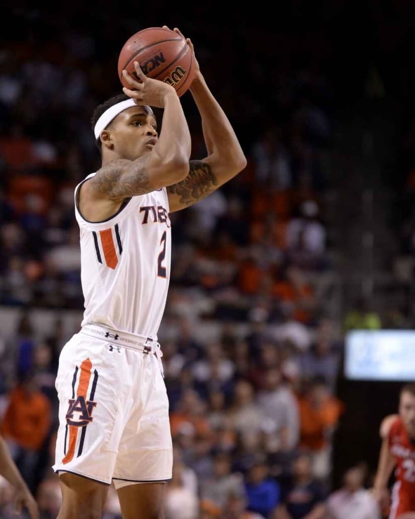
Bryce Brown shows off the side stripes against Georgia (Photo via Madison Ogletree, Auburn Plainsman)
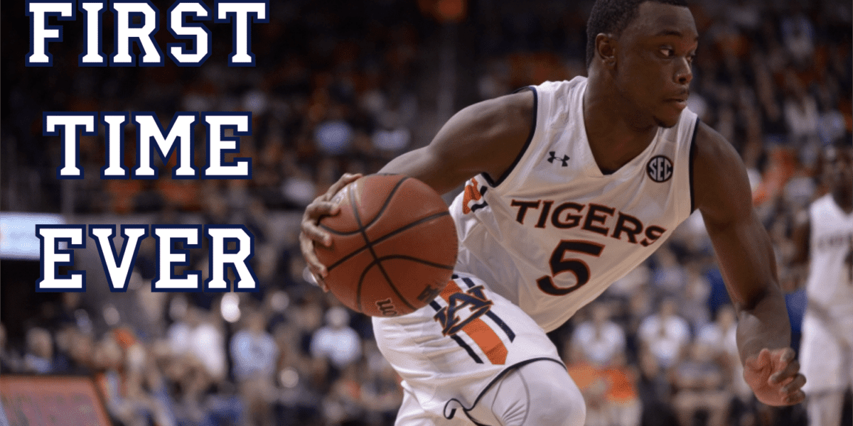
The biggest change with these uniforms is the chest mark. Auburn has sported a basketball team since 1906. No team in those 108 years have ever worn “Tigers” on the chest. Until 2016. These new uniforms became only the second set on Auburn’s campus to sport the team nickname on the chest, with softball’s new grey uniforms.
This comes at an odd time, as Auburn has continued to push marketing the school name over the nickname. I contacted Auburn Athletic Director Jay Jacobs about this a few years ago:
As for the branding of our uniforms, there has indeed been a concerted effort to brand “Auburn” over “Tigers” since we underwent a branding study several years ago. The decision was to use the interlocking AU and AUBURN in Copperplate font as our primary mark. Having said that, our coaches do have input on our uniform choices.
I also heard that the baseball team was begging for a new jersey with “Tigers” across the chest a few years back, but were ultimately denied. It’s fair to say that these uniforms were approved through Bruce Pearl. Coach Pearl has a ton of power in Auburn, and this is easy within his realm.
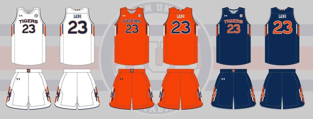
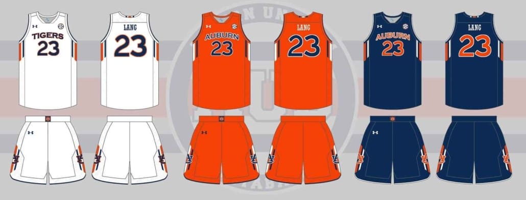
Auburn debuted the 2015 tiger stripe alternates in a win against Missouri on January 10th. Unfortunately for the “Tigers” uniforms, the team fell to Georgia. The striped uniforms were worn the remainder of the season and through a magical run in the SEC Tournament, minus one game – the orange out game against Ole Miss. The biggest question for the “Tigers” set is if they’ll have a similar fate of being part of a new set that will be worn the remainder of the season. There hasn’t been any indication whether there is a blue – or even orange – set. If there truly are, they’ll more than likely look like this:
That is, if they keep the team nickname on the chest. Take a look at professional basketball and baseball teams. The normal rule of thumb is to wear the team nickname at home, and the city name on the road. It’s quite possible the road versions will follow that rule as well. If so, they’ll possibly look like this:
Personally, I think these uniforms are a big downgrade from the throwback-inspired design that Auburn debuted last season and since tweaked a little bit. I didn’t hate seeing “Tigers” written across the chest, but I realized midway through the game just how much I dislike the Copperplate number font on a basketball jersey. After about a year and a half of the old school block font, I was spoiled. If there’s anything that can hold back Auburn’s athletic uniforms (outside of football, of course), it’s the Copperplate numerals.
Enjoy uniforms and want to learn more? Be sure to follow the Auburn Uniform Database, like the AUD Facebook page, and follow me on Twitter for even more uniform news. Also, you can support this site by purchasing AUD t-shirts and other merchandise.
Featured image via Madison Ogletree, Auburn Plainsman

Great job as always Clint. I could not agree more–this is significant step back from the simple, clean look of the last year and a half.
I also think it speaks to a larger problem and that is the Copperplate font it looking very dated. It is time for a new word mark and it's past time to remove them from the uniforms.
A few thoughts, I agree this is a bit of a downgrade from the throwback or fauxbacks we have been sporting this and last year. However, for us in basketball I do not see much of a reason to keep the same uniforms year after year when we do not really have an identity like football.The kids love new uniforms and it will help recruiting to have a new set or two each year like we have since Pearl got here. I would even be ok with a grey set as alternate. The stripe looks sharp to me, but could be longer. Good news we will have a new set this time next year if you don't like these.
Generally, I like the old style block lettering but have no issue with Copperplate font. It actually looks sharp and clean to me, somewhat unique. Having one font, and the Northwestern stripe throughout our programs is good branding, ties everything together (synergy if you will). When I grew up we had all kinds of different fonts and schemes across sports and it frankly looked messy when taken together.