The Dark Ages of Auburn Basketball Uniforms
This site was originally set up to document the uniform history of Auburn basketball. As I went through and documented the many different uniforms of the program, the 2000-2004 period was always difficult to nail down. The biggest issue was that, for some reason, photos and videos are few and far between, let alone those in good quality. So trying to track down evidence of the uniforms and date them was extremely difficult. Now that I’ve acquired basketball media guides and Glomeratas (Auburn’s yearbook) from the time, it’s been a little easier.
Last week saw a breakdown of the infamous tiger striped jerseys, and their nearly identical successor, but those just set the tone for Auburn’s uniform aesthetics for the next half decade. The first five years of the new century started off fantastically for the Tigers play-wise. But the uniforms were nothing short of a dark time for the program.
As mentioned last week, the Tigers wore two different tiger striped jerseys across the 1998-99 and 1999-00 season.
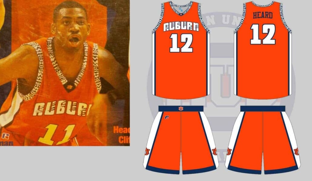
Towards the end of the 1999-00 season, Auburn decided to go ahead and mix things up early. The orange jerseys that featured blue and white panels on one side were fazed out for a new (awful) orange uniform with something more similar to Aztec print than anything else I could find. The wordmark and numbers were rendered in Russell Athletics’ “Rock” font, but the wordmark had a little bit more detail to it. For whatever reason, someone thought it to be a good idea to add tiger stripes to the arched wordmark, creating a really odd clash with the patterned design on the sleeves and collars.
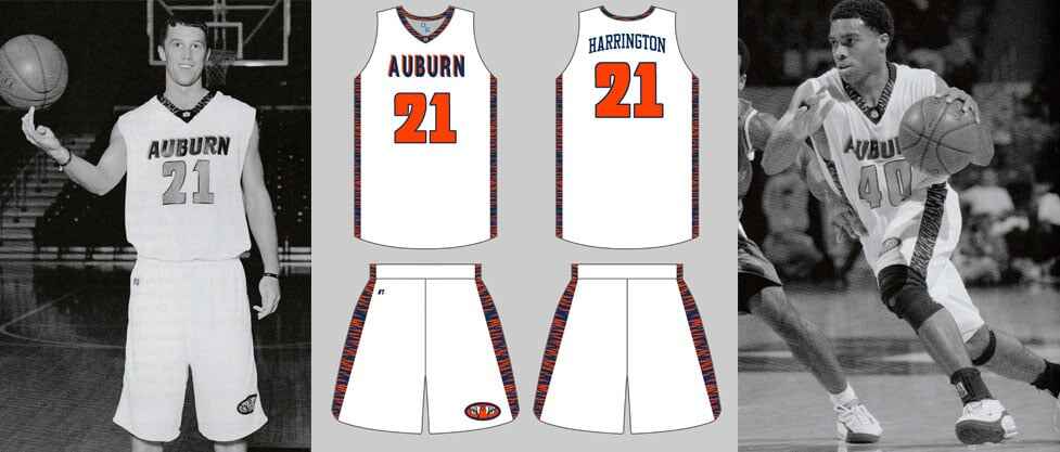
As the 2000-01 season approached, Auburn completely changed up two of the uniforms, keeping the blue jerseys classic. The white uniforms continued Auburn’s love for the tiger stripes, now being featured heavily on the side panels of the jerseys and shorts. The team continued to use the “Russell Rock” font for the numbers. Quite possibly the most horrendous piece of this uniform was the chest wordmark, which I called the “neon lights” look. “AUBURN” was rendered in an odd “Russell Viper” font with a reverse drop shadow-like effect.
The orange jerseys kept the tiger striped “Rock” wordmark, but removed the patterned sleeves and replaced the collars with the same tiger stripes that Auburn had worn the last few seasons.
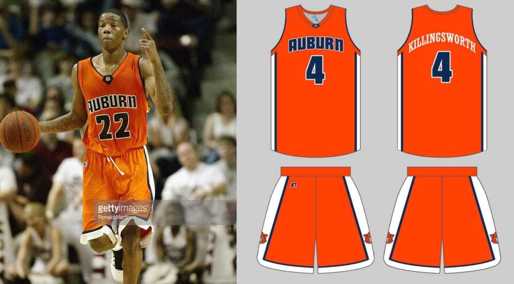
The 2001-02 season saw a little bit more uniformity for Auburn’s designs. Once again, the blue uniforms stay the same. The orange uniforms kept the same design as last time (tiger stripe collar, “Rock” font numbers and wordmark) but changed the font and wordmarks from white to blue, and dropped the tiger stripes on the chest “AUBURN.”
The white uniforms would basically be a recolored versions of the orange design, but with blue wordmarks and orange numbers.
Auburn decided to trash the tiger stripe look for the 2002-03 season. Once again, the blue uniforms were untouched, but the same can’t be said for the other two sets. The orange uniforms saw the least changes, simply removing the removing the tiger stripe collars and tweaking the shorts to remove the blue waist band.
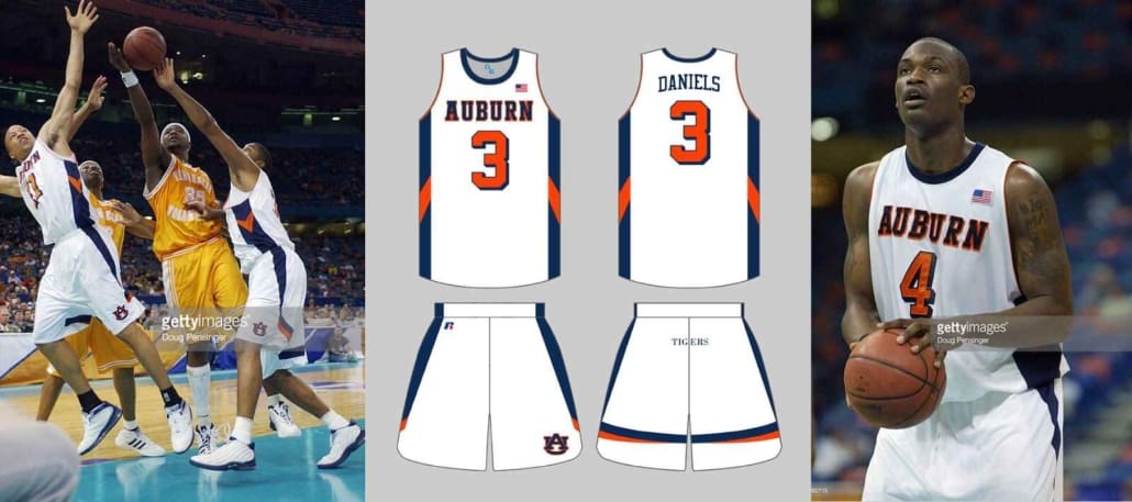
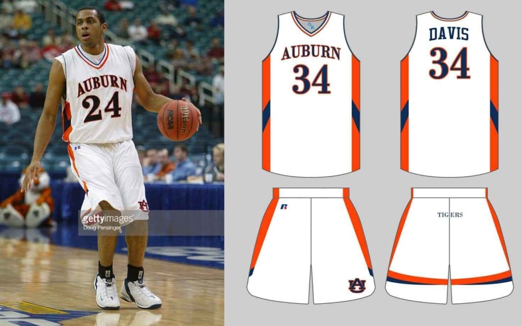
The white uniform is where the biggest changes came. Gone are the tiger stripes, the “Rock” font and the traditional side panels. The new design features an old-school crew neck collar, blocky wordmark and numbers, and side panels with an odd v-shape design. The shorts also featured a unique design, with the panels tapering down the leg and eventually wrapping around to the back of the leg. This would also be the first time Auburn basketball would wear a tramp stamp on the shorts.
The biggest changes across the board came in 2003-04, as Auburn broke out brand new white and blue uniforms. Sadly, I’ve yet to find any evidence of an orange jerseys being worn this season. Both sets would be based off the previous white set, complete with the odd side paneling and short designs. The white tops would see the side designs color swapped from the year before, with orange being more prominent and the v-shape being blue. The crew neck from the year before was replaced with a more traditional collar, complete with thin orange, white, and blue striping. Auburn also went back to the wordmark and number font of the tiger striped jerseys.
The blue uniforms would be color swapped versions of the white. White being featured so heavily on the side panels was a poor design choice.
In a short four seasons, Auburn wore nine different uniforms. It wasn’t just minor tweaks across the board (like the orange jersey saw), but these were major design overhauls across the board. Thankfully, the 2004-05 season started a much more tame and consistent rotation of uniforms. Once Auburn switched over to Under Armour, the uniforms have continued to get better each to and the current throwback design is one of the best the program has ever sported.
Enjoy uniforms and want to learn more? Be sure to follow the Auburn Uniform Database, like the AUD Facebook page, and follow me on Twitter for even more uniform news.






Interesting that auburn and other college basketball team have no set uniform style as is found with Auburn and many other college football teams. I guess there is no tradition in college basketball for uniforms. Even Kentucky constantly alters their basketball uniforms.