New Alternate Auburn Baseball Uniform
The rumors were true, they do exist. Yes, the poorly designed and unfortunately sold at retail jerseys that were seen in shops over a month ago are real. They made their debut over the weekend. And they look just as bad on the diamond as they do the clothes hanger.
For the second week in a row, Auburn played a Thursday-Friday-Saturday conference series. This weekend, the Tigers hosted the Tennessee Volunteers, who are in the first year of a Nike rebrand. The Tennessee team has been known to wear some not-so-flattering uniform combinations this season. When Auburn announced via the Twitter account that the Tigers would be wearing the previously rumored uniforms, I just knew that this would be an ugly weekend of baseball uniforms. Low and behold, Thursday night’s series opener proved to be just that.

Thursday night’s game was extremely rough on the uni-watching eyes (image via Kenny Moss, Auburn Athletics)
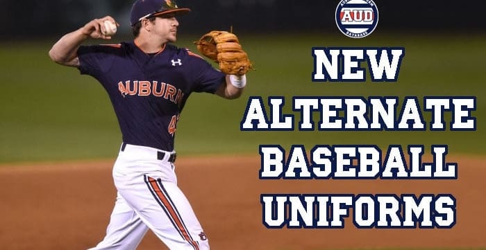
Thursday night saw Auburn break out the white version of the new striped alternates. I arrived at Plainsman Park early, like normal, and was appalled at how bad these uniforms looked in person. Until the promo photos from the Twitter account, I wasn’t aware of the new tops being paired with new pants. I didn’t realize just how much the stripes – tops and pants – tapered to a point at the bottom of the respective article. The promo photos showcased the pants featuring a single AU logo on the right knee cap, and it looked even more comical in person.
I’m not against the use of Auburn’s infamous Northwestern Stripes being used on the baseball diamond, but it certainly has be done better. There were a lot of things wrong with the stripes used on these baseball alternates that kept them from being an even decent looking set. First off, the stripes weren’t even a true representation of the stripes used on Auburn’s football uniforms for decades, and recently the basketball and soccer teams’ uniforms. The white uniforms saw the better representation of the stripes, only adding a set of blue stripes on the boarder of the middle orange stripe. The blue set ultimately confuses me, with the striping – the white-blue-white area – being placed on an orange field. The blue tops don’t even feature a recolored version of the stripes used on the white tops! For the most part, when a team has two different colored uniforms with the same design feature, they simply recolor it! I have zero idea what Under Armour was thinking when they designed these two sets of stripes, especially those on the blue tops.

Cody Nulph, who usually wears stirrups, un-cuffed his pants halfway through Thursday’s game. Apparently these new striped pants hate stirrups. (image via Kenny Moss, Auburn Athletics)
Outside of the design of the stripes themselves, they weren’t even placed well. Where I imagined the stripes to be placed completely vertical, they instead started on the front side of the sleeves and ended pointing towards the back side of the arm, seeming to wrap around the sleeves. And with the stripes on both the jerseys and pants tapering to a thin point, the design just felt rushed an unfinished. As mentioned above, we know Under Armour can do true Northwestern Stripes justice. One frustrating aspect with these alternates is that Under Armour produced the same striped design for Northwestern, and did it so much better (on the sleeves, at least)! If Under Armour had produced these Auburn uniforms with a truer representation of the stripes, sleeve stripes that don’t wrap around the arm, and stripes that are solid throughout the uniform rather than tapering, it’s possible that these had been a successful look.
For the Friday matchup, Auburn debuted the blue alternates. I already explained my displeasure with the striping, so no need to rehash that here. Much to my surprise, I actually liked the blue tops better than the whites – lesser of two evils, speaking. When we first saw these designs hanging in the store, I immediately leaned towards the white tops and hated the blue version, mainly because of the poor stripe pattern. But after seeing the two uniforms in person, I truly think the blue tops are much less visually jarring, for whatever reason. I can’t pin point the reason, but I shocked myself when I came to that realization.

Among the poor design choices made by Under Armour, the Auburn logo on the knee cap was comical (image via Kenny Moss, Auburn Athletics)
How about those pants? If the stripes weren’t bad enough, the AU logo on the kneecap was truly laughable. It made for a good reference point for a strike zone, and in turn good material for a heckle pointed at the home plate umpire, but I digress. Much like the stripes used on the blue jerseys, I have no idea the reasoning behind Under Armour placing the logo on the knee. We see hip logos on football pants all the time, but that trend has thankfully stayed away from baseball. Nike, on the other hand, has starting putting their logo on the right knee, roughly in the same position as the AU logo was for Auburn.
As for some of the smaller, minor details, the AU logo appeared on the back of the jersey, similar to that of the softball uniforms. Also, the new pants are on Under Armour’s latest template, which features the manufacturer logo on the belt tunnel as opposed to above the back pocket, again, a move that resembles that of the softball team. Each jersey featured a contrasting-colored strip around the collar – blue on the white tops, orange on the blue tops. Finally, the SEC patch on the left sleeve has been updated to feature the orange outline – as opposed to the white outline worn on the other uniforms and other Auburn teams.
I mentioned at the beginning of this piece that I was worried about really bad looking uniform matchups throughout the weekend, and sadly those worries came true. The first game of the series saw Auburn, of course, in the newly debuted striped white alternates. Tennessee, on the other hand, broke out their all-Smokey grey road uniforms. I go back and forth on whether I like Tennessee’s use of “Smokey Grey,” but I have to say I think it’s a bit too dark for a baseball diamond. I think the grey works well for the football program (especially with Nike doing a much better job with the uniforms than adidas), but I’m not a fan of it being used for baseball. Regardless, I do think Thursday’s game was one of the ugliest games in Auburn baseball, and maybe even college baseball, history.

A sliding Kyler Deese showcases the minor details of the new uniforms, including the orange collar stripe and new SEC patch (image via Kenny Moss, Auburn Athletics)
Friday’s game saw Auburn in the blue striped alternates, and Tennessee in some pretty bad orange tops paired with the Smokey Grey hats and pants. Now, a lot of people really hated this look, and thought Tennessee had the ugliest baseball uniform ever, but it honestly wasn’t that bad. Tennessee’s orange tops were just a bad design with tone-on-tone chest lettering and numbers, which would be completely illegal nowadays in college football. Again, it wasn’t the worst game – it wasn’t particularly good either. It would’ve been better if Tennessee wore their white pants, which they’ve paired with the orange tops earlier this season. For Saturday’s game, Tennessee once again wore their all greys, and Auburn, to the praise from many, went back to their typical, classic white uniforms. A much better looking game overall.
Auburn has always been a university based in solid uniform designs. There, of course, have been some great designs and some not so great. These new baseball uniforms will certainly go down as one of the worst designs worn by an Auburn athletic team. Hopefully these two games will satisfy Under Armour – and reportedly a contractual obligation to wear them – and they can spend the rest of the season in the closet.
With the two new uniforms, Auburn has now hit 10 different uniform combinations on the season. As previously reported, Butch Thompson is extremely simple when it comes to his team uniforms, so it’s a bit surprising to see that number so high, especially when you think of last year’s team wearing twelve combinations, which consisted of two more uniforms that haven’t been worn this season – the white vests and the fan-favorite throwback uniforms. The Tigers are still a ways off from meeting the “record” (from those season I’ve completed, that is) of 15 uniforms worn during the 2012-13 season.
Here are the current Auburn baseball uniform records:
Featured image via Kenny Moss, Auburn Athletics


Leave a Reply
Want to join the discussion?Feel free to contribute!