Blogerata: 2017 Glomerata Review
It’s finally time again to pick up the new yearbook. Did it sneak up on you? It sure did for me. That’s partially because the Auburn Glomerata team once again did a poor job marketing the distribution dates. I didn’t even know about it until the final day and I collect these things! Finally having the new volume in my hands, I wanted to write down some thoughts I have on it. I love to browse through these, and now having 55 volumes in my collection dating back to 1934, I think we have a good bit of material to base the current volume off of.
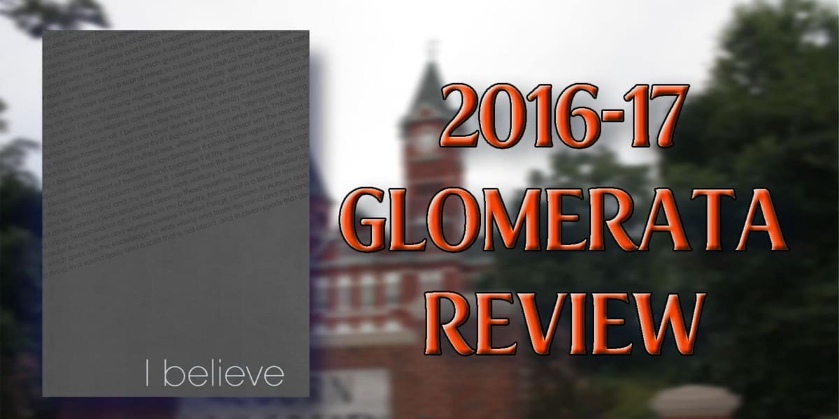
First thing you always notice is the cover. Last year’s cover was a great design, but the material used wasn’t the best. A little bit of dirt and some finger prints soon became nearly impossible to clean up. The 2016-17 Glom features a more “common” material, moving away from the previous year’s choice, and has a simple “I Believe” at the bottom right corner. This year’s slogan is countered by a diagonal printing of the Auburn Creed, which balances really well. The back cover continues the Creed writing and also has a really nice embeveled Auburn University Samford clock tower logo. The simple design of the cover would bleed into the heart of the Glom and be the design choice for the 400 plus page yearbook.
My favorite aspect of the 120th Glomerata are the photographs. Specifically the printing of the photos. They feel to be more like a true photograph printing rather than simply printing a photo onto a sheet of paper.This different style makes the photos really pop and grab your attention as your flipping through. The opening pages showcase a few bits and pieces of the Creed combined with (thankfully) relevant photos to reflect the meaning of the quotes. The page-by-page, quote-by-quote presentation showcases that meaning really well, makes it pop, and is truly impactful as you flip the pages.
The layout of the pages are all rather similar, with the photos being the dominant aspect, a page title that seemingly always contrasts in color, and a nice synopsis of the page’s information. Because the Gloms are becoming more photo-heavy, the written content is starting to lack. As I read through previous versions, the texts are so detail heavy. In most portions, it is incredibly easy to place yourself in the moment. One of the more memorable examples of this for me is when I first read the 1996 Glom and reading through the multi-page spread of Hurricane Opal. I didn’t know that Auburn was hit by a hurricane, let alone the damage. The writing paired with the photos was so powerful that it was hard not to imagine what it was like to be in Auburn during the storm.
Many of the pages tend to feel a little empty, with the myriad of photos sometimes not fitting the entire page. There are some areas that just have too much white space that could easily be filled in with even more photos and pertinent details.
The Glom did incredibly well with the full-page or two-page photos that are placed throughout the book. I liked the photos placed at the top or bottom of the page and spread across both open pages. I truly loved the full spread images, especially with the material used for the larger photos. A moon rising over Samford, a gorgeous wide angle shot of Jordan-Hare Stadium‘s stripe-out game, and a spectacular capture of a lighting strike behind the Samford clock tower. They all look so good in this presentation.
I started to notice that some of the photos looked familiar. And that’s going to happen with contributors and permissions and such. It’s just rather annoying, to me at least, when only a few select photos have the credit listed. I noticed one set of images that I knew came from the Auburn University Bookstore, and no credit. Even that can be a minor gripe, though. A more important gripe is that the captions on photos were sometimes wrong, if present at all. Checking out the softball spread, there are only three images, and only one caption was correct. The three images chosen showcase three of the seniors on the 2016 Women’s College World Series team – Tiffany Howard, Emily Carosone, and Jade Rhodes. Except whoever it was that built this page in the Glom offices didn’t realize they were looking at the wrong roster, as they labeled the shown players as the freshman on the current team – KK Crocker as Howard and Brittany Marasette as Rhodes. I understand that these are easy to make mistakes, but it’s something that can’t happen if the modern volumes of the Glomerata want to be respected.
Speaking of which, it was nice to see the softball and baseball pages actually use photos from the current year. Last year’s volume showed baseball from two years prior, and softball upwards of four years. For someone like me, that uses the Gloms to research something specific to the year (my athletic uniforms for each year), using photos that don’t match the season is completely inexcusable, especially when there are so many photos available to choose from.
I never care to look through the Greek life pages, even though they take up the largest percentage of the Glom, but this year’s layout was rather interesting. Previous volumes simply stated the individual fraternity or sorority, and the photos of the respective members. This year’s layout, though, does a little bit more, as it showcases the individual group’s crest, which is a fantastic way to differentiate each group. The sorority member photos are also a little different, being placed in an oval shape rather than the typical squares that the frats used. Some of the sororities also had a different font for the names – some went straight block font and others a more traditional cursive. Both were rather difficult to read for the small size, but nice to see a little difference. One sorority was actually printed in black and white, so I wonder if each organization may have had a little input on their respective spreads.
The organizations pages are maybe the biggest weakness overall. Some of the larger, more well-known groups have a little bit more in terms of descriptions and photos, but the majority of organizations are sharing the page with a few others. Only a few groups actually have a description. Many of the groups that don’t are the ones that I want to learn more about, know exactly what it is they are doing!
Overall, this is one of the better Glomeratas from my time as an Auburn student. Sadly, they still don’t hold up to the classics of the 1970s and 1980s and earlier volumes. It’s nice to see a simple and modern design stay constant throughout the book, but there’s still a few things that could be fixed. If there’s one thing that next year’s production team must do better is marketing. As mentioned at the beginning, I had no idea they were handing out Gloms this week. When I learned and went to the Auburn Glomerata Facebook and Twitter accounts, there was very little trace of promoting the distribution dates. As I walked around and picked up my copies today, there were still so many copies remaining on what was scheduled to be the final day. For the first time in nearly everyone’s academic careers, a yearbook is free. People need to know what the Glom is, know when and where to get it, and understand that it is free to grab. I am obviously a big proponent of the Glomerata, and I want to see many people, every Auburn student and faculty/staff member, pick up a copy and keep it for a long time.


