2015 Auburn – Jacksonville State Uniform Preview
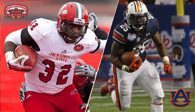
After surviving a late game run by Louisville in Atlanta, Auburn heads home to debut the new MEGATRON …I mean open the season at home against Jacksonville State. Saturday marks the first time that these teams will face each other. Jacksonville State won’t be the push over that so many people are thinking. The Gamecocks were ranked #7 in the FCS division coming in to last week’s match up against #8 UT-Chattanooga. JSU won that game 23-20, to get off to a good start in the season.
Throughout last season, JSU played around with some different uniform elements. More than anything, they really like to switch around the helmet decals. They started the season out by wearing the JSU Gamecock logo they’ve traditionally worn for years. The following weeks saw two different helmet designs. Both removed the Gamecock decals and replaced them with a straight JSU decal. Both also feature a tapering stripe down the middle. One design was a white stripe with black outlines, also featuring the player numbers on one side of the helmet. The other was a black stripe with white outlines, with the JSU decal on both sides. Those two designs seemed to switch each week last year.
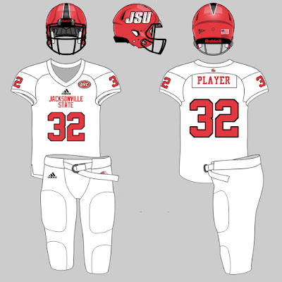
This season, it looks like JSU has made one simple change to their uniforms. With the Gamecock missing from the helmets, they decided to add it as a patch to the front of the jersey. It also looks like they’ve removed the “JACKSONVILLE STATE” from the chest area. Jacksonville State also seemed to switch around wearing their white or red pants on the road. With the team wearing their white pants last week in Chattanooga, I’m thinking they might wear their red pants this weekend in Auburn. Jacksonville State going red-white-red would contrast very well with Auburn’s white-blue-white. This was my prediction from the summer; it’ll have to be updated slightly after this weekend’s game.
Previous Game Review
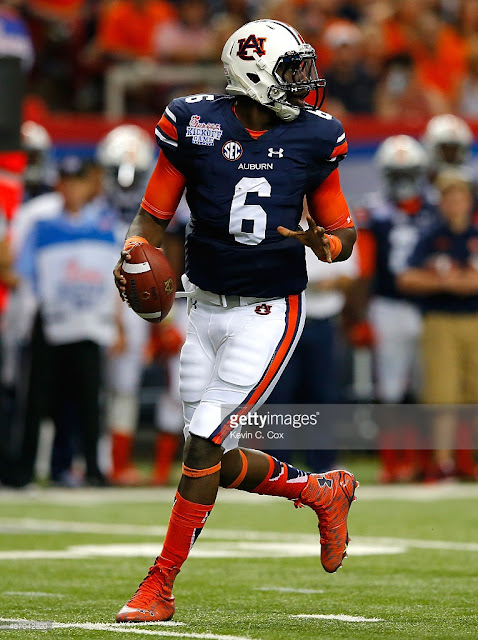
Auburn broke out the new template uniforms last week in Atlanta, and they looked great in person. Along with that, they wore the orange accessories, which I thought popped and contrasted quite well. Many Auburn fans were in the opposite camp, according to reactions on twitter. The chrome-ish orange helmet stripe didn’t show up very well from up in the stands, but looked pretty nice in photos. A number of people complained about the oranges not matching, which was to be expected with the new finish. We’ll see how they look in Jordan-Hare this week.
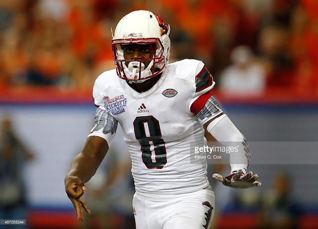
Louisville’s “Uncaged” Laser Chicken uniforms weren’t anything special live. The Murderbird helmets didn’t register at all from the upper decks; they were a bit more visible from lower. The numbers were illegible completely from any seat in the Dome. The Old English nameplates got a lot of attention online. The grey lettering on white jersey, plus the nameplates being screen printed rather than sewn on, was a poor choice, but I enjoyed the novelty of matching the nameplates to the Old English L logo that Louisville teams have been known to wear.
See you bright and earlier Saturday morning in Jordan-Hare!
War Eagle!

I loved the new uniform templates. However, I'm not a big fan of the super-bright orange. Maybe it was just too much of it. I have mixed feelings on the new helmet stripe. At first I loved it but it's not bright like the over-done accessories. Like you've said, it's more like Texas' burnt orange (I know that's what we're supposed to have). Either way, like usual, we're the best looking team on any given Saturday!