Uniform War 2015: Who Won the Off Season?
Overall Quality of Designs:
- Nike: The Swoosh has always had a tendency to template many of their teams to the same look. Thankfully they’ve moved away from that in recent years. As a whole, this may have been one of Nike’s better seasons in regards to providing good uniform designs. One of my favorite redesigns of the entire summer is certainly North Carolina. When you showcase things that are unique to a certain school, and do it well, you’ll be doing just fine. UNC’s new uniforms feature their infamous argyle pattern in one of the best ways possible. When Tennessee revealed their new Nike uniforms, it was a big sigh of relief that Nike didn’t pull their typical tricks and mess up a great historical uniform design. The implantation of the checkerboard to the uniforms was well done, and the Smokey Grey uniforms look better than the year before (except the anthracite shoulder yokes). The grey alternate helmet is the type of innovative design Nike has gotten much better at providing in recent years.
- Under Armour: Ever since the original Maryland Pride uniform game, people have associated Under Armour with being the second coming of Nike and Oregon. Yes, while Under Armour has rolled out some different designs, people fail to see the great uniforms they continue to push out. This season, Under Armour updated many of their teams to their newest “ungrabbable” template, which showcases the uniform features so much better than the previous set. The biggest design of the season for the guys out of Baltimore would be Cincinnati. After leaving Adidas and signing with Under Armour not long after the spring sports season ended, UA made some great changes to the overall brand, and even added a pretty interesting stripe used to represent many characteristics of the campus. Many of these elements subsequently created by designers seem to be very forced with poor backstories, but this one works pretty well. The uniforms showcase the stripes in three different locations, each in a different orientation. The biggest drawback from Under Armour’s newest template is the front of the leg stripe, and the fact that they continue to use it as a stripe placement. Where a design like Cincinnati’s would have been too busy on a traditional stripe location, one like the throwbacks Utah revealed are a bit odd, as those aren’t how the pant stripes were worn in the days they are attempting to honor with the throwback. The area could be used well in certain applications, but overall, it’s a bit too much at this time.
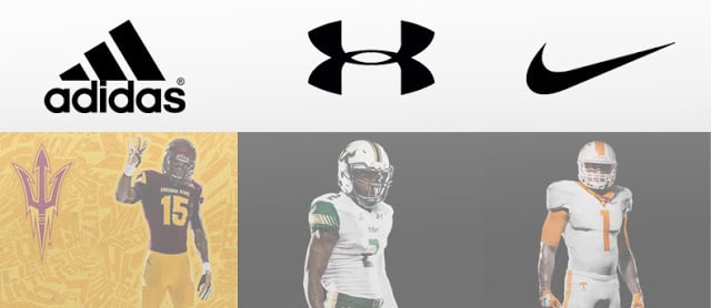
- Adidas: If you’ve read anything I’ve written about Adidas, whether here on the AUD or on my Twitter, you know I’m no fan of what they do with their uniform design program. When you look at a uniform by the Adidas team, you know exactly who made it, even without seeing the logo, which I guess is what they’re going for. But when you continue to put out designs that look awful, don’t represent the school in the slightest, and just seem to be completely tone-deaf to the reactions of the uniforms, especially those that spend their time critiquing and designing uniforms themselves, your reputation as a uniform design company certainly takes a hit. The template that Adidas continues to use and innovate keeps hindering the overall designs. The “tiretreads” visible throughout the uniform (they’ve actually extended down the chest and to the pants with the Shockweb 2.0 template) are very tacky looking and can all but ruin an otherwise good design. This season, Adidas has added slashes to the numbers and through many of the stripes that don the shoulders. These aren’t new elements by no means, but they’ve become more prominent over the years. These additions seem to serve no purpose whatsoever, to performance or design, and seem to be added just because they can. Miami was one of the better designs of the summer, but features many of the unneeded elements, and ultimately hindered the overall design. Arizona State, on the other hand, just has the tiretreads, and seems to be more bearable than many other uniforms.
Presentation:
- Nike: Nike has always tried to keep their presentations as uniform as possible, with the same poses, same backdrop, lighting, whatever. This season was not nearly as uniform as they have been in the past. Some teams went with the plain black background, some had the black to white gradient, and some were just done by the school’s media department. The problem with this is that it’s difficult to make out details of the uniform with some presentations, and others show the details very well, but it’s tough to get the whole picture of the uniform. It’s difficult to punish Nike when a school makes poor promotional photos, so that won’t hurt Nike here.
- Under Armour: Under Armour doesn’t have as many teams as Nike or Adidas under their banner, so it’s a bit easier to control the presentations. Early August saw Under Armour reveal uniforms for five of their teams. Only one of those uniforms were a new design – Cincinnati. The other teams were just being updated to the new template. But it was nice to see some cohesion with all five teams being presented the same way. The stadium backdrop, even with the giant UA logo, is a cool choice. It helped drill home that these are truly football uniforms, not costumes to be worn on a grass field.
- Adidas: Where Under Armour tried to present their uniforms as football uniforms, Adidas did the opposite. For the last few years, Adidas has used extremely loud and busy backdrops. It started as a random set of stripes and shapes, but has evolved to what they call “mantraflage,” with different words and phrases relating to the school is plastered on the background. It’s not as brutal when the color contrasts well with the uniforms, but it’s nearly impossible to concentrate on the design features when they blend in. It’s truly a headache to look at, and the usual gimmicks Adidas adds to the uniforms certainly don’t help. The poses used for these photo shoots don’t do a good job showcasing the details of the uniforms. It’s really hard to get an idea of exactly how the whole uniform will look with this presentation setup.
Improvement from Previous Set
- Nike: Some of the best improvements came from Nike this year. The only thing is, many of the improvements came on top of what Nike provided teams in previous seasons. As I said before, this year’s North Carolina uniforms are one of my favorite sets. But, the previous set Nike revealed a few years ago were easily one of the worst designs. UCONN went from bad helmets and decent uniforms to alright lids and hideous uniforms. Wake Forest, who updated their uniforms for the first time in what seems like a decade, looks wonderful with their new uniforms. San Diego State has one of the more unique elements in the Aztec Calendar being added to the uniforms. But then you have TCU who went completely overboard with their “frog skin” pattern, and applied it to the entirety of the uniform, from head to toe. Not every team improved, but those that did seemed to improve over a pretty bad design from previous years from Nike. The good was good, but the bad was pretty underwhelming.
- Under Armour: As noted above, Under Armour spent most of this year updating their teams to the newest template. Only two teams received brand new designs (Utah will be wearing a throwback design that combines different elements from past uniforms), and both will look pretty good, much better than their previous designs. South Florida has new uniforms that feature a nice stripe design based off their bullhorn logo. Like many Nike teams, these are a big improvement over their last designs, made by Under Armour. USF hasn’t had a wonderful look period in previous years. Cincinnati, on the other hand, changed from Adidas where they had very bland and uninspired uniforms. These new designs finally feature interesting elements and look good on the uniforms.
- Adidas: Where Adidas has faltered in overall design and presentation, their design changes from past years to current uniforms are pretty good. Miami, who ended a 27 year relationship with Nike, never had a wonderful look under the Swoosh. This year’s design for the Hurricanes is a really nice one – Northwestern stripes on the sleeves and pants work very well for Miami. But the design is hurt with the typical games played by Adidas. Arizona State improved upon their design from Nike by making some tweaks to the previous design. Nebraska’s black alternate this year is just a color-swap from last year’s design, which is extremely lazy on Adidas’ part. Texas A&M’s black alternate features some “reflective technology” on the helmet, designed and produced by HydroGraphics, Inc. That’s a cool element, but I feel like it won’t be very noticeable during gameplay. The rest of the uniform is very bland and seemingly just tone-on-tone. Only two of the teams Adidas outfits this season will be an overall improvement from the year before. That doesn’t bode well for Adidas.
When it comes to these off-season redesign projects, quantity is certainly a factor. Nike proved, though, that they can still provide quality designs even with their large number of teams they outfit each season. Under Armour has done a fantastic job of providing each of their teams a unique design that truly embodies the university well, and distancing themselves from the thought of them being a company that designs nothing but wacky costumes. Adidas continues to fall in terms of quality designs, and their attempts to innovate the world of uniforms – whether in designs, gimmicks, or presentation – keeps them from gaining any ground on the other two companies.
Throughout this analysis, I’d have to crown Nike the winner of the summer. I try not to let the quantity of teams affect this, but Nike’s work has been hard to complain about this summer. Under Armour has only released a new design for a few teams, with others just being upgraded to a new template. While those designs have been great, the body of work is just too small to effectively debate that they have replaced Nike at the top. On the other end of the spectrum, Adidas struggled once again to truly put a great product on the field. When the best thing you do all summer is “pretty good, but ruined by the gimmicks Adidas always adds,” it’s hard to get out of the bottom of the rankings.


Leave a Reply
Want to join the discussion?Feel free to contribute!