Ranking the SEC
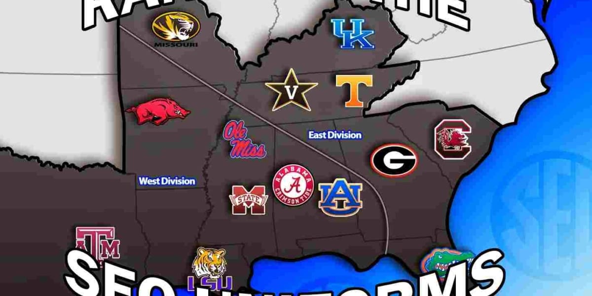
The off-season is slow. Slower for some people than others. Real slow for the uniform guy. Slower than you could imagine for the Auburn uniform guy. So, for the past few weeks I’ve been trying to think of new ideas for posts that would make the time go by faster, and none of those seem to come into fruition real well. That’s where this series comes in. Over the next 40 days or so until college football starts, I’m going to do my own ranking of uniforms, conference-by-conference. And since this is an Auburn site, we start with the SEC today. I’ll go through my ranking and reasoning, and then would like to see what you guys think by ranking these uniforms in comments below.
The SEC is obviously one of the greatest football conferences in the country, both in on-field talent and the traditional uniforms. That “traditional uniforms” has changed over the past year or so, but there’s still plenty of tradition in these unis. Now, I know that everyone has an opinion, and that all of those are different. I don’t plan for my list to be “THE” list that is the best of all time. The debate over what’s good and what isn’t is what makes all this entertaining. I don’t have much of a criteria (tradition vs modern, colors, etc) other than what looks good to me and what doesn’t. I have taken everything into consideration in making this list. What the team wears now versus last year or even 10 years ago. The template the manufacturers are using. Combinations that the team can make or have made out of their different aspects of the uniform sitting in the closet. So, let’s get going!
- Auburn- Yes, I am certainly biased on this one. Auburn definitely has some of the best uniforms in all of college football. The one thing I dislike about the current uniforms is the UnderArmour template. We’ve already covered that here in a different post. I can’t wait until UnderArmour transitions Auburn into their newest template. Hopefully when they do, Auburn’s sleeve and pants striping will return to normal. But as far as all that goes, the orange and blue Tigers on the Plains claim the number one spot here.

Shanna Lockwood - Alabama- I know I might take some flack for putting “the bad guys” this high on the list, but it’s true. Alabama has great uniforms. There’s always talk about how to update them or whatever, and the answer is simple: You can’t. Nike updated Alabama to the newest template for their latest National Championship, and they’ve been wearing those ever since. Now if only we could get the Iron Bowl back to being a color-on-color match-up…
- LSU- Don’t hate me because I like tradition. I’ve always loved the Tigers’ uniforms. LSU does UCLA stripes better than UCLA. Recently, LSU was upgraded to the newest Nike template, and since moved the SEC logo from the chest to the FlyWire collar, which I think was pointless. Florida has a reason to do that, with the Gator head logo and the Nike swoosh. But LSU just looks very lopsided without the SEC patch on the chest. Hopefully they switch that back soon. But regardless, purple and gold looks best on the LSU Fighting Tigers.
- Vanderbilt- This is probably the biggest surprise of the list. Two years ago Nike revealed some new uniforms for the Commodores, including a new white helmet that I think is just gorgeous. These uniforms are proof that even plain uniforms can look wonderful. I’m not a fan of the gold jersey simply because of the black shoulder yoke, but I guess you can’t just have three plain jerseys in today’s football. But that white lid though…
- Florida- This is where it gets tough to rank some of these uniforms. It’s pretty tough to decide whether Florida or Georgia has a better look. Well, thanks (sarcasm) to Nike, we can make it a little easier. Florida recently changed their Gator head logo slightly (UF did this, not Nike) and, although a minor change, I passionately hate it. Last year Florida also changed their number font slightly. Small changes here and there, but they are bigger to me than the casual football fan. The Gators have always had a wonderful look. And although some alternate uniforms look awful, I really like the white F lid. Would hope to see that return soon. Also, that blue top, orange pants combination is awesome. More of that please!
- Georgia– Like I said with Florida, Georgia is tough to rank. And here’s where Nike messed up. In 2013, Nike revealed a new uniform set for the Dawgs as well as a new Bulldog head logo. The worst part of the new uniforms are the new rounded numerals versus the old block font. As long as we don’t see those awful Power Rangers alternates again I’m good…
- Missouri- What happens when you get a new conference to play in? You get new uniforms. Of course! Well, Nike had a ball with these. I don’t love them, and I don’t hate them either. I thought Mizzou had a great look to begin with, and these new uniforms border being silly for the sake of it. I like the new logo and the oversized helmet decals. Just like Vandy, Mizzou has a white jersey with a pointless black shoulder yoke. But overall, I’d rather take these than leave them. Missouri has done well with pairing them up to look good. And I have no reason to think they won’t continue to do so.
- Ole Miss- If I would’ve done this listing last season or the year before, Ole Miss would be a top five team easily. But last summer, Nike (again) decided to have some fun and mess around with a great look. I’m not sure if Nike was trying to simplify the Rebels or what, but they did an awful job with it. Gone are the red and blue striped grey pants (they are still used as an alternate pair, but they didn’t wear them much last season) and in are plain blue and white pants. Oh, and the new pants have REBELS down the pant legs, which is a huge no-no in my eyes. Shame on you Nike. You can always redeem yourselves a little bit if we ever get that beautiful baby blue helmet back…
- Tennessee– Let me say this first. I love Tennessee’s uniform design. The UT orange paired with the white pants looks really good. But I hate what adidas has been doing with them. The “tire tread” template (as UniWatch calls it) that adidas uses is awful. Don’t get me started on the hideous “Smokey” grey alternates revealed last season. I despise those. If you’re going to change a team like Tennessee even for a one-off, why not go all out and give them a new helmet as well? You don’t if you’re adidas, because you don’t think straight. (I’m not a fan of adidas and their recent mistakes in uniform designs if you can’t tell)
- South Carolina- Here’s the prime example of never having a good identity. S. Carolina has changed uniforms a few different time over the past few years, and none of them seem to work very well. USC doesn’t have a wonderful athletic history (the baseball team’s back-to-back World Series championships were the schools first ever championships), so that always hurts when a designer is planning on what to do. So that’s why we see so much randomness when it comes to the Gamecocks. I must say the most recent re-design is the best of their recent uniforms. The two simple stripes on the shoulders are very nice. I just hope to Steve Spurrier that we never see those awful camo uniforms again.
- Mississippi State- When adidas originally revealed their new uniforms two years ago, they looked just like Texas A&M, and that bugged many people, myself included, but I still liked them. Well, then the one-off alternates starting coming. And those bulldog head helmets are awful. Then they revealed these “throwback” uniforms that will apparently only be worn a few times this season, which is sad. I really like these.
- Arkansas- Arkansas was easily the bottom of the league two years ago with their old uniforms and before the #14 team ruined their look. But thankfully Nike re-designed Arkansas this off season. Sadly, they still aren’t anything special. Thankfully the all black (technically “anthracite”) uniforms are a thing of the past. These guys just have never had a wonderful uniform. And they have the potential for that. Still not a fan of the new pig head logo either…
- Texas A&M– Before last season I would’ve ranked Texas A&M much higher on the board. And sadly they still looked the same as Mississippi State, which hurt them in that department. But adidas and the Aggies made some bad decisions with some alternates last season that bumped them down this far. These were pretty bad, and worry me about what they may come out with this year.
- Kentucky- Is there anything better than Kentucky blue with some checkered board? Well, Nike and UK think so. And they’re wrong. A year or two ago, Nike gave the Wildcats a new black set with blue shoulder caps that looked awful (especially with the white helmet). And this year the guys from the Bluegrass State will be breaking out a new grey uniform, that is awful, and at least two new chrome helmets that are not bad, but chrome is a bit old already. I just hope these are fake (I’m sure they are)…


My opinion is the only one that matter 😉
S Car, Ark, A&M all up, down goes bama, Mizzou, Tenn. Grey Tennessee is the worst thing I've ever seen.
AUB, LSU, TEN, FLA, ALA, GEO, MIZ, OLE, KEN, SCAR, ARK, TAM, VAN, MSU. Not much "deep though" reflected here; mainly based on what "fits my eye" along with various biases related to personal experiences & preferences. Did not consider some teams' alternate combos (e.g., TEN's nasty grays).
Meant to say "not much deep THOUGHT" put into this. Mainly based it on a culmination of what I've grown to like through the years….
I don't understand why schools feel compelled to abandon their traditional school colors and outfit themselves in the most bland color – gray. They keep the traditional helmet and it always looks awful against the gray jerseys and pants. Unwatchable and uninspiring.
I think Mizzou should be farther down the list. Those baby blue ole miss helmets are fresh.