Auburn Concept Uniforms – Round 4
It’s becoming a yearly summer tradition here on the Auburn Uniform Database. Taking ideas from readers and Twitter followers to create the silliest, craziest, and sometimes actually plausible designs for Auburn’s football uniforms. We’ve done this a few times previously, and the ideas continue to get more interesting each edition.
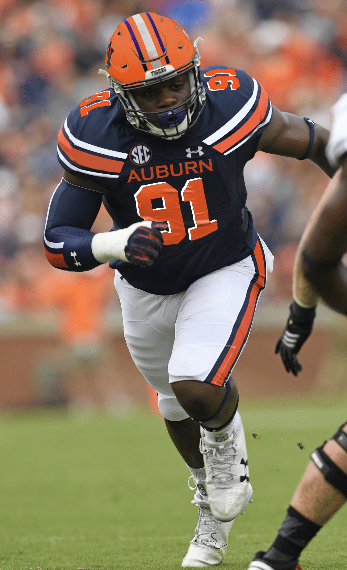
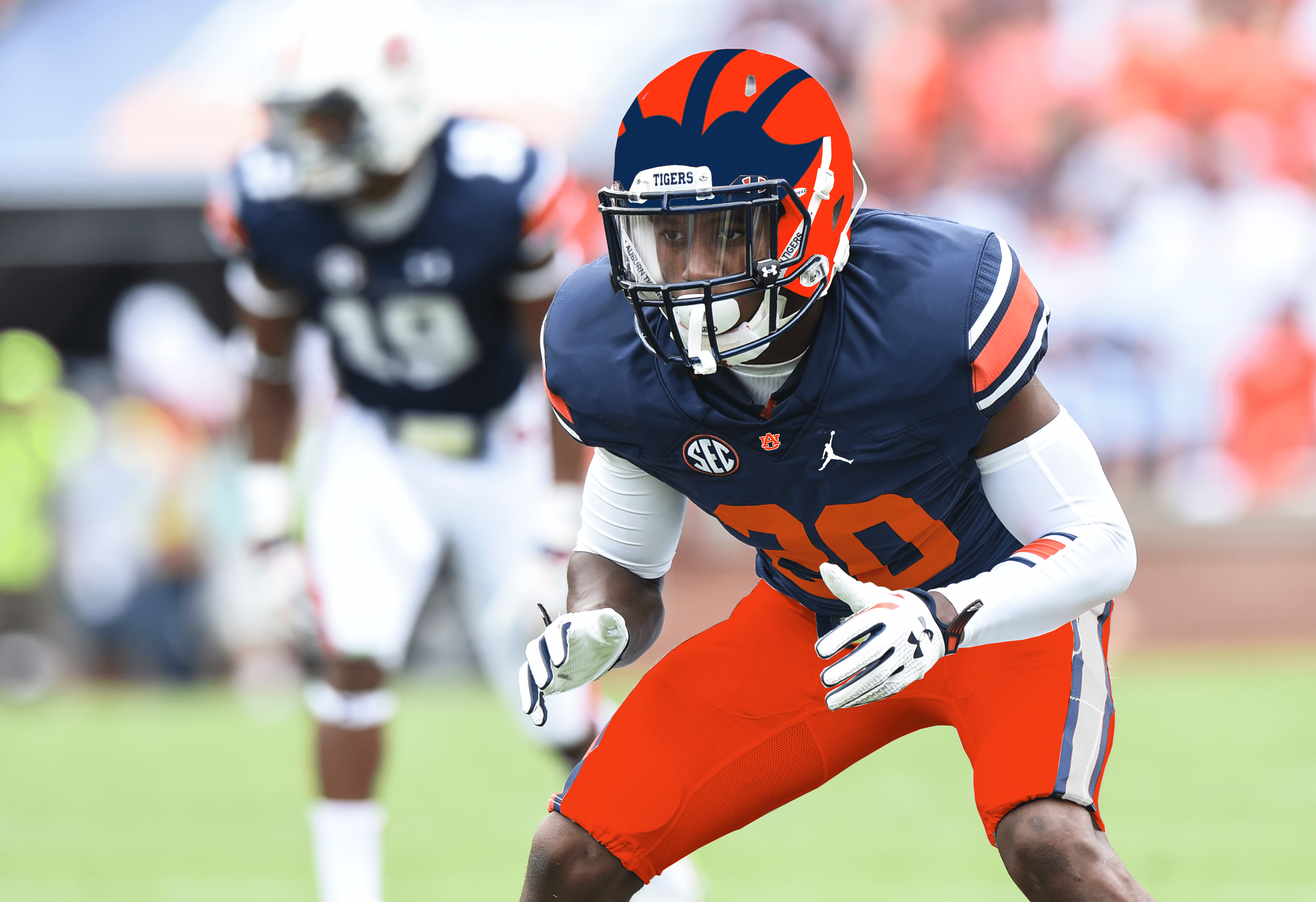
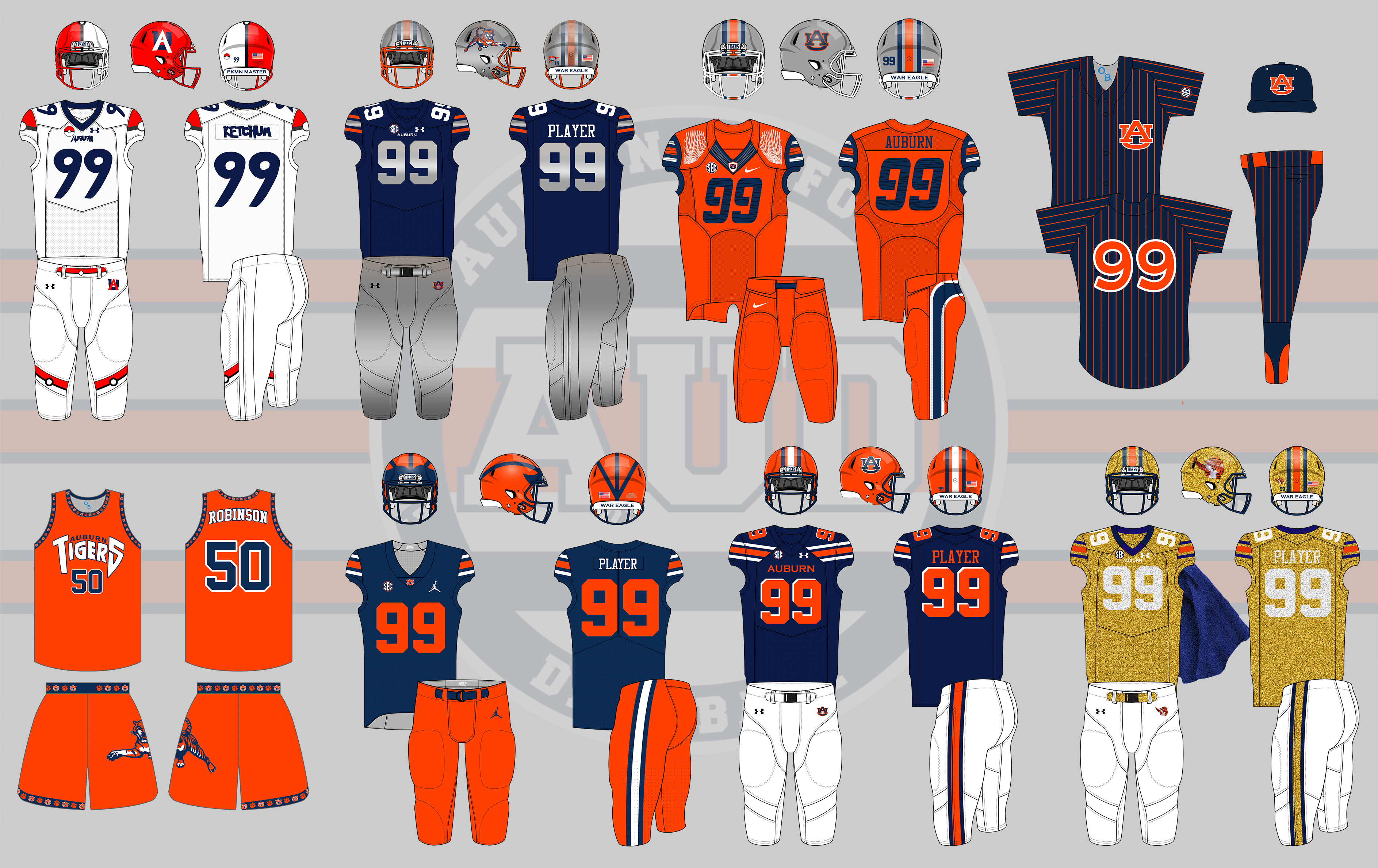
This year, we have another eight concept ideas. Like the previous editions, the suggestions will be mocked up on a standard template. As an addition, I have edited game photos of Auburn players to hopefully represent the concept on the field. I’m not very experienced with the real life edits, so they will differ in certain areas from the mock ups.
Because I know some will get upset (and already have), I have to say that these aren’t in any sense supposed to be taken seriously. I never have any intentions on Auburn even considering these crazy designs. Don’t get worried or upset when there’s nothing to get worried or upset about. Now on with the show.
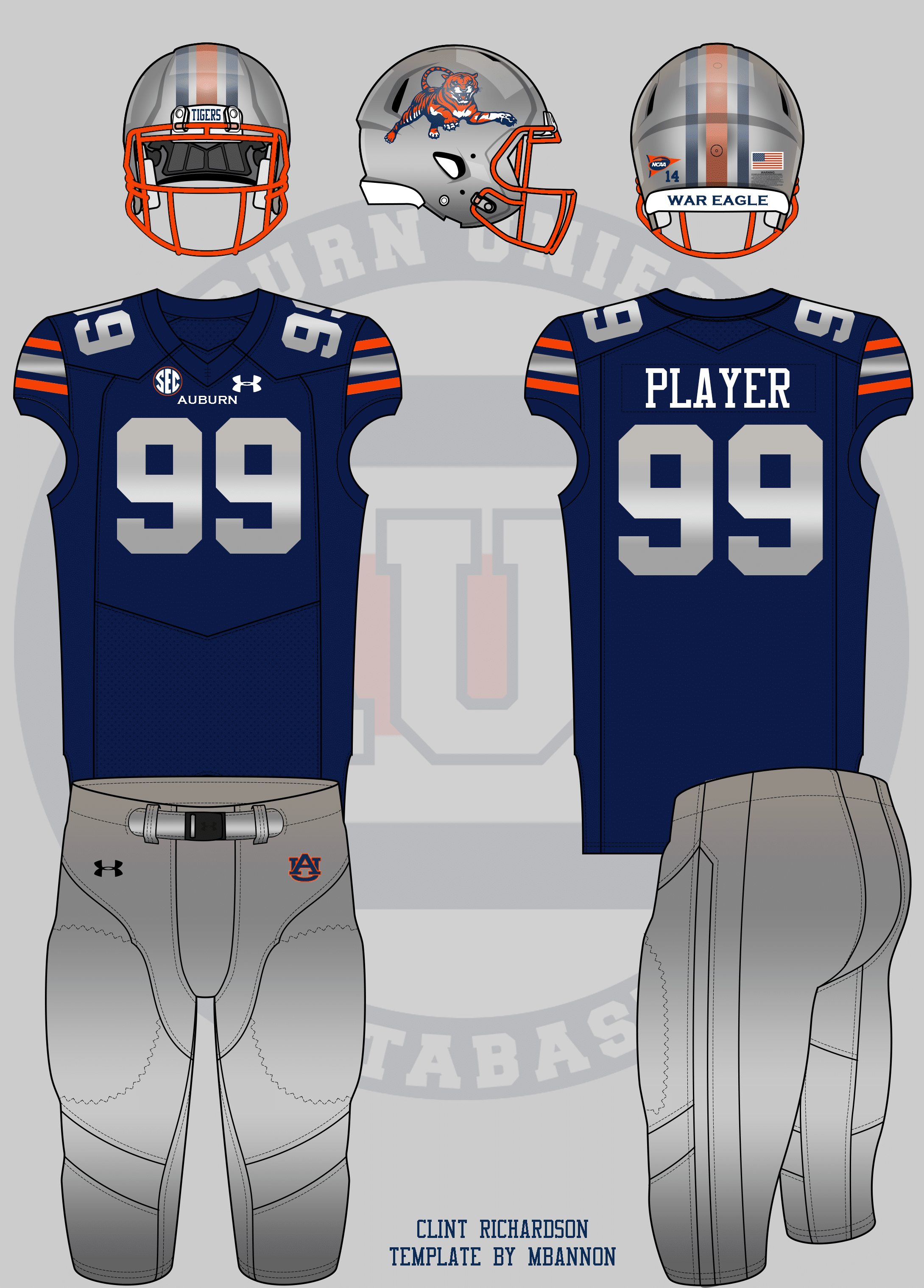
We’ll start with one suggestion actually from the last round of concepts. David wanted to see an Auburn football uniform based off an orange, blue, and grey painted 1929 Lincoln. He also added to his suggestion this year.
Inspired by this car. Silver helmet with standard decals & stripes, orange face mask. Orange jersey w/blue & white NW stripes. Silver pants. pic.twitter.com/oSVQIaOReG
— David (@dsmall75) July 27, 2017
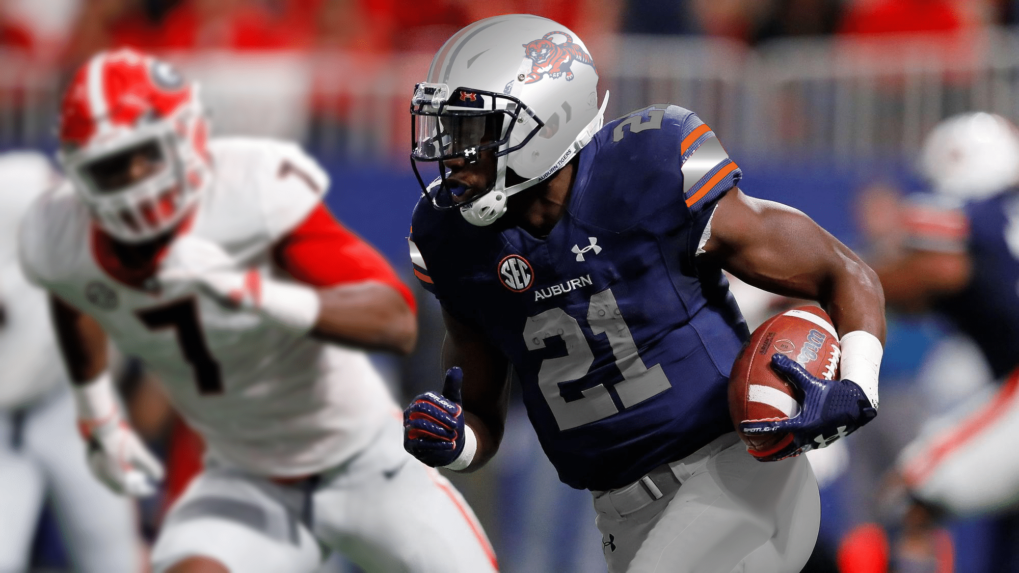
I wanted to best replicate the car on the uniform, which meant sticking with the blue jerseys. Orange is rather limited in the car’s scheme and I wanted to stay true to that. The helmet, numbers, and pants each feature a metallic grey gradient to give it a nice shine.
I didn’t even realize until I finished, but the Photoshopped image of Kerryon Johnson looks a lot like his new Detroit Lions uniforms.
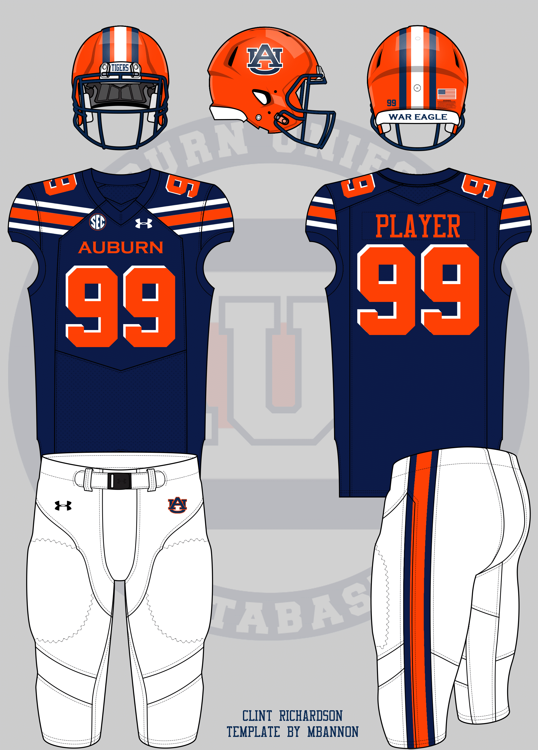
Last year, I made a Nike-based Auburn uniform and included the current Cleveland Browns’ pants style. This year, Colin wanted to go a step further.
Cleveland Browns style jersey stripes ?
— Colin Turner (@ct95designs) July 14, 2018
I left the pants as normal this time around. Auburn gets an orange helmet and orange numbers with a white reverse dropshadow.
I must say, I do like the larger stripes.
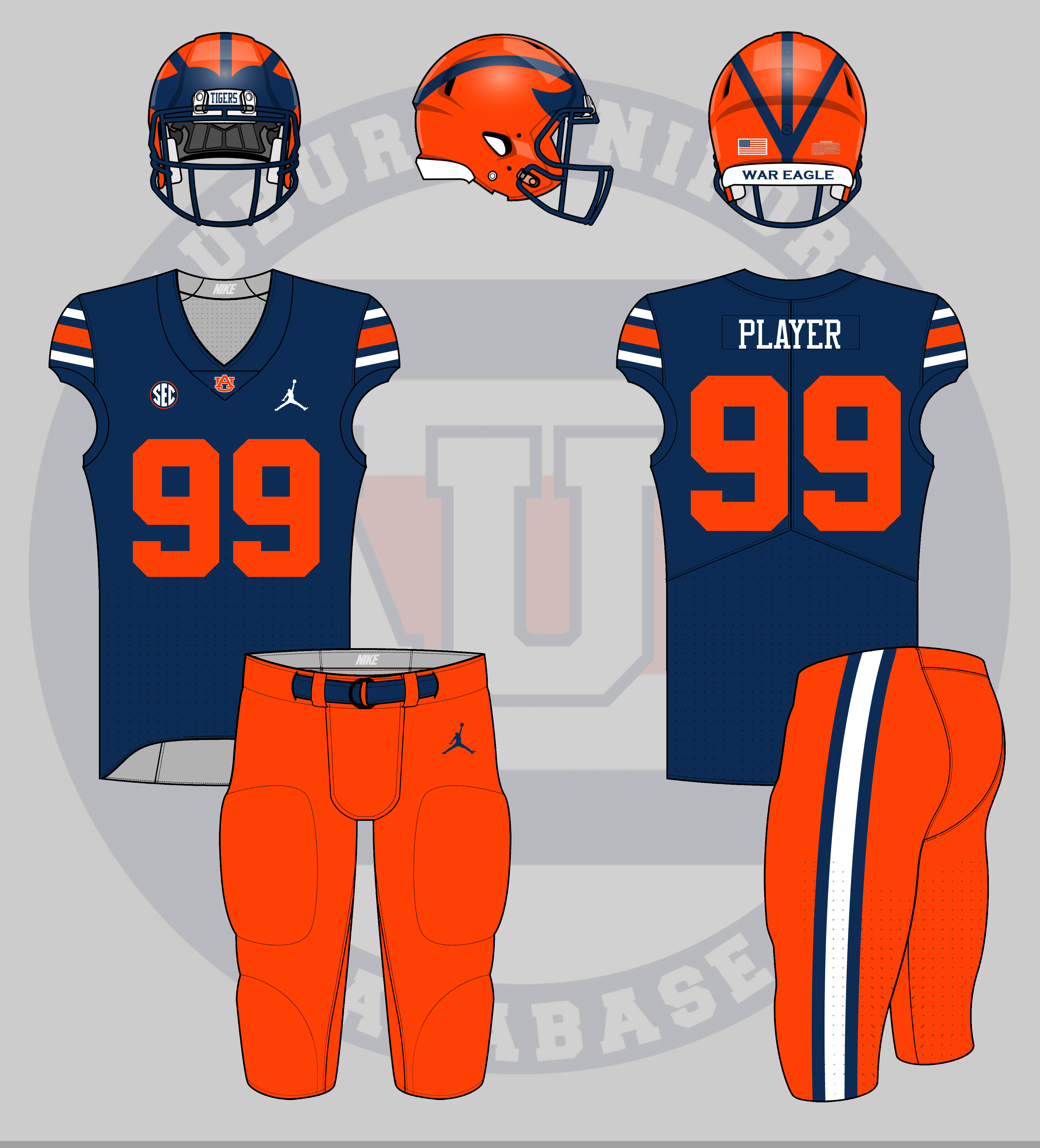
Auburn has one of the most traditional uniforms in college football. But what about using even more traditional elements? That’s what Carter wanted to see.
Michigan Auburn Jersey. Air Jordan
— Carter Byrd (@CarterByrd13) July 11, 2018
I tried to mimic Michigan’s uniforms with an Auburn twist. While Michigan uses a dark helmet shell color with bright stripes, Auburn’s are reversed. Michigan doesn’t wear stripes otherwise; Auburn does.
I wanted to expand this series of concepts beyond football, and invited people to suggest concepts for other sports.
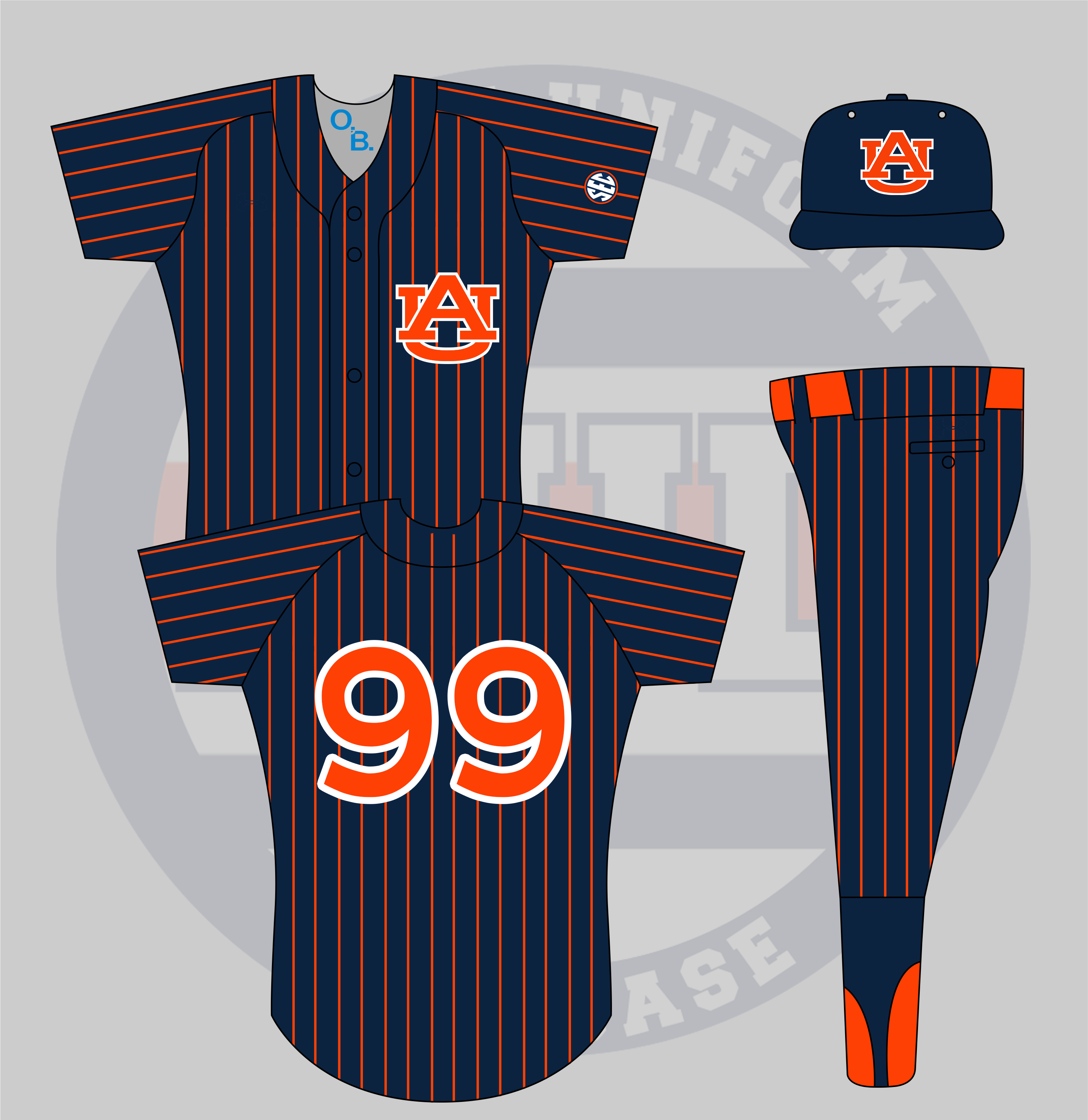
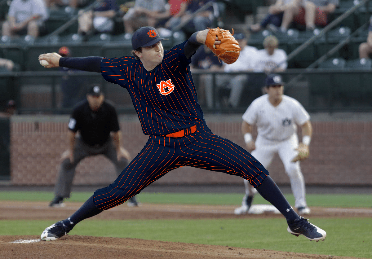
The first one received was for baseball:
Also, what about an all-Navy pinstripe for Auburn Baseball. Very similar to the Vanderbilt ones?
— Auburn Rants (@AuburnRants) July 14, 2018
Vanderbilt’s all black pinstripe set is a very divisive design (I, for one, enjoy the look). Vandy’s design features their light color (gold) over their dark color (black) as the base. This Auburn design includes a navy blue base with the pinstripes being navy. It’s a re-coloring of Auburn’s current white pinstripe uniform with a few tweaks, including the outline on the number and logo. I wanted to pair the new orange-logo cap with this design rather than the white-logo hat to better match.
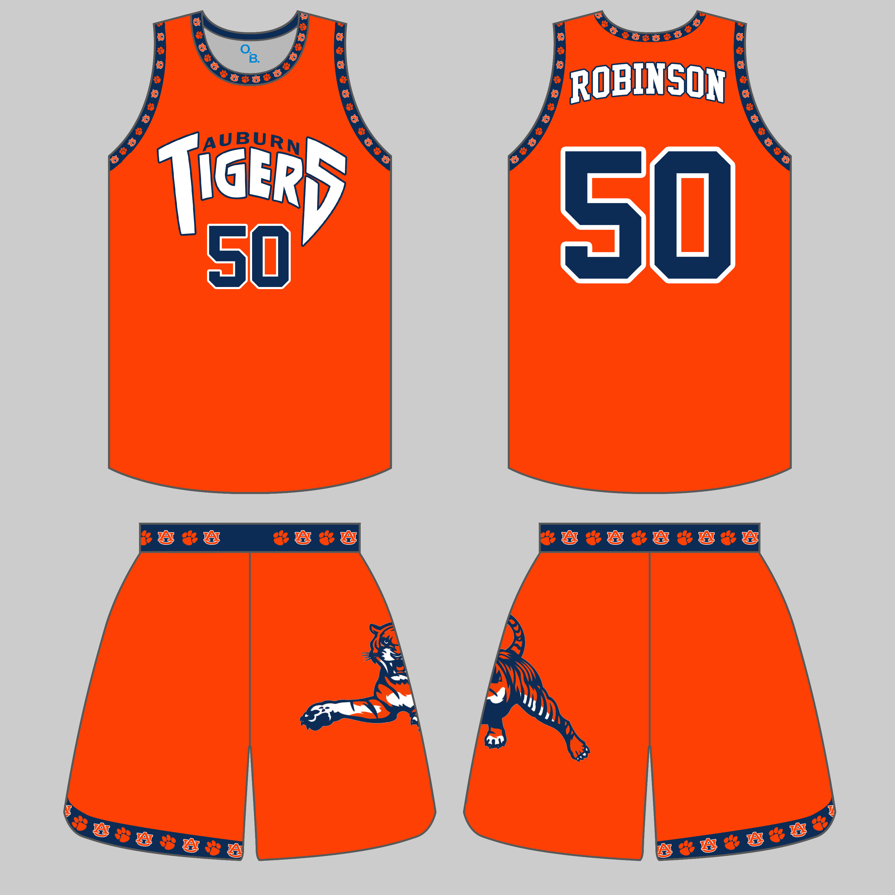
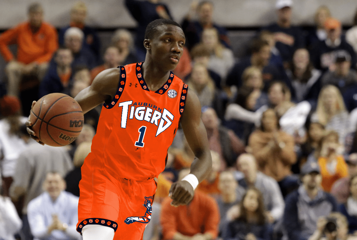
A basketball uniform concept was also suggested. I really enjoyed creating this one.
Auburn hoops uniforms in the style of Vancouver Grizzlies pic.twitter.com/xpfSjVUpr6
— Son ‘o’ Crow (@SonOfCrow2) July 15, 2018
While the Grizzlies had a more ornate pattern used on the trims, I wanted to stick to current Auburn icons. The Auburn trim features the AU logo and a paw print. The wordmark was recreated to mimic the original Grizzlies font. Vancouver had a large bear with a basketball on one side of the shorts. Auburn has no such sports-specific logos, so the throwback leaping tiger fit perfectly.
Previous editions of Auburn concepts centered around some more plausible designs that could be trotted out on the field. Not this time. And never when Carter Michaels has suggestions. I know I can always count on him for great ideas.
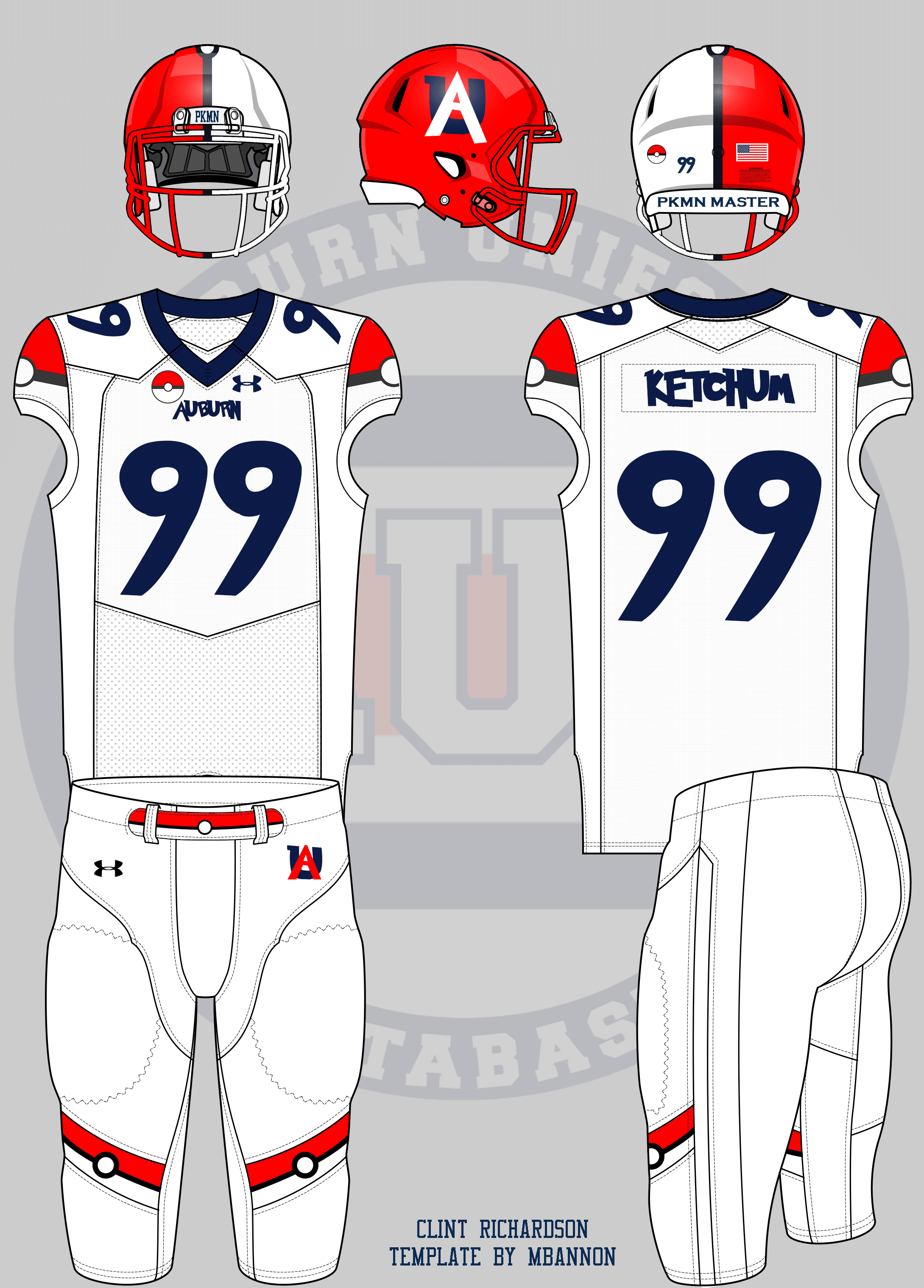
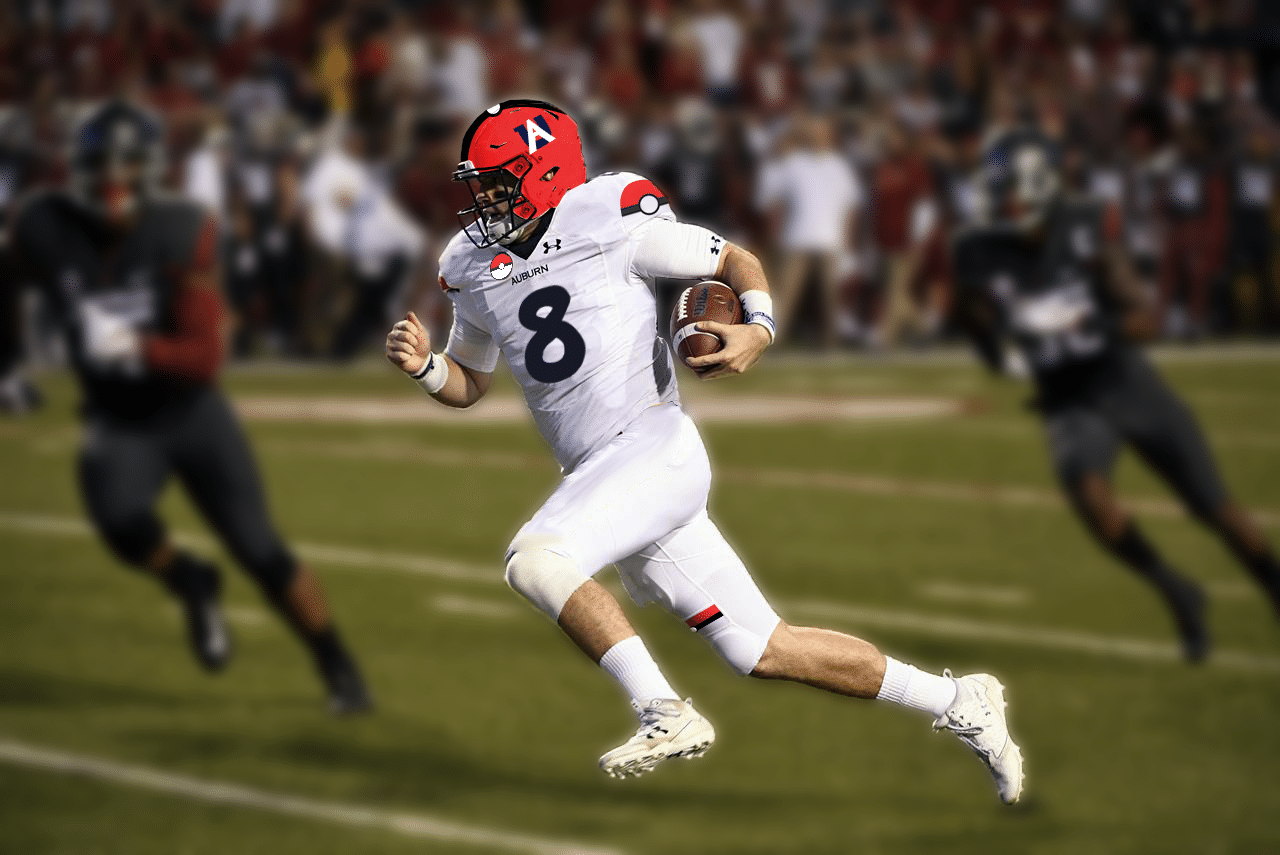
Auburn football decides to have a minor-league baseball style theme night complete with themed uniforms. The theme? Pokemon.
— Carter Michaels (@TheRealCMike) July 15, 2018
I make it no secret that I love Pokemon, and this one fit perfectly. I wanted to keep to the “minor league” mentality with this one. Some baseball teams will abandon their branding for the theme night uniforms. They also typically use one design element and over use it. For this concept, Auburn does the same.
Pokemon has many great design elements to use, but none are as iconic as the PokeBall. I wanted to use the PokeBall to the fullest extent, so the general striping pattern is used on the helmet, facemask, shoulder caps, and thigh stripes on the pants. The fonts across the jersey all changed to the Pokemon font. The helmet logo was also created with the same font. It’s cheesy because it was meant to be.
Tom is also a go-to for suggestions and he didn’t fail me this year.
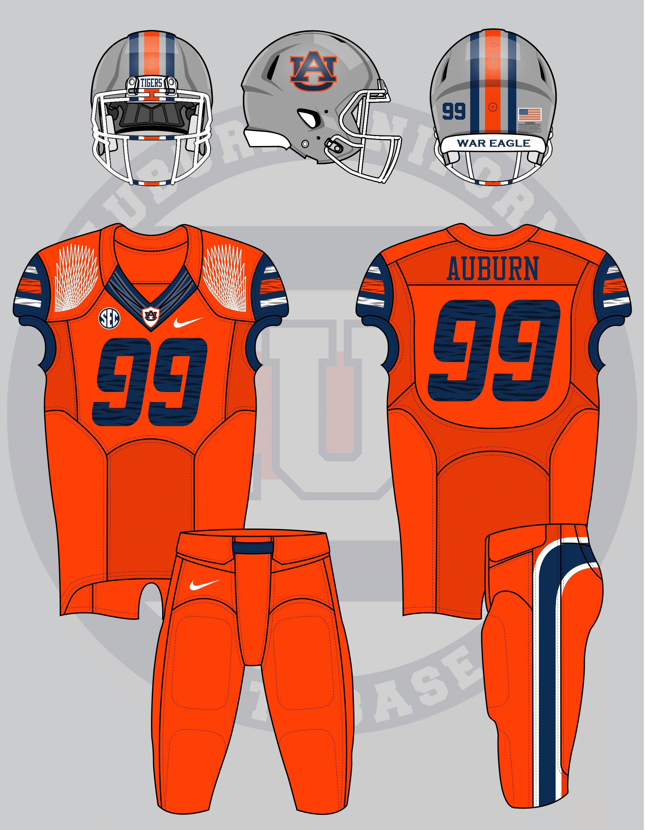
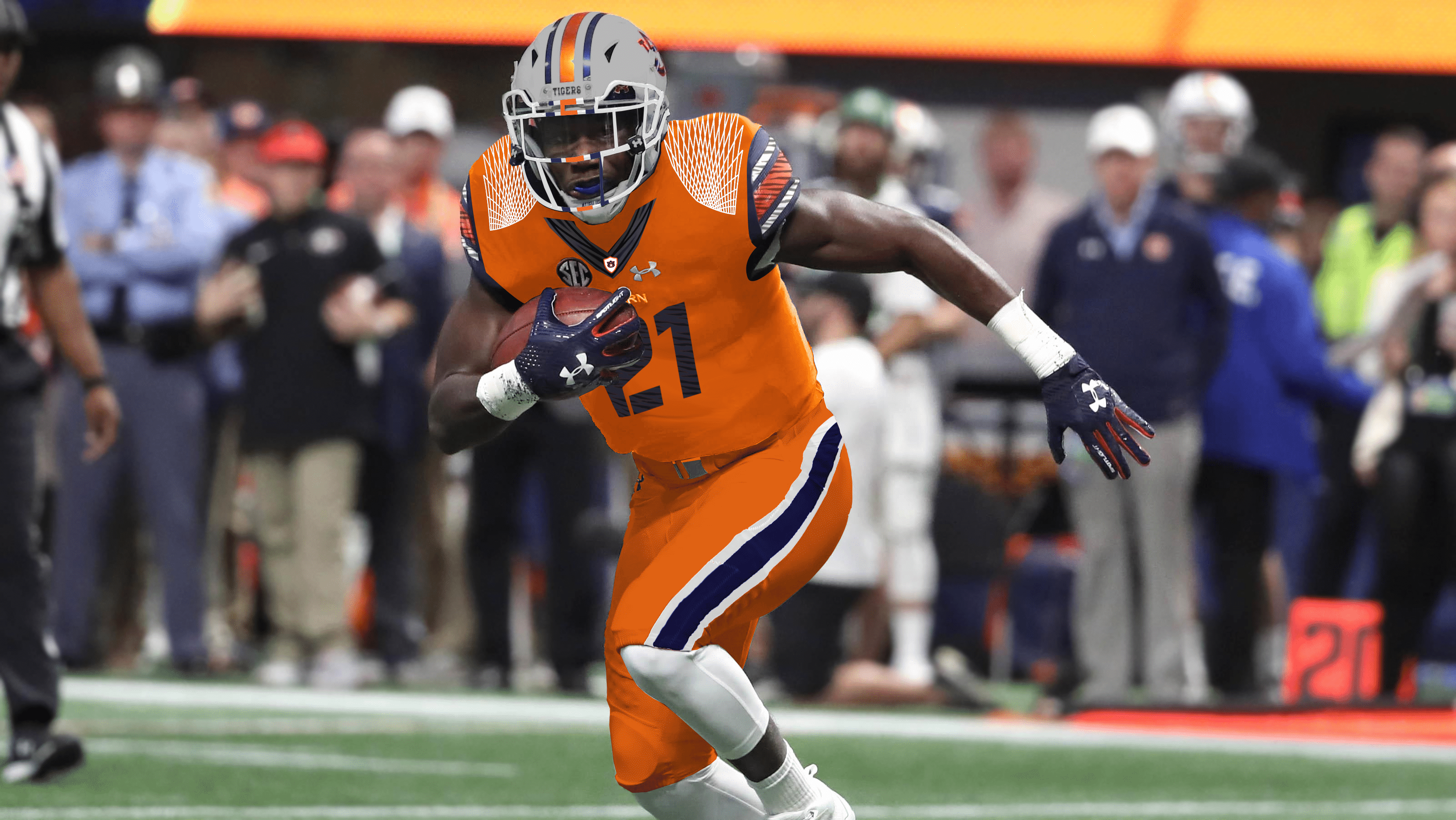
How about as annoyingly Nike Pro-Combat as you can.
— Tom (@ths0002) July 11, 2018
This might be my favorite concept of this round. I tried to incorporate as many Nike Pro Combat tropes from the early 2010s as possible. For this design I used: the helmet from Georgia’s alternates – grey with stripes over the facemask; floating FlyWire collar and shoulders from multiple; stencil number font from Army; curved butt stripes from Florida. I made the shoulder caps contrast in color, the stripes float and don’t connect to the end of the shoulder caps, and the stripes and numbers have tiger stripes sublimated.
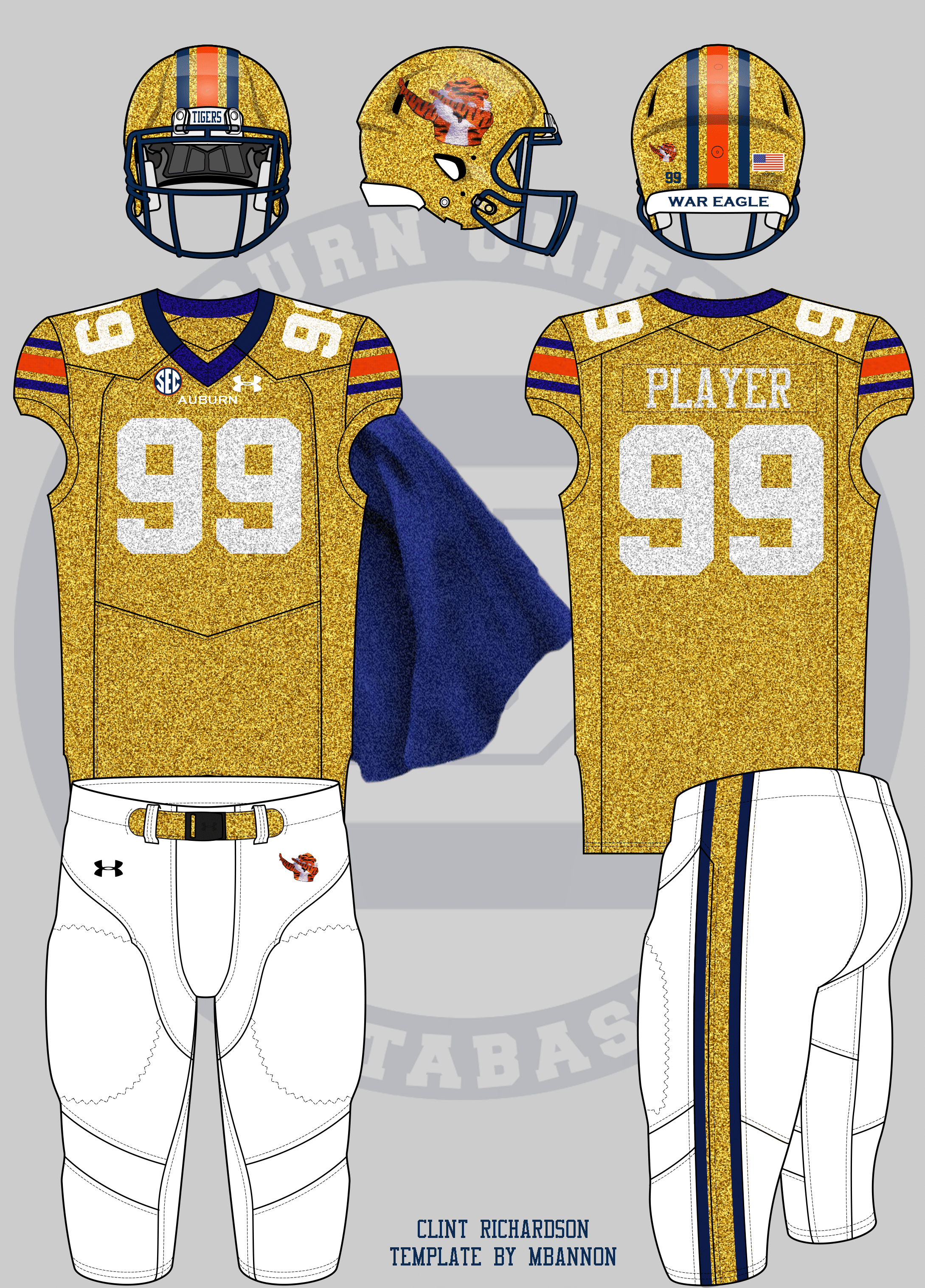
To round out this round, here’s the craziest concept I’ve ever received. I asked for crazy designs this time and this one was the best.
imagine: a gold sparkly football uniform with added navy and orange sparkles for ~aesthetic~ and capes, gold sparkly socks, and a dabbing aubie on the helmet
— jillian (@wtmjillian) July 15, 2018
I never thought I would see a gold uniform. Or even a cape!! I love using Dabbing Aubie on the helmet.
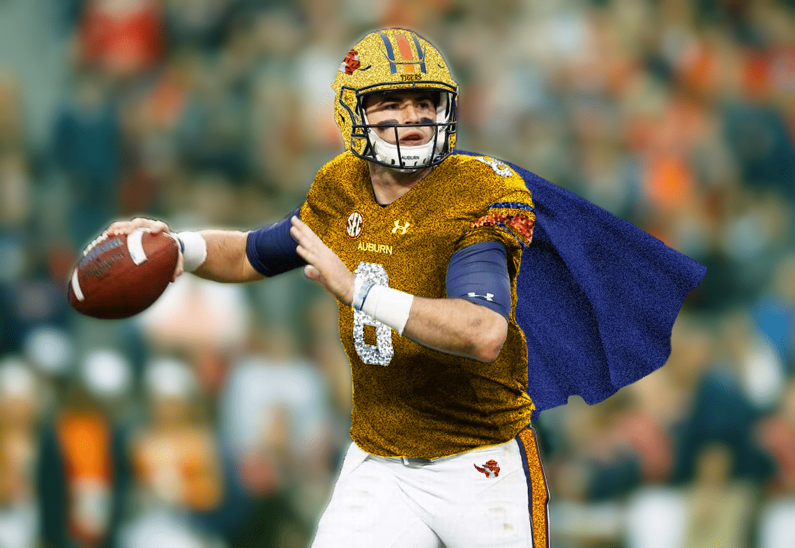
Like I said, it’s rather crazy. Now feast your eyes on Jarrett Stidham wearing a sparkly gold uniform and … a cape:
Someone get Under Armour on the phone. These must be worn!
So there’s the eight newest concept uniforms added to the collection.
Which of these designs are your favorites? Have an idea for a future concept? Save it and let’s do this again next year!
The Auburn Uniform Database is celebrating five years in 2018! Take time to check out the brand new website and consider purchasing an anniversary t-shirt. Do you enjoy uniforms and want to see more like this? Be sure to follow the Auburn Uniform Database, like the AUD Facebook page, Instagram page, and follow me on Twitter for even more uniform news. You can also purchase your favorite team’s merchandise through Fanatics, with a portion of your sale going to support this website.

Thereason are some interesting concepts here. I like the tiger on the basketball pants, and some of the different helmet ideas. However, I think the gold looked horrible.
Thanks and War Eagle!