Auburn Fixes Sash Stripe Soccer Kits
After three long seasons of a poorly conceived design, the Auburn Soccer team has finally updated their kits. The new uniforms – the 4th iteration of the striped sash design – are quite possibly the best design in the program’s history.
Before we dive into the newest kit design, let’s take a look back at how we got to this point.
As the 2014 season was getting ready to begin, Auburn showcased a new set of uniforms that were radically different than anything else they had ever worn. Sashes are a popular kit design element across the world, so it was only a natural fit for Auburn to utilize the iconic Northwestern Stripes in such a manner.
This first set had some interesting design choices. The stripes weren’t rendered in the correct weights – the center stripe was much thicker and the spacing was just off. Additional orange stripes were also placed around the arm, abs, and across the back above the nameplate. The shorts also had a matching stripe.
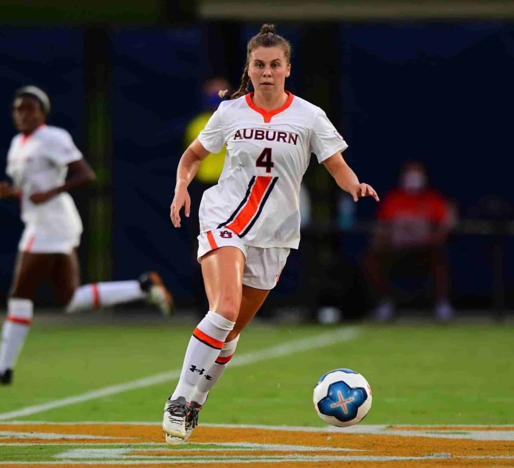
After two seasons, the Tigers updated the sash stripe look for the 2016 season. And these were perfection.
The stripes on the sash were at the correct weights and spacing, making for a much cleaner look. The additional striping was removed while contrasting sleeve cuffs, collars, and shirt hems were added. The color balance was great, the stripes were great – these were hands-down the best uniforms that Auburn Soccer had ever worn to date.
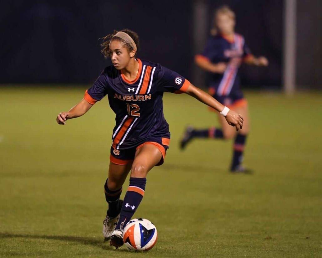
After two years of sporting this kit, Auburn made another change. This change was more of an Under Armour template change (much like Auburn Football’s 2011 uniform change), as a mesh area was placed over the collarbones. The transition in material probably made it difficult to carry the sash stripe to the shoulder, so it just terminated at the number instead. The “belly button” stripe, as some called it, simply could not compare to the previous edition.
The new jerseys also had orange wishbone collars, which didn’t help the color balance. All three jerseys had an orange collar, so it worked well on the blue colorway, felt out of place on the white tops, and made the orange goalkeeper jerseys feel unfinished. The sleeve cuffs were also removed, making for a rather empty appearance.
It’s been three years since Auburn moved to the ill-fated “belly button” stripe kits. Now, with the 2021 season fast approaching, the Tigers have finally fixed the biggest issue plaguing their kits. And they might have beaten out the 2016-17 kits as the best in program history.
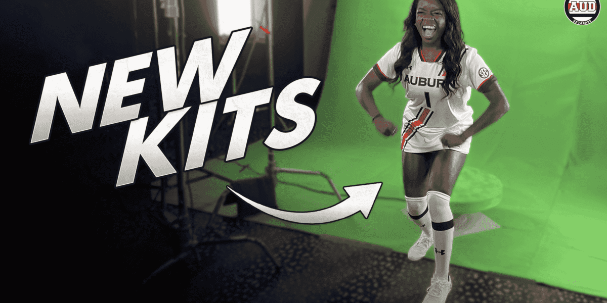
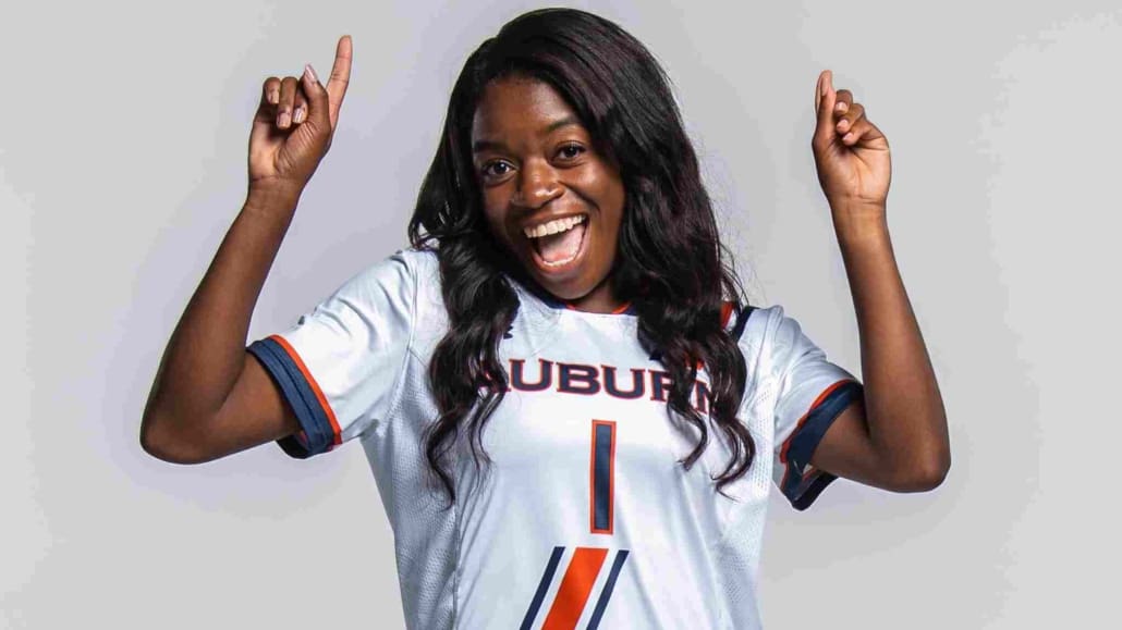
July 13, 2021, was media day for the Auburn Soccer team and gave us the first look at these new jerseys. The most notable detail is naturally the sash. The full-length stripes are finally back!
Not only is the sash back to full length, but the stripes have also received a slight tweak. They aren’t as thick as the previous editions but the dimensions and spacing are more true to the football stripes that have been worn since the 1950s.
The colored collars and sleeve cuffs are also back, providing some much-needed color balance throughout the jersey. But take a close look – they aren’t just a solid block of color. There’s an additional stripe on both areas! Now that’s how good color balance on a uniform is achieved.
Over the previous three designs, Auburn went from striped shorts to blank shorts, back to stripes. Auburn once again will have the stripes on the shorts. But they won’t be a single-colored stripe last previous editions, but they’ll also carry the Northwestern Stripes! The new stripes are angled forward with the bottom half terminating above the bottom of the shorts leg.
With the collars and sleeve cuffs featuring a different solid design, the stripes on the shorts seem a bit of an odd choice. Some could argue that letting the striped sash stand on its own would have been a better option. I would’ve liked to see shorts similar to the 2016-17 style, but with the collar and sleeve design carried over. I’ll save judgment for now, but I am curious to see just how these shorts compliment the shirts.
When the team sported these kits for the first time, it was evident that they had arrived in the Auburn Equipment room shortly before media day. Many of the athletes were sporting un-numbered jerseys during the first photoshoots. Only a handful of jerseys were actually complete.
And that might have created an interesting quirk that you just don’t often see with Auburn. When Auburn hit the pitch for the first exhibition match against Memphis, there were mismatched #1s used on the jerseys. Some had the “classic” style that non-football Auburn teams have used for over a decade now, while others use a new, serif style. The inconsistency of the numerals is quite odd to see. The new serif font is actually an upgrade over the traditional Copperplate look. Though, the decision to change – and not change all of them – is confusing.
When I shared this on Twitter prior to Tuesday’s match, a few people wanted to place blame on Under Armour. That simply isn’t the case. As mentioned above, many of the jerseys arrived in Auburn completely blank. It was up to Auburn – or Auburn’s contracted seamstress stores – to add the names and numbers to the jerseys. It’s unclear if the different #1s were due to different seamstresses doing the work or what exactly caused the discrepancy.
In other tweaks, the socks look to have a slightly different appearance. For the white kit, the socks have a solid navy stripe above a navy Under Armour logo. Previously, the stripes featured a large orange stripe with a smaller navy stripe below. The goalkeepers look to be sporting the old two-striped socks with their new orange kits.
Auburn has yet to showcase the navy uniforms in any promotional materials. The team wore white for the second exhibition match at Kennesaw State while the goalkeepers wore navy this time around. However, images of the blue colorway were not available following the game.
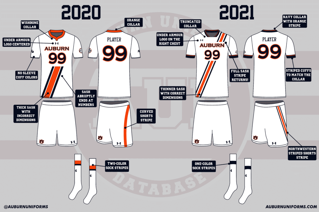
It’s easy to go on and on about all the changes, but it’s usually easier to comprehend just how much changed by looking at the before and after. So, as is usual around these parts, here’s a side-by-side look at the new kit with the previous design.
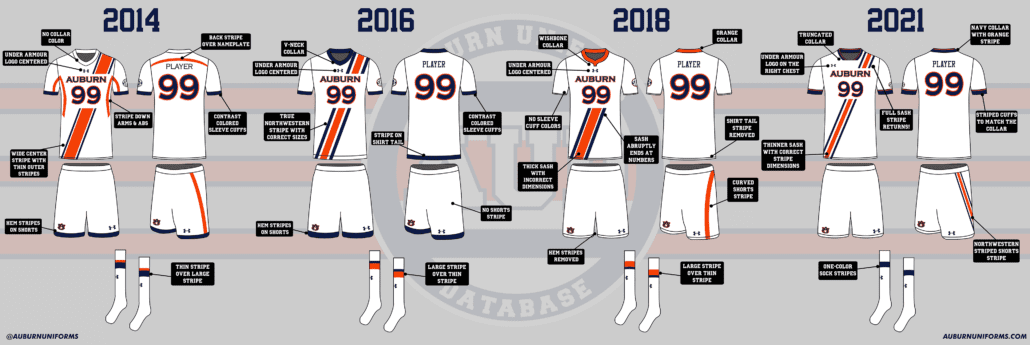
Let’s go a bit further. As this is the fourth iteration of this very design, let’s look at all four together and see how things have progressed over the last seven seasons.
Auburn kicks off the 2021 season this Thursday as they travel to Samford for the first regular-season matchup.
The Auburn Uniform Database features a collection of Auburn Soccer uniforms dating back to 2011. The entire historic catalog is currently a work in progress.
Enjoy learning about Auburn uniforms and history? Want to see more like this? Be sure to follow the Auburn Uniform Database on Facebook, Instagram, and Twitter for even more uniform news. To support this work, you can donate directly via Buy Me A Coffee. You can also purchase your favorite team’s merchandise through Fanatics, with a portion of your sale going to support this website.


Leave a Reply
Want to join the discussion?Feel free to contribute!