Crazy Auburn Uniform Concepts – Round 8
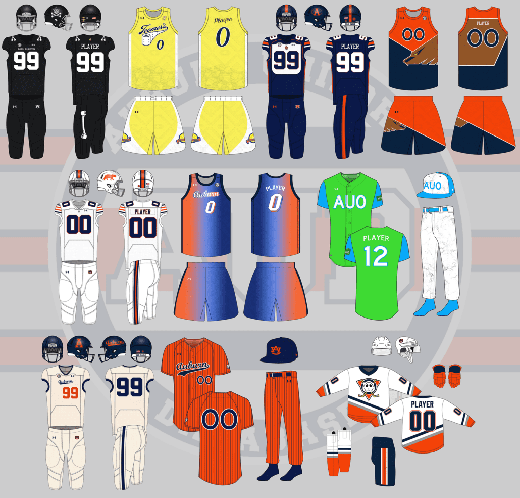
Welcome back to the greatest time of the year – crazy concept uniform designs!
If you’re new here, each summer I put out an all-call on Twitter for the craziest, silliest, sometimes possibly realistic concept ideas that Auburn fans would like to see come to life.
Why? Well, the summer is often riddled with talking heads discussing alternate uniforms. The same horrendous designs have been passed around for years and it’s time to add more fuel to that fire!
This series also works to show that Auburn’s uniforms are pretty good as is. The Tigers don’t need to make any changes or bring unnecessary alternates into the rotation just because they can.
A few things before we get started:
- First off, these designs are intentionally silly, obnoxious, and over-the-top. That’s the point. No one expects to see these hit the field or court. We aren’t saying Auburn should wear these whatsoever. If you are truly upset about any of these designs, that’s solely on you.
- I am not a designer or an artist. This is always a fun project that helps push my very limited creativity. These are not the world’s best Photoshop jobs and they were never expected to be so. Again, they’re goofy on purpose.
Did your suggestion make the cut this year? Let’s dive in and take a look at this year’s crazy Auburn concept uniforms!
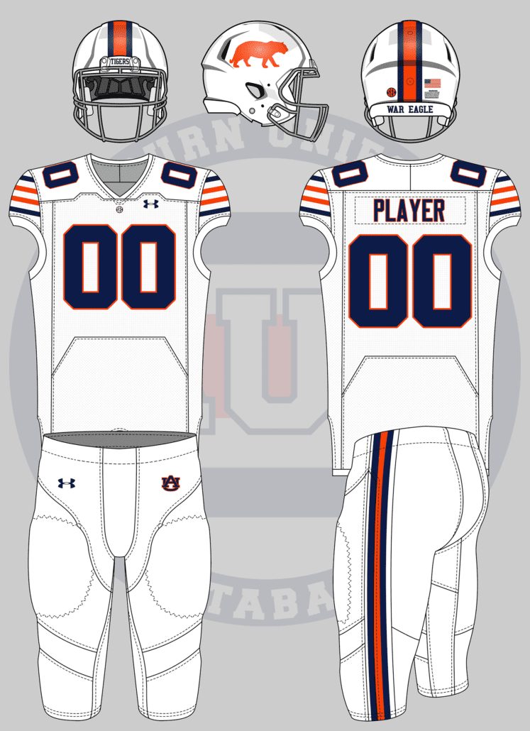
I’d like to see one based on the throwback Bills uniform (Auburn colors, orange tiger on helmet, etc)
— Tom (@ths0002) May 30, 2022
Who doesn’t love the standing buffalo? Let’s see how it works as a standing tiger.
This one was a rather simple tweak. Facemask goes grey, helmet stripes now touch, jersey stripes match the Bills’ design, and the pants stripe is much thinner. To play closer to an NFL uniform, the SEC patch moves from the right chest to the center, much like the NFL shield placement.
The Bills’ standing buffalo logo is iconic and swapping it with a tiger silhouette works really well here. The different sleeve striping is also a nice fit that doesn’t stray too far from the classic Northwestern Stripes.
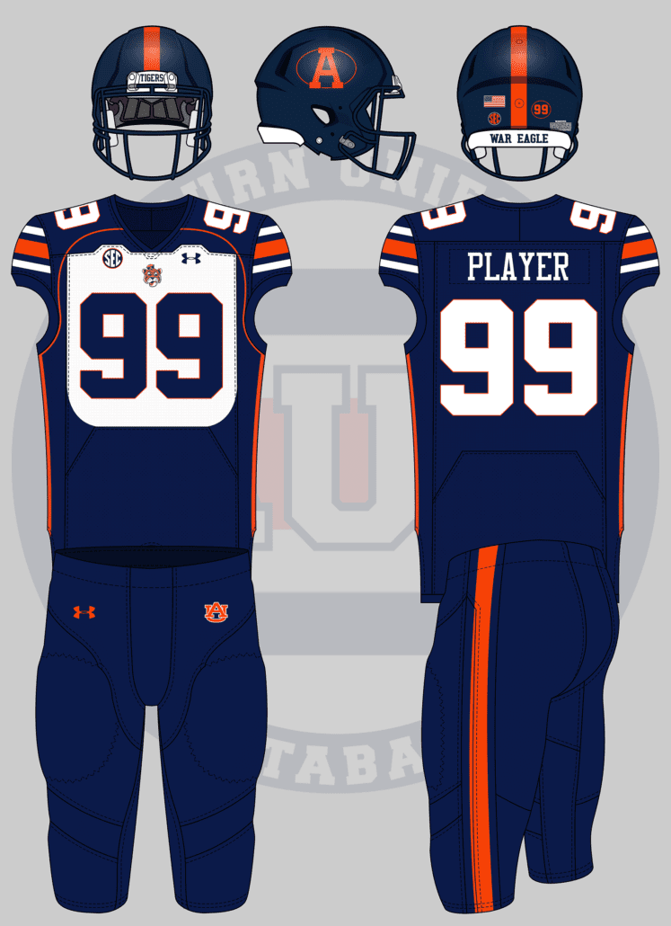
Auburn version of those hideous BYU bib unis from like 15 years ago
— Sonny Dichiara Is My S🅿️irit Animal 🦚 (@originalgAUlf) May 25, 2022
BYU’s 1999 uniforms are often considered the ugliest in the history of college football. And for their ugliness, I love them! The Cougars actually forced the NCAA to change the uniform rules which now require the jersey to be entirely a single color.
For the Auburn-ized version, it starts at the helmet. A navy helmet carries a throwback block A placed within an orange-outlined oval, much like the BYU logo. To add to the logo aesthetic, the player’s number is also encircled on the back of the shell.
The old templates allowed the “bib” effect on the jerseys much better than Under Armour’s current design. The white are is restricted within the “file tab” textured area here. BYU also had their cougar head logo within the collar, but we’re going to place Sailor Aubie on the chest.
The numbers get an orange outline, the jersey gets terrible orange piping to connect the collar to the side stripes, and the pants get a single orange stripe to match the helmet.
This but auburn pic.twitter.com/bPaYPcPfYa
— ⚓️ Drew Crowson 🦚🇺🇦 (@SonOfCrow2) May 24, 2022
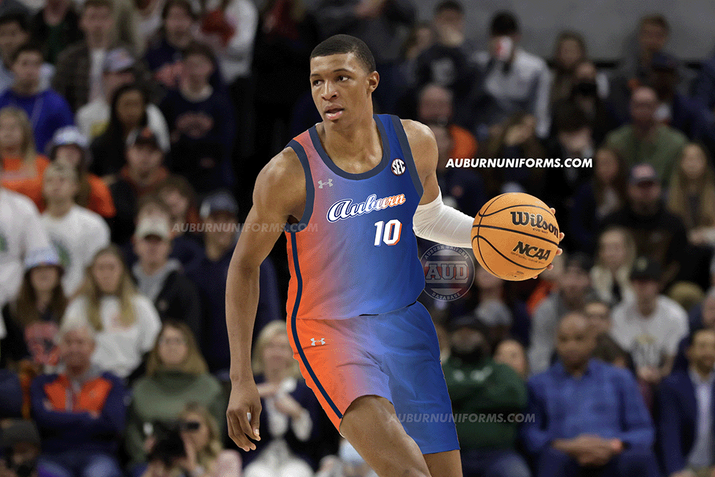
This now makes the third straight year we’ve had an Auburn x NBA crossover design!
The Miami Vice uniforms have been incredibly successful for the Heat. Naturally, we had to make the light blue and pink gradient orange and navy to start off. I stuck with the normal Heat font and added the matching gradient-drop shadow.
Miami uses black wordmarks and numbers, but to stick with Auburn colors and make it pop more, I went with white. And instead of mimicking the Miami Vice font as closely as possible, I went with the beautiful Auburn baseball script.
I debated adding the old 1990s Women’s Basketball flaming AU logo to mimic the Heat logo, but decided against it. Keeping it simple worked well here.
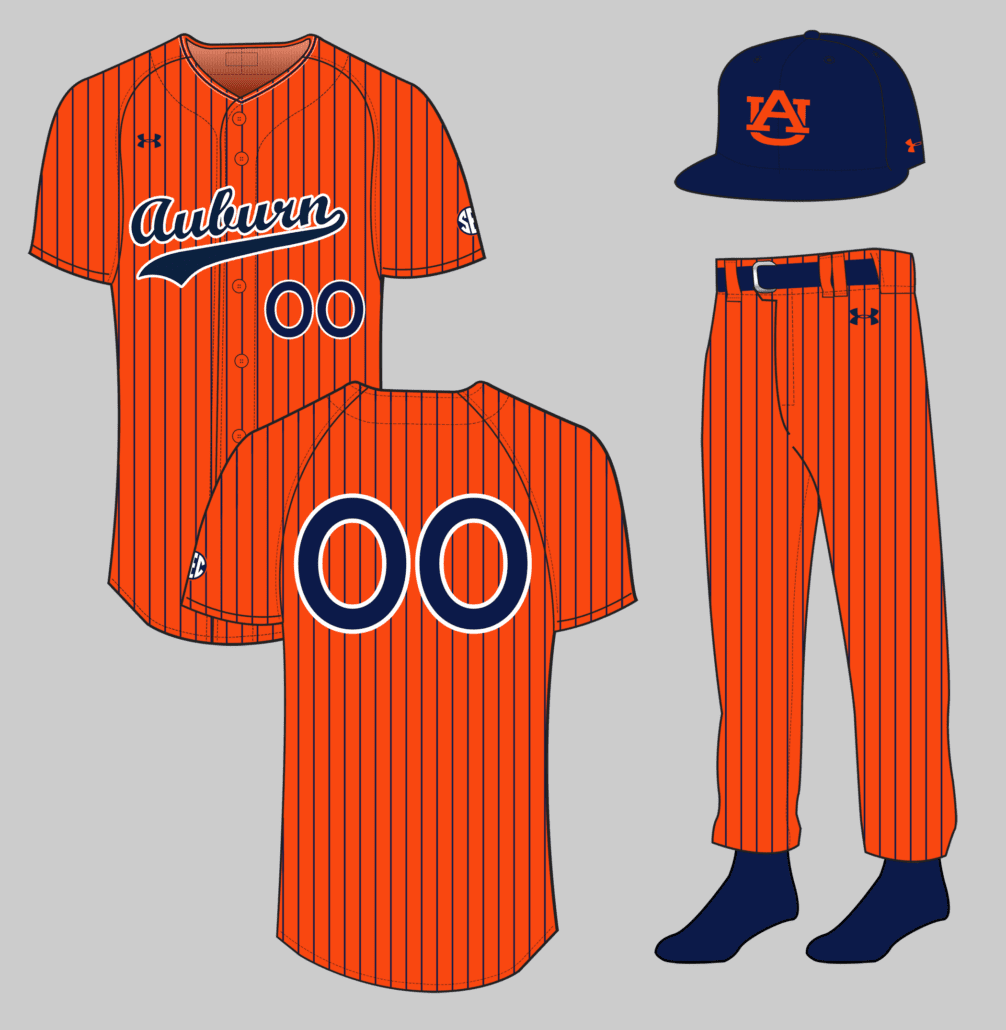
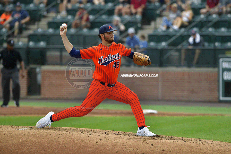
Orange jersey and pants with navy pinstripes and a navy hat or vice versa
— autiger24 (@Aubfather) May 31, 2022
There have been many different pinstripe uniforms over the history of baseball. But I don’t believe I’ve seen an orange uniform with pinstripes. Let’s see how it works!
Uh, yea, that’s a bit much!
This one could have gone a number of ways. Of course, we start with an orange base, add navy pinstripes, and go from there. The script Auburn has been a staple lately for the Tigers, and it differs from the AU-logo pinstripe sets Auburn has worn over the years. I went back and forth on having a white outline on the script and numbers or not, but trust me, it worked better with the stroke.
For consistency’s sake, the numbers and script are basically the only usages of white on the entire design. The cap also copies this, with the vintage orange-AU logo cap returning for the first time since 2010.
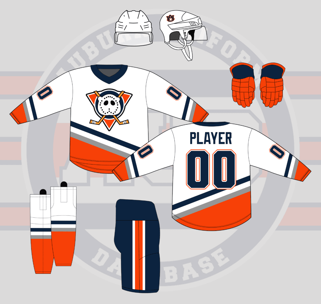
Anaheim Mighty Ducks uniforms with an Aubie shaped goalie mask on the logo. pic.twitter.com/yjUymIRt5s
— Matt (@MRickG_) May 25, 2022
Well, this is a first for this series. It’s about time we add hockey here!
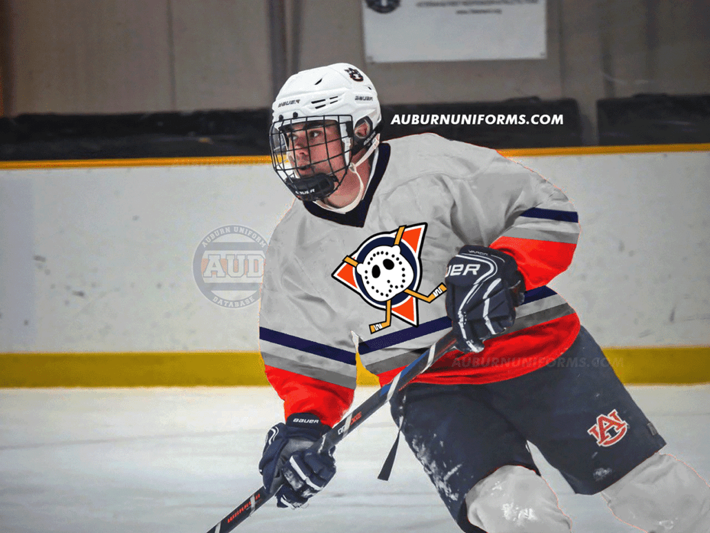
The original Mighty Ducks uniforms had a great look, especially with their colors. To Auburn-ize the design, I simply swapped all purple to navy and all teal to orange. The silver sticks around from the original design.
When I tell you that I’m not a designer, I hope this proves it. The Aubie mask is, well, nightmare fuel, personally! Love the idea, but the execution isn’t amazing haha.
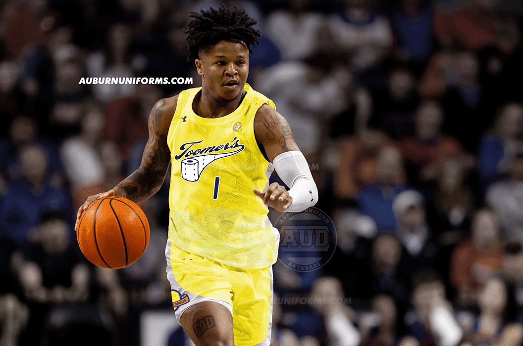
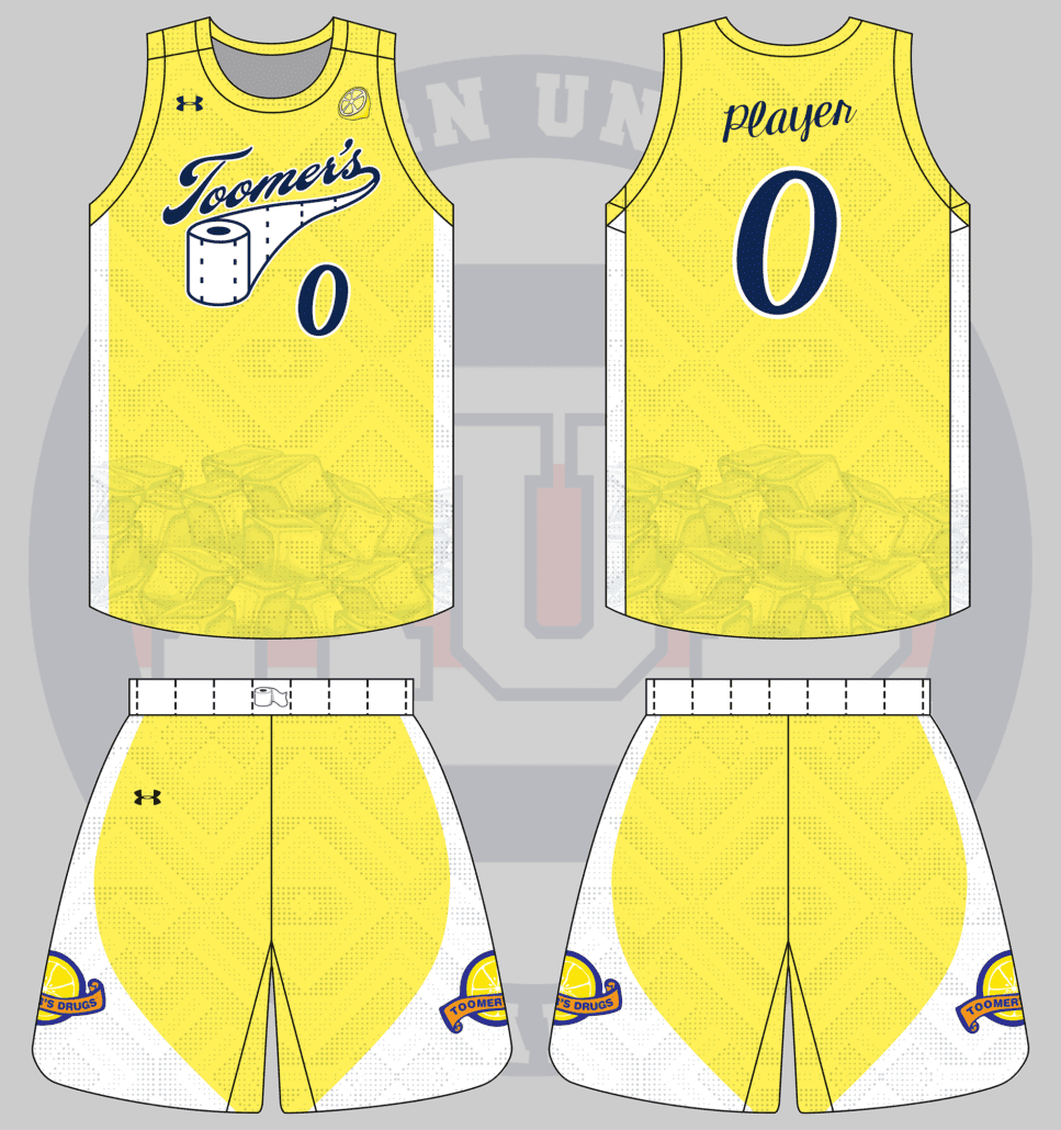
Gimme a Toomer’s Lemonade based basketball uniform 🍋🏀
— Avℇry 🎨 (@Neji11x) May 30, 2022
Avery has a thing for Auburn food-related concepts 🤔.
Avery went above and beyond and used his actual artistic abilities to provide some design direction. He even provided the beautiful Toomer’s script logo for the chestmark!
This one feels a lot like an NBA City Connect design. The base design goes all yellow to match the lemonade. At Avery’s request, the SEC patch is replaced with a lemon (I genuinely tried to make an SEC-Lemon patch but it wasn’t working) and ice cubes are added at the bottom of the jerseys. The sillier the better, right?
The waistband on the shorts is white with perforation marks to match the script’s toilet paper tail. The numbers and player names are rendered in a font that matches the script.
The shorts feature the Toomer’s Drugs logo on both sides, housed within a white field that mimics some designs of Auburn Basketball’s past.
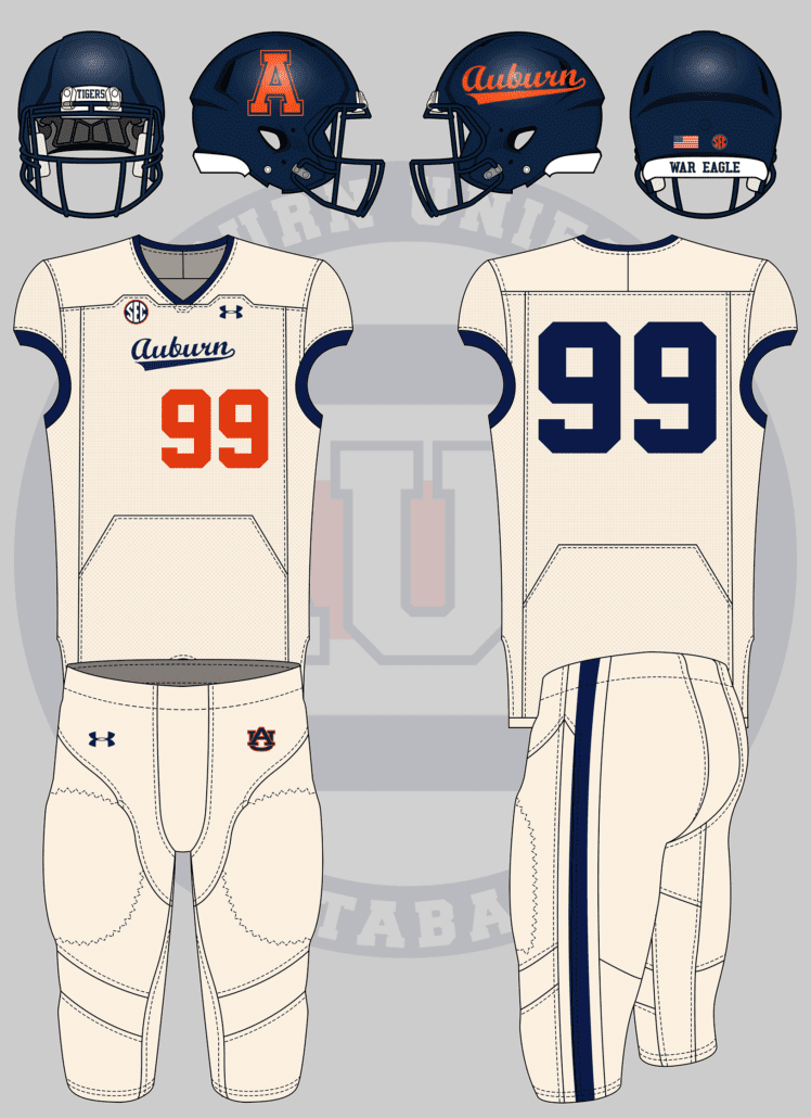
and/or vice versa. A football uniform based off of baseball’s pinstripes or 80s cream/off-white scheme
— Adam Sparks 📸 (@adamsparksphoto) May 24, 2022
Auburn’s fauxback cream uniforms are among the best in college baseball. It’s a shame that we haven’t gotten to see them since 2018.
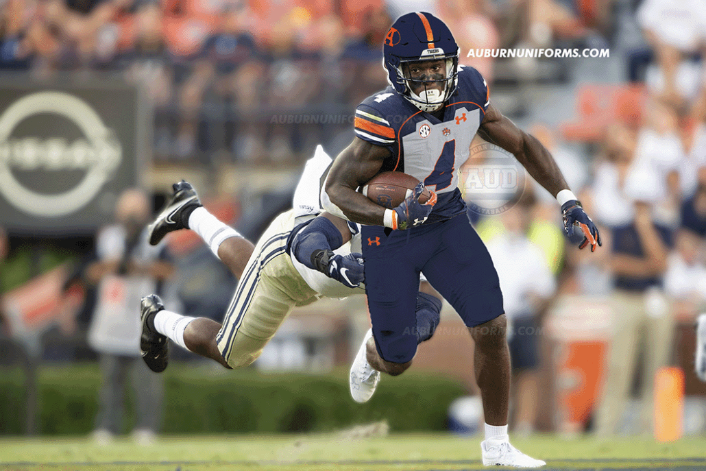
This one’s mostly a simple crossover design. The jersey and pants go cream-colored with navy collars, arm cuffs, and a single stripe on the pants. The script gets placed on the chest but is naturally smaller than the baseball design. The front numerals go orange and get offset.
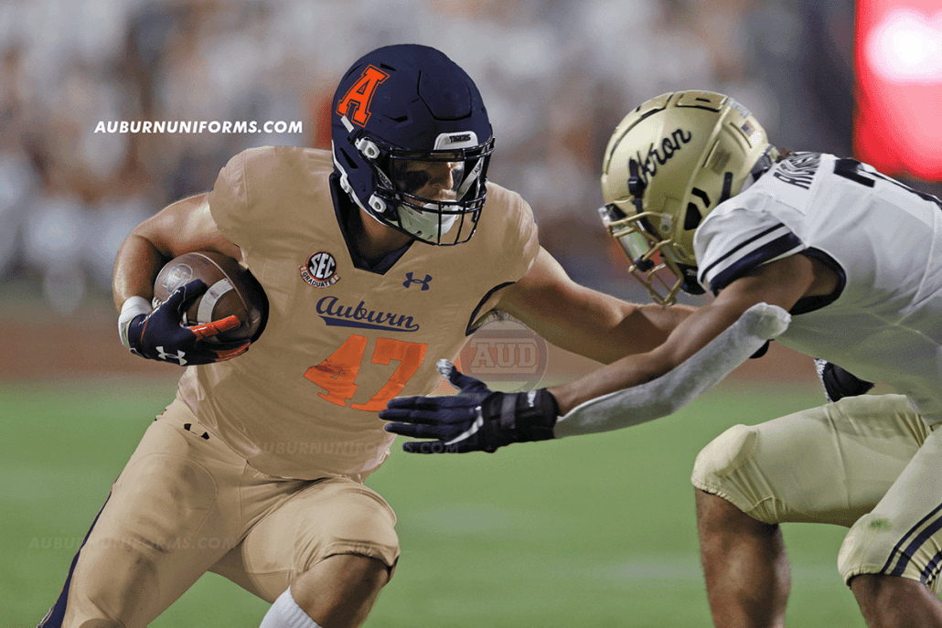
The best thing here is the helmet. The navy helmet gets to feature both Auburn’s beautiful script currently worn and the throwback block A logo that was previously worn on the hats. Now that’s a helmet I want on my shelves!
Yes, of course, I had to use a photo of John Samuel Shenker, the latest two-sport athlete at Auburn!
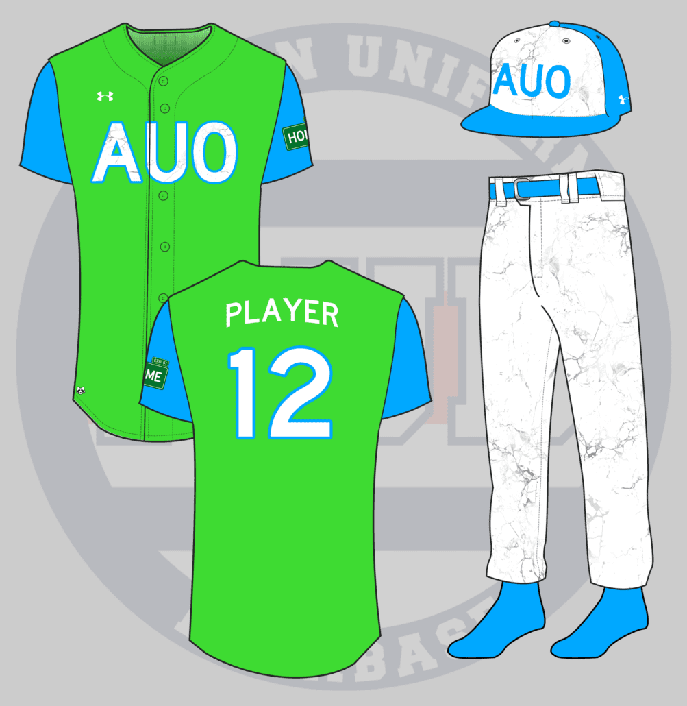
What would a City Connect Auburn baseball uniform look like?
— Plainsman Parking Lot (@AUPPL) May 31, 2022
Now, this is the perfect crazy concept idea! I love this one. If you aren’t aware, MLB and Nike began introducing City Connect uniforms last year, similar to the NBA’s designs. The uniforms were drastically different than the team’s usual threads and often had a direct link to something in the city. Kansas City features fountains, Boston went with the Marathon design, Miami threw back to a Negro League team, and so on.
After going back and forth on what local attraction to connect to for Auburn’s design, I finally settled on Chewacla State Park.
Yea, it’s a lot. Let me explain.
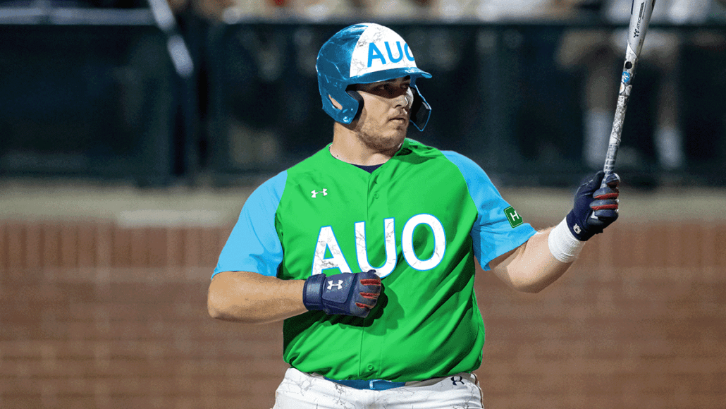
Let’s start with the colors. The green is meant to represent the tree canopy and plant life throughout the park. The light blue is for the water, specifically the park’s beautiful waterfall. I went with a vest jersey rather than a traditional jersey because one, it’s different than any other City Connect uniform so far, two, it’s traditional for Auburn Baseball, and three, sometimes you need to layer up when on an early morning hike! (Ugh, the Nike speak leaked in again.)
Chewacla has long been mined for a specific type of marble unique to the area. So any white areas on the uniform get treated with a marble texture. The hat and chest get the AUO airport code to further connect to the twin-city area of Auburn and Opelika. And those abbreviation hats have been all the rage in recent years.
The left sleeve receives a special patch that resembles an interstate exit sign. Hoping off Interstate 85 and Exit 51 is the best way to reach Chewacla State Park. But heading north off the exit will take you home to campus.
Last but not least, there’s a hidden raccoon patch on each jersey. For this mockup, it’s placed on the bottom half of the jersey. Why a raccoon? Well, the name Chewacla derives from an indigenous language that translates to Raccoon City. Yes, I did learn that while making this design.
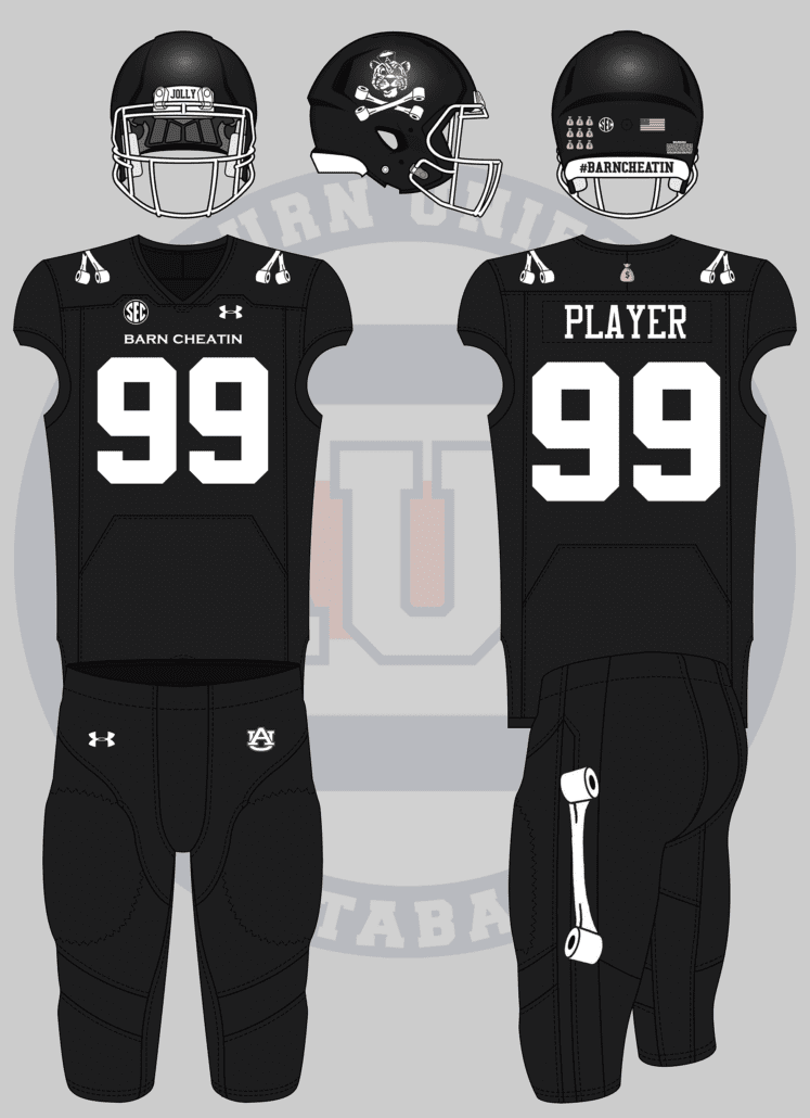
An Auburn football uniform inspired by #TheRefs and #barncheatin with the pirate Aubie logo on the helmet. (special request that the photoshop be of Cam Newton) pic.twitter.com/ksSsLVCD4L
— Carter Michaels (@TheRealCMike) May 24, 2022
Carter never fails to bring a great concept to the table! Let’s see what we can do with this design.
For the crowd that wants black uniforms, here ya go!
The entire premise of the uniform is based on the Jolly Aubie flag that @AUPPL designed years ago. And I must say, it fits well here on the helmet. The front bumper on the black shell reads “Jolly” referencing the logo and the rear bumper features #BarnCheatin, a popular Auburn Twitter inside joke when anything goes Auburn’s way.
The jersey shoulders feature the crossed toilet paper rolls in lieu of numbers or stripes. “Barn Cheatin” replaces the school name on the chest. A single toilet paper stripe is placed on the pants stripe to tie it all together.
The only splash of color comes from the “money bag” patch on the jersey above the nameplate and the award decals on the helmet. I can just see someone like Cam Newton, surrounded by “improper benefit” controversies, wearing a helmet covered in money bag decals!
And, to satisfy Carter’s request, here’s an image of the Chosen One wearing the #BarnCheatin uniform!
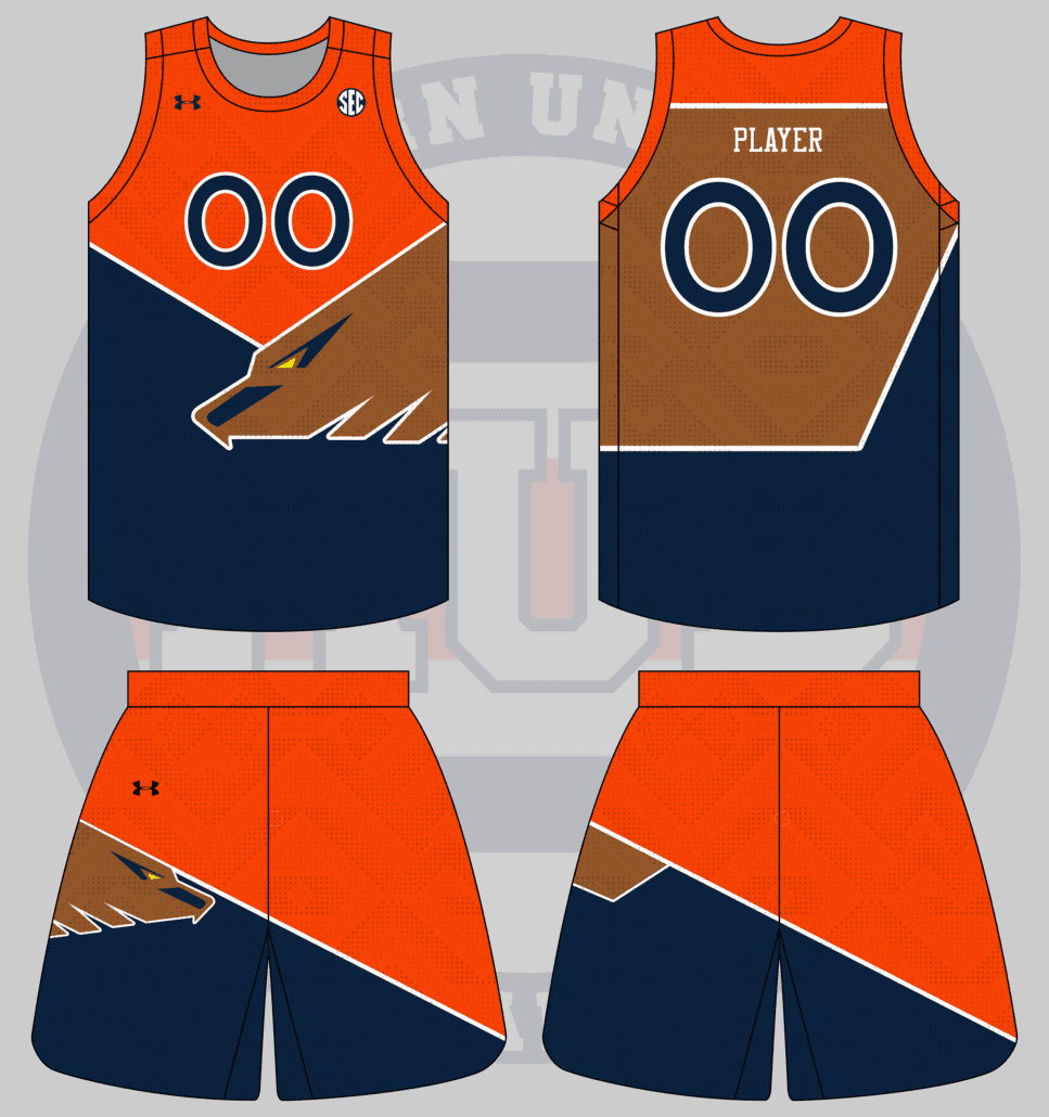
guess who’s back, back again! an auburn version of this AFL Melbourne Demons/Hawthorn Hawks jersey from their proposed 1996 merger. I’m thinking basketball with the eagle and geometric motifs on the jersey and shorts. pic.twitter.com/aIuSdVqGRL
— jillian (@macnchillian) May 26, 2022
As is tradition, we wrap up another year of crazy concept uniforms with my sister-in-law’s designs. Can’t say we’ve ventured into the world of shoulda-coulda-woulda Australian Football League before! 😂
Wild design input equals wild design output.
I tried to match the AFL jersey as close as possible, but give it more of an Auburn – and eagle – flair. Red, blue, and yellow make for a colorful palette, but we’re going to stick to reality a little more here. The yellow gets swapped out for brown to match a golden eagle’s feathers.
Since the AFL design only featured a jersey and no shorts, I had to make it up in this case. I decided to simply mirror the jersey design and have the eagle head coming from the other side. You can’t have too many eagles!
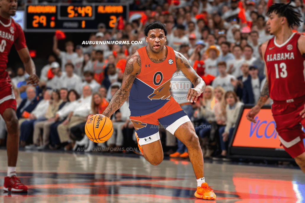
There was only one choice for the player to model the new uniform – the psychopath himself, KD Johnson:
That will wrap up another year of crazy concept designs! Did your suggestion make the cut? If not, don’t worry. We do this each summer., Keep an eye out for the request each summer and we’ll do it again next year!
Which of these designs was your favorite?
Enjoy learning about Auburn uniforms and history? Want to see more like this? Be sure to follow the Auburn Uniform Database on Facebook, Instagram, and Twitter for even more uniform news. To support this work, you can donate directly via Buy Me A Coffee. You can also purchase your favorite team’s merchandise through Fanatics, with a portion of your sale going to support this website.




Leave a Reply
Want to join the discussion?Feel free to contribute!