
It’s my favorite time of the year – time for another round of crazy concept uniform designs!
If you’re new here, I put out an all-call on social media each summer for the craziest, silliest, and sometimes possibly realistic concept ideas that Auburn fans would like to see come to life.
Why?
Well, the summer is often riddled with talking heads discussing alternate uniforms. The same horrendous designs have been passed around for years. It’s time to change that (and add more fuel to that fire!).
This series also works to show that Auburn’s uniforms are pretty good as is. The Tigers don’t need to make any changes or bring unnecessary alternates into the rotation just because they can.
A few things before we get started:
- First off, these designs are intentionally silly, obnoxious, and over-the-top. That’s the point. No one expects to see these hit the field or court. We aren’t saying Auburn should wear these whatsoever. If you are truly upset about these designs, that’s solely on you.
- I am not a designer or an artist. This is always a fun project that helps push my very limited creativity. These are not the world’s best Photoshop jobs and they were never expected to be so. Again, they’re goofy on purpose.
This year’s crop includes eleven brand-new designs! Did your idea make the cut?
Let’s dive in and take a look at this year’s crazy Auburn concept uniforms!

To commemorate the rematch of the AU-Oregon title game, Auburn creates an AU version of Oregon’s unis that day: pewter helmet w/neon orange AU logo, silver tiger claws on shoulders, neon orange numbers w/neon blue outline, pewter pants. (Oregon obviously would wear Oregon-ified version of Auburn’s unis.)
This is the perfect design to start with. We have a solid base with Oregon’s unique 2010 title game design and just need to adapt it to Auburn-ify the look!

We start with the same carbon-fiber grey helmet that Oregon wore in Glendale. The center stripe retains the same words, except I swapped “Oregon” for “Auburn.” A brighter-than-normal orange is used for the AU logo on the sides and the bumpers.
For the jersey, the shoulder design replaces the Oregon wings with a tiger claw scratch design I found online. This specific design filled the space better than some other generic scratch images that better resembled Adidas’s clipart stripe design from the mid-2010s. The number carries the same orange as the AU logo with a carbon-fiber pattern inlay. I added a bright blue color to add some needed contrast and make the numbers pop a little better.
Oregon has long since dumped the Belotti Bold font, but using it for Auburn just feels off. It’s a much more unique element than Auburn is used to. But that’s the point of this series – to push the concept of what makes Auburn feel like Auburn and make some goofy uniforms along the way.


Cody and Jolly Aubie have been a mainstay in recent years. We’ve tackled football and baseball, so it’s only natural that basketball be added to the lineup.
When certain design motifs are used across multiple entries, I always try to not just copy/paste elements across sports and call it done. I always want to see each of these have a little more of their own identity – and these Jolly Aubie designs push that creativity for me.
As requested, the Auburn script mark gets placed front and center. I thought about tucking the number off to the side as Cody requested, but nothing worked well. Instead, the toilet-paper-cross-bones works as a great element to house to the numbers. And the top corner of the toilet paper roll fits pretty well into the tail of the script mark. The TP also appears on the back to border the nameplate.
The most unique part of this design is the TP/cross-bones repeating around the sleeve trim and the shorts leg. This was meant to mimic the collar designs that many teams wore the 1990s, like LSU and Boston College. I kept it away from the collar to keep it from being overkill, adding a thin white stripe just to pull it all together.
The shorts carry the same design around the right leg while the left side gets an oversized Jolly Aubie logo. Asymmetric designs aren’t uncommon in basketball and Auburn has worn similar looks in the 1990s.
I really happy with how this one came out! I love the cross-bones pattern to add just a little bit more to the design and helps differ it from the other sports we’ve previously created.


Jason Day has made a name for himself with some… unique outfits on the PGA Tour. This one is one of the more unique and loud designs. Let’s see how well it translates to a football uniform.

Let’s start with the jersey. The white tops get navy stripes around the collar and the shoulder caps to mimic the black-trimmed vest. The giant wordmarks on the front get adjusted to read “Auburn Tigers” with “Football” in the middle. The small “no. 313” at the top gets converted to the player numbers. The same design gets replicated on the back.
I debated mimicking Day’s cap, but decided to base the entire uniform on the vest alone. So we pair the navy pants with a navy shell. The same design from the jersey gets replicated on the sides of the helmet. The colors get adjusted to best pop on the navy base.
For the first time in football uniform design, the player number will appear on the front bumper. It’s a small detail here that adds a unique touch to the new uniform concept.


Powder blue has gained a lot of popularity in Auburn in recent years. We did this exact design for basketball last year, so let’s see how it works for softball!
This one is pretty straightforward – make Auburn Softball powder blue uniforms that resemble the baseball team’s look in the 1970s and 1980s.
For this (and all of these, actually), we start with the new Nike template that the team will likely wear this upcoming season. Nike’s baseball/softball uniforms include a pullover design similar to what baseball previously wore. The unique wishbone collar will go orange with a thin white stripe to match the sleeve stripes.
The script mark fits perfectly on the chest, and we’ll throw the number underneath. I debated changing the number font, but I thought Copperplate actually worked well enough here (and better than the same Script MT Bold font the wordmark is based on).
The biggest struggle with this design came with the socks. No combination of colors and stripes seemed to work well here. Powder blue socks made for an odd look, matching the shirt and pants. Orange socks were the best for contrast, but adding white and/or powder blue stripes just never looked right. Reluctantly, these socks will remain plain and simple to round out this design.


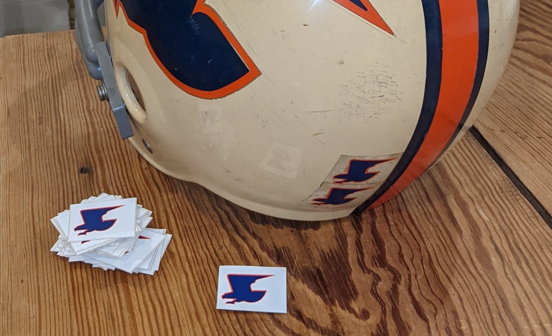
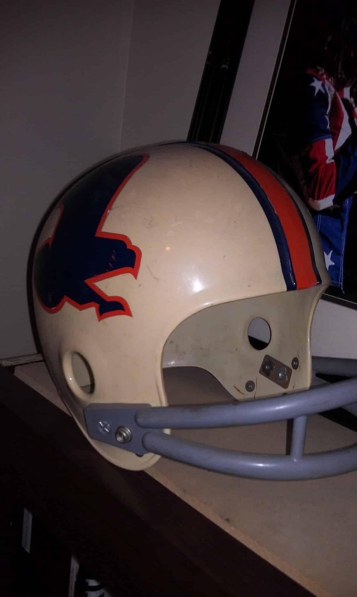
This one requires a little backstory. A few years ago, I highlighted Randy Brown, the man behind many of Auburn’s designs and logos that you know and love. For his senior art thesis in 1976, Randy took up the task of redesigning the Auburn football uniforms. He had already created the “weagle” design – the USPS-looking double-eagle design that Doug Barfield used as award decals on the helmets – and wanted to base the entire uniform on this design.
With his mother’s sewing machine, Randy hand-made a home and road colorway of the jerseys with the Weagle logo wrapping around the sleeves, a la the Seattle Seahawks of the 1980s.

For this concept, I matched the design as closely as possible to Randy’s original creation. The helmet matches Randy’s thesis design with the Weagle on the sides and a thinner helmet stripe with no gaps between the orange and blue decals. A grey facemask tops the helmet off, to match Randy’s original concept and what was available for the team at the time.
The jersey swaps the Northwestern Stripes for the Weagle eagle on the shoulders. Modern jerseys are so much tighter than half a century ago, so we lose the amazing wrap-around sleeve design. But we’ll mimic it as much as possible. The numerals go from white to orange but carry a white outline to pop against the navy. And, just to add a little modernization, we’ll throw the AU logo onto the collar.


I ask for crazy designs, yet I’m still surprised when people bring the crazy…
Apparently, for some back story, Cam Coleman was spotted eating an Uncrustable on the field during warmups before the A-Day game practice.

Alright, stay with me here.
The Uncrustables box has a lot of elements – loud purple, the weathered plaid design, the light blue bubbly font for the logo, and even the purple circle with the…indention marks? That makes for a recognizable brand and a lot of elements to incorporate into the uniform.
The primary feature here is the plaid pattern from the box. It dons the helmet shell, the body of the jersey, and the stripe on the pants. The white front jersey number is housed in a purple-indention-circle on the chest with a Tigers mark set to resemble the Uncrustables logo. The collar and sleeve cuffs are solid purple to break up the plaid (there’s a lot of plaid after all…), with the cuffs donning the darker purple marks from the circle.
The rest of the player numbers are light blue with a white outline. The nameplate is solid purple to let the name itself actually be legible.
Yes, it’s very loud and outlandish, but it meets the brief. And honestly, I kinda like it. If Uncrustables ever were to outfit a football team, they should 100% go with this design!

Why do I do this to myself…

In honor of Auburn moving to Nike (I’m sure you’re getting a lot of these), I’d like to throw it back to this old commercial: Godzilla vs Barkley-themed MBB unis! Use whatever elements you see fit from the commercial or its accompanying poster and comic book.

Carter always brings the best concept ideas year in and year out. This is another great one!
After digging around the imagery available for this campaign, I decided to base this uniform directly on the poster design. With the background being the city on fire, the base color of this uniform is going to be Auburn’s burnt orange.
From there, we add Auburn across the chest in the Godzilla typeface, complete with the yellow-green gradient that was used on the poster. “Tigers” is added underneath in a font style to match “Barkley” from the poster. The collar and sleeve trims are rendered identically – black base with a yellow-green gradient to match the wordmarks and number.
The big man himself, Godzilla, dons the left side of this jersey. It’s the same artwork pulled directly from the poster. Godzilla spews…water?…from his mouth and, instead of colliding with Barkley’s basketball, it instead hits the side of the player number. The number is also rendered in the Godzilla font with the same gradient colorway to match the chestmark.
Barkley makes his appearance on the shorts. There was too much power between the two big men to both be featured on the jersey, unfortunately. Opposite of Barkley is a comic book-style bubble with a gradient AU rendered in the Godzilla font.
It’s loud, but dangit, I love it. It feels like something that would be hanging on the racks of a streetwear store.


This is going to be the first double concept. I told you powder blue was growing in popularity. I don’t love duplicating the similar designs, especially in the same article, but I thought this would be a fun challenge to differentiate it from the softball and basketball designs. Especially since there were multiple suggestions incorporating the light blue color.
Unlike the softball design, this football uniform includes a few throwback logos to truly harken back to the older days of Auburn baseball. The vintage wordmark arches across the side of the helmet, while the old block A logo sits on the collar.
The orange/white/orange stripe sits squarely on the shoulders and down the pants, while the helmet has a reversed stripe. The double stripe pattern appears on the collar and the sleeve cuffs. Gotta add as many stripes as possible with this look.
To wrap it up, and to truly embrace the “Bo Knows” aspect of the suggestion, there are two additional items. The helmet’s rear bumper reads “Bo Knows” in a script font. And the chest features a silhouette of Bo’s famous shoulder pad and baseball photo with “Bo” right in the middle.
That’s now three uniforms based on the same vintage Auburn Baseball design. Hopefully, these three differ enough at this point. We’ll have to retire this uniform from future editions, though.


What if Allen Potts brought home a different color scarf to Virginia AND Auburn chose a different mascot from The Deserted Village? Maybe Queen’s College or City of Cambridge… and the scorpions or something?
Last year, we had a unique story-driven uniform with the A State United 1943 WWII combo design. That was fun, and this will be similar.
So the story goes that Allen Potts, a track, baseball, and football star for the University of Virginia in the 1880s, attended a student meeting in 1888 about changing the school’s colors. Originally, the Cavaliers’ colors were grey and red, representing the Confederacy and the blood shed during the war.
Potts attended the meeting wearing a bright orange and blue scarf (or handkerchief, depending on the story) that he obtained from Oxford University after spending the summer there on a boating expedition. Another student pulled the colorful fabric off of Potts and suggested that those colors be adopted for the school. Almost immediately, Virginia students accepted.
George Petrie graduated from the grey-and-red University of Virginia in 1887. He would wind up at Auburn in time to coach the school’s first football team in 1892. When Atlanta was preparing to host that first game between Auburn and Georgia, a representative reached out to Petrie inquiring about the school’s colors to use for the city’s decor. Without much consideration, Petrie responded with navy blue and burnt orange, the colors his alma mater had just recently fully adopted.
The city of Auburn, Alabama, was named after Oliver Goldsmith’s 1770 poem, The Deserted Village. The poem opens with “Sweet Auburn, loveliest village of the plain…” John Harper is credited with the founding of the city in 1836. His son Thomas had mentioned the unnamed village his father was settling to Lizzie Taylor, whom he would eventually marry. Lizzie said to name it Auburn after the poem, and it stuck. The Tigers nickname also comes from the poem – “Where crouching tigers wait their hapless prey.”
So there’s the backstory. Now let’s change it up from there.
Let’s say, rather than Oxford, Potts instead spent his summer boating at Cambridge. Cambridge’s primary color of “Cambridge Blue” is actually a light greenish color. Orange and blue are complementary colors on the color wheel, so let’s find a complement to Cambridge Blue. That comes out to be a pinkish-red shade. So that’s our new color scheme.

And rather than tigers, let’s find another animal from The Deserted Village. There are a few other creatures mentioned throughout the poem: snakes, birds, bats, and even tornadoes. But probably the most unique, as far as athletic teams go, is the scorpion – “Where the dark scorpion gathers death around.”
Light green, pink-red, and a scorpion. Let’s see how this turns out.
Both of the colors came out a little too light for an athletic uniform. So I increased the saturation for both – not an uncommon thing for teams to use a different shade for uniforms like this. I also brought in Cambridge’s Dark Blue color from their branding guide as a tertiary color to act as a barrier color when necessary.
The basis of this entire design is basically a butterfly effect – what if Potts did this rather than that? And how would that trickle down throughout Auburn’s history?
Auburn is still Auburn and is very reserved with the uniforms. So we stick with a rather simple look. Cambridge is also a classic, traditional school, so that fits the mold here. The jersey gets the green/blue base color with the pink/red as a trim color. The Northwestern Stripes are adjusted to remove the outermost stripes, use the negative space in between the stripes instead, and add the dark blue as a border for each color. Rather than the block number font Auburn has used for decades, I wanted to utilize another classic, vintage font and landed on Clarendon.
To match the jersey, the helmet also goes green. A red scorpion silhouette with a dark blue outline sits on both sides. The facemask is also dark blue. “Scorpions” dons the front bumper with the logo, while two scorpions don the rear bumper with “Strike First” – the new battle cry for this alternate world Auburn University.
There’s one final detail incorporated – the Scorpius constellation. A small constellation decal is added to the back of the helmet to tie into the ancient Greek constellation identified in the second century. With some more creativity, this entire identity could better tie the space aspect to the real-world creature. I wanted to do something small to tie the two, and I like this little addition.


You wanna get nuts? let’s get nuts!
Hear me out: Toomer’s Corner Uniforms 🌳🧻🌳
Helmet: Leafy/Tree Canopy texture w/ TP middle stripe(s) + white facemask
Top: White w/ navy perforation lines
Bottoms: white with navy perforation lines
Socks/shoes: brown to represent the roots
It can sometimes be much easier when a full design is written out like this. Avery is an artist after all. But other times, inspiration takes over and the original idea has to be pushed aside. For better or for worse…

My initial idea with this concept was with the helmet. I immediately thought of all the hand-painted designs that college football teams have donned in the last decade or so. A hand-painted canopy covers the entire shell with a few strands of toilet paper flowing in certain areas. A white center stripe has perforation lines to represent a toilet paper roll. The AU logos and facemask match the stripe – white with tear-away lines throughout. The rear bumper now reads “See You at Toomer’s,” so all the defenders chasing the ballcarrier know exactly what will happen after the game.
Now we start to differ from Avery’s original vision. For the jersey, the shoulders carry the same tree canopy and toilet paper design as the helmet. The body then transitions from the leaves and sky to the brown of the tree trunks. The Auburn Oaks logo is emblazoned on the collar. The nameplate is a strand of toilet paper to house the player names and actually be legible against the busy canopy background.
The pants carry the tree trunk brown the rest of the way throughout the uniform. And a white TP stripe sits on each leg, representing the final rolls thrown into the Oaks after a long day of Auburn Athletics and celebrating a victory.


My idea is to create a row the boat themed baseball uniforms! IYKYK. The design is Auburn-themed sailing adventure with nautical details, including a sailboat, rope, and oars.
I’m shore the team will really sea-ze the day with these unis!

We wrap up this year’s crazy concept series with another idea from my sister-in-law. After her first idea of a gold sparkle uniform with a cape, Jillian has earned a permanent slot in this series for years to come.
And this one requires a little backstory as well. When Auburn Baseball traveled to Lexington to face Kentucky in March, there was some hoopla surrounding Auburn’s bench. Despite Kentucky’s dugout enjoying themselves with antics throughout the weekend, first-base umpire Jeremy Dupree tossed pitcher Ryan Hetzler and a student manager for rowing the boat. Jomboy had a great breakdown of the moment here.
Auburn would end up winning the weekend series, and Row the Boat became a hilarious unofficial battle cry for the 2025 Tigers.
Alright, enough backstories. Let’s check out the design.

Jillian provided a nice sketch for her concept, which is always a good start. As requested, we have an entirely orange uniform. The jersey, in a very minor-league move, features large waves with a little Auburn sailboat trying to survive. Two crossed oars with the “Row the Boat” battle cry sit on the right chest. The oars are also used to build out the player numbers.
Instead of squishing the numbers onto the chest with everything else, these are moved to the sleeves. It’s a little Phillies-like, and something Auburn hasn’t done before, but it was the best option here. The opposite sleeve gets a large Sailor Aubie logo, but with his usual sailor cap swapped for a captain’s hat.
Nautical ropes adorn the sleeves, collar, and pants to tie everything together. The cap mimics the jersey design with the giant waves and boat on the front panels. And if there ever was a reason for a rope hat to don a baseball diamond, this would be it!

I need this hat now. I’m in love with it.
And there you have it – 11 more uniquely insane concept uniforms for the Auburn Tigers. Here’s one last look at all of them in one place.

Which design was your favorite? Which one do you think can actually come to fruition?
Did your suggestion not get picked? Don’t worry! We do this each summer. We’ll do it again next year!
It’s a very busy summer for the Auburn Uniform Database this year. A huge series breaking down every single Under Armour uniform was just published that you should check out. We’ll also have the usual summer stables – 2024-25 Season Review, 2025 CFB Uniform Preview – along with plenty of coverage of Auburn’s transition to Nike in just a few short weeks.
Stay tuned to the Auburn Uniform Database for everything Auburn aesthetics, as each program will debut new uniforms during the upcoming athletic season.
Want to see more like this? Be sure to follow the Auburn Uniform Database on Facebook, Instagram, and Twitter for even more uniform news. For ways to support the AUD, including affiliate links to Fanatics and Dick’s Sporting Goods, visit the Support page.
Love these. Kind of wish the Toomer’s one had the green just on the top with brown on the pants and below. The belt could be toilet paper looking, even.