Auburn Changing Logo
Auburn University attempted to change from the well-known interlocking AU logo in 1995. It didn’t go well.
History tends to repeat itself, and that’s the case here.
Rumblings of Auburn changing the primary AU logo have swirled on social media for a few weeks now. The fanbase has been understandably unhappy with the potential for change.
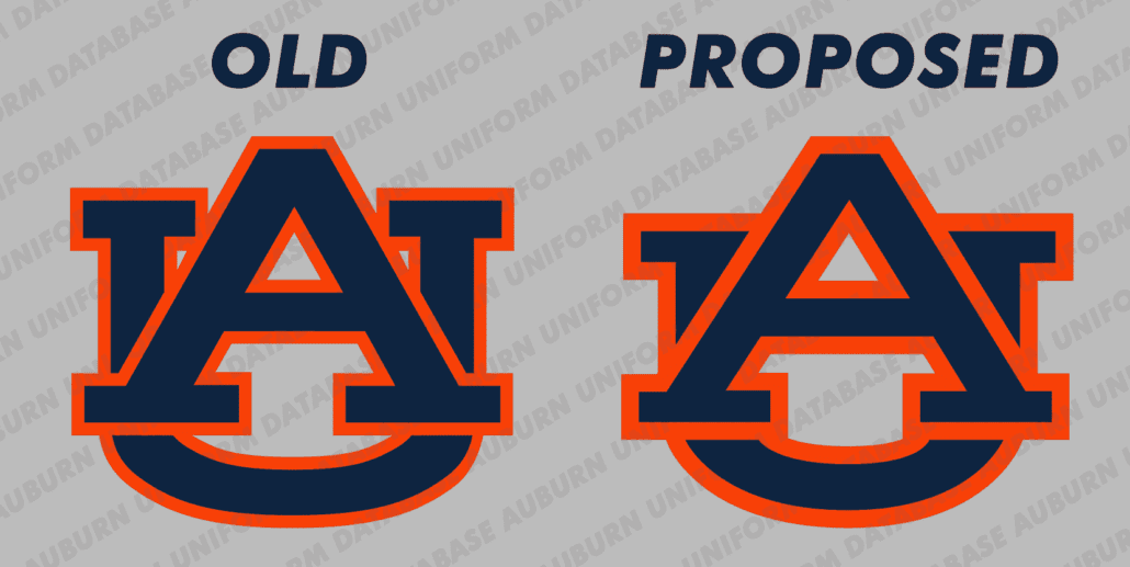
The original AU logo, which has donned Auburn’s football helmets since 1966, will soon be a bit different. In order to remove some of the white space in between the letters, the U is slightly smaller. A little squished, in fact. The white space between the upper portions of the U and the A are gone, while the lower portion is considerably smaller.
Multiple sources have presented information regarding this proposed change. Brandon Marcello of 247 Sports first reported the changes, confirming what sources presented the Auburn Uniform Database.
Our source likened the logo change to being similar to what other universities have done in recent years. Notre Dame and North Carolina, among others, took the opportunity to refresh their logos. In 2015, UNC teamed up with Nike to “refresh” and present a “consistent brand” across the entire university and athletics programs. The results created a more symmetrical logo while also emphasizing the individual letters. Notre Dame’s changes were similar, tweaking the outline of the interlocking ND logo. Both examples feel more like the natural evolution of an existing mark, whereas Auburn’s is more drastic.
It’s unclear at this moment when the transition will take place. With football season just a few weeks away, it’s difficult to imagine the switch happening in time for kickoff. Helmet decals are easy to change out, but when you look around Jordan-Hare Stadium, let alone the rest of campus and the city of Auburn, there are many locations where the original AU logo would need to be changed. The mid-field logo, all the signage on the concourse, the giant logos located on the exterior of Jordan-Hare – all would need to be changed in a short period of time.
Because of that, I expect this change to roll out following the 2019-20 academic season. Still, there would be a lot of work to replace all the logos. There are logos on every stadium, sign, banner, door, hedge, baseball hat, gymnastic leotard, basketball court – the list goes on. With teams recently receiving new uniforms, they immediately will have to be changed to reflect the new logo. That’s a large expense for what many believe to be a small and unnecessary change.
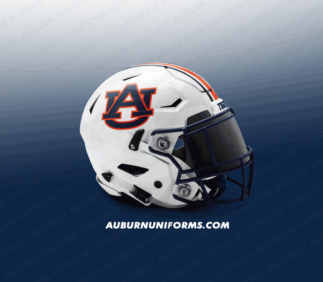
But helmet decals are probably the easiest application to swap out. There is a chance when Auburn walks onto the field in Dallas to face Oregon in the August 31 season opener that the new logo will appear on the helmets. Here is a look at how different the new logo would look on the football helmets:
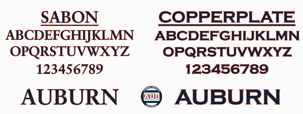
In addition to the logo change, Auburn is expected to change the accompanying fonts. Auburn has used the Copperplate font on nearly every application minus the football numerals since 2005. Copperplate will be replaced with the Sabon font, which is admittedly more similar than not to its predecessor.
It remains to be seen if the font change will affect the non-football uniforms going forward. The Sabon numerals probably wouldn’t be as effective on the jerseys, so Auburn could either stick to Copperplate numbers or revert back to a standard athletic block font.
UPDATE (8/9/19): In an email to Auburn Undercover, Auburn University stated that the font will not be changed, that Auburn will be sticking with Copperplate for now. They also stated the logo was not “new” but was part of a “new identity system.” Simple semantics and corporate speak at work – it’s a new logo.
The University provided Auburn Undercover with official logo renderings, including one with Auburn rendered in a Unitext font, per the email.
All of this comes just two years after Auburn University retired the Samford Hall silhouette logo that was used to differentiate the academics from athletics. The AU logo was selected to unify all of Auburn University – academics and athletics alike – under one brand, one logo. That decision seems to be undermined as that unifying logo has now been changed.
Universities across the country have taken different approaches to this challenge, with most taking the single-logo route. Recently, however, University of South Florida revealed a full-body bull logo to represent the academic portion of the school. After backlash from the fanbase and ridicule that the logo resembled that of Merrill Lynch, USF killed the academic-only logo in May of this year.
In 1995, Auburn’s then-president William Muse wanted to see what options were available beyond the AU logo that had been around for three decades at the time. A public contest was held, and two University employees created 42 concept logos. None of which were selected. Alumni, students, and fans did not take kindly to the desire to change and the entire project was dropped and nearly forgotten.
The new AU logo change could go one of two ways. Fans can riot and force the hands of university officials to admit their mistake, resulting in reverting to the original design. Or the new logo sticks and is eventually forgotten or accepted among the fanbase and community.
Visit the E2C Network to listen to a discussion regarding the new logo and other changes.
Want to stay on top of Auburn logo news? Enjoy uniforms and want to see more like this? Be sure to follow the Auburn Uniform Database, like the AUD Facebook page, Instagram page, and follow me on Twitter for even more uniform news. You can also purchase your favorite team’s merchandise through Fanatics, with a portion of your sale going to support this website.



The new logos design doesn’t even make sense. To take away JUST the areas that define the letters? Nonsense. And to change the font to Sabon… Well Jeezus, just call it Saban. All totally wrong for a program with a classically handsome logo and uniform. My two cents.
totally agree with you, some millennial marketing type tying to justify their job.
If it isn’t broke don’t fix it. Just leave it alone!
Please tell me this is a joke! I don’t like it!! I’ve always loved the way the logo looks especially on the helmets!
DON’T. CHANGE. THE. LOGO.
PLEASE. DON’T. CHANGE. THE. LOGO.
Who is the insane person pushing this nonsense. Someone wrote If it’s not broke don’t fix it. Not only is it not broke , it’s iconic, changing it will brake it. Sometimes change is good but not this time. The present logo is an institution and it’s inspirational. To all my Auburn brothers and sisters I say I love Auburn, I am Auburn, don’t do this! Get into this and let’s keep our present football helmet logo. Please, if you don’t it’s going to happen but not in face of overwhelming opposition. WAR EAGLE.
no.
Keep the current logo. War Eagle!
Whoever designed the new logo should be fired.
ya know where I want change? On the field of play, such as a good offense and a dependable defense. And if we can’t get the change we need, change head coaches. Not very worried about the logo but it’s almost like we’re having some micromanaging from somewhere other than the coaching staff of the football team.
Since the original AU logo originated with the Band’s percussion section… by changing it to remove the inner serifs on top of the U, it’s sufficiently different enough to end our usual band alumni comment that the band created the AU logo, not athletics…