Building an Auburn Alternate Uniform
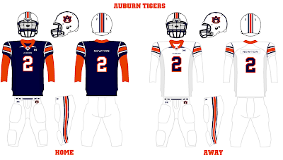
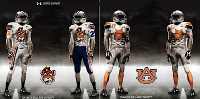
Every football season it seems the talks of an alternate uniform for Auburn just won’t stop. The talks come from everywhere – players on the team, fans, non-Auburn fans, uniform nerds like myself. No matter how many times I see concept artwork for a design, it’s hard for me to get behind it. I don’t like the idea of having an alternate uniform just for the sake of doing so. Keeping to the traditional navy and white uniforms is what is helping Auburn stand out even more in today’s dozen different combination world. I’ve not been a fan of the idea of alternate uniforms until last year, that is.
Homecoming has always been about celebrating the past of Auburn. Stories are shared by families and by many involved with Auburn, faculty and athletics personnel. What a better way to share the history of Auburn football than with specially designed throwback uniforms? But what year do you throwback to, and when?
Well that was the discussion on the Wishbone. Instead of picking random seasons here and there, let’s build a homecoming-specific uniform, one that combines elements of seasons past and honors each of those eras in it’s own way. Each year a new element would be added to the uniforms, to gradually build a uniform that is worn on a specific day. It may take 10 years or so to have a uniform that does this, but with how many Auburn fans and people involved with the school are against the idea, it would be a great way to ease these new design elements into the modern day uniforms.
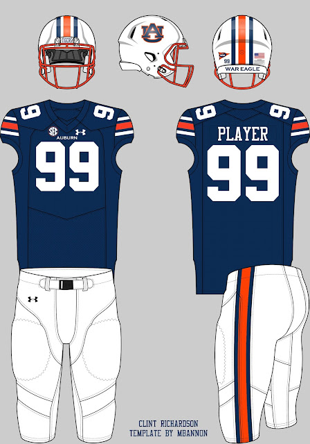
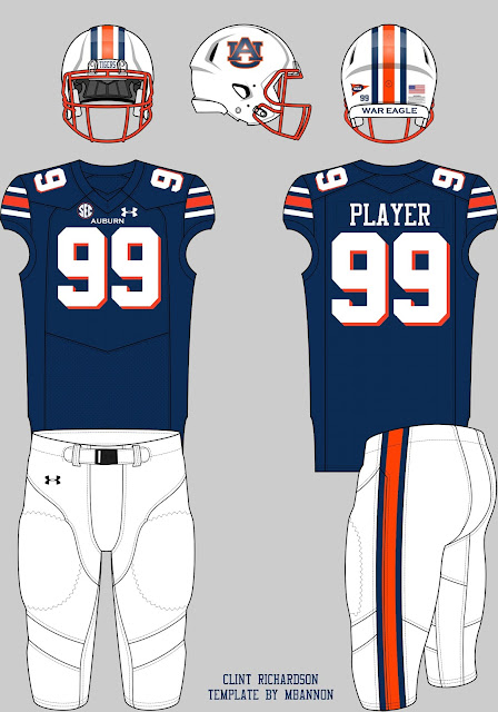
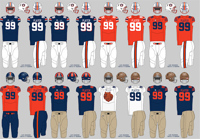
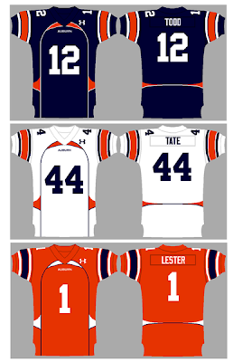
So, as a little summer project, I’ve put together some mock-ups of this new Homecoming Uniform Project. For sake of being realistic, all these uniforms are based on the new Under Armour template, with every detail remaining – conference and Under Armour patches, Auburn wordmark on the chest, nameplates, etc.
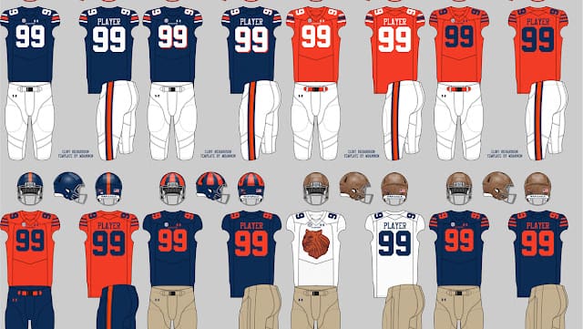
For the first season of this program, let’s add some orange into the uniforms. I’ve always been a proponent of bringing back the Bo Jackson-era orange facemasks (I even built an Auburn helmet with an orange mask). The orange would contrast with the blue jerseys much better and add a nice pop of color. It’s a simple change, and easy to do. Many of the older fans in the stands would enjoy seeing an element that was worn during a legend’s career.
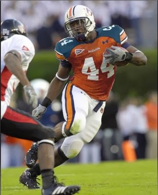
Out of this entire program, the second element might cause the most controversy – orange drop shadows. Like it or not, the 1990s did happen, and are still part of Auburn’s history. Would adding the drop shadows and the facemasks together create an orange-heavy uniform? Probably so. But it would still be fun to see on the field.
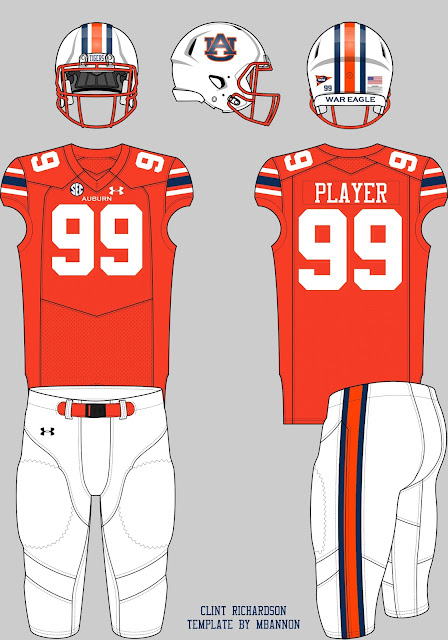
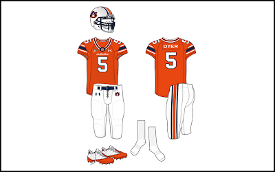
Year three would be the beginning of the larger scale changes. Let’s take the orange from the drop shadow, and just cover the entire jersey with it. Yea, many people hated the orange jerseys (and falsely believe we have a winless record with them), but stories of the 1980 Georgia game tell that the fans went nuts when they saw their Tigers enter the field with a new jersey. Just like the drop shadows of the 1990s, the orange jerseys were real. Plus, the orange facemask could stay, as it was worn with the orange jerseys in the past.
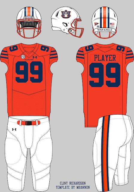
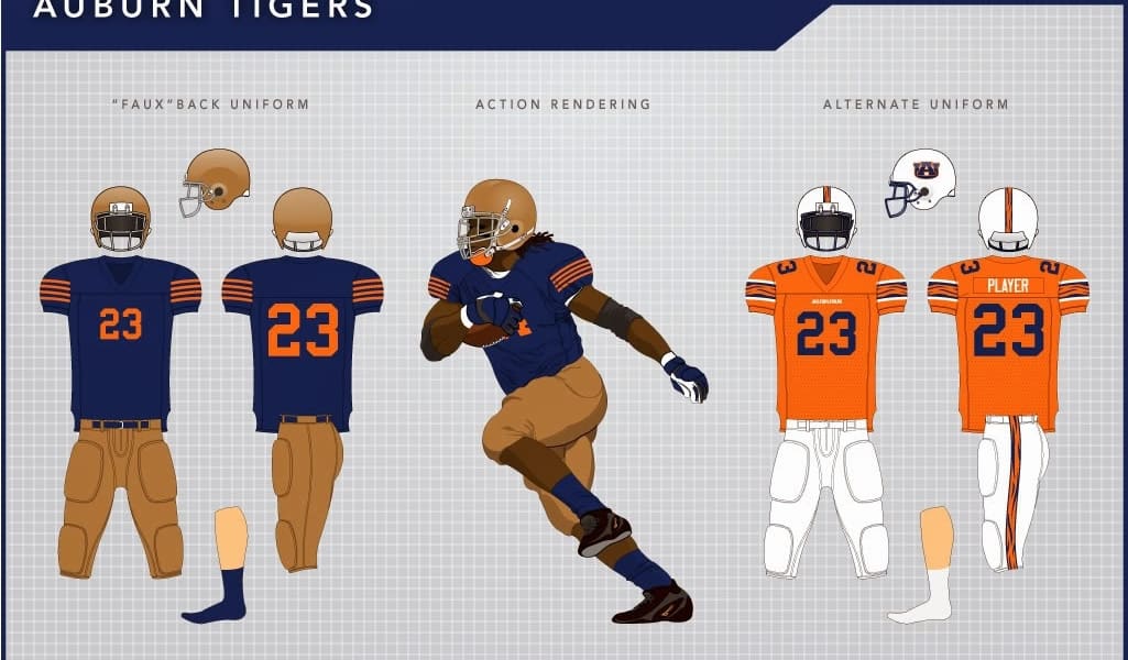
Well, that’s the biggest set of designs that Auburn has seen in the modern era of football. We could always go with a grey facemask and numbers on the helmets, like was worn in the 1960s. Or the blank helmets that the 1957 team wore, but we’ve already done that once. So where do we go from here? Well, to keep with the “adding on to the last uniform” idea of this entire program, let’s tweak the orange jerseys. Change the Northwestern stripes to three equal blue stripes, akin to those the Chicago Bears wear on their throwback uniforms. Also, change the numbers from white to blue. There we go, we just built the 1946 jersey!
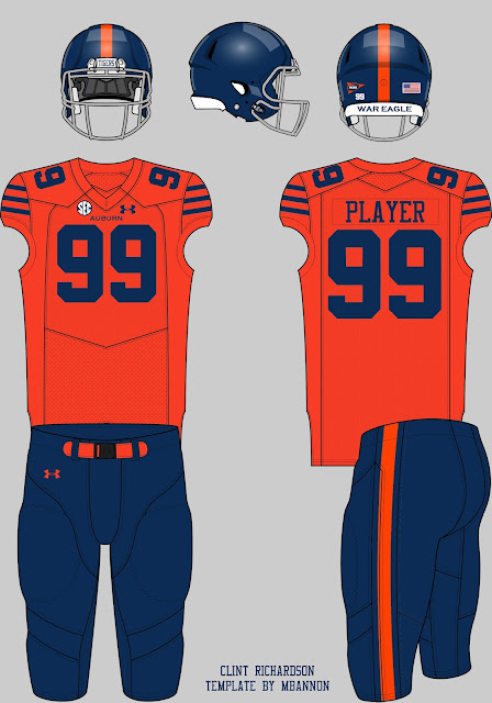
But wait, isn’t that jersey paired with blue pants? Fair enough. And a blue helmet? Done. Let’s keep the orange stripe on the helmet to match the pants. There you have it. The full 1946 uniform on a modern template. Looks pretty good.
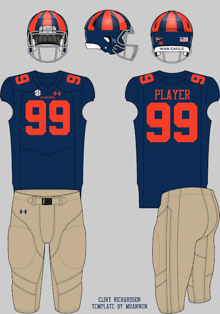
1946 certainly wasn’t the first year Auburn played football, so let’s keep going. Let’s take that blue helmet and add some orange pinwheel stripes. Let’s take the stripes off the jersey, switch the orange and blue, and throw in some khaki/tan colored pants. Now we have a uniform from the 1930s! Within five years, we’ve now gone back 80 years into Auburn’s history.
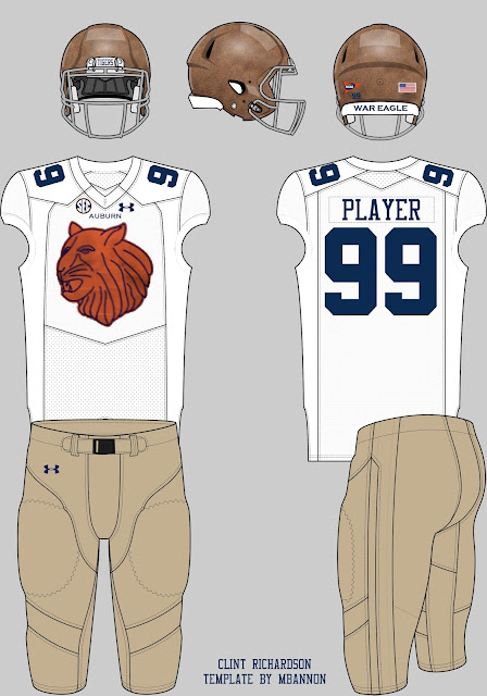
Year seven of this program would certainly be my favorite. Let’s keep the tan pants from the previous season, but let’s go with a tan helmet to match. We’ve already seen teams wear faux-leather helmets, so this could work. For the first time during this stretch of homecoming games, let’s outfit the team in white jerseys. Let’s go full 1929 and add the cat head logo (it’s a tiger head, I know) to the chest. Michigan, Wisconsin, and Nebraska have worn letter logos on the chest, so this also has been done before.
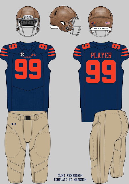
We can continue all the way back to 1913 pretty easily. We already have the tan helmet and pants from the last few years, so all we need is another blue jersey. Throw in those three orange stripes, once again similar to that of the Chicago Bears, and we have a uniform design that is over a hundred years old. Of course we’d have to go with the numbers on the front, back, and shoulders, for sake of staying modern, but that shouldn’t hurt it too much.
The 1913 season was one of the first times Auburn wore a uniform that could easily be replicated for today’s modern era. Earlier seasons saw some unique designs, with little uniform technology available. We could go as far back as 1903, or even 1892 for that, but it would involve taking a lot of liberties, many more than what we’ve already taken, just to make it viable. It would be extremely difficult to capture the characteristics of these older uniforms. We could roll out a white or tan uniform with orange shoulder caps and large waist bands, but that just wouldn’t do those teams and uniforms justice.
With that in mind, I say we cut this program off right around the 1913 season. That gives us eight different uniforms for Auburn to wear. And we could even stretch it out longer than eight years or so by adding elements slower than I’ve depicted here.
Those fans that would like to see alternate uniforms always say they’re perfectly fine with it being a single game, just as long as we get something different. Those that don’t want to see anything new love the look of the traditional Auburn football uniform. This program, designed to honor and educate about the history of Auburn football, could easily bridge the gap between these two extremes. The entire program would be historically accurate while keeping Auburn at the center of the designs. Auburn has changed plenty over the last 150 plus years. The football uniforms are no different. It’s time we showcase these uniforms and share our history, a history many Auburn people themselves don’t know anything about.
What do you think about using a single game each season to do something a little different? What uniform designs and elements would you like to include, or even not include?
