I know this isn’t Auburn basketball, but it is still uniforms, and it is what I’ve been working on for so long. I had to post this in two parts on AUFamily.com, but I’m just going to post it all right here. It’s just that long. There were about 70 teams or so that are listed, and I could still add some more. I hope you enjoy this post, I may do more on something like this in the future.
War Eagle!
I’m going to start this off with a few of the new NCAA rules that affect uniforms, then start going down the list, starting with the SEC.
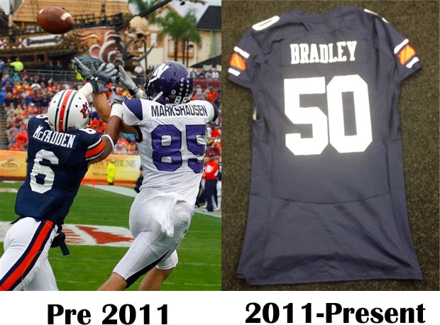
NCAA rule changes– Two new changes for the NCAA relate directly to uniforms. The first, what I call the USC rule, bans players from changing uniform numbers during the game unless the alert the referee, for the use of a player playing two different positions (numbers are assigned to certain positions; example, 50-79 is for lineman).
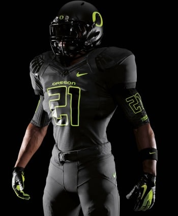
The second rule dictates that the uniform numerals must contrast completely with the color of the jersey. The number must be clearly in contrast, regardless of any border around the number. This rule will basically ban gradient numbers, much like what Nike liked to use with their ProCombats, and even these from Oregon, which I thought was always a good look for them.
SEC
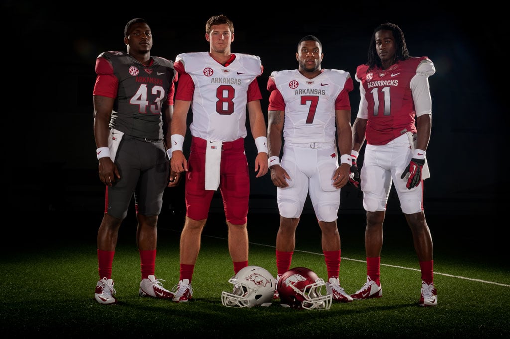
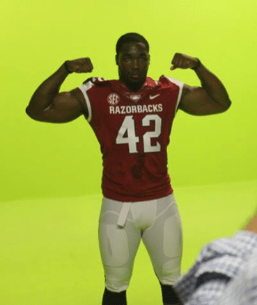
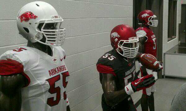
- Arkansas- Nike and the Hogs released new uniforms last year (yuck). Well, with the NCAA’s new uniform number rules, they had to change them. And boy do they look a lot better. Finally, the NCAA did something right! Arkansas also updated some other aspects of the uniform, with the removal of the second shoulder stripe, and a new decal on the white helmets. Not huge changes, but upgrades. Grade- B+
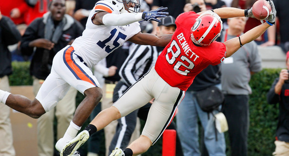
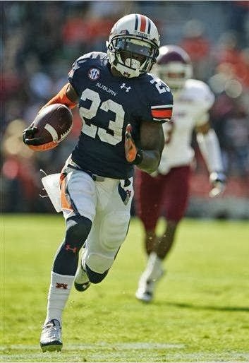
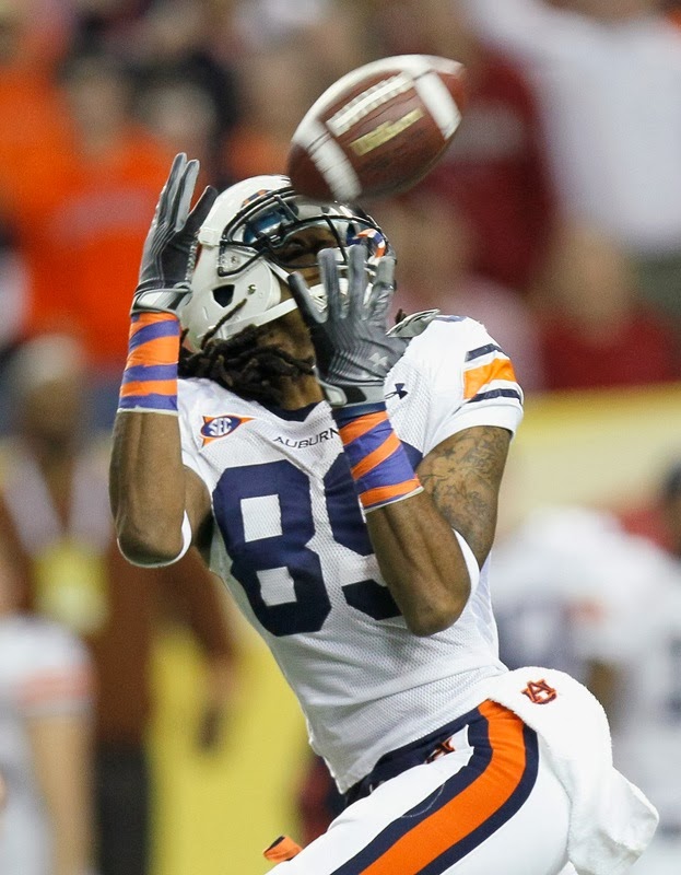
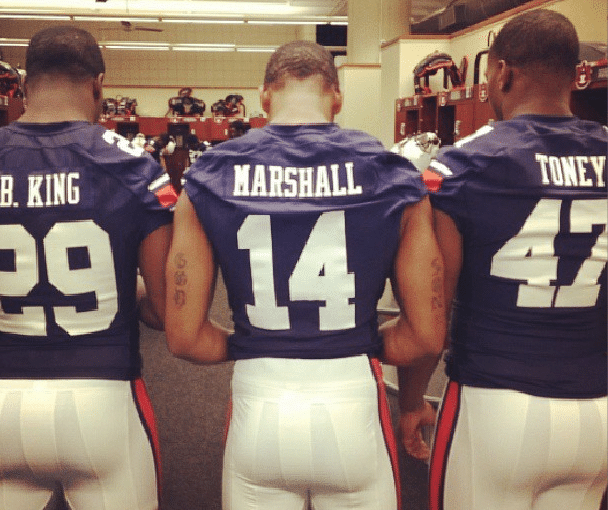
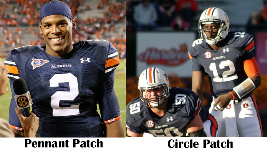
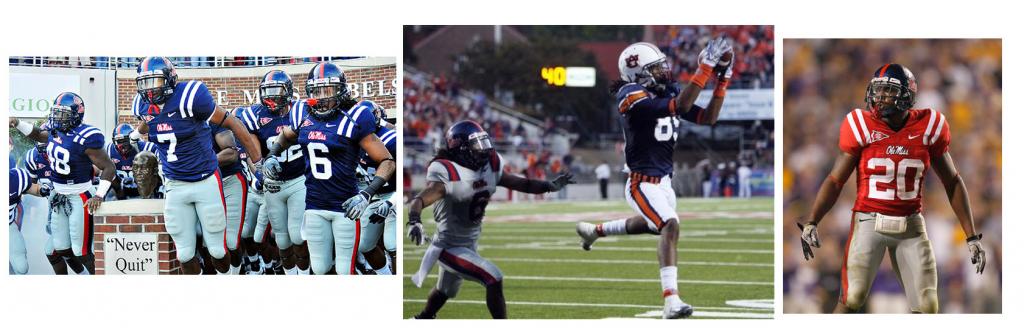
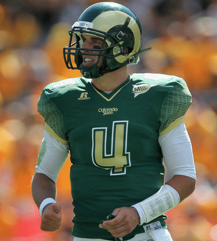
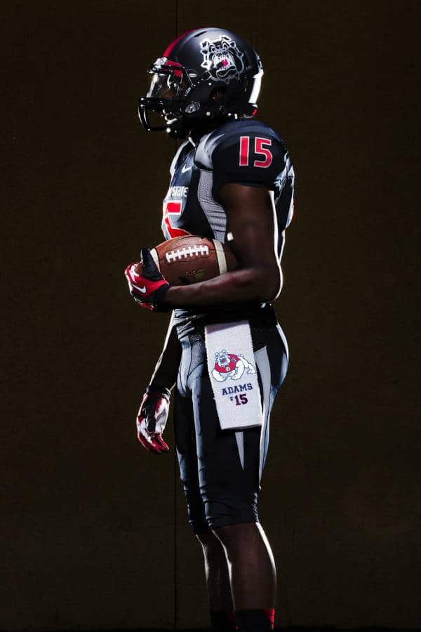
- Auburn- The past few years for Auburn’s uniforms haven’t been the greatest. Following a national championship (which was the last year the uniforms looked their best), UnderArmour makes the numbers and nameplates smaller and skinnier. Last year was an upgrade, as they both were enlarged, but still a bit skinnier than in the past. Also, a “WAR EAGLE” ‘tramp stamp’ was added just below the belt. Thankfully, that seems to be removed. I can confirm that the biggest difference is the cut of the jerseys. They have more room for the players’ arms to move around better. Hopefully next year the numbers, nameplates, and pant stripes will be back to normal. Also, and this is just me being picky, does the SEC patch not look a bit cramped? Could it not be scooted over about a quarter inch to the outside? It was with the pennant logo patch…Grade- A-
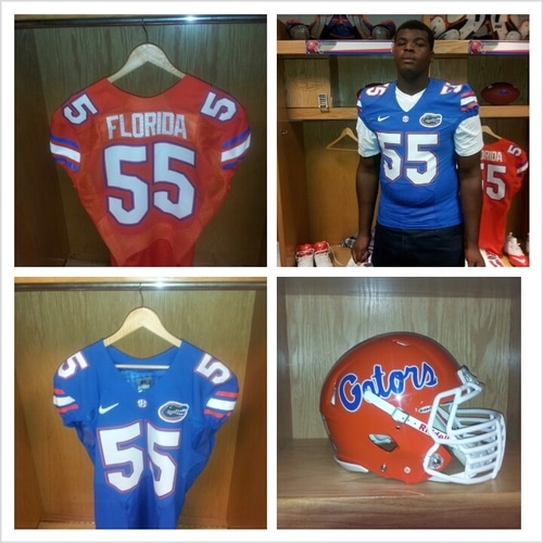
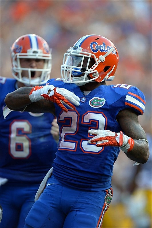
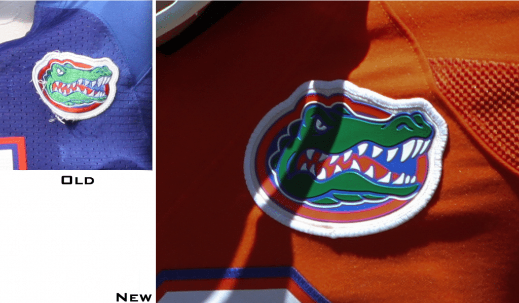
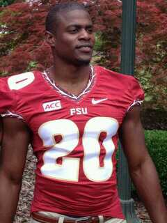
- Florida- Florida has not changed their uniforms in so many years (other than a ProCombat every now and then). But 2013 comes a change for the gators. The striping and number fonts are slightly different than the past. The gator head patch on the jerseys had been cloth patches, but now seem to be a plastic chip, similar to the new NFL logo on the Nike uniforms. Also, a recruit posted this picture online which has a grey pair of pants. No confirmation on these, so we’ll wait and see. Grade- B-
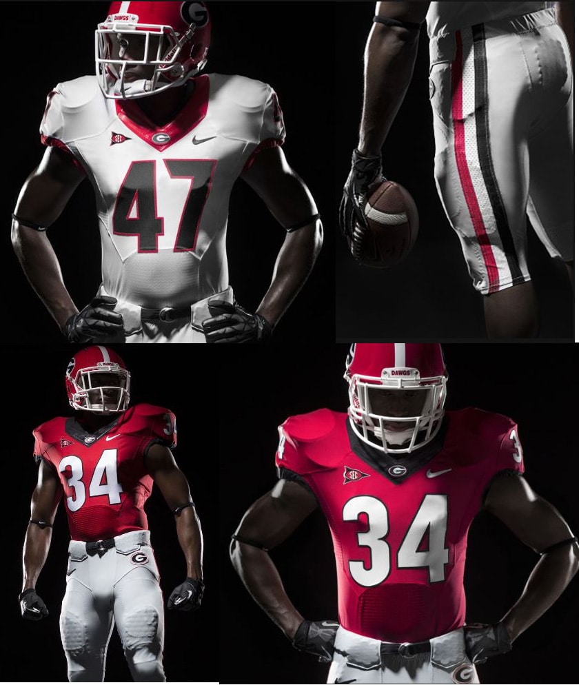
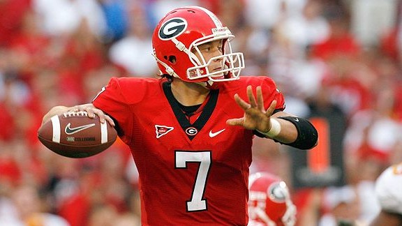
- Georgia- According to the news release, Georgia and Nike spent 15 months working on this new “rebranding” of the athletic department. FIFTEEN MONTHS! For what?! A new word mark, alternate logo, and number font? Really?! C’mon now. That shouldn’t take more than fifteen weeks. Tops. Football wise, they really didn’t do much (here are the old ones). They just transitioned UGA to the new Nike template (much like they did with Alabama for the NC game), and changed the number font, which isn’t very good to begin with…Personally, I’m just more of a fan of boxier fonts for a football uniform than rounded. Looks a bit childish. Grade- C+
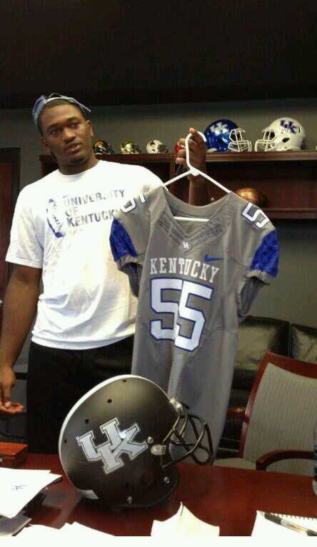
- Kentucky- Now, Kentucky went nuts last year with their new uniforms. This year, this grey jersey and lid were posted online. Head Coach Mark Stoops has said that these will not be used until 2014, but you saw it first here!
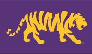
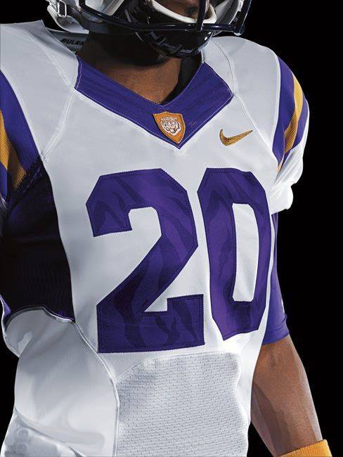
- LSU- No uniform changes as of now, but LSU did trademark this new logo for use on merchandising. Keep an eye out and we’ll see if it is transitioned into the athletic department in the future. Grade- N/A
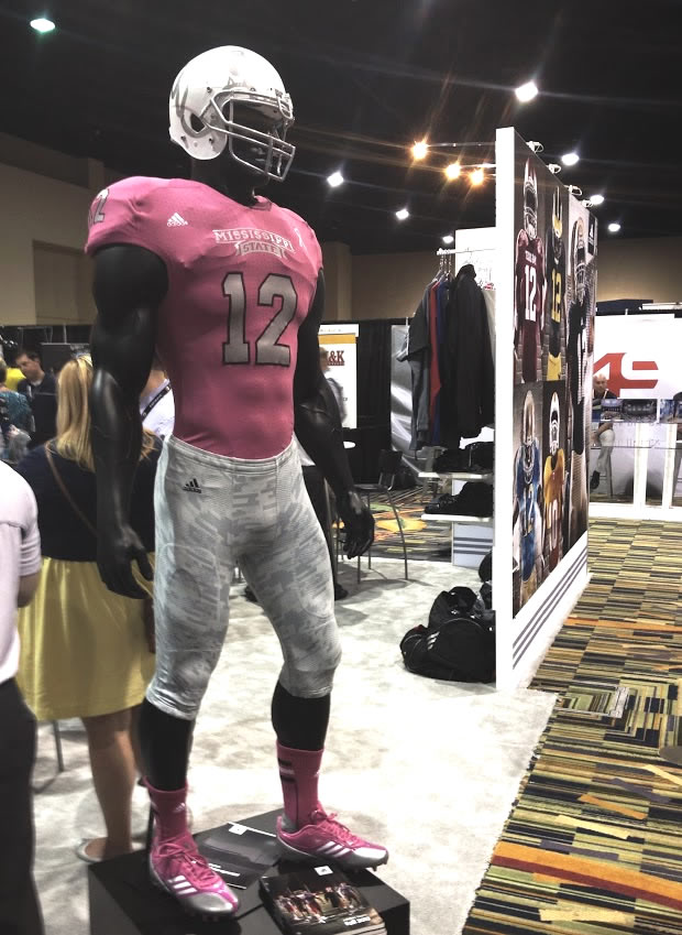
- Mississippi State- Oh boy did this stir up some ruckus. A pink breast cancer jersey, with grey Zubaz pants. I seriously get shivers every time I see this thing… Thankfully, this has been claimed as just a creative mock-up. You may now rejoice (I sure am!)!
*UPDATE*- Turns out adidas really did have something new for MSU. New egg bowl unis (woo…). Now these are decent. Not wonderful, not pitiful. Looks an awful like the same set they wore for the same game a few years ago…
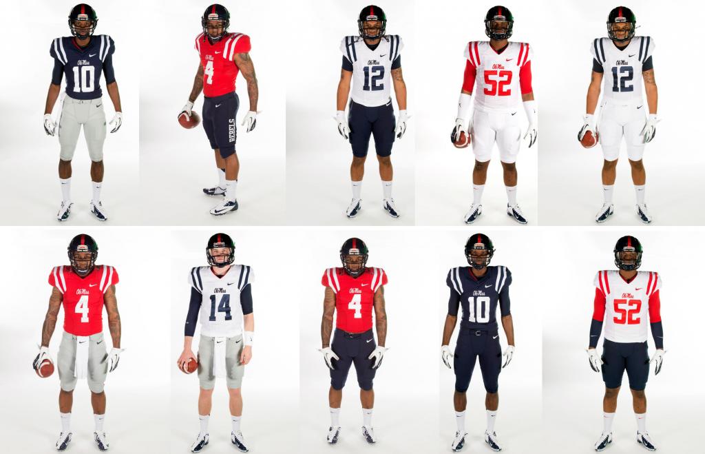
- Ole Miss- Ole Miss has updated their uniforms for the new season. And it’s very unfortunate. Ole Miss had some really nice uniforms the past couple of years. Now, they’ve added blue and white pants to go along with their greys. No more are the red-blue pants stripes, as “REBELS” has replaced them on the pants leg, similar to what Arkansas used to have. The new tops are nothing more than removal of color. One color to “compliment” the base color. The old jerseys at least had some outline color, even if it was just the word mark under the collar. These, these are just plain bland. I’m really disappointed in these. Pants are awful. Jerseys are boring. Nicely done Ole Miss and Nike, you ruined a typically nice looking set. And I miss the grey tops… Grade- C-
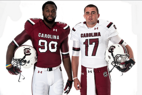
- South Carolina- UnderArmour has new uniforms the Gamecocks from South Carolina. Not terribly bad, not much better than last year’s. Still a bit of an identity crises with just random stripes and such. But, it would be difficult to make a Gamecock look good on the field…I do like the socks though…Grade- B-
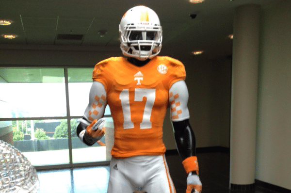
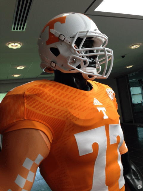
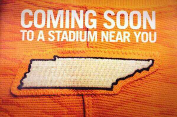
- Tennessee- Tennessee has added some small changes to their uniforms. First, adidas moved them to the awful “tread marks” template (keep reading for more on that). Secondly, the state of Tennessee has been added as a patch above the nameplate. Look for some small changes to continue over the next few years. Grade- B+
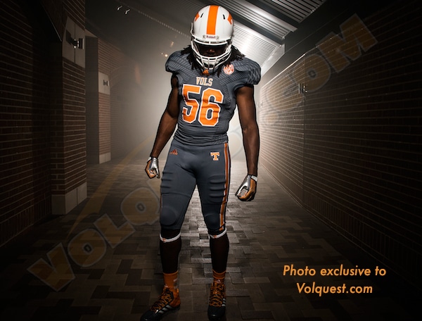
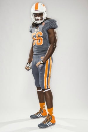
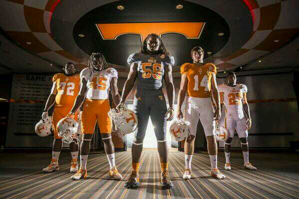
*UPDATE* Tennessee has now released a new “Smokey” grey alternate, with grey tops and bottoms. These aren’t too awful, to me. I like the pants striping; looks real good. The “tread marks” are back, of course…I would’ve liked to have seen an alternate helmet. If they’re going to do something like this at Tennessee, why not go all out? Here’s a picture of all their “base” combos. Grade- B
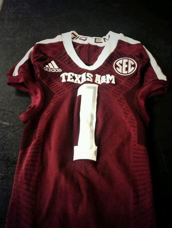
- Texas A&M- Not much of a change uniform wise for the Aggies, but more of an adidas template change. All the adidas teams are appearing to wear these new uniforms, which have been referred to as ‘tire tread marks’ by UniWatch. Just wish we knew the reasoning behind this from adidas…just doesn’t make much sense…Anyways, back to the Aggies. “Gig ‘Em” has been added to the inside of the back collar. Thankfully, unlike many other adidas teams, the adidas logo is on the chest, and not below the collar. I’m personally interested to see how this new template looks on the field, and if you can even see the “treads”. Also expect a black alternate or a new helmet or two. If I remember correctly, A&M plans to “blackout” Alabama at home this year. Grade- B
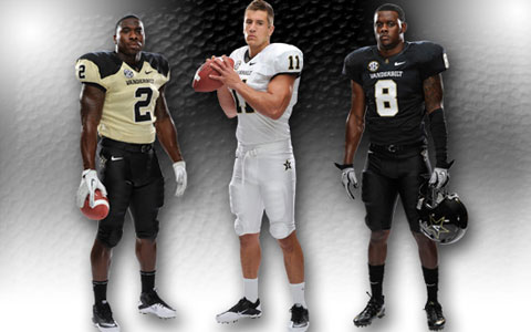
- Vanderbilt- Last year Nike and Vandy unveiled a new set, with new helmets (still love the white lid). So, we haven’t heard from them at all this offseason. But, look at their coach. Wouldn’t put anything past him.
PAC 12
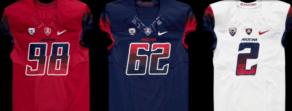
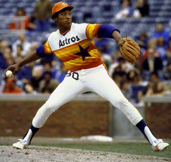
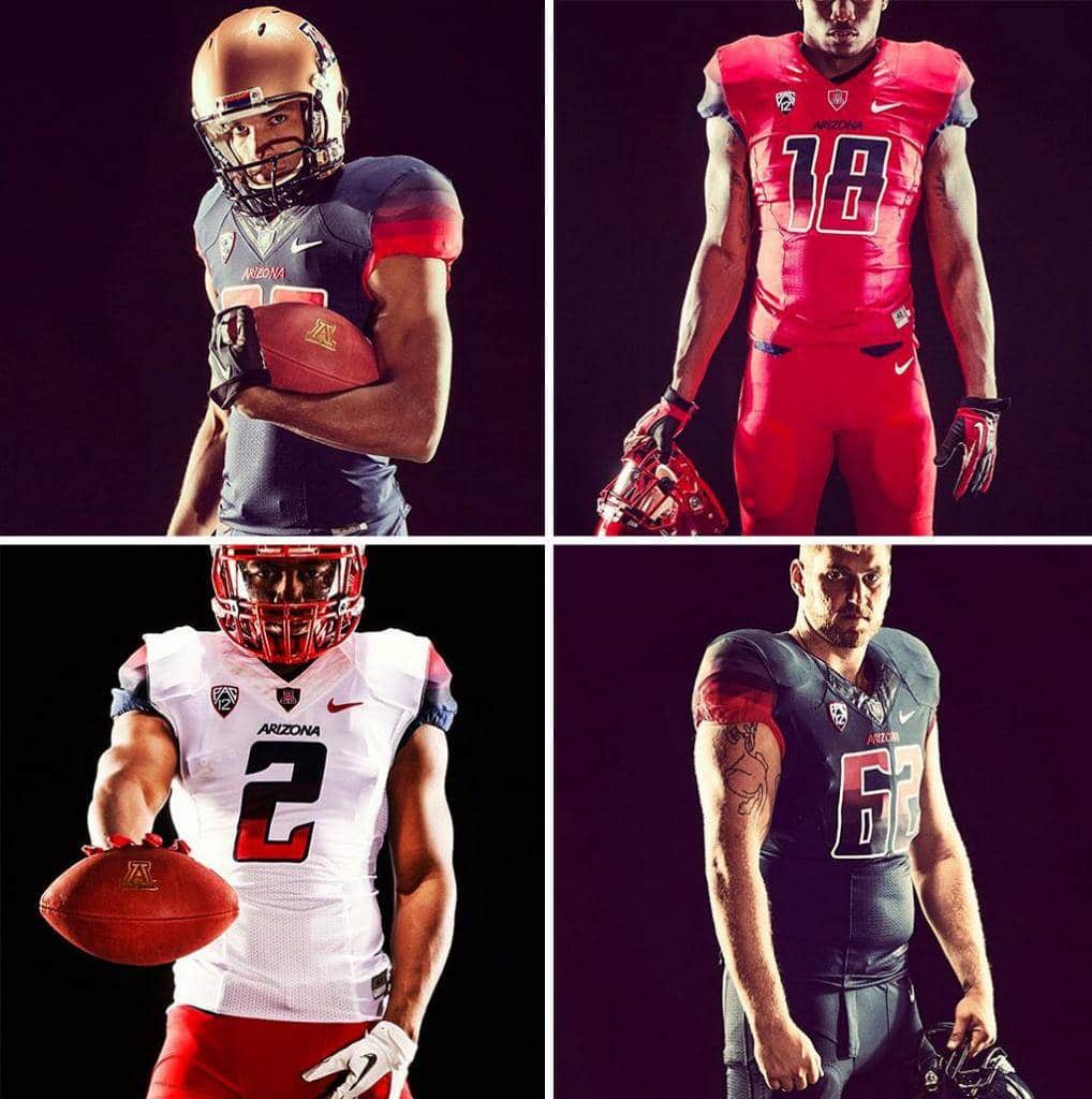
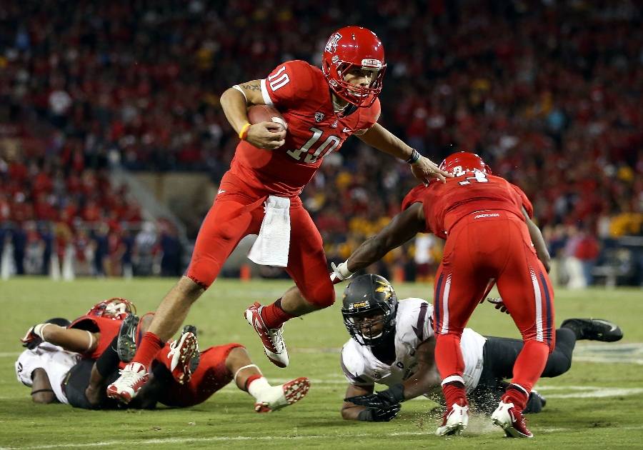
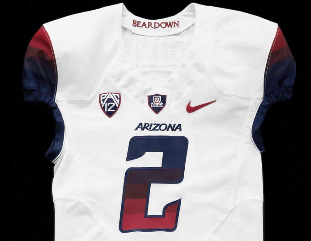
- Arizona- Few years ago Nike spent all their time working with Arizona State. And boy did Sparky look good. This time around, the Swoosh spent their time with the Wildcats of Arizona. And boy did they miss the ball here. Bleh. I thought the rainbow trend died with the ‘80s Astros? (BTW, love the “Tequila Sunrise” jerseys, and they’re somewhat making a comeback) Like mentioned, the NCAA released new rules not allowing these gradient numbers, but since Nike and Zona were already producing these, they got a waiver. And that’s a shame. Ugly, underwhelming, and the helmets are awful. The copper helmet was released last year, as a nod to the state flag, and it’s alright, just doesn’t look like it matches nor belongs. Now, the red helmet was released last year as well, and it belongs back in the dumpster. Red lid AND red facemask??? No. Just, no. Bad Bear. Although, these do look cool, even though they will never see the field…Grade- C-
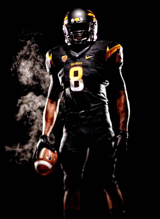
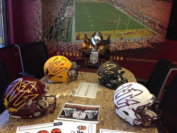
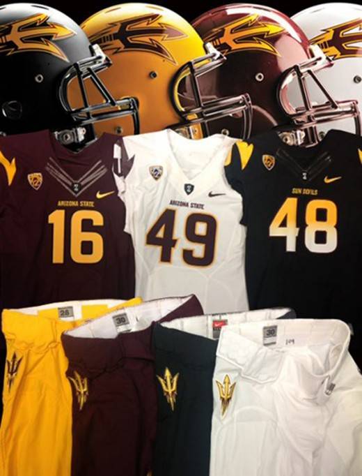
- Arizona State- In 2011, ASU redesigned their entire athletic department. What they and Nike did back then was really amazing. Now, according to this picture, they have introduced a new set of helmets with oversized pitchfork logos. I, for one, think these look amazing. I’ve been a fan of whatever ASU has done since this redesign. They just keep surprising and looking good! No word just yet if these helmets will be a replacement for the original or just an alternate. Grade- A
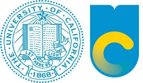
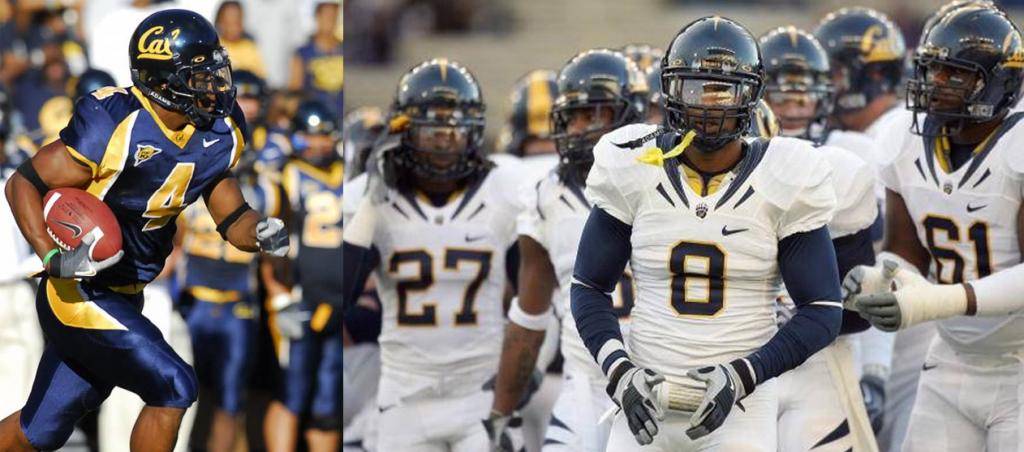
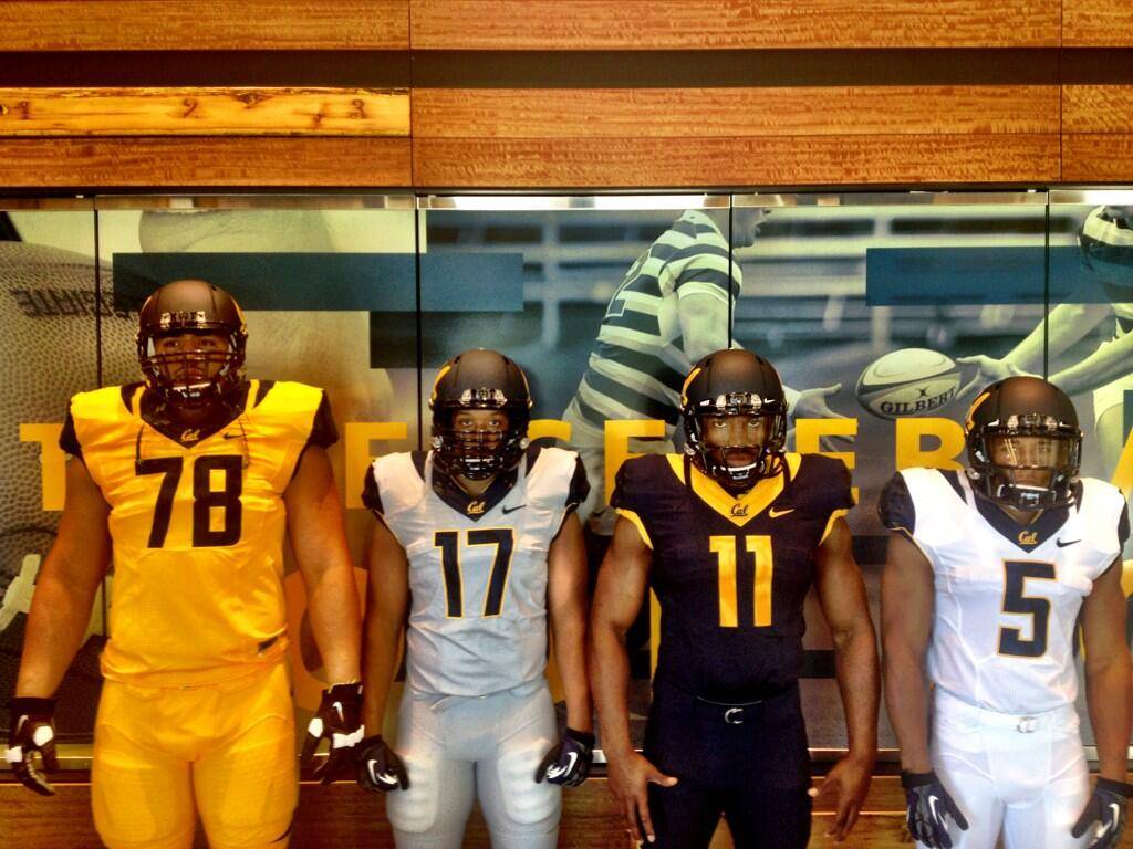
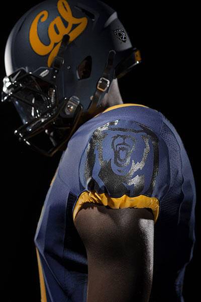
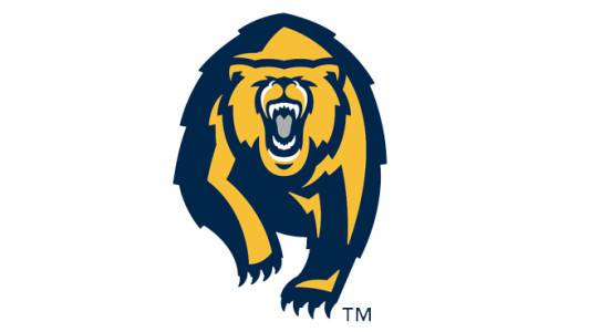
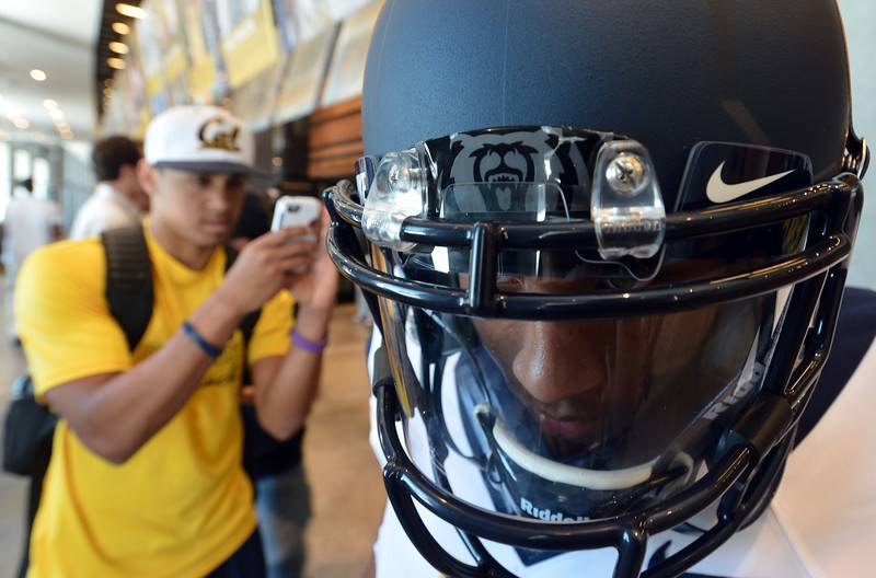
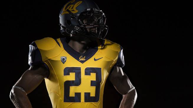
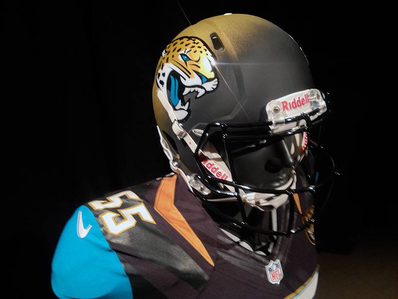
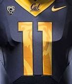
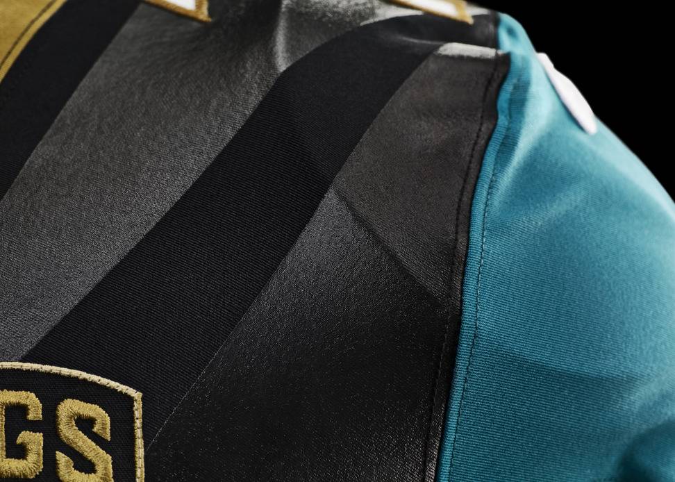
- California- Like many programs, California has decided to rebrand their athletic department with the help of Nike. They even tried to use a new logo for the school itself, but that didn’t go over so well. Cal has had a true identity crises over the past few seasons. They never could get their look down. It was always a mess. Nike stepped in to help with that this year. They now have new blue, yellow, and white uniforms, and will obviously mix and match to their pleasing. At first look, I really like these. Simple, yet bold. The bear on the shoulder and hip (which so happens to be a brand spanking new logo, mind you) is a little distracting, but will take some getting used to. The matte blue helmet looks good, but like always with matte helmets, execution is key (see rant below, at Middle Tennessee State). These new uniforms also have a necktie thing, just like (my) Jacksonville Jaguars with their new uniforms. We’ll see how this looks in the fall on the field. The bear details inside the numbers will more than likely be a detail overseen unless up close and personal with the uniforms. Grade- A-/B+
- Colorado- This photo was one of the first prototypes revealed over the offseason. I really hope this prototype is real. We haven’t heard from Colorado since this, so who knows what’s going on over there.
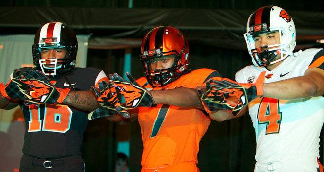
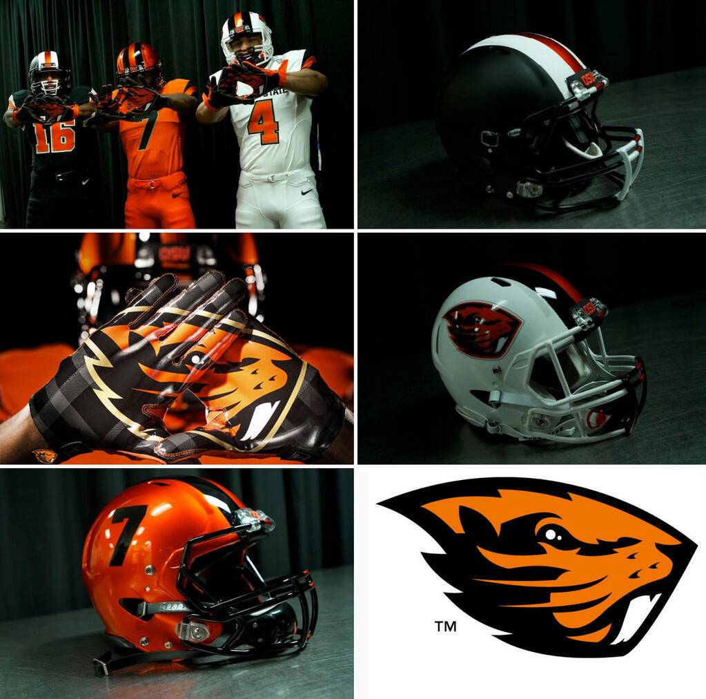
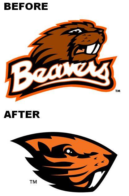
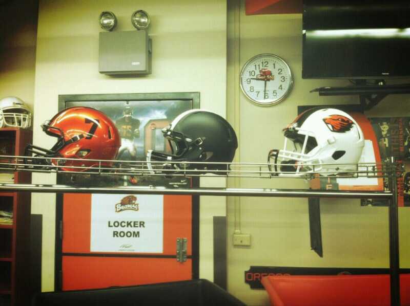
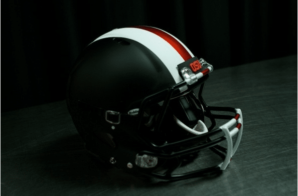
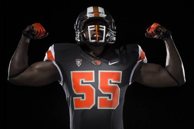
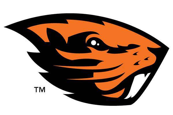
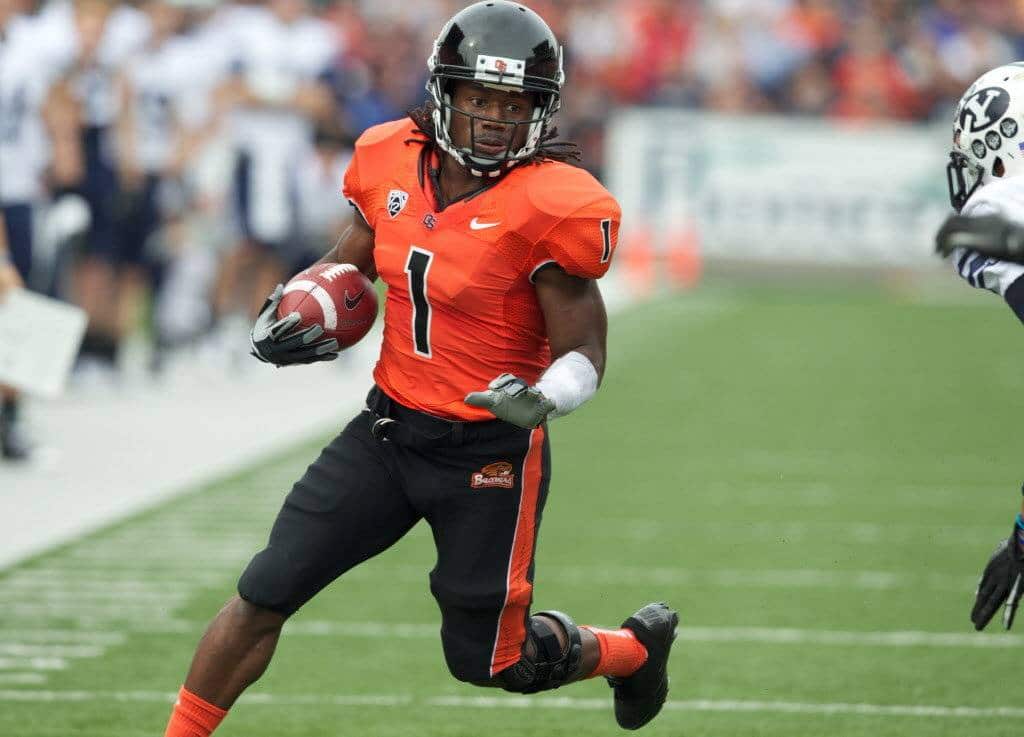
- Oregon State- Oregon State and Nike spent so much time the past year or so working on this. I must say, these are the most beautiful uniforms of the offseason. I LOVE everything about this uniform set! The new logo is slowly growing on me, but I like it. The three different jerseys are amazing! I LOVE the three helmets, especially the matte black one! The stripes extending to the facemask are supposedly to resemble a badger’s front teeth, and it looks great. One matte helmet, two metallic, each with completely different styles- blank for the black one, TV numbers on the orange one, and the badger logo on the white one. Nike really did a wonderful job rebranding every aspect of OSU’s athletic departments. This is by-far the best uniforms in a long time! Kudos to everyone involved! #ReBeaved (Here’s what they wore before) Grade- A++
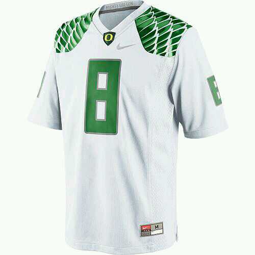
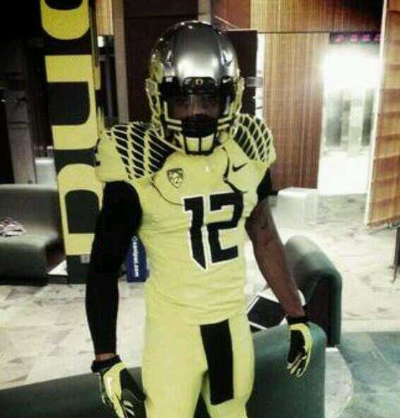
- Oregon- Oregon could, and probably should, have their own section just for them on here. We honestly haven’t heard much from the Ducks this offseason, but that doesn’t mean they aren’t working on a lot. We seriously only have a few pictures. Here is the newest retail version of their jerseys; nothing much different. We then get a few pictures of all yellow look. Not bad, I like. Just wait and see what Uncle Phil and Nike can put together for Oregon.
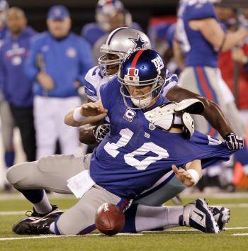
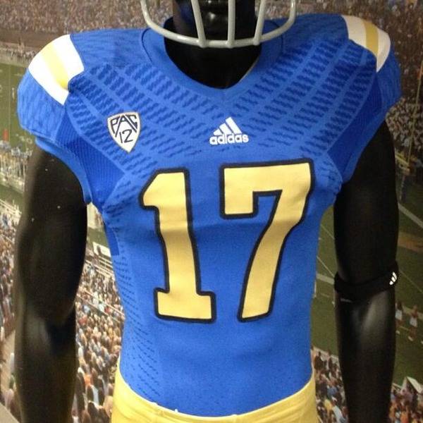
- UCLA- adidas, again, goes with something completely useless and just plain odd. UCLA has recently used the same “super-stretchy” material like what Reebok had a lot of NFL teams in, the NY Giants mainly (adidas and Reebok are owned by the same company, in case you didn’t know). Now this jersey is just weird. What’s the point? What was their inspiration? (Usually designers have a reason- school history, campus architecture, etc…- but this just seems like a “heck, it looks cool [kinda], let’s do it!” kinda thing) Jim Mora was actually quoted at some point saying how he wanted the UCLA stripes (what they are technically called) to go all the way around, like they used to be, but that obviously hasn’t happened yet.
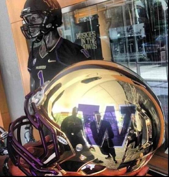
- Washington- The Washington Huskies also have a brand new chrome gold helmet prototype! Who knows if this is real or not. We’ll see soon enough.
Big Ten
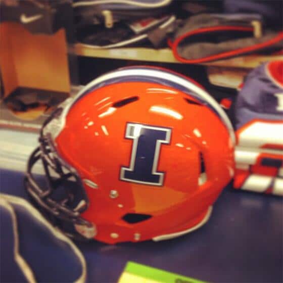
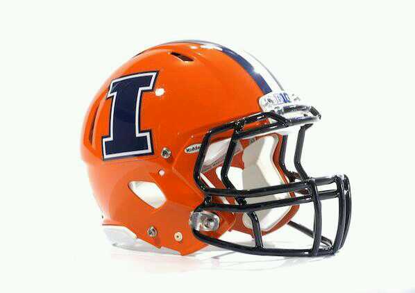
- Illinois- A picture of this nice orange lid with a blue block “I” leaked a while ago. Illinois helmet prototypes have leaked before, but (if I remember the story correctly) I believe this picture was tweeted by a coach. And weeks after speculating if it was real or not, they officially revealed this one. This new “I” lid replaces the old orange “ILLINOIS” helmet, although their matte blue helmet will remain in the rotation. Grade- B
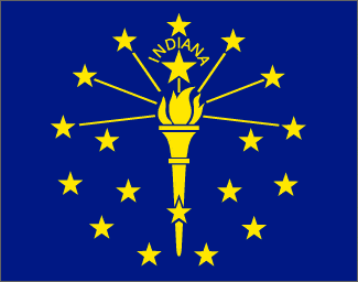
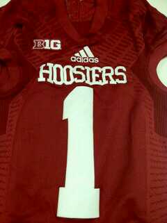
- Indiana- The Hoosier’s now have the worse arsenal of helmets ever. I guess Indiana has a few guys somewhere in the program that wanted to do something for the sake of doing it. These are awful. Flat awful. The weird design on some of the helmets is supposedly from the state flag. Doesn’t look right when it is not in its original colors…”17 year olds love shiny things…” Oh, and let’s just add “tread marks” to top it off… Grade- C-
- Michigan-Funny story out of Michigan during spring practice. Apparently they wanted to change the color of their none-contact practice jerseys to orange. Well, why pay for new jerseys when you can get some for free? Ask and you shall receive! Oregon State (that just went under a full redesign of their own) sent Michigan a few old Orange jerseys, in which Michigan repurposed. Oddly, OSU is a Nike school. Michigan is an adidas school. Not very often do you see mingling like this between two schools with completely different apparel company contracts. But no need to let good jerseys go to waste! Turns out adidas did not like this one bit, and as soon as word got out, they sent Michigan orange practice jerseys from their own shop. Seems like a lot of work to make sure your product is on the [practice] field, right? Grow up adidas…
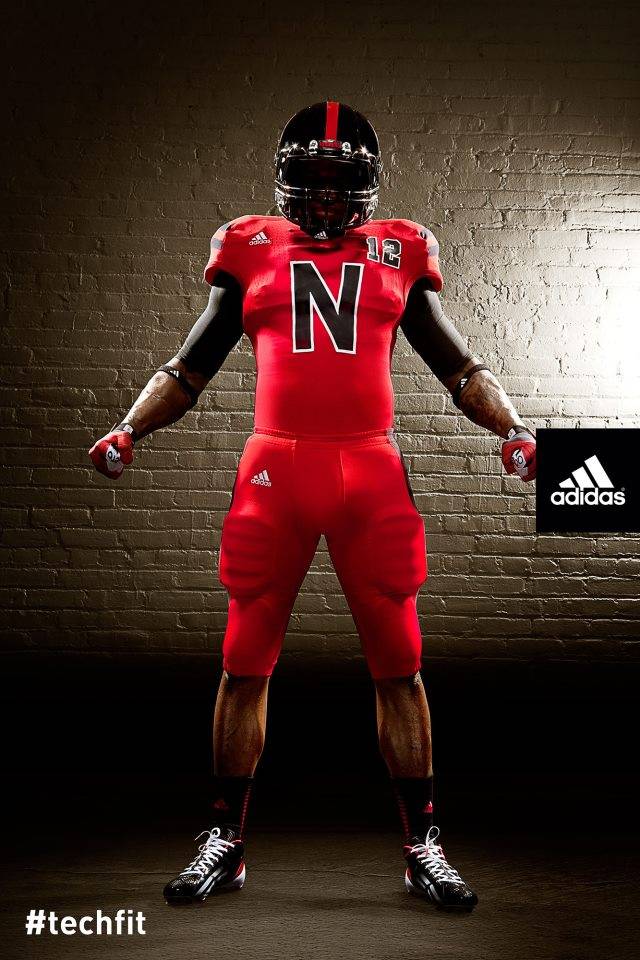
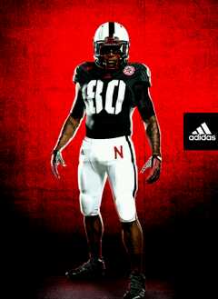
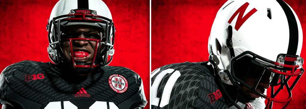
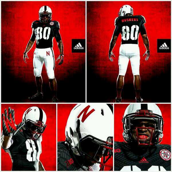
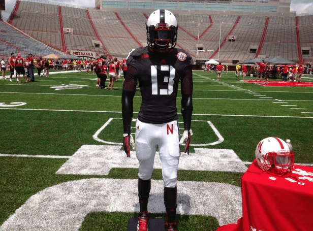
- Nebraska- Well, adidas is going after Nebraska…again…as you can see, they went for something really unique last year. This year is no exception. I like that the Black Shirts tradition is being involved for once, not like in the past where they added black pants because of the same tradition. The stencil number font is just a novelty. You probably won’t even notice on TV. I LOVE the matte white helmet though. I think a lot of Nebraska’s uniforms seems a little underwhelming because their logo is nothing more than a block “N”. So, you do what you can with what you’ve got. Unfortunately, these have the same “tread marks” as every other new adidas uniforms…shame… You’ll get to these on TV when Nebraska plays UCLA, which I’m sure will probably have their own special uniforms as well, so schedule the DVR if you like, or avoid it if you want to avoid these…
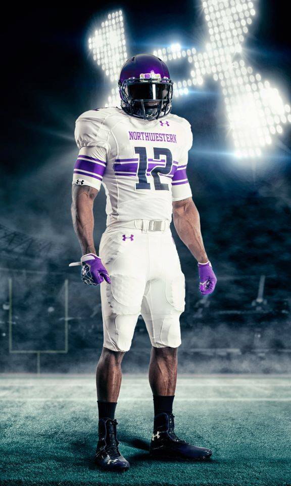
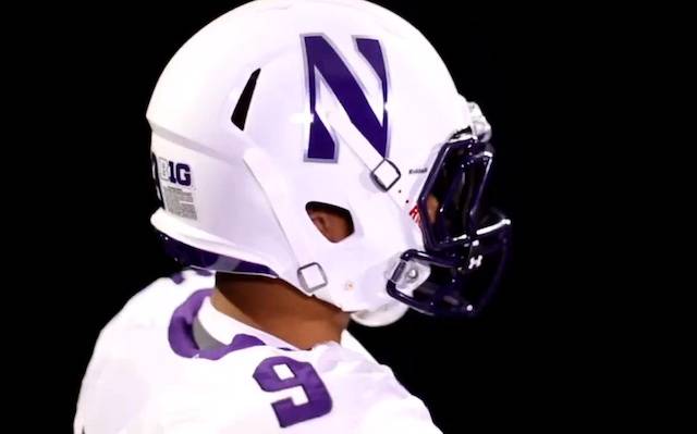
- Northwestern- Last year UnderArmour went and completely overhauled Northwestern’s uniforms, and I loved them. This year, we got a shot of a helmet with a USA style decal, which a lot of teams have been doing lately. As with most, these are a nice gesture, but look so out of place…Grade- B-
*UPDATE* Northwestern has released a great matte white helmet, to go with their white pants and tops. I LOVE this. NU has always had that purple helmet, and last year broke out some black ones, but this one, this one POPS! I love it. I want it on my shelf. Grade- A
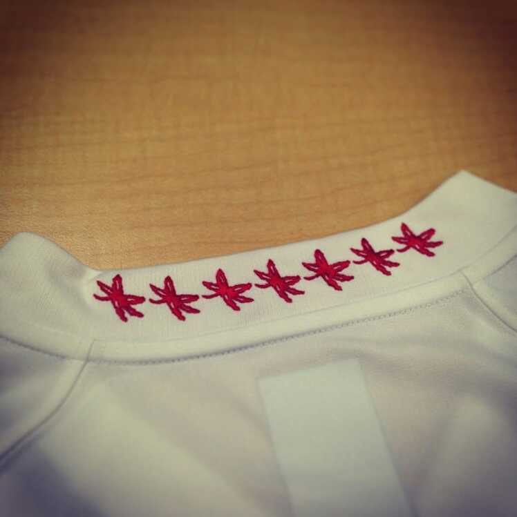
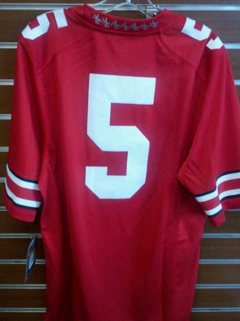
- Ohio State- Though we haven’t seen a game cut version of these changes, we have seen the retail versions. And these have new buckeye leaves around the back of the collar. As well as some minor number font changes. We just need to wait for more. Grade- B-
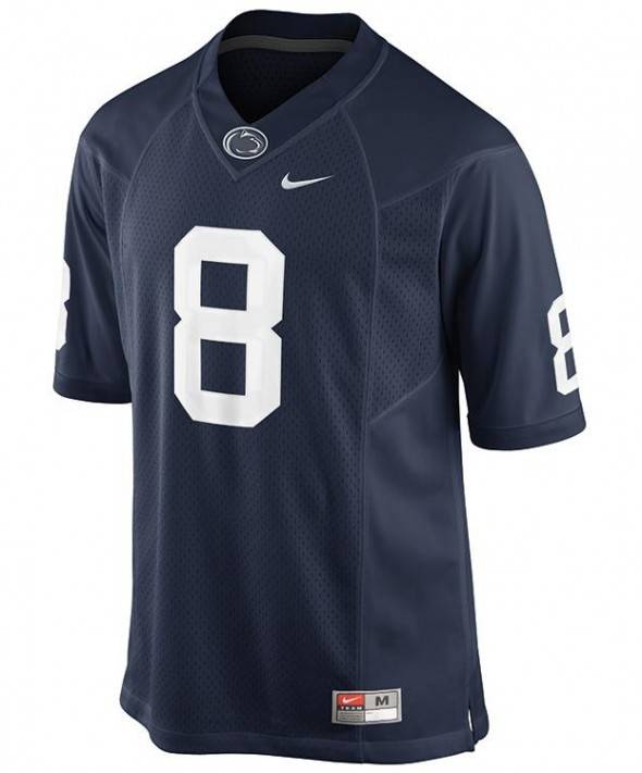
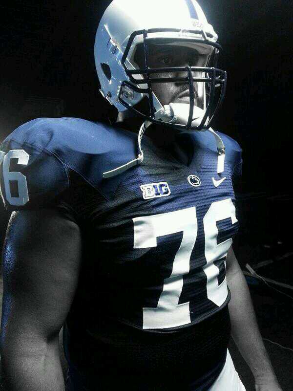
- Penn State- As Penn State has tried very hard to separate itself from the Paterno era, they have changed up their traditional simple uniforms. Last year, they added player names on the back. This year, the cat head logo has been added to the bottom of the collar. Other than that, these aren’t much different. But I still wouldn’t rule out more changes, as they really want to get away from JoePa as much as possible… Grade- B
Big 12
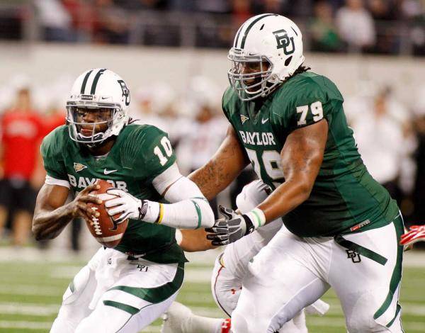
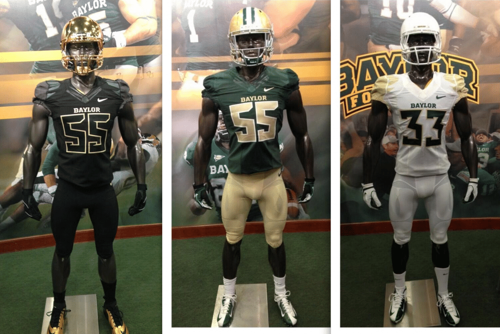
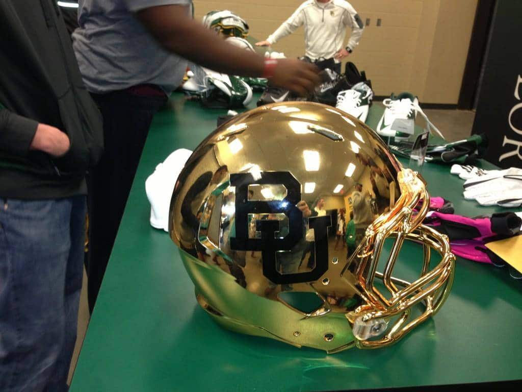
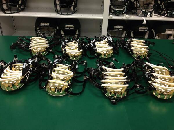
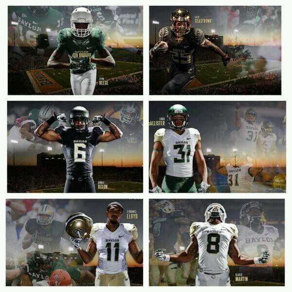
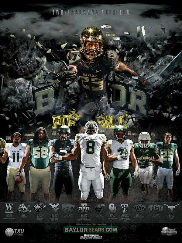
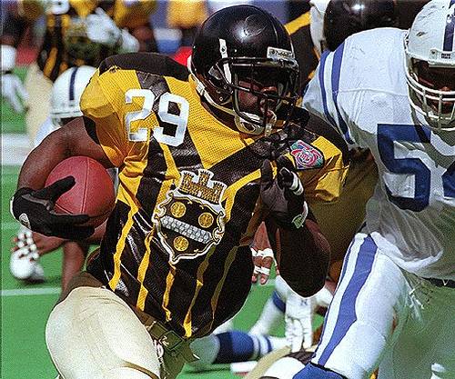
- Baylor- Another team that has had a bit of an identity crises when it comes to their football uniforms is Baylor. With RG3, they had bear stripes. Now, they have these. And don’t worry, the Bears of Baylor would never be outdone in the helmets race. Try (so far), three new helmets, plus the traditional gold one. A nice pretty white one, a well done matte black one, and get this, a gold one! The chinstrap is even gold!! Yea, I’m not so sure how that’s going to go over on the field either. I’m really hoping it never sees the field, and is used for special occasions, similar to what the (my) Jaguars gave the Weaver family after they sold the team. But that won’t be the case, and these, I think, will see a lot of action. Going to need your shades to watch these on TV. And one last look at them all. Baylor will be wearing 1950 throwbacks at some point this year. Curious to see what they look like, and when they wear them. With all the new uniform combos they have, I don’t know when they’ll be able to wear them… Grade- B-
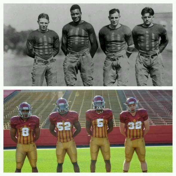
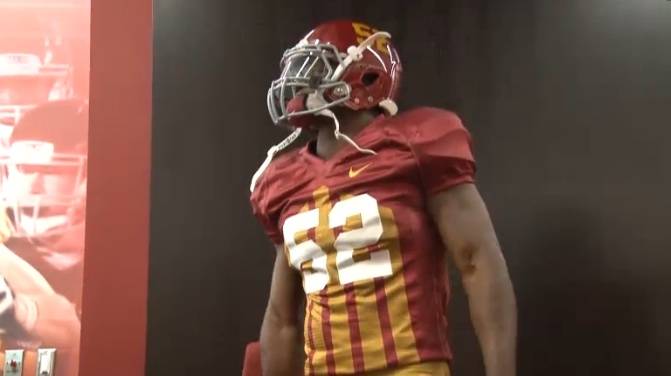
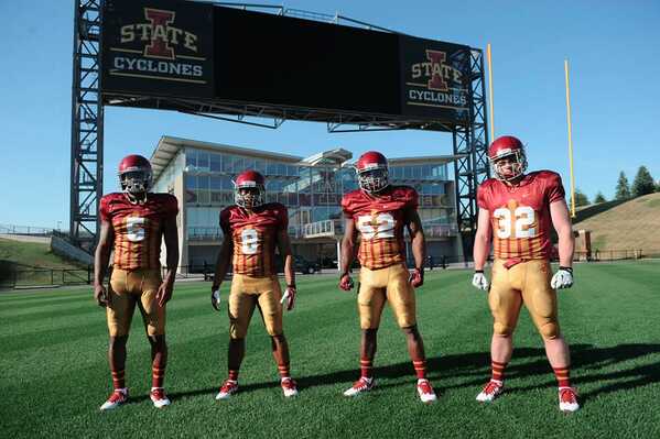
- Iowa State- One of the greatest eras in football was when nearly every single football team wore vertical stripes, like these. The Pittsburg Steelers threw back to something similar to those about a decade or two ago. Now, Iowa State is going to do the same. I love these! I wish it was required for every team that wore this design in their past had to wear their own version of these for at least one game. Keep the history in the game people! Grade- A
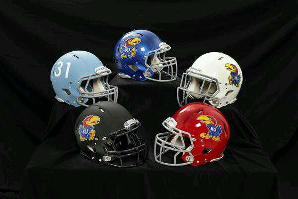
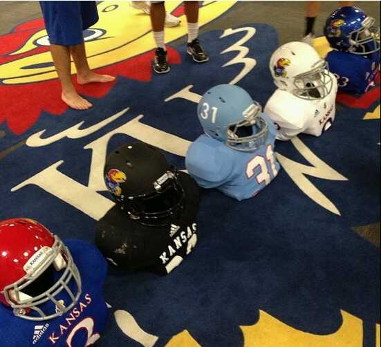
- Kansas- Think to yourself- What do the Kansas Jayhawks need? If you answered five different helmets in five different colors, you’d be right! And Kansas would be wrong! I don’t think anyone needs five different colored helmets, except Oregon, cause, ya know, they work it. Kansas doesn’t need anything other than their original helmet, and a throwback baby blue every now and then. But here, even the original blue helmet looks bad. As well do the white and red ones. Especially the red lid. Yuck. Oddly, I really like the matte black lid. That just looks sick to me. But there’s that beautiful baby/powder blue lid that looks awesome! No logo, just TV numbers. This picture makes it look matte, which I think would be pretty cool. And now that we have this picture of the helmets with correlating color jerseys, we can get a better picture of these. Really don’t know what to think about these now. Somewhat disappointing they don’t have a red top in this picture. No need for the red lid right?? (Turns out they had a black top last year?) Wonder if they’ll have just as many pants. If so, then they really need to mix and match well. I can imagine some of these combos looking good, and some, well, not so well…Also, “treadmarks”… Grade B-/C+
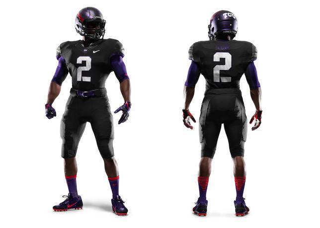
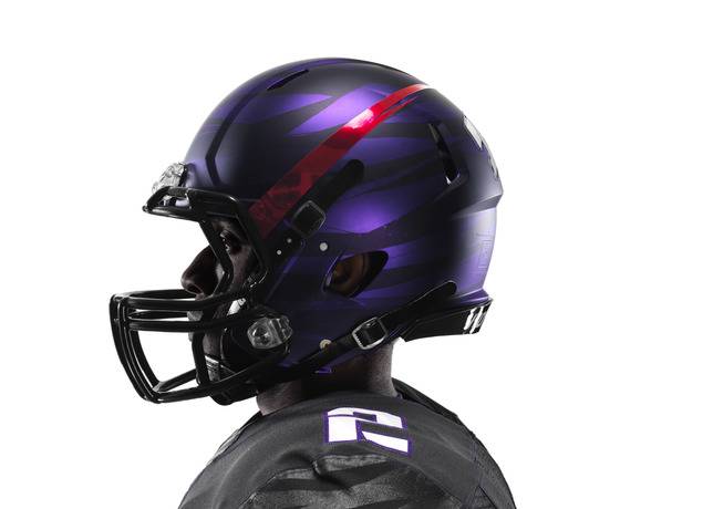
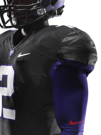
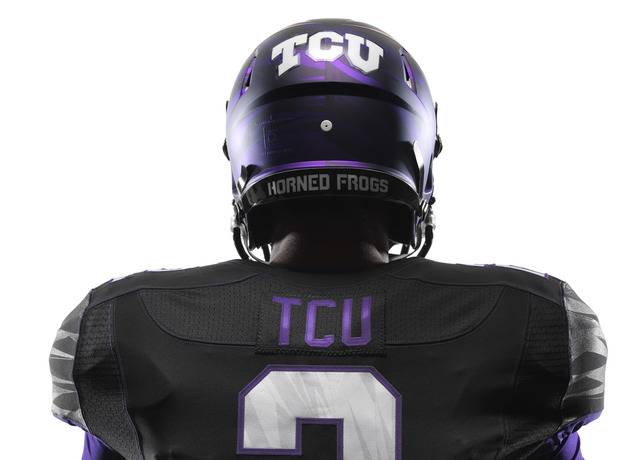
- TCU- One of the latest reveals in the summer is from TCU. Nike has had so much fun with TCU over the past few years. It a bit ridiculous with what they have come up with. Now, they have gone completely off the wall. New plain black uniforms, with red accents (I didn’t know TCU had red as a color…). And a new… unique… helmet. I am not a fan of the solid uniforms. The shoulders do invoke a similar pattern to what my Jaguars wear, but it’s just not enough. The helmet is odd, but I kinda like it. Another HGI concept. I like the horned frog skin pattern on the lid, but I honestly am not sure what the red stripe is…Well, according to Nike “The uniform also features red accents that harken back to the horned frog’s defense mechanism – a shot of blood from the eyes that repels encroaching foes.” Alright then…Grade- B-
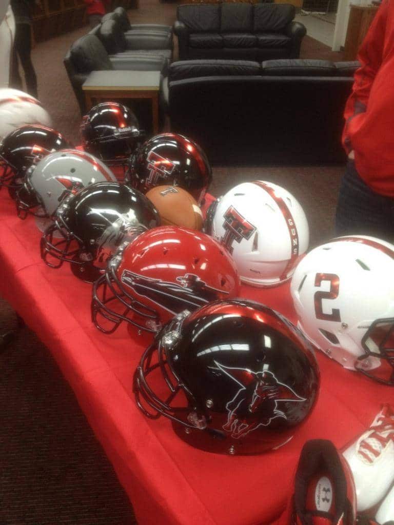
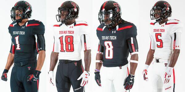
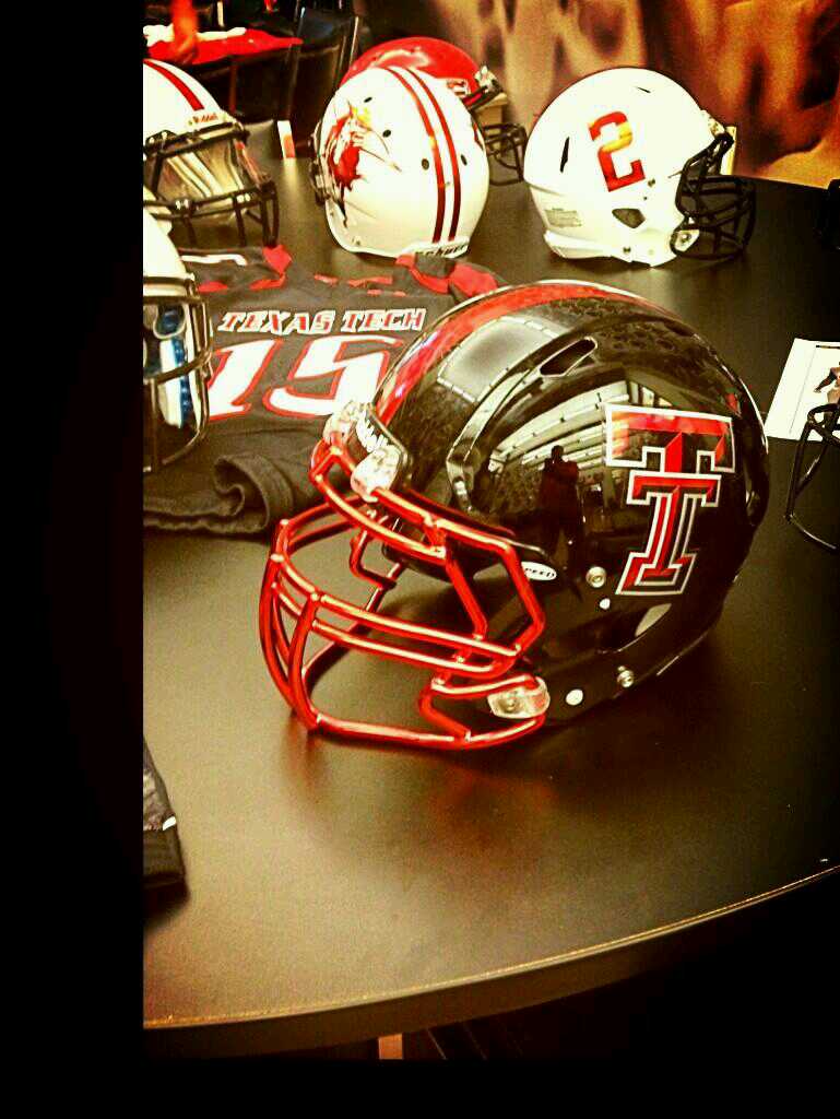
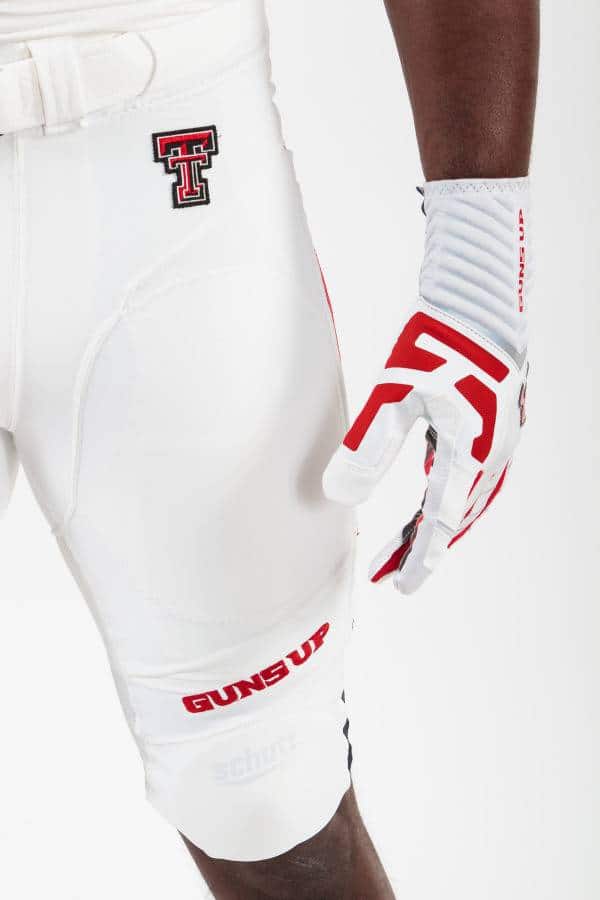
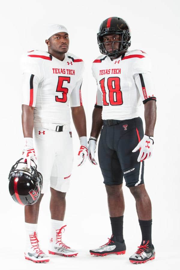
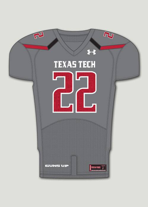
- Texas Tech- Texas Tech’s helmet table may consist of the most prototypes seen this year. Some of these look flat out awesome. Others, not so much. The red helmet with the Red Raider looks awesome! The black one just below that looks pretty good as well. The two white helmets with the red stripe down the middle, which seem to be the same helmet, just different sides, looks really cool, with logo on one side, TV number on the other, and “GUNS UP” on the stripe. I like that one. Unfortunately, when TT revealed their new uniforms from UnderArmour, they only had one helmet. And the only difference with that one, is the red stripe with “Guns Up” at the base of it. Now, these uniforms aren’t great. Random stripes, yay…The good news is they can mix and match and still look decent. Rumor is there is a grey alternate, but we’ll have to see. Wish some of those prototypes had turned out real… Grade- B-
- Texas- Texas is another team to update their uniforms and transition them to Nike’s new template. This picture is just a prototype, but the new on field versions will be the same, except for no Flywire. The Longhorn logo is new. And it looks like a plastic chip, similar to Florida’s Gatorhead and the NFL shield. The whites are the exact same; no Flywire, plastic chip, everything else. Grade- Improvement
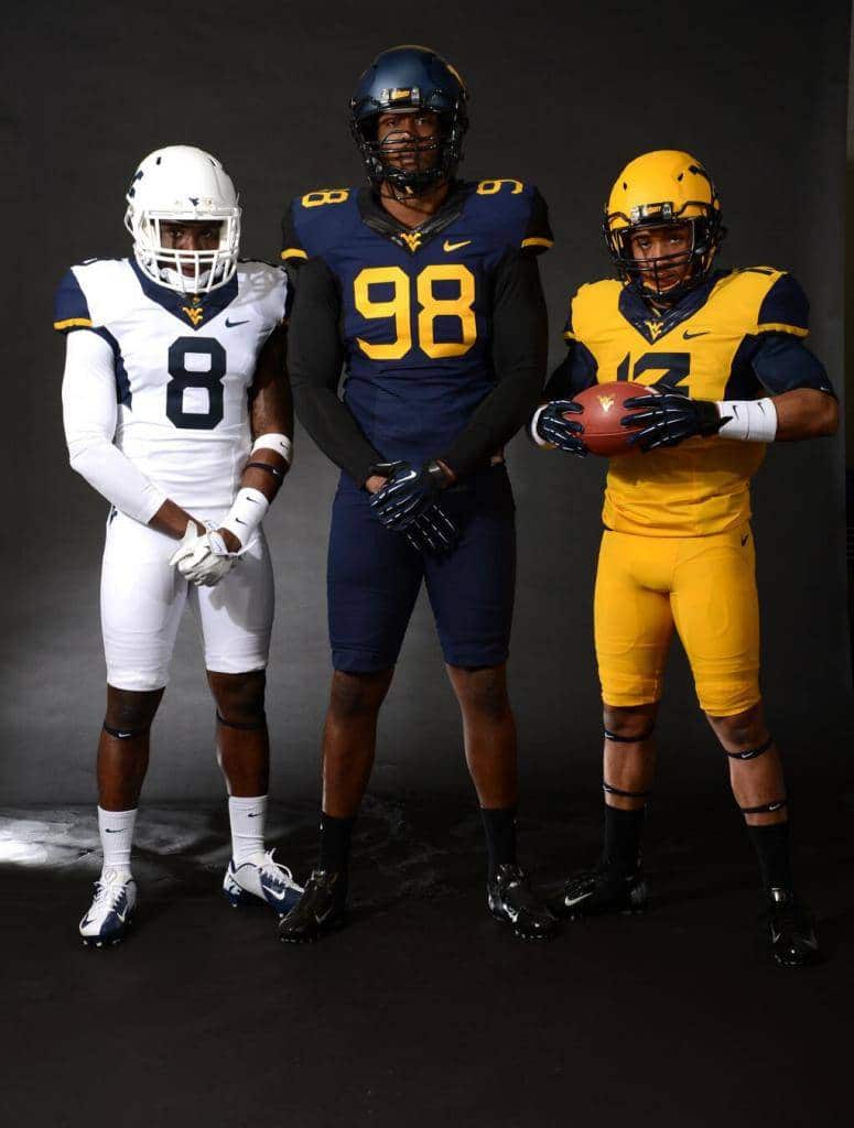
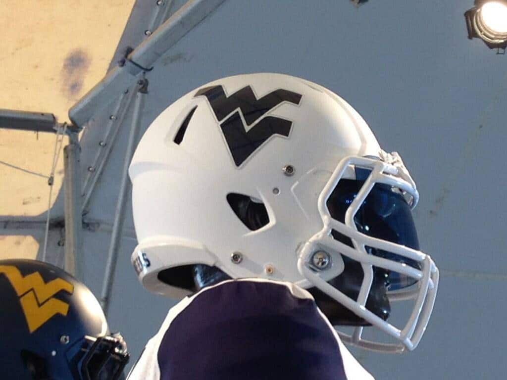
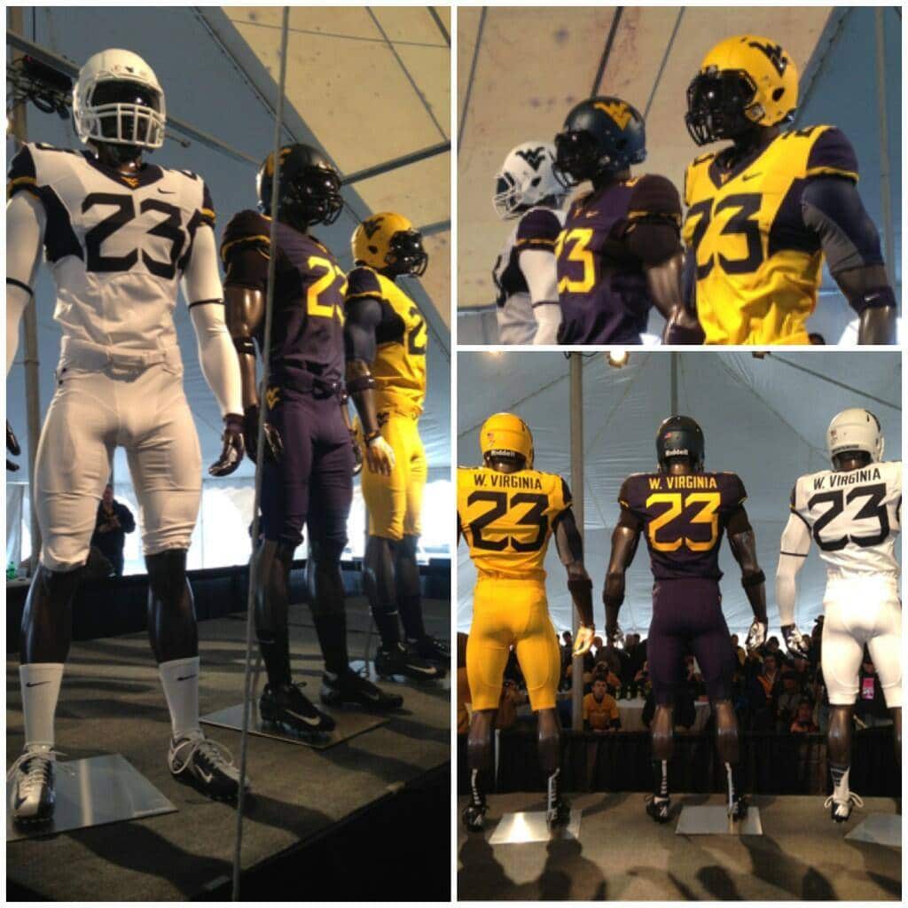
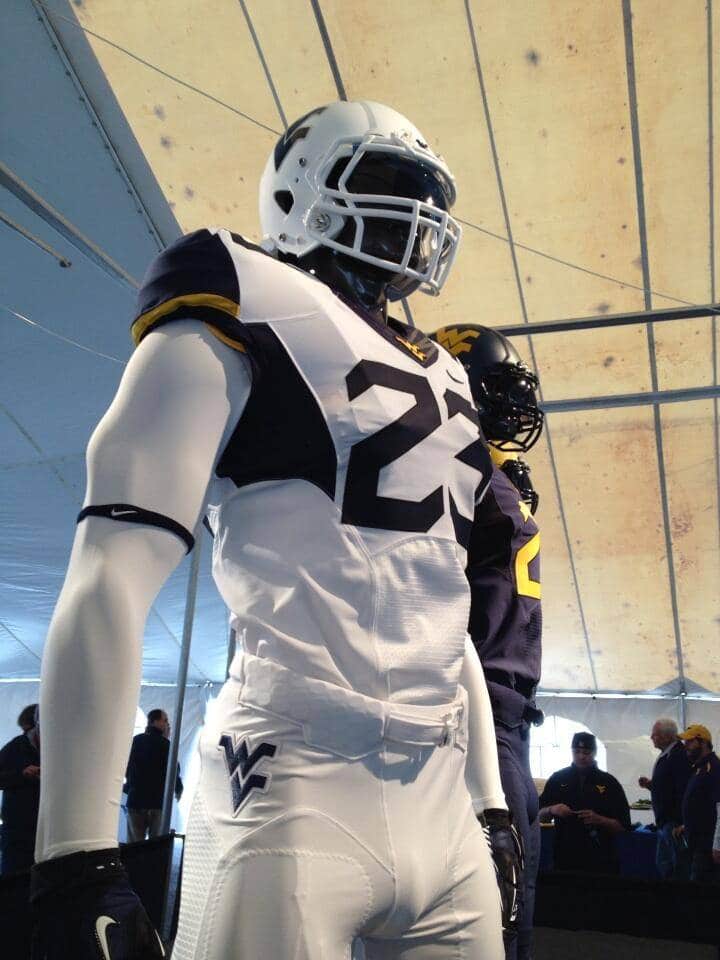
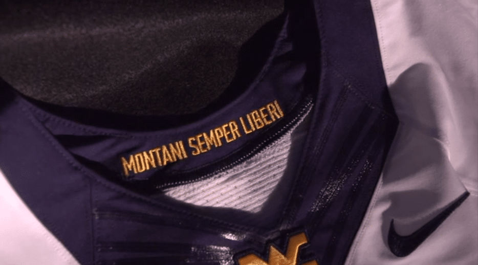
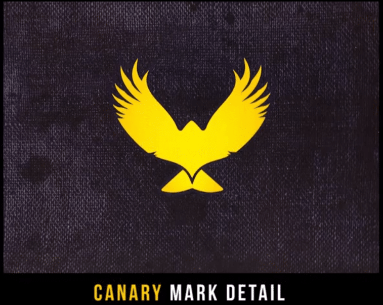
- West Virginia- The Mountaineers of WVU have released some…bold…uniforms this year. West Virginia kept the original blue helmet, but added a white and yellow helmet to the rotation (first time since for the white one since 1979 and the gold one since 1978).The helmets look nice. I like them. Especially the all white one. The jerseys are so plain, they border on the line of being uninspired. Nike threw in the color-stained arm pit thingys, like what LSU wore a while ago. Those are just a poor design element. Nike also created a brand new number font, which is supposed to resemble a miner’s ax. Eh, ok…Some cool elements though, Nike put the state motto of Montani Semper Liberi, which is Latin for Mountaineers are Always Free, into the collar, as well as a unique yellow canary, which were sent into caves by miners to detect deadly gases. Grade- B-
ACC
- Clemson- The new ACC patch looks like a billboard. What’s with the background not matching up? Looks very disjunct and out of place. Just doesn’t blend well. Should’ve stuck with the ole pennant logo. But that’s an ACC issue, not Clemson.
- Florida State- What do the Seminoles look like with their new ACC patch? Glad you asked! Here ya go! Nothing special…too billboard like…
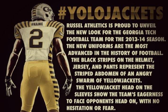
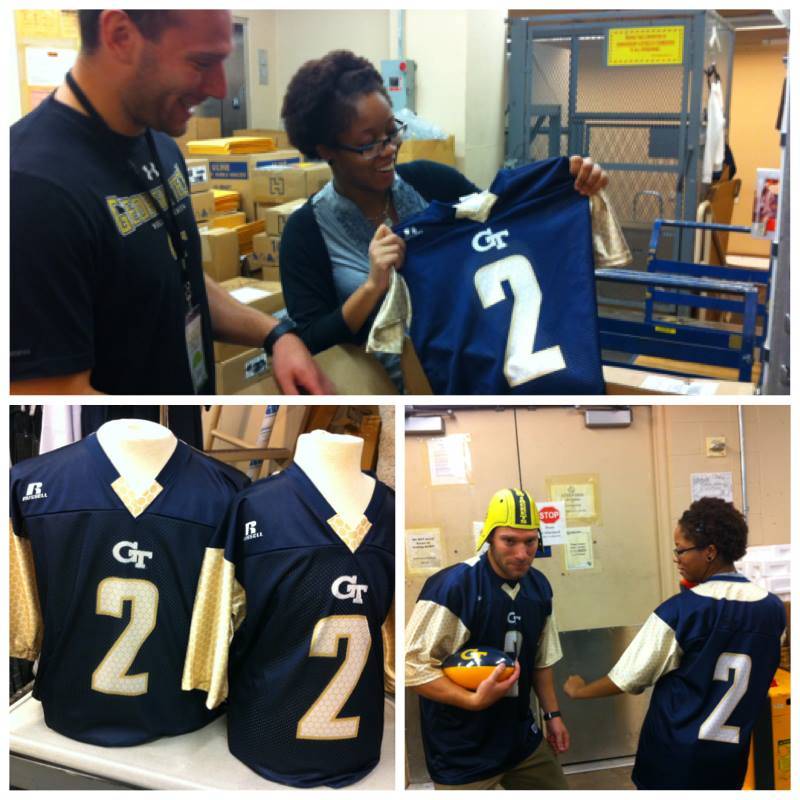
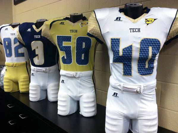
- Georgia Tech- I would never post a fan’s tweaks or complete overhauls on this list. I want to do only legit news and uniforms you will see on the field this season. But there is an exception here. This is just too good to pass up. Apparently, news broke out that Georgia Tech was to have a brand new uniform set for this year (we haven’t seen anything yet). A few people started tweeting out this picture. Unfortunately, it’s all fake. I LOVE this uniform, give or take the bee helmet stripe. This looks like someone took Michigan’s throwback uniforms and put it on steroids. I love the humorous smiling bee face on the shoulders. I love this uniform so much it hurts that it isn’t real. The biggest shame, GT has had the biggest identity crises over the past decade(s) and really could have used a bold uniform like this! No grade since its fake, unfortunately But we do actually have some things from GT. We have new retail versions arriving at stores. What’s different? Nothing much, just that the “TECH” under the collar now reads “GT”. Here’s the “honeycomb” style they broke out mid-season last year. Please, Russell, I’m begging you. Do something good!
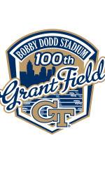
*Did you know that GT has now played 100 years at Grant Field at Bobby Dodd Stadium? I didn’t either. Not until they released this logo for the occasion.
- Miami- Here are their uniforms with the new ACC logo patch. Blends in much better here. Hopefully Nike will take Miami through a full rebranding like they have so many this offseason real soon.
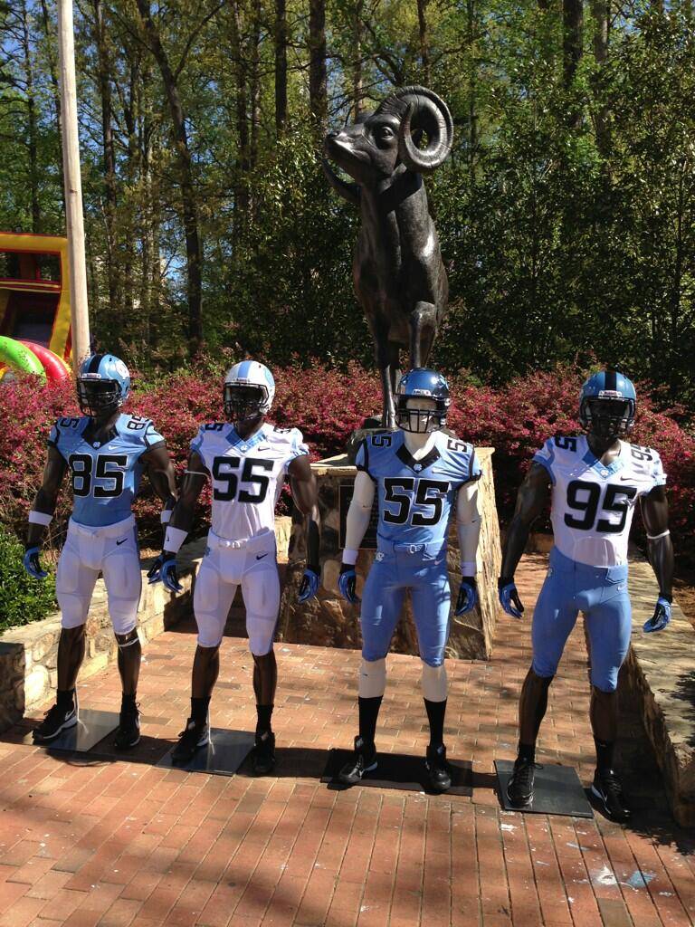
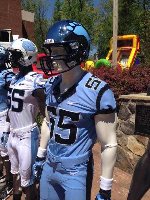
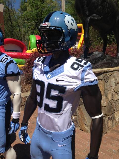
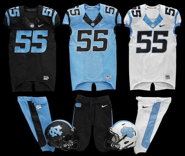
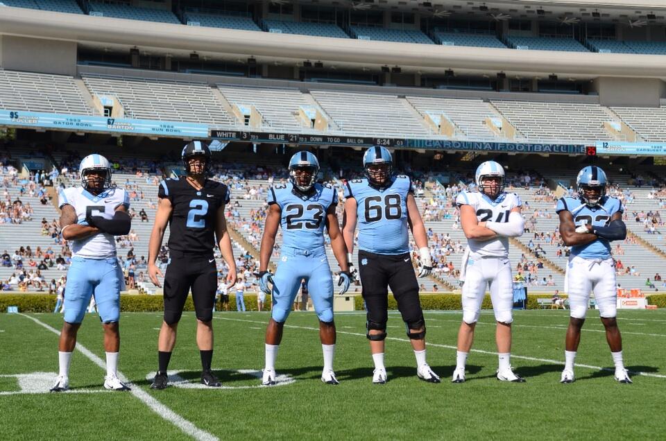
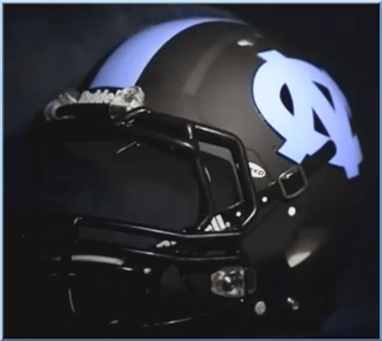
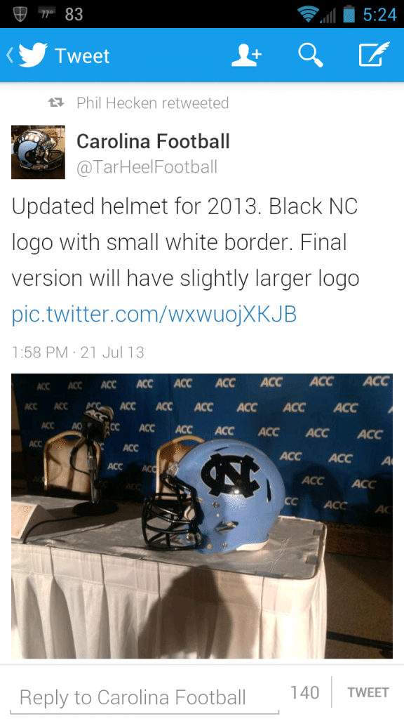
- North Carolina- UNC unveiled their new unis before their spring game. And they should’ve waited longer and spent more time at the drawing board. I’m not sure what the designer(s) of these was thinking. So very basic that it’s bad. Black numbers across the board, which isn’t even a team color. The Nike Flywire color just sticks out contrasting like that. The single stripe on the shoulder creates what seems like an empty spot on the jerseys. Very underwhelming and nothing special. They have brought back the HGI chrome tarheel helmet from last year. Just not a fan of the use of black at all. UNC announced before these were revealed that they would have a blackout game. The black uniforms are sadly the best set, only because of the solid color Flywire and use of Carolina blue on the numbers. And a nice lid. And just fyi…These are just…bad. Grade- D
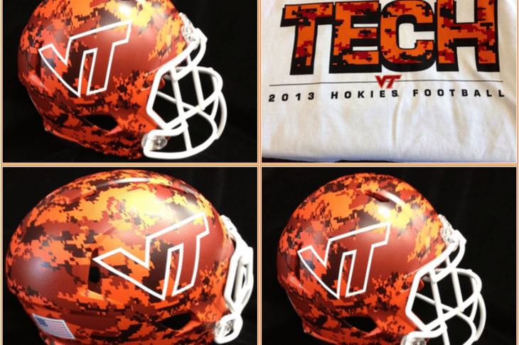
- Virginia Tech- New military appreciation helmets for VT for the Sept. 21 game vs. Marshall. I am not a fan of these whatsoever. These are horrendous. Really hoping they don’t have matching uniforms, but I highly doubt that. Grade- D+
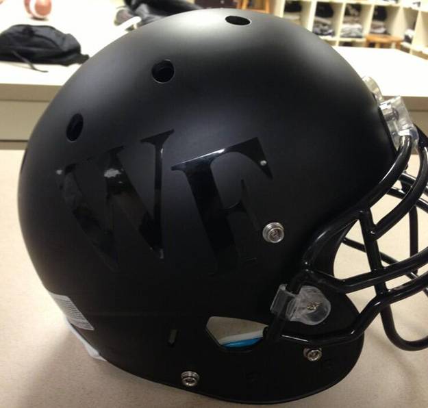
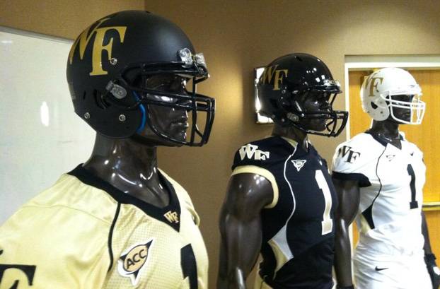
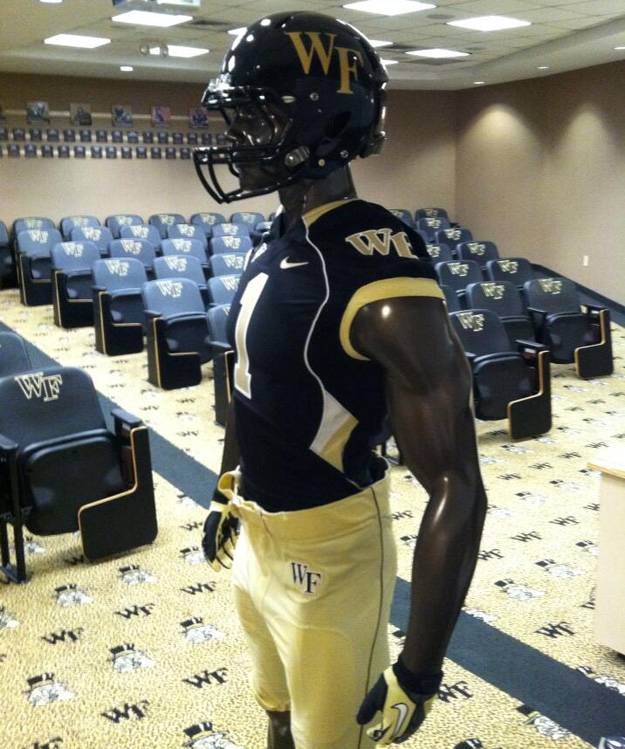
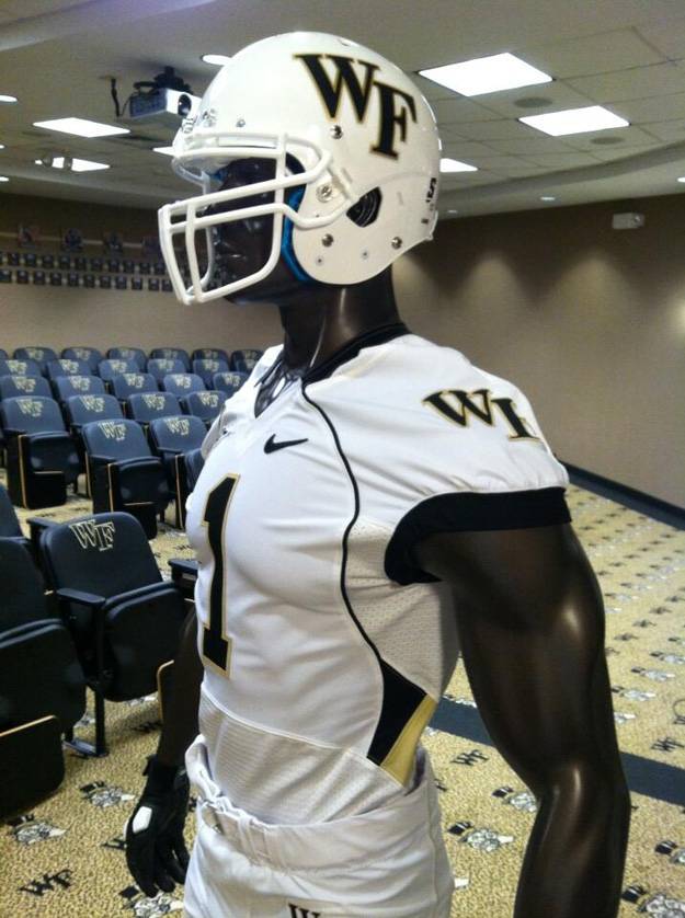
- Wake Forest- The Demon Deacons have joined the armed race with new helmets of their own. Why anyone would place a matte black logo on a matte black helmet to the point where no one can see it is beyond me. The white, double-sided helmet, with the Deacon logo on one side, is definitely going to take some getting used to. Right now, I’m not a fan. Just hope they look better on the field. Grade- D-
SCATCH THAT!!
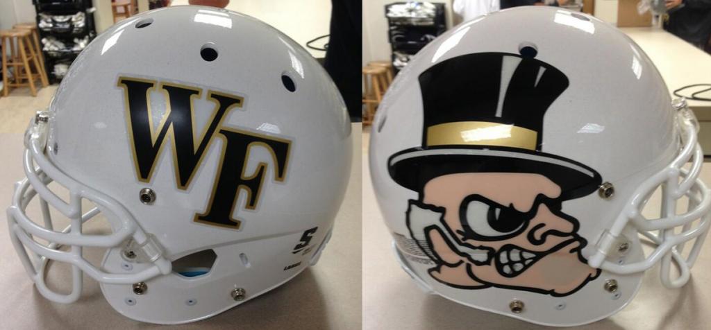
Turns out all this pictures above were just fakes. Possible prototypes by the athletic department. THANKFULLY! Here are the real lids they revealed. Like the new matte black and white lids. Now just to redo the jerseys… New Grade- B+
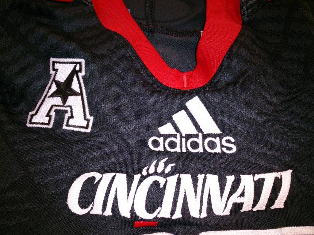
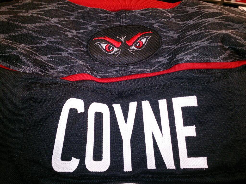
1. Cincinnati- After a season or two of Cincy adding new additions to their uniform collection, we only getthese two picturesof the new uniforms. As you can see, new AA conference logo, and “tread marks” make another return…Wish we could see more, but I would expect to see some different, and new, aspects in the future. Grade- B
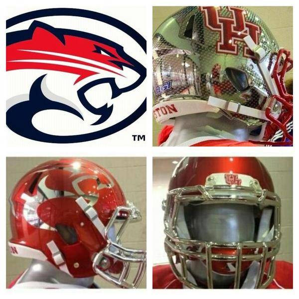
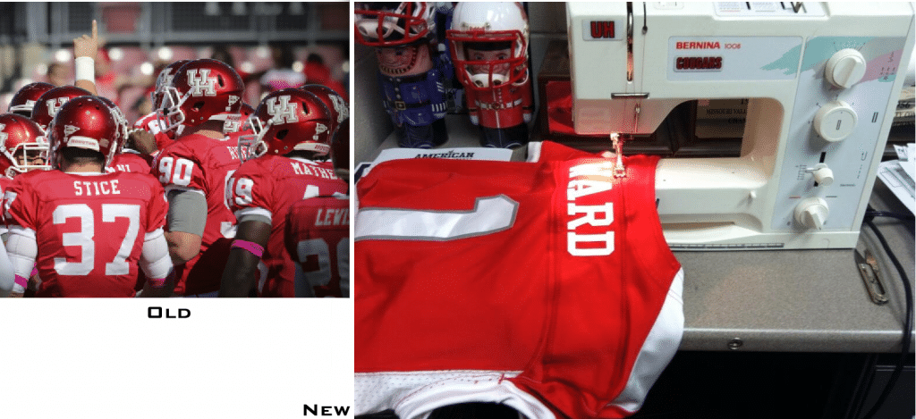
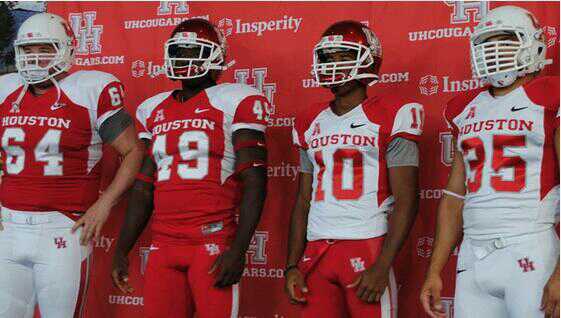
2. Houston- Last season Houston rolled out a redesigned UH logo with the new Cougar Head logo. Now, they seem to have gone a bit equipment happy. The white UH helmet is flat out gorgeous. Sadly, that’s about it. I wasn’t a fan of the new cougar head logo at all last year, so needless to say I’m not a fan of the helmets with that logo. The red one with the traditional placement isn’t too terribly bad. The red helmet with the oversized cut-out cougar head, yea, that doesn’t work for me at all. And then the diamond plate UH helmet? Looks like Houston, Nike, and Hydro Graphics, Inc. (who created the likes of Oregon’s chrome winged helmets and such) just went “Ya know what? We can do whatever we want. Let’s try something completely different!” Sorry fellas, but you shouldn’t have… Houston also got new jerseys, now with number outlining, and some sort of striping. Have I mentioned that I hate armpits and silly shoulder things? Here is the prime example of what I’m talking about. With the reveal of the uniforms, only the matte white and glossy red helmets were shown, so, will we see the other crazy designs, or were they just mock ups? Grade- C+
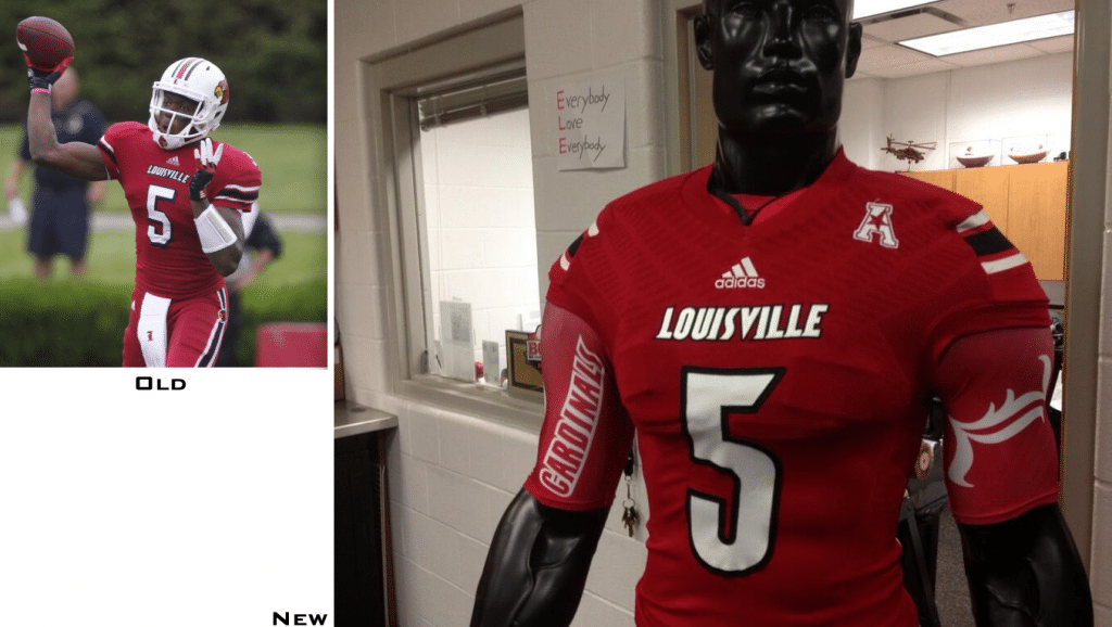
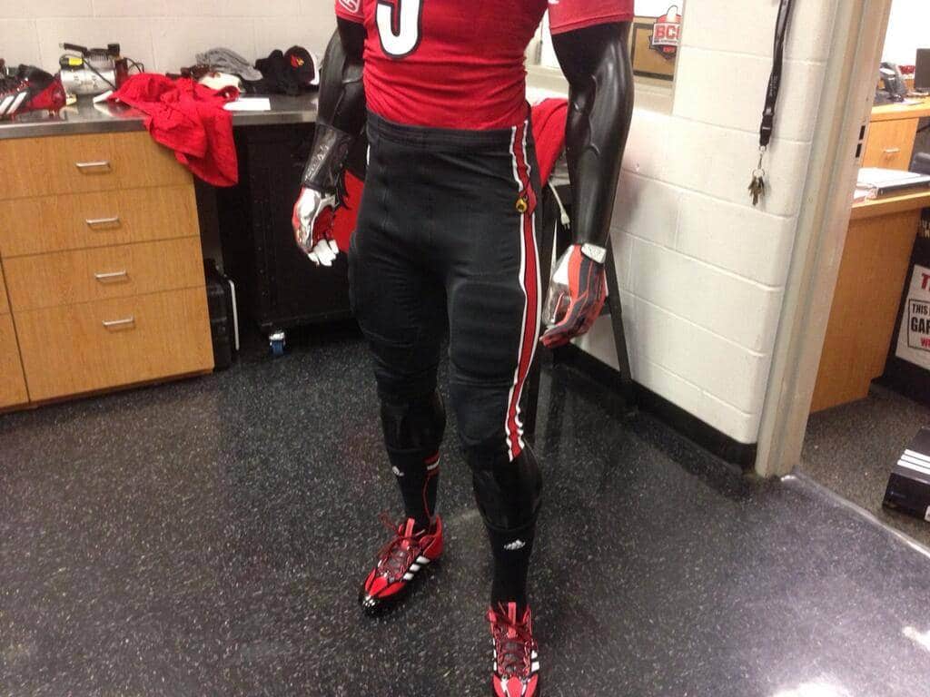
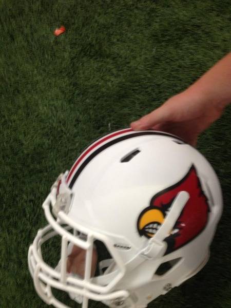
3. Louisville- The Louisville Cardinals have now updated their uniforms, complete with AAC patch and adidas “treadmarks”. Also, a new pair of black alternate pants, which look good paired with that white top. Hopefully we won’t see all red this year. And how can you not like this gorgeous matte white helmet?! No word just yet if this is real or not, which I really hope it is. Grade- B+
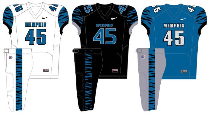
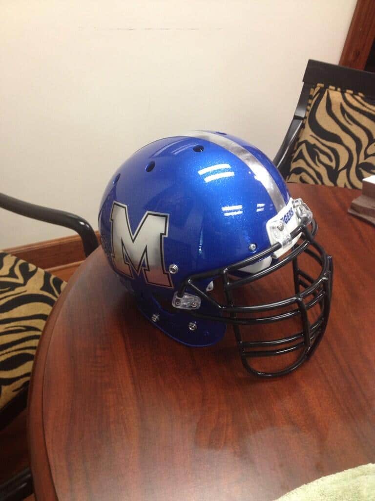
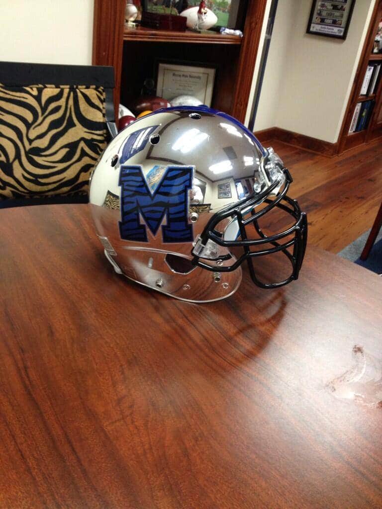
4. Memphis- Memphis has had some unique looks over the years. Early this year, the alumni association had these mock ups for their members to vote on. Unfortunately, it seemsthat the grey pants (and possibly white, hard to tell) made it through, and, if you can look very closely, the blue and white jerseys have faint black stripes as well. But the biggest news is with their three new helmets. Who likes chrome?! 17 year olds, that’s right! I love the traditional blue lid with the M and tiger logo going chrome. I also really like the chrome blue with TV number lid. But I really love the new silver chrome helmet, if it weren’t for the decal and striping having those tiger stripes inside of them. Other than that, I like these helmets. Will be very interesting to see how they look onfield. Chrome is the new black, if you haven’t noticed yet. Grade- B
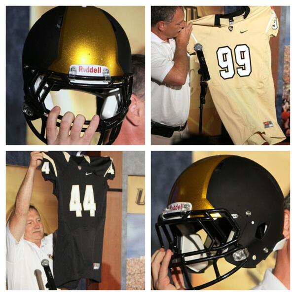
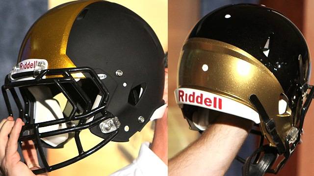
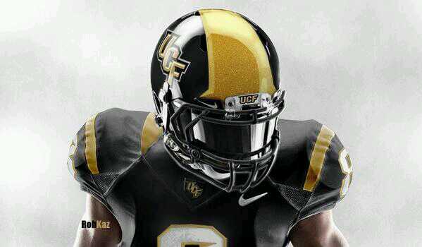
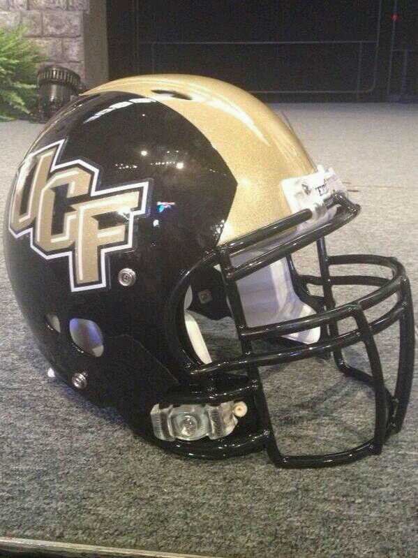
5. UCF- UCF has been releasing their new uniforms very un-traditionally. They released the uniform design on an ESPN TeamDesigner-like template(Bush league UCF, C’mon!). Then they show off the uniforms, along with the new helmet design, at a season ticket holder dinner (with no models I may add). And to top things off, they show off one helmet with the design they want, and another with the colors they are supposedly going to use. The look is very bleh, but the presentation receives a failing grade. And what seemed like forever after we got the first look at everything, we finally see what I think is the final product, and actually on a real person! I like. I really like the unique lid. I like the metallic gold portion, but I wonder how it will look on the helmet models that don’t have that raised portion of the crown. Grade- B for uniforms, F for reveal (It’s called showmanship man!)
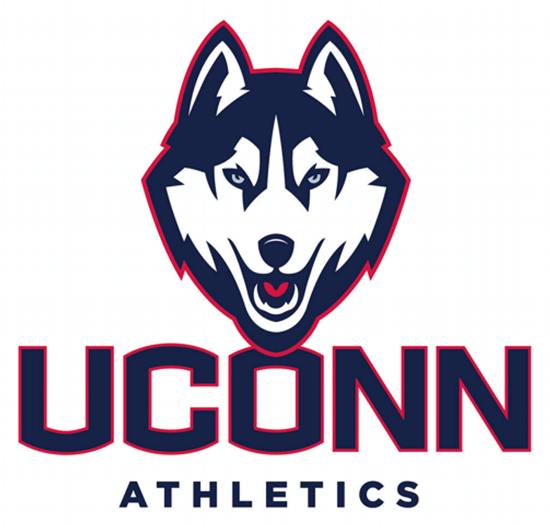
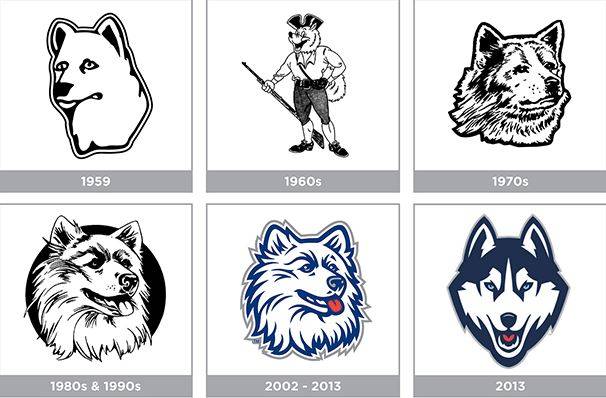
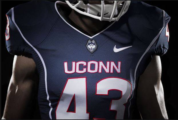
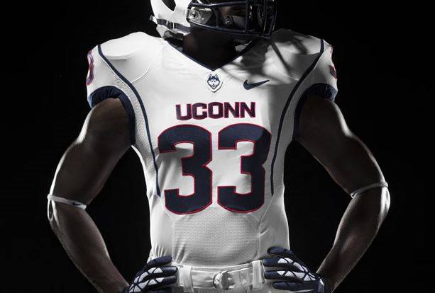
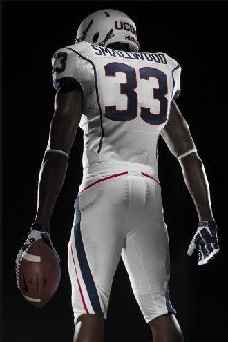
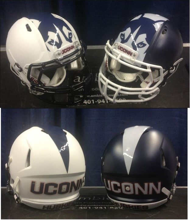
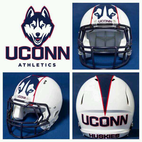
6. UConn- Nike has been working overtime this offseason, rebranding and redesigning many teams already. Now, they show off their work for Connecticut. They rebranded everything, straight down to the husky head logo (Here’s a nice timelineof all the previous husky logos used). The uniforms themselves are actually pretty nice- nice, clean, bold. Random “piping” or striping or whatever it is would be better if it actually connected somewhere. The pants stripe is simple and new and exciting. The helmet- oh lord, the helmet…oh boy, where to start…how about back at the drawing board. These never should have left there. No. Just no. Tiger/Husky/Dog/Cat/Snake eyes should NEVER be used solely on the helmet. I miss the traditional block C to be honest… (The helmet was actually upgraded a few weeks after the reveal, adding a contrasting outline around the stripe) Grade- C+
Conference USA
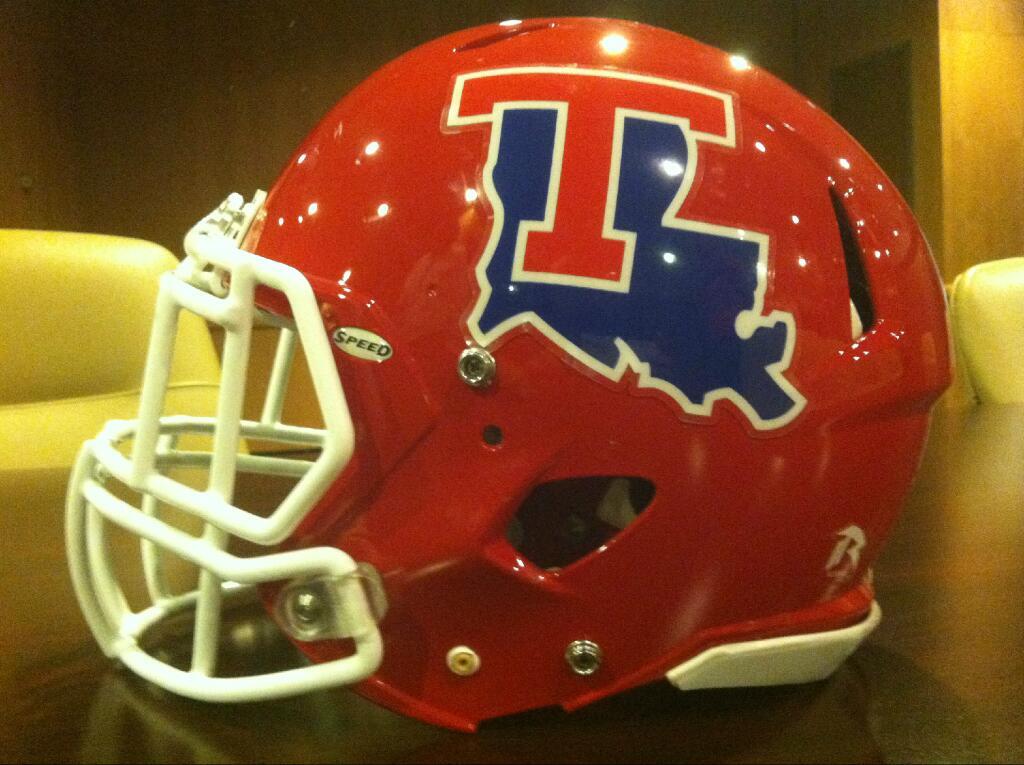
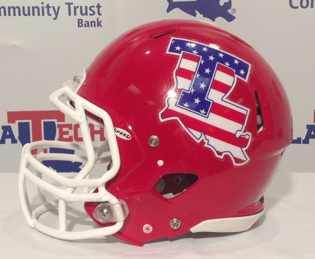
2. Louisiana Tech- The Bulldogs of LaTech will have minor changes to their helmets. Instead of the “T” being white like in the past, it will now be red, which seems to be more difficult to read to me. I always thought LaTech had amazing helmets, and always loved that logo, but this is a downgrade. LaTech will also wear this pretty cool decal for their game versus Army on September 28. Grade- B for the decal change
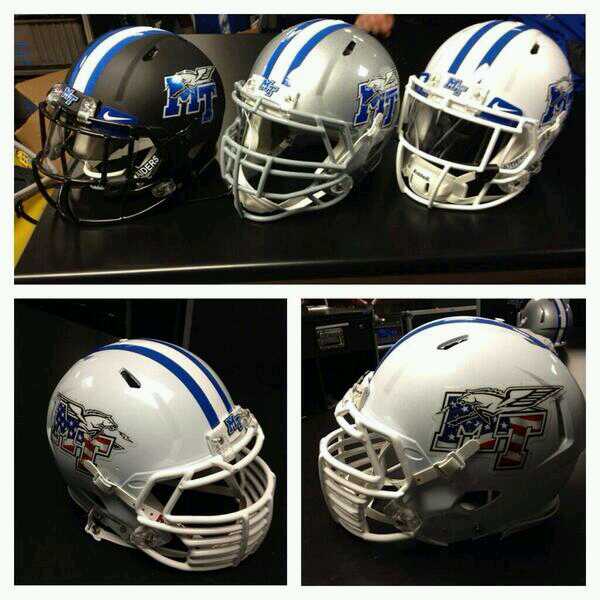
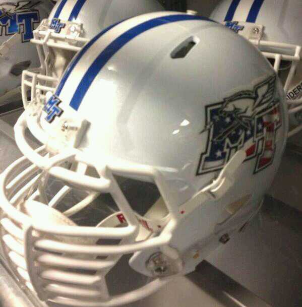
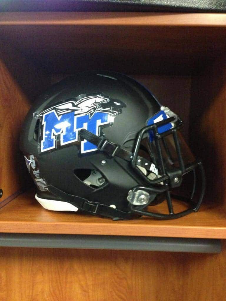
3. Middle Tennessee- Middle Tennessee State has just about as many uniform combos as you can ask for. Now they’ve added a new matte black helmet, and a nice white lid to go along with their traditional silver. They also have new Stars and Stripes decals to go along with this. Overall, nicely done. But this is the perfect example of what I hate about the matte helmet craze. Just look at it. The extra “negative” space on the logo decal adds a very odd effect. The decal itself would do this if the lighting was different. Many companies, teams, and designers think you can just add a matte colored helmet and do everything else the same (logo, stripes, etc…) as before, when in all actuality, it just looks awkward. I wonder if someone could come up with a matte decal to make it match? Grade- B
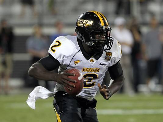
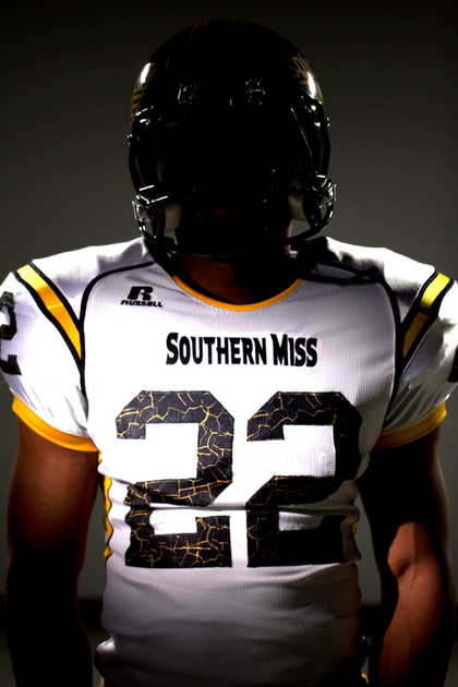
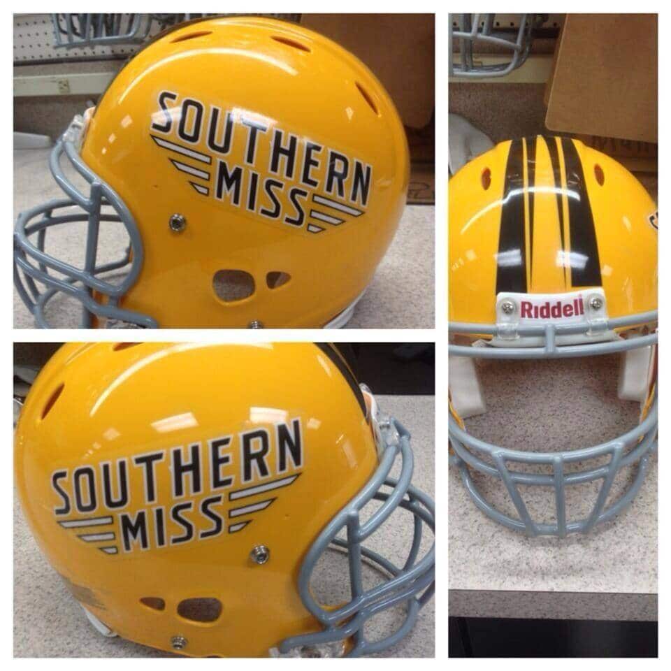
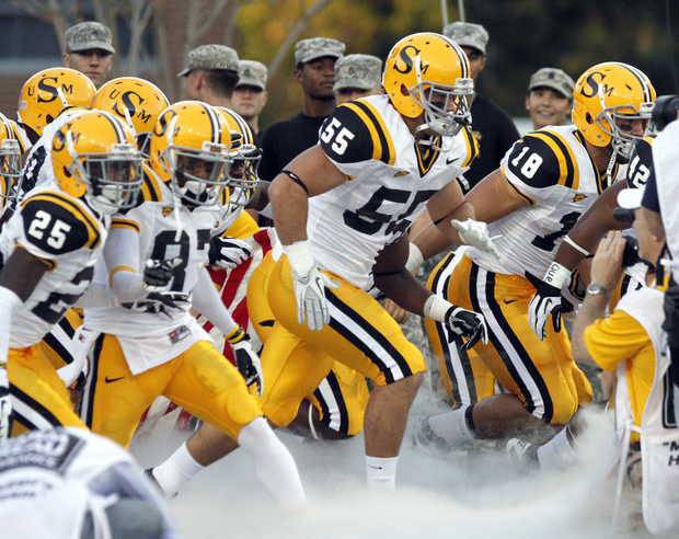
4. Southern Miss- Southern Miss went from Nike to Russell (don’t hear that very often, again) over the summer. And it’s a shame. Nike made Southern Miss look good (which was apparently harder than you’d think). Russell’s new Golden Eagle uniforms look…bleh…so similar to Georgia Tech. Just…I don’t know what it is about Russell, but their uniforms just seem so bulky, the complete opposite of Nike and adidas and UnderArmour. This is really sad. Only plus I can see is the cracking, I guess, inside of the numbers. Subtle touch that you won’t see unless you’re right by the jersey itself. Russell just threw in random stripes and lines and quit. They also added a new helmet, which the fans voted on, which I’m not a fan of. Even more unfortunate, we more than likely won’t be seeing these gorgeous throwbacks… Grade- C
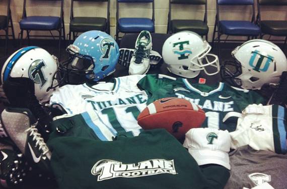
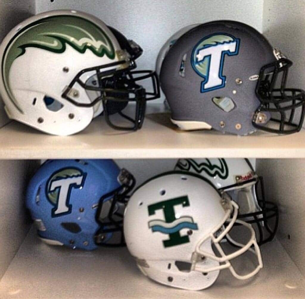
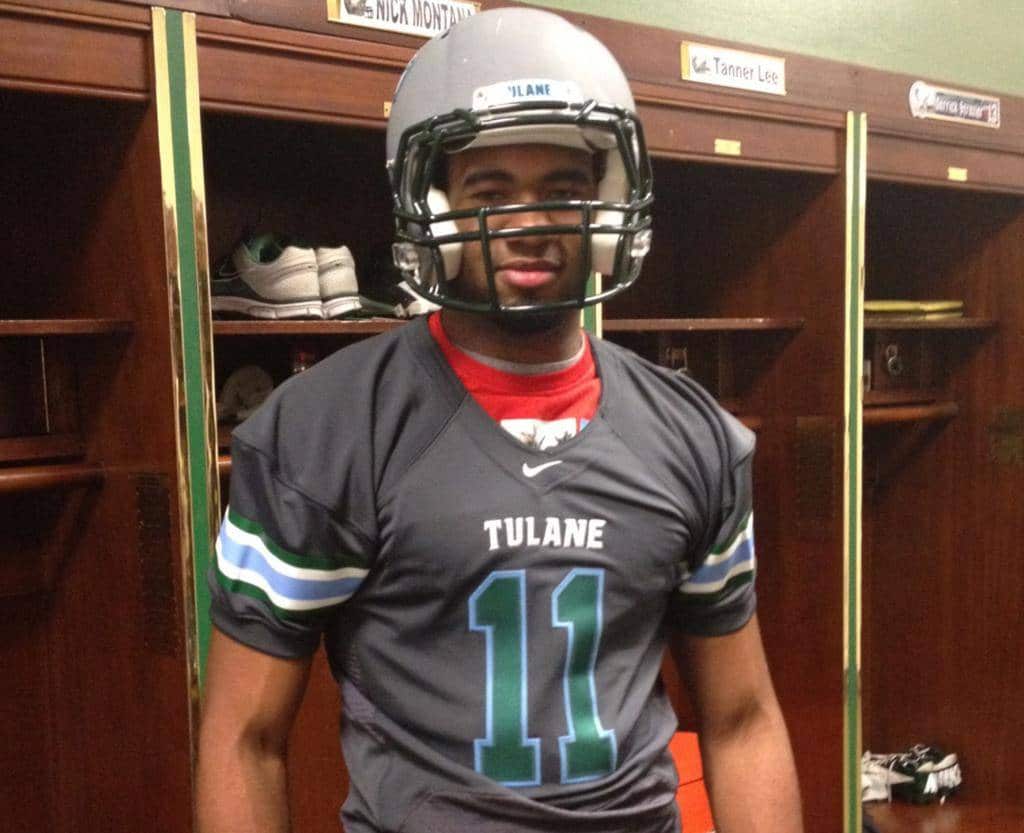
5. Tulane- Last year Tulane began their own sector of the equipment “armed race,” adding many different styles of helmets over the year. They obviously are continuing that into this year’s season. I honestly like all the styles that are visible right here. I love the baby blue colored lid. I wish we could see the other’s in the back, but we may see them soon enough. A recruit tweeted out this picture of him wearing what seems to be a new grey alternate. Grade- incomplete
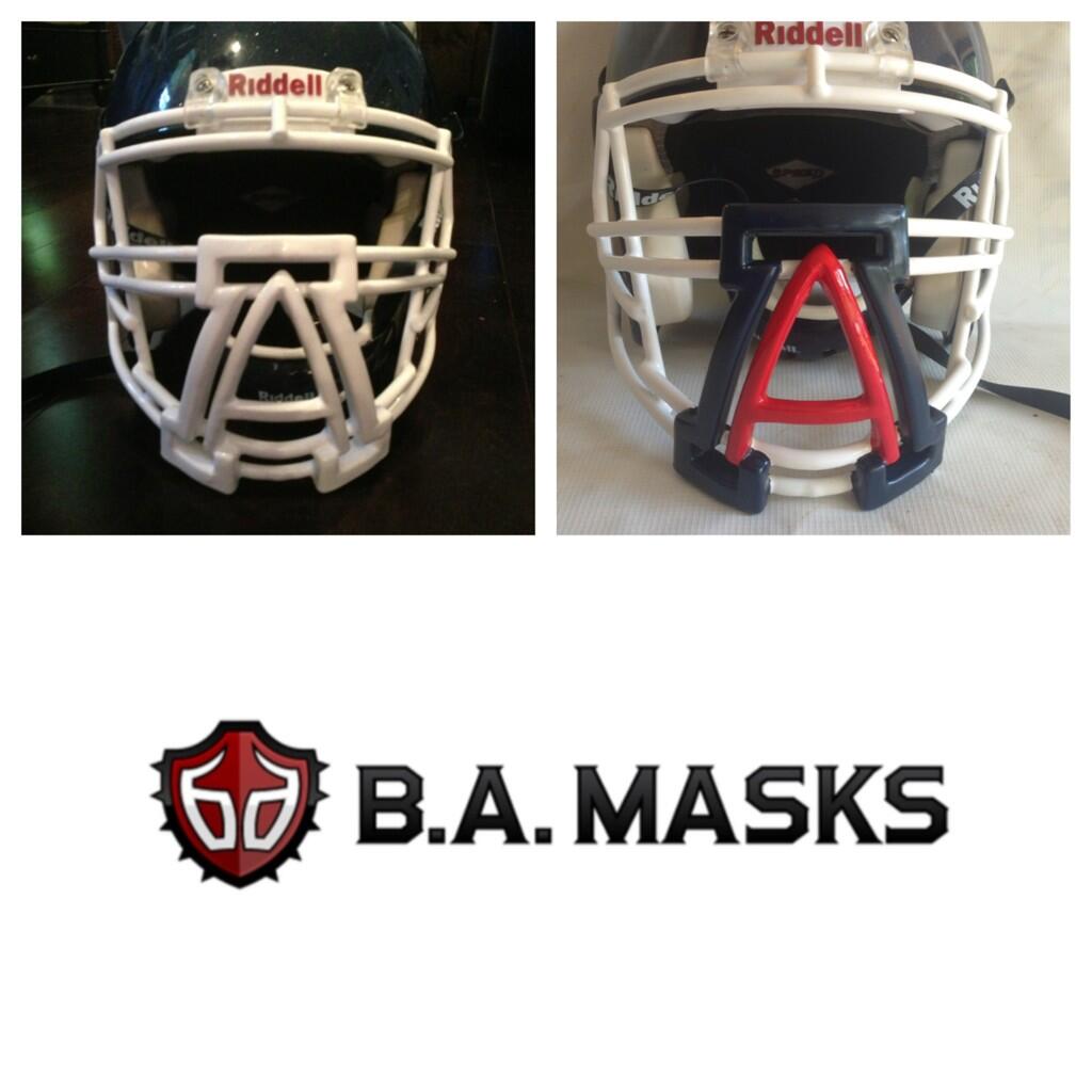
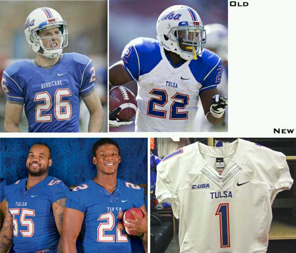
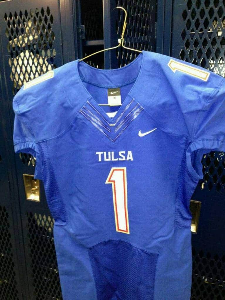
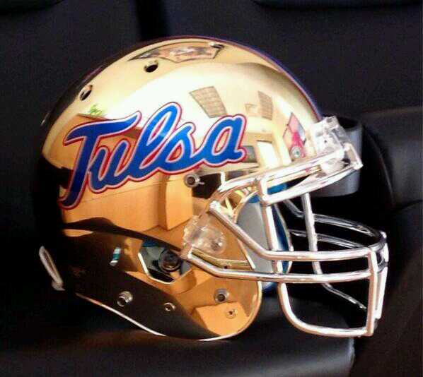
6. Tulsa- The Golden Hurricanes of Tulsa (Oklahoma, doesn’t make sense to me either. Another mystery of the world I suppose) have updated their uniforms and switched them to Nike’s newesttemplate, with Flywire, sweat box, and all. Much cleaner. Although, a little simple for my tastes. I liked that the old white uniform had the blue shoulders to break up too much white, but that is now gone. Also, as many other teams have done, a golden plated helmet (prototype more than likely) has been released. I really like this one though…How cool would that look with this custom (from BadAss Masks) facemask?! Grade- B+
Mountain West
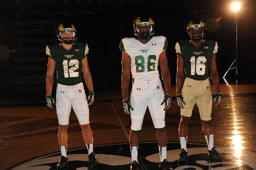
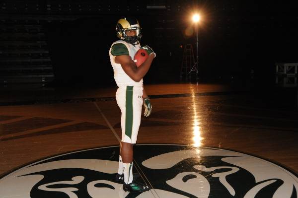
1. Colorado State- Colorado State has had so many issues with their uniforms lately. Mainly because of their providers. A year or two ago, the Rams switched from Nike to Russell (don’t hear that much), and Russell did them no favors. This year, they switched to UnderArmour. And UA helped out tremendously! I’m usually not a fan of odd shoulder designs like this, but I dig it. I like that they only have a green and white top, and white and gold bottoms, for now at least. The iconic helmet hasn’t been touched; good. And a good, thick stripe down the pants to break up a boring plain colored pair of pants (and notice the bottom of the stripe. That’s the same stitching design as Auburn. So UnderArmour is still a year or two away from fixing those…) Grade- A-
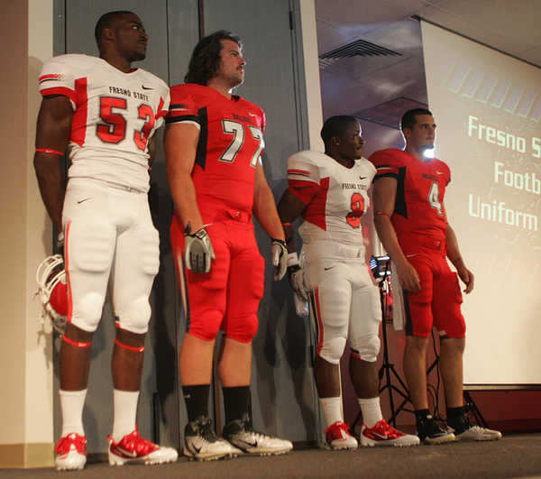
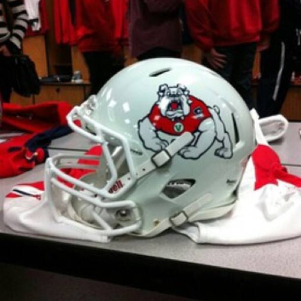
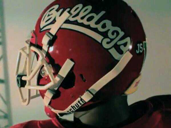
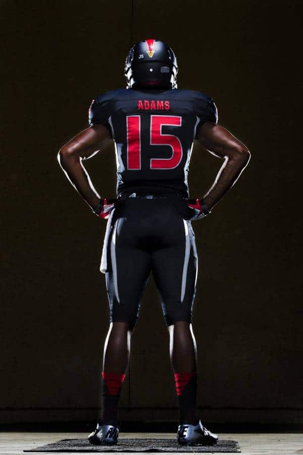
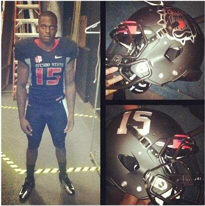
2. Fresno State- After revealing new uniforms two years ago, Fresno State is adding a new set and three new helmets. First, the new white helmet. This helmet was actually revealed months ago by a recruit, which is nothing more than the original red lid switched to white. Secondly, the Bulldogs will wear a new 1996 throwback helmet, with “Bulldogs” written in script on the side. Thirdly, and what happened to be a big surprise to most, Fresno State revealed full out black uniforms, of course for a “Black Out” of the stadium. And I for one am a big fan of these. The helmet is matte black, with TV numbers on one side, and a fierce bulldog head on the other. The white arm pits and pant stripes do a good job breaking up the all black, even though they look awful on their usual uniforms. Thankfully, the black unis don’t have the ugly shoulder striping that the red and white tops do, very similar to what Arizona used to have. I used to think Fresno State had one of the best looking uniforms, and then they slowly ruined it. They ruined their helmet by adding the truncating stripe. Just go back to the simple WAC era uniforms…please… Grade- B+ for black, C overall
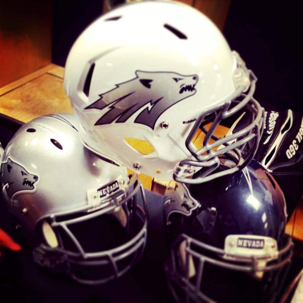
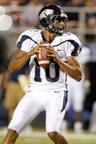
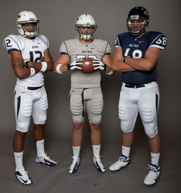
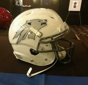
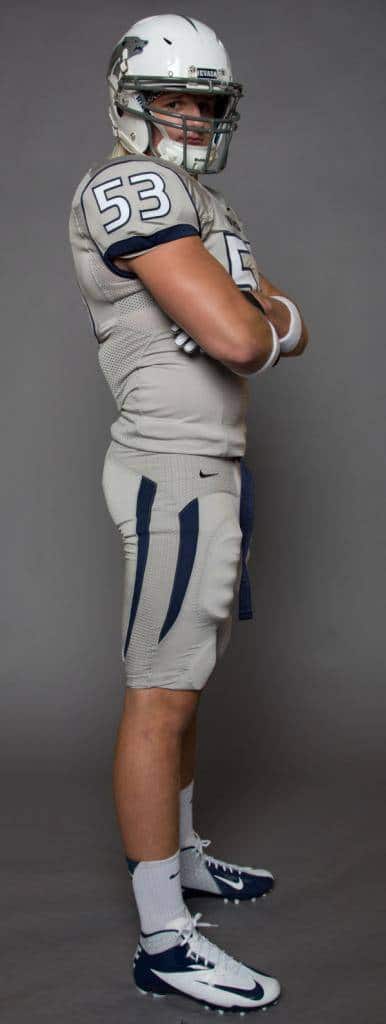
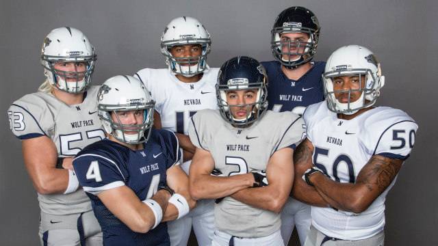
3. Nevada- Another team that had their new uniform ideas leaked by recruits is the Nevada Wolfpack. Now, when Colin Kaepernick played here, they didn’t have the greatest uniforms, but still looked decent. Now, I don’t think they look worse, nor do they necessarily look better. But they did add a new lid, new tops, and new bottoms to mix! Yay! Anyways, the uniforms have been simplified, to basically just a shoulder pipe around the numbers. Then they threw in a new white helmet (blue lid is much better…). They apparently were looking at a grey helmet, but supposedly trashed it at the end. A new grey pair of uniforms and pants were also added. Unfortunately, again, because of Nike’s pant template, Nevada has the shortened stripes…I’m sure thesewill look better on the field, but we shall see. Grade- B
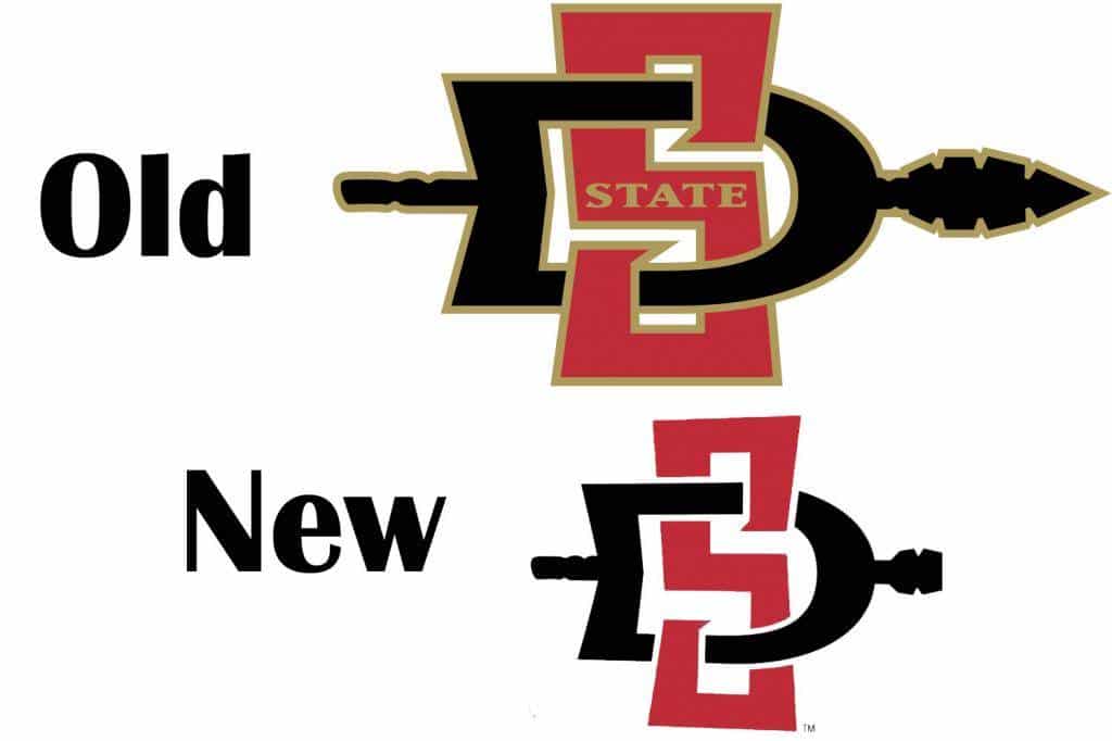
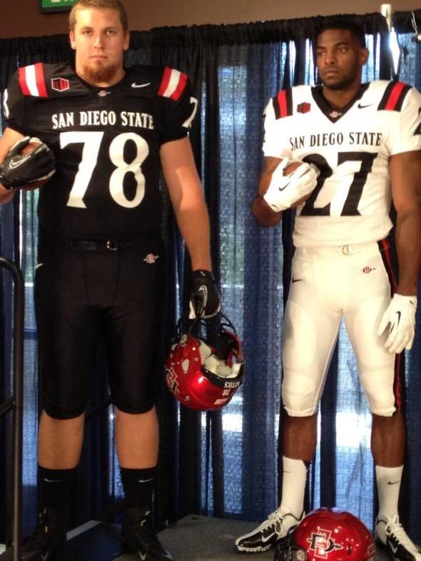
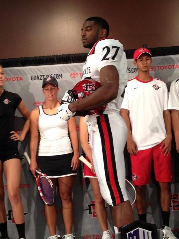
4. San Diego State- The Aztecs from San Diego State have not only unveiled new football uniforms, but also an updated logo. The logo isn’t drastically different, and without this graphic, you probably wouldn’t notice a difference whatsoever. But you definitely would notice the football uniforms. And boy do these look good! Who doesn’t love UCLA stripes on the shoulder and matching stripes down the pants?! Very traditional, and I love that. I love these. Think white over black and vice versa would look good too. (Here are the old ones) Grade- A
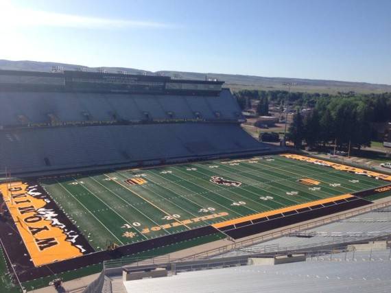
5. Wyoming- Wyoming has replaced their turf field this year, with a unique look nonetheless. As far as turf field designs, I like it! It looks better installed too. As far as football fields, don’t get me started on turf fields…I just want a nice mud game…is that too much to ask?! Apparently, cause turf fields ruined them
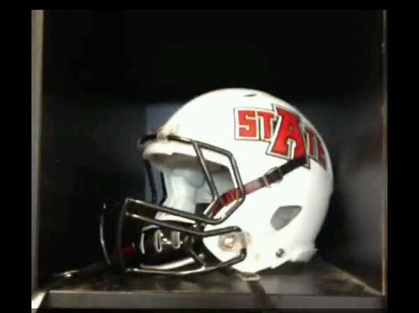
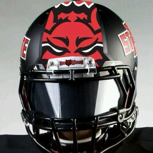
1. Arkansas State- As Arkansas State starts another season with another new coach, they possibly have a new white helmet. And this new UConn style lid circulated the web, but no idea what if it’s real or not. Grade- B+
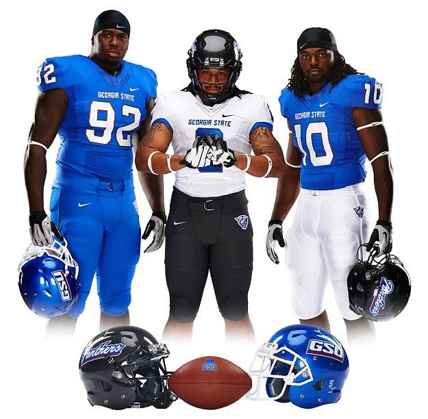
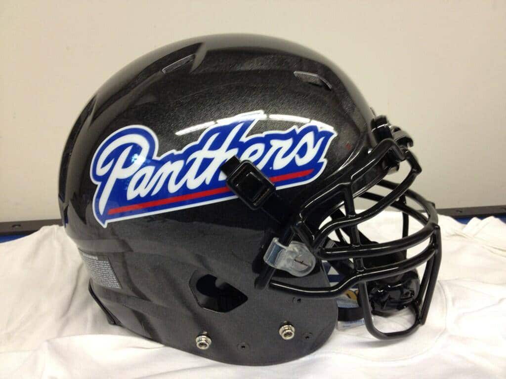
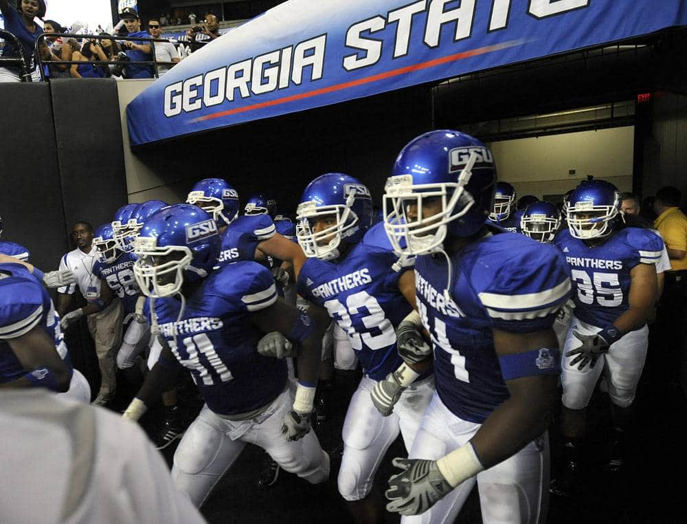
2. Georgia State- Georgia State has revealed new Nike uniforms. They also addeda new helmets. The new uniforms are just plain. I liked the stripes on the old ones. If anything, I think there needs to be something to break up the monotony of a single color, like these new uniforms. I would like for them to not wear that all blue set, but you just know that wont happen…Grade- B-
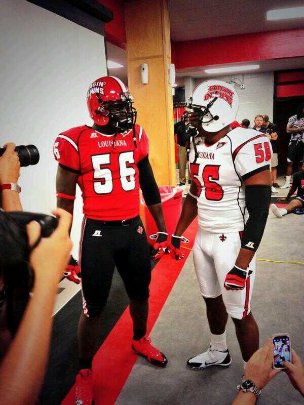
3. Louisiana-Lafayette- The Ragin Cajuns have released their new Russell uniforms. And I actually like these. Very clean, very bold. Just not a fan of the chest piping. (And is it me, or does Russell make the bulkiest looking uniforms?) These definitely beat the old set. I love the two sided helmets, with the Ragin Cajuns wordmark on one side, and the flue-de-li on the other. I think these look a whole lot better than the past set. Speaking of Ragin Cajuns, did you know the apostrophein “Ragin” is actually a chilly pepper? Well, now you know. Grade- A-
4. Louisiana-Monroe- The Warhawks of Louisiana-Monroe have updated their adidas uniforms. No more are the stripes around the back and pants. Now are just plain, somewhat boring, single color uniforms. And there adidas goes again, placing their logo under the collar, and making it look oh so cramped, when they could just move it over…Grade- B-
5. South Alabama- The Jaguars of South Alabama will be playing their first full season at the D1 level. And to commemorate, they got new Nike uniforms. Honestly, these aren’t too bad, but aren’t the greatest. The typeface is painful to look at. Would look a lot better if they went with their logo typography. The helmet features a Denver Broncos style truncated stripe, and a very big helmet number. The pantsare nice, but like most (if not all) Nike pants, stripes don’t go all the way up or down the leg because of the template. Overall, not bad, but could be better. Would like to see how they look on the field. Grade- B-
6. Texas State- Remember when D-1 was 120 teams? Yea, that’s long gone. Now there’s too many teams to count, and we call it the FBS (yea, I hate it too). Let’s add another new team to the D-1 (still calling it that!) list- the Texas State Bobcats. The Bobcats will be playing in the Sun Belt conference to begin this milestone season. And they have some odd looking helmets…Texas State will also be coached by Dennis Franchione. Here are the uniforms they wore last year, don’t know if they have revealed new ones or not. Doing some research about this program, I found out I just love their stadium! I’m not sure why, but I just do!
7. Western Kentucky- Unfortunately for the Red Toppers, they have a new coach this year. Even more unfortunate, it’s Bobby Petrino. But the good news, they have a wonderful looking chrome white helmet! Chrome base, and stripe! If only the logo was chrome as well. Really curious as to how this one will look on the field. Petrino also updated the uniforms, like he did when he got to Arkansas. And that’s a shame. WKU had some great uniforms, and these are decent by themselves, but a total downgrade after what they used to have. Random piping across the chest, “HILLTOPPERS” down the pant leg, and just bleh. The piping on the black uniforms doesn’t even connect to anything!! I wish they hadn’t touched the previous set, but then again, these could be a lot worse. I still like the chrome lid, but these uniforms take the grade down. Even the conference patch is on the wrong side of the chest!! (small detail that bugs me…) Grade- B+(lid) C (uniforms)
Mid-American
1. Buffalo- Did you know that Buffalo was in New York? Just to be sure you don’t forget that, Buffalo has added a new chest plate which reads “State University of NEW YORK Buffalo”. How awful is that…That’s so bad it’s hilarious. “What state do we play in again?” The chest plate definitely will cause some confusion with the new matte blue helmet, which looks great, reading “UB” for University of Buffalo…Black armpits on both uniforms makes these even worse…Grade- C-
2. Kent State- Kent State has updated their uniforms, and the high school stripes are thankfully gone. These are a lot cleaner, and nicer. The base layer is annoying, but I don’t think a lot of players will be wearing those.
3. Massachusetts- UMass played their first D1 season last year, with new uniforms to boot. Now, they have a possible new helmet, which I like. And a great story out of UMass for their spring game, where they wore nameplates with the names of victims from the Boston Marathon Bombing. Kudos. Grade- A- (helmet) A+++ (spring game)
4. Miami (OH)- Definitely adidas’s most out there uniforms of the year, Miami (OH) has some wild ones. “MIAMI” is written across the shoulders, and the back of the helmet. Chrome lid, and chrome colored number outlines. The numbers and helmets and gloveshave an odd feathered pattern. White pants and red pants have a HUGE “M” on it. Don’t really know what to think of these just yet.Bold for sure. Different, yes. Wait for it to be on the field? Absolutely. Grade- B for Bold
5. Western Michigan- The Broncos of Western Michigan have received new helmet prototypes this year. Oddly enough, they look extremely identical to those helmets worn by theBroncos from Idaho…Even more odd, I like this one a whole lot better than two of Boise’s three helmets with this same design. It’s really hard to beat that matte black one with the red-eyed bronco, just saying. When WMU did reveal their new uniforms, the helmet design was slightly changed. The color has changed to a darker brown, and it is matte, as well as a matte white lid. The uniforms are just plain. Hey adidas, let’s get away from these super simple stuff…Also, the Broncos will be playing their 75th year in their stadium, so they have a commemorative logo. Grade- B
Independents
1. BYU- According to Wikipedia, BYU’s uniforms were royal blue from the 1970s to 1999, when the blue was changed to a darker shade. This year, BYU plans to throwbackto theroyal blue uniforms. Also, for homecoming, the player names on the back will be changed to “Tradition”, “Spirit”, and “Honor”. Am I the only one that wishes they would switch back full time to the royal blue? Grade- A (throwback) B- (gimmicky NOBs)
2. Notre Dame- The Notre Dame Fighting Irish are coming off a great season obviously. So what does adidas do to commemorate the occasion? Update to the new “tread marks” template…Yuck. Hey adidas, MOVE YOUR LOGO OVER! Along with the typical uniforms, Notre Dame will be donning “shamrock series” uniforms for the second year in a row. And these are shiny. Glitteryin fact. I do like Irish-style number font, as gimmicky as they may be. The numbers, shamrock, and helmetsare so shiny…but that’s what 17 year olds like, right? Right. I liked the green helmet decal better last year, but anything, and I mean anything, is better than the 40/60 helmet design from last year… Grade- B-
*Michigan and Notre Dame are playing their final regular season game, and at the Big House to boot. So, like anyone else with the opportunity, they have alogo for the game.
3. Old Dominion- The Monarchs from Norfolk, Virginia will be playing their first season as a D1 team as FCS independent in 2013, with their second season being played in the C-USA. The Monarchs don’t really have a rich history (pun intended) with their uniforms, and their new unis aren’t much different than what their used to be. Why would I put a team that won’t even be playing FBS football for another year you ask? This is why. One of the most beautiful helmets ever crafted. Both matte AND chrome. That’s just gorgeous if you ask me! And apparently the logo is supposed to be chrome as well! I can’t wait to see these on the field!! Grade- A
Lower Level teams
Southern Conference
1. Appalachian State- Last year the Mountaineers of App State got some awesome throwbacks! This year, they got brand new Nike uniforms. I like the matte black helmets, but wish the A decal wasn’t just an outline. I like that Yosef is staying this year, much like last year’s throwbacks. The only gripes I have about these are 1) silly shoulder thingys and 2) need something to break up the monotony. At least there is no piping like years past. Grade- B+
2. Citadel- The Citadel has new adidas uniforms. By now you know the deal, adidas, just move it over. Save me some heartburn. Please. Nothing special with these white ones. But wait, there’s a new blue alternate!! Very similar to what Michigan and Nebraska and Wisconsin (all adidas teams…) have worn. I like that blue color, and think that would be a great look on the field! Grade- B+
3. East Tennessee State- East Tennessee State has decided to restart their football program after being discontinued in 2003. Former Tennessee coach Philip Fulmer has been named Director of Football Operations, which will consist of head coaching duties. Here are just two of the prototypes presented at a press conference early in 2013. Wouldn’t mind seeing both of these this year. Grade-incomplete
4. UT-Chattanooga- The Mocs from Chattanooga have a brand spanking new white helmet. It’s only the old blue one, but mocked up in white. I like it. Think it will break up this all blue look. And are those not the biggest numbers you’ve seen in a while?? Grade- B+
Ohio Valley
1. Tennessee Tech- The Golden Eagles of Tennessee Tech have a wonderful looking purple helmet to go along with their typical look. Grade- B+
Big South
1. Coastal Carolina- New matte black helmet (with glossy decal, bleh) for CC. Here’s what they usually wear. Grade- B-
Independent
1. Charlotte- 2014 will be the first year of football for UNC-Charlotte, but they will play in the C-USA in 2015. Now that they’ve revealed their new uniforms, I wish they would be play C-USA this year! I love these, only for the gradient(?) stripes, like the old stripes of Arizona. But overall, not a bad first set. Grade- B+
D2
1. Findlay- Ever heard of the University of Findlay in Ohio? Neither had I. Not until they revealed their new helmet, which makes them the first team ever to have a player’s name on the back of the helmet. Now what happens when you have something long, like Richardson or Lutzenkirchen?? Grade- A-
And that does it for this year’s uniform tracker. I used to think uniforms were just my personal forte per say, but I love seeing everyone’s reactions to all this kinda stuff.
Hope you all enjoyed, and let’s hope for one hell of a season. I’ll be in the student section wearing this!
War Eagle!


