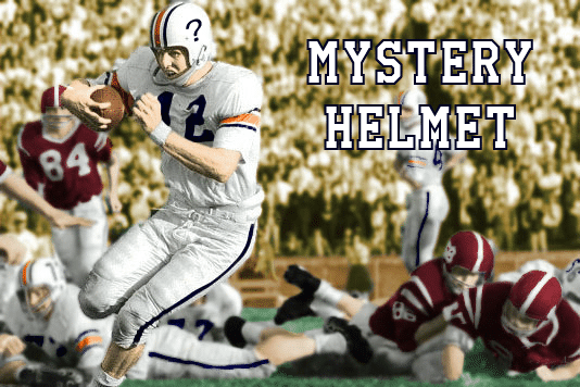
Auburn’s football uniforms have been nearly the same for the last 60 years or so. But there were plenty of changes the years prior to to 1966, when the AU logo first donned the helmets. From orange and green uniforms in the 1930s, to blank helmets that eventually sported the player numbers, it took Auburn a while to find a true uniform style that they would eventually stick with for decades to come.
One of the most obscure oddities in Auburn uniform history was recently discovered. AUD friend @PosingPlainsman sent me an email a while ago detailing a photo he found on eBay. Take a look below (click to enlarge):
(image used with permission from Alabama Media Group)
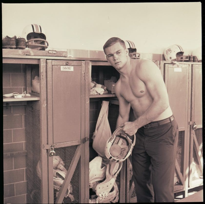
The man in the photo is none other than All-American running back Tucker Frederickson. The subject of much attention during his playing days, being called “the most complete football player I’ve ever seen,” by his head coach Shug Jordan. Though Frederickson isn’t the point to focus on in this photo. Instead, take a look in the background. On top of the lockers sit the football helmets worn during the 1964 season, when the player numbers donned the sides. But wait, there’s no numbers visible. But there is something else. Let’s take a closer look:
(image used with permission from Alabama Media Group)
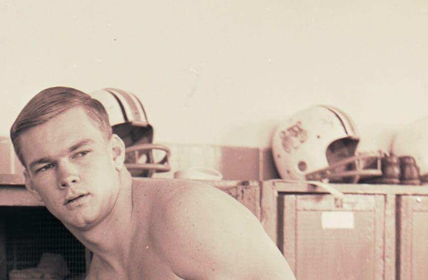
Those aren’t numbers on the side of that helmet. In fact, it looks like a tiger head. But that’s no Auburn Tiger design. What’s going on here? What actually is on the helmet and where did it come from? So many questions that need to be answered here.
Around the time PosingPlainsman sent this image to me, I was contacted by Robert Clay of the Alabama Media Group for some information for an upcoming video about Auburn’s orange uniforms. I sent the original image to Robert, hoping that he might have some better-quality files. Turns out, the AMG actually had a copy of the original negatives taken from these photos. Per Robert, the photos are from a player profile done on Frederickson back in 1964. So there’s some more context for the mystery.
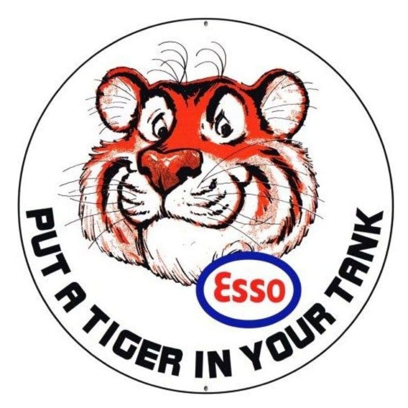
PosingPlainsman’s original email had a theory regarding the tiger head. The thought was that the design used was awfully similar to the Esso tiger used in marketing campaigns starting in the 1950s. In 1959, Esso’s tagline that accompanied ads and jingles and commercial was “put a tiger in your tank.” Esso was merged with Exxon in 1972. In 1995, the two companies helped establish the Save the Tiger Fund, to help preserve Asia’s tiger population.
The Esso tiger was a marketing success back in the 1950s and 1960s
The theory isn’t too far fetched. Only until recently, one of the Exxon stations in Alexander City, just 40 miles north of Auburn, sported the Tiger on top of the station. There’s no telling how many Esso stations were located in and around Auburn during the time. It’s not hard to imagine someone associated with the Auburn football program picking up a sticker or two of the Esso Tiger and slapping it on the helmet.
After searching for any clues possible, I decided to go to the source. I tracked down Tucker Frederickson to ask about this very mystery. Back in his home state of Florida, Frederickson is a board member for the Fish and Wildlife Foundation of Florida, which helps ensure the conservation of fish and wildlife in the state. Mr. Frederickson had no memory of the photo itself, let alone the helmet in question, when I spoke with him over the phone.
After getting off the phone with Frederickson, I knew that there wasn’t much chance to finding the truth behind this all. Frederickson mentioned on the phone that he and his teammates would joke and play around with each other and typically playing pranks on one another. With that in mind, I think I have an answer for this mystery helmet design.
I came to the conclusion that the photos were taken before or after a practice session for Auburn. Therefore, the helmets shown in the image are practice lids, hence the reason they don’t have the player numbers on the sides. The helmet in question with the odd tiger head was the result of a team prank. Someone on the team happened to come across a sticker or decal with the tiger head – possibly the same Esso tiger popular at the time – and slapped it on a helmet so that they would have to go to practice with it on. With all the stories of Coach Shug Jordan, it’s easy to imagine how much of a stickler Jordan was on the football field. I can just see Coach Jordan erupting at a player, forcing them to run the entirety of the practice session and long after, for altering their uniform in any form or fashion.
(photo via Michael Niziolek, Ledger-Enquirer)
But what if the Tiger head had actually stuck? What if Coach Jordan didn’t flip out at the sight of something foreign being on one of his player’s helmets? What would it look like on today’s uniforms?
Great questions. And here’s about all I can do to answer those – a PhotoShop mockup.
Take a look at the image to the right. It just looks wrong. I think we’ve all gotten so accustomed to seeing the football helmets with the AU logo that anything different is simply wrong and should never be thought of again. But, at the least, it makes for an interesting discussion piece. Maybe we should add this to our Auburn football uniform concept list?
So there you have it. A mystery that, well, is still very much so a mystery.
What do you think about this? Have a different theory (or even answers!) to what exactly is on the helmet? How it got there? Be sure to comment below or email me with any details you would like to share.
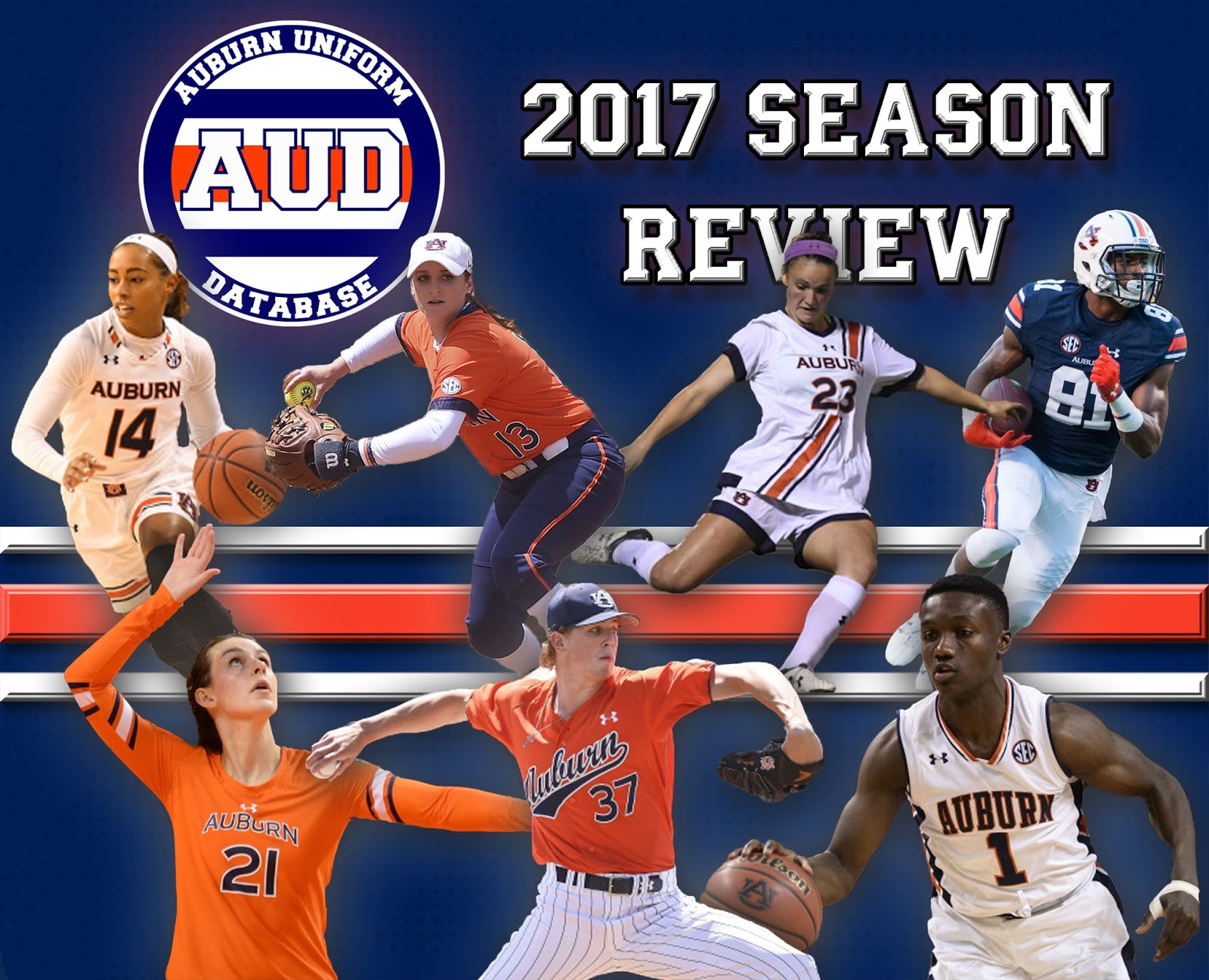
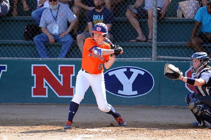
Another year of Auburn Athletics has come to a close. Let’s take a look back at the season by way of each program’s uniforms.
One of the biggest additions to (almost) all the uniforms this season was the SEC’s new Graduate patch. The SEC Grad patch was an initiative from the league office and commissioner Greg Sankey to put an emphasis on academics. The Arkansas football team was the first to try this out with a test run at the beginning of the football season. Come October, all the conference teams were sporting the new look for their athletes that have already earned a degree. Unfortunately for volleyball and soccer, these patches came out towards the end of their seasons, so none of their athletes were able to wear it if they qualified to do so. The remaining sports each had at least one graduate on the team sporting the new patch. Below you can find a collection of SEC Graduate patches for each sport.
Auburn SEC Graduate Patches
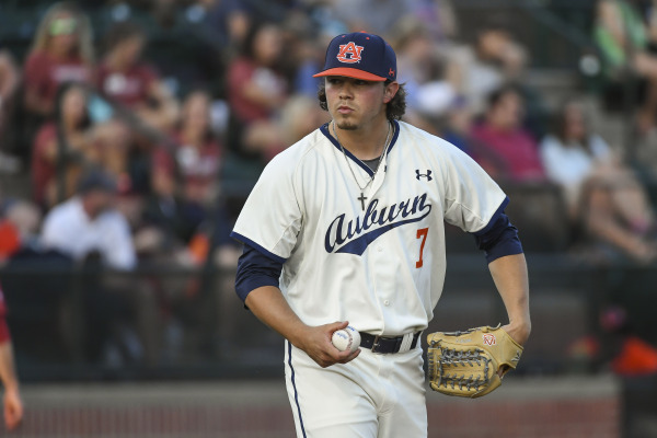
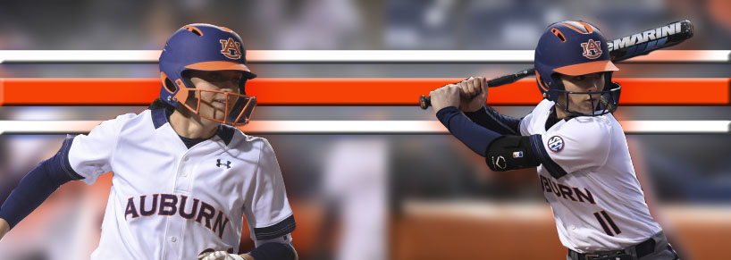
Baseball
The second year of the Butch Thompson regime at Auburn was not expected to be much. The media members voted that Auburn would finish tied for last in the conference before the season began. Then the Tigers hit the field.
The throwback uniforms are always a fan favorite.
(photo via Wade Rackley, Auburn Athletics)
Auburn was 14-5 heading in to conference play, swept then #5 Florida at home, and quickly rose through the many college baseball national rankings. The Tigers topped out at #4 before struggling through the tail end of the season. A 7-game losing streak was the low point of the year and put the team in a hole they struggled to climb out of with the remaining games.
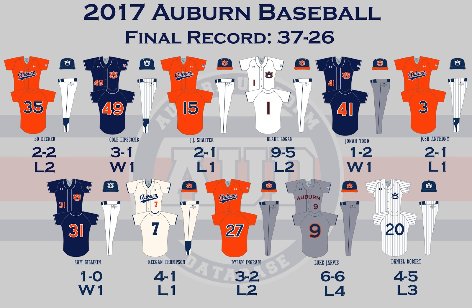
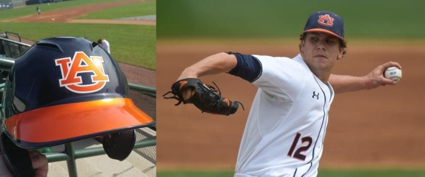
Even without sporting any brand new uniforms, there was plenty of uniform news for this Auburn baseball season. The beginning of the season saw the team heavily favor the blue and white hat that was typical saved for the pinstripe uniforms. The sans-orange hat was actually paired with five different combinations on the year. For the first time in over a year, the fan favorite and spectacular Auburn throwback uniforms saw the light of day. Unfortunately, the inconsistencies still existed from the last time they were worn.
Much like the Softball team, the Baseball program debuted a new batting helmet design this year. The new design featured an orange bill and AU logo that was to be paired with the matching hat. The old design with simply the white AU logo was worn with the sans-orange caps.
Of the eleven different combinations, four of them were brand new for the program. Auburn had previously worn blue tops on pinstripe pants, but never paired with the blue and white hat. The same holds true for the orange jersey and white pants combo. The Tigers paired the script Auburn orange jerseys with grey pants for the first time since the 2013 season, when the pants had a different design. We also saw orange tops and pinstripe pants for the first time this year.
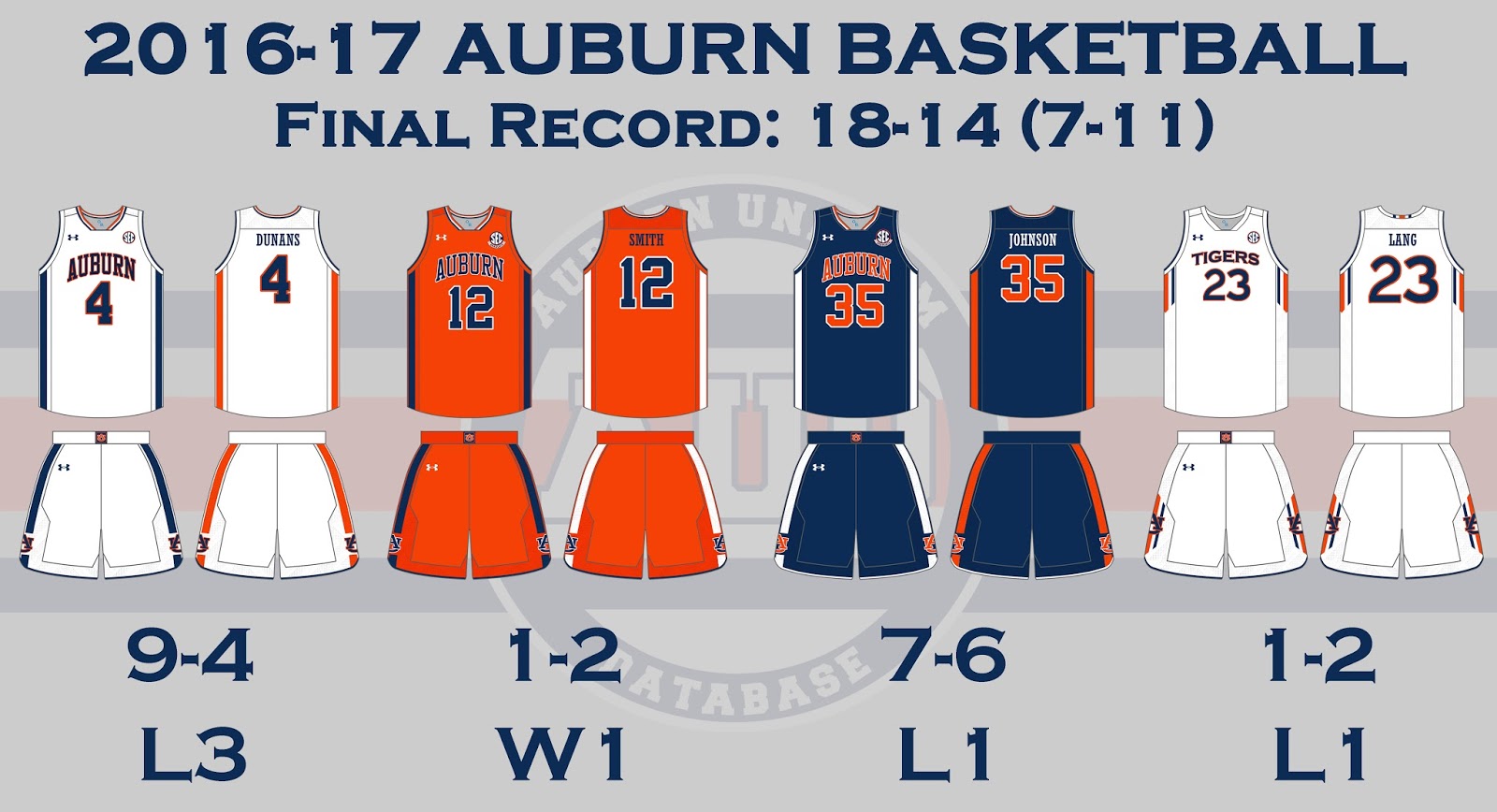
Men’s Basketball
A year that started out promising ended with disappointment for the Auburn Men’s Basketball team. Although the team finished with a winning record for the first time since the 2008-09 season, it was hard to not wonder “what if?” A lot of talent, little chemistry, and a few key injuries derailed the promising season for the Tigers.
Last year we saw Auburn transition over to a new throwback-inspired uniform design. This year, they were tweaked a little and updated to the newest Under Armour template. Many of the tweaks were considered improvements – such as the full collar stripes – while some were downgrades – the AU logo on the shorts moving over and interrupting the side stripes. I personally believe that pairing the new jerseys with last year’s shorts would be the ideal look for Auburn Basketball.
Auburn Basketball will be wearing new uniforms and the new Under Armour template this season. Here’s a side-by-side look at all the details: pic.twitter.com/VXOpfUNa6w
The new shorts were a little confusing for some, like Ronnie Johnson, who wore them backwards for a half against Boston College.
Auburn’s Ronnie Johnson wore his shorts backwards in first half vs Boston College. Fixed them for the second half (major h/t @jonwaldenshow) pic.twitter.com/uTQFtoDZaS
In addition to the updated uniforms, Auburn broke out a new set of alternates. These new unis featured Auburn’s infamous Northwestern Stripes that Under Armour continues to apply to as many places as possible. The biggest aspect of these alts is the chestmark – this would be the first time ever that Auburn basketball had worn the university’s nickname front and center on a uniform. The “Tigers” alternates debuted in the conference opener against Georgia, which resulted in a loss for Auburn.
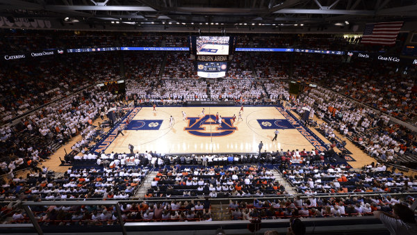
The Tigers played the season on a brand new court design. Gone was the previous orange-dominate court and in was a blue-based, blue-surrounded court. This is the first design change of the Auburn Arena.
A look at the new blue-based court design in the Auburn Arena (photo via Dakota Sumpter, Auburn Athletics)
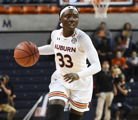
Women’s Basketball
For each of the last few years, I’ve added a new program to my uniform trackings. This year’s team was women’s basketball. Coach Flo’s team was impressive a second season in a row, making two straight NCAA Tournaments.
Auburn women’s basketball had new uniforms this season
(photo via Anthony Hall, Auburn Athletics)
Much like the other Auburn athletic programs, things looked great for most of the year, and then a poor finish kept everyone wondering what had happened. After a promising non-conference schedule, the Tigers suffered a six game losing streak during SEC play. The Tigers looked to compete for an SEC Tournament title, but were bounced in the opening round by Georgia. North Carolina State ended Auburn’s season in the NCAA Tournament.
Auburn broke out new uniforms this season, updating to the newest template from Under Armour. The new uniforms, like many other Under Armour items, heavily feature the Northwestern Stripes. Similarly to the men’s uniforms, the women had an AU logo on the side of the shorts that disrupted the striping. For some reason, mainly because of the template, the striping didn’t wrap all the way around the legs.
Even with the three new uniforms this season, the Tigers still wore a pink uniform that was multiple years old. I was told that the team expected Under Armour to send new pink uniforms, so they didn’t order any themselves. So expect to see a new set of pink unis – possibly in the same design as the other uniforms – this coming fall.
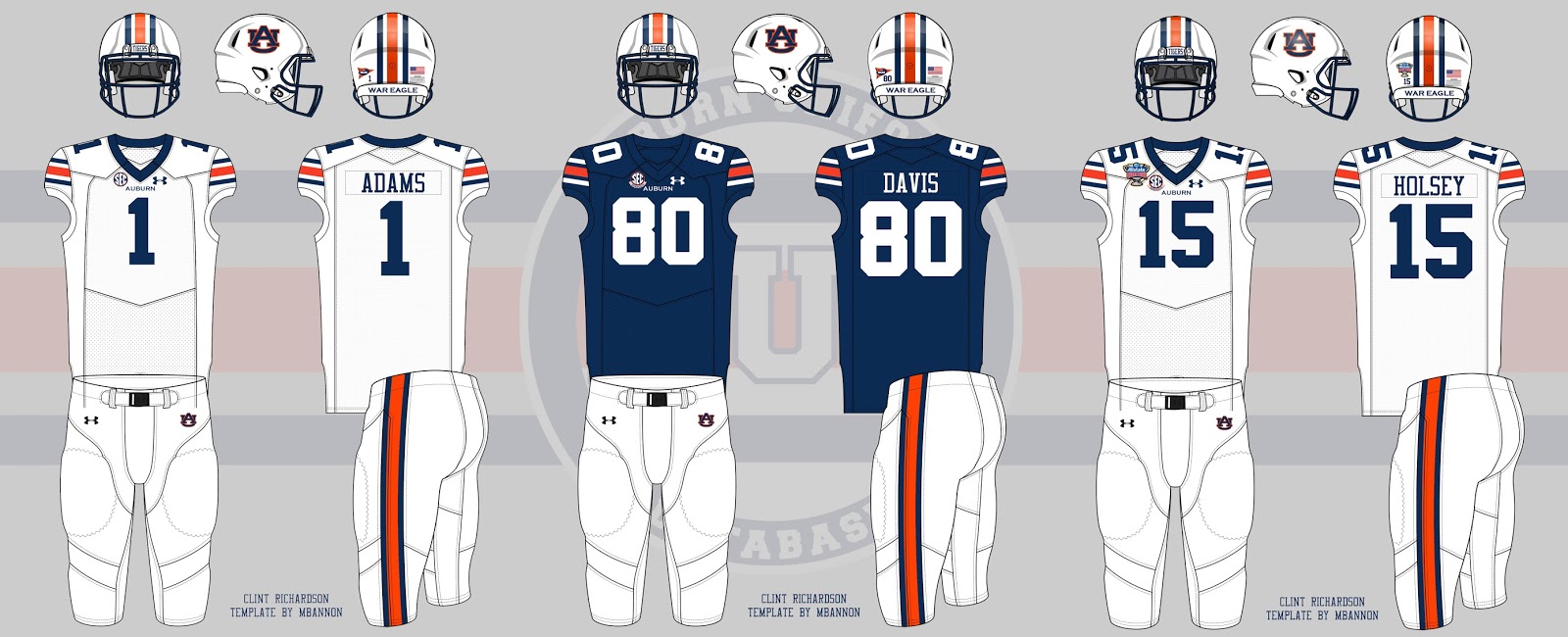
Football
It seems like the theme for many of the Auburn sports this year was “what if?” And it all started with football. The 8-5 season was marred by the rotating quarterback position, especially in the opening game against eventual national champion Clemson.
Before the season started, many Auburn players were spotted wearing the Riddell SpeedFlex helmet, one of the new helmets designed to help limit impact and concussions. The 2017 A-Day game also saw another new helmet – the Vicis Zero1 – being worn by Will Hastings.
The Tigers were expected to wear treDCALs this season, a new addition to thigh pads that add a silhouette of a logo or number, but they never saw the football field.
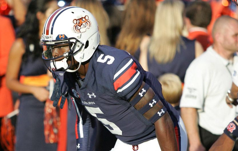
Montravious Adams was named SEC Defensive Lineman of the Week in late October after his stellar performance against Arkansas. During the game, though, Adams’s AU helmet decal was ripped off at some point.
SEC D-Lineman of the Week Montravious Adams had his AU logo ripped at some point during Saturday’s game vs Arkansas pic.twitter.com/2x0LLD5c6t
There wasn’t much new added to the football uniforms, other than a new compression sleeve design that was worn by a few players.
There were a few noteworthy sightings at this year’s A-Day game. You can see a collection of tweets regarding these sightings here.
Looking forward to the new season, Auburn will be fielding a football team for the 125th year. Will the Tigers mark the occasion with a special anniversary patch like they did for 100 years back in 1992? Details are here.
Soccer
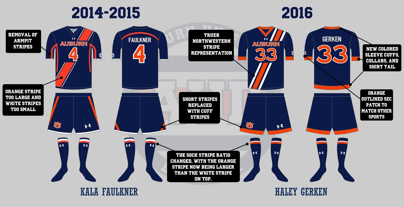
A year after a historic and emotion-filled season, the Auburn Soccer team came back and bettered the last year. After reaching the program’s first Sweet 16 and finishing the season ranked #12, the best ever, Auburn reached their first Elite 8 this past season, and was ranked #8 in the final polls. The Tigers racked up 17 wins in their 2017 season, breaking the previous program record.
The Auburn Soccer team was another program to debuted new uniforms this year, with these making tweaks to the design from the previous season. The Northwestern Stripe sash is tweaked to better reflect the true dimensions of the striping. The odd shapes under the arm and on the shorts are now gone, creating a much cleaner look.
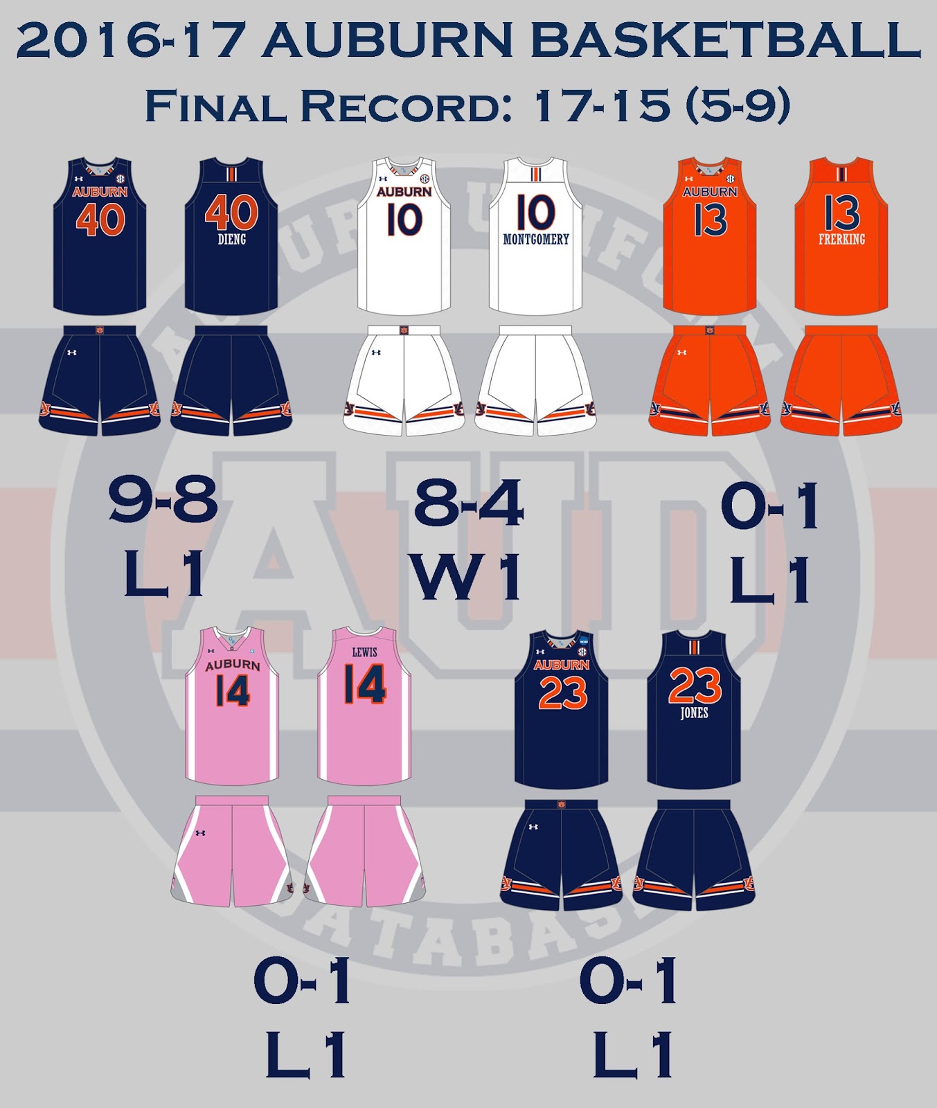
Softball
After reaching the final game of the Women’s College World Series last year, the goal for the Auburn Softball team was to win it all. With losing so much talent the year before, reaching the final series was going to be a challenge in itself. Unfortunately, and through more than their fair share of turmoil through the season, the Auburn Softball year was cut short after losing in the Super Regional round.
The Tigers changed from orange facemasks to blue midway through the season
Softball received a whole new line of uniforms last year, so there wasn’t much expected in that realm this season. Even with no new uniforms, there was still plenty going on the diamond for the Tigers. Auburn sported new batting helmets from game one against Oklahoma in Mexico. These new helmets featured a matte blue shell, orange highlights, and an orange facemask. The Tigers would change over to a blue facemask around the time conference play started.
Kasey Cooper wears the wrong batting helmet
(photo via Wade Rackley, Auburn Athletics)
Not all was well with the new helmets though. On March 2, against Liberty, the legendary Kasey Cooper was sporting the batting helmet from the year before. She would return to the orange-detailed new helmet the following day.
Kasey Cooper was subject of another uniform-related happening later in the season. Before the series finale game vs Missouri in mid April, Cooper mishandled a ball in warmups, resulting in a nasty black eye. To protect the eye and keep from having a repeat incident, she wore a protective mask for two of the three games in South Carolina.
Once post season play began, the Tigers were given another new batting helmet. The second helmet of the year was a glossy white lid, with blue highlights and a chrome-like AU logo on front. They looked better with some uniform combinations than others.
Casey McCrakin sporting one of the two new batting helmets
this season (photo via Dakota Sumpter, Auburn Athletics)
Although there were no new jerseys or pants for the Tigers, Auburn did add a few new uniform combinations to the history book. Against LSU, Auburn paired the white tops with grey pants and white socks. They would later do the same but with blue socks against Ole Miss. The white jerseys were part of four different combinations, with the two mentioned, the typical white/white/blue look, and a new white/white/white look that debuted against Missouri in mid April. The orange jerseys were also part of four pairs, with two brand new looks – orange/blue/white worn against LSU in the SEC Tournament, and orange/white/white against Cal in Regional play.
The orange/white/white uniforms were part of a last minute change for the Tigers. Due to NCAA rules, teams must contrast in post season play, with the home team wearing light colored uniforms and the road team dark. Cal won the loser’s bracket game to face Auburn immediately after. The Tigers were originally wearing all white and had to change to meet the rules.
Volleyball
I admit to not being a big volleyball fan, not understanding a lot about the sport, and not having paid much attention to Auburn’s program in the past. But this year saw a new uniform style debut, and of course I was all over it.
New uniforms for Auburn Volleyball this season
(photo via Dakota Sumpter, Auburn Athletics)
The volleyball team sported new jerseys that featured the Northwestern Stripes across the sleeves at the elbow. The weird part is that the stripes didn’t meet on the back side of the arm.
The Tigers showcased a blue and orange version of these new jerseys. Auburn had a pair of shorts that matched the tops with the stripes – as seen on the team’s intro video – but they sadly never wore them.
The volleyball team would finish the season 15-16 and missed out on post-season play.
In Auburn Uniform Database news, this past season was another good one for the site. Even with the slower news regarding Auburn uniforms, the content that was available helped continue to grow the site and my personal Twitter account. The website surpassed 400,000 lifetime views just before the calendar switched over to 2017. Last October, my Twitter account passed 4,000 followers as well. Individual article views have been the highest they’ve been in the history of the site. And in personal news, I graduated from Auburn University, the greatest school in the country, in May. Don’t worry, the uniform content will still be here with plenty more coming in the future.
The 2016-17 athletic season was a rollercoaster for Auburn Athletics. Great talent and expectations, losing streaks and bubbles busting. This past season was another success for this site, and I genuinely thank you all for your continued support.
Here’s to hoping for a better overall season of Auburn Athletics and more continued success for the Auburn Uniform Database.
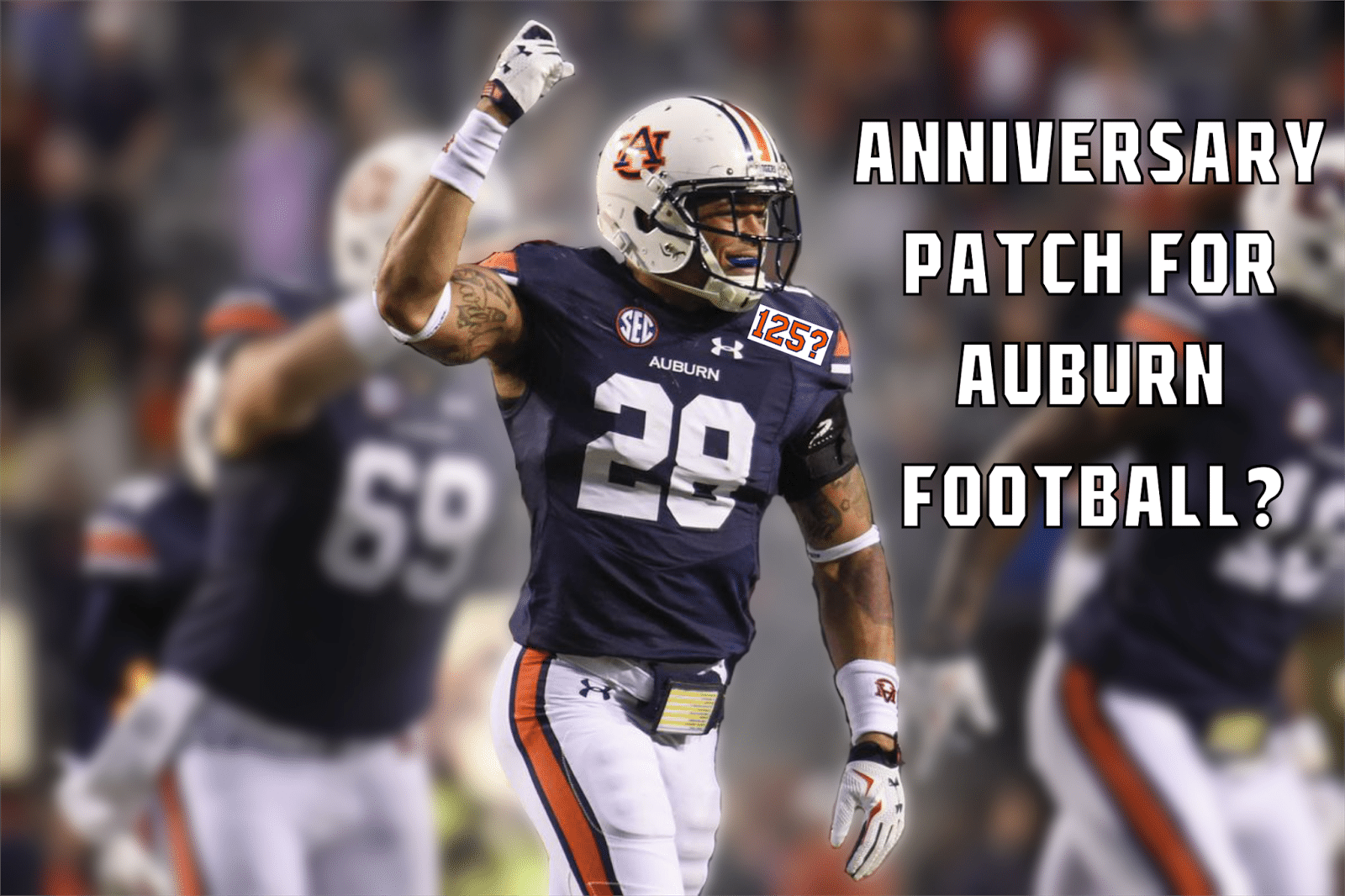
Over on Twitter, I typically get a lot of questions in regards to Auburn’s uniforms, people wondering where to purchase a specific piece of Auburn merchandise, and even some questions about gameday for the different sports on campus. Recently, I had a question posed to me that I hadn’t thought of whatsoever beforehand – Will Auburn celebrate the 125th year of football like they did the 100th anniversary?
Anniversary patches are an incredibly common aspect to athletic uniforms. The NHL celebrated 100 years with patches on every team once the calendar switched to 2017. Individual franchises sport special patches or decals for what seems like every somewhat significant number of years in operation. The San Francisco 49ers celebrated 70 years of football in 2016, but have anniversary logos for 40, 50, and 60 years in the sport.
With all that said, Auburn is a different story. Auburn doesn’t like to celebrate but the biggest of anniversaries. In 1992, the football program was 100 years old, so the team wore special patches commemorating the occasion. That has so far been the only Auburn football-specific anniversary patch sported on the football field. The entire SEC wore 75th anniversary patches in 2007-08, but more on that in a bit.
Auburn University’s 150th anniversary logo.
2014 marked the 75th year of Jordan-Hare Stadium, but the special logo was only found in select places – the schedule posture for the year and a few t-shirts were all I could find personally. I was surprised to see the logo wasn’t on the football uniforms at all. I expected it to appear on the back of the helmets in the form of a small decal, but it never did.
The basketball program also celebrated a centennial year during the 2005-06 season, and wore a special patch for the milestone. The odd part of this patch design was that it consisted on the clock tower from Samford Hall, not anything related to the basketball program. It seemed more of an academic patch than an athletic patch.
Speaking of academic anniversaries, Auburn University marked the 150th year of the school in 2006 with a special logo (right). The interesting part was that it was found on the football field at the 25-yard lines.
Going back to the SEC patches, there have been a few special patches worn. The 2007-08 season marked the 75th anniversary of the creation of the conference. Every sport under the SEC banner at all the schools wore a special patch throughout the entire year. Two years prior, when Auburn basketball celebrated 100 years, the SEC basketball teams had a throwback uniform program and another special patch to celebrate “Eight Decades of Championship Basketball.”
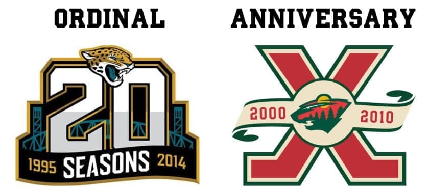
With knowing how Auburn, the SEC, and other organizations celebrate these milestones, let’s turn back to the 125th anniversary coming up. First off, a little lesson from a 2016 Uni-Watch article detailing the difference between an anniversary patch and an ordinal patch (well worth the read if you have time):
There’s a difference between an anniversary and an ordinal. An anniversary is the same as a birthday — you celebrate it at the conclusion of the numbered year in question. Example: When you turned 10 years old, you celebrated your 10th birthday, which was also the 10th anniversary of your birth. An ordinal is always one number ahead of the anniversary. Example: On your 10th birthday, you began your 11th year.
The Jacksonville Jaguars and Minnesota Wild took two different approaches to celebrating their history.
What’s the difference in terms of the patches? Take a look at the patches to the left. Notice how the anniversary patch has a cleaner look in terms of the years represented (2000 – 2010 rather than 1995 – 2014) than that of the ordinal patch.
What’s the point of all this? It’s that Auburn has been strictly celebrating anniversaries in terms of their milestone celebrations. The 100 year patches for basketball and football both were anniversaries, as were the 75th logo for Jordan-Hare and the 150th logo for the University.
That would lead me to assume that if Auburn were to celebrate 125 years of football, then the upcoming 2017 season would be the time to do so. With the end of the athletic season coming real soon, we should expect to see whether Auburn is planning to do this or not soon enough. The 100th anniversary was celebrated throughout the year on the football programs and the media guide that was printed well in advance of the season. Typically, the upcoming media guides are available around the time of SEC Media Days, which are set to begin on July 10th. Once the media guide is released, we will have a better idea of whether this is set to happen or not.
Personally, I would expect to see something similar to the recent 75th anniversary logo for Jordan-Hare. I would imagine to see a nice logo created, but not marketing all that much and won’t appear on the uniforms. I personally believe in celebrating every milestone (especially for smaller organizations), but it just doesn’t seem like Auburn – to me – to do something special for this one.
(image Albert Cesare – Montgomery Advertiser)
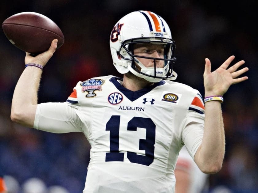
Another big part to think of is the space on the jersey itself. If Auburn were to create a patch for the season, then the front of the jerseys could very well get incredibly crowded. With the SEC patch and the Under Armour logo embroidered on the other side, along with the embroidered “Auburn” directly below, there’s not a lot of space left. Take a look at last year’s Sugar Bowl jersey. Notice how the bowl patch fits well on the shoulder area. But also think of how crowded it would look with yet another item on the opposite side. Let’s use the 100th anniversary logo just for proof of concept:
I’m not saying that Auburn should stray away from doing the anniversary patch solely because of how crowded the jersey could look. I’m just saying that, with today’s landscape of college jerseys, it’s something that needs to be considered. Something that might not have been considered back in 1992 when there wasn’t as much on the chest and football jerseys were a completely different style.
So what do you think? Should Auburn do something special for the upcoming season?
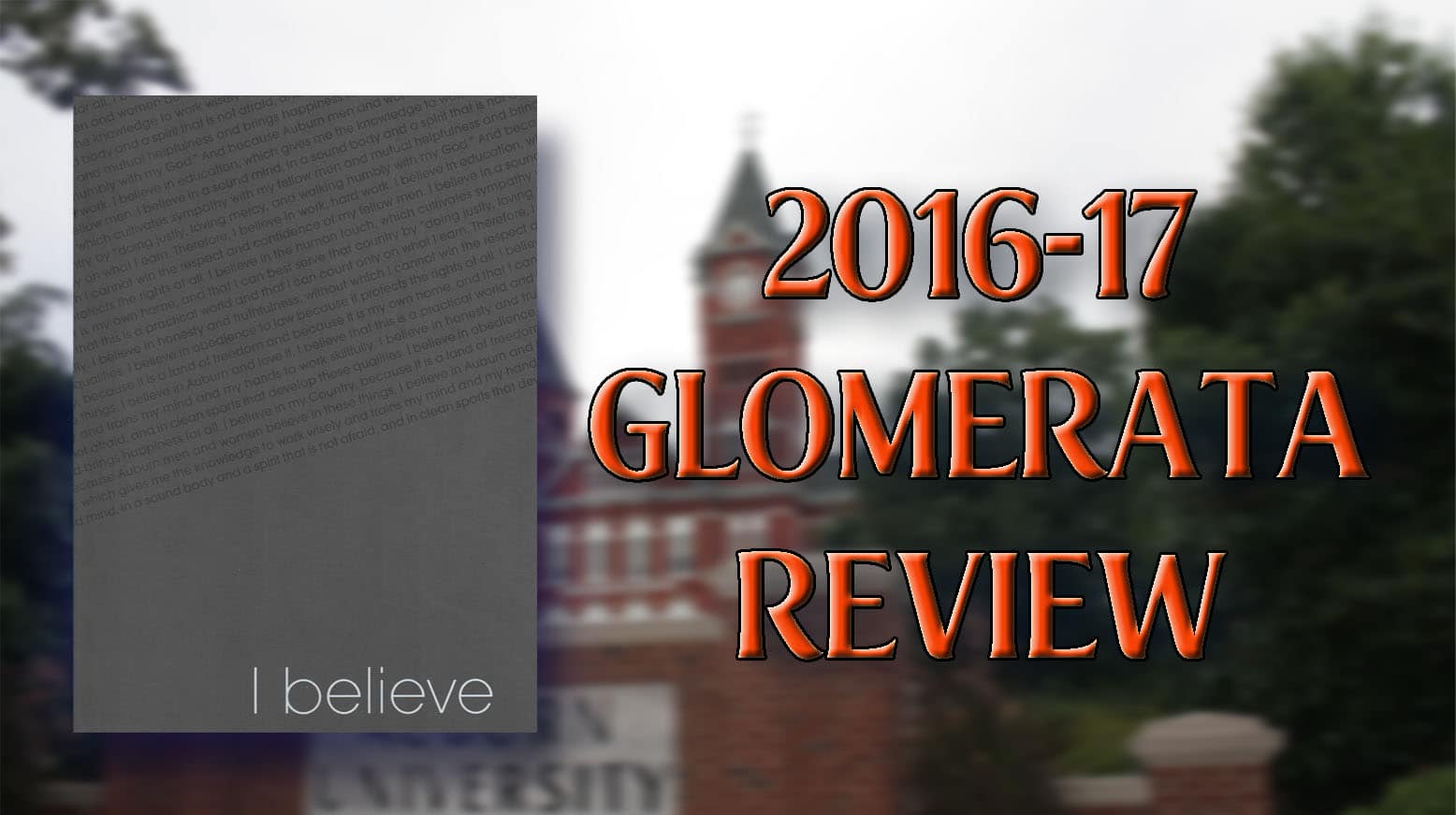
It’s finally time again to pick up the new yearbook. Did it sneak up on you? It sure did for me. That’s partially because the Auburn Glomerata team once again did a poor job marketing the distribution dates. I didn’t even know about it until the final day and I collect these things! Finally having the new volume in my hands, I wanted to write down some thoughts I have on it. I love to browse through these, and now having 55 volumes in my collection dating back to 1934, I think we have a good bit of material to base the current volume off of.
First thing you always notice is the cover. Last year’s cover was a great design, but the material used wasn’t the best. A little bit of dirt and some finger prints soon became nearly impossible to clean up. The 2016-17 Glom features a more “common” material, moving away from the previous year’s choice, and has a simple “I Believe” at the bottom right corner. This year’s slogan is countered by a diagonal printing of the Auburn Creed, which balances really well. The back cover continues the Creed writing and also has a really nice embeveled Auburn University Samford clock tower logo. The simple design of the cover would bleed into the heart of the Glom and be the design choice for the 400 plus page yearbook.
My favorite aspect of the 120th Glomerata are the photographs. Specifically the printing of the photos. They feel to be more like a true photograph printing rather than simply printing a photo onto a sheet of paper.This different style makes the photos really pop and grab your attention as your flipping through. The opening pages showcase a few bits and pieces of the Creed combined with (thankfully) relevant photos to reflect the meaning of the quotes. The page-by-page, quote-by-quote presentation showcases that meaning really well, makes it pop, and is truly impactful as you flip the pages.
The layout of the pages are all rather similar, with the photos being the dominant aspect, a page title that seemingly always contrasts in color, and a nice synopsis of the page’s information. Because the Gloms are becoming more photo-heavy, the written content is starting to lack. As I read through previous versions, the texts are so detail heavy. In most portions, it is incredibly easy to place yourself in the moment. One of the more memorable examples of this for me is when I first read the 1996 Glom and reading through the multi-page spread of Hurricane Opal. I didn’t know that Auburn was hit by a hurricane, let alone the damage. The writing paired with the photos was so powerful that it was hard not to imagine what it was like to be in Auburn during the storm.
Many of the pages tend to feel a little empty, with the myriad of photos sometimes not fitting the entire page. There are some areas that just have too much white space that could easily be filled in with even more photos and pertinent details.
The Glom did incredibly well with the full-page or two-page photos that are placed throughout the book. I liked the photos placed at the top or bottom of the page and spread across both open pages. I truly loved the full spread images, especially with the material used for the larger photos. A moon rising over Samford, a gorgeous wide angle shot of Jordan-Hare Stadium‘s stripe-out game, and a spectacular capture of a lighting strike behind the Samford clock tower. They all look so good in this presentation.
I started to notice that some of the photos looked familiar. And that’s going to happen with contributors and permissions and such. It’s just rather annoying, to me at least, when only a few select photos have the credit listed. I noticed one set of images that I knew came from the Auburn University Bookstore, and no credit. Even that can be a minor gripe, though. A more important gripe is that the captions on photos were sometimes wrong, if present at all. Checking out the softball spread, there are only three images, and only one caption was correct. The three images chosen showcase three of the seniors on the 2016 Women’s College World Series team – Tiffany Howard, Emily Carosone, and Jade Rhodes. Except whoever it was that built this page in the Glom offices didn’t realize they were looking at the wrong roster, as they labeled the shown players as the freshman on the current team – KK Crocker as Howard and Brittany Marasette as Rhodes. I understand that these are easy to make mistakes, but it’s something that can’t happen if the modern volumes of the Glomerata want to be respected.
Speaking of which, it was nice to see the softball and baseball pages actually use photos from the current year. Last year’s volume showed baseball from two years prior, and softball upwards of four years. For someone like me, that uses the Gloms to research something specific to the year (my athletic uniforms for each year), using photos that don’t match the season is completely inexcusable, especially when there are so many photos available to choose from.
I never care to look through the Greek life pages, even though they take up the largest percentage of the Glom, but this year’s layout was rather interesting. Previous volumes simply stated the individual fraternity or sorority, and the photos of the respective members. This year’s layout, though, does a little bit more, as it showcases the individual group’s crest, which is a fantastic way to differentiate each group. The sorority member photos are also a little different, being placed in an oval shape rather than the typical squares that the frats used. Some of the sororities also had a different font for the names – some went straight block font and others a more traditional cursive. Both were rather difficult to read for the small size, but nice to see a little difference. One sorority was actually printed in black and white, so I wonder if each organization may have had a little input on their respective spreads.
The organizations pages are maybe the biggest weakness overall. Some of the larger, more well-known groups have a little bit more in terms of descriptions and photos, but the majority of organizations are sharing the page with a few others. Only a few groups actually have a description. Many of the groups that don’t are the ones that I want to learn more about, know exactly what it is they are doing!
Overall, this is one of the better Glomeratas from my time as an Auburn student. Sadly, they still don’t hold up to the classics of the 1970s and 1980s and earlier volumes. It’s nice to see a simple and modern design stay constant throughout the book, but there’s still a few things that could be fixed. If there’s one thing that next year’s production team must do better is marketing. As mentioned at the beginning, I had no idea they were handing out Gloms this week. When I learned and went to the Auburn Glomerata Facebook and Twitter accounts, there was very little trace of promoting the distribution dates. As I walked around and picked up my copies today, there were still so many copies remaining on what was scheduled to be the final day. For the first time in nearly everyone’s academic careers, a yearbook is free. People need to know what the Glom is, know when and where to get it, and understand that it is free to grab. I am obviously a big proponent of the Glomerata, and I want to see many people, every Auburn student and faculty/staff member, pick up a copy and keep it for a long time.
One team is looking to defend it’s conference championship and run to the final game of the season. The other is looking to fight out of the bottom of the conference. Auburn Softball started the new season last week with a win over #1 Oklahoma. Auburn Baseball’s year begins this weekend, as the young team looks to gain some needed experience. Two teams on rather different paths, but each sporting some new looks to the new year.
Courtney Shea sports the new softball batting helmets vs BYU in Mexico (photo via Ryan Greenwod)
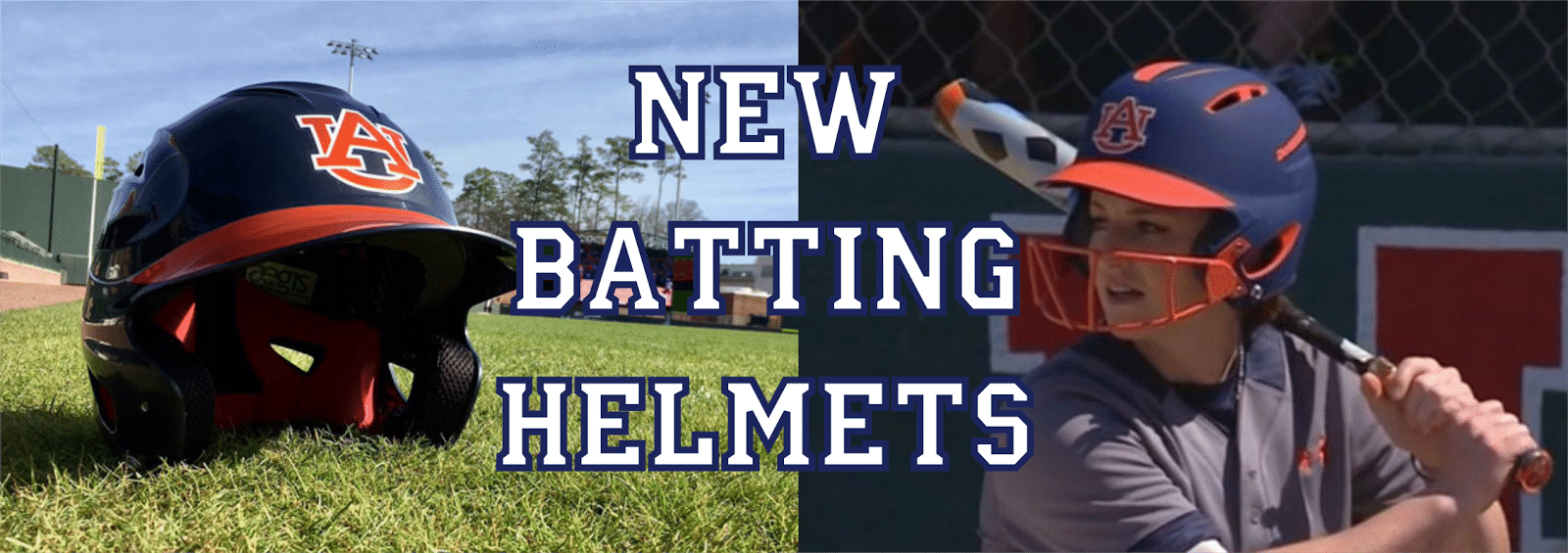
The 2017 season was expected to be rather uneventful in regards to uniforms for Auburn’s two stick-and-ball sports. Softball received a full wardrobe of new uniforms last season, and, after breaking out some new alternates last year, there’s some rumbling that Baseball could see their own upgrades for next year.
The uneventful-ness of the season ended rather abruptly on the first day of the Softball season. With the Softball team out of the country, playing their first four games in Mexico, the Baseball team hosted a viewing party on their brand new scoreboard while having their own practice. With Auburn being the designated away team in their opening day matchup against defending champion Oklahoma, we got to see the Tigers bat first. And that’s when the new additions to the team’s aesthetic look was revealed.
Having previously worn plain matte blue batting helmets, the new bright orange-detailed helmets were extremely prominent. The new helmets once again feature the matte blue shell (which looks a bit brighter this year) with matte orange details on the bill and around the ventilation areas, as well as on the facemask. Auburn used to be rather simple with the design on the back of the helmet, having just an American flag and the player number last season. The new helmets more so resemble a football helmet, adding a SEC decal and having the Demarini logo (the helmet manufacturer) bold in orange rather than tone-on-tone as in the past.
Since Myers took over previous to the 2014 season, Auburn has now worn three different batting helmets. Well, one helmet had two different decals. Myers’ first year and a half saw the team wear a matte blue lid with a white outline of the AU logo. About halfway through the 2015 season, the decal changed over to an orange AU logo with a white outline, making the logo much more prominent. The year before the coaching change, Auburn actually wore two different batting helmets – one featured a white lid with a blue bill and AU logo outlined, the other a blue lid that fades to orange, again with an outlined AU logo. Here’s a look at the last few Auburn softball batting helmets, including a look at the pride stickers used back in 2012:
While sitting at Plainsman Park on Thursday watching baseball practice and the softball game, a new batting helmet was brought out for a little while. The new baseball helmets simply added an orange decal to the bill, but the additions proves worthwhile. The helmets mimic the orange-billed hat that the team wears with the majority of the available uniforms. The previous design – blue without the orange bill decal – will be worn when the Tigers wear the pinstripe uniforms. The baseball team has stuck with the same batting helmet design for the better part of a decade now, so the addition of the bill-decal is one of the bigger changes in recent years.
I personally don’t think we’re going to be seeing much more uniform worthy news out of these two programs this year. Again, softball just recently got four new sets, and baseball is set for some new threads in the coming years.
Regardless, you can be sure that any news will be covered here and on my Twitter account. For all your Auburn uniform news, be sure to follow the Auburn Uniform Database, like the AUD Facebook page, and follow me on Twitter for even more uniform news. Also, you can support this site by purchasing AUD t-shirts and other merchandise.
https://auburnuniforms.com/wp-content/uploads/2017/02/helmets.png5651600Clint Richardsonhttps://auburnuniforms.com/wp-content/uploads/2023/07/AUD-10-Anniversary.pngClint Richardson2017-02-13 07:11:002023-01-22 21:42:31New Batting Helmets for Baseball and Softball


