Crazy Auburn Concept Uniforms – Round 6
Auburn uniform concepts are always a divisive topic and seem to be a common mid-summer, no-sports content filler.
Here at the Auburn Uniform Database, we do it a little differently. Rather than simply sharing “sick” designs that have zero context whatsoever like some other outlets, we include the fans to produce some never-before-seen ideas that are (mostly) completely off the wall!
This marks the sixth edition of one of my favorite new traditions. I put out a few requests on the AUD social media accounts to collect the ideas that came in. Like always, some are actually decent designs and others should never be connected to Auburn Athletics whatsoever.
This series is simply meant to showcase designs and to prove just how spectacular the current Auburn uniforms are. In no way are we suggesting that these uniforms should ever be produced and worn or that they are even good looks. And I’m certainly not the best at Photoshop.
With all that out of the way, let’s dive into another 12 uniquely awesome Auburn concept uniforms!
Oh boy. New LA Rams uniforms meets Auburn Tigers? 😆
— Colin Turner (@colin_turner95) May 22, 2020
Colin has been a mainstay in this series, often suggesting some Auburn-NFL crossover look. He stays on brand here with the controversial new Los Angeles Rams uniforms.
This design is mostly just a direct copy of the Rams look. Horns are placed on the helmets and sleeves, gradient numbers and stripes, and the silly nametag patch on the chest.
I often try to match a design to better fit Auburn’s aesthetics, but it’s difficult to find a good comparable design to the classic ram horns.
While the horns make no sense for the Auburn Tigers, can’t say I hate them being rendered in orange and blue!
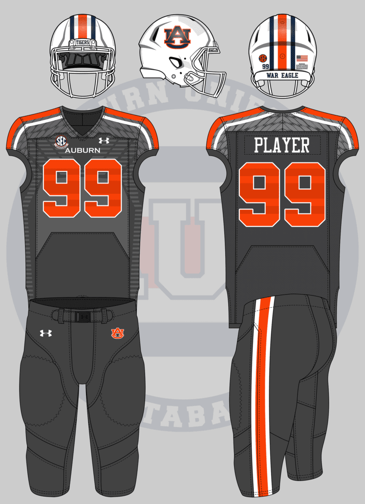
These. But Auburnized. I’m talking adidas shockweb pattern, metallic numbers and all. 😬 pic.twitter.com/pTW0t7rcBQ
— Chad Fields (Vols Uniform Boy) (@CfieldsVFL) May 22, 2020
While Tennessee has a wonderfully classic uniform design, poor Chad has been tortured by bad uniform decisions. I know these horrendous uniforms have haunted his nightmares for years now.
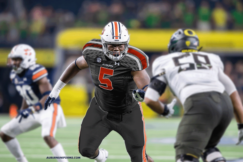
The Tennessee jerseys had a lot of details going on. The adidas patterns showing through were one thing, but there were also the shoulder checkerboard stripe and the number details.
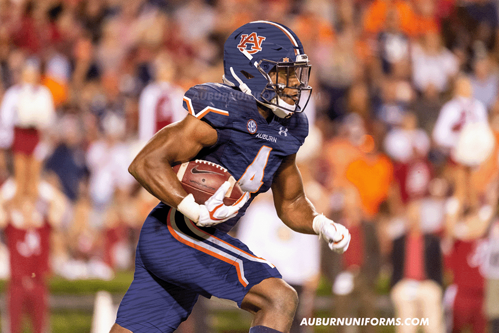
With Auburn having its own set of stripes, I placed the Northwestern Stripes across the shoulder yoke rather than the checkerboards. The stripes also are sublimated over the numbers. I threw on a nice white mask to tie everything together and best match the UT designs. Unlike Chad’s reference photos, these Auburn jerseys feature a white outline around the numbers to better pop against the dark grey.
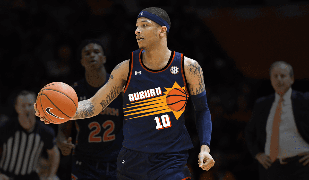
-basketball uniforms that like the Barkley Era Suns uniforms
-you may have done this before, but a football uniform that combines different throwback elements like Penn State did
-football uniforms based on eagles being the mascot: Philly helmet wings, Oregon jersey wings, etc
— WookieATC78 (@WookieATC78) June 19, 2020
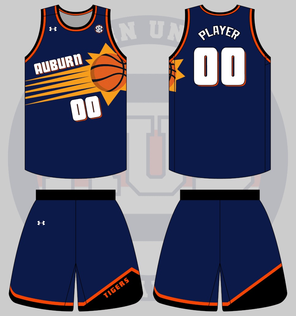
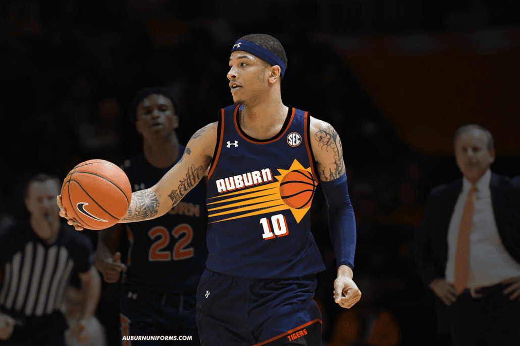
When you give me multiple options, you give me the freedom to pick what I think works best for this series! I thought the Barkley-era uniforms would be a lot of fun to recreate, so that’s what we have here. Enjoy!
Like I said with the Rams uniform, I like to make these designs more Auburn-esque than simply copy/pasting. But it’s difficult with such iconic design elements like the horn helmets and the shooting sun-basketball.
I wanted to avoid adding any black to the uniform and stick to Auburn’s navy, orange, and white, but it just didn’t work. The purple and black Suns uniforms are much more iconic than the whites.
As college programs continue to mimic throwback professional uniforms, this set certainly isn’t out of the realm of possibility and I would not be upset if it were to happen.
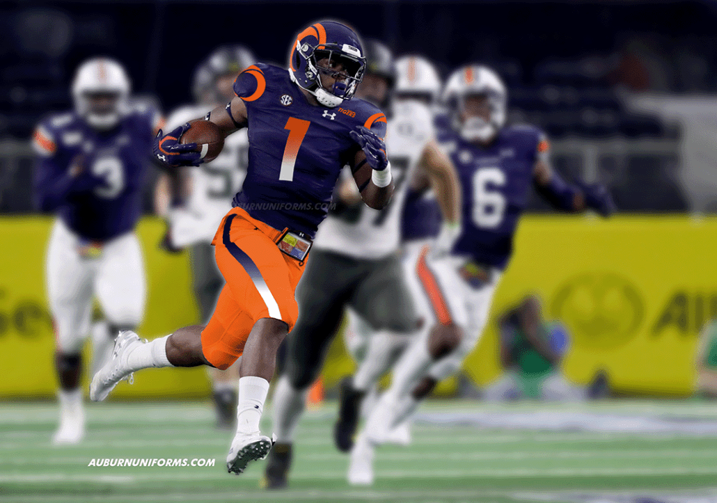
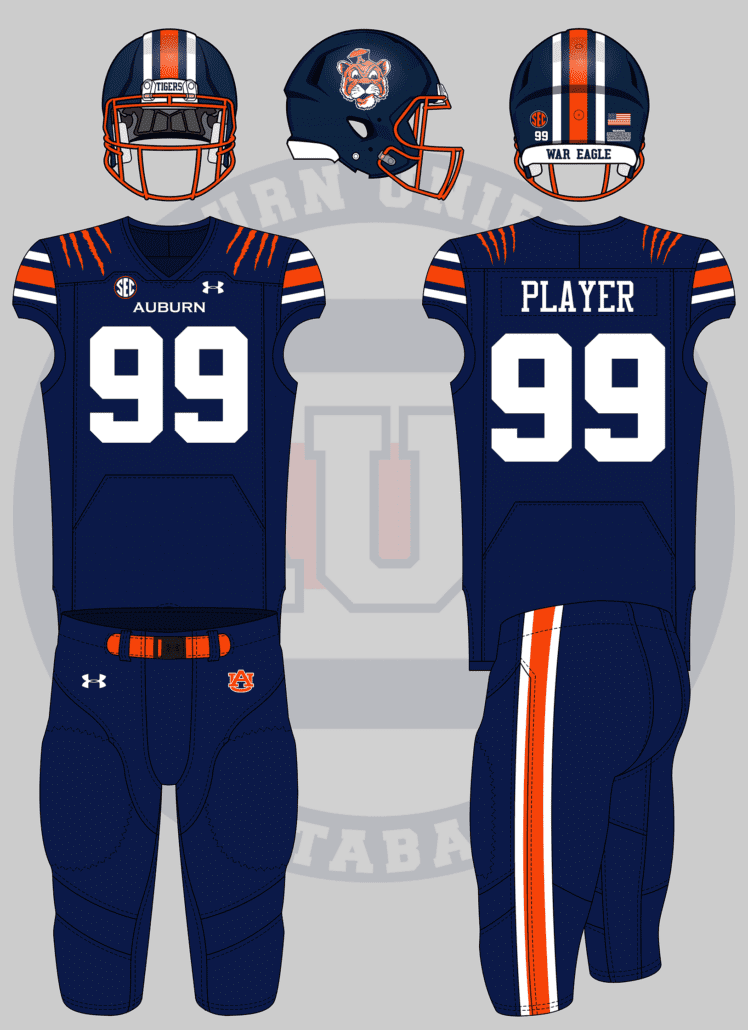
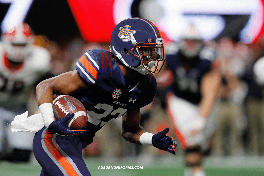
So here is my idea for a football uni since I saw I could send one on Insta, A Navy blue helmet with the old tiger with a hat logo on both sides of it with the same stripes and an orange facemask,Same blue jersey but with orange claw marks on the shoulder, and navy pants+stripes
— josh.iguess (@JoshIGuess11) May 23, 2020
When selecting what suggestions to use, I try very hard to make sure we don’t duplicate any look from previous entries. All-navy has been rather popular (and will continue to be), but I liked the idea of the orange mask on the navy helmet. That was my biggest sell here.
Yea, I adore that helmet. I want one myself now!
Despite Twitter’s character limits, it can be beneficial for me when the suggestions are incredibly direct and detailed. Josh spent much of his time here working on the helmet details, so the rest of the uniform was left to me.
I wanted to stay more true to Josh’s suggestion, so I simply added some navy pants and removed the TV numbers on the shoulders for the tiger claw mark stripes. I’m not too keen on this personally, as it’s rather generic and has been utilized by some adidas teams in recent years.
The real winner here is that helmet 😍.
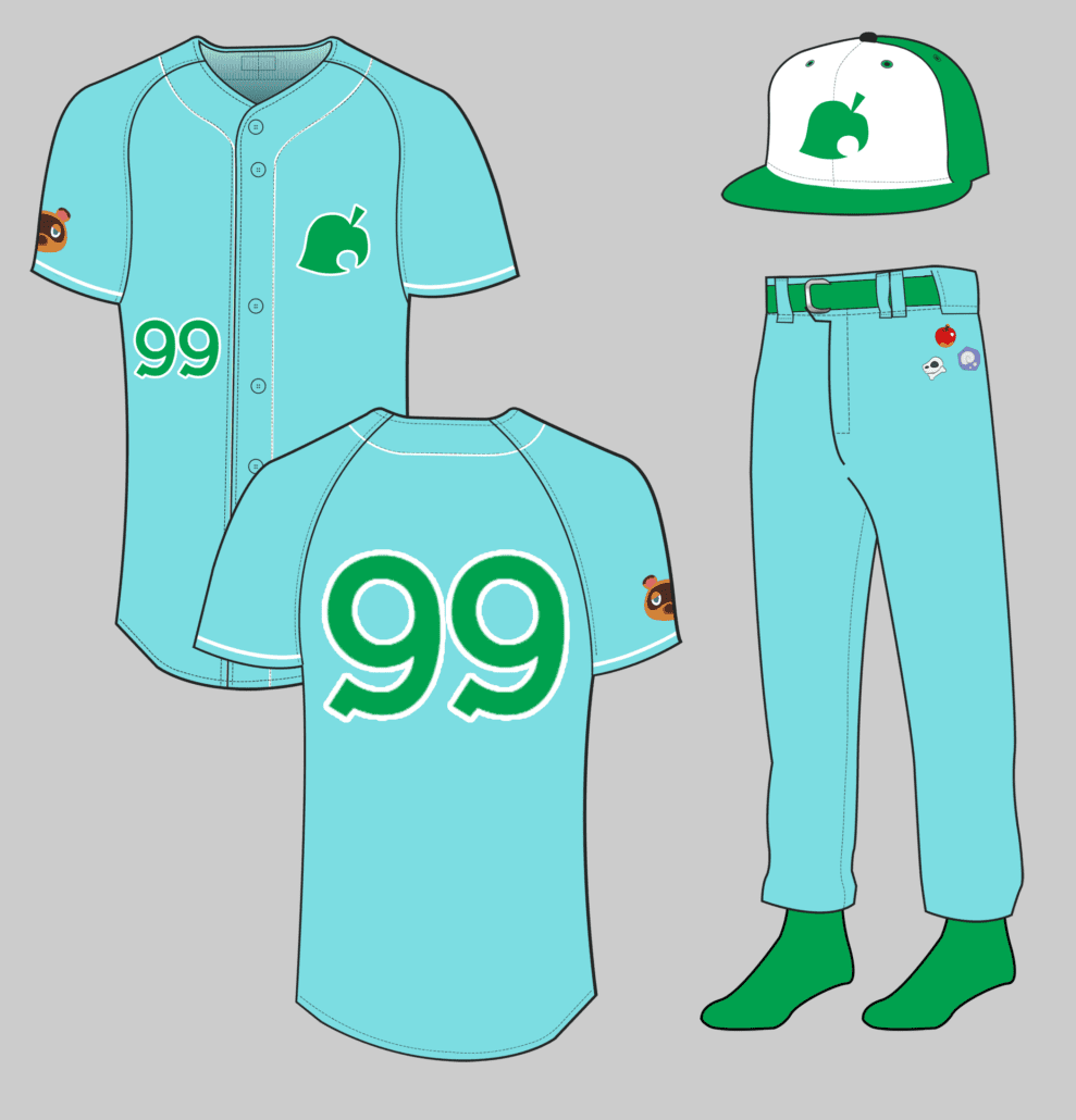
Can I get an animal crossing themed Uni? Doesn’t matter which sport, I’m thinking Isabelle/Tom Nook island attire… pic.twitter.com/nQ62WYRqFu
— Laura Church (@lauratysonnoble) May 22, 2020
Animal Crossing has been the summer hit and I can’t get enough of this game.
Animal Crossing is such a unique and in-depth game that it was difficult to find an approach for this uniform. I went with the mentality of a Minor League baseball team and their often over-the-top promotional uniforms. Much like Super Hero Night supersede the team’s branding, so does Animal Crossing take precedence over Auburn’s!
The main colors come directly from the special Animal Crossing Nintendo Switch edition. I took the leaf logo and made that the main element for the hat and jerseys. The number font comes directly from the Animal Crossing logo font.
The fun detail of this uniform comes on the pants. In the game, the characters hold many items in the pocket inventory. The pants will feature several different icons from the game placed on the hip, where pockets would go if baseball pants had traditional pockets. Each player would have a different combination of icons, making each pair unique.
Alright, football unis based on:
2014-15 men’s basketball blues
2001 softball whites
Baseball pinstripes and/or off-white
2019 baseball blue digital camo capAlso, updated version on the 1930s greens. pic.twitter.com/YgIjDHxFIg
— Adam Sparks (@adamsparksphoto) June 19, 2020
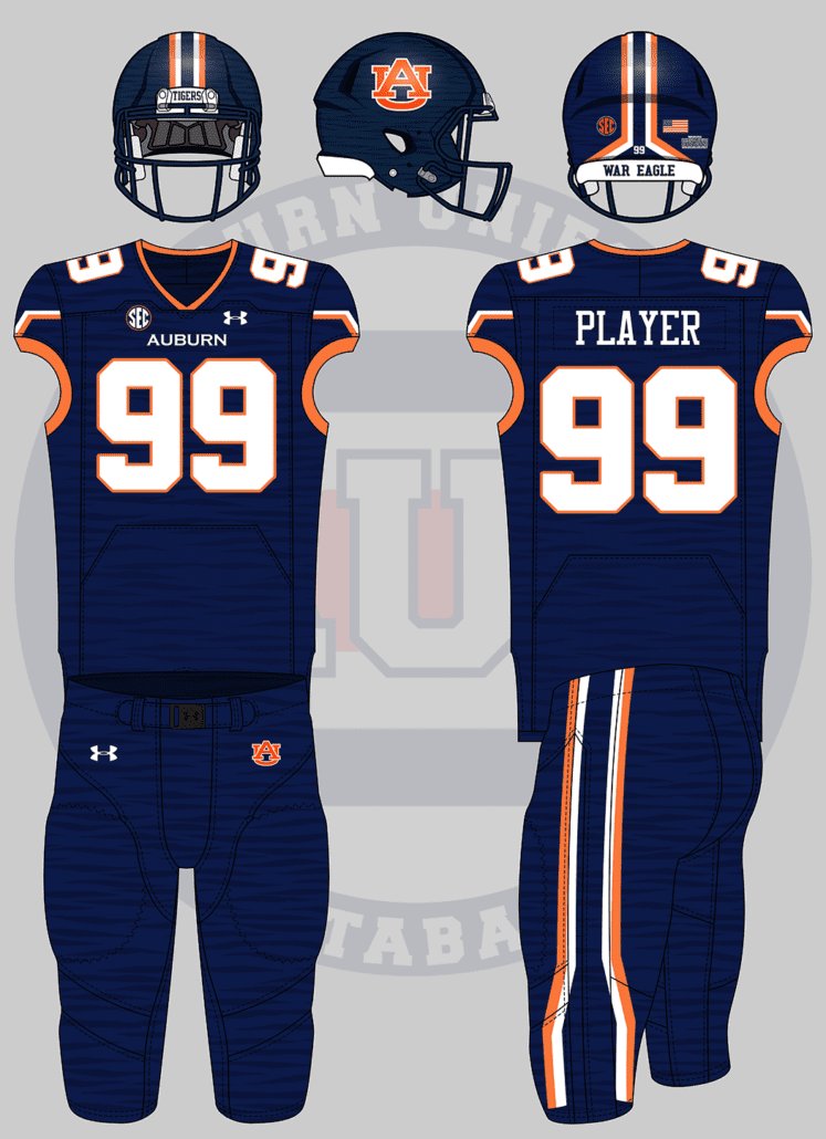
Adam also handed out a lot of ideas. I had to throw out Adam’s preferred idea because camo is the one thing that I won’t allow in this series! I wanted to do something different and thought the 2015 Men’s Basketball alternate uniforms would make for a very unique look.
The MBB uniforms had a few key elements that were transferred over to this football design – “bracket” stripes, sublimated tiger stripes, and a lighter shade of orange.
Let’s start with the stripes. The brackets were mimicked directly on the pants but set to a V-shape on the shoulders similar to Cincinnati’s uniforms. The helmet stripe also features the brackets, which creates a unique look that bends outwards in the back.
The lighter orange is used throughout. The numbers have an orange outline to match the basketball uniforms along with an orange collar and sleeve cuffs. The basketball uniforms had the tiger stripes on the bottom half of the jersey and all over the shorts, but I went all out and put them on everything head to toe.
The bracket stripes make this such a unique look, especially the helmet. I wouldn’t mind seeing this helmet concept on my shelves.
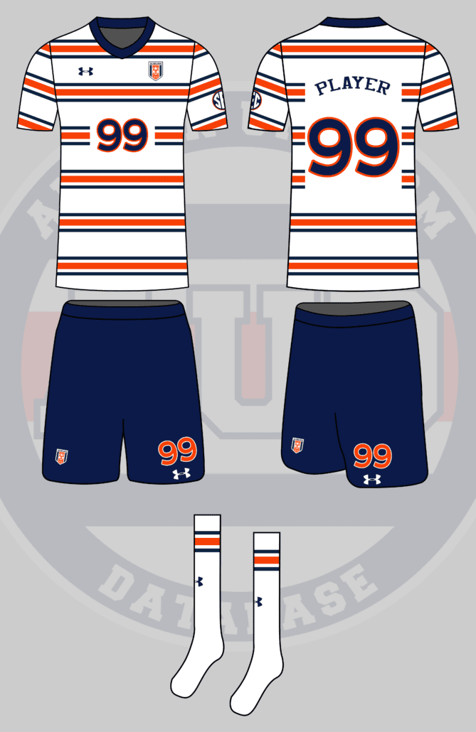
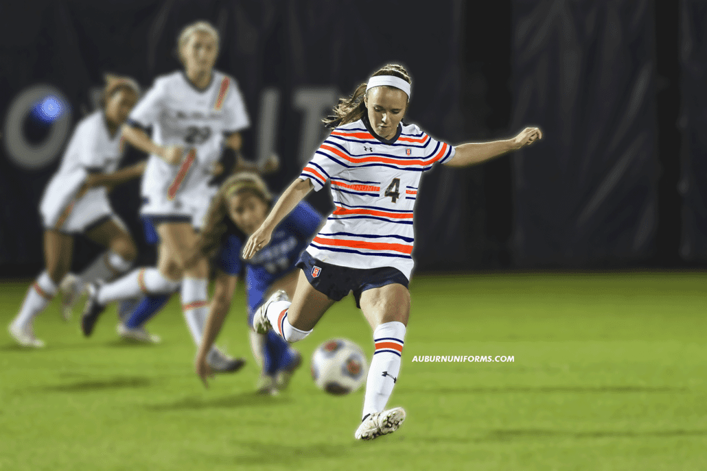
Auburn soccer in the style of the 2012 USA “Waldo” Jersey but replacing the red stripes with Northwestern stripes, and changing the number font, etc. to Auburn branding
— Brennan Scott (@brennanscott7) May 27, 2020
As you can imagine, football uniforms dominate this concept series. I wanted to include more non-football designs this round, and Brennan hit it out of the park with this suggestion. I’m admittedly no soccer fan, but the Waldo kit was enough to catch my attention.
The Northwestern Stripes are such a staple at Auburn, so much that multiple sports have worn them over the years. Auburn Soccer’s striped sash uniforms were perfection.
Where the USA kit works with the bold stripes, I think the multiple, thinner stripes might be a detriment here. I matched the number of stripes on the USA kit for this design, but maybe removing a set or two would do better.
While it isn’t used on the kits, Auburn does have a soccer crest. I wanted to use it here, but it sure does get lost in the stripes.
This design has some potential but could be tweaked some to make it worthy of being worn on the pitch.
That will conclude the “sane” concepts. Now we get into some of the more wild looks.
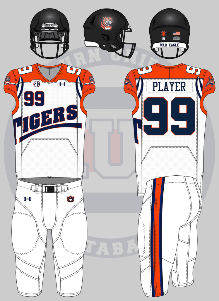
Uniforms based off teams from failed football leagues in Alabama. Birmingham Barracudas and Thunderbolts. pic.twitter.com/Mwg1thopqB
— Matthew (@MRickG_) May 27, 2020
This is exactly the concept idea I look for! Something unique that has zero chance of ever making the field is what makes this series fun to make.
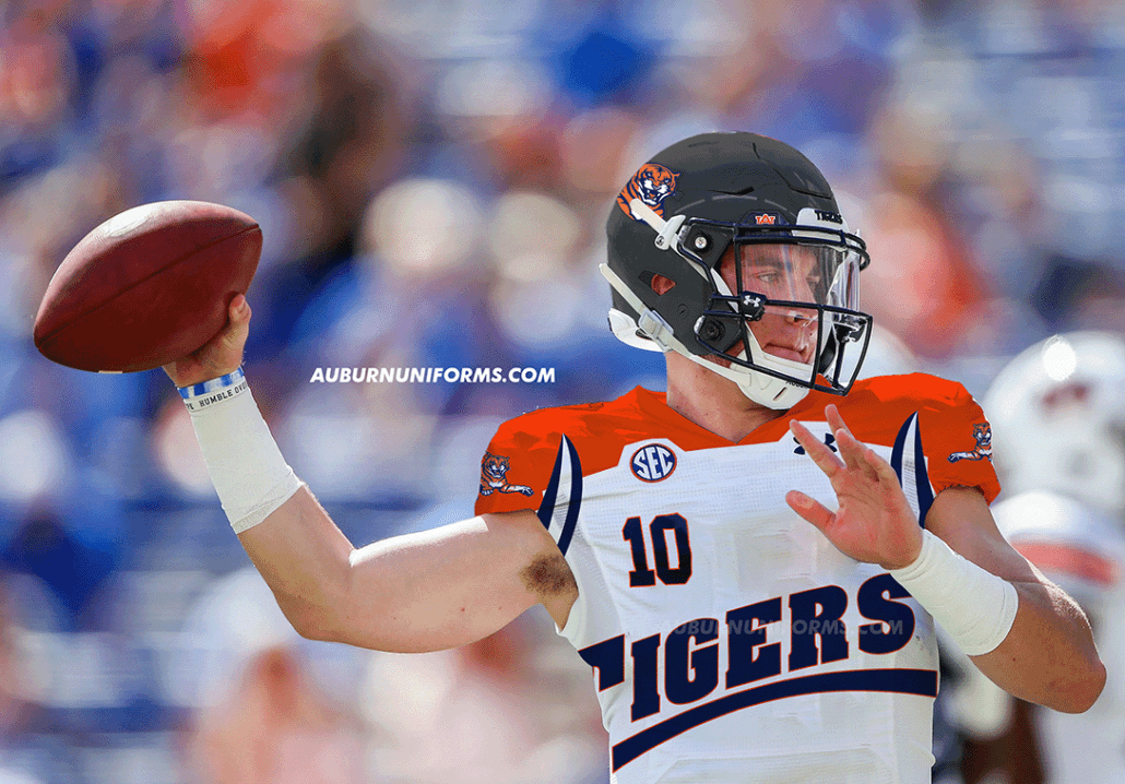
I went with the Birmingham Barracudas as they had a more intriguing look. The ‘Cudas had several logo variations built specifically for their usage on the uniform.
I went with the 1990s Tigers wordmark for a bold look on the chest. The jumping tiger gets placed on the shoulder and the tiger head is placed on the black helmet.
The Barracudas had many colors to work with that we didn’t with Auburn. I added a lighter shade of blue to the pants stripe but didn’t use it elsewhere. The shoulder yoke is orange to just make this as bold of a look as can be.
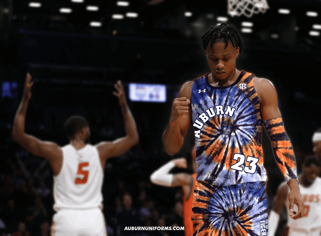
Gimme an orange and blue tie die basketball jersey plz
— Drew Crowson (@SonOfCrow2) June 20, 2020
You got it, Drew!
Creating a tie-dye pattern in Photoshop is more complicated than I imagined, so I found a nice orange and blue pattern on Google that also worked to mimic a tiger tail.
I thought about mimicking the New Jersey Nets’ tie-dye uniforms of the 90s, but it wasn’t bold enough for my liking. A tie-dye base uniform isn’t enough on its own, so I made the team name wrap around the swirl on the front and the player name on the back follows suit.
The number is placed awkwardly on the front and the team nickname is on the shorts just to drive home the craziness that tie-dye naturally embodies.
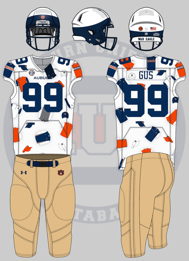
A uniform that is just a collage of the different vests and visors that Gus has worn over the years.
— BH (@6pintsofkramer) June 19, 2020
Good thing I already have a collection of Gus Malzahn’s gameday wear…
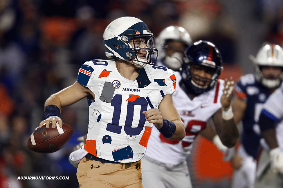
I went back and forth for a long time trying to figure out how best to fulfill this request. I thought about making the jersey look like a vest and then scratched it. Finally, I went with the idea to make the vests and caps as polka dots on the jersey.
The jersey has multiple vest mockups with the hat and visors being placed in between. The Ditka-inspired vests are placed on the shoulders to act as the traditional Northwestern Stripes. My favorite detail is with the numbers, as at least one digit on each player’s jersey will “wear” a Gus visor.
The rest of the uniform is meant to mimic Malzahn’s gameday apparel. The pants are khaki-colored and the helmets are meant to look like Gus’ usual visor choice.
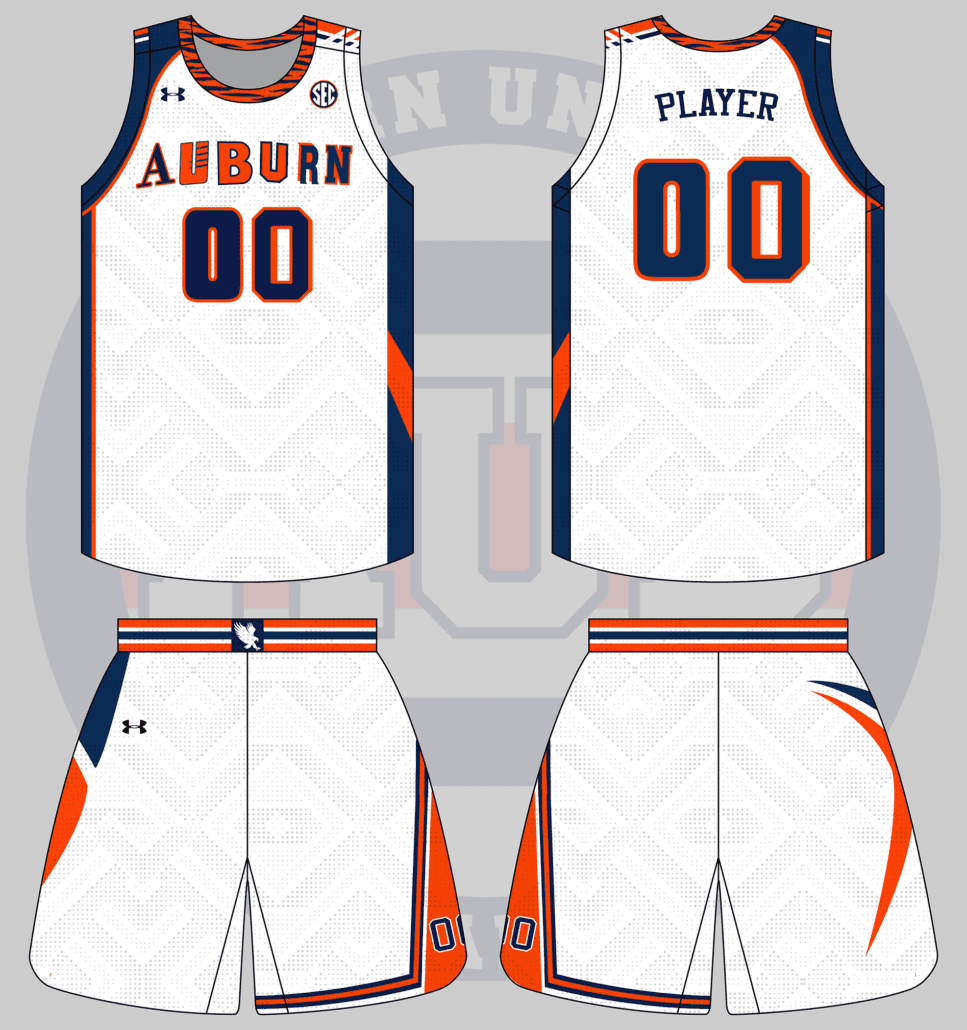
I want to see a basketball jersey that uses an individual element from as many different older (and current) Auburn jerseys as possible. Each individual letter and number can use a different font, it can be asymmetric as needed to add more.
— Carter Michaels (@TheRealCMike) May 22, 2020
I can always count on Carter for suggesting the perfect basketball idea.
I did just as Carter requested and included many different design elements from the last 60 years of Auburn basketball uniforms.
Just like the football team, Auburn basketball was rather traditional and unchanged for several years. Even when something changed, it was something simple like the side panels or shorts design. I wanted to throw in as many unique details as possible, and the more crazy uniforms are from the turn of the century.
Here’s a breakdown of each element utilized. You can view the original uniforms here:
- Right shoulder – short striping from the 2019-20 uniforms
- Left shoulder – large striping from the 2012-15 uniforms
- Collar – the beloved tiger stripes from the 1998-2000 uniform
- Right side panel & shoulder yoke – from the 2006-09 uniforms
- Left side panel – from the 2002-03 white uniform
- Shorts Waistband – from the 2019-20 uniforms
- Right shorts leg – from the 2009-12 uniforms
- Left shorts leg – from the 1969-72 uniforms
- Numbers – first digit from 1999-03 uniforms, second digit from 2002-03 white uniform
- Wordmark – each letter is from a different wordmark
- A – used from 1996-2004
- U – used on 2000-01 orange jersey (made letter orange rather than white)
- B – current font used since 2004-05
- U – used from 1969-79
- R – used on 2000-01 white jersey
- N – used on 2002-03 white jersey
All in all, 13 eras were included in this uniform design. As crazy as it is, I kinda like it!
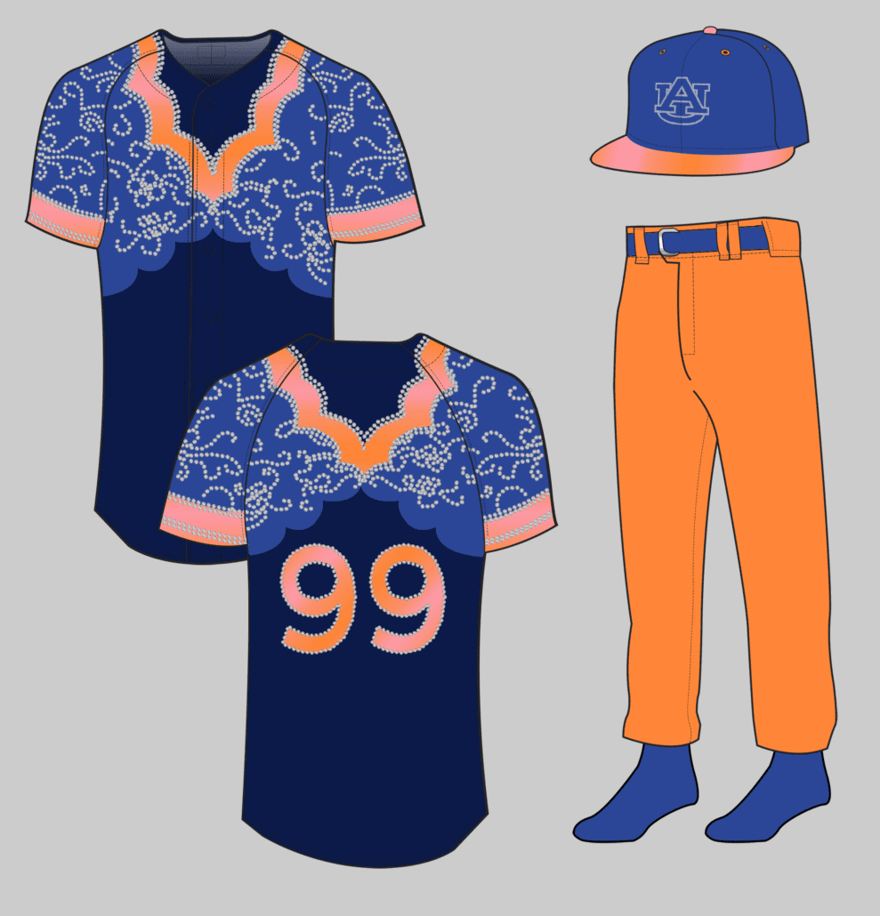
okay so my idea is baseball (with stirrups, not pants) based on the ice skating gymnastics uni. baseball caps have a tiara or ribbon on them around the front to match. the socks are SPARKLY and have the same ombré of the uni
— jillian (@wtmjillian) June 20, 2020
Jillian earned a permanent spot in this series after giving us a beautiful gold sparkle uniform with a cape! She brought another great concept last year, and she didn’t disappoint this round.
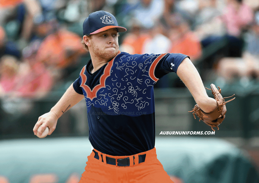
I’ll admit it – this one kicked my butt. I’ve wanted to expand the Auburn Uniform Database to cover gymnastics leotards, but one of the many hurdles is accurately replicating each design. This uniform took a lot of learning and experimenting, but I was finally able to replicate a number of the rhinestones.
This was another direct replication from the source material. The jerseys are nearly 1-to-1 and feature a navy base, a lighter blue upper-portion, and a light orange used around the sleeves and collar. The orange also has a subtle orange-to-pink gradient, much like the team’s leos.
As leotards don’t have numbers, pants, or hats, we had to get a little creative. The numbers are rendered in the same pinkish gradient with rhinestone outlines. The pants are orange with some lighter blue details on the belt and socks. The hats also feature the lighter blue for the crown color with the visor being pink and orange once more. The AU logo on the cap is simply outlined in rhinestones to mimic the logo on the back of the leotard.
Another twelve concept uniforms are complete. They’re crazy, they’re garish, but that’s the point! Once again, these designs are completely for fun and meant to be crazy and bad. We are not here to push for these designs to actually be worn.
Big thanks to everyone who submitted ideas again this year! We had over 40 suggestions that had to be cut down to a workable number. Those cuts weren’t easy, as a lot of interesting ideas were left on the cutting room floor. Just because your idea wasn’t selected does not mean it was a bad one.
Hold on to your ideas and let’s do this again next summer!
Did you enjoy this group of Auburn concept uniforms? Want to see more like this and other Auburn uniform news and details? Be sure to follow the Auburn Uniform Database, like the AUD Facebook page, Instagram page, and follow me on Twitter for even more uniform news. You can also purchase your favorite team’s merchandise through Fanatics, with a portion of your sale going to support this website.






Leave a Reply
Want to join the discussion?Feel free to contribute!