Crazy Auburn Concept Uniforms – Round 7
It’s the greatest time of the year again! Yes, it’s time for another round of insanely crazy Auburn concept uniforms!
Each year, I put out a request on Twitter for the craziest, silliest, sometimes possibly realistic concept ideas that the fanbase would like to see come to life.
Why? Well, the summer is often riddled with talking heads discussing alternate uniforms. The same horrendous designs have been passed around for years and it’s time to add more fuel to that fire!
This series also works to show that Auburn’s uniforms are pretty good as is. The Tigers don’t need to make any changes or bring unnecessary alternates into the rotation just because.
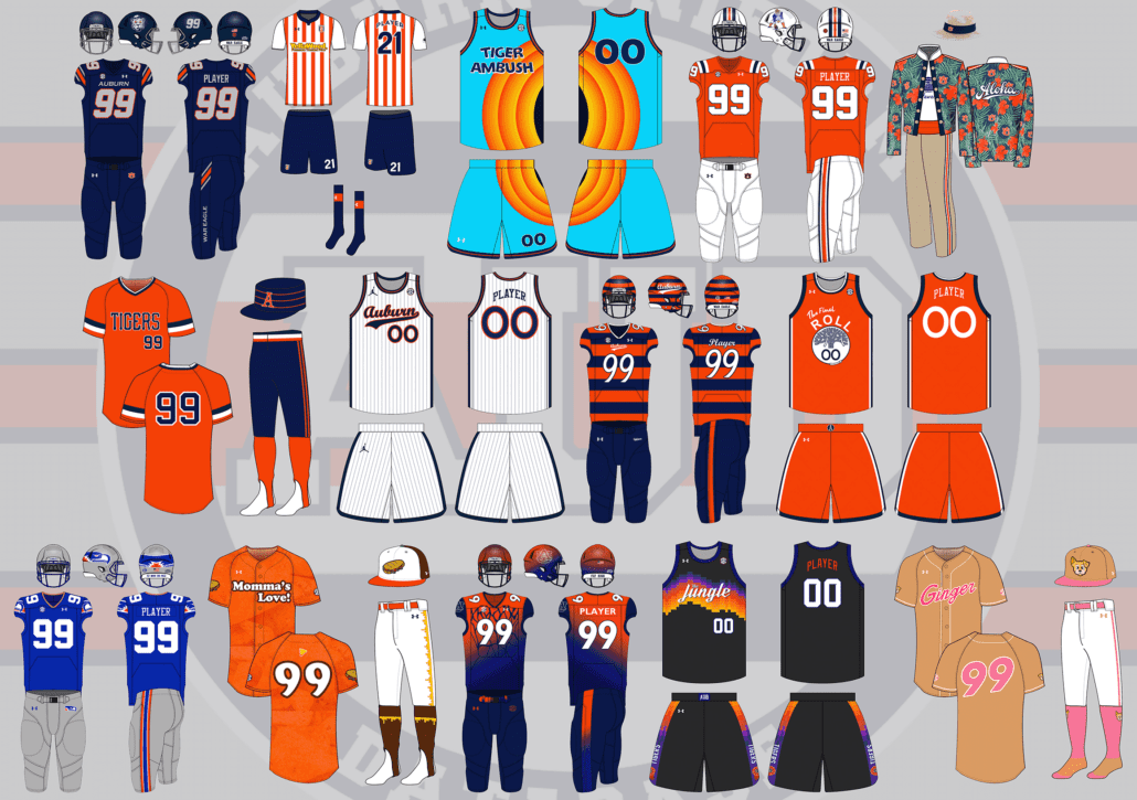
This year saw a record number of concept suggestions – over 50! There’s no way I could have tackled all of them, so below are 14 uniform concepts that are ever more silly than in previous years.
A few things before we get started:
- First off, these designs are intentionally silly, obnoxious, and over-the-top. That’s the point. No one expects to see these hit the field or court. We aren’t saying Auburn should wear these whatsoever.
- I am not a designer nor an artist. This is always a fun project that helps push my very limited creativity. These are not the world’s best Photoshop jobs and they were never expected to be so. Again, they’re goofy on purpose.
Alright, that’s enough of that. Did your suggestion make the cut this year? Let’s dive in and take a look at this year’s crazy Auburn concept uniforms!
(You can click on all of these images to view a larger version. For Chrome users, consider utilizing the HoverZoom+ plugin as well)
Auburn on Boise State designs for Coach Harsin? pic.twitter.com/iCX1nwJzJz
— Dan (@danctweeter) June 9, 2021
The perfect suggestion to start off the 2021 concepts!
In December when Harsin was hired, I joked about making the field orange to celebrate. But what better way to honor Harsin’s alma mater than bringing Boise’s aesthetic with him!
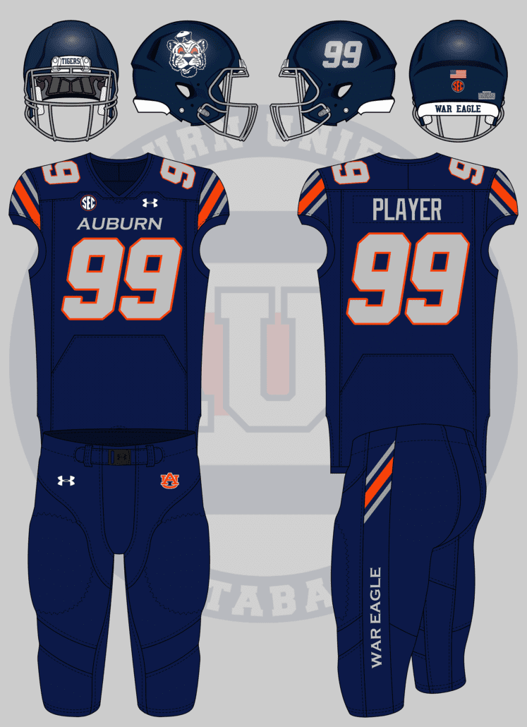
Since 2017, Boise has worn jerseys that showcase a horizontal stripe across the sleeves. Stripes are Auburn’s forte, so it was a simple choice to keep the Northwestern pattern but give it the fast-angled approach. Boise also uses grey as opposed to white, so Auburn’s colorway reflects the same change. The chest mark is larger and italicized, much like the Broncos look. The number is now a light grey and also gets the italicized treatment with a new orange outline.
When Boise State first revealed this set, many wanted to see the diagonal stripes carried over onto the pants. And Nike apparently felt the same, as it’s included in the catalog version of this design. So of course I had to add the stripe to the pants for Auburn’s version. And rather than going with the team nickname on the pants leg, we’re going with the battle cry because, well, it’s better!
The last bit here is the helmet which is now navy with a silver facemask. I tried my hand at recreating the large Bronco logo into a tiger head, but let’s just say my logo-making skills are, uh, trash. So a ghostly Sailor Aubie now populates the right side of the shell with the player number on the left (a terrible trend I for one can’t wait to see end).
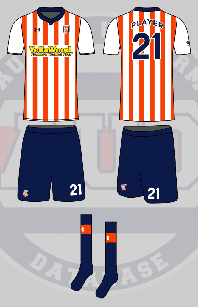
Soccer uniforms modeled after Premier League uniforms – small Auburn logo/crest in the upper left corner and a giant sponsor logo in the center (Under Armour, YellaWood, Verizon, etc).
— M (@MRickG_) June 9, 2021
One thing that this crazy concept series has lacked in recent years is better representation from sports other than football. We’ve done a few soccer uniforms in the past, but it’s always enjoyable to bring new kits to the pitch.
I’ll admit, I know very little of soccer and absolutely nothing of the Premiere League. So after a little research into the designs worn across the pond, I settled on a few common looks, mainly with the vertical stripes. As soccer tends to change designs each season, this look isn’t based on any one team’s design but rather a few different aspects I liked.
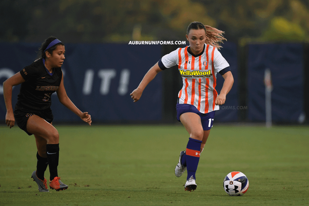
The base jersey is white with orange stripes across the torso only for Auburn’s Premier League look. I thought of making the stripes Northwestern Stripes, but that was done last year only horizontally. The solid orange works well here, too. I also kept the sleeves bare to emphasize the torso stripes and avoid being pinstripe-like or looking like a referee.
One of the best features of soccer uniforms I’ve always liked is the large number on the shorts, so of course, that was utilized. The shorts go navy to create some balance with the white tops. The socks also go navy with a larger orange stripe solely to house the Under Armour logo.
Yellawood gets the front chest advertisement location. I debated what colors to use – white, yellow, navy – but settled on yellow and black to really pop and fit better into Yellawood’s (somewhat obnoxious) branding design.
The final details include the Auburn Soccer badge being placed on the left chest and the player name and number being rendered in the Copa America font from a few years ago.
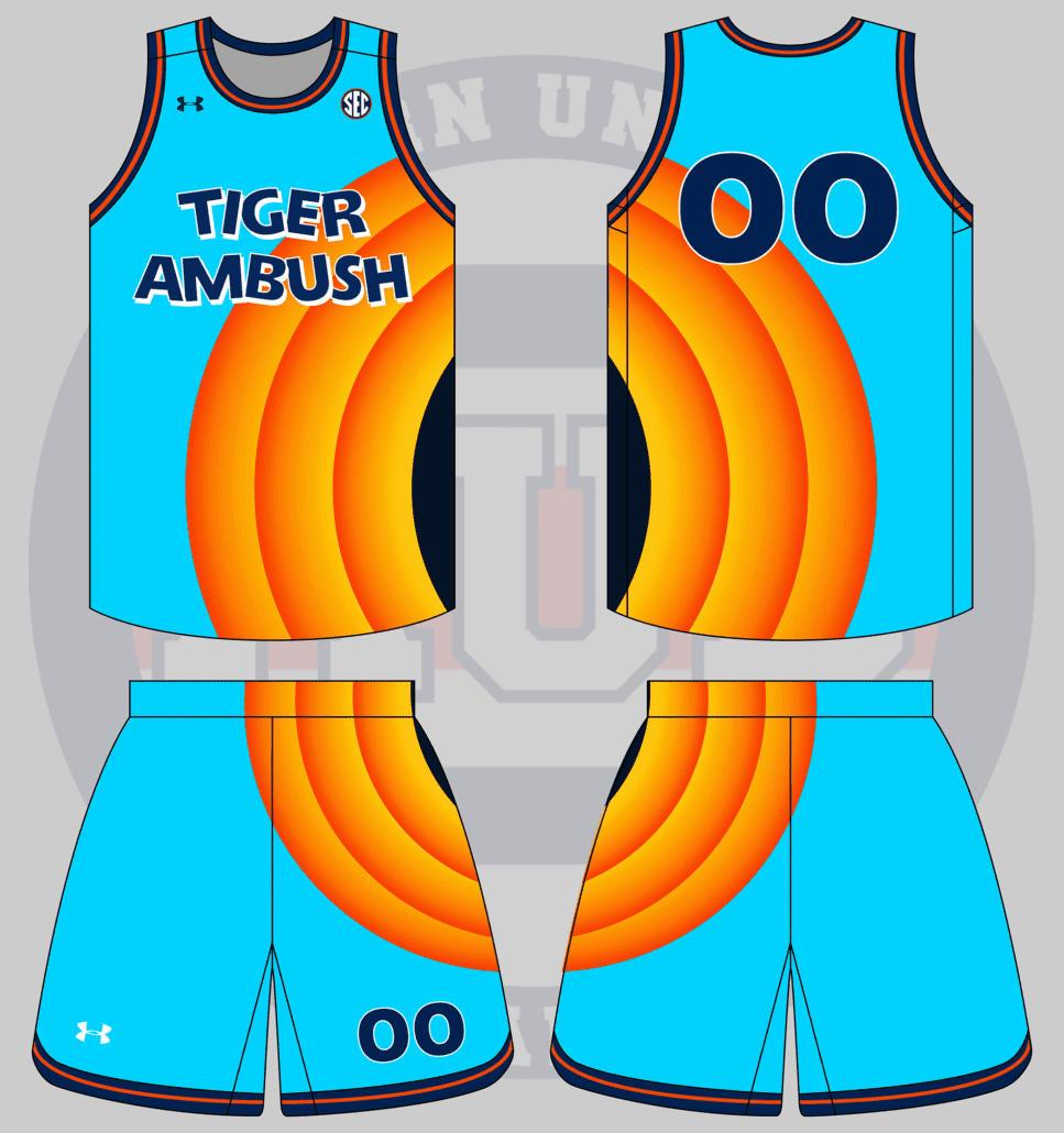
In honor of the new Space Jam, I want an Auburn version of the new Tune Squad uniform, complete with a massive Auburn logo of your choice incorporated on the side. pic.twitter.com/tfLbyhPAkZ
— Carter Michaels (@TheRealCMike) June 9, 2021
Carter is always the master at bringing the best ideas to this series!
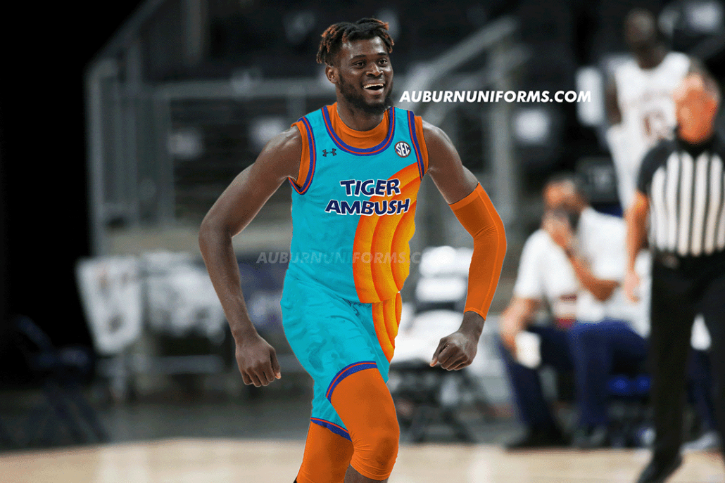
I went off suggestion a little bit and stuck with the Looney Tunes gradient circle design on the side. It works well enough. I did think of adding an Aubie logo to the center of the circle to replicate Porky Pig poking out, but it wouldn’t have been very visible with this template.
The Tune Squad name and logo are pretty iconic, so I really wanted to play off of that. I found a compatible font to work with and discovered that the name for a group of tigers is either a “streak” or an “ambush.” Ambush is a much better choice here, so that’s what dons the front of these uniforms.
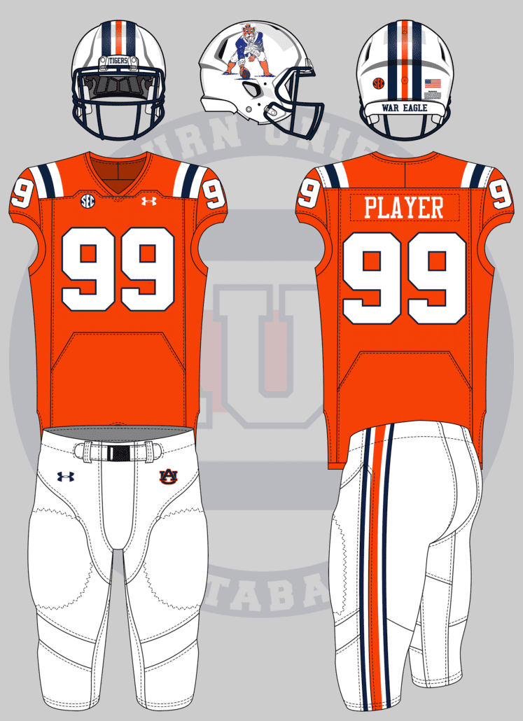
— Bruce Pearl’s Afro (@AU_barner2) June 9, 2021
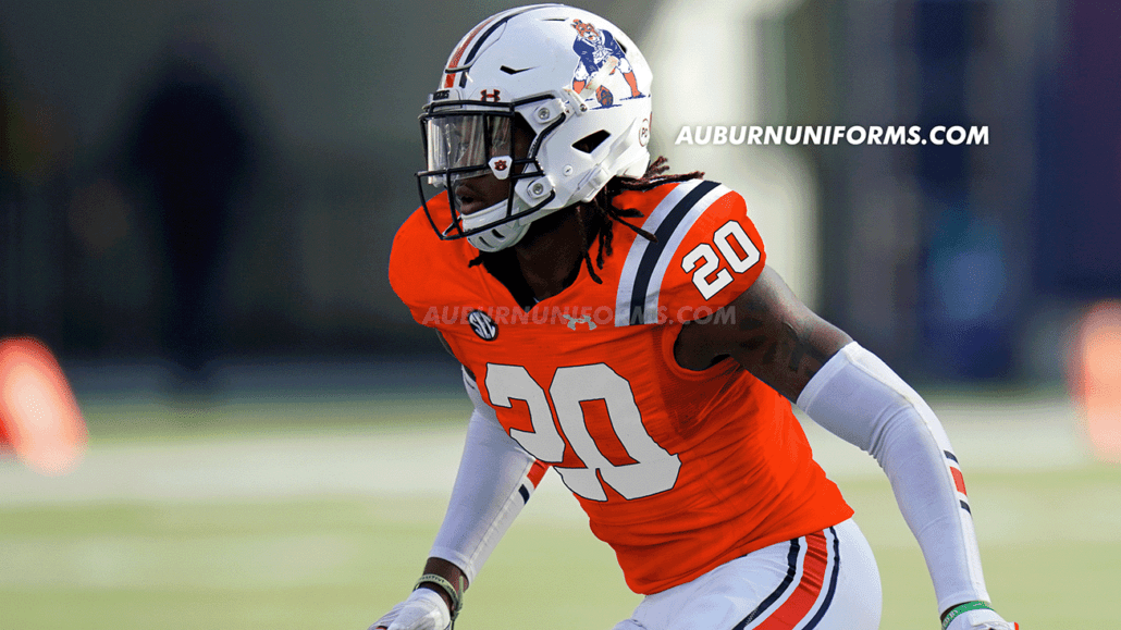
New England’s Pat Patriot throwbacks are among the best in the NFL. It’s a shame the league’s one-helmet rule has mothballed this look – along with Tampa’s creamsicles, among others – for the time being. Now that the rule has finally be repealed, it’s time to bring these beauties back!
This one’s a rather straightforward design. New England’s red now becomes Auburn’s orange while the royal blue is now Tiger navy. The sleeve stripes are replaced with UCLA stripes across the shoulder. The helmet and pants see a slightly modified approach to the traditional stripes.
Pat himself has seen a little makeover, now donning the Sailor Aubie logo on his head! The arms and hands were also made orange with some tiger stripe additions to tie the whole thing together.
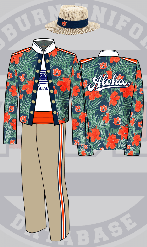
Alright. I’m thinking the band uniform but based on an auburn Hawaiian shirt. Probably blue or white pants. With a beach/straw hat themed shako. Very obnoxiously on vacation vibes
— Laura Church (@lauratysonnoble) June 9, 2021
Yes! The first marching band uniform concept of this series!
This was another suggestion that was a struggle. I wasn’t sure where to start or what template to use, as band uniforms aren’t nearly as consistent across the board as sports uniforms. So, I started with the Auburn University Marching Band uniform design that was worn from 1995 to 2006 for the split jacket look.
The outer portion of the jacket features the floral Auburn pattern as found on a few retail items as a base. The “break,” for lack of a better word, across the center is used to resemble the floral shirt being unbuttoned. Underneath is a white t-shirt with a corny Hawaiian tourism design, just to push the “obnoxiously vacation” vibe that Laura wanted. The back of the jacket is the best, featuring a large, bold Aloha script!
The pants are no longer blue or white but rather khaki-colored. We keep the stripes for good measure here.
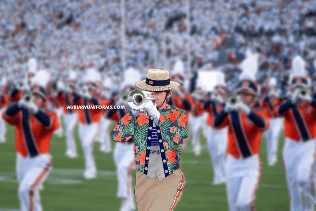
Gone are the traditional shako and plumes and in are the straw hats!
The “real-life” images are always the biggest challenge with my Photoshop skills, but this one was magnified without quality, solo band photos!
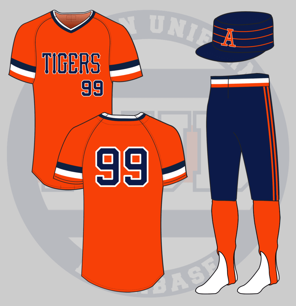
Another one: Auburn Baseball but Pittsburgh Pirates from the late 1970s/early 1980s (the flattop hats)
— Tom (@ths0002) June 9, 2021
The Pittsburgh Pirates were one of the first teams in professional sports to mix and match their uniforms. From 1978 to 1984, the Pirates were among the best dressed in the league.
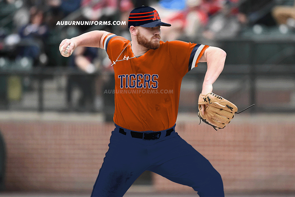
Despite the multiple color combinations available, I wanted to base this design on the gold jersey and black pants look. The jerseys are based on Auburn’s early 1980s design with the large sleeve stripes. The chestmark is rendered in the official Pirates font. The pants are now navy with a navy/white/orange striped cummerbund and two orange stripes down the leg. Orange stirrups are worn for the first time, as the Pirates often wore yellow ‘rups.
If the Pirates weren’t known for their over-the-top uniforms, they’re certainly known for the unique pillbox cap design they sported for this time frame. Auburn gets a navy cap with three orange stripes and we’re going to stick with the classic block-A logo on the front.
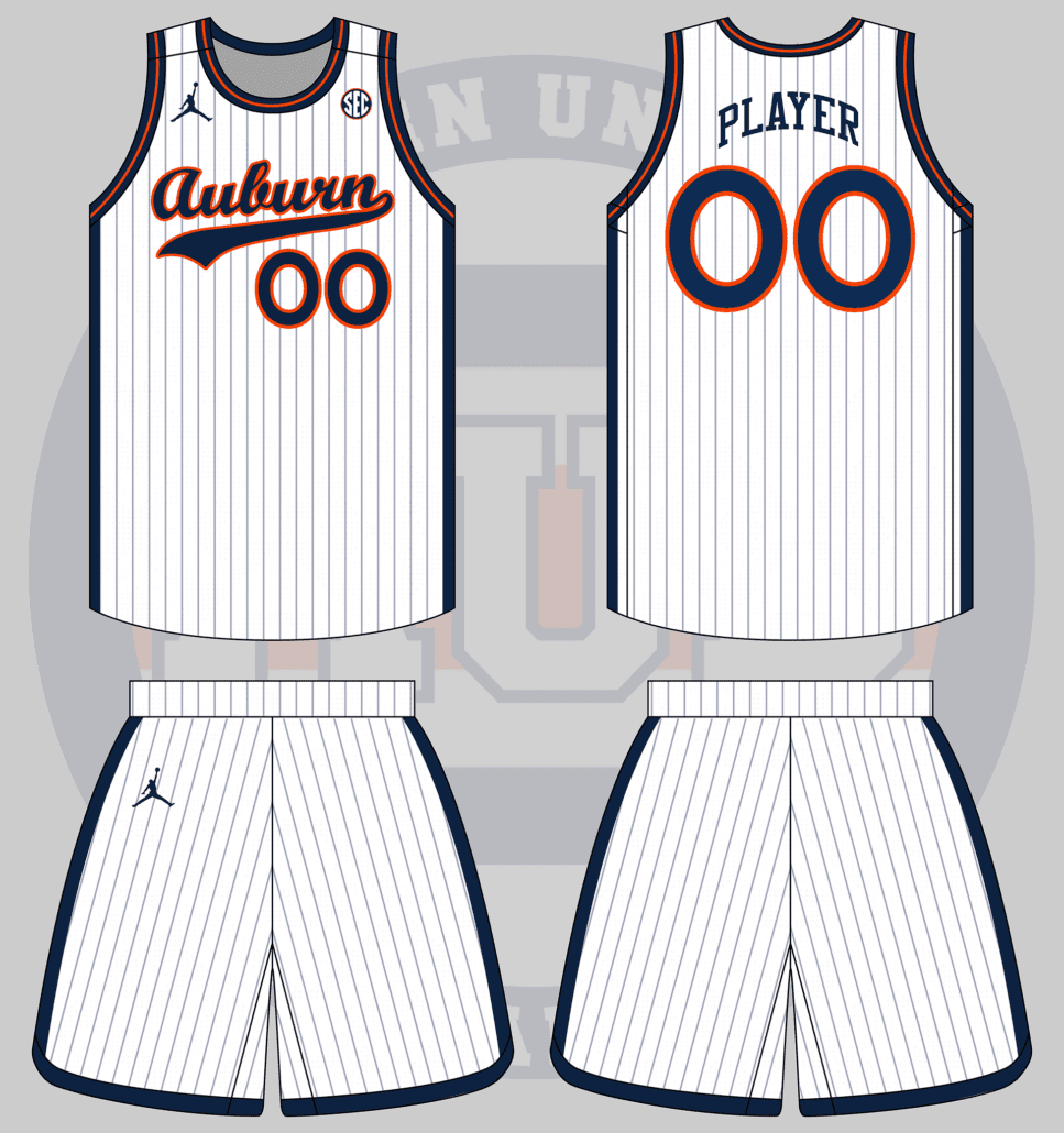
Basketball uniform based on the script Auburn from the baseball uniforms. Made by jumpman
— Drew Crowson (@SonOfCrow2) June 10, 2021
I sat and stared at Photoshop for far too long trying to figure out how to base the uniform off the script alone. I finally moved to base the basketball uniform off a baseball uniform instead, and I really like how it worked out.
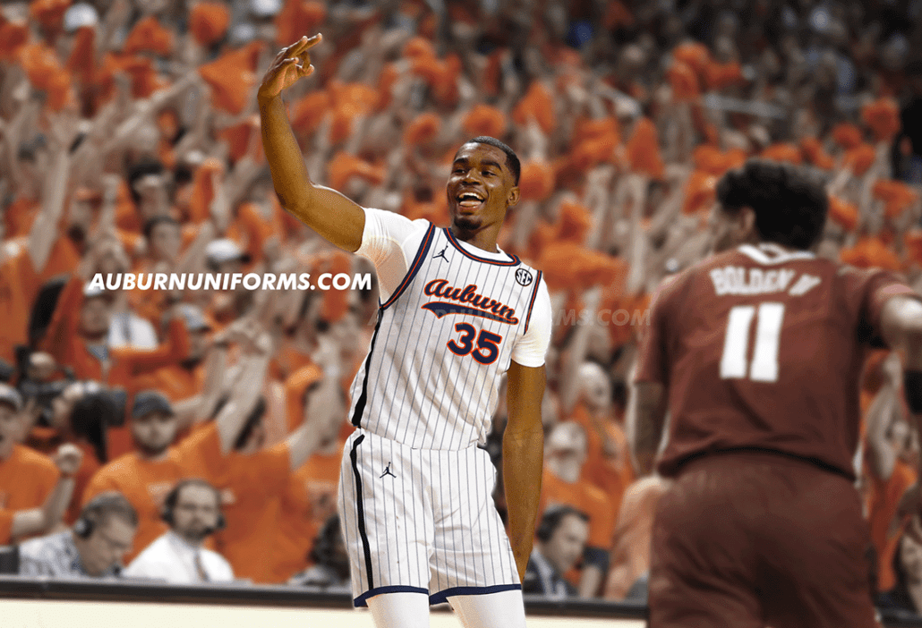
Pinstripes aren’t the most common look on the hardwood, though some teams have worn them before. Auburn has never donned such a look – until now. The base uniform is white with light navy pinstripes. The script logo dons the chest with the player number directly under, a la the baseball team. The player’s name also gets a rather baseball treatment, being larger than usual and arching across the back.
To keep from having the uniform simply be all white, the sides of the jersey and shorts have navy stripes. The collar and trim are also navy with a thin orange stripe.
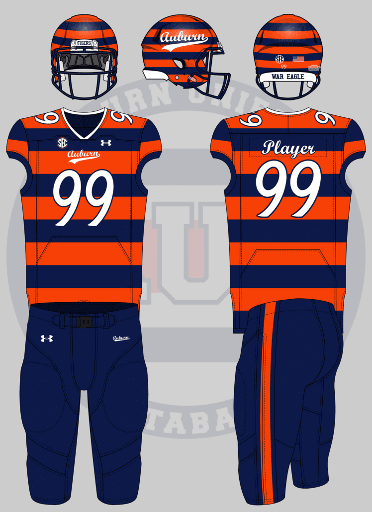
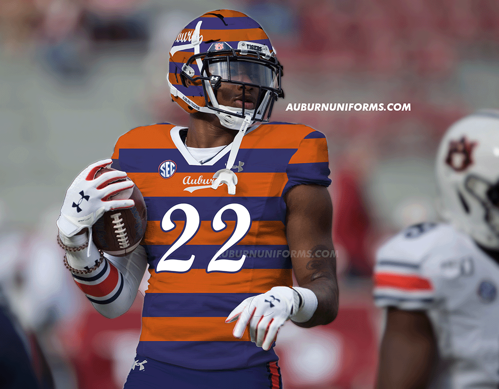
What about rugby style uniforms? Like the ones the cheerleaders wear sometimes but on football uniforms. Also with Sailor Aubie because I love him (you should do these for the Jacksonville Jags too for fun)
— Jordan Williams (@jno_will27) June 9, 2021
The rugby sweaters are always popular! We did a baseball version of this design a few years ago, so a football uniform is the perfect next step.
The first step here was to translate the base design over. The jersey was easy with the horizontal stripes featured on the cheerleaders’ shirts. The collar is white on the football jersey to mimic the popped collars that the male cheerleaders sport. The women’s shirts have a script Auburn on the chest, but it’s slightly different from any official Auburn wordmark. So we skirt that, stick to brand standards, and throw the baseball script on the front of the jersey. To match the script, the number and nameplate are rendered in a similar script font.
The cheerleaders wear plain blue pants or skirts on the field, but that’s a bit boring for a football uniform. I decided to keep the orange stripe down the pants leg to add a little more pop of color. The script Auburn also replaces the AU logo on the hip.
But the real beauty here comes with the helmet. Cheerleaders don’t wear any headwear, so I had to get a little creative with the lids. I debated making the stripes match normal helmet stripes, but thought it would be more fun to simply match the jerseys. Much like the pants, the AU logo on the helmet shell gets replaced with the script Auburn logo.
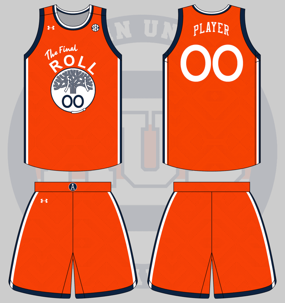
Golden State Warriors mashup with a toilet papered tree from Toomer’s Corner instead of The Town.
— Andrew Lind (@AndrewMLind) June 10, 2021
This is one of those suggestions that’s so good off the bat but became more of a challenge the deeper I went. I’ll explain.
I love the current Golden State Warriors uniform set, particularly the primary yellows. The Town uniforms are such a great way to connect to the city and local fanbase – it just works.
Tweaking the design to Auburn was a bit more difficult than I thought. I figured Auburn’s orange would be a good substitute to Golden State’s yellow, but, as similar as the colors may be, they aren’t identical and don’t work quite as well. The Warriors have also utilized this look on black uniforms. I wanted to avoid that and stick with true Tigers colors instead.
Rather than sticking with “The Town,” I changed it to “The Roll” and then added “Final” to the logo to commemorate the 2013 final rolling of the original oak trees. The lined-tree logo in the center stays rather untouched but gets two rolls of toilet paper hanging off. Adding more rolls felt like the right recipe to make this design as over-complicated as possible, so I kept it to a minimum.
To channel my inner Nike-speak, “the two rolls of toilet paper are limited, but indicated that you, the fan, have plenty of room to add your own flair!” Ok, enough of that. I added one last roll to the bottom of the circle just to differentiate a bit more from the original design.
The shorts are a really basic version of the Warriors’ design, removing the Golden Gate Bridge elements connecting the stripes to the hemline. A throwback Auburn Baseball “A” logo is added to the belt buckle to replace the Warriors’ Circle-W logo.
I’ll admit this isn’t my favorite of the bunch and I’m sure a few different choices could have made for a better look. If you have any suggestions, leave them in the comments!
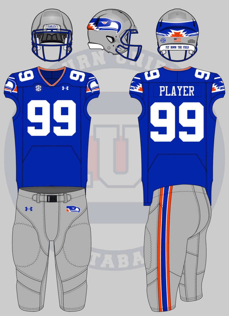
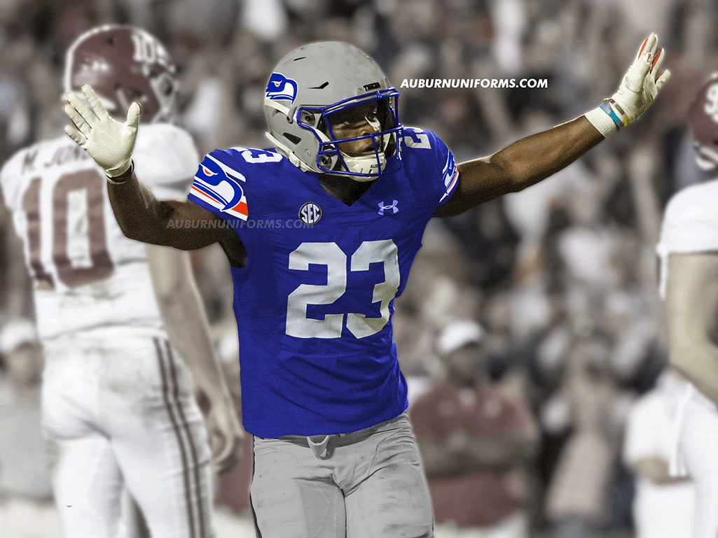
Actually, let’s amend that, Seahawks throwbacks with the wraparound logo on the sleeves
— Colin Turner (@ct95designs) June 10, 2021
Colin has joined in on this series for multiple years now and loves to see what Auburn would look like in NFL looks.
The biggest challenge with this suggestion was tweaking the iconic Seahawks logo. I wanted to keep with the bird look but naturally make it look more like an eagle. I’m in no way a logo designer, so this was a challenge. I took the throwback ‘hawks logo, changed the colors to a lighter blue and orange, tweaked the eye to make it more intimidating, and added some ruffles across the back to give it some more eagle-like character.
The new logo was placed on the helmet, and of course it meets in the back! It also dons the shoulders, placed on top of a new set of stripes to mimic the original design. To top things off, the jersey collar gets a white/orange/white stripe and the pants stripe also mimics the old-school Seattle look.
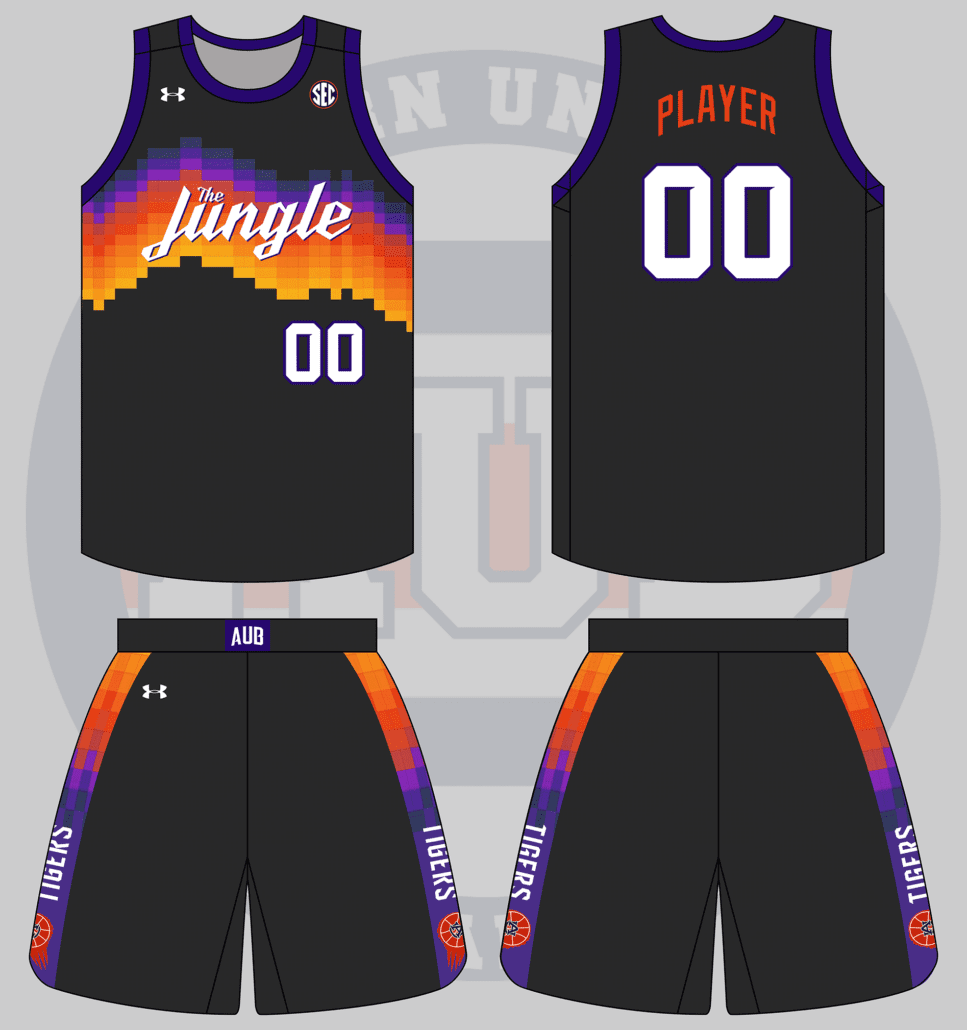
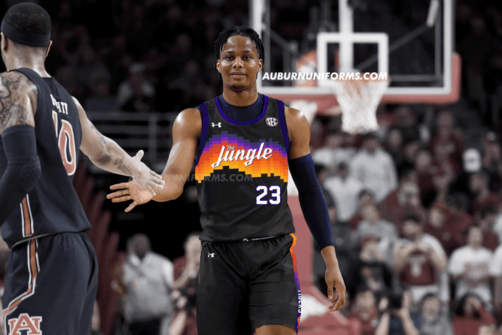
FB/basketball jerseys similar to the suns “valley” jerseys this year except it says “the jungle” and in auburn colors obvi https://t.co/hg2gH3Mq3O
— Paxton Bush (@paxton_bush) June 9, 2021
Phoenix’s “The Valley” uniforms have quickly become a fan favorite from the NBA since their debut in December, and it’s understandable why. How will it work Auburn-ized?
Much like last year’s Suns uniform concept, I tried to avoid simply going with black as the base color. The Suns’ purple is also just different enough from Auburn’s navy, so a compromise was made. Rather than black, I went with a lighter shade of charcoal grey – similar to the softball uniforms a few years ago. Navy is also made a bit brighter, closer to purple, just to pop off the dark grey better.
The unique gradient pattern across the chest is such a great aspect of this design. I found a font similar to what Phoenix used for their wordmark to render “The Jungle” across the chest.
The shorts also get the gradient treatment. The Suns’ famous flaming basketball logo is nice, but let’s use Auburn’s own version. During the 1980s and 1990s, Joe Ciampi’s Auburn Tigers women’s teams often sported a flaming AU basketball and it makes its debut on a men’s uniform with this design.
Gotta say, I really love this design. Maybe a t-shirt is in its future. 🤔
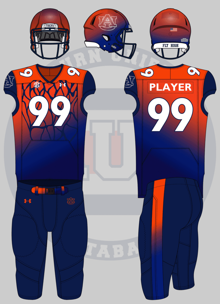
Football uniforms that are fashioned after/inspired by the gymnastic team’s leotards
— Emily Enfinger (@EmilyEnfinger) June 9, 2021
If there’s one Auburn sport whose uniforms give me fits, it’s gymnastics. The leotards are incredibly well-designed and custom-made, so it’s difficult to replicate in an efficient manner.
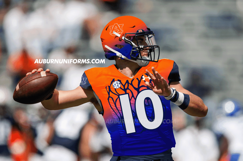
Emily also indicated that she wanted to see the Tigers’ “snakeskin” leotard utilized for this suggestion. Let’s see how it came out:
Yep, it’s colorful!
The base design starts with an orange/light blue/navy gradient across the jersey. The sleeve cuffs are all navy to mimic the leotard’s navy sleeves. Much like the gymnastics team, this jersey only features the AU logo on the right sleeve, leaving the left side blank. The AU logo is also rendered in rhinestones like was utilized one last year’s baseball/gymnastics crossover uniform. You’ll also notice the SEC patch gets it’s own gradient – a first of its kind for SEC teams! The chest of the jersey sees the “snakeskin” portion of the leotard.
As leotards don’t have player numbers, I had to get a little creative here. After a quick Google search, I decided to base the numerals off of the gymnastics judges’ scoreboards. The rounded numbers with a navy outline sure do give a Denver Broncos feel, but I like it here.
Gymnasts typically don’t wear leggings with their leotards while competing, so the pants here were fully up to the imagination. I thought about mimicking the high-waisted look of a leo but quickly decided against it. Instead, I stuck with all navy, giving the belt a rainbow gradient like the jersey, and adding a large orange stripe down the side.
Finally, the helmet also gets the rainbow gradient treatment complete with the rhinestone AU logo. For an added touch, the rear bumper changes from War Eagle to Fly High. I almost made the facemask gradient as well, but had to show some restraint!
Can we see a Momma Goldberg’s inspired baseball jersey?
— Av3ry 🎨 (@Neji11x) June 10, 2021
Gotta have that Momma’s Love! No Auburn restaurant is as beloved and considered overrated as this sub shop.
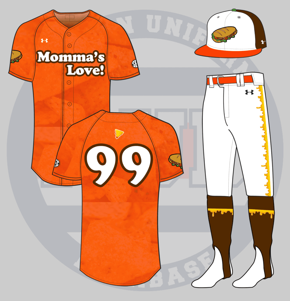
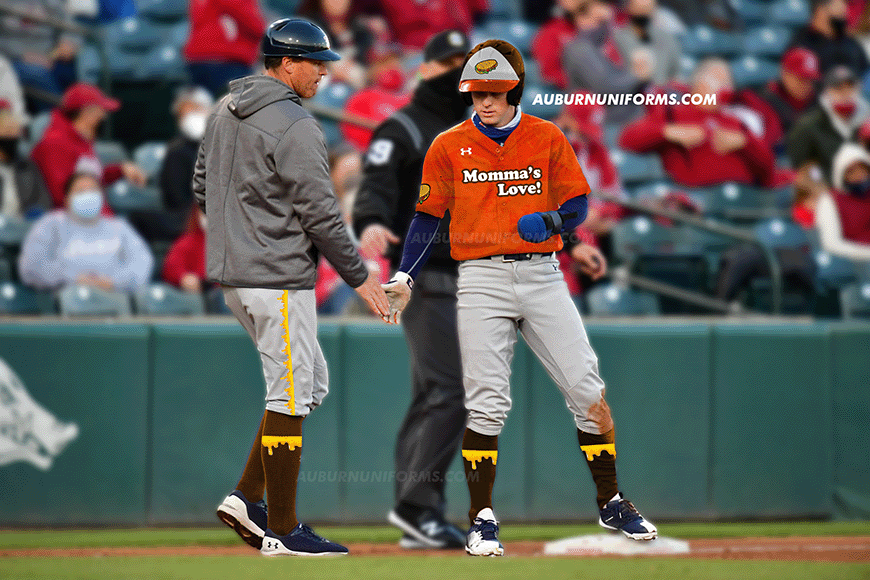
I immediately thought of Minor League Baseball’s fascination with food-based uniforms and that this would be the perfect tie-in. Let’s start with the hat. Like most MiLB foody hats, this one is a tri-color cap featuring Momma Goldberg’s brown color on the back, an orange bill for the famous Doritos nachos, and a cartoony sub sandwich across the front. The squatchee – the button on top of the hat – gets the lone touch of green to match the lettuce in the sandwich.
The jerseys come in orange and feature a sublimated pattern to resemble the details on a Doritos Nacho Cheese chip – it’s all the finer details! The chest mark features “Momma’s Love!” in the same font as the franchise’s logo. The back number is rendered in the same font. The sandwich from the hat dons the right sleeve and a cheesy nacho chip is placed right above the player number!
My favorite details come below the belt. The pants stripe is super cheesy and is also replicated across the brown stirrups, Of course, Kason Howell is the perfect man to sport these incredible stirrups!
Now I need to stop at Momma’s next time I’m in town!
By tradition, we wrap up the annual Crazy Concept Uniforms piece with my sister-in-law’s always amazing suggestion. Let’s see what she has for us:
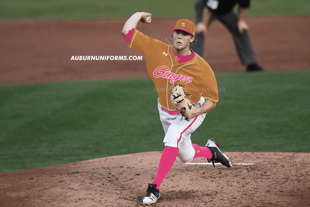
this year I’m keeping it simple: a Ginger themed baseball uniform. Give my aubie-loving queen the space to ✨SHINE ✨ her face, her iconic pink nail polish, her fur coloring. something that really captures her essence. pic.twitter.com/Law1LoH9fR
— jillian (@wtmjillian) June 11, 2021
Alright, alright, hold on. Let me explain this one real quick. Ginger is my incredible dog. She’s been with us since 2009 when she was dumped in a neighborhood across the street. She’s the sweetest thing ever. Last year, she was diagnosed with an inoperable grapefruit-sized tumor and we were told she had between two and four weeks left. Well, Ginger laughed in the vet’s face and has been doing fine ever since!
So, the pink. Ginger has always worn a pink collar, but that wasn’t enough for one member of our family. My father – yes, you read that right – gives Ginger a “spa day” each Monday and paints her toenails a bright shade of pink.
No, really.
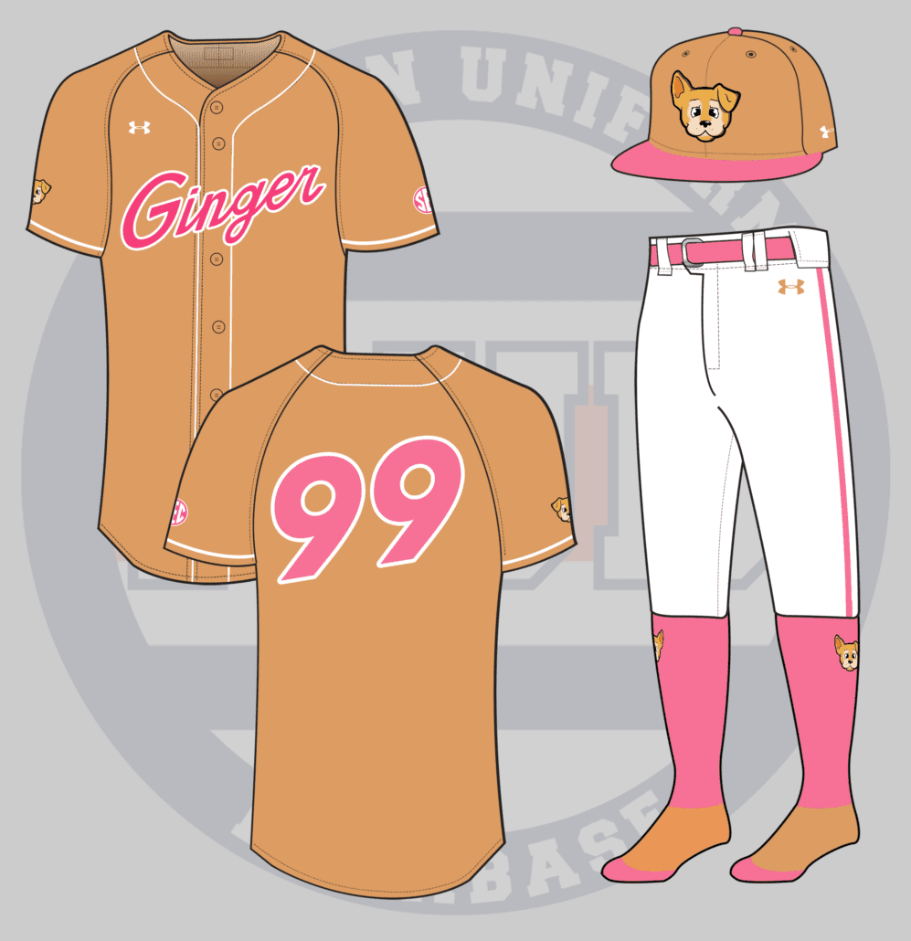
Alright, on to the uniform. Jillian provided a lot of extra details not included in the tweet above and I tried to incorporate as many as possible. The jersey and ballcap are a light brown-tan color that matches Ginger’s coat. The cap’s bill and squatchee, along with the jersey script, number, and SEC patch are each rendered in pink to match her manicured nails. The pants get a large pink stripe down the side with the belt and socks, naturally, are also pink.
The best part of this concept, for me, is the custom Ginger logo. My good friend and super talented artist Avery Dove created this logo in the same vein as many Minor League Baseball team logos. It fully captures Ginger’s staple “one ear up, one ear down” pose she gives on a daily basis.
So there they are! Another set of the silliest concept uniforms are complete. Which one was your favorite? Which one could I have designed differently?
If your suggestion didn’t make the cut this year, don’t worry! There were over 40 suggestions that had to be left on the cutting room floor. I so wish I had the time and space to create all of them. We do this each summer, so be sure to bring your ideas back next year!
My thanks go out to all of those who made suggestions this year as always! You guys always surprise me with how creative and silly you can get.
Enjoy learning about Auburn uniforms and history? Want to see more like this? Be sure to follow the Auburn Uniform Database on Facebook, Instagram, and Twitter for even more uniform news. To support this work, you can donate directly via Buy Me A Coffee. You can also purchase your favorite team’s merchandise through Fanatics, with a portion of your sale going to support this website.


I think the Golden State design is very, very good, but suffers from using the word “roll” b/c that’s too similar to a commonly used vulgarity. I think a better term would be “The Corner” since we now tip-off at Toomers.
My favorite is the Ginger one.