Auburn Football will spend the final season in Under Armour uniforms wearing a brand new template.
With the 2025 move to Nike looming, the Tigers are set to debut a new jersey template this fall when the 2024 campaign kicks off against Alabama A&M. As with any new uniform in the Auburn Athletics field, the Auburn Uniform Database is here to break down all the details.
Diving into the details
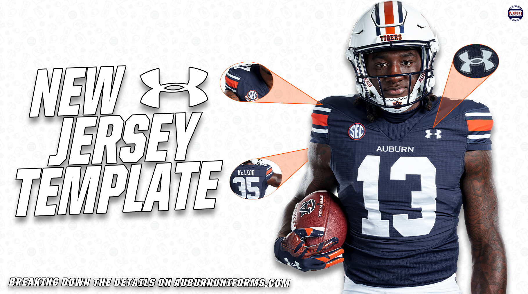
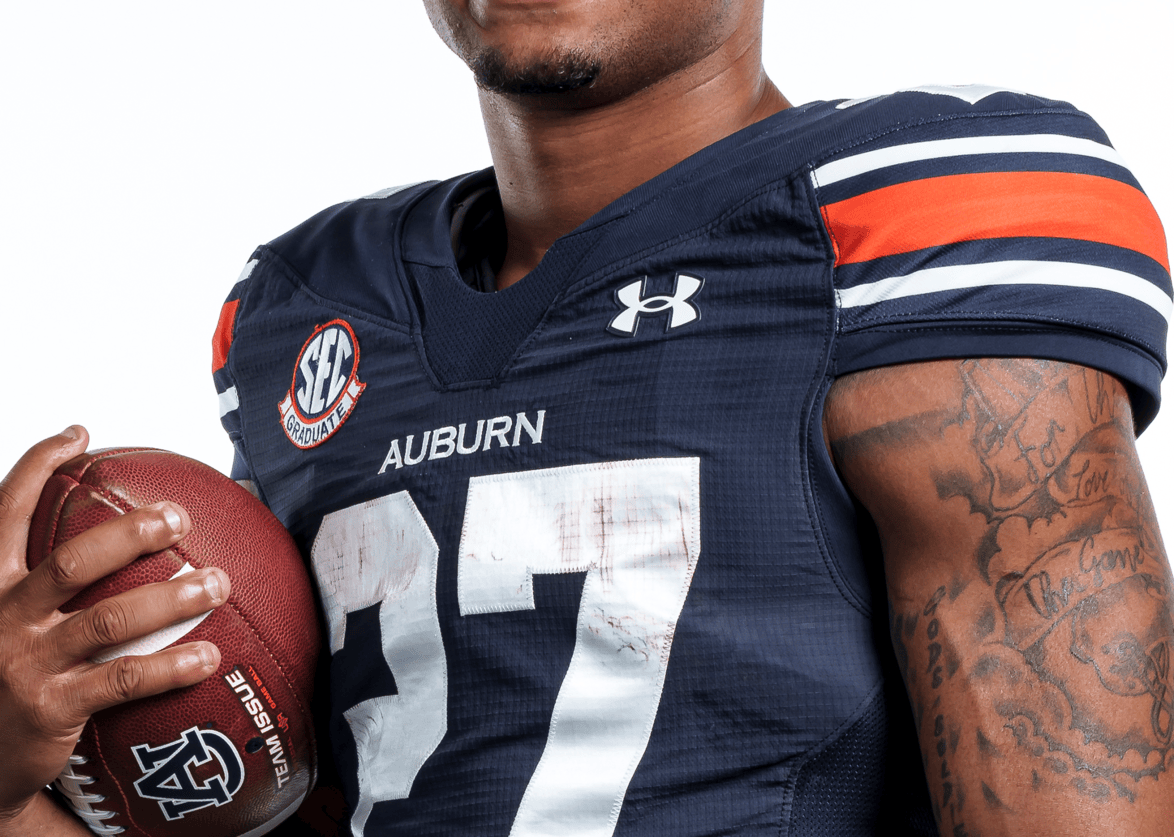
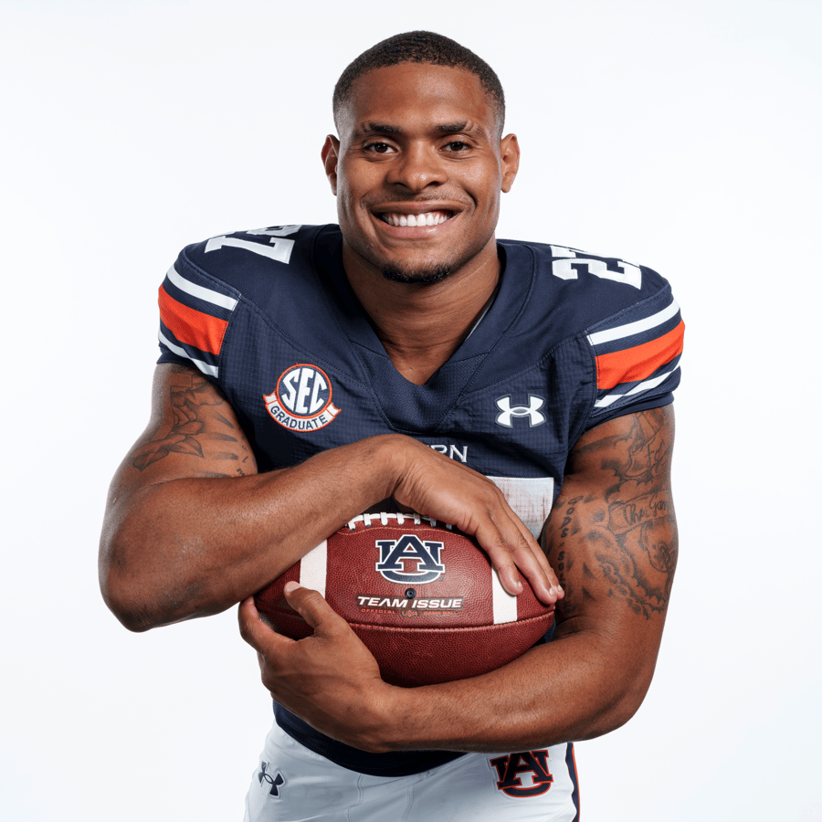
The most prominent feature of this template is the diagonal chest seams. Stemming from the collar, a line on both collarbone areas stretches out to the shoulders and around to the back of the jersey. This seam creates the bases of the new sleeve area, which were previously referred to as “shoulder caps.” They’re no longer just a “cap” on the side of the jerseys, but more intertwined into the entire build.
The other sides of the sleeve area is formed by the vertical seams that run from the bottom of the jersey up along the sleeve cuffs and into the diagonal chest seams. This new build creates a unique layout for the shoulder caps, making them more rectangular than circular. This seemingly allows for larger stripes as you can see in the Auburn photos.
Let’s go back to the top. The collar is considerably larger than the previous style, more in line with a standard collar shape. Where the front of the collar connects to the chest of the jersey is much thicker than necessary – and the bottom half of which is a mesh fabric to assist with breathability. The thicker collar allows for a team logo, as we’ve seen with Maryland and Wisconsin, or the Under Armour logo as Notre Dame is utilizing. Auburn will be leaving this area blank and retaining the Copperplate wordmark underneath, above the number.
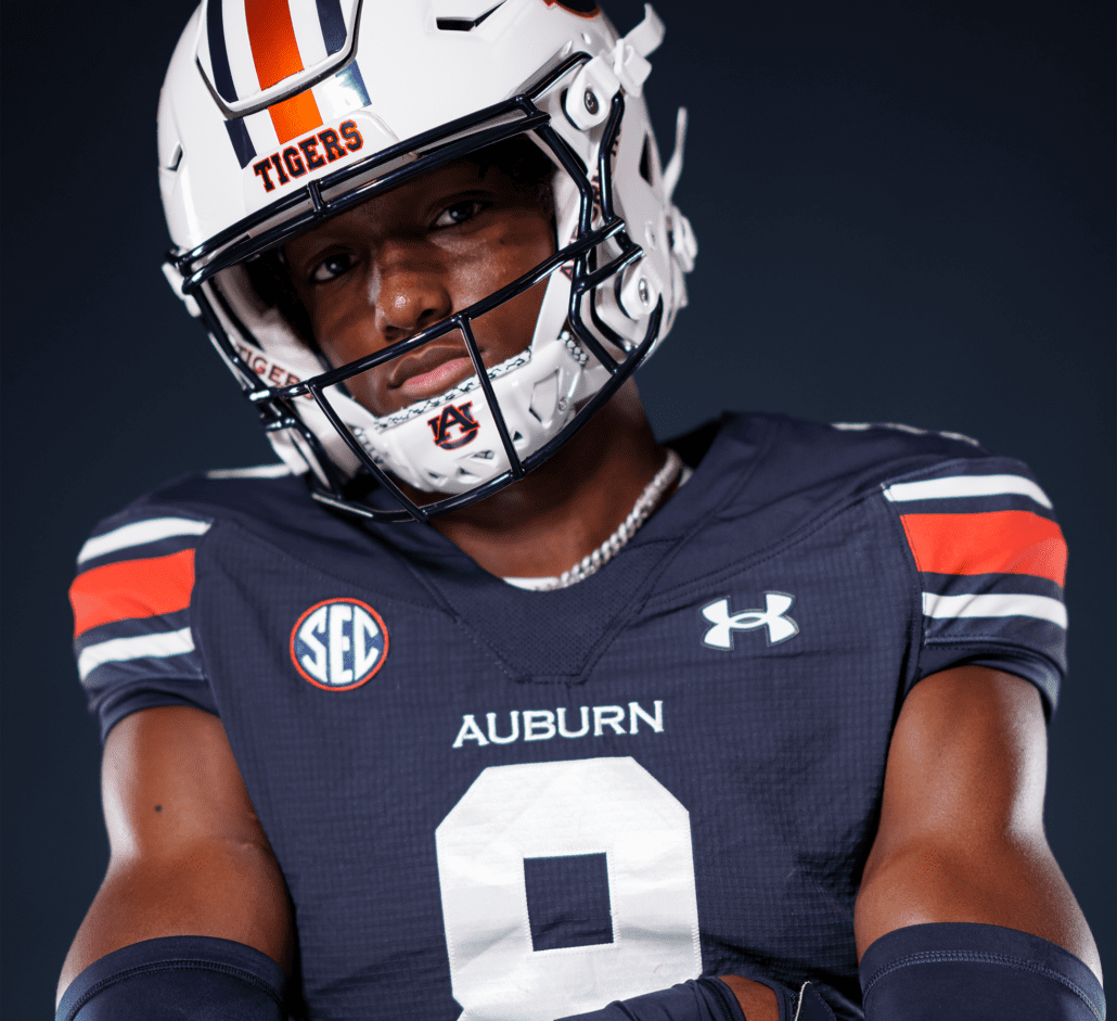
The new template also introduces a new twist on the sleeve cuffs. Traditionally, these have been a thin elastic area to ensure the shoulders stay tight to the pads. They’ve previously been on continuous pieces around the entire opening. Now, the top portion retains the elastic design while the bottom portion extends further downward, seemingly to keep this portion tighter on the player’s body. The entire cuff is more square, much like the shoulder/sleeve area.
The rest of the jersey also features a few new design elements. Just below the player number, the seam is more V-shaped rather than the sharp, upside-down U-shape on the previous template. This area connects to the vertical seam on the sides. The matching area on the back loops back to the top of the jersey as it appears there is only one vertical seam on the sides.
The nameplate area looks to remain unchanged, however, the back portion of the sleeve area now wraps upward to connect to the collar. This removes the need for the single vertical seam above the nameplate on the old template.
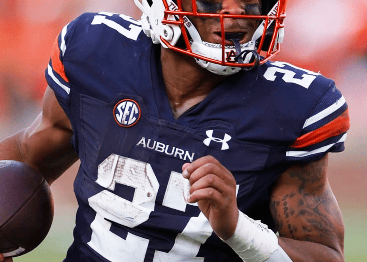
The numbers are always a topic when it comes to Under Armour uniforms. While it’s difficult to say if the new jerseys have larger numbers, they are slightly different than previous jerseys. A source indicates that they have a new “sheen” to them. The rest of us will have to wait until gameday to know exactly what that means and how they look in action.
The GridArmour texture that makes the jersey more wear-resistant and “ungrabbable” has previously covered most of the jersey. Now, the pattern has been removed from the shoulder caps and doesn’t overlay the stripes.
One of the more unique tweaks comes with the logos. The Under Armour logo on the jersey and the pants, and the AU logo on the hip of the pants, are no longer embroidered. They are rendered in a new rubbery material. It’s similar to the logos used on the Under Armour polos for a few years now. The change makes the logo pop a little extra, with a visible outline that catches light and, in turn, your eyes.
While I, admittedly, haven’t paid much attention to the pants seams in recent years, the britches sported with the new jerseys feature a much more simplified stitching pattern as what was originally introduced in 2015. For simplicity’s sake, I’ve carried those pants over each year on my mockups. Pants are rarely a focus point in photographs, so it’s more difficult to nail down the details.
Beginning with the 2021 season, it appears that Auburn players have had the option to wear traditional belted pants or modern elastic and drawstring pants. They’ve co-existed for some time, but apparently, the new pants remove the belts altogether.
The Inspiration
While this is the first time we will see this template on gameday, it’s not entirely brand new to Auburn.
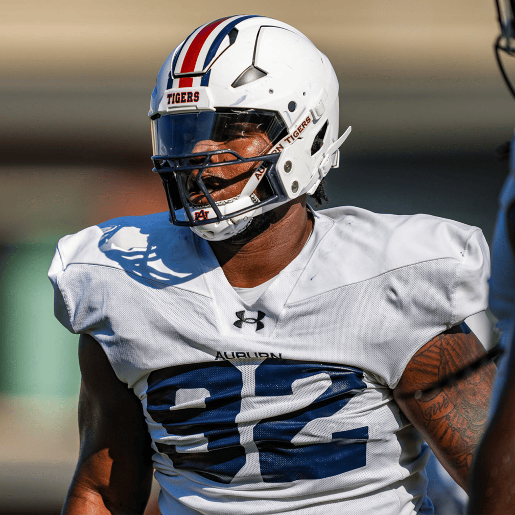
Last season, the Tigers sported new jerseys in practice. The new tops featured the same collar and diagonal seams as the new game jerseys. The Under Armour logo was placed on the center of the collar, which thankfully we won’t see in games.
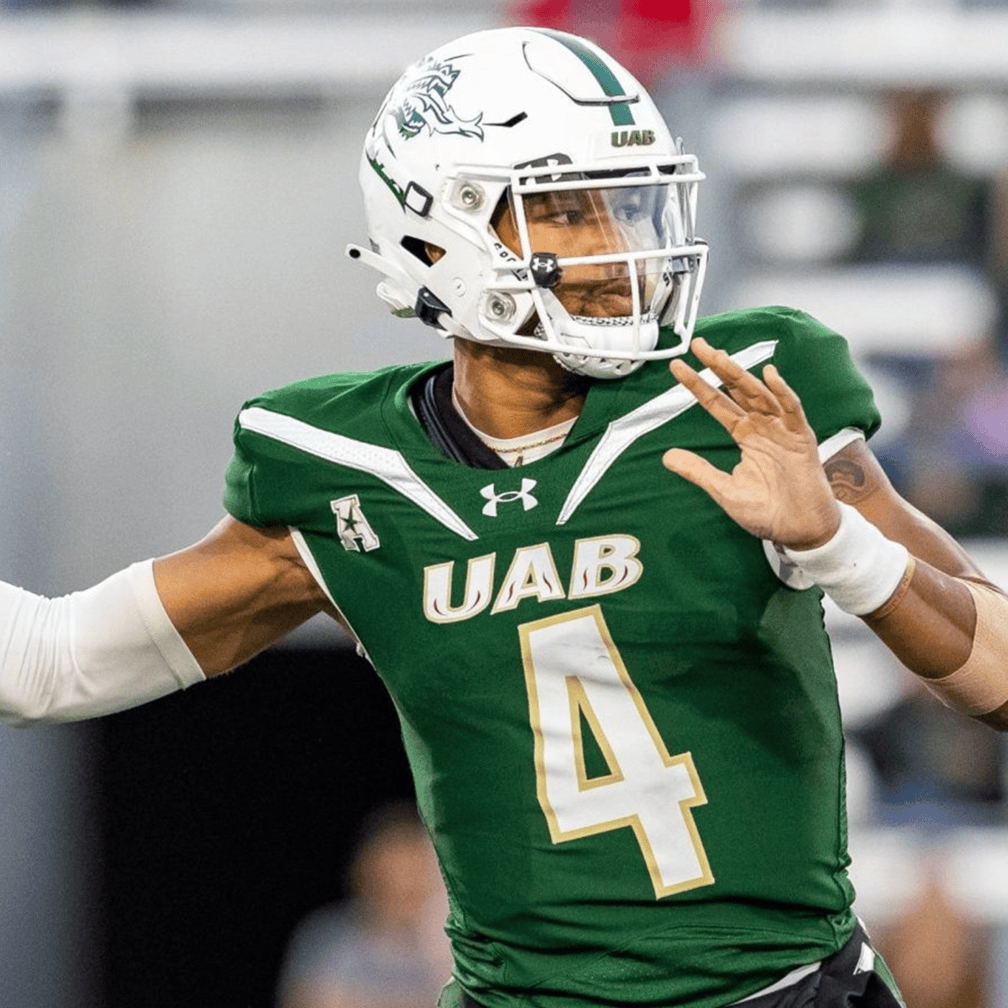
A similar template was debuted last year by the likes of UAB and Colorado State, among others. This design featured a double seam on the chests, which the Blazers used to turn into a contrasting stripe.
Under Armour is clearly looking to have its logos placed centrally rather than in the traditional left chest location. They even did this with the new basketball template that debuted last year.
Why make the change?
With only one year left on the Under Armour contract, why change to this new template?
It’s a fair question. One that I had myself.
There are a few things in play here. First, the lifespan of a template is about four years. We’ve seen that play out in football with new templates getting introduced in 2011, 2015, and 2019. The 2023 season was the fifth for this template, so the Tigers (and other Under Armour schools) were overdue. We can chalk up the extra year to covid-related issues, as supply chains are still recovering.
Equipment teams don’t prepare for the upcoming season during the summer. They get started the fall prior, at minimum. Orders for the next season have to be placed roughly ten months prior if not more. We’ve seen it before – it takes roughly two years to get a rebrand and redesigned uniform through the process. Even getting a new product like this template takes a lengthy lead time.
The orders for the 2024 football season were placed long before the announcement that Auburn was signing with Nike was made public. Even before the writing was on the wall the announcement was imminent.
Regardless, the 2024 squad needed uniforms to wear. The equipment team couldn’t get wrapped up in the impending news here. They are still being outfitted by Under Armour this season, regardless of the contract status and news.
If you’re a visual learner, here’s a handy set of side-by-side images showing all the changes between the new and old uniforms for all three colorways.
(Special thank you to Austin Perryman and Auburn Athletics for supplying the photographs in this article.)
Previous Template Breakdowns
Want to see more like this? Be sure to follow the Auburn Uniform Database on Facebook, Instagram, and Twitter for even more uniform news. For ways to support the AUD, including affiliate links to Fanatics and Dick’s Sporting Goods, visit the Support page.






Leave a Reply
Want to join the discussion?Feel free to contribute!