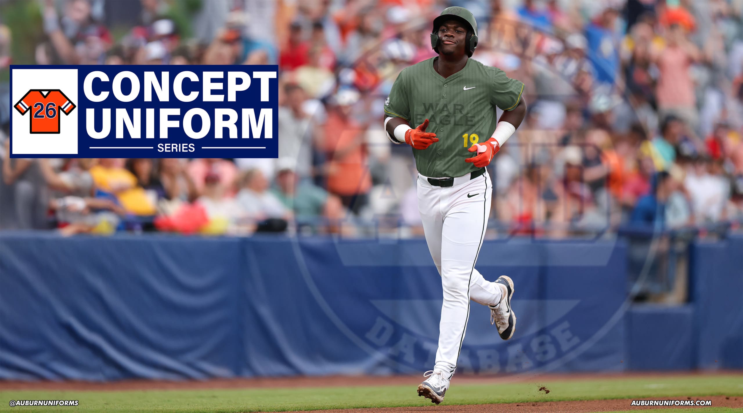
It’s my favorite time of the year – time for another round of crazy concept uniform designs!
If you’re new here, I put out an all-call on social media each summer for the craziest, silliest, and sometimes possibly realistic concept ideas that Auburn fans would like to see come to life.
Why?
Well, the summer is often riddled with talking heads discussing alternate uniforms. The same horrendous designs have been passed around for years. It’s time to change that (and add more fuel to that fire!).
This series also works to show that Auburn’s uniforms are pretty good as is. The Tigers don’t need to make any changes or bring unnecessary alternates into the rotation just because they can.
A few things before we get started:
- First off, these designs are intentionally silly, obnoxious, and over-the-top. That’s the point. No one expects to see these hit the field or court. We aren’t saying Auburn should wear these whatsoever. If you are truly upset about these designs, that’s solely on you.
- I am not a designer or an artist. This is always a fun project that helps push my very limited creativity. These are not the world’s best Photoshop jobs and they were never expected to be so. Again, they’re goofy on purpose.
This year’s crop includes ten brand-new designs! Did your idea make the cut?
Let’s dive in and take a look at this year’s crazy Auburn concept uniforms!

Normal home football uniforms on baseball, including a hat with the helmet design.
I love to start with a simple concept like this. Let’s see how well the design translates to the diamond.
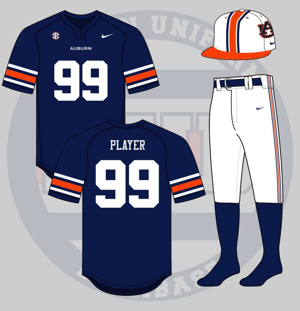
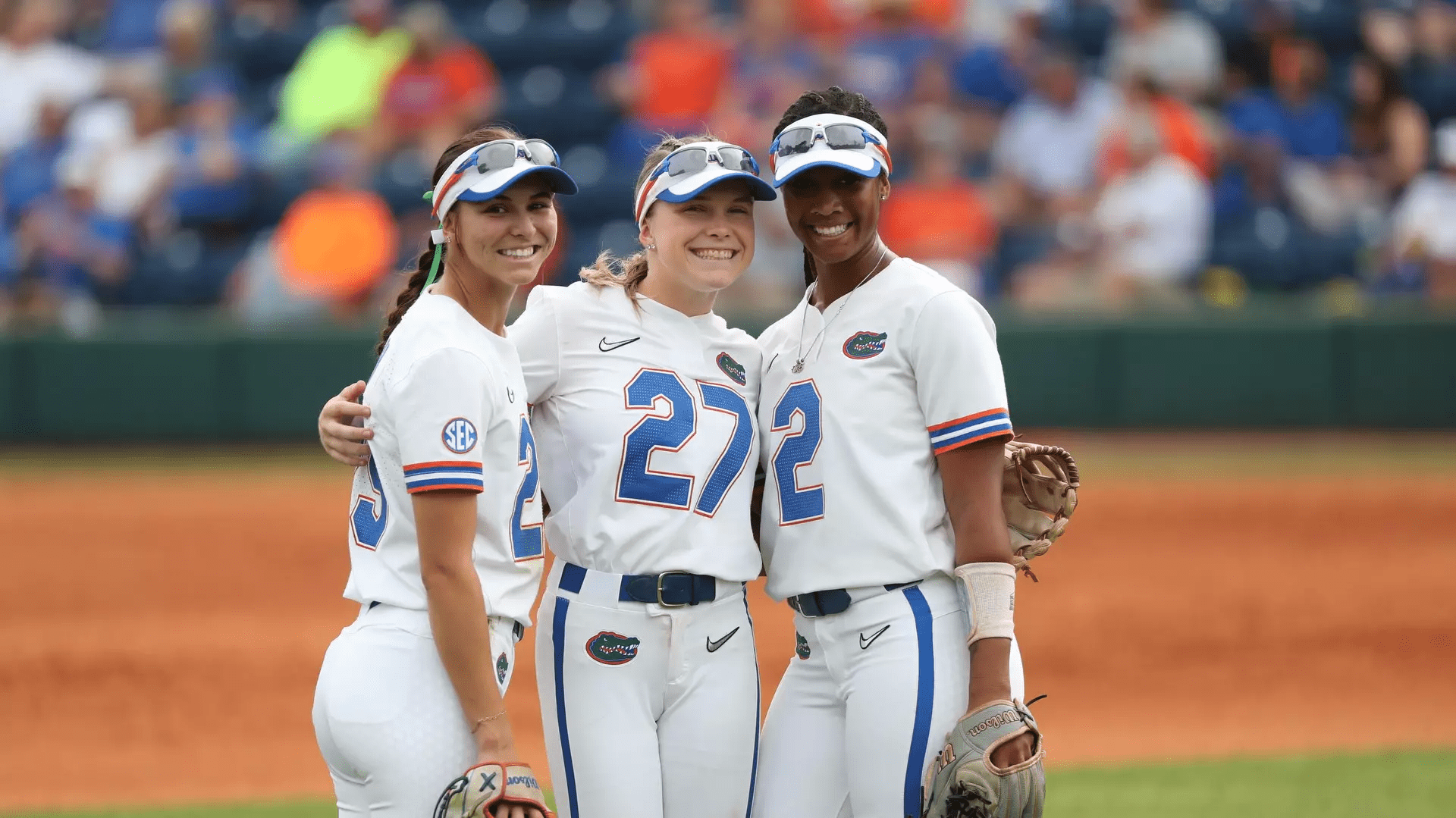
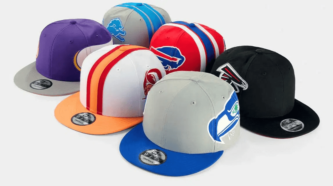
This concept has some good precedent, with teams like Florida softball wearing a football-inspired uniform, and the old-school helmet-hats returning (albeit without an Auburn style).
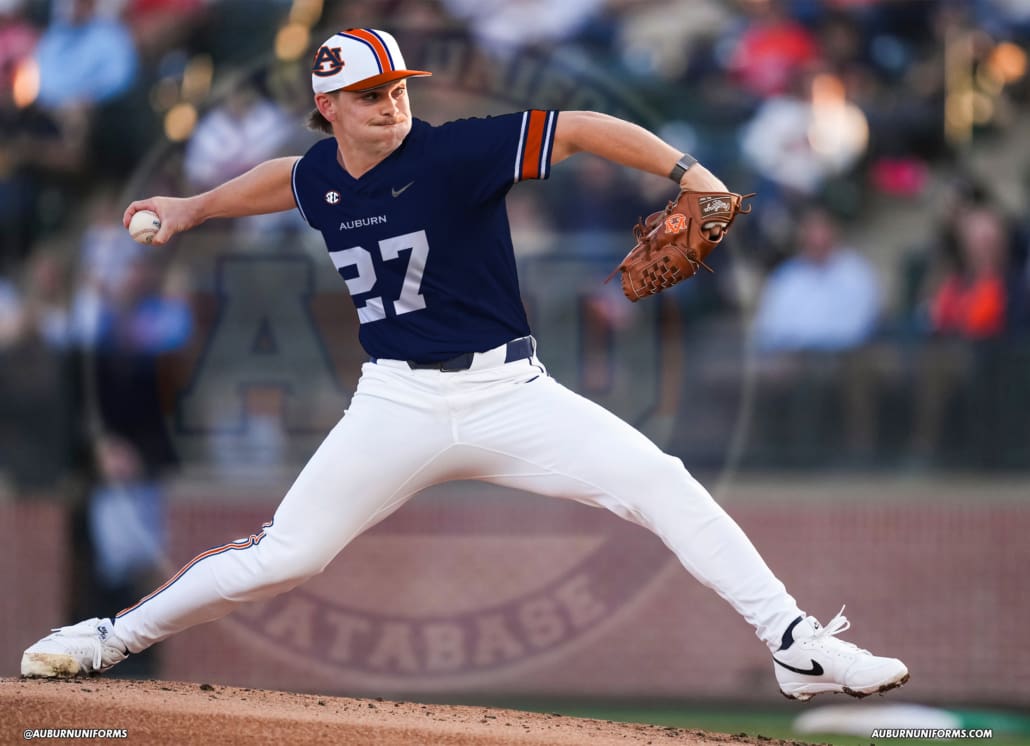
It’s a pretty simple rework of the football design. The helmet design translates pretty well to the hats. There were options for the bill color, but of course, I had to go with my favorite orange facemask colorway to complete the headwear. The jersey replaces the large chestmark with a small, Copperplate mark and large numbers centered on the front. And the Northwestern stripes don the sleeves, as well as the pants stripe.
This look certainly works better for Florida softball than Auburn baseball, but I think it has potential if we wanted to bring it to life in Plainsman Park. If the Tigers ever took a Savannah Banana approach and played inside Jordan-Hare, this would be a natural fit.

One of the best ways to increase your chances of being included each year is to throw out ideas for the sports that aren’t well represented in this series. We don’t often tackle Auburn Soccer, so let’s see how this one does.
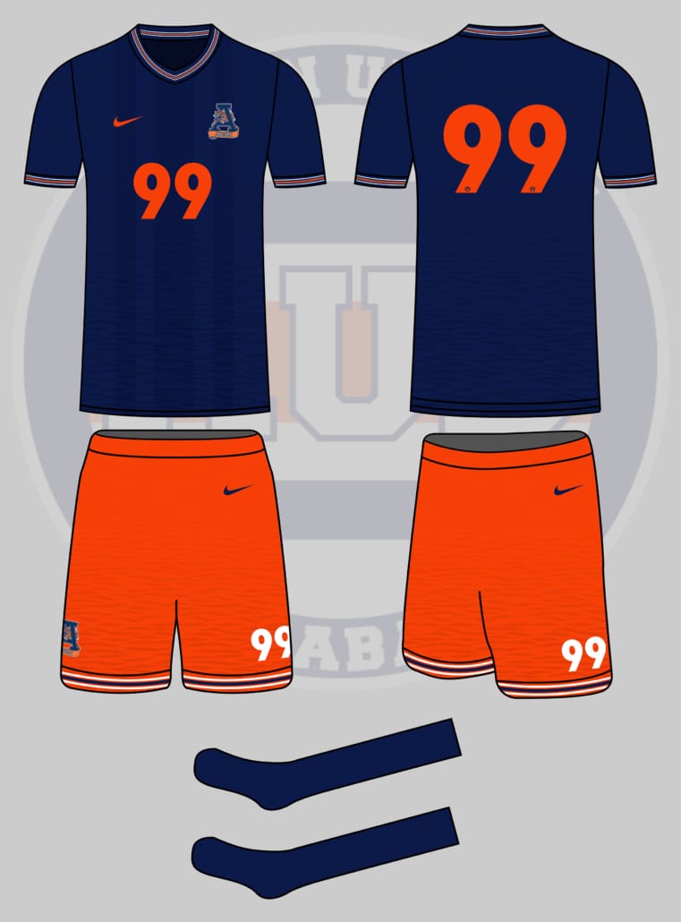
I admittedly don’t know much about soccer kit design. But I like this one.
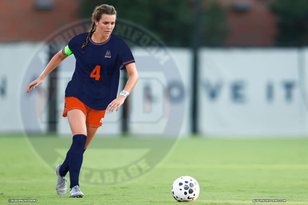
We start with a navy jersey that includes Northwestern stripes around the collar and sleeves. As requested, the Tiger-A logo sits on the left chest as the new team crest. Orange numbers sit centered, with the rear numbers including the AU logo at the bottom, much like the international kits do (for some reason – I’ve never understood this and the league-wide fonts). Much like the first new basketball uniform design under Bruce Pearl, a subtle tiger-stripe pattern is prevalent at the bottom of the jersey.
The shorts include two details that I do like in soccer uniforms – contrasting base color from the shirts and large player numbers on the legs. The tiger-stripe pattern follows the jersey’s lead, with the Northwestern stripes wrapping the bottom of the shorts. The Tiger-A logo sits opposite the player numbers on the right leg.
It’s a little simple overall, and has a great nostalgic approach to it, but I think it works. As much as I’ve loved Auburn Soccer rocking the striped sash look for so long now, it would be fun to see a different design in the coming years. And what a perfect opportunity to break out a unique look from the team’s design history.
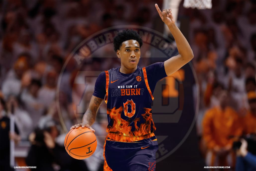
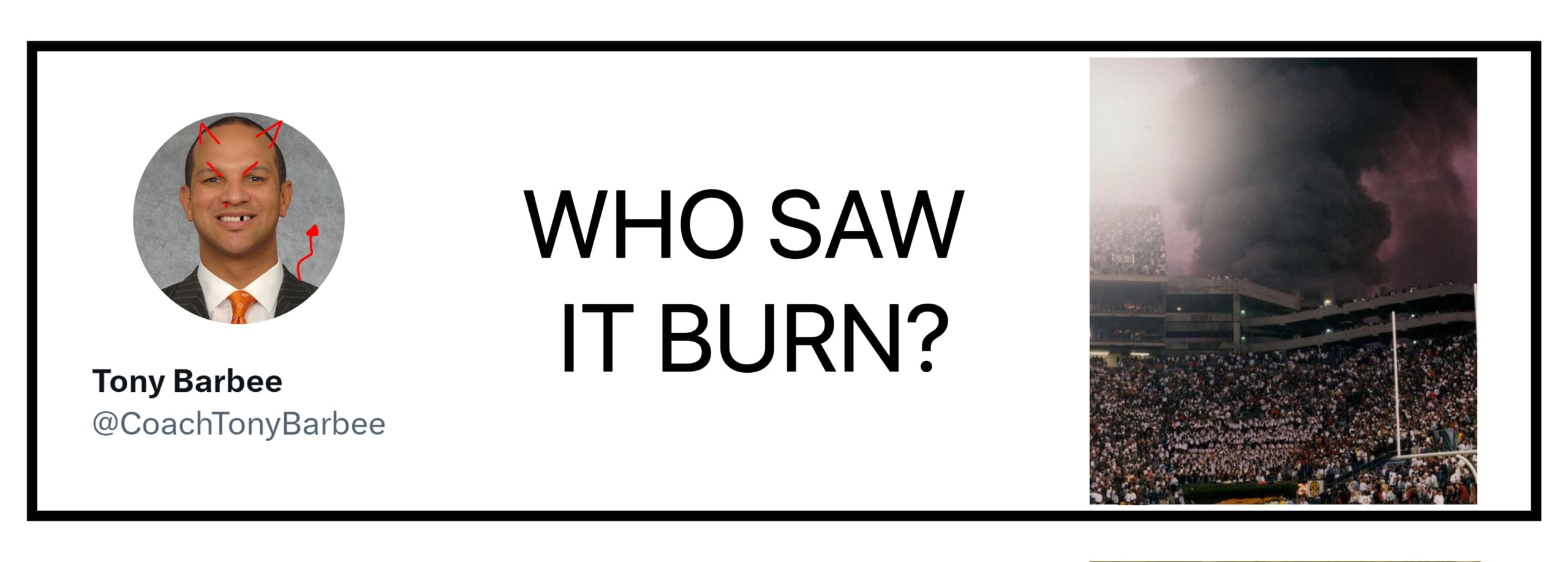
I have an idea that is legit insanity, so hear me out: Tony Barbee “Who Saw It Burn” 🔥🏚🔥 Edition of the basketball uniforms.
Design suggestions:
• Tops – navy blue to mimic the night sky with Who Saw It on the chest in script
• Bottoms – orange to mimic the 🔥
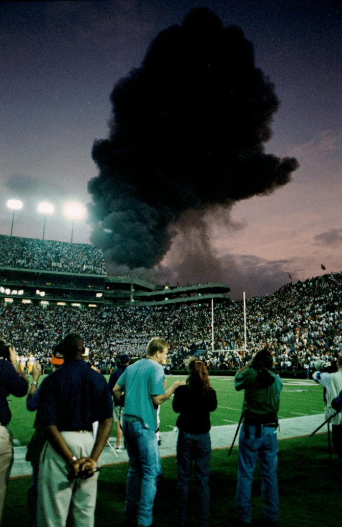
Oh boy. That’s a deep cut and a fun idea.
For anyone not around during the horrendous Tony Barbee era: the worst coach in Auburn basketball history one day randomly tweets about the 1996 fire that engulfed the old Auburn Sports Arena, right outside Jordan-Hare Stadium, during the LSU game.
Many of us, myself included, have been inducted into the “Tony Barbee Blocked Me Club.” It’s a point of pride now.
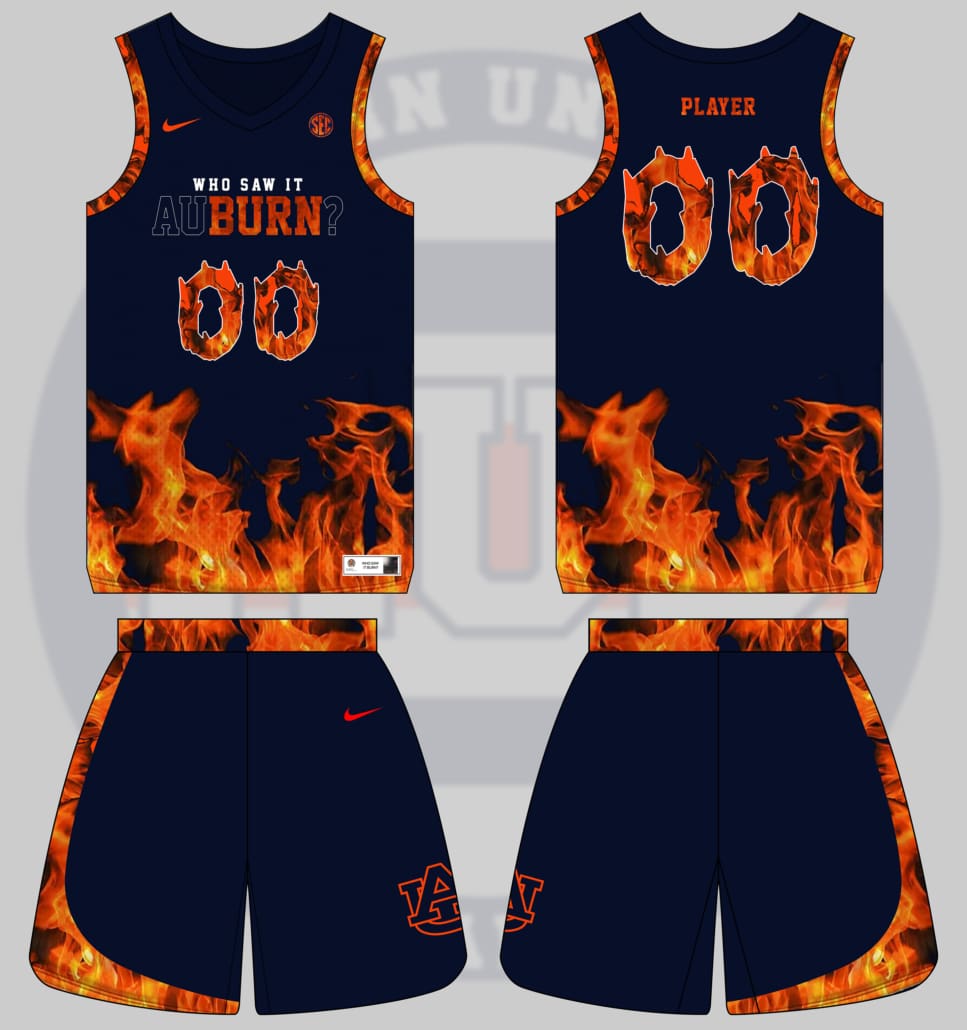
I went back and forth on this one for a while, trying to figure out the right approach. I decided to lean directly into the fire, both from the Barn’s inferno and the destruction we witnessed during the Barbee era.
The jerseys and shorts both feature a very loud flame pattern that’s directly from the over-the-top uniform manufacturer websites. It’s loud and obnoxious and really in your face. The collar goes without the flames because, well, we have to show some restraint here! The numbers carry a flame-inspired font to further drive the motif home.
The chestmark was my starting point with this design. I wanted to include the bulk of Barbee’s tweet in some fashion. Then it hit me that “Burn” is just part of “Auburn,” so why not play into that? So “BURN” is fully engulfed in flames while the rest of the wordmark and the question mark go ghosted. “Who saw it” sits directly on top.
I wanted to keep this close to the 1990s aesthetic, so I added the asymmetric design to the shorts reminiscent of the uniforms the basketball program introduced in 1996.
My favorite part of this design is the jock tag. It’s designed after the infamous Barbee tweet (with a little easter egg doodle 😁)!
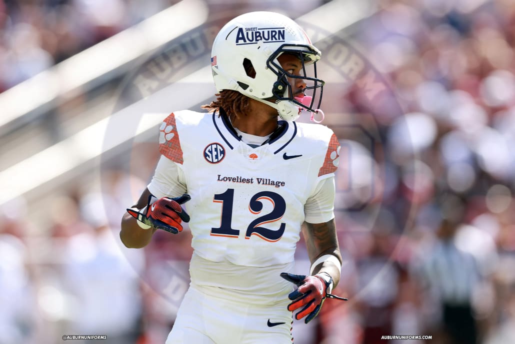
A few years ago, we put together a uniform based on the City of Auburn’s branding. And, funny enough, last year had a fan-favorite connection to Oliver Goldsmith’s poem. This takes a different approach to both suggestions and feels like a truer City Connect design by pulling in elements of different parts of Downtown Auburn.
I took Will’s initial items and added to them. Take a look.
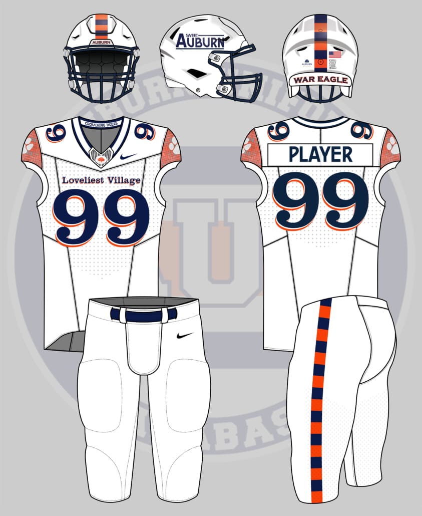
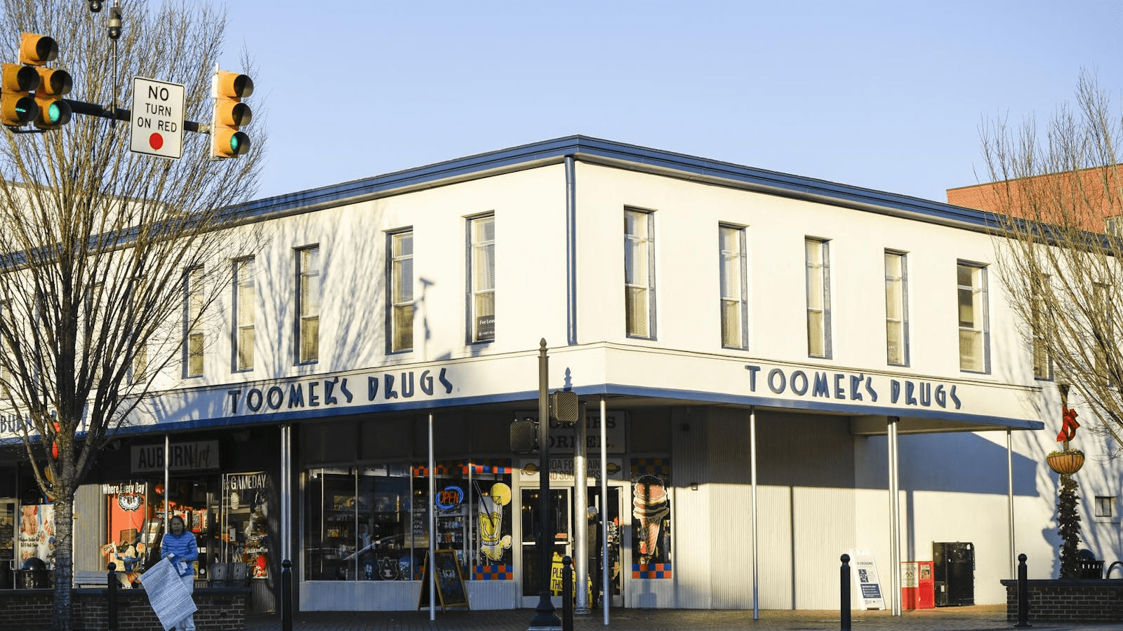
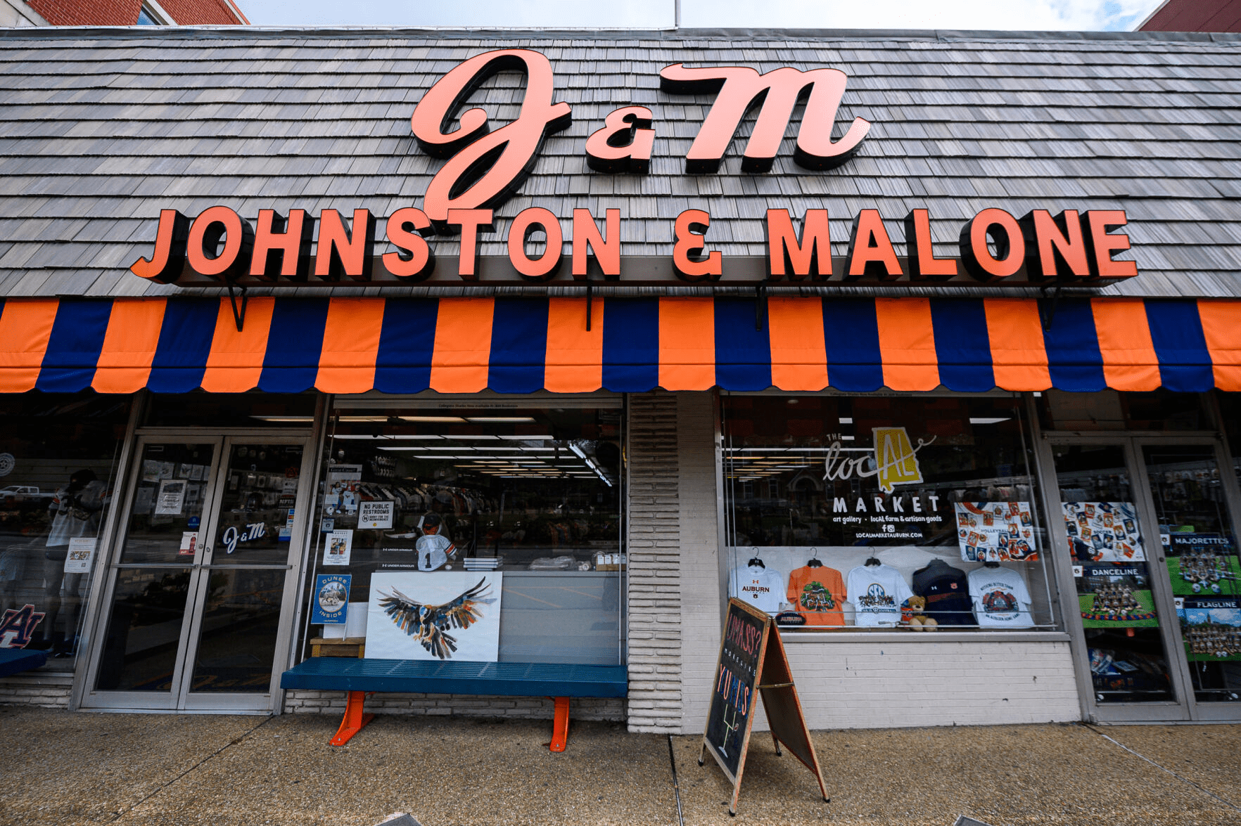
Starting with the helmet, “Sweet Auburn” sits on the sides in the aesthetic of the Toomer’s Corner building signs (that font was not easy to match). The center stripe features alternating orange and blue blocks to mimic the awning at J&M Bookstore. That same stripe is duplicated on the pants. The rear of the helmet includes two small decals – a City of Auburn decal with the new branding and a custom, scroll-shaped Warning decal to represent Mrs. Ruth, the lady who spends many days at the Corner.
The jerseys include Clarendon player numbers to mimic the War Eagle Wall next to J&M. The “Loveliest Village” chestmark matches – I swapped from Will’s initial “The Village” suggestion to connect it back to the city better. The collar includes a navy stripe at the top and bottom to mimic the Toomer’s Corner building signs, with “Crouching Tigers” on the inner collar, and the nameplates on the back, in the same matching Toomer’s font. The collar also includes a center badge that includes the Toomer’s Oaks logo.
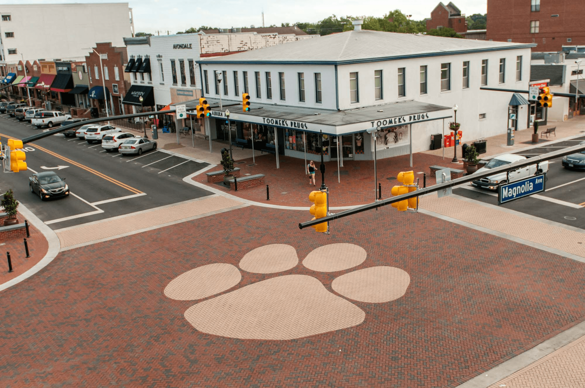
My favorite aspect of this design is the shoulder caps. To bring it all “Home on the Corner,” the intersection’s brick pattern and classic paw print are replicated here.
I spent some good time trying to find any other aspects of Downtown Auburn, but couldn’t find much more to include. I think this does a good job of combining the main aspects and makes a pretty decent design.

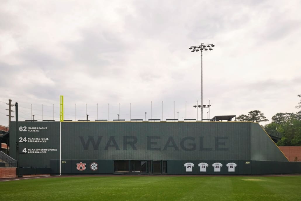
If I had a nickel for every time we’ve had a baseball uniform based on a wall design, I’d have two nickels. It isn’t much, but weird that it’s happened twice now.
The first one was based on the War Eagle Wall in Downtown Auburn (which was mimicked again above). This one brings a different inspiration that can be really fun.
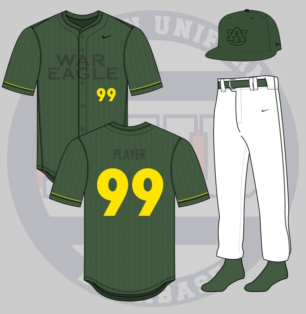
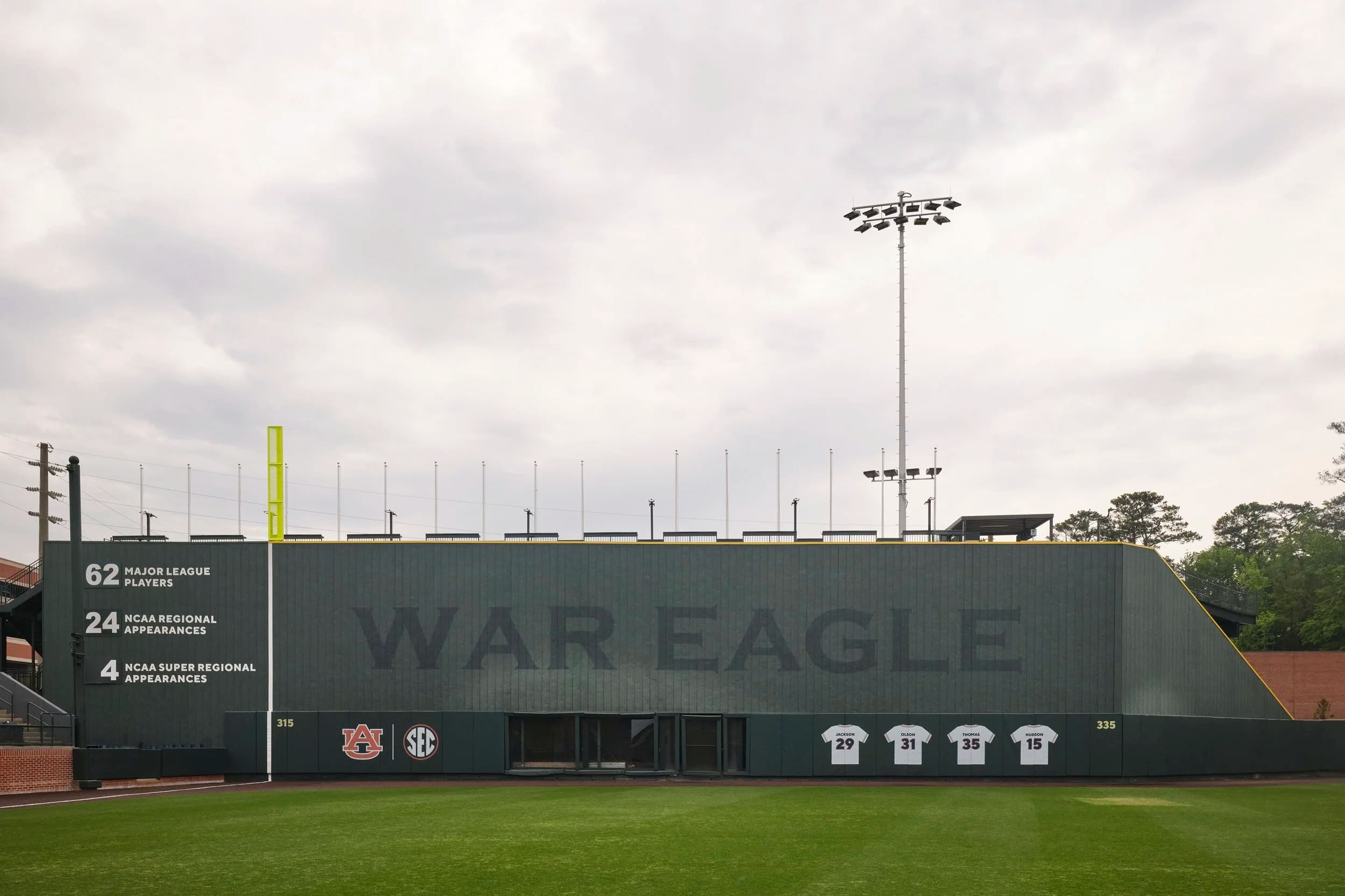
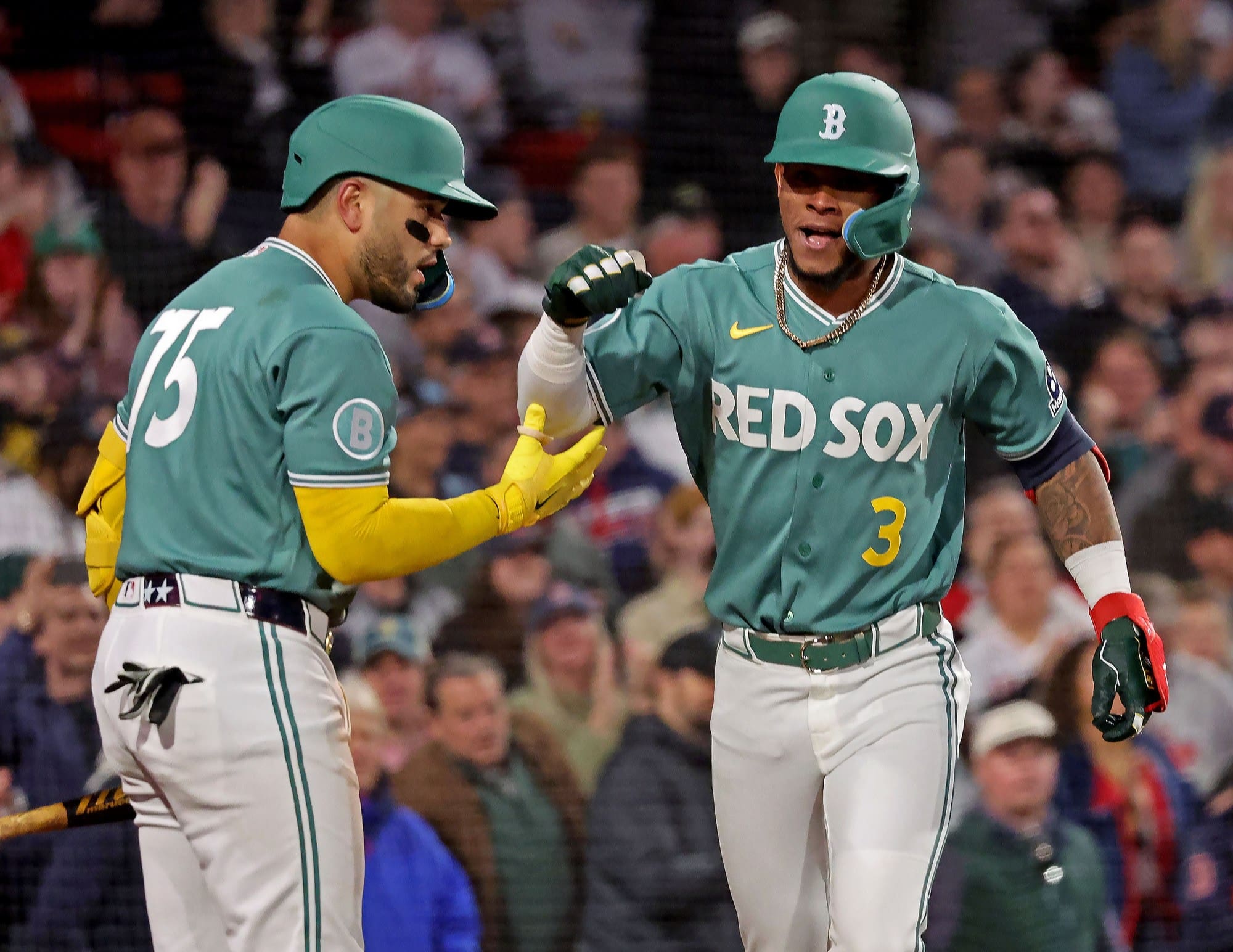
The big green wall at Plainsman Park was modeled after Fenway Park’s Green Monster. The Red Sox are currently sporting their second City Connect uniform, which was designed after the wall. So the real challenge here was to create something unique to Auburn and differentiate it from the Boston version.
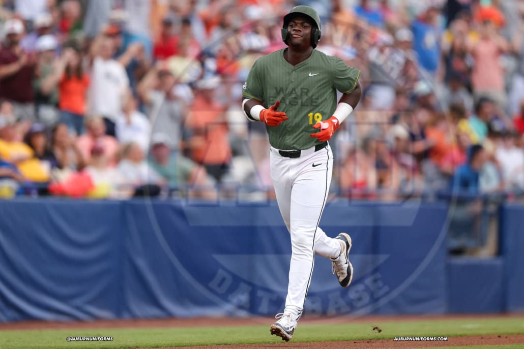
The Auburn version begins with a green jersey and ballcap. The tops receive subtle dark green pinstripes to mimic the corrugated metal used on the Monster itself. A dark green, tone-on-tone “War Eagle” sits on the center chest while a matching AU is used on the helmet, to represent the designs on the left field wall and the center field batter’s eye, respectively. The player number is presented in yellow to match the home run distance markers. And we’ll throw in a yellow stripe around the sleeves, much like the coverings used on the top of the outfield wall. The pants remain white and have a single green stripe down the leg. It’s to be worn with matching green belts and socks.
While it does have some similarities to Boston’s new look, it’s just different enough to be more similar to the Auburn wall. Boston’s look also has some unique elements to tie into the Green Monster’s scoreboard. All in all, I like this for an Auburn design, the Fenway connections notwithstanding.

I’ve said it before and I’ll say it again – I love what Carter brings to this series each year with these ideas!
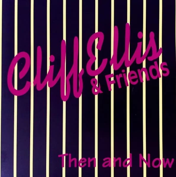
I had recently learned that Cliff Ellis had a musical background. I still need to dive into that discography and listen to some of it. There’s something spectacularly 1990s with this album cover and it fits in pretty well with the Auburn uniforms worn during the Ellis era.
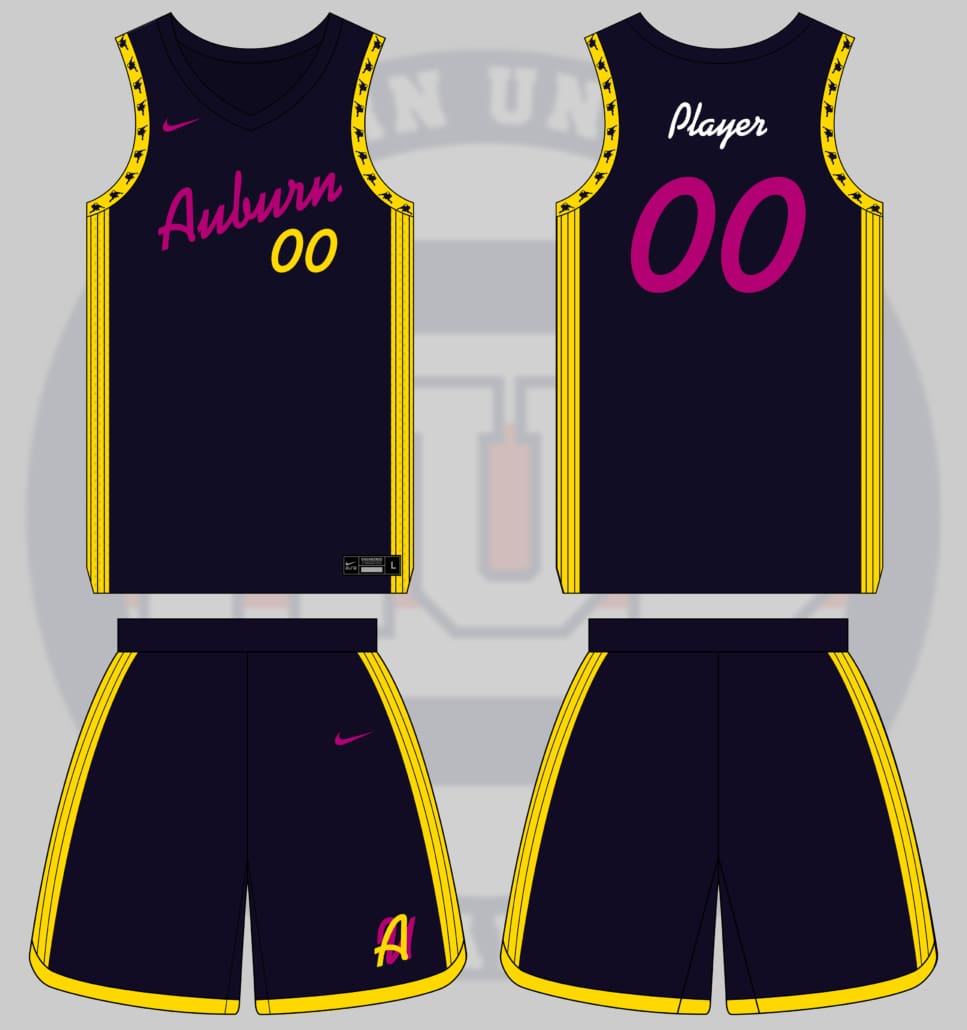
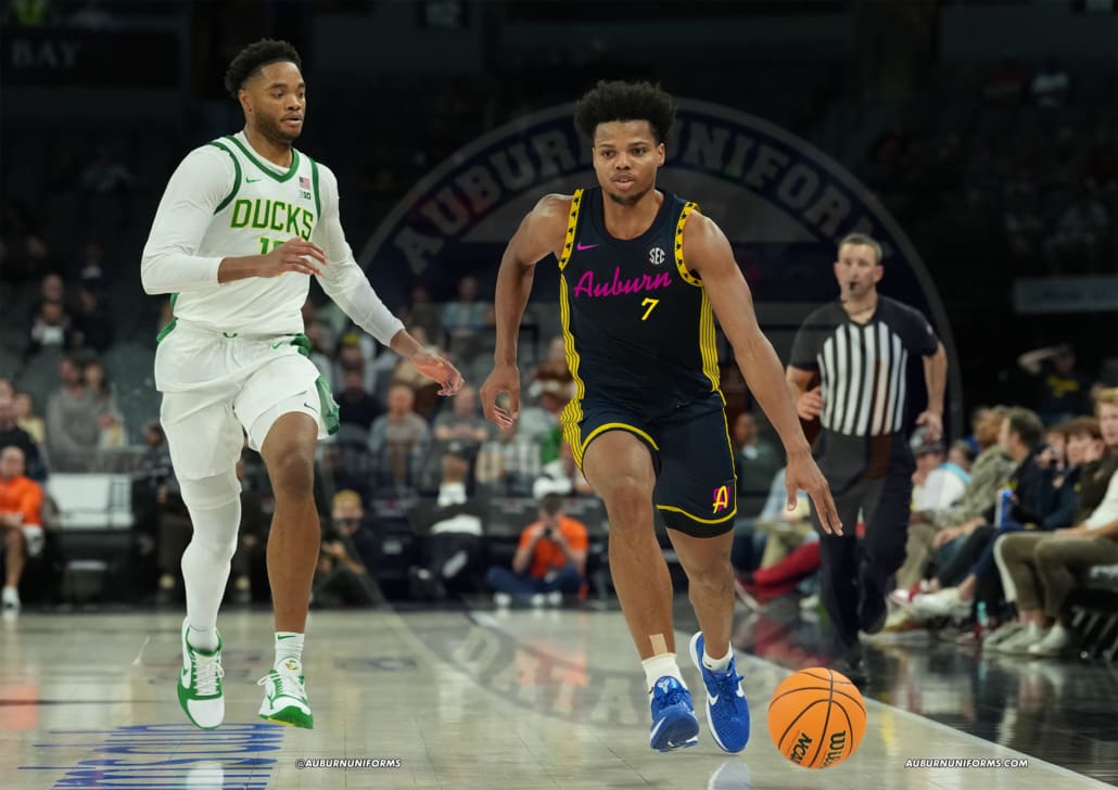
This is one of those designs that took some back and forth to get something unique and aesthetic (to some degree).
I knew I wanted to use the elements from the album cover – the script title, the unique colors, the pinstripe background. The image Carter originally sent over looked black and white with purple text. But some more searching turned up a slightly different color – dark navy and yellow. Maybe it had been sun-washed over the years, maybe it was a bad photo. Regardless, I ran with the yellow colorway.
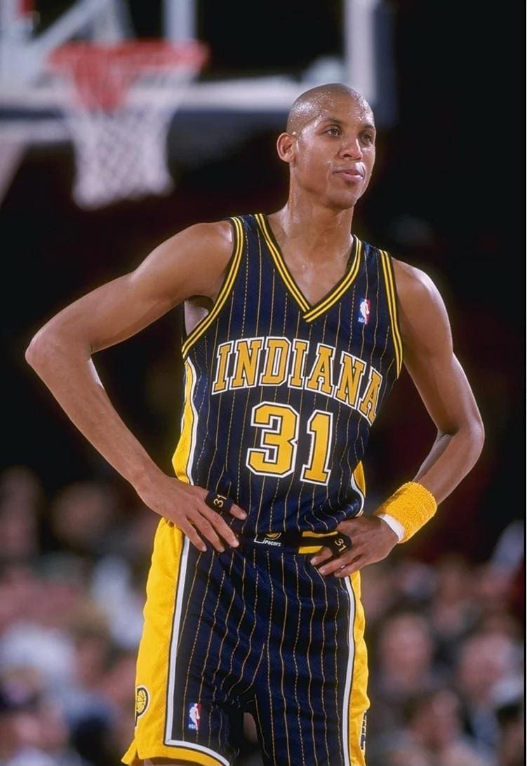
We’ve done pinstriped uniforms in the past, and navy and yellow equals a strong Indiana Pacers look. So we needed to do something different here. I placed the pinstripes in a yellow field and locked them to the sides of the uniform. The chestmark is in purple and matches the cover album title font. The player number is in the same font, but yellow on the front and purple on the back. I even added a new AU logo to the shorts, with both the A and the U being rendered in the same font, one in each color to really pop.
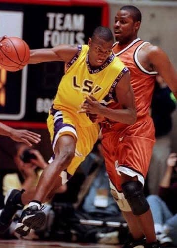
That was a fine start. But it didn’t really scream 1990s yet. There’s another similar concept later on that also stuck to the 90s aesthetic, so this needed to go a different direction. One uniform design that Auburn never jumped onto was the logo-patterned collar like LSU and Boston College, among others, sported (the tiger stripe and Aztec-patterned collars aside). I always love seeing these designs and wish Auburn had something similar. So, I made it so here – the arm holes now carry a silhouette leaping tiger pattern. It’s just 90s-enough to really tie this one together.
Yea, it’s not an Auburn look, no doubt. It fits the brief, though! And that’s the point of this series.
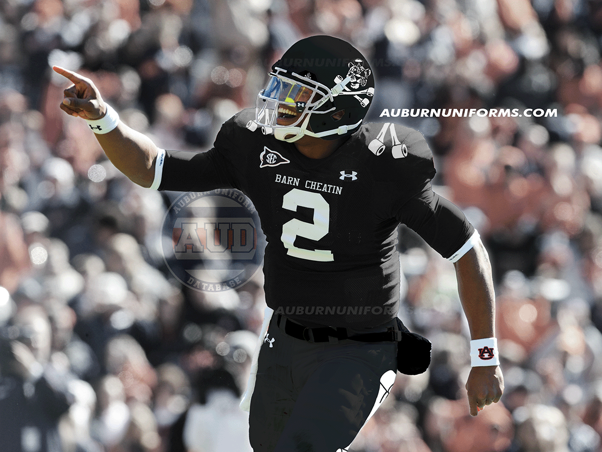
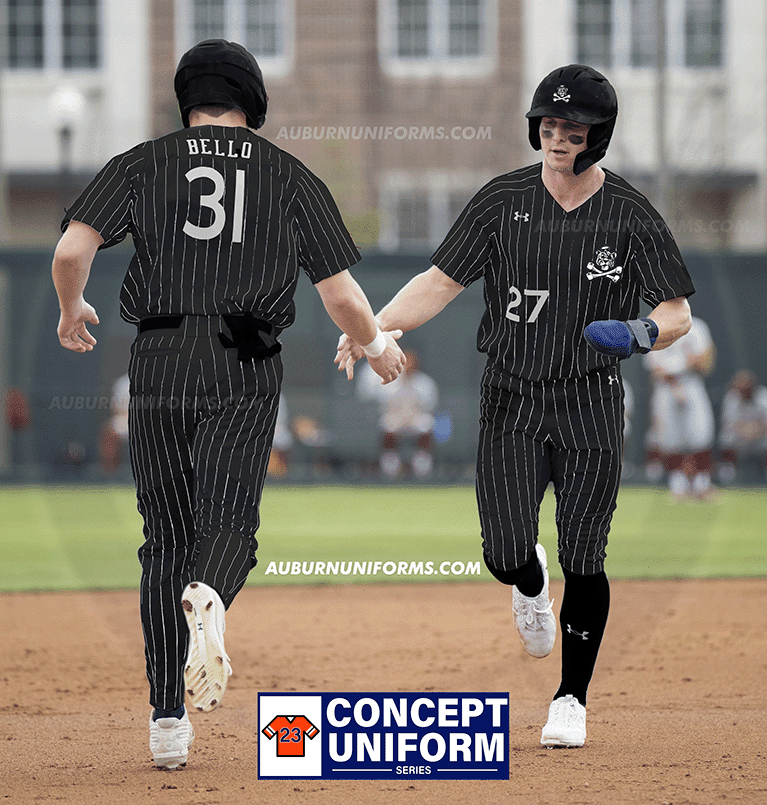
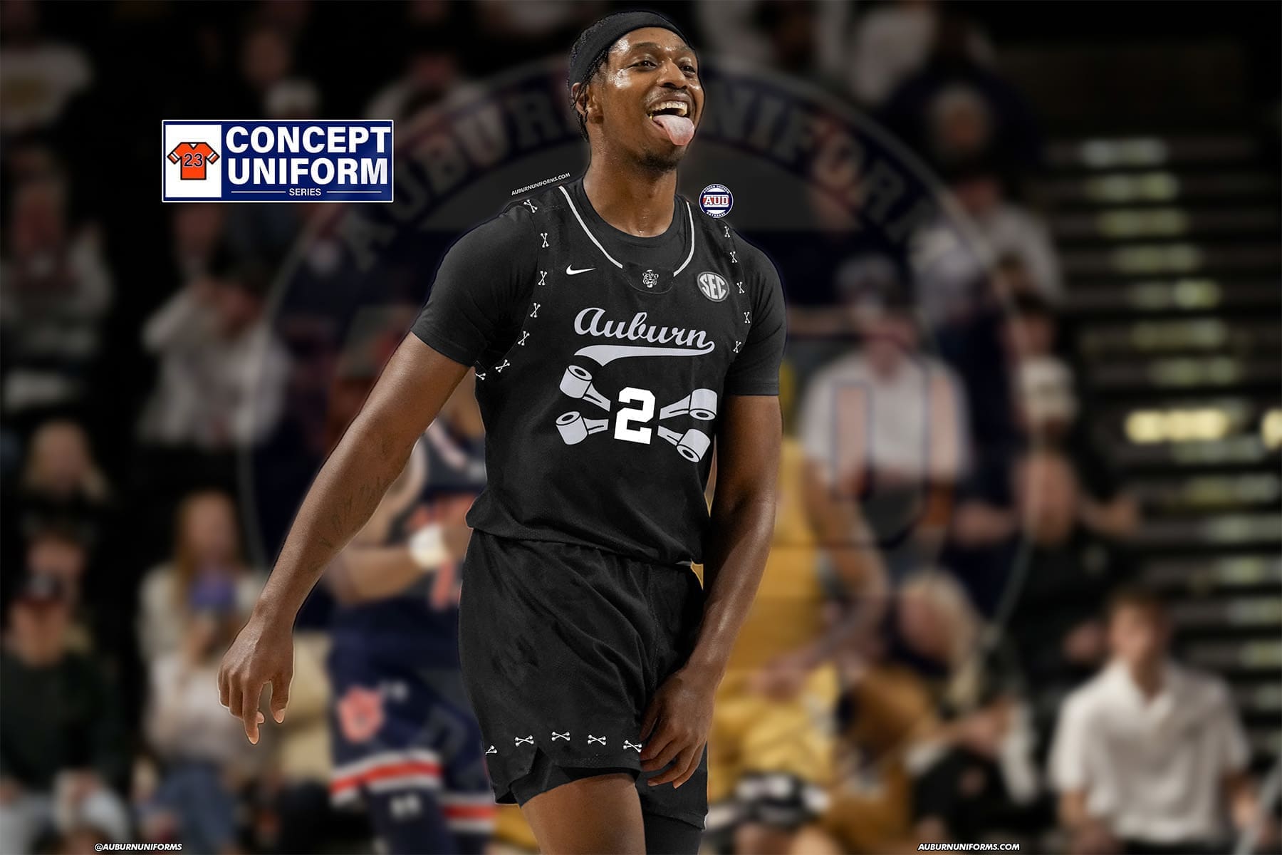
The grand finale for my requests… Jolly Aubie Softball uniforms 🔥
Jolly Aubies in script along the front with all black uniforms with white pinstripes. Batting helmets are matte black with the Jolly Aubie logo on them! Big Northwestern stripes on the socks like it used to be!
Another year, another Jolly Aubie suggestion from Cody. We’ve tackled some other designs for football, baseball, and basketball over the years. So let’s wrap it up for another diamond sport.
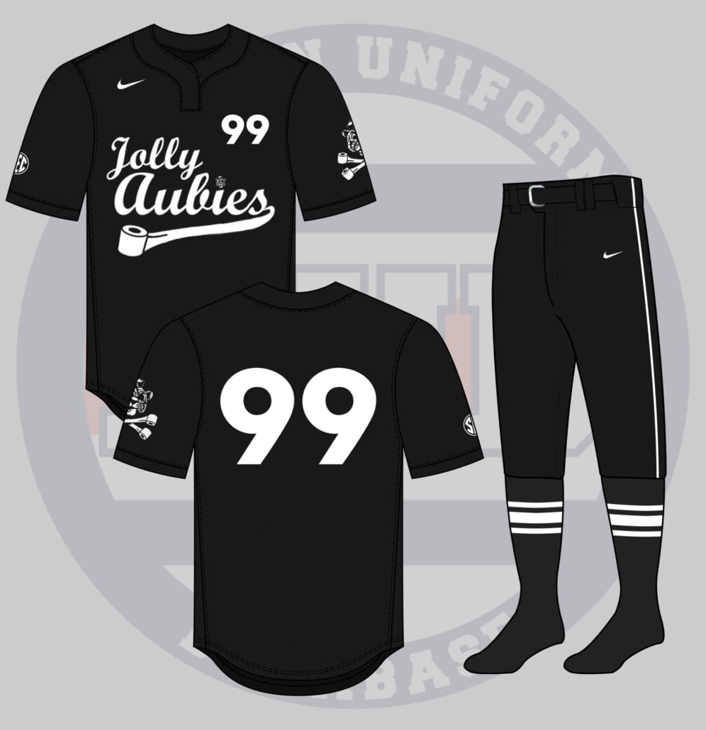
The biggest challenge with these Jolly Aubie uniforms is differentiating each program from one another. Football was pretty on the nose with the Cam Newton money bag design. Baseball had the pinstripes, so I threw that element out from Cody’s initial idea. Basketball used toilet paper to display the player number.
It really felt like things were pretty well exhausted with this mini-series. Then I reread the concept: “Jolly Aubies in script along the front.” That was it.
Using a font similar to the script Auburn mark, we start with a two-tiered wordmark for the Jolly Aubies. The “s” transitions to a toilet paper tail, not too dissimilar from the Toomer’s Drugs basketball uniforms a few years ago. And because we can, the “i” dot is replaced with the Jolly Aubie logo.
Without a good spot on the center for the player number, the digits will move to the left chest above the script. And to add more to the look, the Jolly Aubie logo is also placed, large, on the left shoulder. I guess we could explain it as a large sailor man’s arm tattoo.
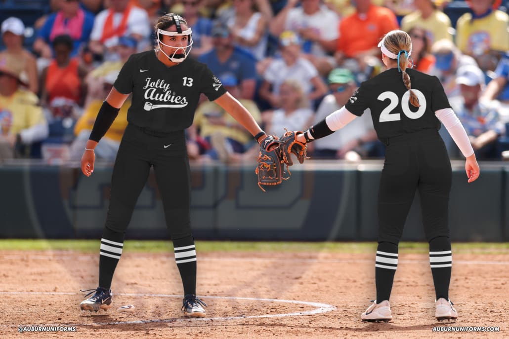
I think this is a great way to wrap up the Jolly Aubie mini-series of uniforms.

I’ll be honest: I know very little of Ella Langley. I knew she was an Auburn alum and had recently made it big in Nashville. I had no idea how I was going to combine her music career with an Auburn football uniform.
So I started doing some research. I also discussed it in a little more detail with Andrew, who threw out the dandelion suggestion. I had to take that and run with it.
And, as a complete and total coincidence, Ella announced that her Dandelion tour was coming to Auburn this year as I was working on this design. Call it serendipity, call it content – it worked out well.
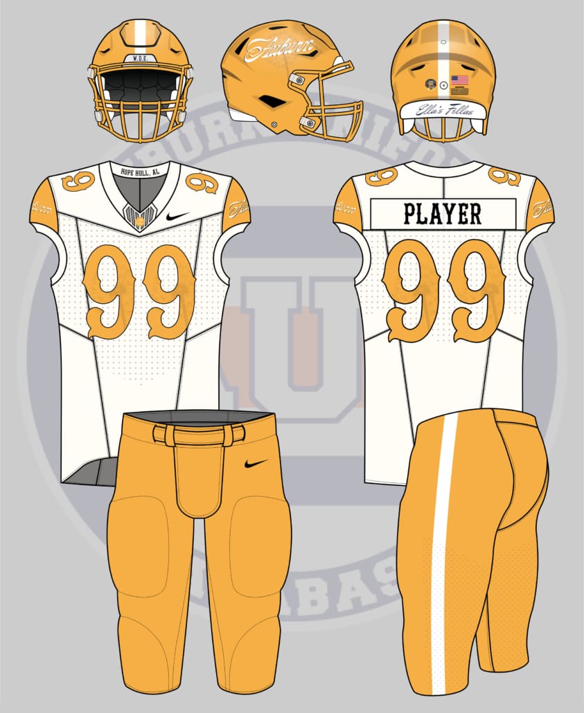
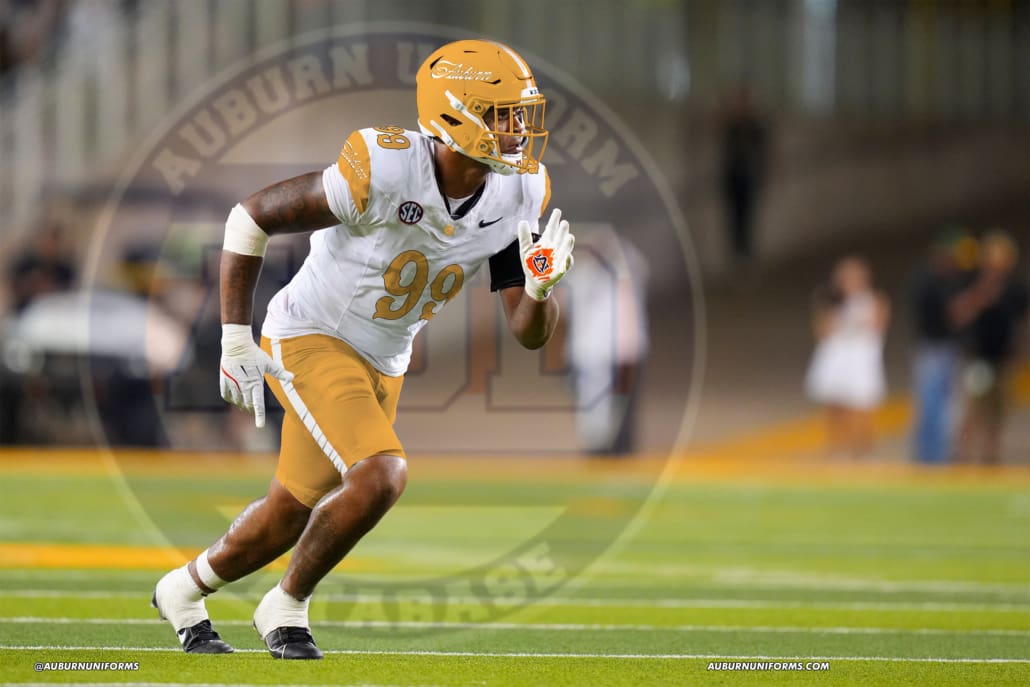
We’ll start things off with the helmet, which has to carry the dandelion gold color. The Auburn script is pulled directly from the postcard announcing her two August tour dates on campus. A subtle dandelion silhouette sits right behind the wordmark decal to tie things together nicely.
The jersey has a white base to represent the road jersey Ella wore at the Texas A&M game last season. The shoulder caps carry the gold color and the white script Auburn to match the helmet. I debated trying something different here to not duplicate the headwear design, but nothing else worked as well. A rather Nashville-esque font is used for the player numbers, which are gold-outlined in black and also feature a dandelion pattern. The nameplate on the back of the jersey is black and rendered in the same font style. An apparently seldom-used logo for Ella is the EL initial design. I thought that worked well to add the collar as a button. “Hope Hull, AL” is also added to the inside of the collar to represent Ella’s hometown, which is just south of Montgomery.
The pants are designed to match the helmet, with a gold base and a single white stripe.
Let’s return to the helmet for a few Easter eggs. The front bumper carries “W.D.E.” but in a similar fashion to her “R.B.F.” merchandise. “Ella’s Fellas” is placed on the rear bumper, so everyone knows exactly who each player is connected to. And we’ll even add a homage to 2026 World Cup hero, freddyLA7 (whose Twitter account has disappeared at the time of writing this), with the Cristiano Rinaldo profile picture surrounded by the German flag placed on the back of the helmet.
How about an Auburn Basketball version of this 90s relic?
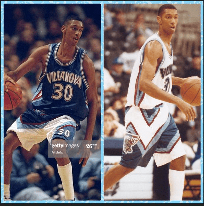
There were some incredible uniform designs in the 1990s. And it’s crazy how Auburn avoided them all. Just like the collar logo design above, this Villanova look was a fun one. Let’s see how we can Auburn-ize it.
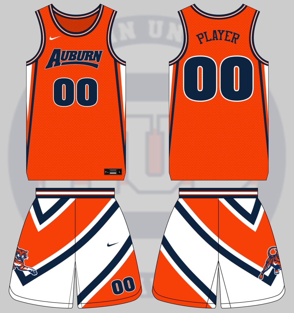
As I studied the Villanova design, a few things came to mind. They ultimately used four colors – navy, light blue, red, and white. For an Auburn version, we’re going to have to do it on just three. I debated throwing in the powder blue color, but decided it might clash a bit too much here. So I stuck with the three colors and tried to balance the stripes.
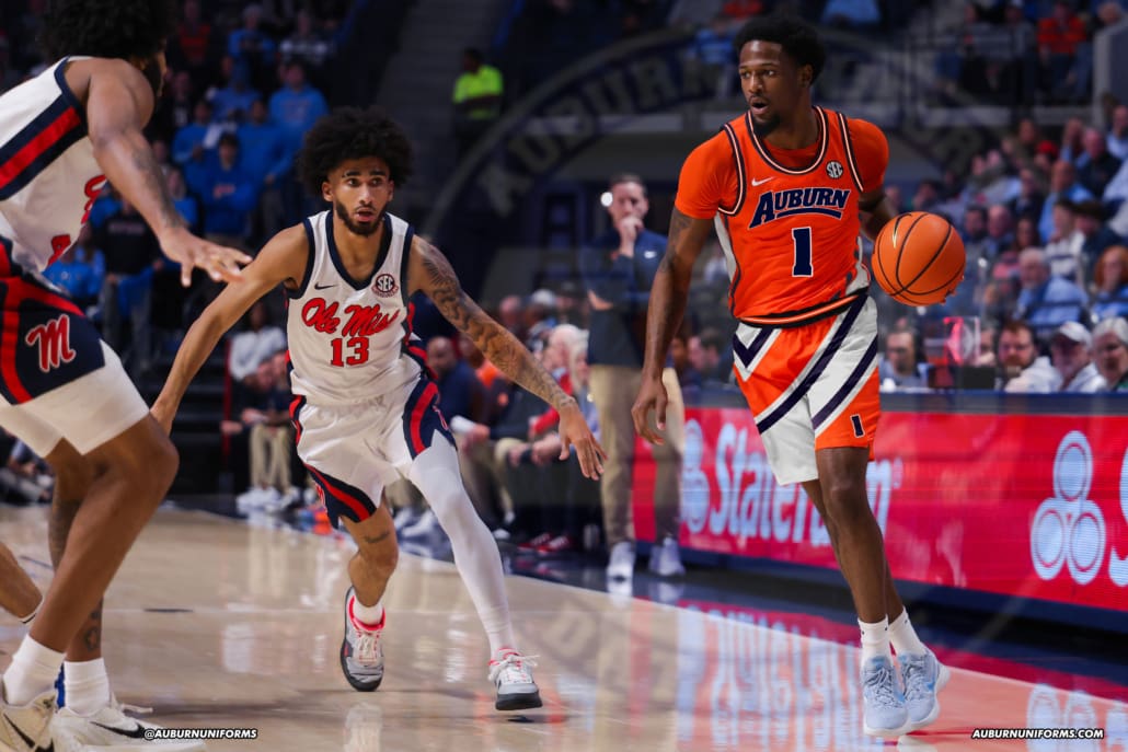
The jersey is pretty tame here. An orange base carries triangular stripes down the side of the torso in all three colors. A navy/orange/white/orange/navy stripe pattern is used on the collars and armholes. To really stick to the 1990s era, we’ll use the old-school wordmark on the chest with a matching font for the numbers.
The shorts are obviously where this design shines. I looked for as many images as possible of Nova wearing this uniform, but couldn’t find as many as I would have liked. I did notice that they had two versions, a navy and a white base, but it wasn’t always paired with the corresponding jerseys. With enough colors on these shorts, they could truly be worn either way and be legal.
So I went with a white base for the shorts. We’re going for wacky and crazy after all. A navy/white/orange/white/navy chevron stripe pattern covers the full canvas here, wrapping around the left leg and right hip. Another 1990s staple, the leaping tiger, is placed on the right leg to replace Villanova’s Grizzlies-ripoff logo. And, much like the soccer design above, I love a unique placement for the player numbers, which are placed in the orange field on the left leg.
I could really see a world where the jerseys are actually worn. The era of wacky shorts designs is pretty long gone, but these would make for a fun overall look.
As is tradition here, we wrap things up with my sister-in-law’s annual concept. She, no lie, spends all year trying to come up with something to submit, always trying to top the previous year’s design. After her initial concept featured a gold-sparkle uniform with a cape, Jillian has earned a permanent slot in this series for years to come.
 This is an entirely self-indulgent inside joke uniform, so, dear reader, please accept that before you proceed.
A Powerpuff Girls-themed white baseball uniform with a pink, blue, and green power stripe that goes down the entirety of one side, from the top of the right-hand side of the shoulder down the pant leg.
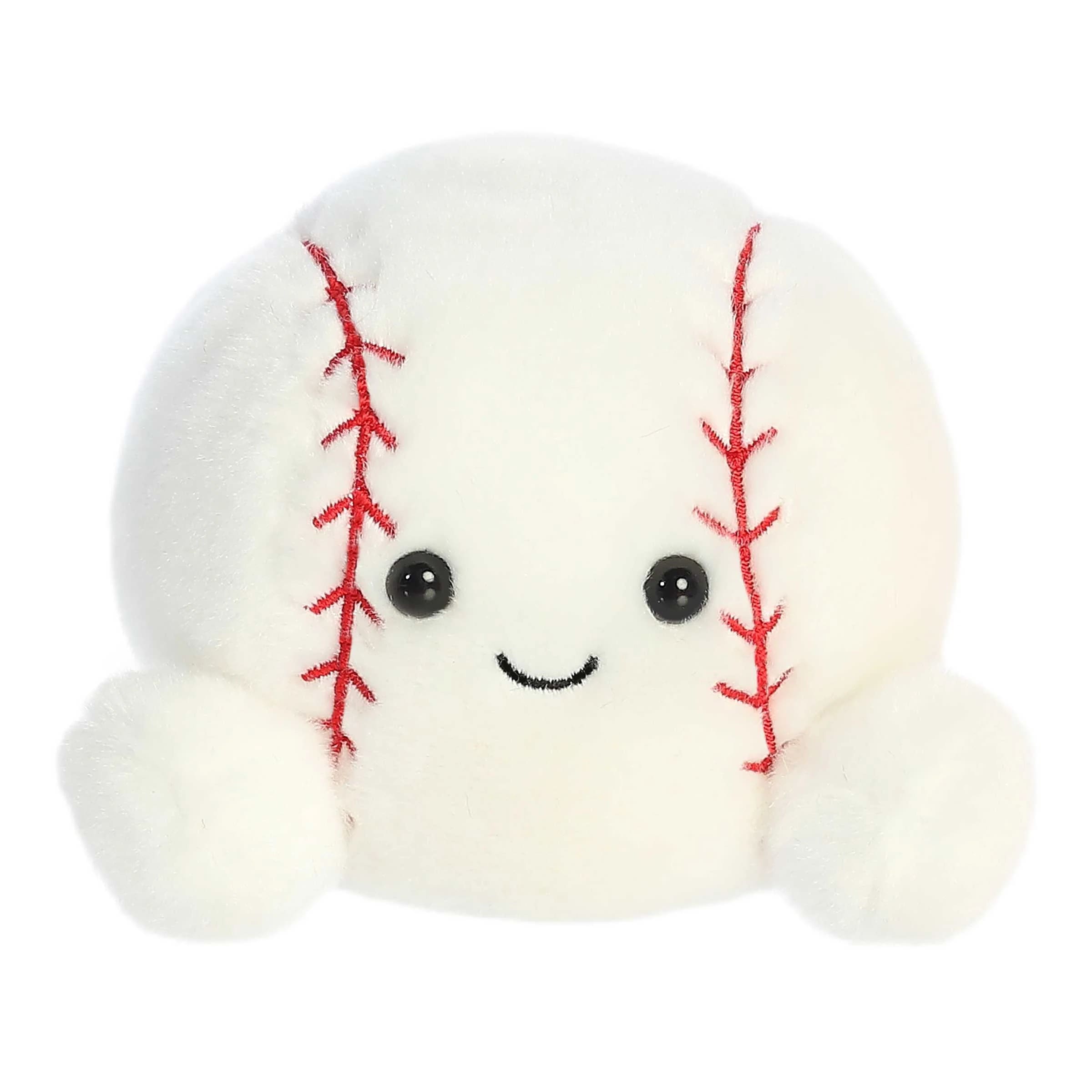
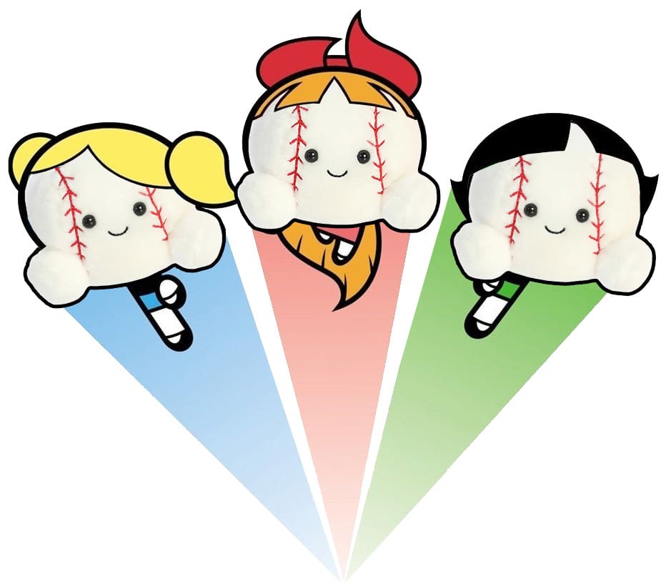
The official-because-I-said-so mascot of Auburn Baseball Batters, who is collectively known as Strikeout™ (3 plushies named Bub, Bubbert, and Bubberino – named after Bub Terrell, who was the first Auburn batter to hit a home run after the plushies were acquired), will be featured on the left upper chest with the three-color PowerPuff Girls logo behind it.
The player’s number will be featured on the bottom left-hand side with a pink, blue, and green gradient effect. Numbers on the back will have the same gradient.
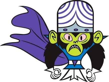
On the hat, it will be white with purple stripes like Mojo Jojo’s hat. Put either the AU logo in the same pink, blue, and green gradient, or write Auburn in the Powerpuff Girls logo.
Oh dear heavens. Alrighty then. Let’s try this one out.
For some additional context, my wife bought a cute baseball plush for herself, her brother, and her sister. The lore of the plushies and “Strikeout™“ grew as the season went on. So, of course, it had to turn into this year’s concept design.
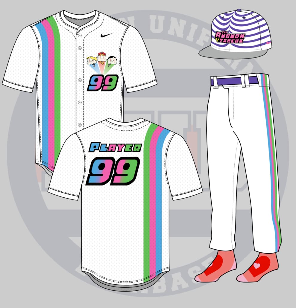
The Powerpuff Girls obviously have a lot of vibrant colors to use for this look. Let’s start with the jersey. As requested, the three color stripes for Blossom, Bubbles, and Buttercup run down the right side of the jersey and over the shoulder for the backside. We really let that stripe stand out, so no additional decorations on the sleeves. The player number is rendered in the Powerpuff Girls logo font, with the tri-color gradient through the center. The player name on the rear is also rendered in the logo font with solid-color letters to mimic the gradient. The three main characters – replaced with the plushie – don the front left chest above the number, with the contrail streaks appearing from behind the numerals.
I know the initial request was for the jersey stripe to continue down the pants. But hear me out.
I couldn’t do it well with this template.
Yea yea yea. Boo me all you want, I get it. The angle of the pants didn’t work well, and reflecting it threw it off even more with the feet facing to the right. So, to compensate, the tri-stripe is utilized as a traditional stripe down the pants leg. We’ll throw in a purple belt to tie it all together as well.
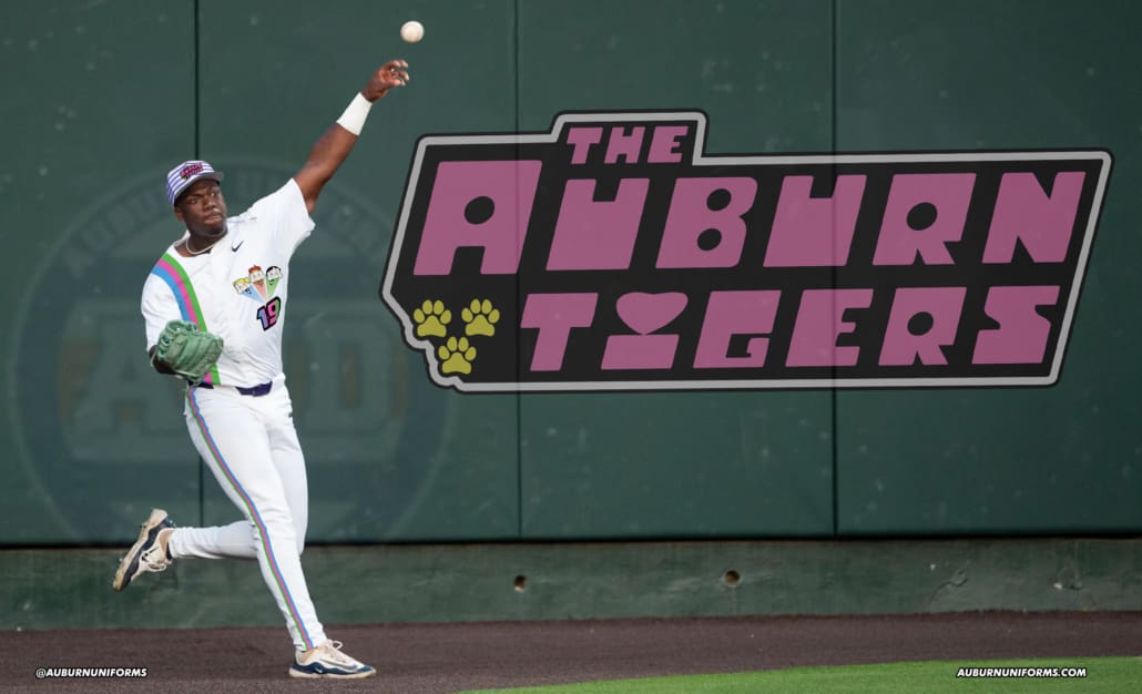
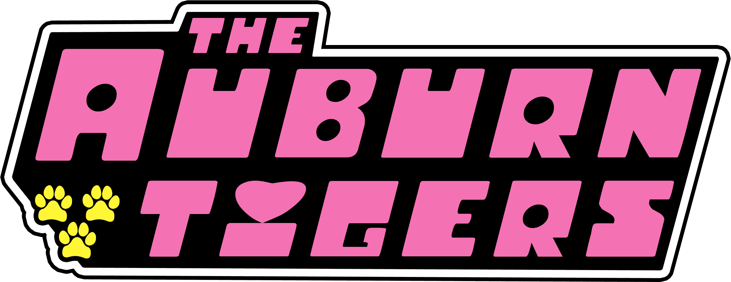
Now for the ballcap. As Jillian submitted, the crown of the hat is white with the wavy purple stripes to match Mojo Jojo’s headwear. The bill is grey to mimic his hat as well, with a pink Nike Swoosh on the sides for a little pop of color. I replicated the Powerpuff Girls logo for The Auburn Tigers, even replacing the three stars with three paw prints, and I’m really fond of how this element in particular turned out.
And, for one final callback to the show, the heart background from the ending scene of each episode is replicated on the team socks.
Whenever I complete the image and get ready to place it on a real player, I try my hardest to find images of different players, even different positions. But this one carried the caveat that Bub Terrell needed to wear it. And unfortunately for me, I had already completed the War Eagle Wall mockup. So Bub becomes one of the rare instances of a player wearing two concept uniforms in the same year.
So, congrats, I guess, Bub!
And there you have it – 10 more uniquely insane concept uniforms for the Auburn Tigers. Here’s one last look at all of them in one place.
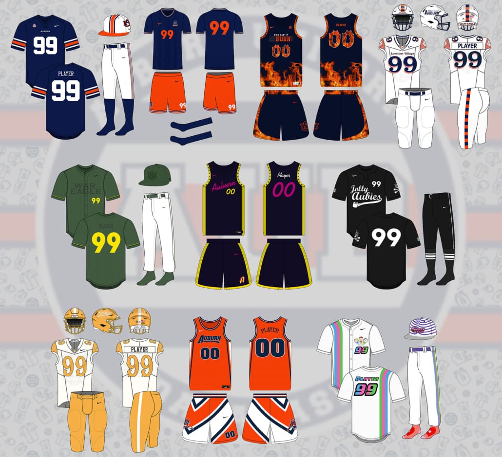
Which design was your favorite? Which one do you think can actually come to fruition?
Did your suggestion not get picked? Don’t worry! We do this each summer. We’ll do it again next year!
I receive messages throughout the year with ideas for this series. But remember, the idea has to come when suggestions are open! So stick to the AUD socials – especially during the summertime – to get your grand ideas included in the next round of concept uniforms.
And one final thought. To repeat myself from the top of this article, if you are truly upset about these designs, that’s solely on you. If you get upset and clearly miss the humor in all of this, the rest of us will point and laugh at you.
It’s fun. Chill out. Enjoy a good laugh.
Enjoy discussing uniforms and all things Auburn Athletics? Want to see more like this? Or want to learn about the newest Auburn uniform news?
Be sure to follow the Auburn Uniform Database on social media for even more uniform news. And subscribe to our new newsletter to get the latest updates directly in your inbox! It’s infrequent on purpose – you won’t get spammed every day or week.
You can also support the work that goes into the Auburn Uniform Database via Buy Me A Coffee, purchasing your favorite team’s merchandise at Fanatics, or even buying some AUD-logo merchandise.
Leave a Reply
Want to join the discussion?Feel free to contribute!