Crazy Auburn Concept Uniforms – Round 5
In what has quickly become one of my favorite traditions here on the Auburn Uniform Database, it’s time for another round of insane, crazy, and sometimes potentially great concept uniforms!
Each summer, I put out the request for Auburn fans to submit their ideas for concept Auburn confirms – the crazier the better. Most of these have been for football only, but we’re slowly branching out to include basketball and baseball. Previous editions have had uniforms based on a car, other football teams, a beloved childhood video game franchise, and even gold sparkles with capes.
This round of suggestions didn’t fall short. In fact, I think this might be the best group of designs thus far!
And because some people are bound to get upset – these are meant to be fun, goofy, and, for the most part, bad. These are in no way supposed to be ideas for anyone to expect Auburn to actually wear.
Without further ado, let’s dive in to the newest concept uniforms.
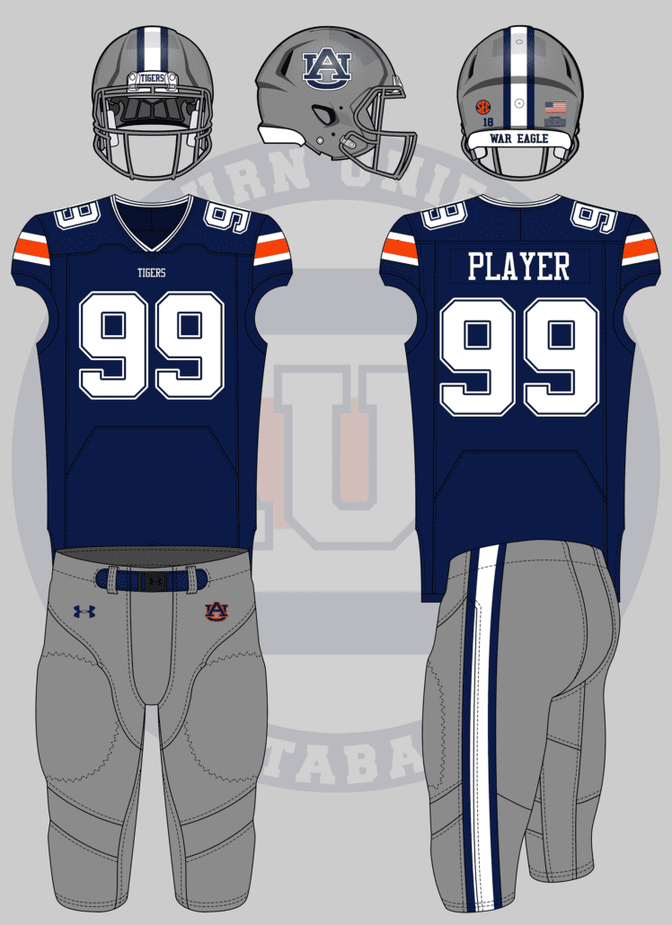
In honor of playing in Jerry’s world opening weekend, I would want to see an Auburn/Dallas Cowboys mashup, kinda like what Arkansas did.
— Cody Adair (@cadair78) July 3, 2019
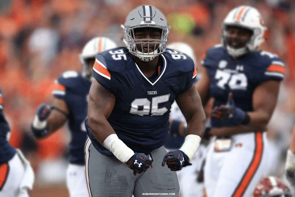
In just a few weeks, Auburn will kick off the 2019 season against Oregon in Dallas, playing in Jerry’s World. In 2017, Arkansas and Texas A&M faced off in AT&T Stadium, and the Razorbacks wore Cowboys-inspired uniforms in honor of alumni Jerry Jones.
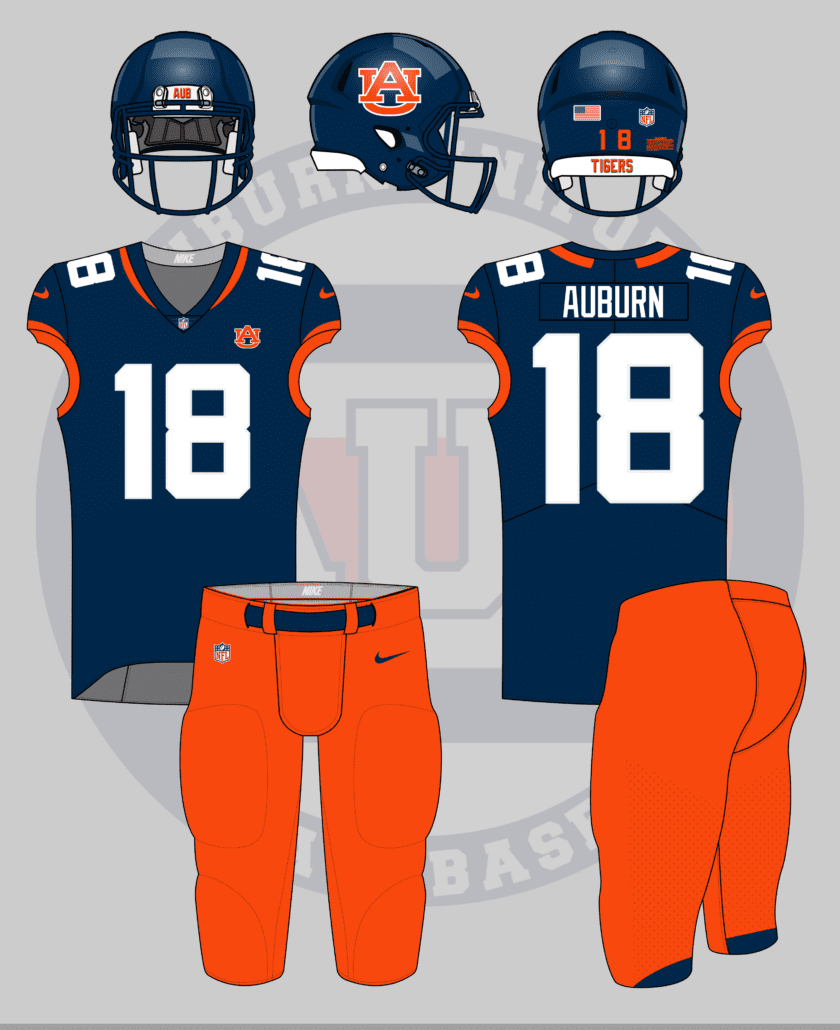
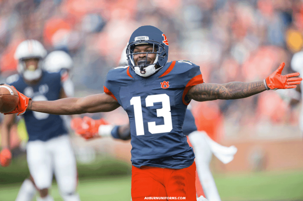
When Arkansas copied Dallas, they simply swapped blue for red. That’s an easy choice when both teams only have a single primary color. With Auburn have blue and orange, it’s a bit more difficult. I wanted to keep a splash of the orange to differentiate from the original Cowboys uniforms, so the shoulders get an orange stripe. Playing around with more orange, and even an orange jersey, just didn’t work.
Let’s stick with the NFL look-a-like designs.
Football unis, Jacksonville jags level minimalism 🤷🏽♂️ pic.twitter.com/Moikduxej5
— Colin Turner (@colin_turner95) July 3, 2019
My Jacksonville Jaguars have struggled on the field for too long now. But at least the uniforms are a bit better. I still miss the original design.
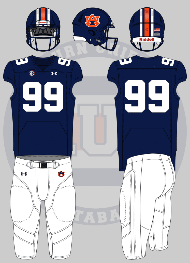
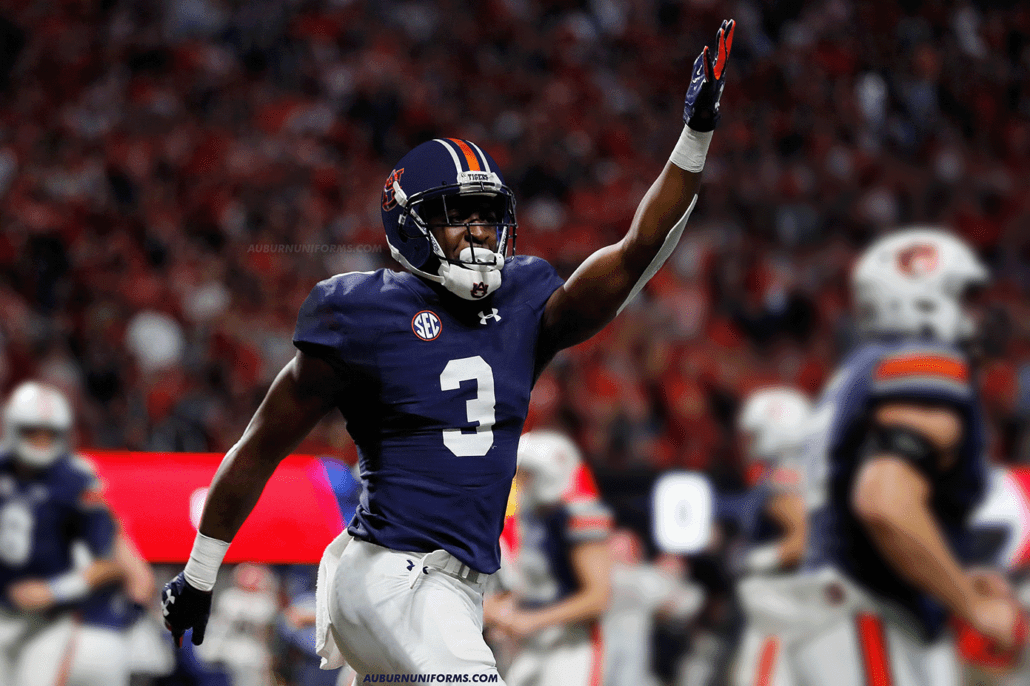
Unlike the Cowboys, the Jaguars have a lot of colors to chose from. I struggled trying to pair the black, gold, and teal with Auburn’s blue, orange and white. I decided to use the navy to replace the black and used the orange for the details.
One more design mimicking other teams.
Matte Navy Helmet with standard AU and striping, but no stripes on pants or jersey. I’m thinking something like the color rush uniforms of the Lions.
— San Andreas (@SanAndreasAU) July 3, 2019
After some discussion with San, he decided to go more Penn State like rather than Lions, as Detroit has stripes all over the uniform.
While Penn State wears white helmets, the navy pairs well here. I actually like this design, one we’ve seen plenty times before. I think the matte look really helps if Auburn were to actually wear a blue helmet shell.
There are always a few people I can rely on for really good concept ideas, and Carter Michaels is no doubt in that group.
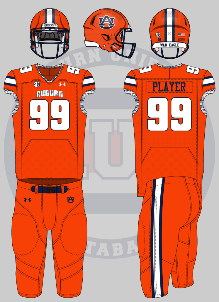
Give me a football uniform based on this basketball uniform. pic.twitter.com/Zb84kPPw3S
— Carter Michaels (@TheRealCMike) July 3, 2019
The turn of the century was a really dark time for Auburn basketball uniforms. The uniform Carter showcased was a one-year special worn in 1999. The collar and armholes feature what I’ve called an “Aztec pattern” that feels very out of place.
As the basketball uniform sticks with traditional striping on the side panels and shorts, I wanted to reflect those on the shoulders and pants. This one is pretty much a one-for-one recreation, and it’s equally as… not flattering.
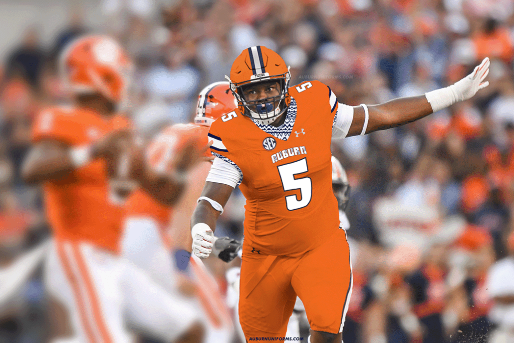
As basketball uniforms are a much smaller canvas for design, it’s sometimes difficult to make up for it with a helmet on a football uniform. I wanted to stick with the orange theme and made for an orange helmet with matching stripes. The shell actually features the same Aztec pattern as the jerseys but lightly sublimated. It creates a nice texture on the lids.
And of course the real-life mockup would use a photo against Clemson, making for a lot of orange in one photo.
I really enjoy seeing new ideas for non-football teams.
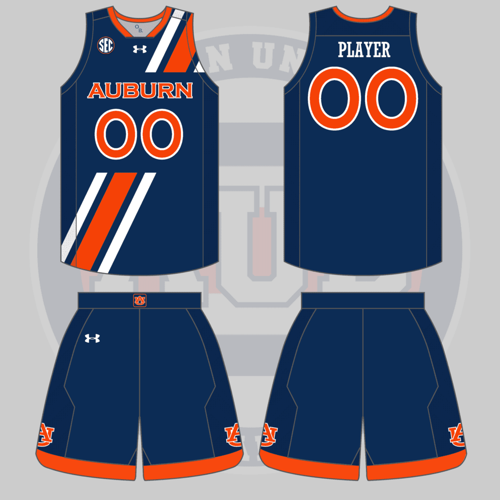
What about one inspired by the full-sash soccer kits pic.twitter.com/rR5H29kRZl
— ⭐️⭐️🇺🇸⭐️⭐️ (@JamesJones_55) July 3, 2019
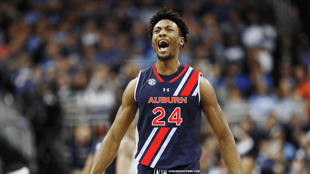
The soccer uniforms looked amazing with the full stripe sash. Unfortunately the new kits aren’t as great in that sense. But how would basketball look utilizing such a great feature? The program has worn uniforms featuring the Northwestern stripe before, but it wasn’t entirely well done.
Yea, I think I’m in love with this.
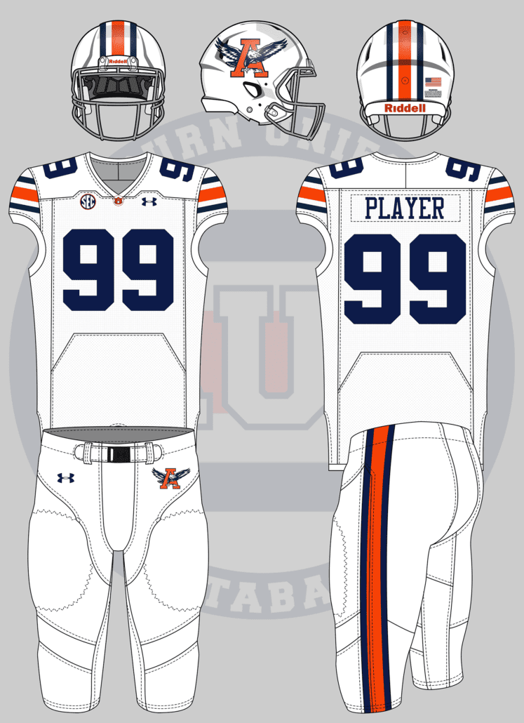
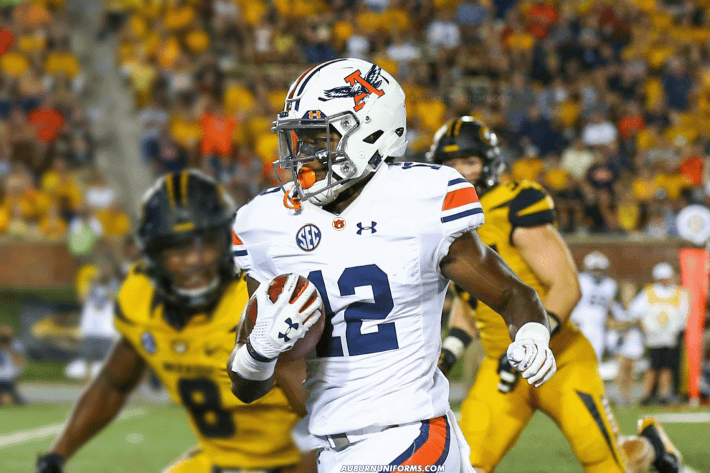
Old school A with the eagle for the helmet decal. Grey facemask. White jersey, 2019 template with no AUBURN wordmark on the chest. 2004 collar design with the AU. Navy and white socks, full length.
— gAUlf (@originalgAUlf) July 4, 2019
Nostalgia hits hard in 2019. Let’s go with an old-school logo, a football jersey design feature from the early 2000s, and the classic grey masks.
It’s rather simple, but that’s ok. Auburn’s uniforms have gone rather unchanged for decades because it works.
The grey mask is a nice touch and throws back to the Sullivan era. The simple “button” on the chest could be a cleaner design than the chestmark currently worn. And who doesn’t like the old school logos??
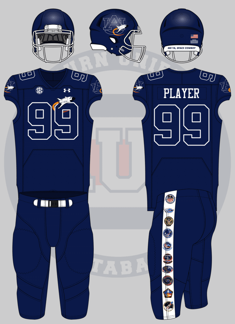
Two words: SPACE THEMED
To honor Auburn’s astronauts
— Tom (@ths0002) July 4, 2019
Auburn has a great space and NASA history, having six alumni being selected as astronauts. In fact, Columbia’s final test flight in 1982 featured two Auburn graduate alums. NASA employed over 800 Auburn people at the time.
UCF has made space uniforms their thing recently, and I wanted to avoid copying any of their designs.
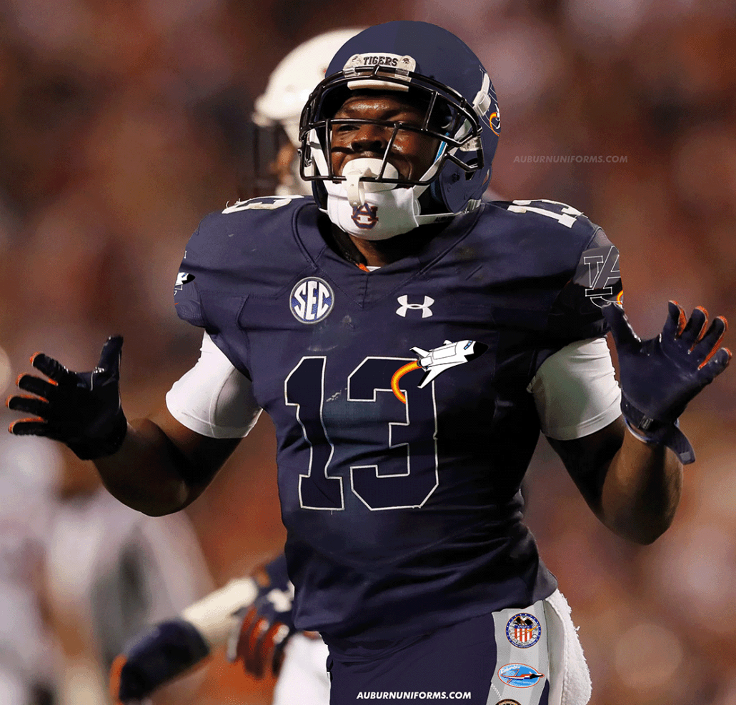
To celebrate Auburn’s history with NASA and space travel, this uniform is meant to honor the past successes. Five of the six Auburn alumni astronauts have been launched into space, and their mission logos don the pant stripes. The AU logo now resembles a constellation and features a space shuttle flying across. The shuttle is also placed on the front chest, circling the player numbers.
Lets go
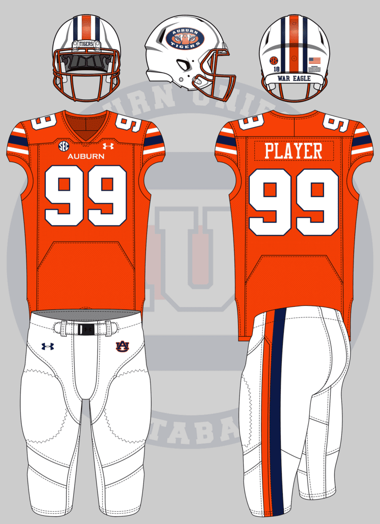
Matte White Helmet with Tiger Eyes chrome decal
Orange Chrome Facemask
Orange Jersey with White Numbers, blue outline
White pants with 1 single orange strip parallel & touching 1 single navy stripe. (Think Scar pants)
Orange socks and cleats— Auburn Rants (@AuburnRants) July 3, 2019
Some crazy designs aren’t actually all that crazy.
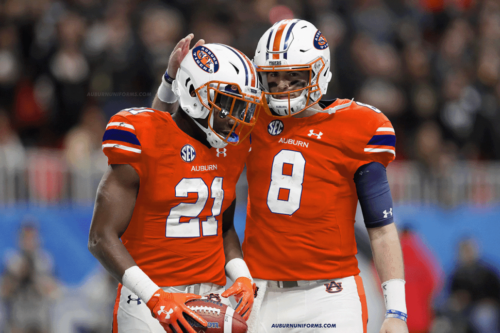
The Tiger Eyes logo is rather divisive among Auburn fans, but that might be the least offensive to many. I would love to see the return of the orange facemasks for real – that’s the one real uniform tweak I advocate for. When Auburn wore orange jerseys during the Doug Barfield era, one of the design issues was the white numbers. A blue outline could easily fix that issue. The pant stripes are a bit different, but can work well here.
I must say, this is my favorite real-life Photoshop image of this entire batch of concepts.
Turn forward the clock, Auburn style. pic.twitter.com/KCZZRAzZ0F
— David (@dsmall75) July 4, 2019
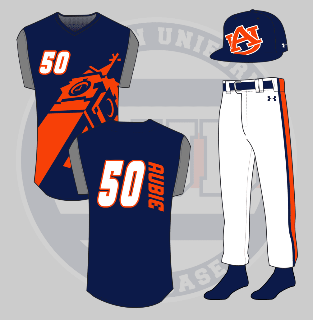
The Turn Ahead the Clock era in MLB history is one of my favorites. The unique designs were all fun and it’s crazy that we’re now at the point were futuristic uniforms are now old enough to be throwbacks.
For this TATC design, I wanted to stick to the theme of the program without blatantly ripping off some designs.
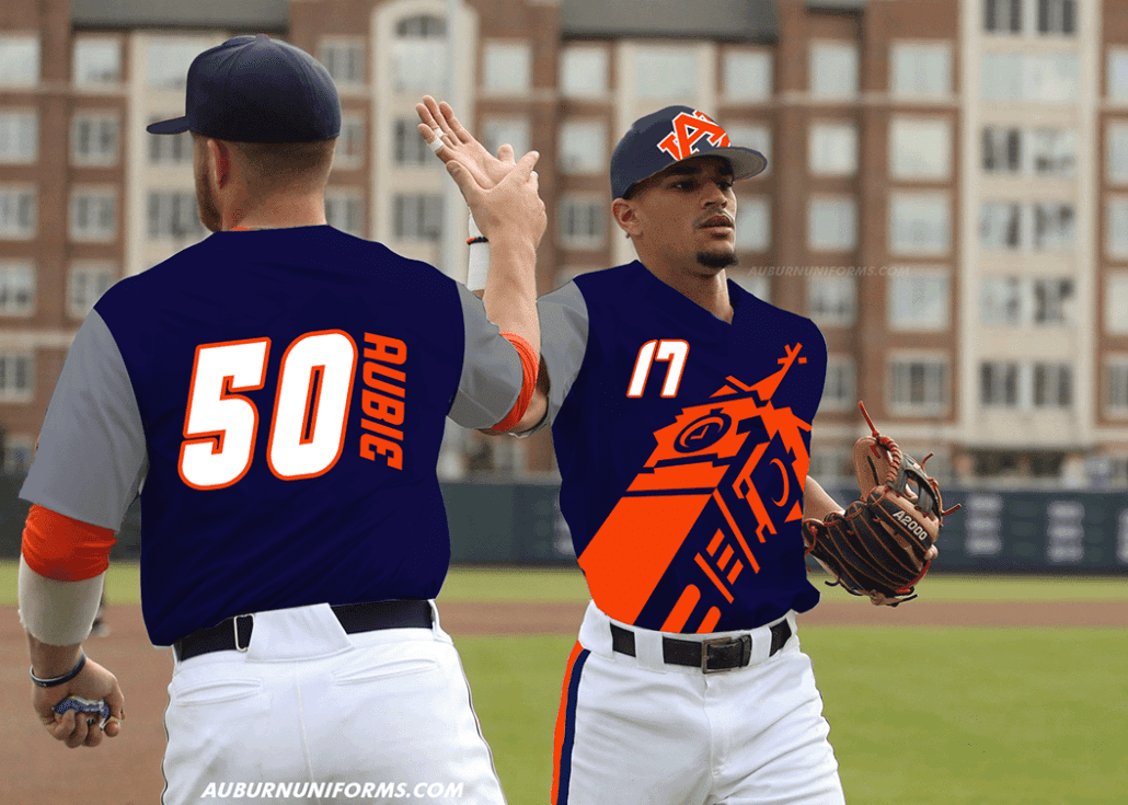
Large logos were a common motif, but a large AU logo wouldn’t have been very dynamic. The now-retired Samford Hall tower logo felt like the right choice here. An illustration of the entire building was considered, but again, this looks dynamic (and obnoxious) enough to fit the mold well.
The vest-like jerseys get a lot of the attention from the TATC era, because the hats and pants didn’t see all that much change. The Mariners wore large striped pant stripes, so Auburn will basically be wearing football pants here. The hat features an oversized AU logo tilted the opposite direction of the jersey logo. While some real hats have shown logos can be continued to the brim of the cap, this one gets cut off. Cause why not.
And you can’t have Turn Ahead the Clock without odd player names and numbers, complete with the vertical nameplates.
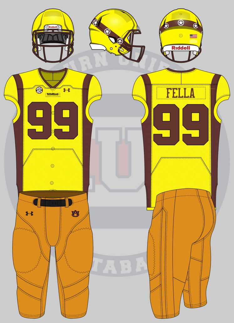
Yellawood themed pic.twitter.com/8hVXSLbTay
— Trace Pridgen (@TracePridgen) July 13, 2019
Ah, good ole YellaWood. Jimmy Rane, who acted in the television spots as the Yella Fella, is an Auburn alumni and Board of Trustee member.
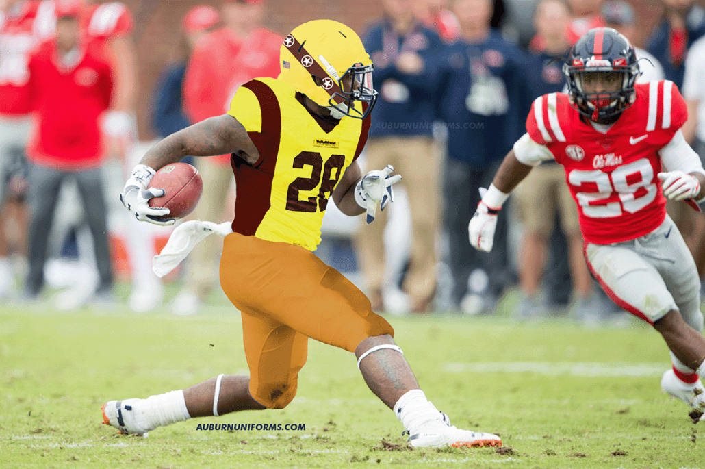
The Yella Fella outfit is so distinct that I wanted to stick as close as possible to it. The jerseys have a yellow body with orange side stripes to represent the shirt and vest worn. Sublimated buttons really drive home the look. The helmet is meant to mimic the top hat and looks rather similar to the Iowa Barnstomers lids.
The chest mark has a YellaWood label like the slabs of wood. And of course, to be authentic, it must be stapled on to the real thing.
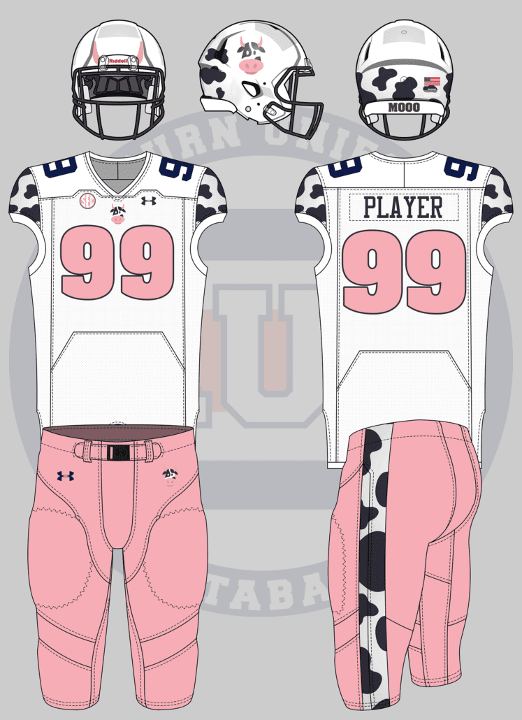
Since auburn is a cow college, I want a cow themed jersey. Do with it as you will.
— Thomas Northcutt (@RealTCutt) July 3, 2019
Cow College. Ight.
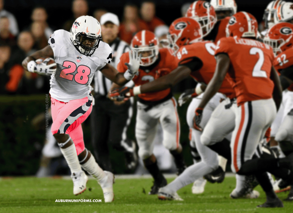
Once again, I wanted to avoid being really cliche with this look and not place spots everywhere. I found a nice illustrated cow head on Google and wanted to use it as the new logo. It’s placed on the helmet and the chest of the jersey. The black and white spots get placed on the shoulders, pant stripe, and are used on the back end of the helmet.
The pink from the cow head logo is used to add some color, specifically with the numbers and pants. And just because it felt even more silly, the cow horns are added to the front side of the helmets.
Good luck avoiding the cow college jokes at this point…
Whenever I request concept ideas, I always hope for the truly crazy designs. The ideas that are so out there you know it’s entirely silly. And that’s where the next two fall in line.
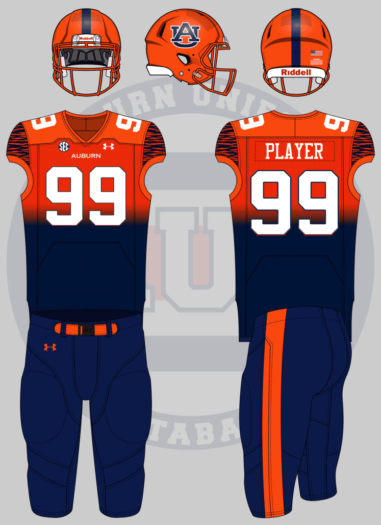
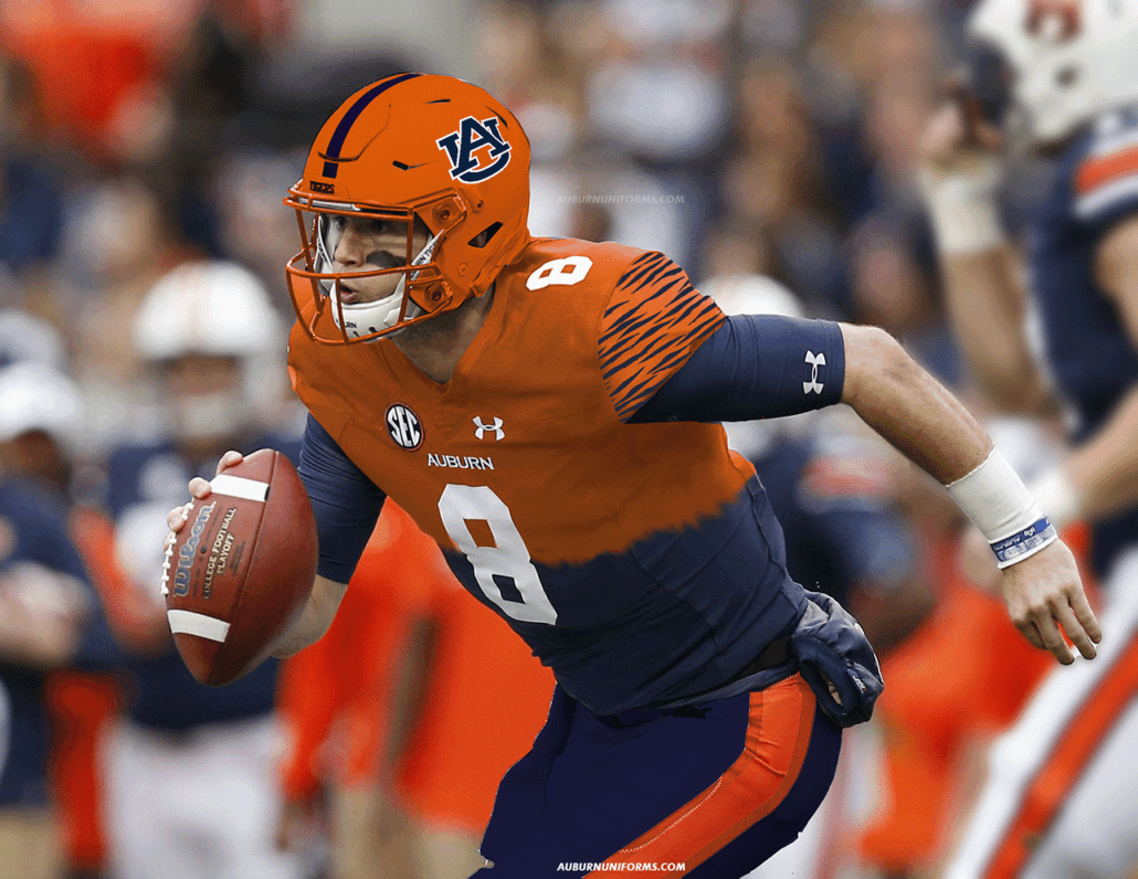
Football: Gradient fade from blue at the top to orange at the bottom. Transition occurs above the waist but below the numbers. White numbers/lettering. 2-3″ wide stripe on sides of bottoms, maybe. Contrasting tiger stripes on the sleeves.
— Emily Enfinger (@EmilyEnfinger) July 3, 2019
Gradients are weird enough. So we have that going for us!
Emily wanted a large single stripe along the pants, so I wanted to mimic that with the helmet. The shell is orange to continue the gradient upward, while the pants continue down. The chest and back numbers feature a gradient outline, reversing the color of the jersey underneath.
The shoulder cap tiger stripes are just the cherry on top for this uniform.
How can we top that crazy?
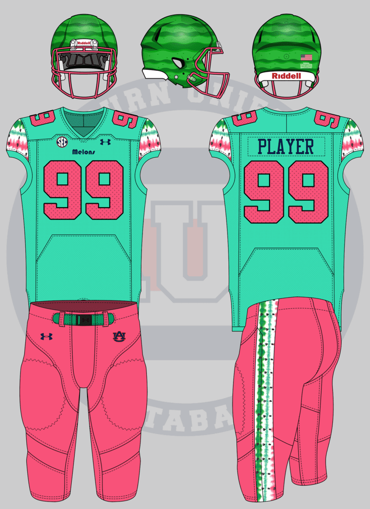
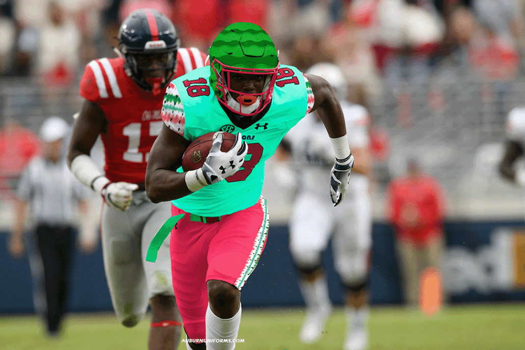
what if auburn changed their nickname to the watermelons, and changed the colors to red and green like a watermelon. Sure would be something
— joshdub (@joshdub_) July 3, 2019
Oh, that’s how.
I asked for crazy, and I got crazy.
These are the fun ideas where creativity can take over.
I found a watermelon stripe pattern on Google and wanted to run with it. The stripes are slapped onto the shoulder caps and pants stripe. The numbers and pants go pink, with the numerals featuring “watermelon seeds.”
The helmet features a dark green set of stripes to resemble the rind of the fruit to top everything off.
When you suggest the world’s first football cape (and gold sparkly jerseys), you earn a spot on the next round of concepts (being a sister-in-law also helps).
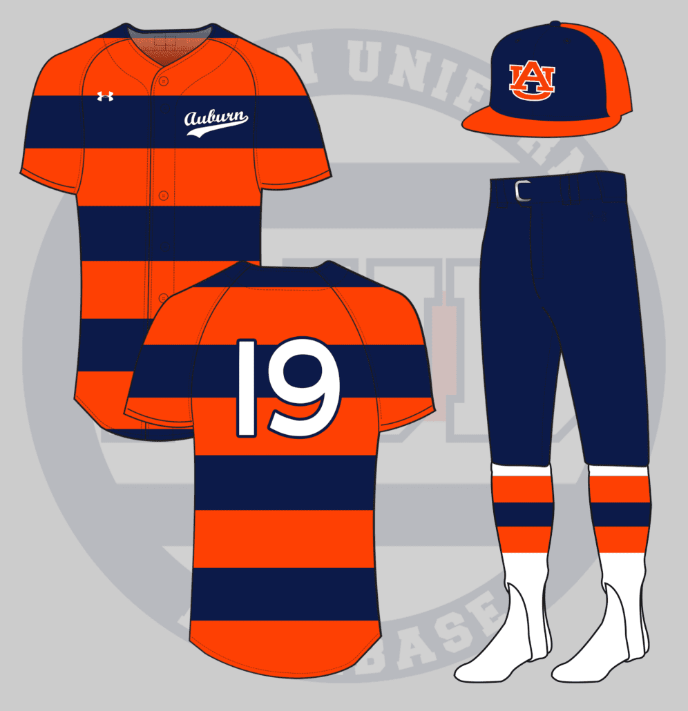
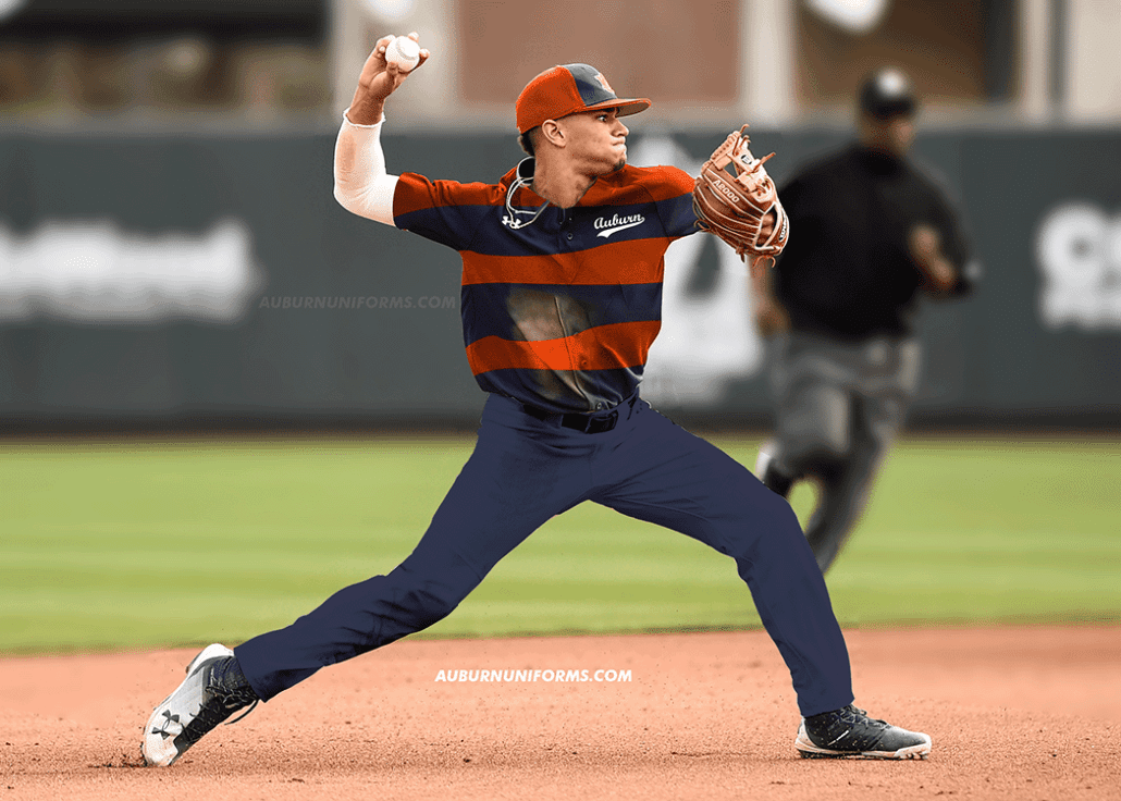
baseball uniforms based on the rugby cheer uniforms!!
— jillian (@wtmjillian) July 26, 2019
Auburn cheerleaders always wear their rugby sweater uniforms for the Iron Bowl. It’s a fun little tradition that I personally love.
The male and female cheerleader uniforms naturally differ a little bit. This baseball design features details from both versions.
The orange and blue stripes fully encompass the jersey. The women tops have a small script Auburn on the chest, so we kept the baseball script but made it much smaller on the side. The men wear long blue pants, but the ladies wear skirts, so the baseball team should wear their pants bloused to showcase the hosiery. The stirrups are white with the same orange and blue stripes, just to break up all the blue.
The hat is similar to the current tri-color design, but sticking to just the orange and blue, no white.
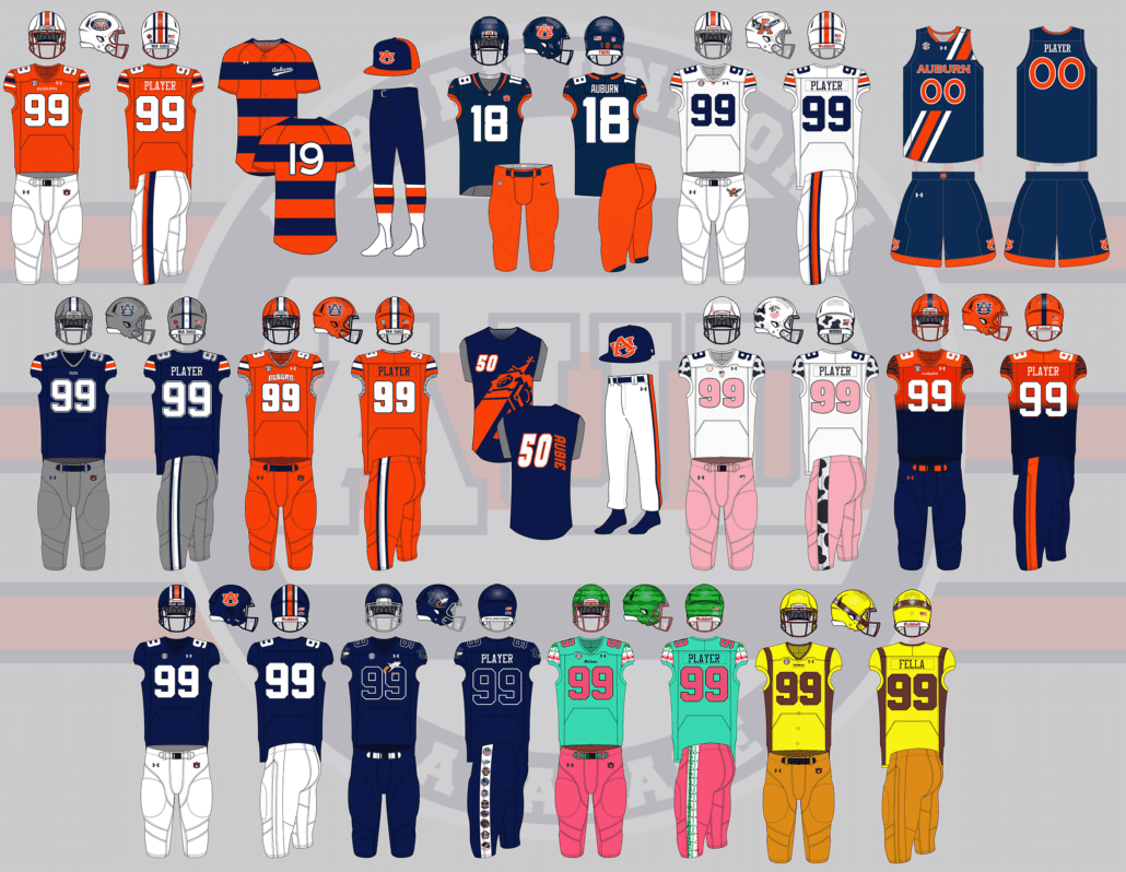
So there you have it. Eleven new absolutely crazy but beautiful concept uniforms for the Auburn Tigers. Again, these are all just for fun and no, I don’t expect or even wish to see (most of) these come to life.
Thank you to everyone that submitted ideas. We had a ton of great ideas and I deeply regret not being able to tackle all of them. Just because your idea wasn’t selected does not mean it was a bad one. There’s only so much time to create these mockups.
Hold on to your ideas and let’s do this again next summer!
Do you enjoy uniforms and want to see more like this? Be sure to follow the Auburn Uniform Database, like the AUD Facebook page, Instagram page, and follow me on Twitter for even more uniform news. You can also purchase your favorite team’s merchandise through Fanatics, with a portion of your sale going to support this website.

Leave a Reply
Want to join the discussion?Feel free to contribute!