Dissecting Auburn Uniforms: Basketball
Now that football season is (unfortunately) over, it’s now time to turn all of our athletic attention to the basketball programs. With conference season having only started just last week, I think that it’s a great time to take a detailed look into the uniforms in which the team will be wearing throughout the rest of the season. So let’s dive in.

The original intentions for this site was obviously to document every uniform ever worn by the men’s basketball program in the 100+ years of playing the sport here at Auburn. Because of that, I don’t feel the need to go into a very detailed description of what the uniforms were like design-wise in the past. But because this is intended to educate about the current uniforms, a small description of the most recent set of uniforms will be needed.
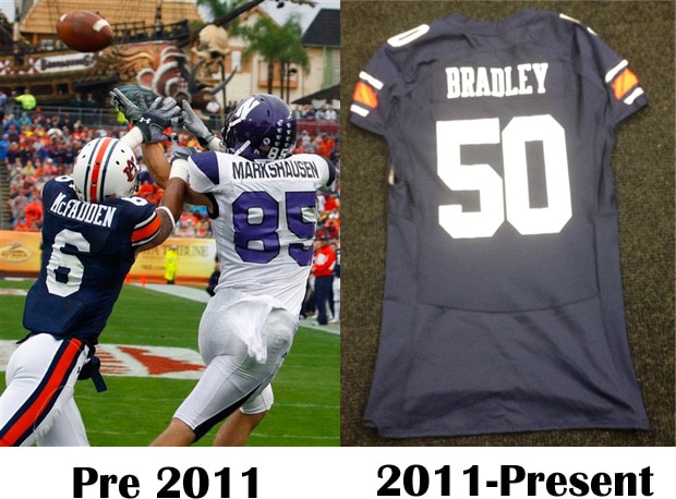
Starting in 2009 and ending at the conclusion of the 2012 season, Auburn wore these uniforms. If you search for images of these uniforms, you can see that these uniforms were pretty basic, cut wise, and had very few, if any, ventilation areas. The only thing of note is that the jerseys had a stitching line across the shoulder, which is pretty evident in this picture. These more or less look like any other basketball uniform, for Under Armour did not design a special template for this set. Now, fast forward to the current set and you’ll see how things have changed a bit.
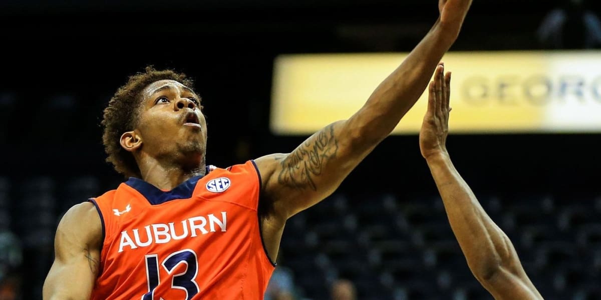
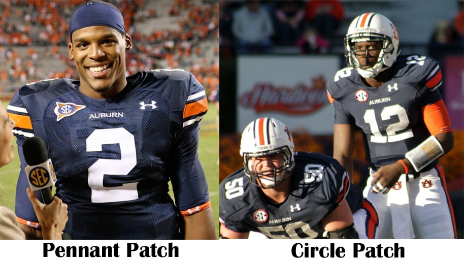
Back in October of 2012, as the team was filming their new intro video, multiple players tweeted out pictures of them “back” in their uniforms, only, this time, they were brand new. The first picture I personally saw was from my good friend Josh Wallace, and needless to say I was pretty pumped about the new uniforms. A few days later Under Armour officially released the new Auburn uniforms, this time in orange, along with a few other teams that would have new sets. As you can see here, not only were the designs new, but the cut of the jersey was different as well. Gone were the rounded V-neck collars, and in were the blocked-off collars. Also you can tell that the waist band has a new design, complete with a belt buckle looking square, and a reverse color back half of the waist band.
 |
|
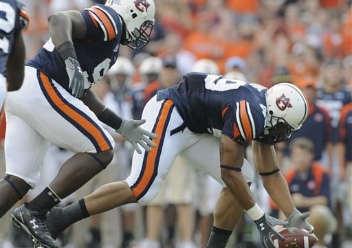
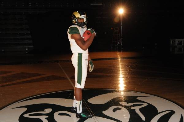
Todd Van Emst
|
The minor details are a little more difficult to see, so I highlighted them so that they are easier to spot. First, you can see that there are shoulder stitches, similar to those of the previous set, but are not as horizontal as those in the past, and a little more prominent. Also, there is a stitch down each side of the torso (there is an additional stitch on the back side, but I couldn’t find a detailed picture to show it). Probably the most notable detail with this cut of jersey is the stitching pattern that goes right above the stomach. The shorts also have some pretty detailed stitch lines, but again, I couldn’t find a good photograph. I asked Chris Denson if there were any other details that someone not wearing the jerseys would know about, and he said that the current set are a lot tighter than the previous ones.
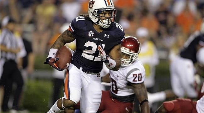
Design wise, these uniforms have already been covered here on the site. But quickly, the jerseys have football uniform inspired Northwestern stripes on the left shoulder, and the shorts incorporate them down the right leg. Each set of stripes has some odd negative stripes that cut through the design. I still have no clue why UA did that, probably just because they could. One of the cool, yet too subtle to notice most of the time, features of the jerseys is that the numbers have a Tiger stripe design. The previous set also had this design. Good luck spotting that unless you are right up in front of them. Another really small detail is that on the back of the neck, there is a little rubber-looking button-like AU square. During the first SEC game of the year last Thursday, Chris Denson actually lost his, and you can also spot the one on Tahj Shamsid-Deen’s jersey in this picture.
Now on to the fun stuff, the accessories. I’ve never been into the shoes and sneaker head thing, so I don’t know much about the current shoes. A few years ago, one of the players (I can’t remember who) posted this picture on twitter. So, you can see that the guys have a lot of options for when they hit the court. But hey, these are pretty nice. Obviously in previous years players wore socks and shooting sleeves. Well, up until this year, they were nothing but plain and boring. And thanks to the good people at Under Armour, we get to see some great looking socks and sleeves. The new socks (which I owned a few hours before the basketball team ever did! [little gloating time]) are amazing, and are reminiscent of old days on the court and the football field. Famed Auburn basketball player John Mengelt and other teams during the 70s wore very similar socks. Look at this great photo of an old Barfield-era team. How can you not love those socks (and Barfield’s get up)?! I want to personally thank Under Armour for bringing those back!
The padded shooting sleeves have to be the most popular part of the uniforms. Not only do the basketball players wear them, but a lot of football players wore them during the second half of the season. The basketball team debuted the white sleeve, and, because of a long home schedule for them, the football team got to debut the blue and orange versions of the sleeve. Under Armour has truly fallen in love with the football team’s Northwestern stripes, and I really like that they are incorporating them into other sports and unique aspects of the uniforms.
There’s always more information and details than what you think meets the eyes. I personally really love these uniforms. But, just the way Under Armour works, and the trend with recent Auburn uniforms, I would expect them to be around probably another two more years tops. And, if the team happens to make a tournament appearance before then, I wouldn’t rule out an alternate. Auburn obviously isn’t a big basketball school, and manufacturers aren’t too big in doing something different with a team like Auburn. I wouldn’t mind seeing something different (odd coming from me right?), as long as it’s done well (always a catch).
 |
|
|
That does is it for the second edition of Dissecting Auburn Uniforms. I’m planning to have a baseball edition up around the time of the start of the season. They have some crazy stuff over there on the diamond.
Anyways, hope you enjoyed this post. Thank you all that read this site through the first season. I’m excited to continue to see it grow.
One last thing, please support the basketball team! People love to use the “win and I’ll come” excuse, and they fail to realize just how much the crowd helps this team out. Don’t just come out for the Kentucky and Alabama games, show up to all that you can! You can bet your butt that I’ll be there as often as I can!!
War Eagle!


