It’s been over two months since I’ve written anything new for this site. Although I haven’t written a new piece in a while, I’ve been working on other parts of the site. I recently updated the bowl game designs page, the Jordan-Hare field designs, and added many uniforms to the Basketball Uniforms page.
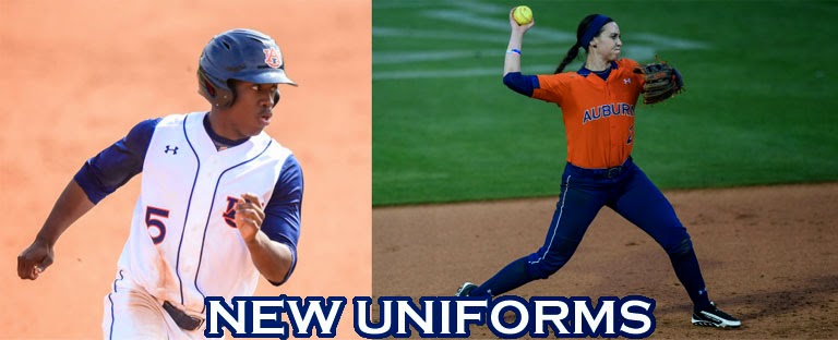
In the time since I last wrote a piece here – about Auburn basketball’s new uniforms – Auburn baseball and softball have both started their seasons, and in turn, revealed new uniforms. First, let’s take a look at the softball team.

Auburn softball added a new orange jersey to the arsenal this season (photo via Zach Bland, Auburn Athletics)
In only the second game of the season, Auburn revealed a new orange jersey. This new orange top is the first time the softball team has worn an orange jersey since the 2010-11 season, when they dumped them, supposedly because the team didn’t like how they looked. This new orange tops features blue sleeve cuffs (cut off underneath the arm because of the template) and a half collar, reminiscent of Nike’s “toilet bowl” collars many NFL teams wore when the uniform contract changed hands in 2012. Auburn has only paired these new tops with the blue pants, and haven’t worn the blue pants with any other combination either. In an attempt to change things up, the team did switch to orange belts and socks for the second game against Tennessee on April 3. Unfortunately, the Tigers lost 8-6, and we haven’t seen this combo since.
A small detail I love about these new jerseys are within the blue areas. The blue cuffs, collar, and inside the numbers all feature sublimated tiger stripes. When I wrote about the softball team’s uniforms last season, I contacted AD Jay Jacobs in regards to the use of TIGERS on their white uniforms. Jacobs replied with the athletic department attempting to brand and promote “Auburn” over “Tigers,” obviously with many schools nicknamed the Tigers across the country, and with two within the SEC. The white jerseys are the only uniforms worn by Auburn athletes that read TIGERS. And the addition of the tiger striped areas to the softball jerseys, as well as the basketball team wearing the same design with their new uniforms, leads me to believe Auburn and Jacobs have loosened their stance on Auburn over Tigers. Hopefully so.

Auburn baseball also revealed a new jersey. Hard to go wrong with a nice vest. (photo via Kenny Moss, Auburn Athletics)
Over at Plainsman Park, the baseball team revealed their own new jerseys. Well, vests to be correct. For the February 28 matchup against then #10 Oklahoma State, Auburn broke out a fantastic white vest – basically the white jerseys with the sleeves cut off. Personally, I think the design looks much better on the vests than their jersey counterpart. The small quirk about these are with the SEC patch. All of the jerseys feature the SEC patch on the left sleeve. But without sleeves, they had to place the patch on the back of the jersey, above the head spoon piping. Which makes it look a bit cluttered on the back.
Auburn baseball has also added a new camouflage hat. The 2012-13 season saw a hunter-orange version of a camodesigned hat. Last year, the disappeared with the new coach in Sunny Golloway. Well, when Golloway was at Oklahoma, his team wore a camo hat and top. This season’s Capitol City Classic against Alabama in Birmingham saw the return of the camo hat, but this time in a navy blue. (Many people have asked if this hat will be available for sale – J&M has ordered them and they should be available soon)

Trey Wingenter sports the new navy-blue camo hat in a win against Alabama
in Montgomery. (photo via Zach Bland, Auburn Athletics)
Now, don’t ever think these teams are done with new uniform additions. The uniform world is ever changing and growing. That, and this photo of the softball team trying on new pinstripe uniforms was sent to me. Just goes to show this stuff will continue for a while.
War Eagle!
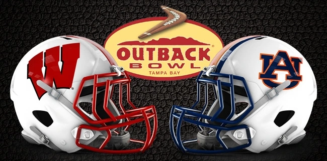
It’s been just over a month since Auburn played their last football game. Wisconsin played in the B1G Championship game, so they’re only three weeks removed from their last game. That leaves these two teams plenty of time to rest up, study enough film to go cross-eyed, and enjoy a good week in Tampa, Fla. to bask in the sunshine. Just as I do every week, let’s take a look at the uniforms these two teams will be wearing on New Year’s Day.

When you think of classic uniform teams, two teams that come to mind a lot of the time are Auburn and Wisconsin. As little (relatively) as Auburn has changed their uniforms over the years, Wisconsin is no stranger to their own amount of change and alternates. Well before the new age alternate craze sweeping college football, the boys from Madison, Wisc. wore these crazy designs. In the 2010 season, Wisconsin made it to the Rose Bowl riding an 11-0 record into Pasadena. To conform to a long forgotten tradition, Wisconsin added rose details to the helmet logo and numbers. The 2012 season featured the first adidas-designed alternate uniform for the Badgers. Adidas designed similar uniforms for each Nebraska and Wisconsin (funny, since they already look similar enough) to wear when they faced each other. Ever since then, the Badgers have played around with red helmet designs, to counter their traditional white lids. For the last year or two, the Badgers have used two different red helmets. The first new shell they wore featured white stripes, basically an inverse of their white helmets. In a later game, they changed it up and added black stripes to the lids, as well as a black facemask. The three different helmets they’ve used each had a different facemask, so it’s no stretch to believe they can mix and match these. One minor change from this year is the removal of Wisconsin’s TV numbers from their jerseys. TV numbers are the shoulder or sleeve numbers on the jerseys, named for the fact that they are easier to read on TV than the chest or back numbers. What is ultimately a minor change, it made a much bigger impact than one would think. From a visual standpoint, it seems to mess with the overall design, leaving a large empty space on the shoulders.
As Auburn is the designated away team, the Tigers will be wearing white uniforms in back-to-back bowl games for the first time since they wore white in three straight bowl games, the 1984 Liberty, 1985 Citrus and 1986 Cotton bowls. And just as last year’s National Championship game, Auburn has placed the bowl patch in an odd position – underneath the Under Armour logo. Unlike the National Championship game, Auburn more than likely won’t wear a decal on the back of the helmets. They didn’t in the 2010 Outback Bowl, and teams outside of the BCS/CFB Playoff games typically don’t. As normal for bowl games, the players typically get new gear. Auburn already broke out new gloves and new cleats once this year. Granted that’s no reason for them not to break out another set of new gear.
We’ve already seen Auburn’s white jersey with the bowl patches. Oddly enough, the day both teams went to visit Tampa General Hospital, Auburn’s jerseys were patched up, where as Wisconsin’s weren’t. I find it hard to believe they won’t be wearing a patch, as it’s rare to not see a team wear one nowadays. There’s still time to get the jerseys patched, but I also don’t see why they wouldn’t do it back home in Madison with their hometown seamstress. Also noticed from the hospital visit was that the Wisconsin players were wearing jerseys with TV numbers. These could easily be old game jerseys the players were given to wear. From Wisconsin’s first bowl practice in Tampa showcased the Badgers practicing in their white helmets. Again, this may not mean anything. We’ll just have to wait until gameday or until Wisconsin or their equipment managers confirm exactly what they will be wearing.
Also of note is that the Outback Bowl trophy has changed since last year. In year’s past, the trophy has featured a solid finish, as though it had been cast (I don’t know, I’m no metal/trophy expert). This year’s trophy is entirely made of crystals. This new trophy weighs in at 60 pounds and is 22 inches tall.
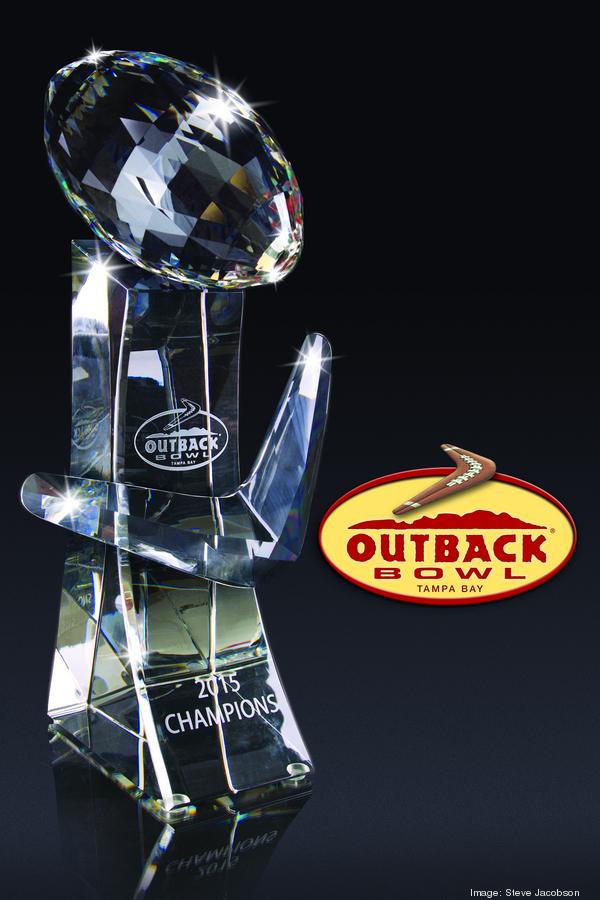 |
| 22 pounds of pure crystals await the winner of this year’s Outback Bowl |
The first football game of the 2015 calendar year is approaching quickly. Players, coaches, equipment staffs and fans all have a lot to get ready before that early morning kick off. Here’s to a great game and great start to 2015!
Random Bowl Uniform Facts

War Eagle and Happy New Year!
Last Friday, it was announced that Arizona State had agreed to terms with adidas, ending a 10 year partnership with Nike. ASU and adidas had previously worked together for four years prior to Nike outfitting all Sun Devil athletics in 2004. This news initially surprised me. Arizona State and Nike worked on a giant project to rebrand their entire athletic department prior to the 2009 season. ASU is able to break out multiple new uniforms each and every year, thanks to Nike. And now they have gone from that to being outfitting by a company many believed to be slowly backing out of college football uniforms. After reading about the switch, the reason became clear. Money. Well, that’s obvious, but it’s true. Arizona State University Vice President for Athletics Ray Anderson has been on record trying to grow the athletic department’s revenue. Which is fine and all. But when you sell naming rights for the stadiums renovation project, not the stadium itself, you have to wonder where the line is. But that’s for another day.

As this news began to surface, rumors of Auburn switching to adidas after the contract with UnderArmour expires after the spring of 2016 began to surface. Now, everything from here on out is pure speculation. There has been no information from either Auburn, adidas, nor UnderArmour. So don’t take what I have to say as factual. This is all speculation.
As mentioned, Auburn’s current apparel contract runs out in spring of 2016. Under Armour originally signed Auburn, their first big name brand in collegiate athletics, in 2005, with the 2006 season being the first in which Under Armour football uniforms hit the field at Jordan-Hare Stadium. The two entities signed an extension in 2008. The 2014-15 contract year entitles Auburn to $4.3 million from Under Armour ($2.5 million equipment, $1.8 million cash). To put that in perspective, and remember that these terms were agreed to in 2008, in 2014 Under Armour bid $90 million over 10 years to outfit Notre Dame, which so happens to be the most valuable collegiate shoe and apparel contract in history.
 |
| Click-Clack in 2006 |
So that begs the question, what does Auburn mean to Under Armour? That’s tough to pinpoint actually. Auburn is still one of UA’s biggest recognizable names in the country. As well as being the most successful football program under the Under Armour banner, with the Tigers reaching the BCS Championship game twice with the UA logo on the chest. But let’s look at this from the uniform standpoint – as that is what this site is for after all. Since signing on with Under Armour in 2005, Auburn has only worn two different uniform templates. That has been documented here before, so I won’t go into it at this point. You can read that here if you like. In 2011, Under Armour rolled out their newest template, and the Tigers were among the first to wear it. At the end of the 2013 season, UA began testing their newest template in the way of alternate uniforms for both Maryland and Texas Tech. Both teams have actually gone back and forth with the templates since then. Maryland has pretty much moved to it full time now. Now, what does that say for the relationship between Auburn and Under Armour? For most people, they don’t think much about it. For me, on the other hand, I see it as Auburn not being the #1 program for UA, for whatever that reason may be. And it very well could be nothing at all.
After last year’s basketball season, people started pointing fingers at Under Armour, putting a good bit of blame on them for the lack of recruiting and performance. Now, I don’t believe that for one bit. Yea, it probably didn’t help the situation, but there were other, bigger factors involved that hurt more so than a shoe contract. I have yet to hear anything good about Under Armour’s footwear and footballs and basketballs from those involved at Auburn. I owned a pair of UA shoes and was pretty disappointed. Granted it’s not an excuse, you have to remember that Under Armour is the youngest company in the apparel industry, starting business in 1996, and began producing shoes in 2006. I’m sure those early Nike shoes weren’t anything special either. All that aside, a major company should still be able to produce quality products for their biggest clients.
Now, what happens at the end of the Auburn – Under Armour contract after the 2016 season? Well, the obvious answer is that they could continue their relationship, but hopefully Auburn Athletic Director Jay Jacobs could negotiate some better numbers for the Tigers. But, like previously mentioned, Under Armour did dish out $90 million to win the contract for Notre Dame. At the time, many “money experts” were saying that if UA had bid much more than what they did, then they wouldn’t make any profit. So would Under Armour even have the ability to bid much more for Auburn? This again goes back to the original question – what does Auburn mean to Under Armour?
 |
| Under Armour may need to Protect This Contract come 2016 |
Let’s go back to Arizona State for a second. Their current contract with Nike is valued at just over $2.1 million. For comparison, Oregon’s contract is worth just under $3 million, which doesn’t mean a whole lot with the Ducks purchasing everything at cost. UCLA, an adidas school, as an apparel contract worth $7.5 million, considerable more money than the two Nike schools just mentioned. The top contracts per each apparel company are as follows –
The worst part of this is the sitting and waiting. There won’t be any news whatsoever on this topic until talks begin to start. And even then we’d have to wait for the official announcement. And if Auburn were to actually switch next summer, it would be another waiting period to see the results of the change. When Nike took over the NFL contract, there was word on shortages of gear for each team. Taking over 32 teams, with 52 players each, is a big undertaking. Taking over an entire school’s athletic department, with upwards of 500 plus student-athletes, is no easy task either.
Auburn and Nike aren’t strangers either. Back in 1995, Auburn had agreed to switch from local Russell Athletic to apparel powerhouse Nike. Before any ink hit the contract, locals and government officials pressured Auburn into ultimately canceling the deal with Nike and sticking with Russell Athletic, who, at the time, was located in Alexander City, only about 45 minutes from campus. But if Auburn were to switch to the Swoosh in this day and age, for one, they wouldn’t earn much more, if any more, than they do with Under Armour now. The top Nike contract is only $100,000 more expensive for Auburn’s current contract. And with the teams Nike outfits, I don’t believe that will be a possible number. And, as many people said before, Auburn would just be “another fish in the sea” with the boys from Oregon.
All of this is just to say changes could be coming to the Plains. As much as some as us don’t want to see it, we ultimately have zero input into the outcome. Especially with some lucrative money on the table. Regardless, we still have a full athletic season, as well as the rest of this current one, to enjoy the fruits of Under Armour’s labor.
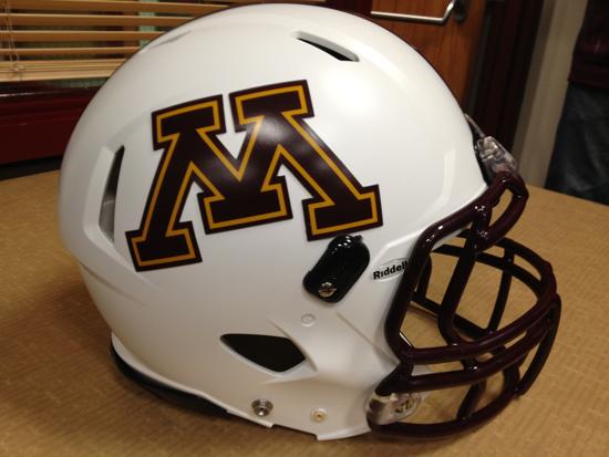
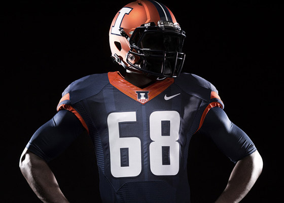
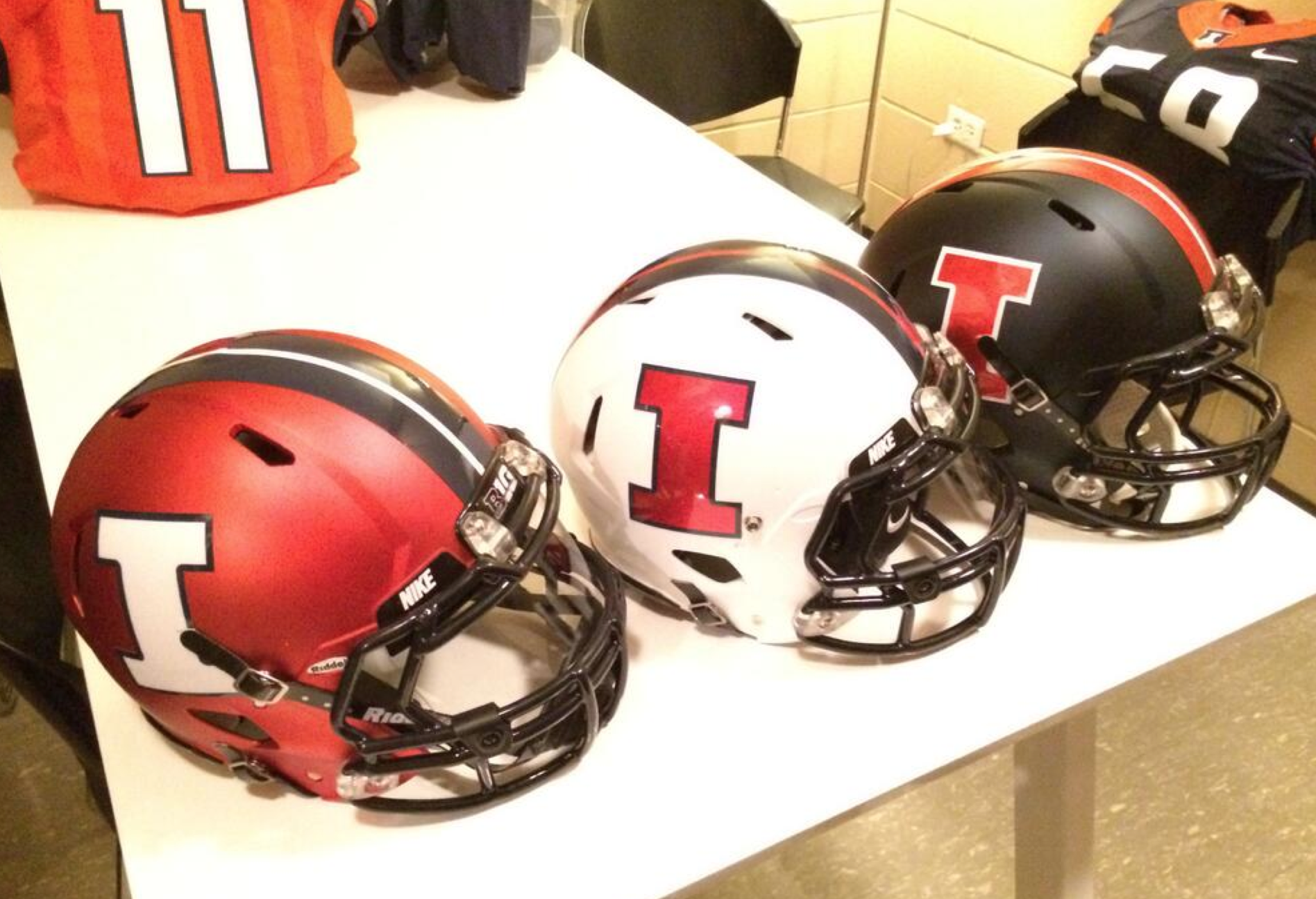
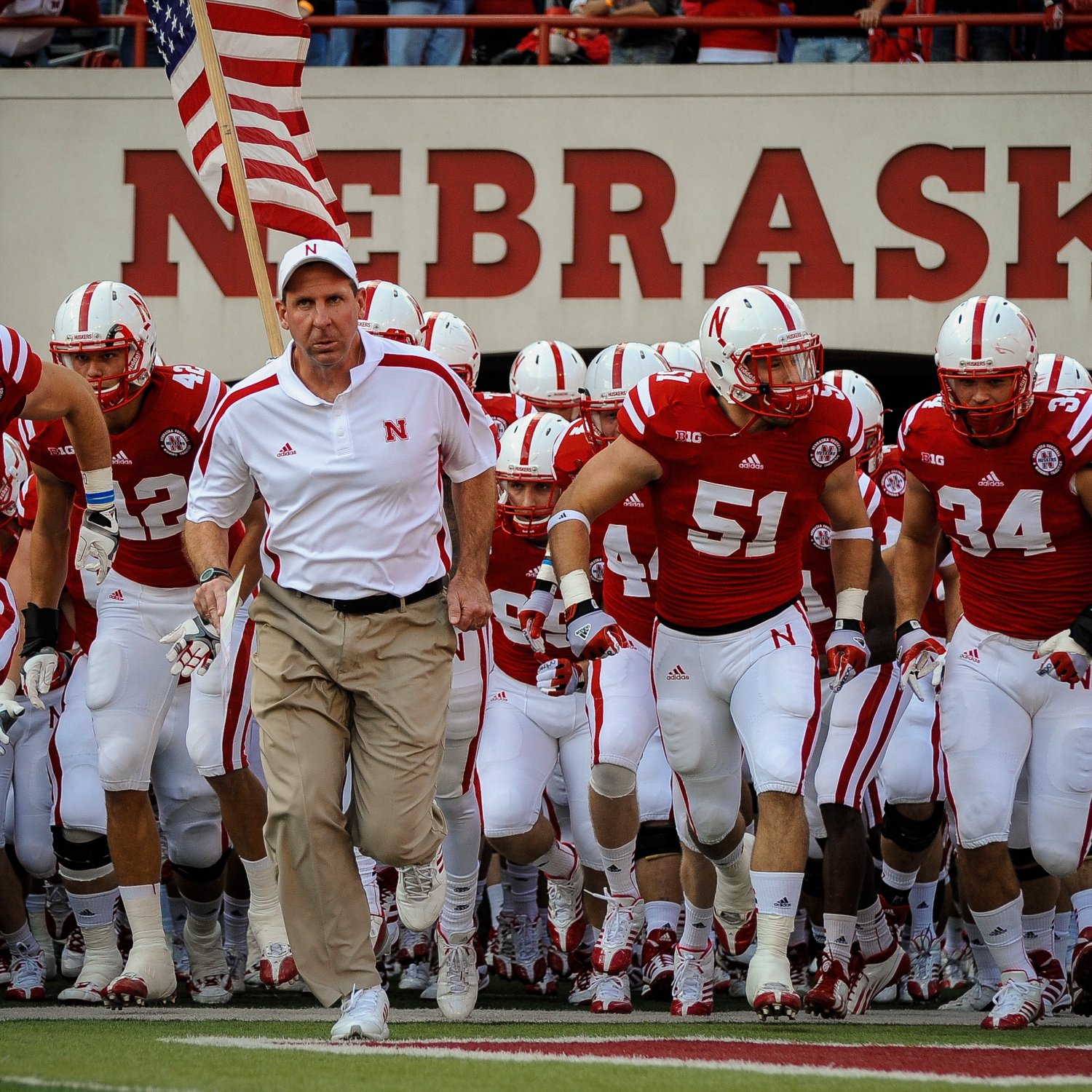
Today I wrap up the Power 5 conference uniform rankings. There’s a chance I may continue and go through some of the smaller conferences, but let’s concentrate today on the Big 10. The Big 10 is one of the most historic conferences, as far as football powerhouses and traditional uniforms go.
As always, this list’s criteria will consist of everything regarding the football team’s aesthetics over the past few years, including special alternates, manufacturer’s templates, and more. And again, this list, as well as all the other ones, is my personal opinion about the uniforms. Don’t get your feelings hurt because I have one team above your favorite team or think my list is completely wrong. I’m all for healthy conversation regarding these lists, so please, leave a comment below with your own rankings.
[UPDATE 11:55: Added the two new Big 10 teams I over looked when first writing this piece.]
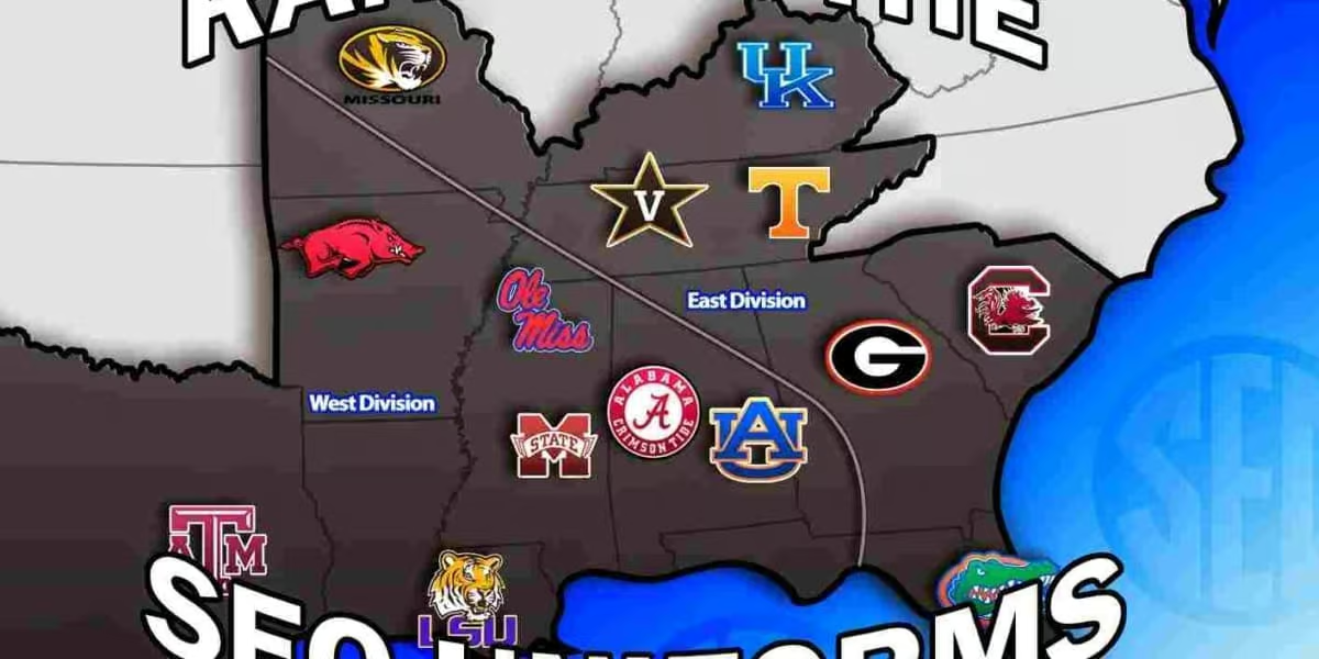
The off-season is slow. Slower for some people than others. Real slow for the uniform guy. Slower than you could imagine for the Auburn uniform guy. So, for the past few weeks I’ve been trying to think of new ideas for posts that would make the time go by faster, and none of those seem to come into fruition real well. That’s where this series comes in. Over the next 40 days or so until college football starts, I’m going to do my own ranking of uniforms, conference-by-conference. And since this is an Auburn site, we start with the SEC today. I’ll go through my ranking and reasoning, and then would like to see what you guys think by ranking these uniforms in comments below.
The SEC is obviously one of the greatest football conferences in the country, both in on-field talent and the traditional uniforms. That “traditional uniforms” has changed over the past year or so, but there’s still plenty of tradition in these unis. Now, I know that everyone has an opinion, and that all of those are different. I don’t plan for my list to be “THE” list that is the best of all time. The debate over what’s good and what isn’t is what makes all this entertaining. I don’t have much of a criteria (tradition vs modern, colors, etc) other than what looks good to me and what doesn’t. I have taken everything into consideration in making this list. What the team wears now versus last year or even 10 years ago. The template the manufacturers are using. Combinations that the team can make or have made out of their different aspects of the uniform sitting in the closet. So, let’s get going!
 |
| Shanna Lockwood |
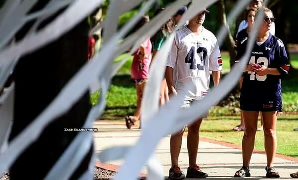
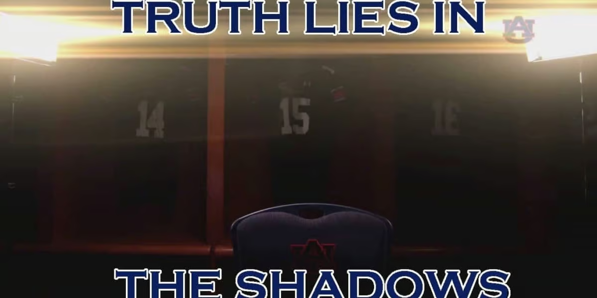
Tough week to be a member of the Auburn Family. First, Jonathon Mincy, a Senior DB, was arrested Friday, June 27, on 2nd-degree marijuana possesion after being the passenger in a car going 94 MPH in a 65 MPH zone. Then, a much more difficult report was released: Beloved Auburn tightend Philip Lutzenkirchen was declared dead on the scene of his 3 AM car wreck Sunday morning. Lutz was the passenger in a car with four others, none of which were wearing their seat belts. Three people in the vehicle were ejected from the car, with the driver and Lutz dying from the incident. The driver was Georgia baseball player Joseph Ian Davis. The Auburn Family mourned the loss of the fan favorite Tiger with many memorial tweets, Facebook posts, and even an impromptu rolling of the trees surrounding the famed Toomer’s Corner.
(IMPORTANT: I am in no way trying to minimalize the death of Philip Lutzenkirchen. This is simply to help get passed the events. People grieve in many different ways. This is how I and many other people have done so.)
 |
| Zachary Bland |
You may be asking “What does this have to do with uniforms?” And you’d be right in asking that. I didn’t want to write a full post in remembrance of Lutz on this site for many reasons. Too many to go in to. But, to answer your question, this tragic event could very well have an impact on Auburn’s uniforms.
Many people were claiming that Lutzenkirchen’s #43 should join the retired numbers list. Lutz was a wonderful player on the field, but there are a lot of wonderful players that don’t get their number retired. Not every number can be retired. A college football team has upwards of 125 or so players, and jersey numbers can only be up to 99. Even with duplicate numbers, a retired jersey number causes some issues when numbering players. Sadly, many players die. You just can’t retire a number because of something like that. It doesn’t make the number any less meaningful to people.
Another suggestion was to award the #43 jersey to a player that personifies everything that Lutz stood and lived for. Now I think this is how it should work. Many teams do very similar awards in terms of numbers. Certain players get to wear a certain number for either the game, a season, or his career. Texas A&M awards a #12 jersey in honor of their 12th Man tradition.
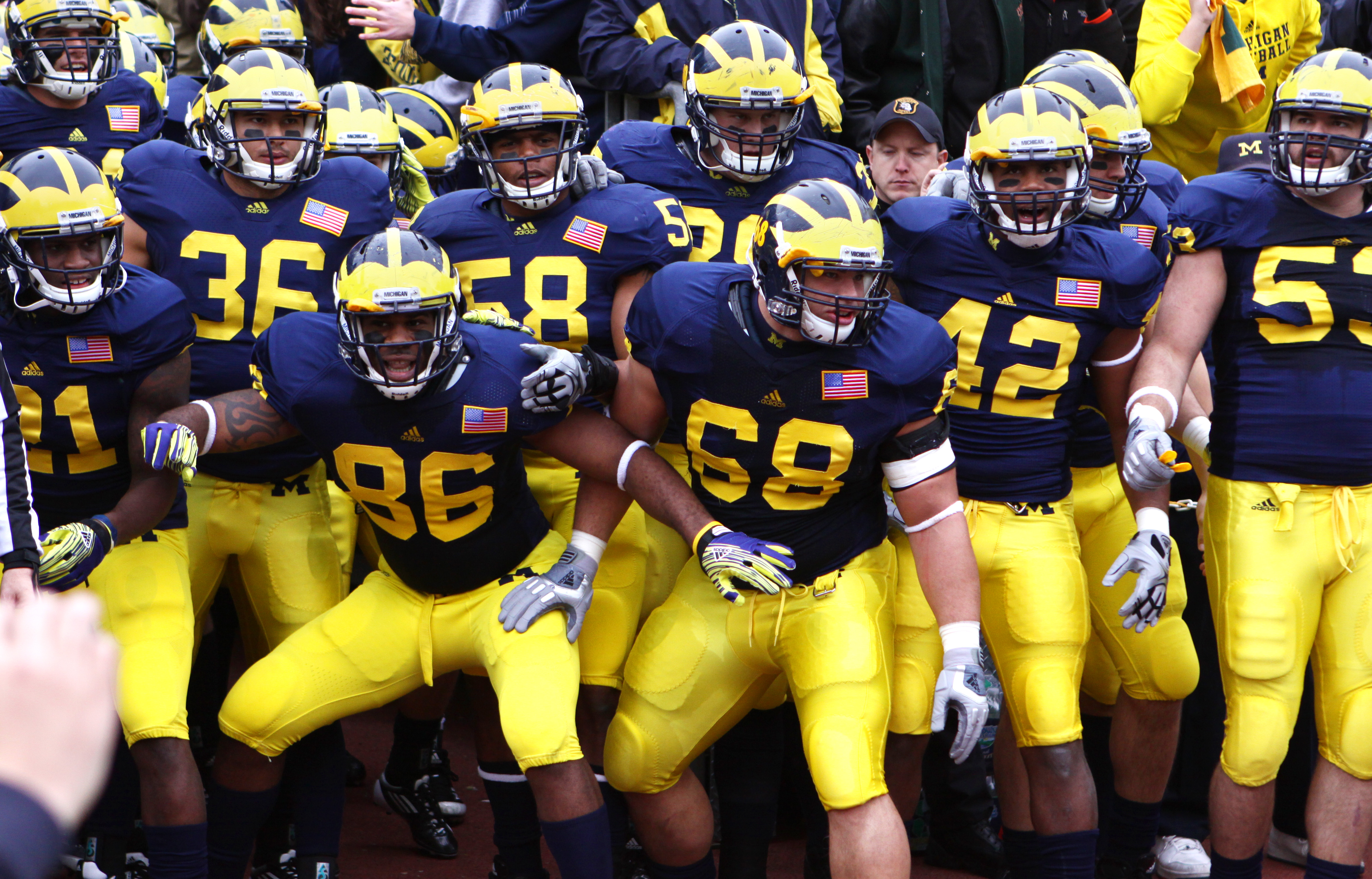
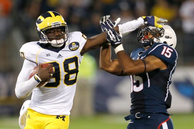
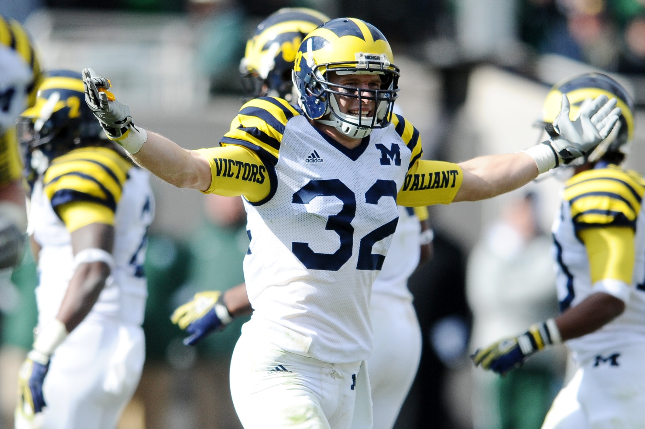
Michigan has gone a little different direction. Michigan used to have six retired numbers, but has since recirculated them transitioning them to “Legends” status. When Michigan deems a former player “Legend,” a player is chosen to wear their then-retired number. The player also wears a Legends patch on the left chest of the jersey, indicating the player that made the number famous to begin with. Desmond Howard’s #21 was the first to be included in the Legends program, when it was un-retired in 2011.
I think the best way to go about honoring Lutz and former #43-wearer Auburn legend James Owen is to reward the jersey to a player that has carried himself in a way that Lutz would have. A player that works hard, is passionate about his game, enjoys life to its fullest, gives to others, and every other characteristic of Philip Lutzenkirchen that we’ve heard about this past weekend in the stories remembering him. Allow the coaches, players, or the Lutzenkirchen family, or a combination of the three, to decide who ultimately gets to wear the special number. I would not be upset if the player awarded the number also dons a patch similar to the Michigan Legends patch. Maybe something like this:

You don’t retire a number for what the player did off the field. You honor the man for the way he lived his life on and off the field. And if anyone deserves to be honored for that, it would be Philip Lutzenkirchen.

I know Gods working so I smile.
— Phil Lutzenkirchen (@lutzenkirchen) June 26, 2014
RIP Lutzy
+Auburn Athletics
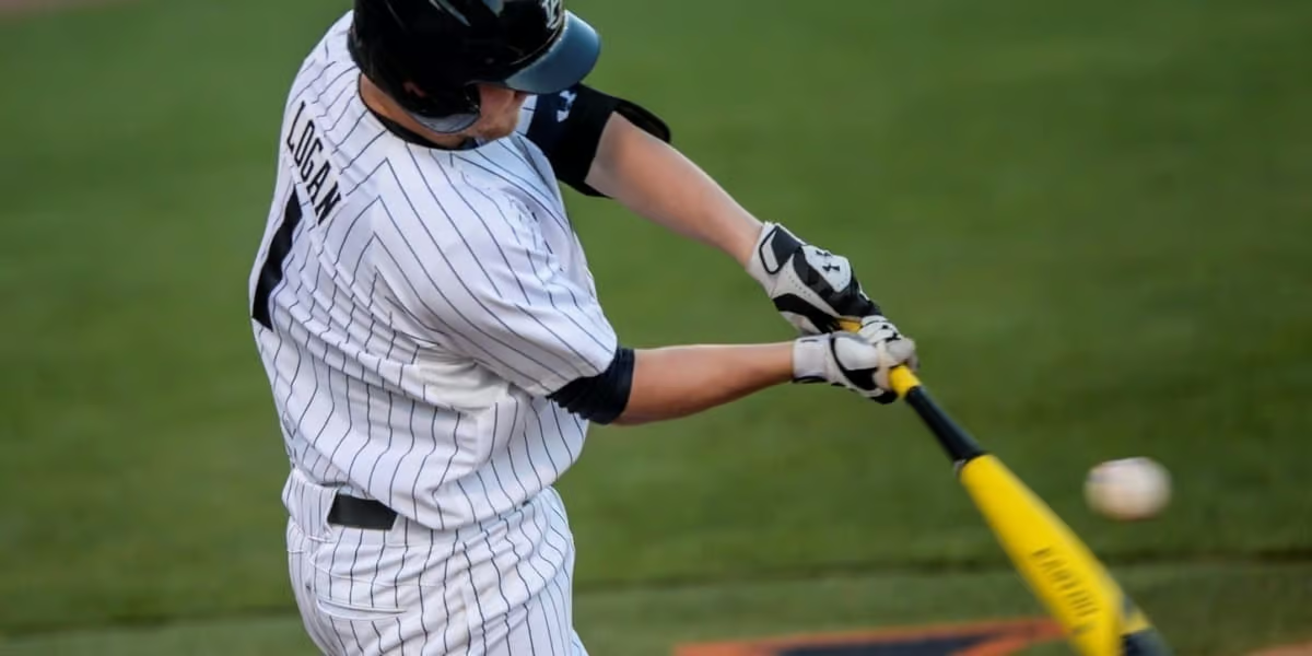
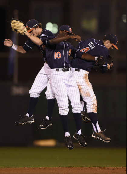
As I was preparing for my preseason baseball posts, I went through countless photos of last year’s games. The one constant thing that I noticed is that the uniforms were anything but consistent. Nearly every picture I saw consisted of random jersey, pant, and hat combinations. There were very few combinations that were always set in stone. The first year of the Golloway era has, thus far, seen absolutely no mixing of uniform aspects. Or so I thought. This past Tuesday night, in a game against South Alabama, we saw our first mix and match of Auburn baseball uniforms.
 |
| Zach Bland |
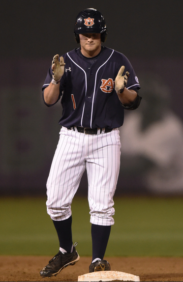
Tuesday night was the last baseball game of the season that I was able to attend. So I got there early to enjoy even more time in the great weather. The first thing I noticed (of course) was that Auburn was wearing the blue tops again. I tweeted that this was the first time we had seen the combo in a while that consisted of the blue tops and white striped stirrups, but boy was I wrong. I then noticed that they were wearing the plain blue ‘rups. It took me probably 10 minutes later to realize that they were not wearing the white pants. As one of the players walked out of the dugout I realized that they were actually wearing the pinstriped pants. If you remember my Baseball News post from January, you’ll remember that the baseball players really liked the blue tops paired with the pinstripe pants.
It is odd that Golloway would decide so late into the season that it is acceptable to start playing with the uniform combinations. When he came in, I was under the assumptions we’d see about the same number of different combinations as the previous year. I’ve been rather surprised how much he’s stuck to the same combinations. Personally, I would have rather seen some hats rotate before going with the blue top, pinstripe pants look. I would love to see the white hats return with the all white look, even if for just one game.
 |
| Zach Bland |
If you look at some pictures from the game, you’ll also notice something different with the stirrups. This season, the entire team has been wearing the standard 3-inch cut stirrups. Tuesday night I spotted a few players going with the higher 7-inch cut ‘rups and I loved it! Ryan Tella was the one that caught my eye first wearing these. A quick look back shows that he’s been wearing the higher stirrups since the South Carolina series. Go Tella! I know there’s a lot of people that would love to see the 11-inch stirrups return, but that’s a bit much for me. I wouldn’t mind seeing some more 9-inch ones, but anything bigger would be a little too high for my liking. Gotta keep room for the stripes!
The look overall was pretty good. It was nice to see something different, even if Golloway hasn’t been into mixing this season. I’m just hoping we don’t see much more of it. There are most combinations that should not be worn than those that should. I’d rather not see the orange (like in the past) or white tops paired with the pinstriped pants…I’m just curious to see what the team does to finish out the season. Do they continue to wear the same standard combinations or do they start changing up the sets? Time, and win/loss records, will determine that.
I hope to have a really interesting new piece up next week. I’m really excited for it and hope everyone enjoys it!
War Eagle!
+Auburn Athletics
Rainy, windy and chilly. That’s not what the forecast called for earlier in the week. I was expecting sunny and 75 degrees and perfect weather for the entire weekend. Then Mother Nature said “NOPE” and added a lot of rain Friday that led to a chilly and overcast and bleh Saturday. I was rained on and sunburned in the same day. That’s what two baseball games and a half of a football game will do to you. I spent most of my day at the baseball games, but this post will be all about some notable things from the A-Day football game.
One of the coolest touches from the game was the SEC Champions logo. The grounds crew placed the logo on the 25 yard lines were the SEC logo always goes. But the equipment managers thankfully placed the same logo on the back of the helmets, where the conference logo usually goes (Auburn wears an NCAA pennant decal, other teams wear the circle SEC logo). It’s a great logo first of all, and Auburn adding it anywhere they could was a fun addition to the game. I would absolutely love to see the Tigers wear that decal through the fall, but I wouldn’t place money on it.
